This guide covers everything you need to know about mastering successful email popups in 2023.
We’ll cover what an email popup is, our favorite examples from top brands, as well as how to make one to get more leads and sales.
Enjoy the guide in full, or jump to a section by using the table of contents below.
1. What Is an Email Popup?
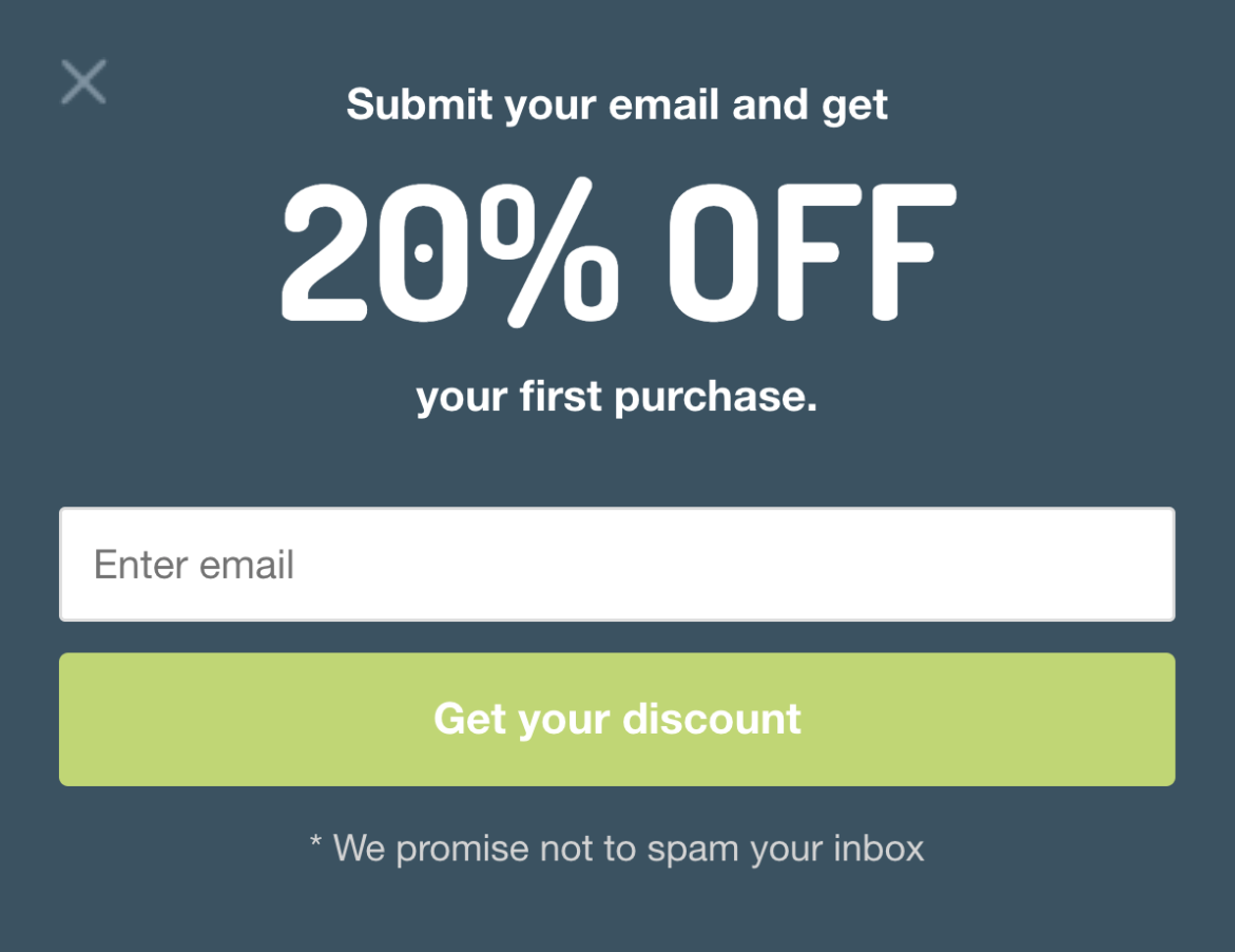
An email popup is a small window that appears on a website visitor’s screen, asking for their email address in exchange for a freebie.
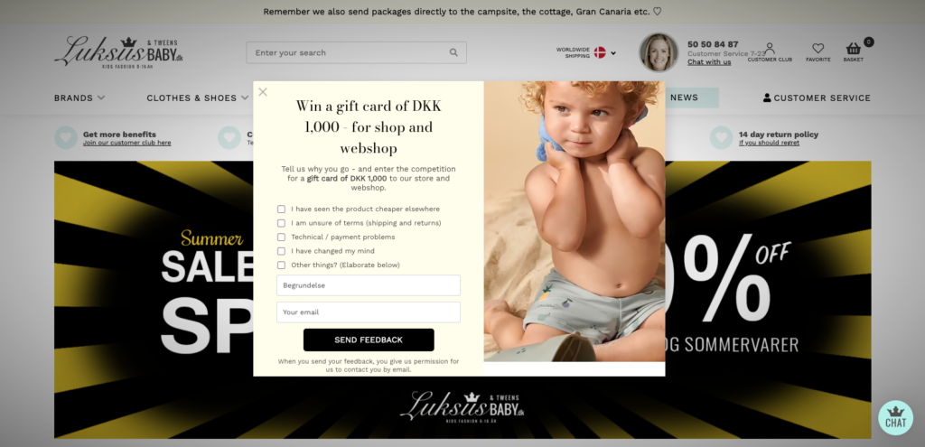
Popups are effective, but if they’re too big or hard to close, they can make the page’s content inaccessible, hurting the user experience.
In 2016, Google announced that it would penalize sites that use intrusive interstitials on mobile due to the limited screen space.

Since then, most websites now use popups that slide in from the left or right of the screen, instead, to ensure their content is still accessible to the visitor.
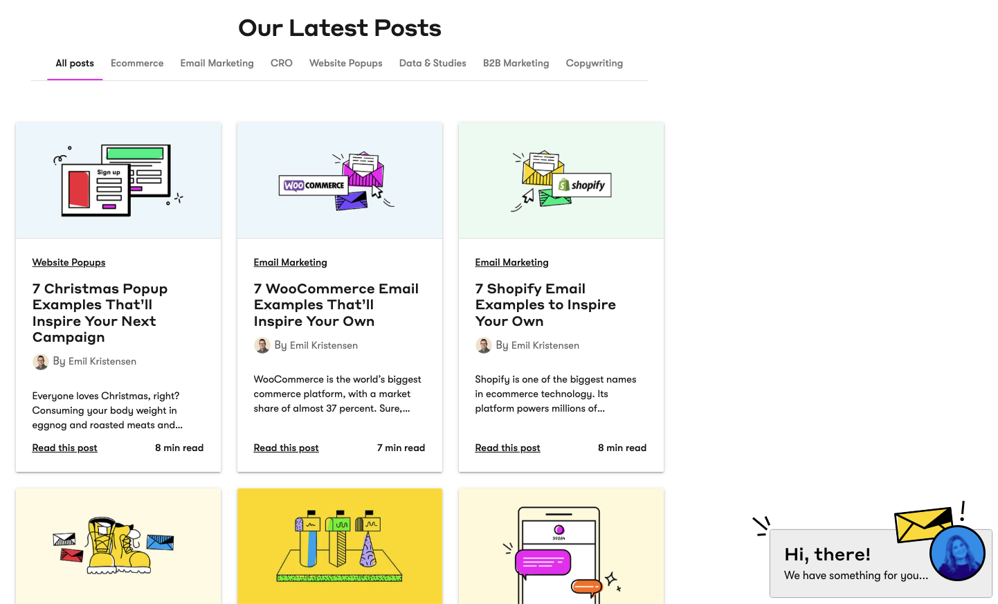
We use a slide-in popup with a teaser on our blog for desktop visitors only:
While email popups are most associated with list building, there’s more to popups than collecting emails.
As we’ll see in part 5, many of the best popup use cases we’ve seen come from those boosting product sales.
2. Do Email Popups Work?
We recently analyzed 1+ billion popup sessions from more than 3,000 customers. And in doing so, found seven interesting findings.
Our most surprising takeaway? Popups with a countdown timer outperform those without one by a whopping 112.93 percent.
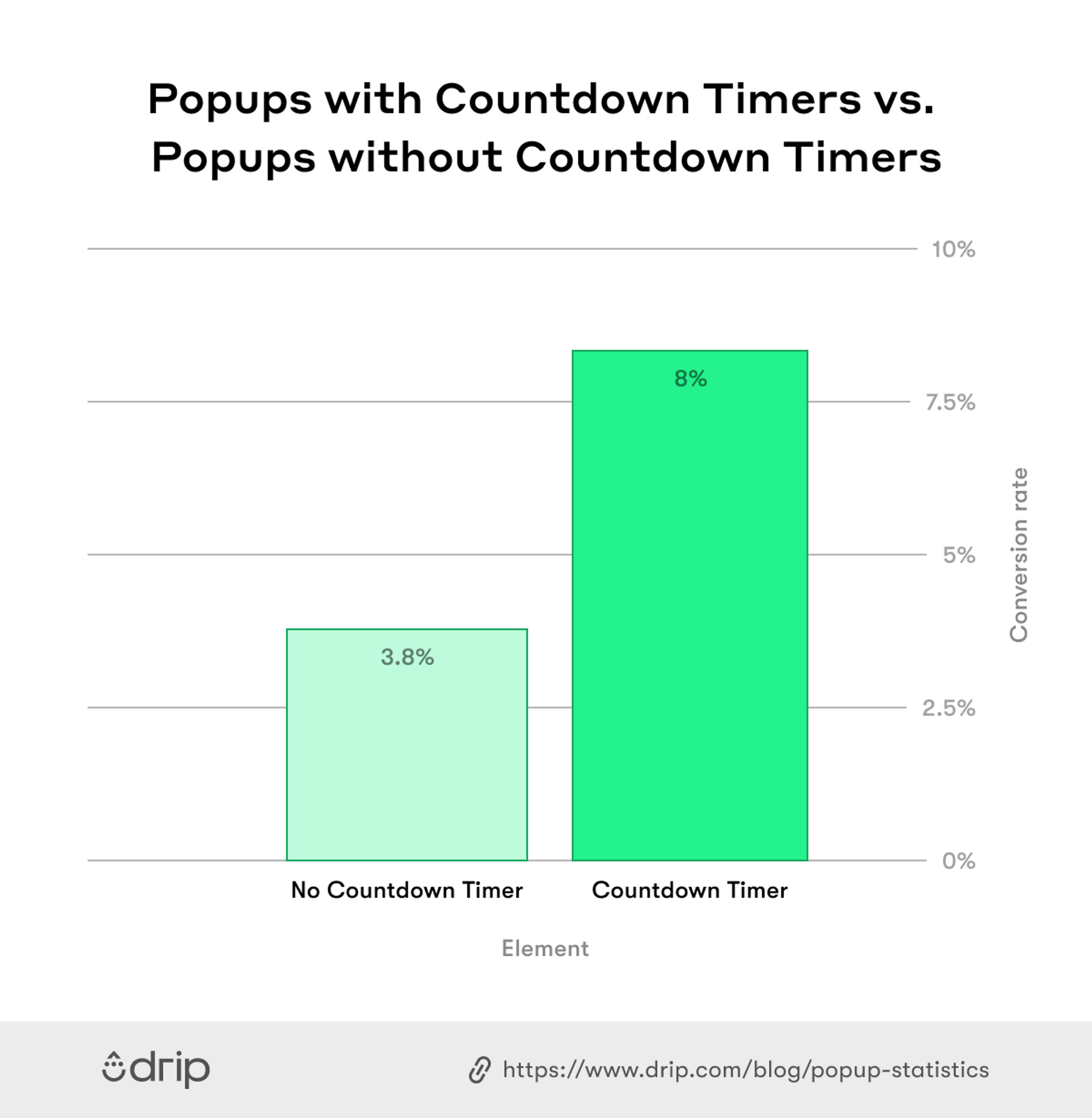 So, if you’re running, say, an on-site giveaway, adding a countdown timer can add urgency, driving more sign-ups in the process.
The bottom line is email popups do work—provided, of course, that you follow the best practices we outline below.
To get our other findings as well as our top email popup best practices, read our article on popup statistics.
3. What Do You Write in an Email Popup?
Writing good popup copy requires focusing on the popups:
- Headline;
- Body; and
- CTA
Let’s look at each briefly.
i. Headline
One way to make an email popup stand out is to use words that the visitor is familiar with within the headline.
Take BarkBox, for instance. The brand offers 10 percent off the visitor’s next order by asking, “Got a good doggo?” before assuring the reader, “They deserve all the goodies.”
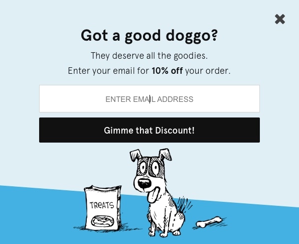
Not only does BarkShop use its target buyer’s language in the headline, but it also asks a preloaded question that few dog enthusiasts would say no to. After all, who doesn’t have a good doggo?
ii. Body
One of our all-time favorite popups belongs to men’s shaving company, Harry’s.
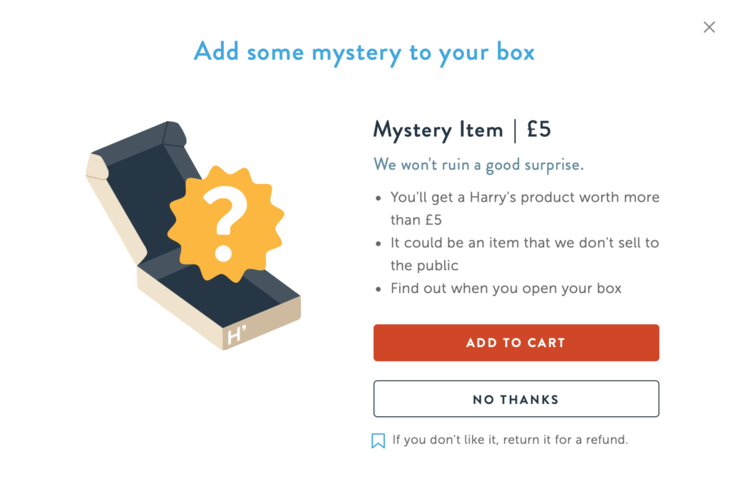
There’s a lot to praise, but we’re most fond of its body copy for a few reasons:
- First, Harry’s opens a curiosity gap by inviting you to “Add some mystery to your box.”
- Then, the brand assigns a monetary amount to the mystery box to boost its perceived value.
- Next, it builds on your intrigue by promising not to, “ruin a good surprise.”
- Then, it includes three bullet points, promoting the offer further.
- Finally, it includes a satisfaction guarantee—something we’ve never seen before for a freebie.
While Harry’s popup is concerned with selling a monthly subscription, you could easily tailor the tactic by “bumping” prospects to, say, qualify for free shipping.
iii. CTA
During Black Friday 2019, we were browsing online when we came across Shein’s Black Friday popup.
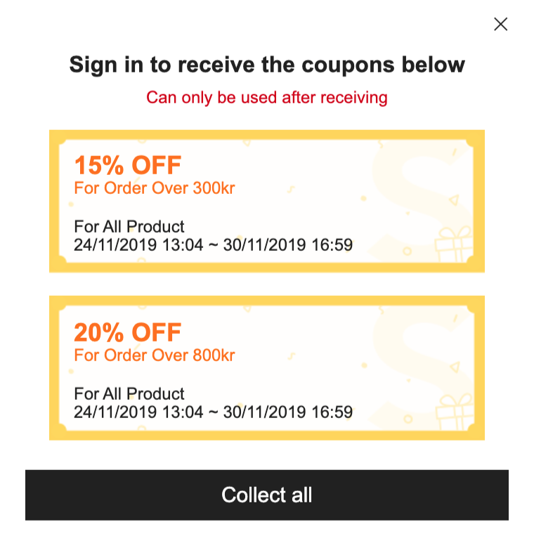
During its Black Friday promotion, Shein offered website visitors, not one, but two time-specific discounts, redeemable during the six-day period. All the visitor had to do was “Collect all” and both were up for grabs.
While other retailers offered one, generic site-wide coupon, Shein offered two, safe in the knowledge that a percentage of subscribers would likely use both, and therefore, spend more during the promotion.
Granted, this CTA was used during Black Friday, but it isn’t limited to the annual holiday. In fact, you could easily adapt a similar strategy for any promotion.
To learn how to write better copy for your email popups, read our article, “Popup Copywriting 101: 9 Little-Known Ways to Turn Traffic Into Sales”
4. How Do I Create an Email Popup?
There are many email popup builders online. Some are great. Others, not so much. But none, in our humble opinion, are more user-friendly than Drip's Onsite Campaign Builder.
Our Campaign Builder is made with busy marketers in mind—meaning it’s never been easier (or more fun) to make email popups for your website.
Here’s how to get started in four simple steps.
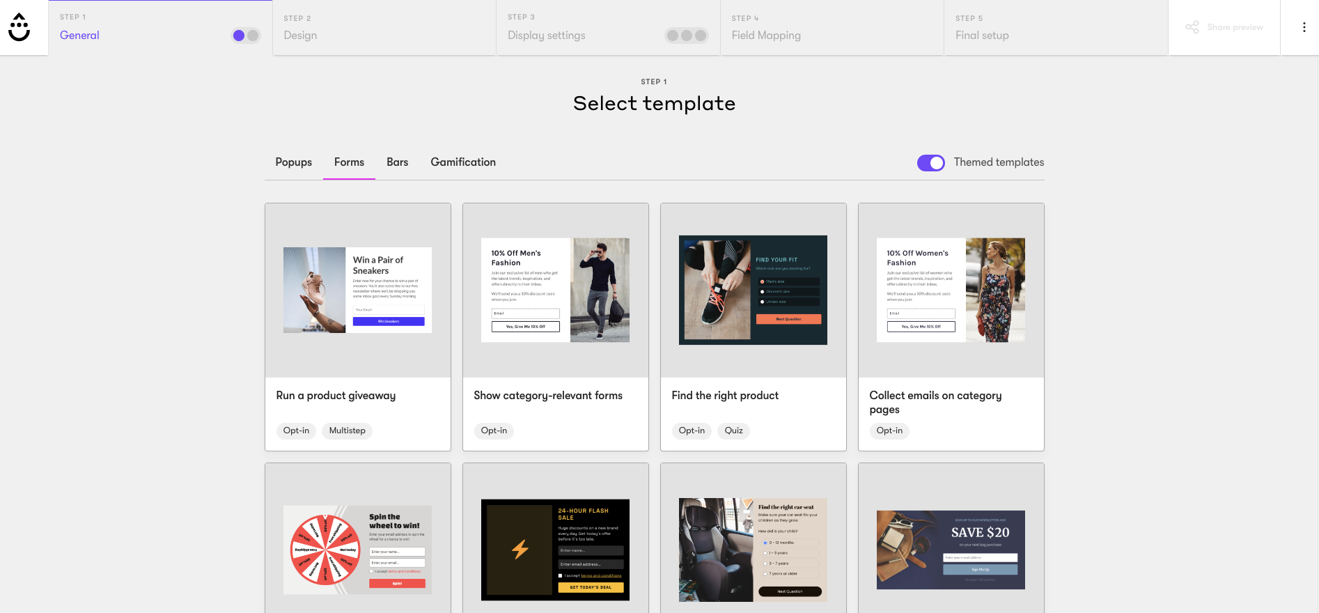
i. Choose a Template Based on a Goal
First, create a free account. Then, once logged in, pick a template in one of our many campaign formats—such as popups, forms, bars, or gamification.
ii. Decide on an Offer
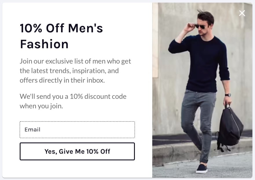
Ask yourself, “What can I offer my subscribers that excites them enough to enter their email address?” If you’re in e-commerce, that might be a 10 percent discount for a product category.
iii. Reflect the Offer in the Copy
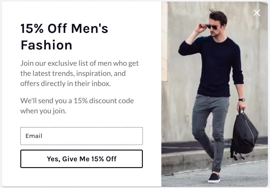
In our example, we’ve chosen a template that’s specific to offering discounts. The copy reads “10% off Men’s Fashion” but we can afford to offer more for our fictional campaign, so we’ll change the headline and the copy to reflect our new offer.
iv. Choose a Trigger and a Targeting Option
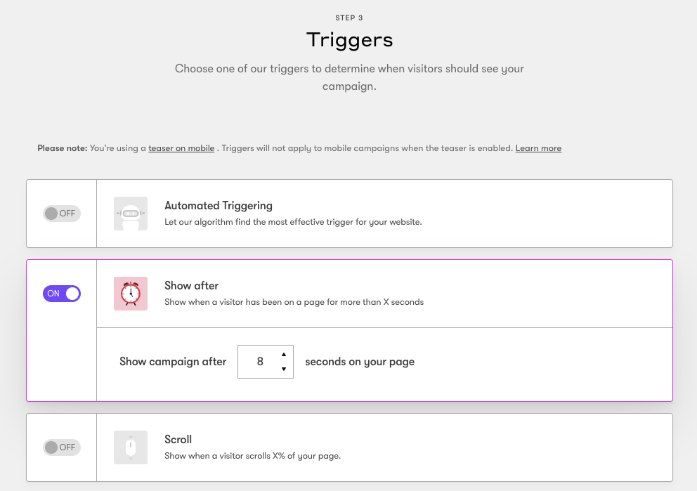
You then need to decide on your When and Who. The former refers to when you will show your popup.
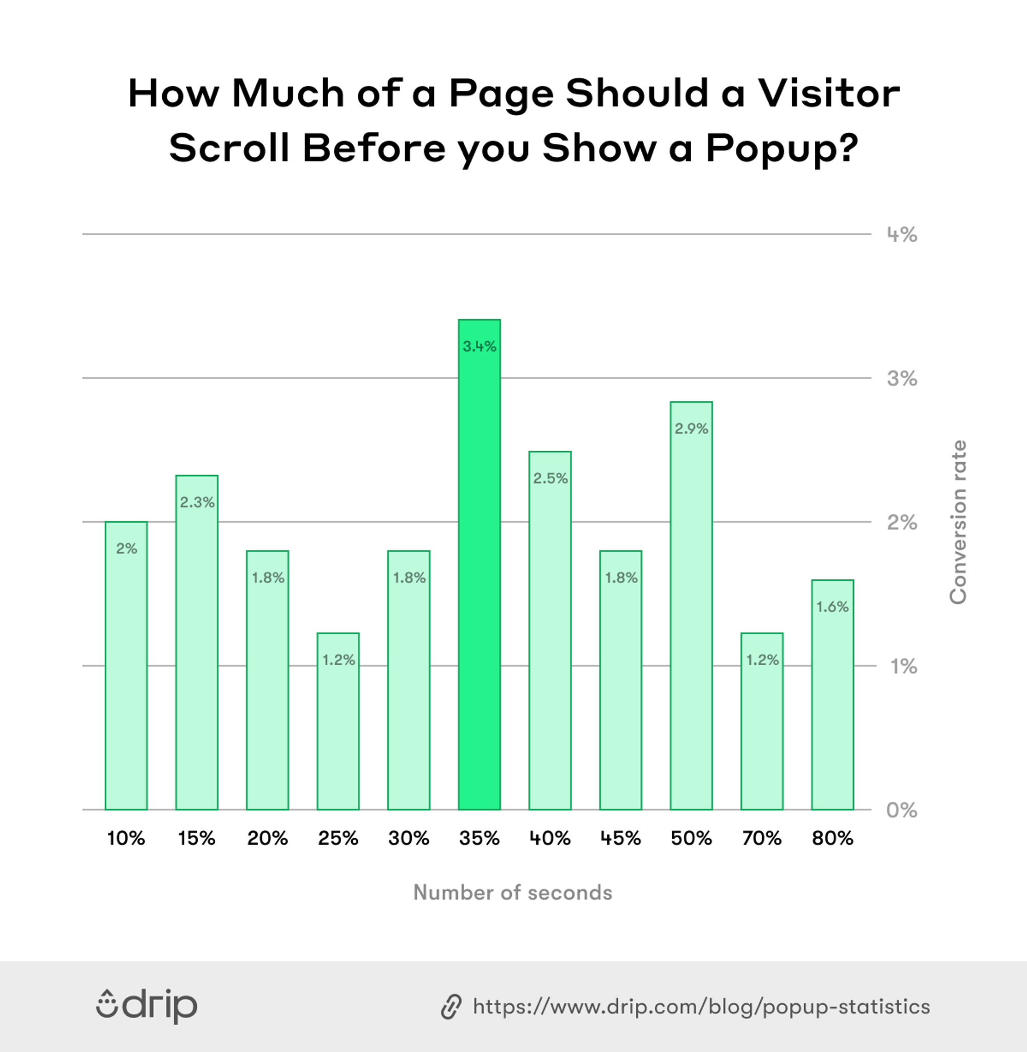
We found from our above research that waiting eight seconds is the most effective time to show a popup.
For our example, then, we’ll leave “Show After” as eight seconds, which is the default setting.
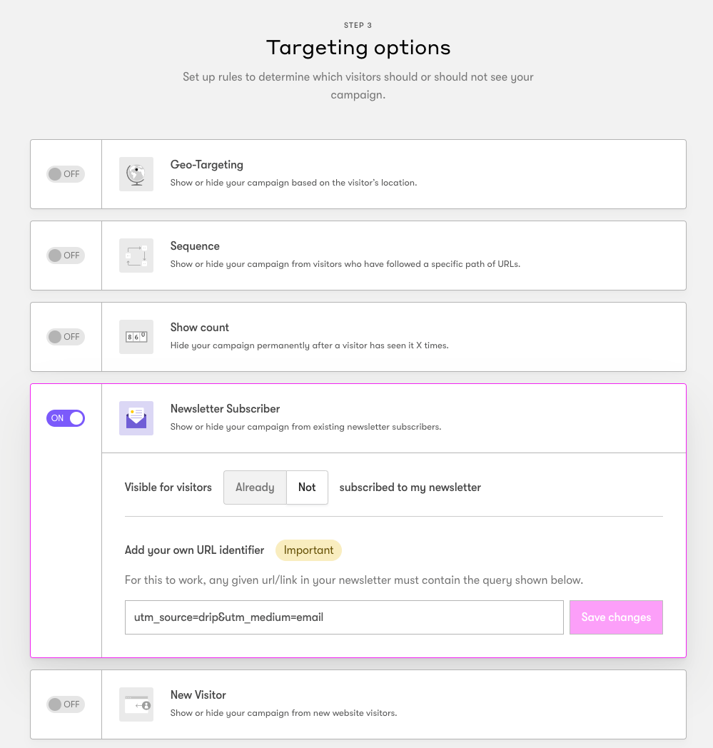
 The who, as the name suggests, refers to which visitors will see your popup. We don’t want existing subscribers to see our campaign, so we’ll toggle on “Hide” for “Newsletter Subscribers.”
And that’s it!
Now that you know how to make an email popup, let’s discuss our nine favorite use cases to inspire your next campaign.
5. Email Popup by Type
There are many ways to collect emails from your visitors. But not all are relevant to you.
The types of popups below are our favorites based on what works for our customers.
- Black Friday Popup Examples
- Cart Abandonment Popup Examples
- Countdown Timer Popup Examples
- Discount Popup Example
- Exit-Intent Popup Examples
- Product Recommendation Popup Example
- Sales Promotion Popup Examples
- Shopify Abandoned Cart Popup Examples and Sales
- Social Proof Popup Examples
Black Friday Popup Examples
Black Friday is the busiest shopping day of the year. According to Shopify, merchants on the platform made over $2.9 billion in revenue throughout the shopping weekend in 2019.
And with many stores moving Black Friday online in 2020 due to the global pandemic, those numbers were even higher.
One sales strategy many retailers use is making a Black Friday popup to grow a segmented email list of people who were eager to hear about their best offers.
Here are two ways to incentivize signups.
1. Offer Early Access
Given that the best Black Friday deals go fast, consider promising new signups that they will be the first to know about your deals. You can even invite them to “jump the queue” as in the example below.
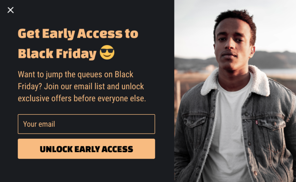
You can then email subscribers early access one day before your best deals go live and if applicable, remind them of the limited availability of the offers.
2. Offer Additional Discounts
If jumping the queues or being the first-to-know isn’t a big enough incentive, you can also offer an additional discount to new signups.
With a discount as little as 5 percent, you can collect more emails and drive more orders.
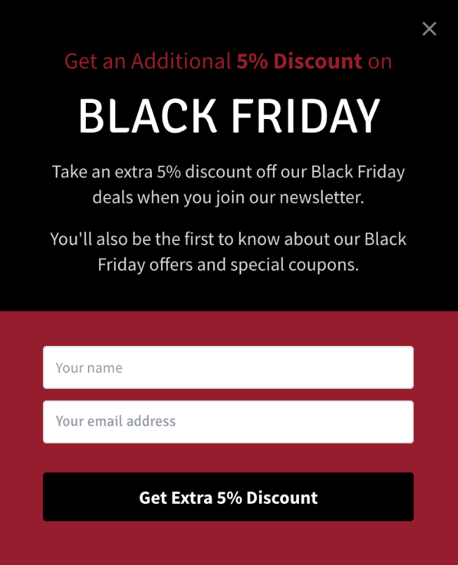
You could even experiment with free gifts, giveaways, free delivery codes, and more for your incentive. (Just remember to hide for existing subscribers.)
Cart Abandonment Popup Examples
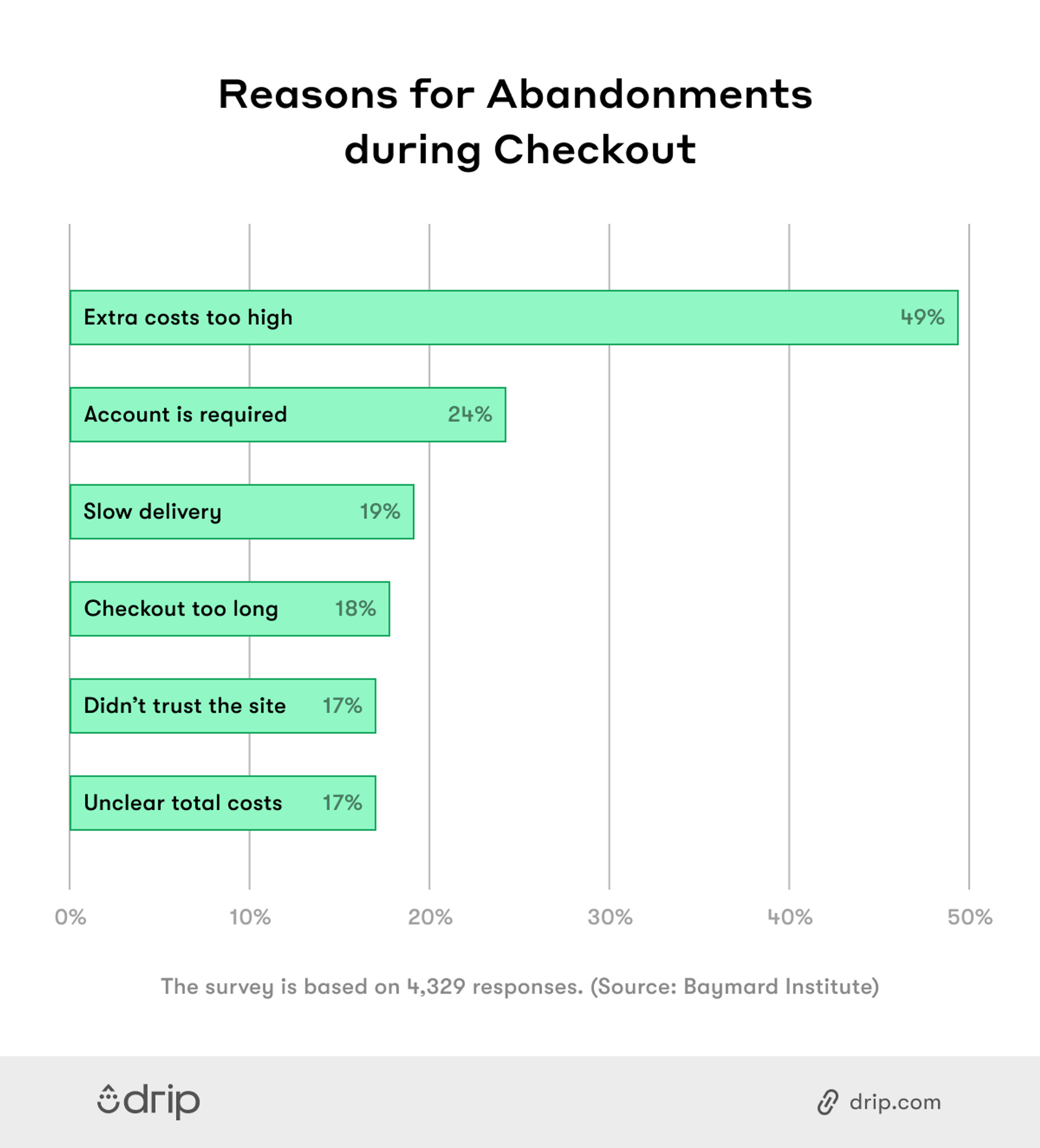
The number one reason for cart abandonment, according to a survey by Baymard, is unexpected extra costs, including, but not limited to, shipping.
It’s no secret, then, that offering free shipping on your site not only increases conversions but also urges visitors to spend more on your website.
If you already offer free shipping, you might be thinking that it’s enough to write it down on your product pages. But free shipping is only an incentive if you nudge visitors when they’re about to leave their cart.
So if you’re offering free shipping, make sure you always remind your visitors about it with a timely popup. Our favorite cart abandonment popup can be found on Kate Spade:
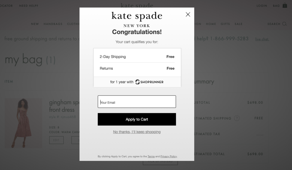
With the title “Congratulations!,” the company grabs your attention and informs you that you qualify for both free shipping and free returns. The fact that these two offers were likely available anyway is beside the point—reminding visitors of what is available to them ought to be a key part of your marketing strategy.
If you’re a Drip user, add the SiteData condition to your campaigns to detect a customer’s basket value. That way, you can trigger a free shipping popup for visitors with over a certain amount of basket value.
Countdown Timer Popup Examples
Using scarcity to trigger the fear of missing out is a powerful email marketing tactic. But it’s also incredibly effective, albeit underutilized, in website popups.
In our analysis of 1+ billion popups, we found that popups with a countdown timer convert better than those without a countdown timer by as much as 112.93 percent.
 If you’re already using email popups on your site, you’re likely asking visitors to join your email list by, say, joining a giveaway.
 But without a deadline to do so, they’ll be less motivated to submit their information.
To motivate new visitors to enter their email, consider adding a countdown timer, like in the example below:
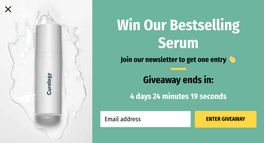
While it’s a common practice to offer discounts in exchange for email signups, many companies can’t afford discounts for each and every subscriber.
A better way to offer discounts, without hurting profit margins or decreasing your perceived value, is to do it for a limited time only. Wedio, a camera rental company, does this well:
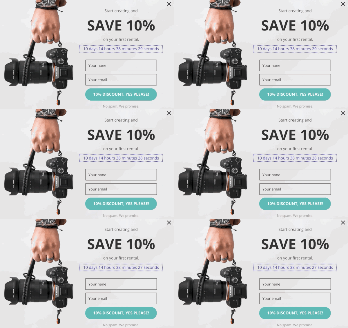
Instead of having a discount popup without an end date, the company uses this incentive sparingly and drives urgency with an attention-grabbing countdown timer in its popup.
They’re not for everyone, but if you want to drive more urgency, countdown timer popups are incredibly effective at getting the job done.
Discount Popup Examples
Offering new visitors a discount is a common list-building strategy. But what if you only want to limit the number of discounts offered?
One approach is to limit when visitors are eligible (such as when they’re about to leave a certain page).
A better, more personalized approach in our experience is to limit who is eligible.
In other words, offer discounts to visitors such as those that exceed a certain threshold in their cart.
For example, if a visitor goes to leave your site with an empty basket, you may not want to offer a discount.
But for those exceeding a certain cart value, say, $50, you could offer a bigger, more “deserving” discount like this discount popup:
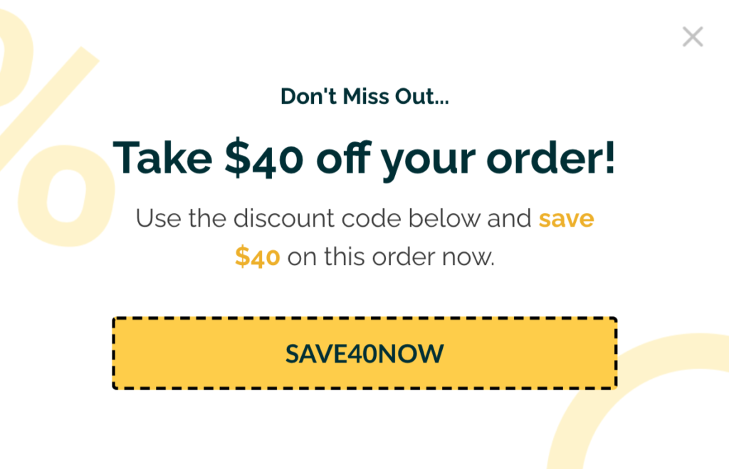
If one of the brands in your store is currently on sale, you could go one step further.
Rather than show a generic popup to all visitors, you could promote a brand-specific discount to visitors that have items from that brand in their cart.
Here’s an example:
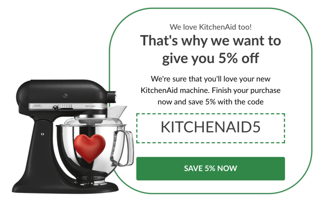
Personalizing your popups will not only help better target visitors that are interested in your discounts but also avoid alienating those that aren’t.
Exit-Intent Popup Examples
Cart abandonment and exit-intent popups go hand and hand. But there’s more to exit-intent than recovering abandoning buyers. One of our favorite, lesser-known use cases, is handling common objections.
When a visitor lands on your homepage and decides to leave, it’s different compared to when they add a product to their cart and then head for the door.
In the second scenario, there’s something stopping them from moving forward and placing an order. With an exit-intent popup, you can address and solve this issue before the visitor leaves for good.
If you’re selling subscriptions, high-priced products, or items with a longer buying cycle, a contact form like the one below works especially well.
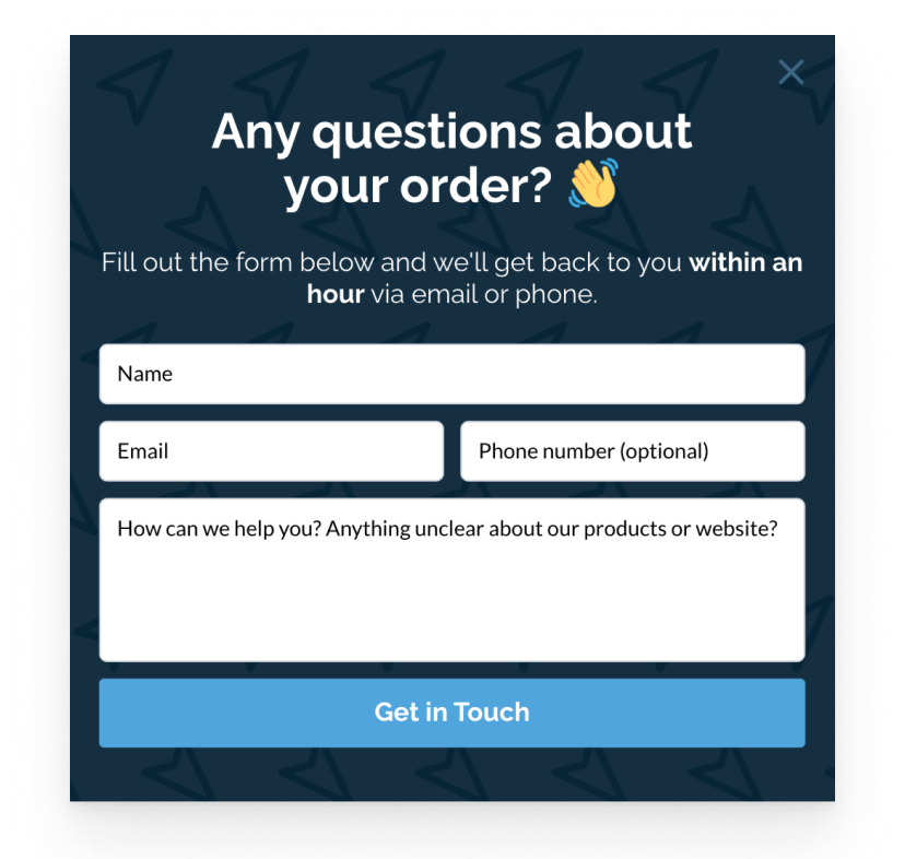
If, however, you’re not available to answer questions, you might consider adding a video to help put the buyer’s mind at ease, like in the example below.
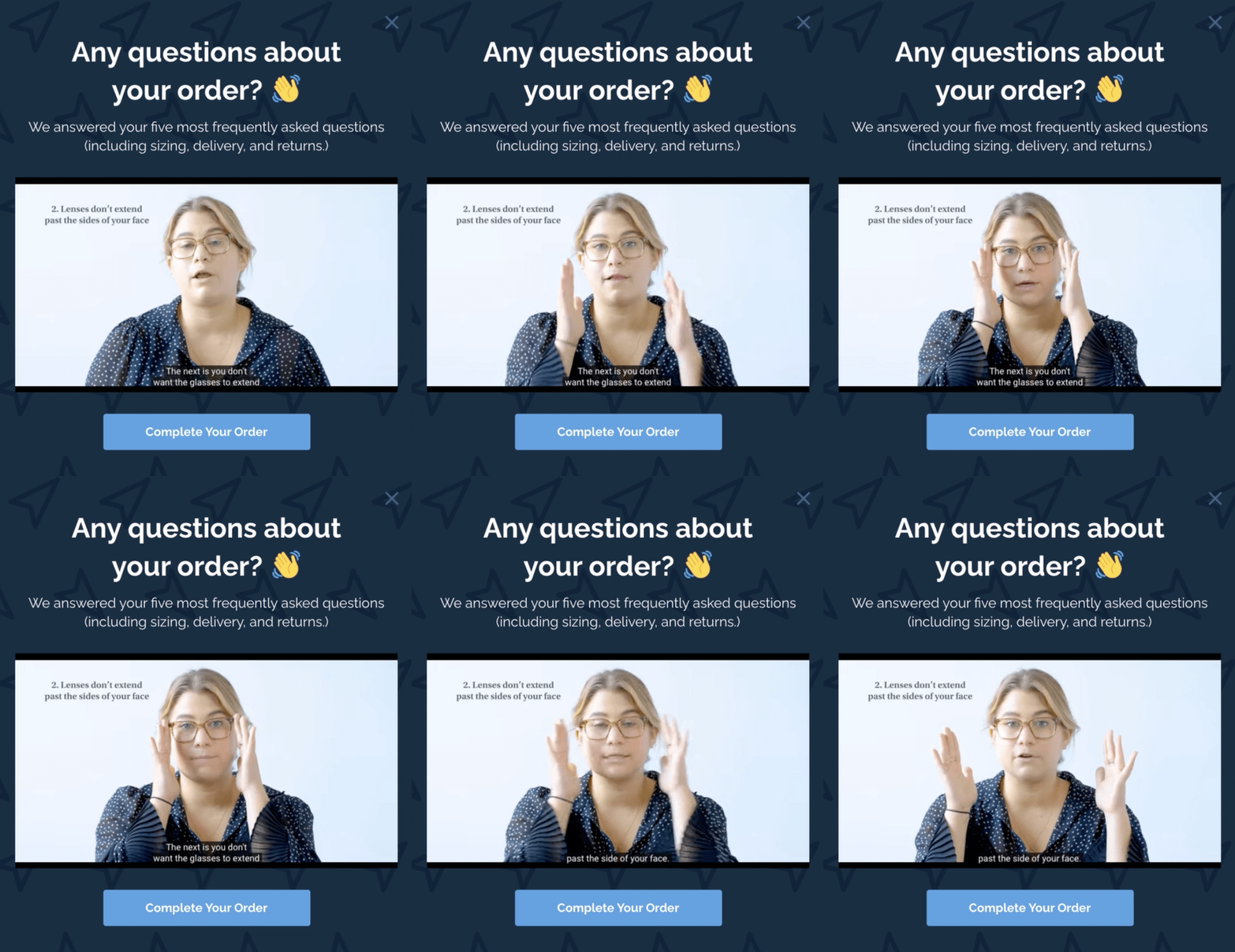
Here, you can schedule the first popup to run during working hours, and the second popup to show when you’re unavailable. It’s personal, efficient, and costs nothing to run.
Product Recommendation Popup Example
Earlier, we talked about how countdown timers can increase urgency and drive more engagement.
Now let’s talk about how to combine them with product recommendation popups to help bolster online orders.
While not an email popup, per say, product recommendation popups are a foolproof way to show the right products to the right visitors at the right time.
If you’re offering daily deals, for instance, you might feature your bestselling products for a particular season or even timeframe.
Here’s an example we made where the visitor can browse the products from within the popup.
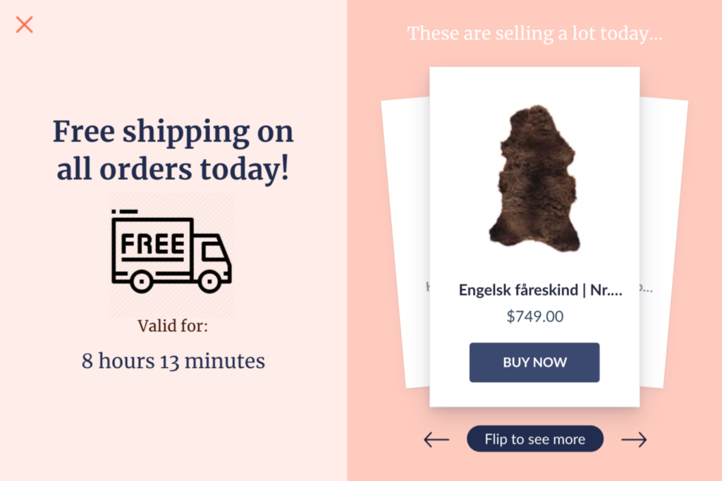
If you wanted to build on our example, you could duplicate the popup for new visitors and invite them to opt-in for discounts on the products shown in the popup.
Sales Promotion Popup Examples
It’s no secret that cross-selling is the perfect tool to increase customers’ average order value (AOV).
However, cross-selling only works as intended if you do it at the right place and at the right time.
Too early and you will annoy your visitors. Too late and you will miss that perfect opportunity to pique their interest.
Cross-selling, then, is all about showing the right product recommendation to the right visitors at the right time.
Take a look at the following example, for instance:
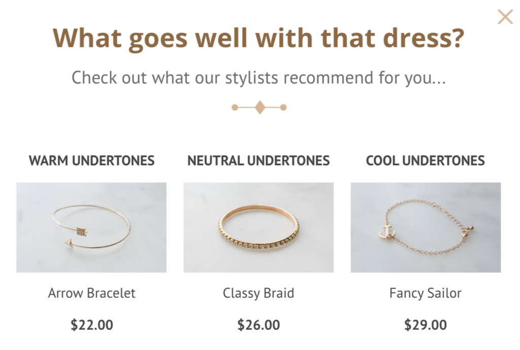
With a cross-selling popup that shows on your product pages, you can recommend similar or complementary items and increase your AOV.
In other words, if you want to nudge customers to spend more when they’re close to placing their order, you can show a popup during checkout that invites them to spend more.
However, for this sales promotion popup to convert well, you need to recommend the right products and offer a compelling incentive. Take a look below to see what we mean:
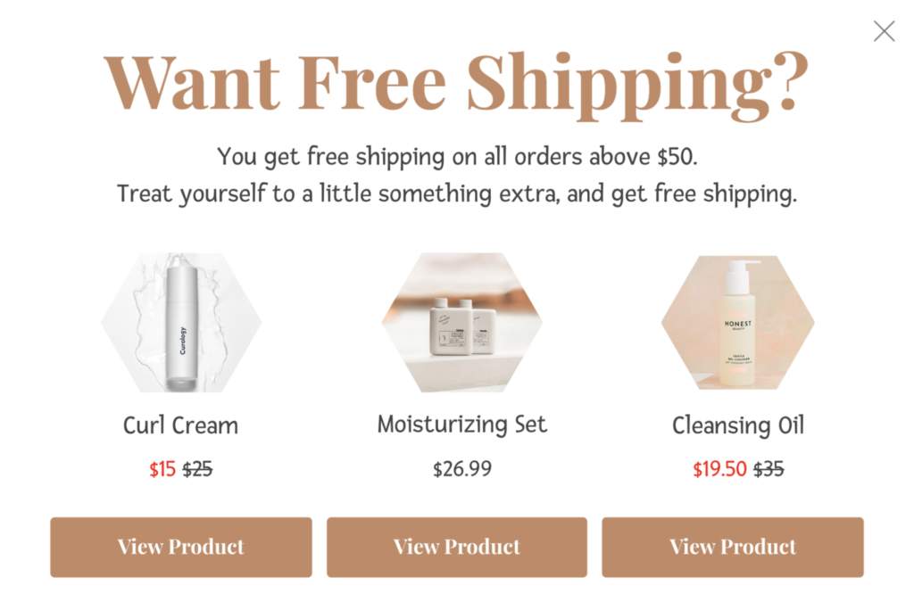
Whether it’s free shipping, a free sample, or a free product, adding a compelling incentive to your popup encourages customers to spend more, without hurting the browsing experience.
Shopify Abandoned Cart Popup Examples
No one ever says no to saving money. That’s why discounts are among the most popular abandoned cart offers.
What’s more, discounts help persuade buyers who abandon their carts due to high costs.
According to one survey, 60 percent of shoppers abandon their carts because of high costs such as shipping, fees, and more.
Knowing this well, Eye Love, a Shopify store that sells eye products, offers a discount to its first-time customers with this popup:
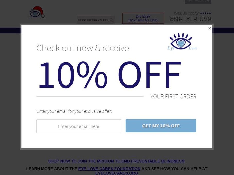
Eye Love is aware that a sitewide discount can eat into its profits. That’s why the company only offers the discount to its first-time buyers.
An eye-catching headline that reads “10% Off” easily grabs visitors’ attention, and the words “Check out now” carry urgency. For a buyer, this may imply that this deal is only available for a limited time.
Thanks to this Shopify abandoned cart popup, Eye Love has the opportunity to contact the prospect to take feedback, send new product offerings, and more.
The popup also has a benefit-driven call to action and a minimalist design. Plus, it’s easy to close with a visible “X” button in the top right-hand corner.
If you’d like to improve Eye Love’s Shopify popup, you can use a contrasting color in the CTA button to make it “pop” in your popup.
Social Proof Popup Examples
When used in popups, customer testimonials help create a gentle nudge, inviting users to take action without feeling overwhelmed or pressured into buying.
Here are three ways to do that.
1. Product-Based Testimonials
One way to add testimonials website popups is to display positive product reviews that handle possible objections.
For instance, take a look at this popup example that you could use on a product page:
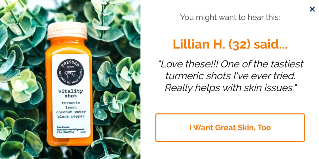
It answers possible objections in the prospect’s mind, such as:
- Have others tried and enjoyed this product before?
- What does it taste like?
- Is it any good for my skin?
By showing selected product reviews in your popups, you can remove possible obstacles to buying, and create social proof for each of your products.
What’s more, by providing reviewer details, such as age or location, you add credibility to your reviews and help visitors identify with the reviewer.
2. Category-Based Testimonials
If you’re selling a wide range of products or don’t have many reviews for individual items, you can show a generic campaign that runs on category pages, like this social proof popup:
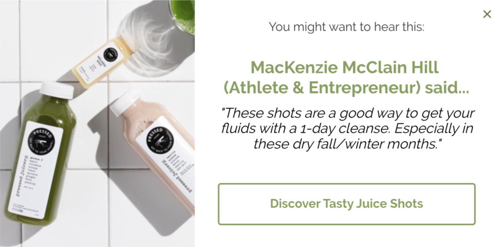
With Drip Onsite, you can target visitors viewing your category pages and hold their attention with social proof.
3. Company Testimonials
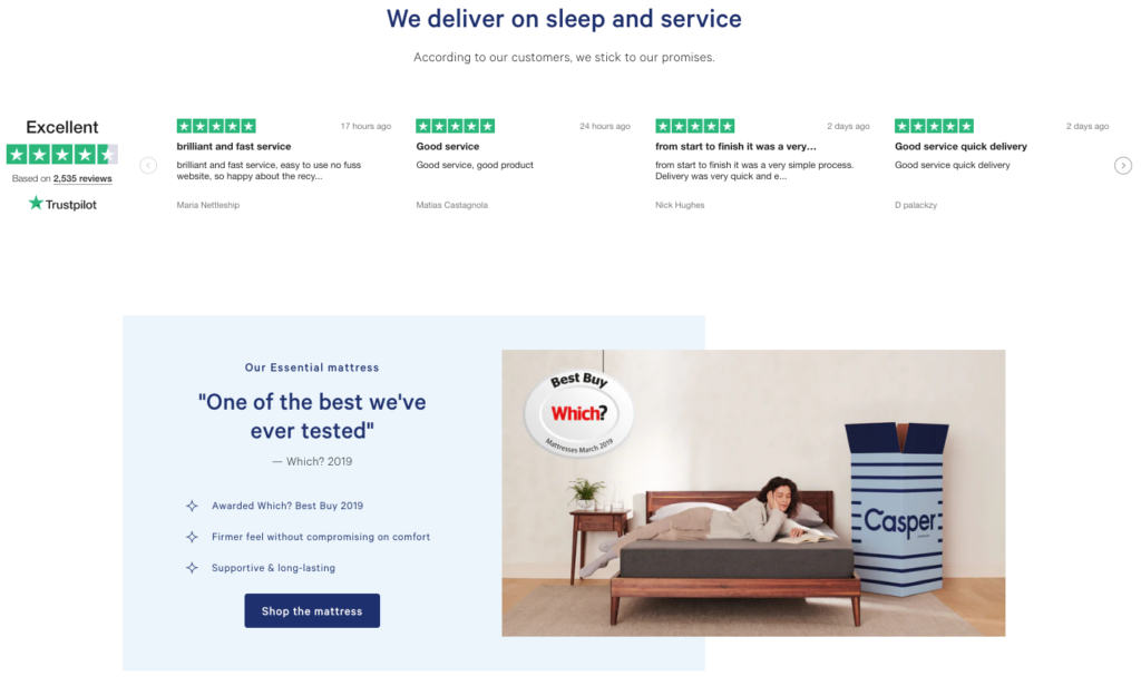
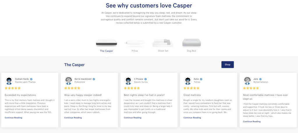
If you’re a single-product business or simply want to build a positive brand image, you can use your company reviews in website popups, instead.
Casper uses this strategy by displaying its company reviews in a number of pages, including its homepage…
On a dedicated product page…
As well as in its email marketing:
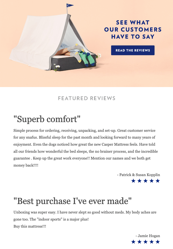
If they apply the same to their popups, as I recommend today, this is what it might look like:
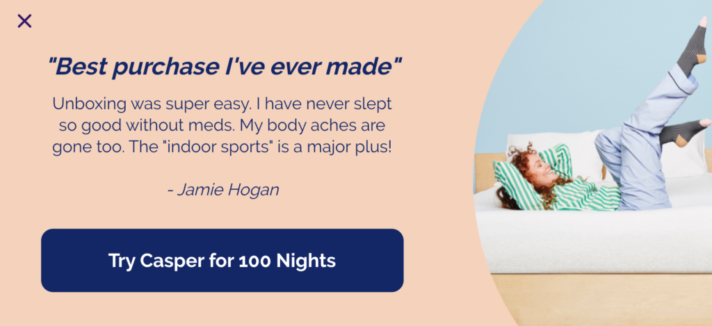
The main advantage of using testimonials in your popups is the ability to show your messages to the right people, on the right pages, at the right time.
There are multiple effective ways to use testimonials in your popups, but no matter which you choose, they instantly add an element of social proof to your popups.
6. Email Popups by Industry
Popup strategies change from industry to industry will. A B2B company might want to collect leads with a lead magnet, while an e-commerce brand might want to capture emails with a discount or giveaway.
Below, we’ve shared our favorite real-life popup examples from a wide range of industries including B2B, e-commerce, and more. Click the link below to learn more.
Ecommerce Popups Examples
We’ve talked about running giveaways using a popup. Now let’s share one of our favorite ecommerce examples.
Danish retailer Ny Form promoted a giveaway in its popups, offering a product as the prize.
The brand first used a unique teaser featuring a flashing floating image, inviting visitors to “Win a Backpack from 2117 of Sweden.”
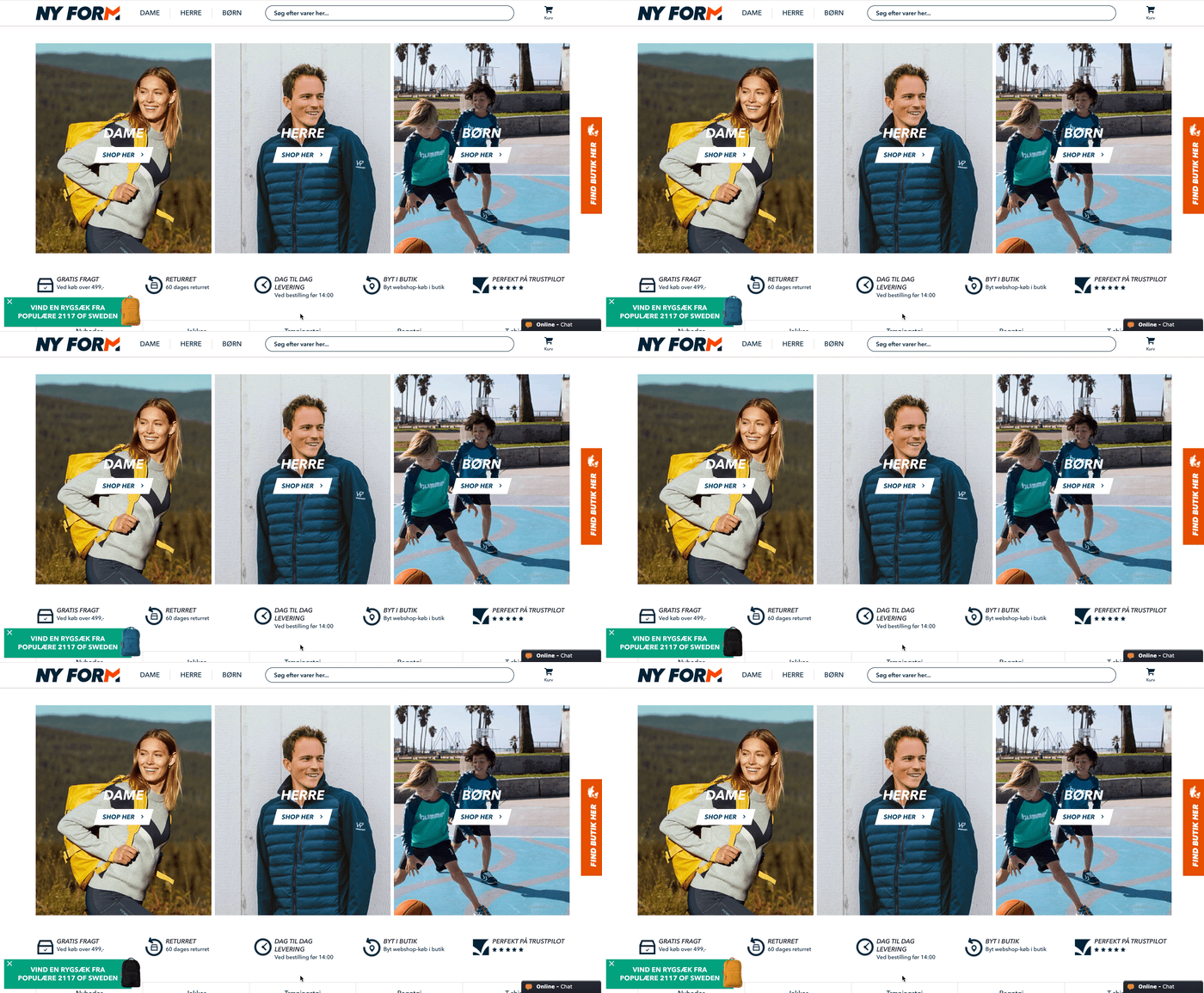
When you clicked the teaser (or waited for a few seconds), a slide-in appeared:
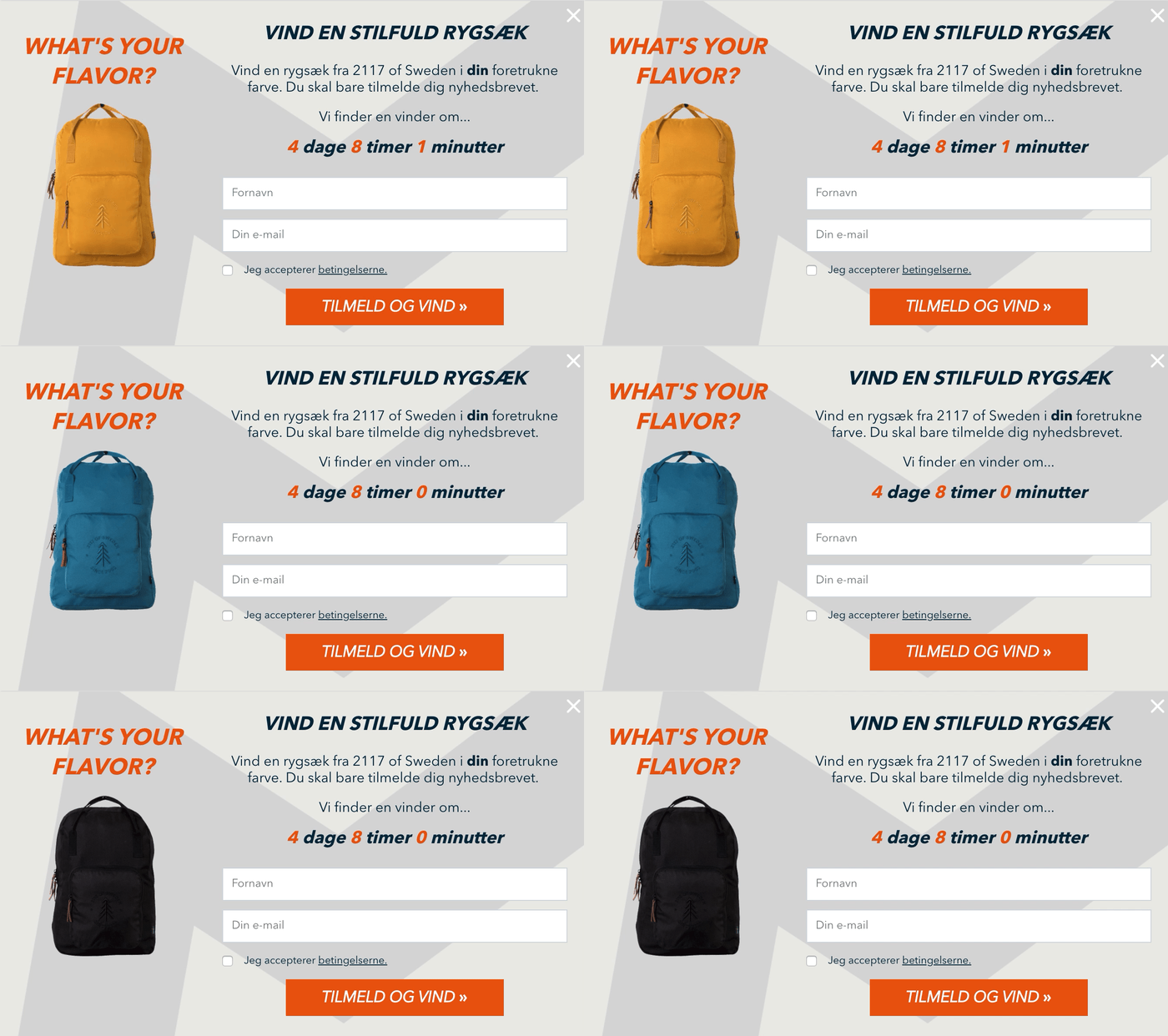
In English, the copy read:
Win a backpack from 2117 of Sweden in your preferred color. Just sign up for our newsletter. We’ll find a winner in 4 days, 8 hours, 1 minute.
Once again, Ny Form used a GIF to showcase the product in different colors.
A few other highlights included:
- Benefit-driven teaser copy and a compelling headline: “Win a Stylish Backpack”;
- A well-positioned prize;
- Clear instructions on what to do (“Just sign up for our newsletter”); and
- An evocative call to action that evoked a feeling of success: “Sign Up and Win.”
Ny Form also uses a countdown timer in its fashion popup to communicate when the giveaway will end. This drove a sense of urgency, nudging visitors in the process to register before the time ran out.
B2B Popup Examples
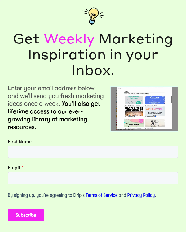
Okay, admittedly we may be a little biased with one as it is from Drip. But objectively speaking, this is one of the best B2B popups we’ve come across recently—namely because we made it. So, we couldn’t help but share it.
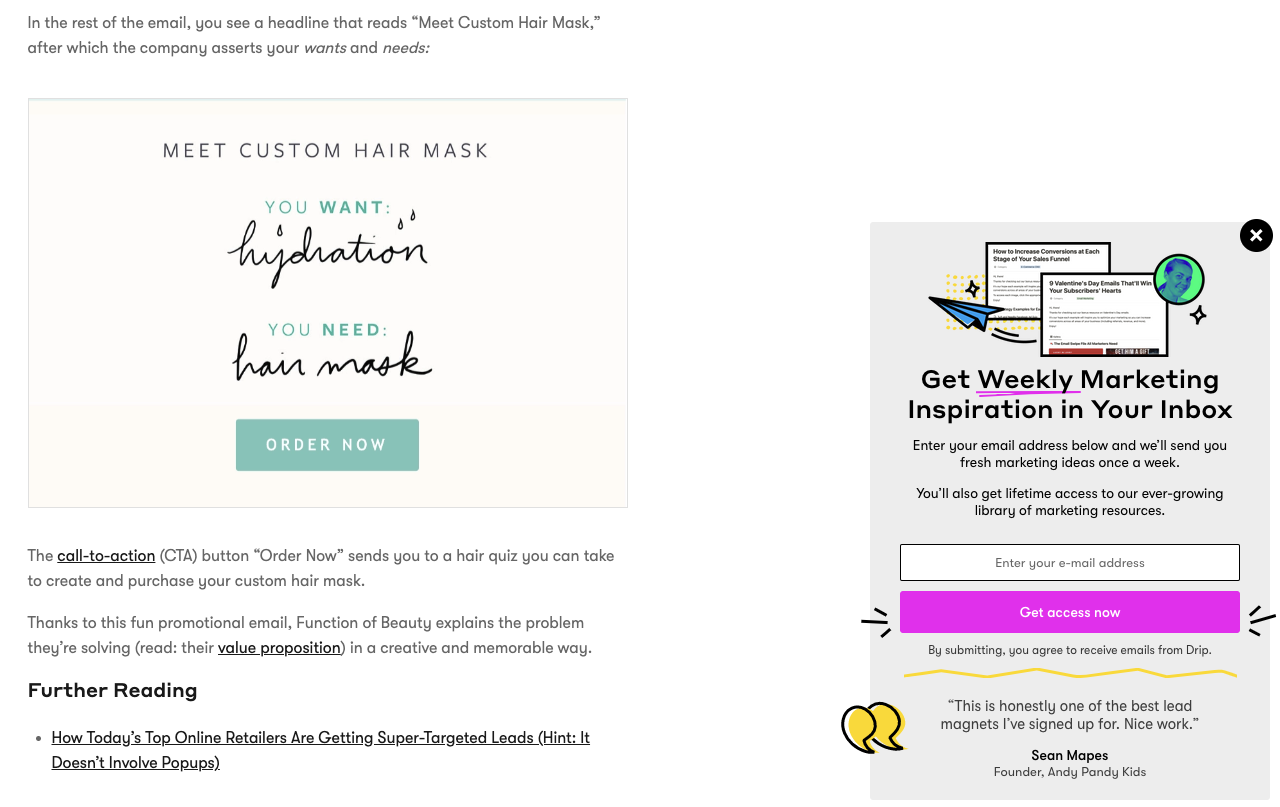 The number one thing this popup has going for it is the value proposition. It lets Drip visitors know they’ll get access to ultra-insightful future posts and a lot more. We first pique their interest with this engaging header.
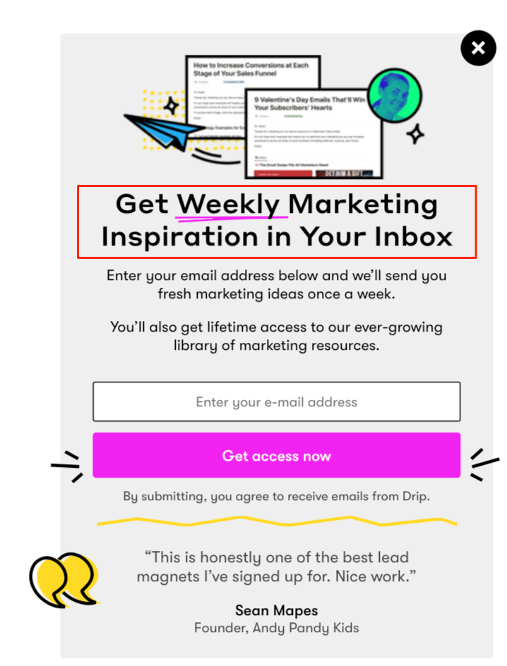 And just below it, we elaborate, letting visitors know some of the epic things they’ll get by subscribing, such as lifetime access to our best marketing resources, along with fresh marketing ideas once a week.
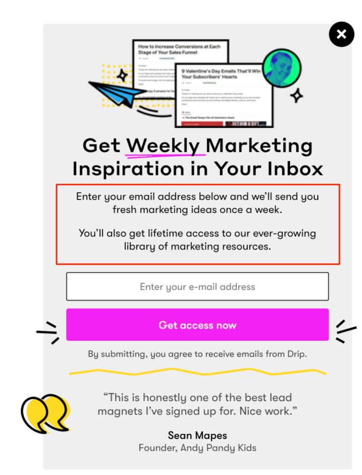
The CTA is good and features a high contrast button that uses the same magenta color you’ll find throughout Drip so that it stays “on brand.”
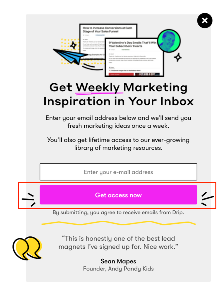 And one other thing is the brief testimonial below the CTA that adds social proof to our marketing resources and weekly newsletter.
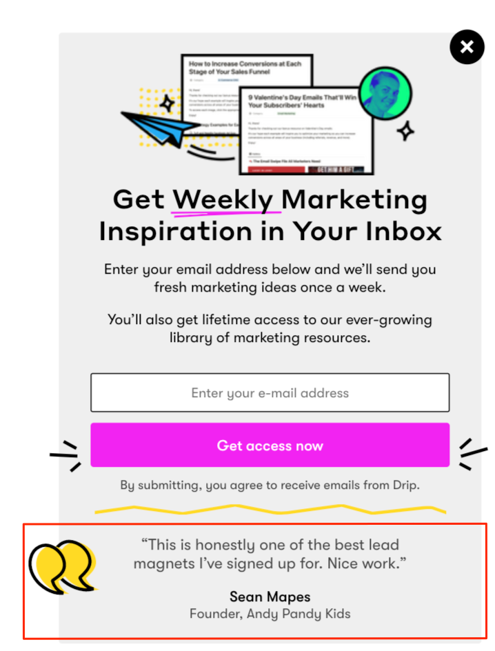 We think this helps flesh everything out and provides the added bit of information many visitors need when deciding whether or not to subscribe.
We should also point out that we make it super easy to exit out of this popup, which is important for preventing disruptions and annoying visitors.
That’s a big deal because a popup should never lower the customer experience. It should enhance it.
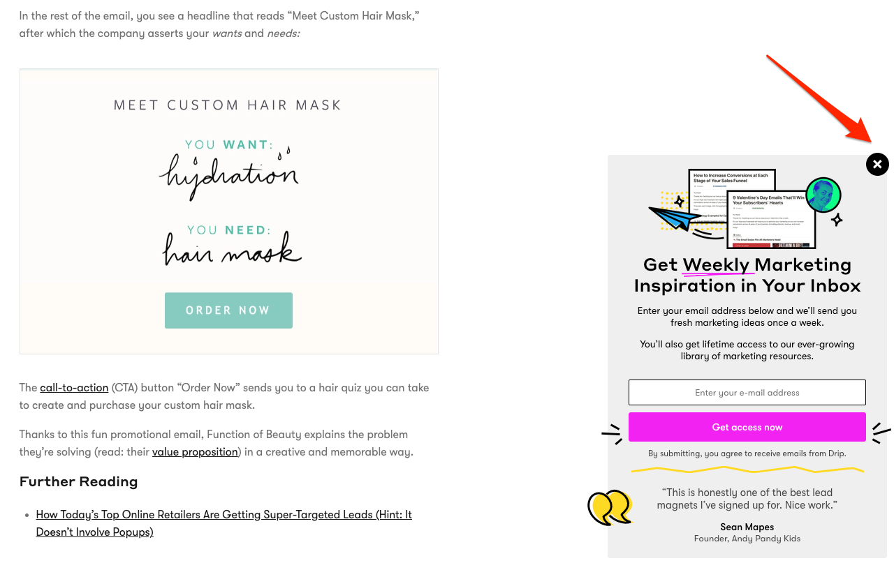 Whenever a visitor exits, the popup turns into a “teaser” at the bottom right-hand of the screen that they can easily re-open if they change their mind later on and want to subscribe.
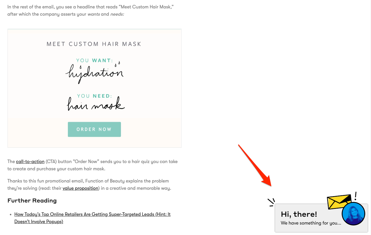 We find that using a teaser like this is a great way to raise the overall conversion rate without creating friction with visitors or being punished by Google for using an interstitial.
Nonprofit Popup Examples
One of our favorite, albeit most obvious, ways for nonprofits to use popups is by asking visitors for donations. Unicef USA illustrates this perfectly.
Merging a provocative image of a girl praying with personalized popup copy (“You can be a hero to children in need!”), the nonprofit grabs your attention before inviting you to “Donate Today.”
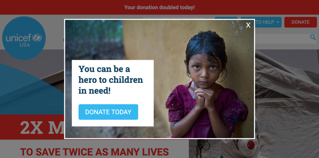
When you click the popup’s call to action, Unicef USA redirects you to a second form where it gives you the option to donate once or monthly.
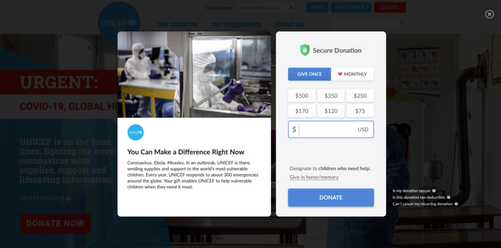
The nonprofit popup also reminds you that “You can make a difference right now,” before explaining clearly where your donation goes (vulnerable children).
We found from our research of 1 billion popups that as much as 75 percent of visitors that complete a popup’s first step complete the second step.
With numbers like that to go from, we can assume that Unicef USA is driving a decent amount of donations with this campaign (especially since they’re still running the campaign).
You don’t have to use a popup, of course. Rescue.org, by contrast, uses a bar at the bottom of their page.
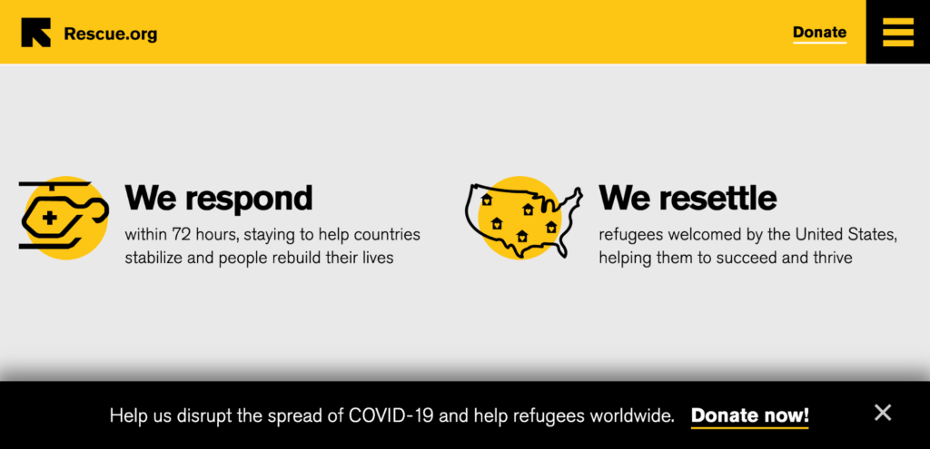
When you click the CTA, the nonprofit redirects you to a page where you can learn more about the Syrian crisis and make a donation.
Asking for donations through a popup—either directly, through the popup itself, or by redirecting visitors to a donations page—is a proven way of raising funds without being too pushy.
Travel Agency Popup Examples
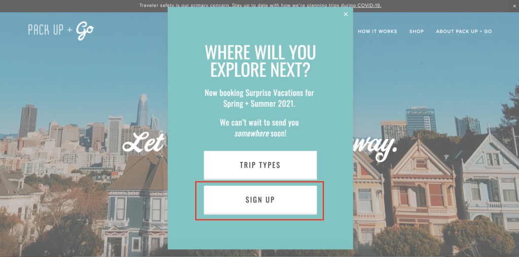
Pack Up + Go is a travel agency with an interesting angle. Customers tell them their budget and fill out a quick survey, answering questions about their travel dates, preferences, interests, and other information. Then, Pack Up + Go plans a surprise destination for them.
While it’s probably not ideal for planning-obsessed travellers that like to stick to a rigid itinerary, it’s a cool concept that’s perfect for more adventurous spirits. I’d personally be interested in trying this out at some point.
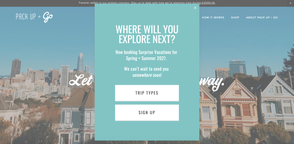
This popup works because it quickly directs a visitor’s attention to Pack Up + Go’s offering by asking, “Where will you explore next?”

Below the header is some quick info letting visitors know they’re now booking vacations for spring and summer 2021—something many people are no doubt wondering about.
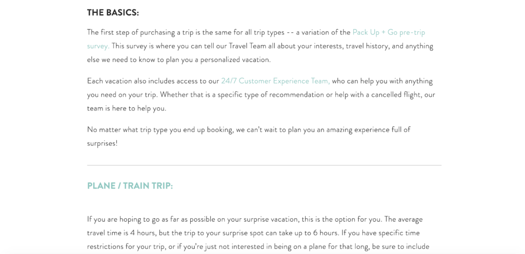
And this travel agency popup offers two clearly written CTAs just below that where visitors can either click on “Trip Types” or “Sign Up.” If a visitor clicks on “Trip Types”…
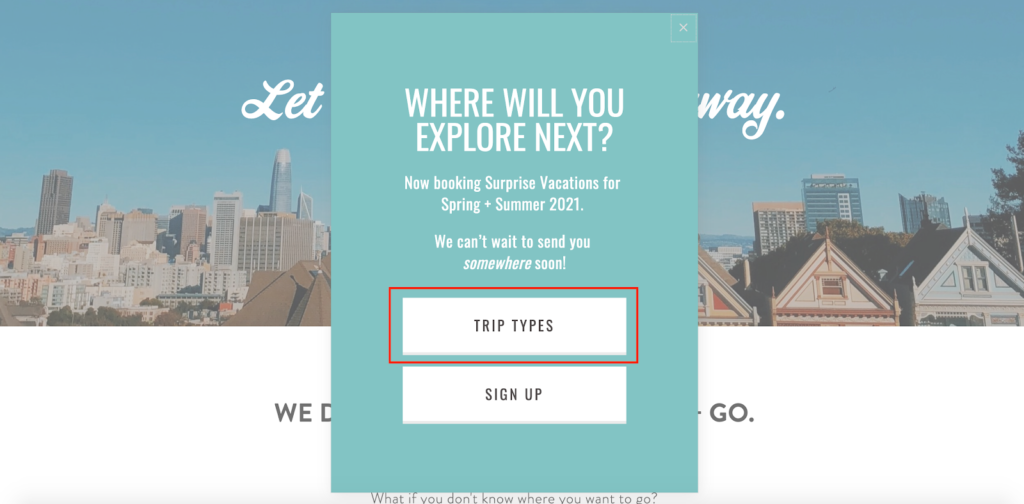
…they’re taken to this page, which gives them an overview of the process, quickly getting them up-to-speed.
Or, if they click “Sign Up”…
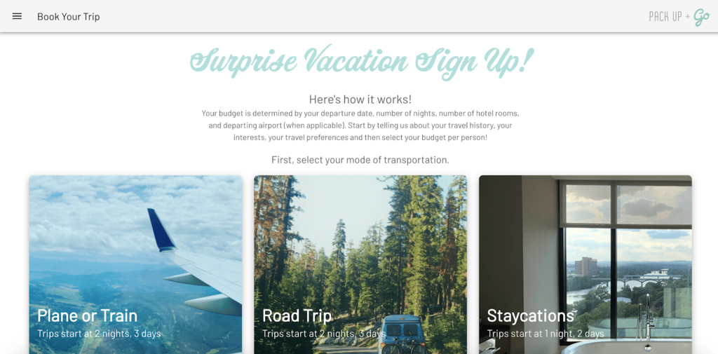
…they’re taken to this page where they can tell Pack Up + Go about their travel history, interests, preferences, and budget to get started.
So, rather than just having prospects aimlessly browsing through their website, this travel agency’s popup quickly directs them to essential information with very little effort. That way, visitors know what’s going on, and Pack Up + Go greatly increases their chances of converting.
In terms of popup design, this campaign’s strong points are its:
- Clear, attention-grabbing headline
- Clean, minimalist design with plenty of space between elements
- Easy to follow CTAs
Automotive Popup Examples
Headquartered in Oakville, Canada, this company makes cars specifically for Canadian drivers and carries an “exciting lineup of SUVs, crossovers, hybrids, trucks, and vans.”
Ford Canada uses a time, automotive popup, which only appears after a visitor has been on the site for a certain period of time (common increments are 5, 10, and 20 seconds).
By the way, our research found that 8 seconds is the sweet spot for timed popups, and they convert 3.62 percent better than popups shown before or after that.
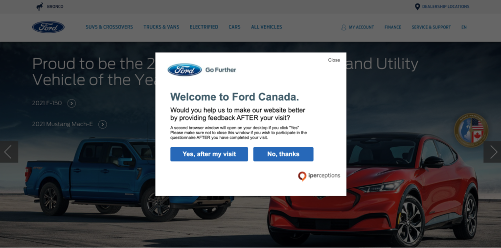
 Here’s what Ford Canada’s popup looks like.
Many brands like this technique because it gives visitors a chance to get settled in and ensures a base level of engagement.
I know that I sometimes get a little annoyed if I get hit with a popup the second I land on a site and haven’t had the chance to feel it out yet. And if a visitor quickly bounces in just a few seconds, it’s likely that they wouldn’t be interested in what you’re offering in your popup anyway.
This example from Ford Canada lets visitors get acclimated before seeing the popup. As for its purpose, this brand makes it clear that it’s to gather feedback after a prospect is done with their visit.
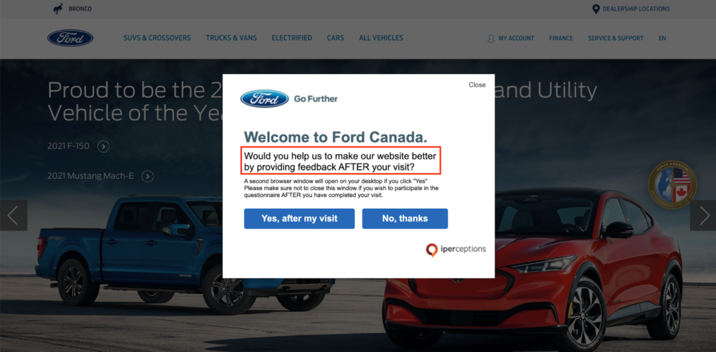
They concisely ask the question, “Would you help us to make our website better by providing feedback AFTER your visit”…
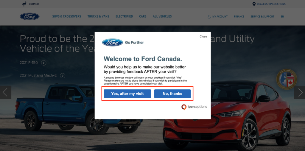
…and include two straightforward answer options at the bottom.
And to prevent disruptions for visitors that aren’t interested, Ford Canada features a conspicuous “Close” icon in the top right-hand corner so they can easily exit.
Also, notice the abundance of negative space they use here.

The information is well organized, and there’s no clutter, allowing prospects to quickly digest it and make a choice. So, if the goal of your automotive popup is to obtain feedback, this is an excellent example to borrow from.
Conclusion
That just about covers everything we know about email popups.
Now, there’s only one thing left to do:
Create a free email popup.
To do that, get started with a free Drip trial and create advanced onsite campaigns, email workflows, and more—in one platform.

