
How does it feel watching visitors load their carts on your Shopify store only to leave without buying? I know, it’s painful.
Beyond your hurt feelings, cart abandonment means loss of revenue and profits, but you’re not alone—cart abandonment is a problem every Shopify store faces.
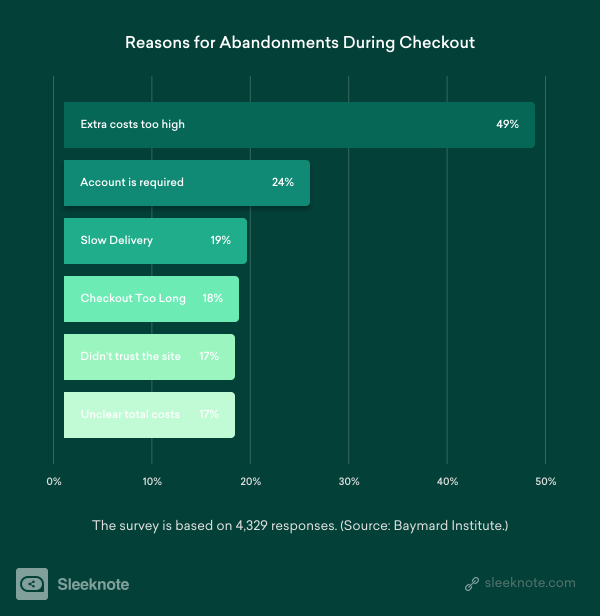
According to Baymard Institute, the average shopping cart abandonment rate is 69.8 percent. This means seven out of 10 shoppers load their carts and leave without completing their purchase.
One of the most effective ways to combat cart abandonment is to use abandoned cart popups. With timely popups, you can convince some of the leaving shoppers to stay on your site and complete their order.
Here are seven Shopify abandoned cart popup examples you can use as inspiration to build your own popups.
1. Eye Love
No one ever says no to saving money. That’s why discounts are among the most popular abandoned cart offers.
What’s more, discounts help persuade buyers who abandon their carts due to high costs.
According to one survey, 60 percent of shoppers abandon their carts because of high costs such as shipping, fees, and more.
Knowing this well, Eye Love, a Shopify store that sells eye products, offers a discount to its first-time customers with this popup:
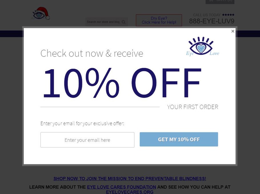
Eye Love is aware that a sitewide discount can eat into their profits. That’s why the company only offers the discount to its first-time buyers.
An eye-catching headline that reads “10% Off” easily grabs visitors’ attention, and the words “Check out now” carry urgency. For a buyer, this may imply that this deal is only available for a limited time.
Thanks to this email popup, Eye Love has the opportunity to contact the prospect to take feedback, send new product offerings, deliver news, and more.
The popup has a benefit-driven call to action (CTA) and a minimalist and simple design. Plus, it’s easy to close with a visible “X” button.
If you’d like to improve Eye Love’s popup, you can use a contrasting color in the CTA button to make it stand out in your popup, like in the example below.

2. Leesa
Sometimes, shoppers need to see what they’re leaving behind. In this Shopify abandoned cart popup example, Leesa, a mattress manufacturer, does just that.
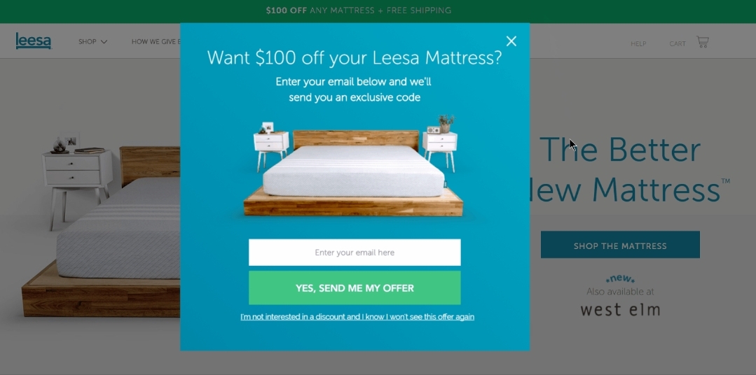
The company’s popup uses the image from the product page you’re viewing. Furthermore, the background color makes the copy, image, and CTA button obvious.
While the copy is short, as it should be, it provides the hook that can attract a shopper to come back to complete their purchase.
By asking a question that’s hard to say no to (“Want $100 off your Leesa Mattress?”) Leesa invites reads to take action to claim their discount.
The CTA text is prominent and benefit-driven. Below the CTA button, Leesa offers an optout option that reads “I’m not interested in a discount and I know I won’t see this offer again.”
Notice how the last part of this popup copy is designed to trigger fear of missing out (FOMO) among the readers. Once they close down the popup, they can’t claim the $100 discount again.
3. Paul Evans
Not every shopper leaves their cart because they’re unhappy with your store or products. Sometimes, shoppers just add products to their cart with a future purchase in mind.
In such a case, your discount offer might be insufficient to convince them to buy right now. Instead, you can offer to save their cart items to an email.
This is what Paul Evans, a leather shoe and belt maker, does with its popup. Paul Evans offers to save shoppers’ carts to email so that they can finish their purchase later.
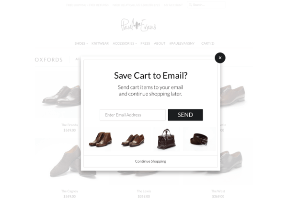
One thing Paul Evans has done well is the display of its products. The copy in the popup is minimal and presents a clear offer to the visitor. What’s more, the black CTA button has high contrast that makes it visible on the popup.
For buyers who may want to see more products on the website, Paul Evans cleverly uses a “Continue Shopping” button at the bottom of the popup.
4. 1 Body
We all want to improve our health. That’s why the supplements market is booming.
But even a brand like 1 Body that sells supplements isn’t immune to cart abandonment.
After all, there are enough supplement manufacturers that give buyers many options.
The first thing you’ll notice about this abandonment cart popup is the background image portraying a (likely) healthy person exercising out in nature.
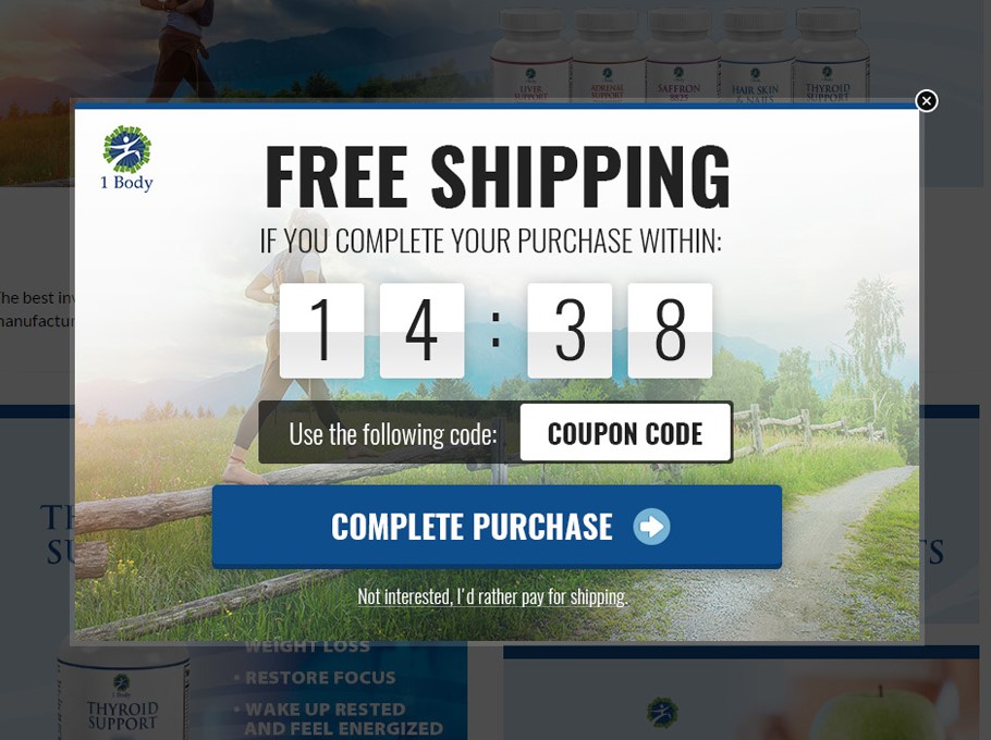
The background successfully depicts what 1 Body’s shoppers are looking to achieve. And although the background image is serene, 1 Body does a good job of adding copy that contrasts with the image. You’ll see that the texts have different colors at parts of the popup to ensure high visibility.
Diving more into the copy, this popup uses a big and bold font to display its main offer: free shipping. This is difficult to miss for anybody as the eyes naturally navigate to the biggest font on the popup.
Once shoppers see the offer, their eyes naturally navigate to the CTA where they can take action. With a dark blue color, the CTA button has a high contrast with the background.
More interestingly, 1 Body uses a countdown timer in this popup to provoke urgency and FOMO to convince abandoning shoppers.
Finally, to make it even easier for its shoppers to take this offer, 1 Body openly writes the code on the popup.
5. Three Drops of Life
Three Drops of Life is a Shopify store that sells water bottles, essential oils, and more. It employs a simple and minimalist design that goes straight to the point without distractions.
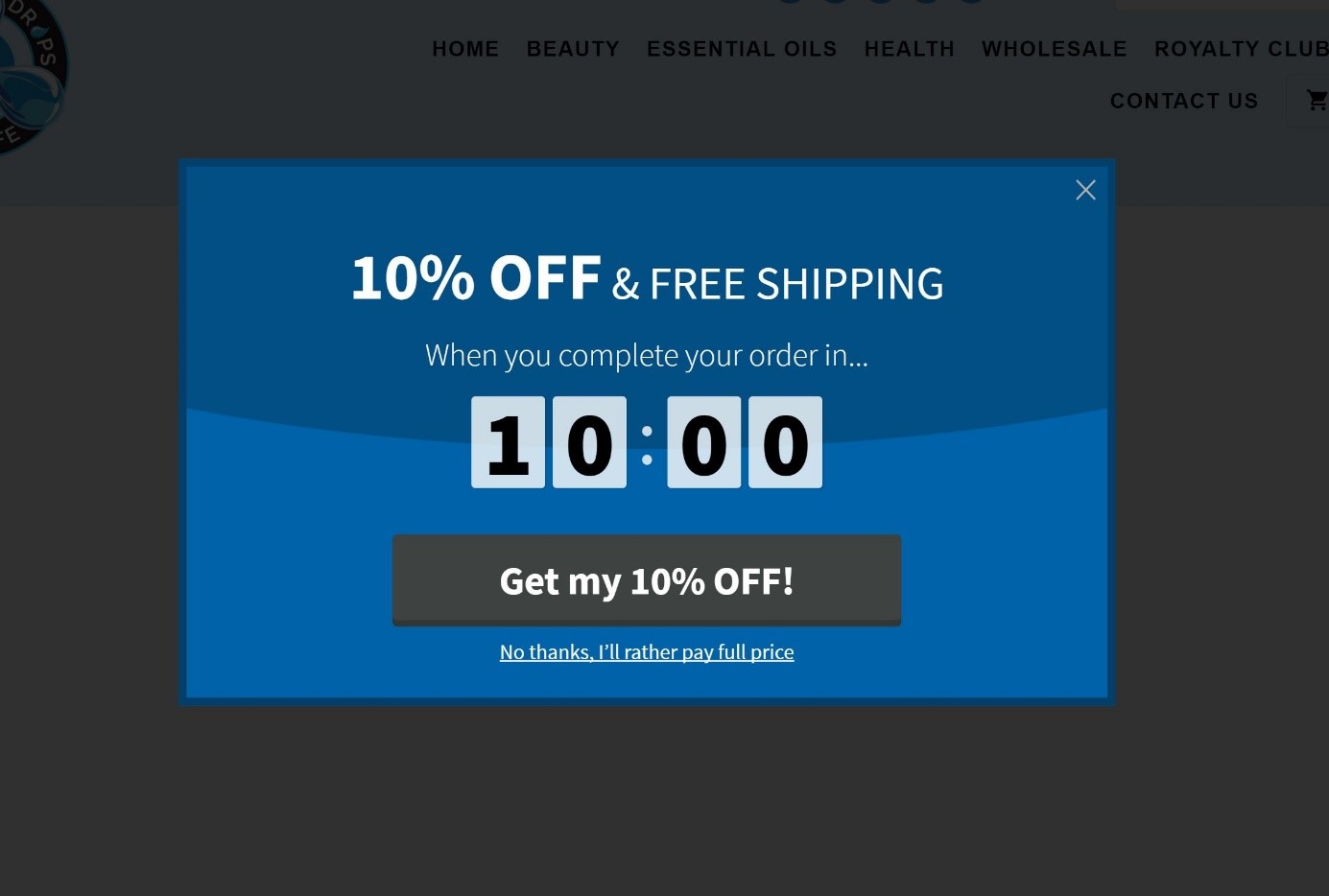
This popup example has a 10 percent discount as its main incentive. In addition to that, it offers free shipping.
Similar to 1 Body, Three Drops of Life uses a countdown timer in its popup to evoke a sense of scarcity and finishes the popup with a benefit-driven CTA button.
6. INIKA Organic
You’re likely using your brand’s colors and style on your website pages and other marketing materials. But, how about your popups?
In this example by INIKA Organic, a company that creates skincare products with natural ingredients, the company uses a reflection of its brand:
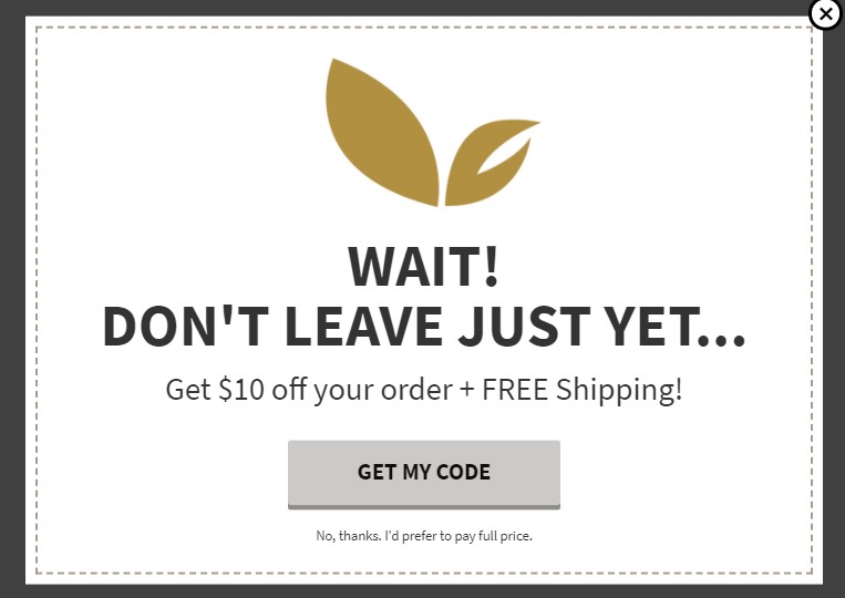
The popup is as simple as a popup can be. It also features minimal copy that promotes its message.
Since the shopper is about to leave the page, the first line should quickly grab their attention. If you’re telling a shopper not to leave yet, there has to be a reason.
In the following line, INIKA Organic tells the visitor why they should wait: They can get a 10 percent discount and free shipping for the products in their cart. To claim that, visitors just need to follow the benefit-driven CTA and complete their order. As simple as that.
7. Rad Power Bikes
Electric bikes are typically high-price items with a longer buying cycle. To help reluctant shoppers a quicker decision, Rad Power Bikes offers a $75 discount in its abandoned cart popup:
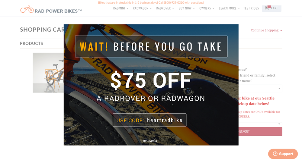
It’s a well-designed popup, thanks to the compelling background image. Throughout the popup, Rad Power Bikes incorporates the same color scheme into its copy.
With the headline “Wait!” the company grabs the leaving shoppers’ attention and invites them to see its offer. And the offer itself is big and bold, which makes it unmissable.
Finally, Rad Power Bikes makes things easy by writing out the discount code that the shopper can use immediately.
Conclusion
Shopify abandoned cart popups are a great tool to convert shoppers who may leave their cart and never return.
There are many reasons people load their carts and decide to leave without completing their purchase. To create effective Shopify popups, you need to know why shoppers are leaving.
After discovering these reasons, you can create offers that will likely convince them to check out their cart items. Look at these examples and implement their strategy in your own popups.


 Book a demo with Sofie
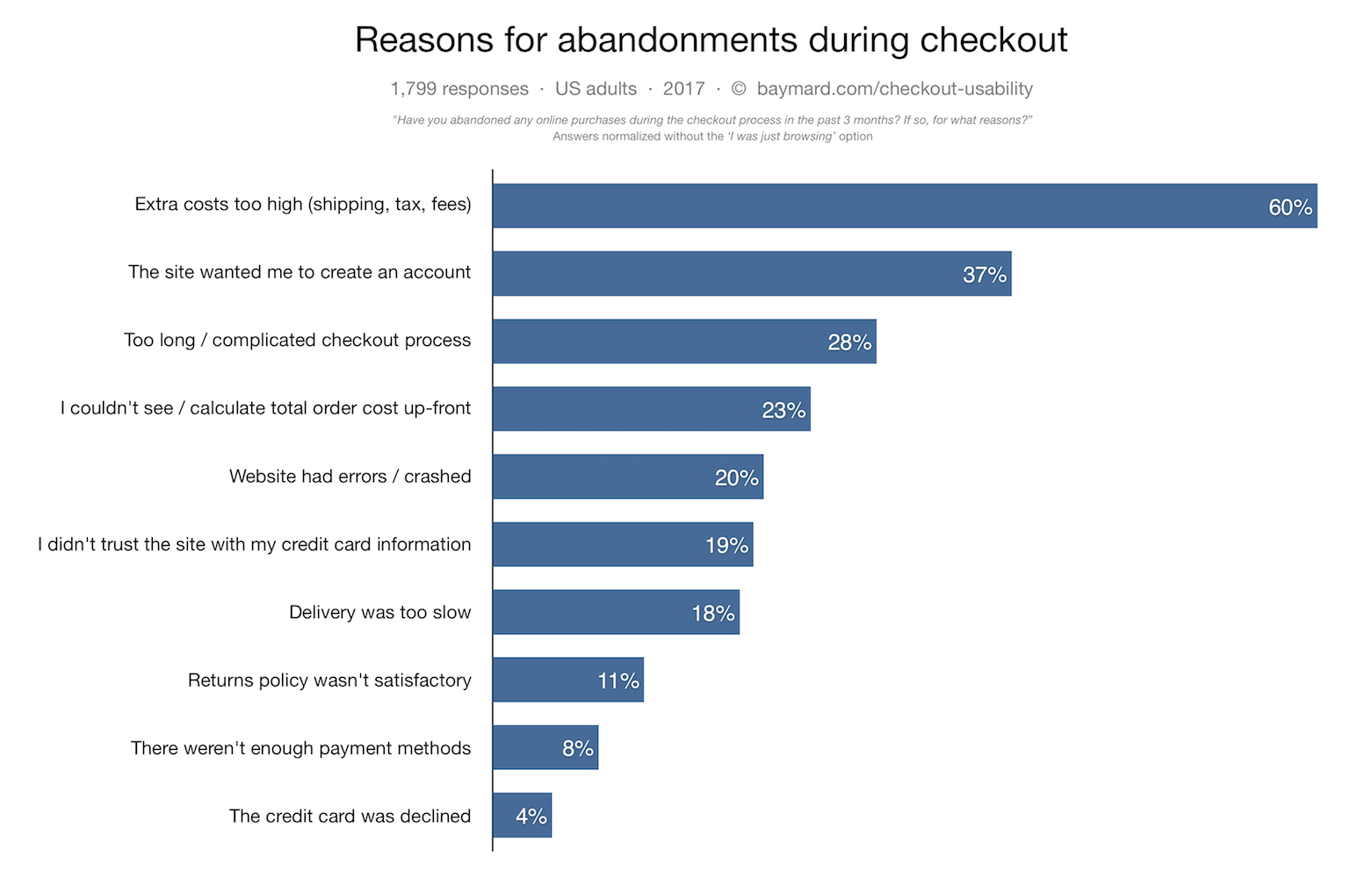