There’s a common misconception among many marketers: “Popups are only for collecting email addresses.”
That’s true—but only if you fail to use email popups to their full potential.
If you want to promote your products and inform website visitors about your current offers, popups are the perfect tool to achieve that.
When I say popups, though, I’m not talking about intrusive, full-screen messages. You know, the ones that appear the minute you land on a website and cause you to reach for the close button immediately.
Instead, I’m talking about relevant, timely, and non-intrusive sales promotion popups that inform, rather than irritate, website visitors when browsing online.
They’re super effective at nudging prospects down your funnel. So, today, I’ll share how to create sales promotion popups the right way, using seven examples we’ve seen from top online brands.
Table of Contents
1. Discounts and Coupons
Discounts are, doubtlessly, one of the most powerful weapons in an e-commerce marketer’s arsenal.
When used sparingly, discounts act as a powerful incentive that convert website visitors into subscribers and customers.
While there’s more than one way to use discounts and coupons in your popups, here are three of my favorite strategies.
i. Collect Email Addresses
You can’t convert all website visitors into customers at once. That’s a given. But what you can do, instead, is capture their email addresses and nurture them with the right emails (that is, until they’re ready to take the next step in their customer journey.)
While doing that, you need to give prospects a valid reason to sign up for your email list, be it the content of your weekly newsletter or early access to your sales before anyone else.
Unsurprisingly, offering discount codes upon signup, as Apuls does, also helps you grow your email list.
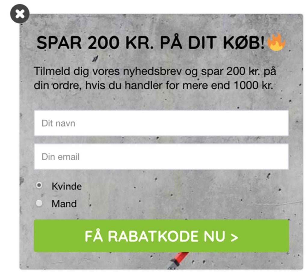
Apuls incentivizes new signups with a special discount.
In this popup, Apuls offers 200 Danish kroner off your purchase when you sign up for its newsletter. Notice how the company segments its new leads by asking gender information so they can target its subscribers with relevant email campaigns later.
To remove any possible friction, Apuls immediately shows your discount code in the success step of this campaign:
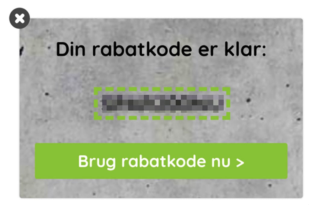
This way, visitors can quickly start browsing and use their discount code, without leaving the page to check their inboxes. And even if they don’t buy anything at this time, Apuls can retarget them in the future with different incentives.
This onsite campaign, which converted at 5.13 percent, helped Apuls combat cart abandonment effectively and collect quality leads. It’s a simple yet effective tactic you can replicate for your online store.
ii. Increase Product Sales
While discounts are effective in capturing top-funnel leads, they also help convert prospects who are further down your sales funnel.
With timely sales promotion popups, you can convince on-the-fence prospects to buy from you and increase the ROI of your sales campaigns.
Check out this simple promotion popup Sofacompany uses on their homepage:
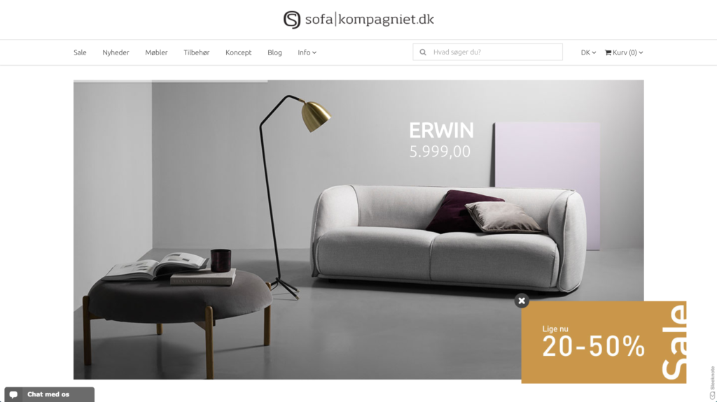
This popup successfully delivers the message without hurting the user experience. It also blends seamlessly with the website design while still standing out to catch the visitors’ attention.
If you want to make your popups easier to engage with, add a benefit-driven call-to-action (CTA) that takes users to your sales pages.
iii. Combine the Two
Most sales promotion popups, typically, focus on one of the goals above. Companies like byRavn, however, cleverly combine the two.
Aiming to capitalize on the holiday shopping season, byRavn targets visitors who are on the hunt for gifts. But the company does that subtly. First, by showing a teaser before triggering the popup:
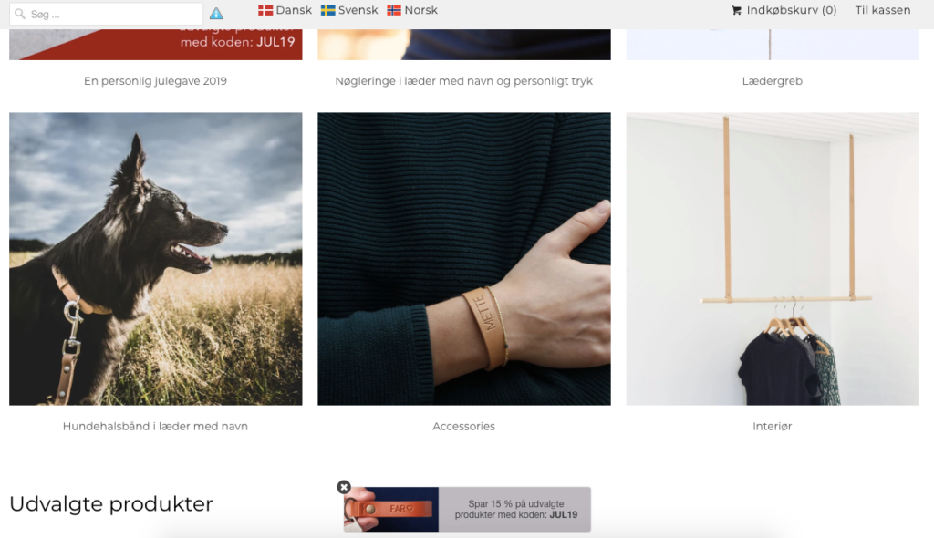
Notice how byRavn adds a product image and the discount code to the teaser, so you can easily see the code and continue shopping without getting disturbed.
But if you want to find out more, you can click the teaser inviting you to save 15% off selected products and view this popup:
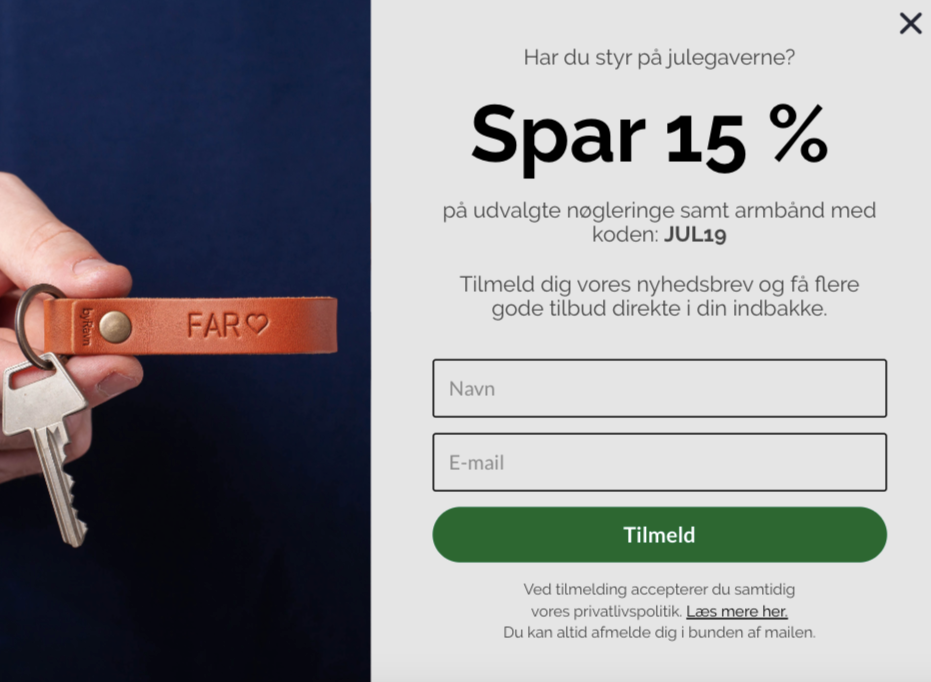
byRavn then builds its sales promotion popup with a smart twist. Instead of gating its offer, the company gives you the discount code and encourages you to sign up for its email list if you want to hear about similar offers in the future.
This is a brilliant way to use popups for both promoting your sales campaigns and to collect interested leads by highlighting your newsletter benefit.
2. Limited-Time Offers
Much like scarcity and urgency, limited-time offers have a proven track record in converting visitors into customers.
If you’re running a limited-time campaign, however, you need to ensure that as many visitors as possible are aware of it before the time runs out. The most effective way to create that sense of urgency without disturbing your visitors is with well-timed popups.
While most marketers associate limited-time offers with flash sales, there’s certainly more to it.
Let’s see three examples of how you can use sales promotion popups to support your limited-time offers.
i. Limited-Time Discounts
If you’re running a sales campaign or offering a discount code only valid for a specific time, you need to communicate the time restrictions clearly.
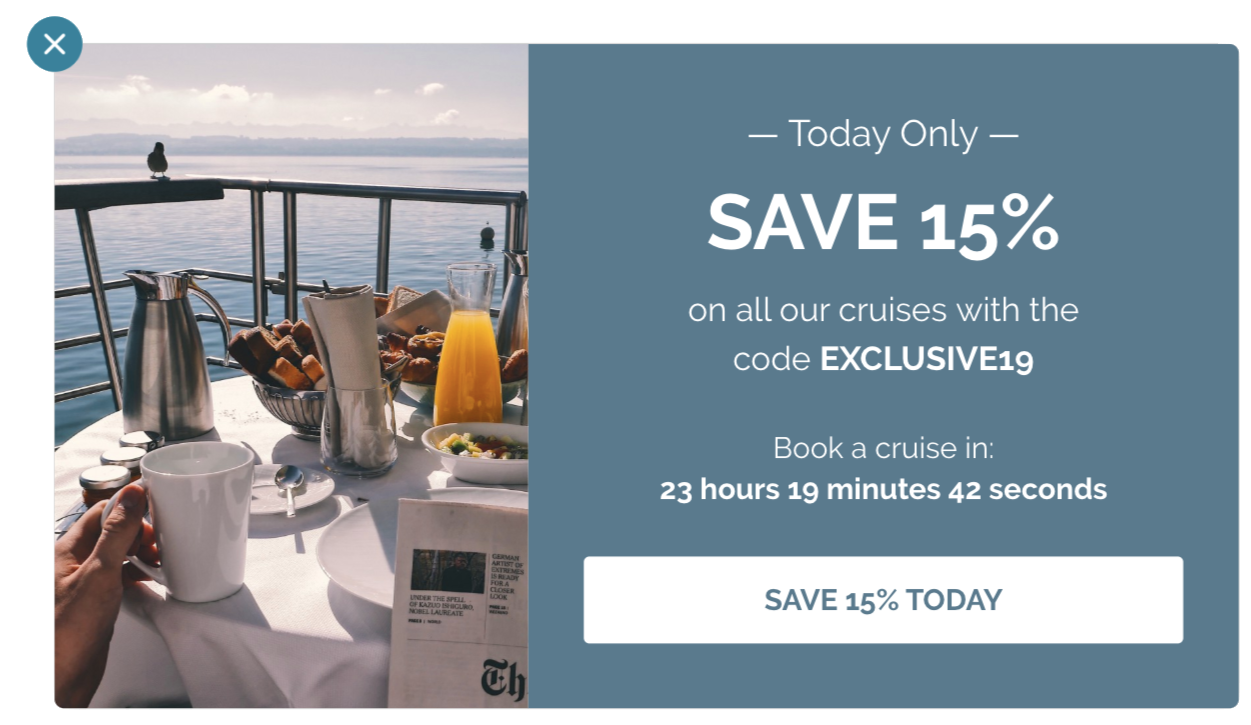
To achieve that, you can add a countdown timer to your popups to improve the effectiveness of your limited-time discounts with a sense of urgency.
While doing that, you need to remember to highlight in your popup copy:
- The benefit of making a purchase (i.e., the value of saving;) and
- How visitors can redeem their discount code.
Here’s how your popup might look:
ii. Limited-Time Free Shipping
If you think that discounting your products will lower their perceived value, or if you simply can’t afford to reduce your prices—you’re not alone.
The good news is, by offering free shipping as an incentive, you can remove a significant obstacle to buying and convert more visitors into customers.
Best of all, you don’t have to offer free shipping all year round for it to be effective. With a limited-time free shipping campaign, you can encourage visitors to buy from you, and boost your sales.
Similar to any limited-time campaign, a compelling popup, such as HairOutlet’s, can help improve your conversions:
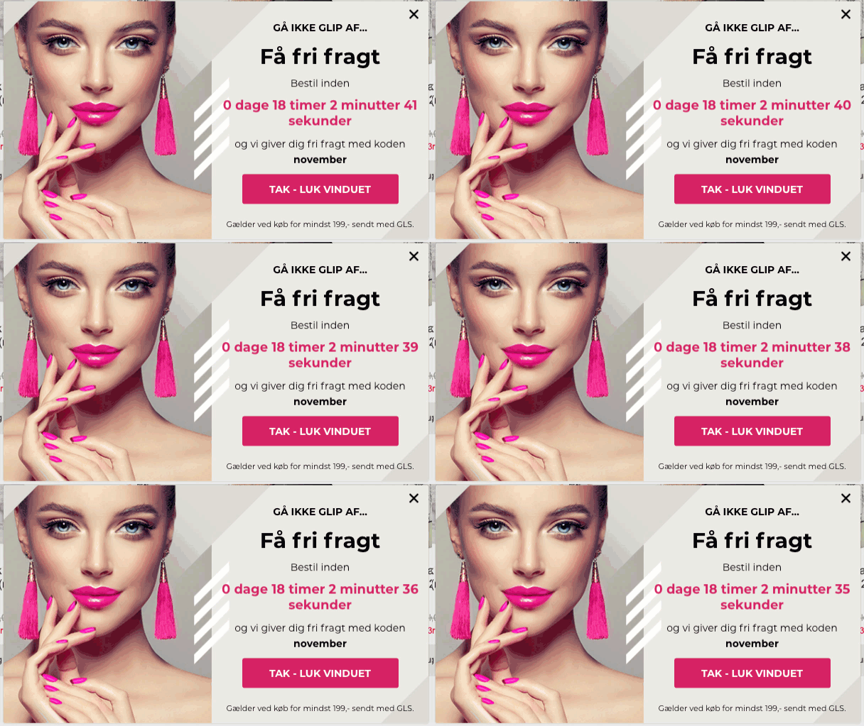
By using a countdown timer, an eye-catching image, and triggering fear-of-missing-out (FOMO), the company gives us a perfect example of promoting limited-time free shipping offers.
iii. Limited-Time Freebies
Discount codes and free shipping are, doubtlessly, high-converting incentives. Yet, it’s almost impossible to resist the power word “free.”
Granted, giving your products away isn’t a sustainable long-term strategy, but it works like a charm as a limited-time incentive.
Take a look at BarkBox’s popup promoting a limited-time freebie:
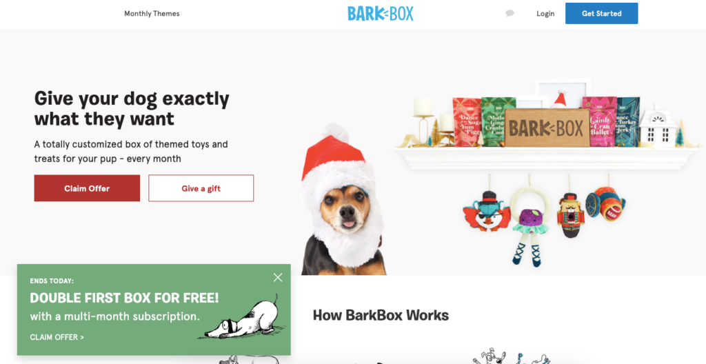
In this simple popup, BarkBox offers new customers two additional products in their subscription box. By using the pre-title “ends today,” the company makes it clear that this is a limited-time offer.
While the above popup might work just fine, I tweaked BarkBox’s campaign slightly to include a countdown timer:
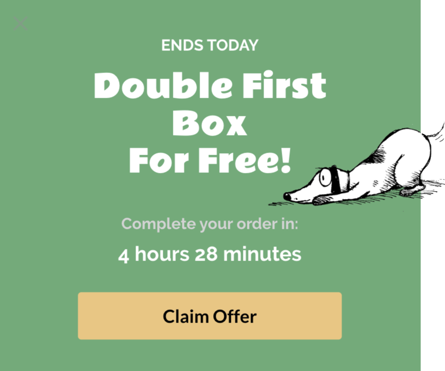
In this version, a ticking countdown timer makes the time constraint clearer and nudges visitors to place an order before the time runs out. It’s a small addition that can do wonders for your conversion rates.
3. Giveaway Popups
Whether you’re aiming to grow your email list, promote a new brand collaboration, or increase your sales, giveaways are one of the most effective tools you can use.
Hosting a contest on your site gives you full control over, both in terms of how you manage and promote your giveaway. With eye-catching popups, you can inform visitors about your giveaway at the right time and invite them to join.
Here are two examples of how to do that, depending on your conversion goals.
i. Collect Email Addresses
A compelling giveaway with a relevant prize acts as a lead magnet, helping you grow your email list with interested prospects.
Jysk Vin is aware of this. That’s why the company regularly draws winners out of its email list to encourage new signups. When you enter their website, first, they show you a teaser that reads “Win 36 Bottles”:
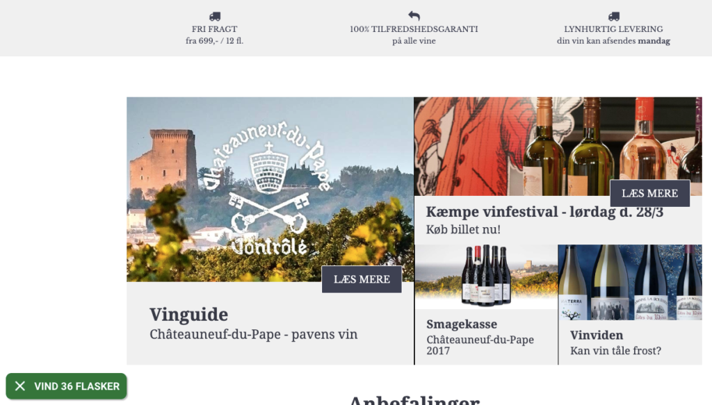
If you’re visiting an online wine store, it’s safe to assume that you’re open to winning 36 bottles. With this benefit-driven CTA, Jysk Vin makes it easy for visitors to click the teaser and see this campaign:
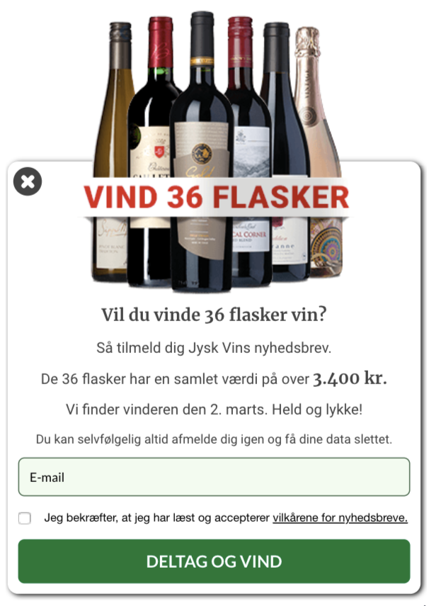
In it, Jysk Vin asks once again if you want to win 36 bottles of wine (valued over 3,400 KR.) And if your answer is “yes,” they invite you to join their newsletter.
More importantly, rather than simply write “Sign Up” or “Join Giveaway,” Jysk Vin cleverly crafts a CTA button that reads “Enter and Win.”
It’s a smart giveaway popup you can use on your site to convert new visitors into subscribers.
ii. Reduce Cart Abandonment
Contrary to popular belief, giveaways can help you achieve more than just collecting emails.
With a timely popup that shows during checkout, you can encourage visitors to place an order to enter your giveaway and reduce cart abandonment.
Here’s what your campaign might look like:
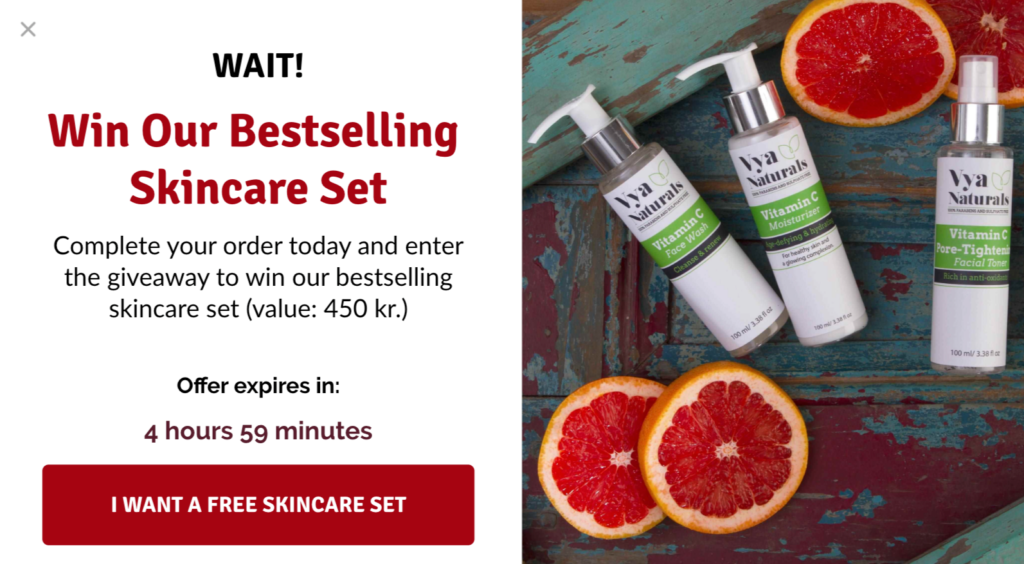
If you want to show this popup only to customers with a certain basket value, you can use our SiteData condition to convert high-value orders.
4. Seasonal Campaigns
Halloween, Black Friday, Christmas, and others… There’s always a holiday around the corner that you can use as an excuse to promote your products.
During this busy shopping season, you need eye-catching promotional popups if you want to capitalize on your holiday traffic.
Check out this Black Friday popup Wool and the Gang uses to promote their offers:
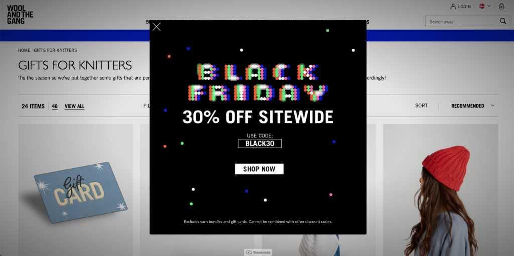
This popup stands out in the website design, yet, doesn’t hurt the browsing experience. If you want to take this campaign to the next level, you can add dynamic product recommendations to it:
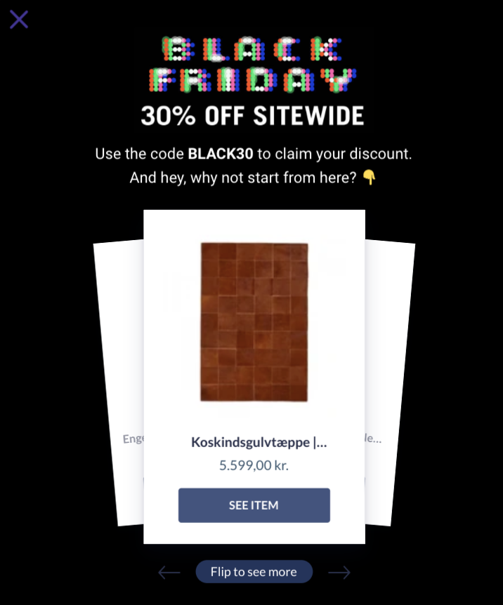
This way, you can give visitors a place to start browsing and use their discount code.
One of my all-time favorite seasonal marketing strategies is creating an advent calendar that allows visitors to open a new door (to unlock a new offer) every day until Christmas.
With an on-site Christmas calendar, you can engage your visitors for a whole month and keep them coming back to your site every day.
Take a look at this popup example by Take Offer:
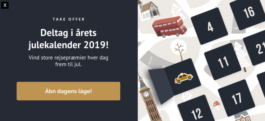
With it, the company invites you to open a new door in their Christmas calendar and when you click the CTA button, Take Offer sends you to this dedicated landing page:
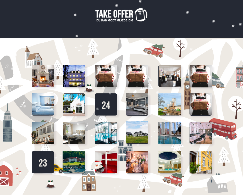
On this page, Take Offer compiles their daily offers, where you can click today’s date to enter that day’s giveaway. Naturally, you’re asked to sign up for the company’s email list to do that:
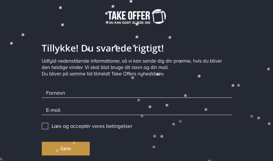
This strategy takes time and effort, that’s a given. But it’s a smart way to engage website visitors during a busy gift-shopping month and potentially increase your sales.
5. Exclusive Offers
No two website visitors are alike. One user might land on your homepage for the very first time, whereas another might be a frequent buyer.
By showing different popups to different users based on where they are in the buyer’s journey, you can align your messages with their needs and wishes.
Whether you want to target and reward a newsletter subscriber or a repeat customer with promotional popups, the key is to create a sense of exclusivity.
Check out this subscriber-only popup example:
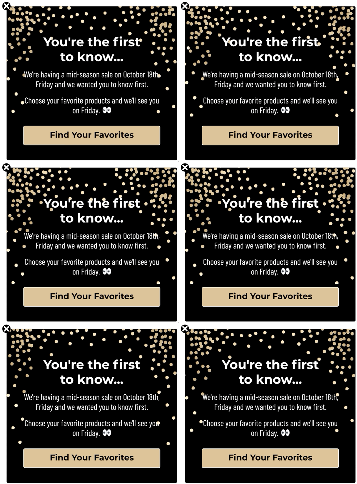
If you’re planning a sales campaign, consider rewarding your subscribers with early access, or a simple “heads up” about the upcoming sales. It helps create anticipation, encourages users to discover products they might want to buy in advance, and improves your relationship with your subscribers.
Drip Insider Tip
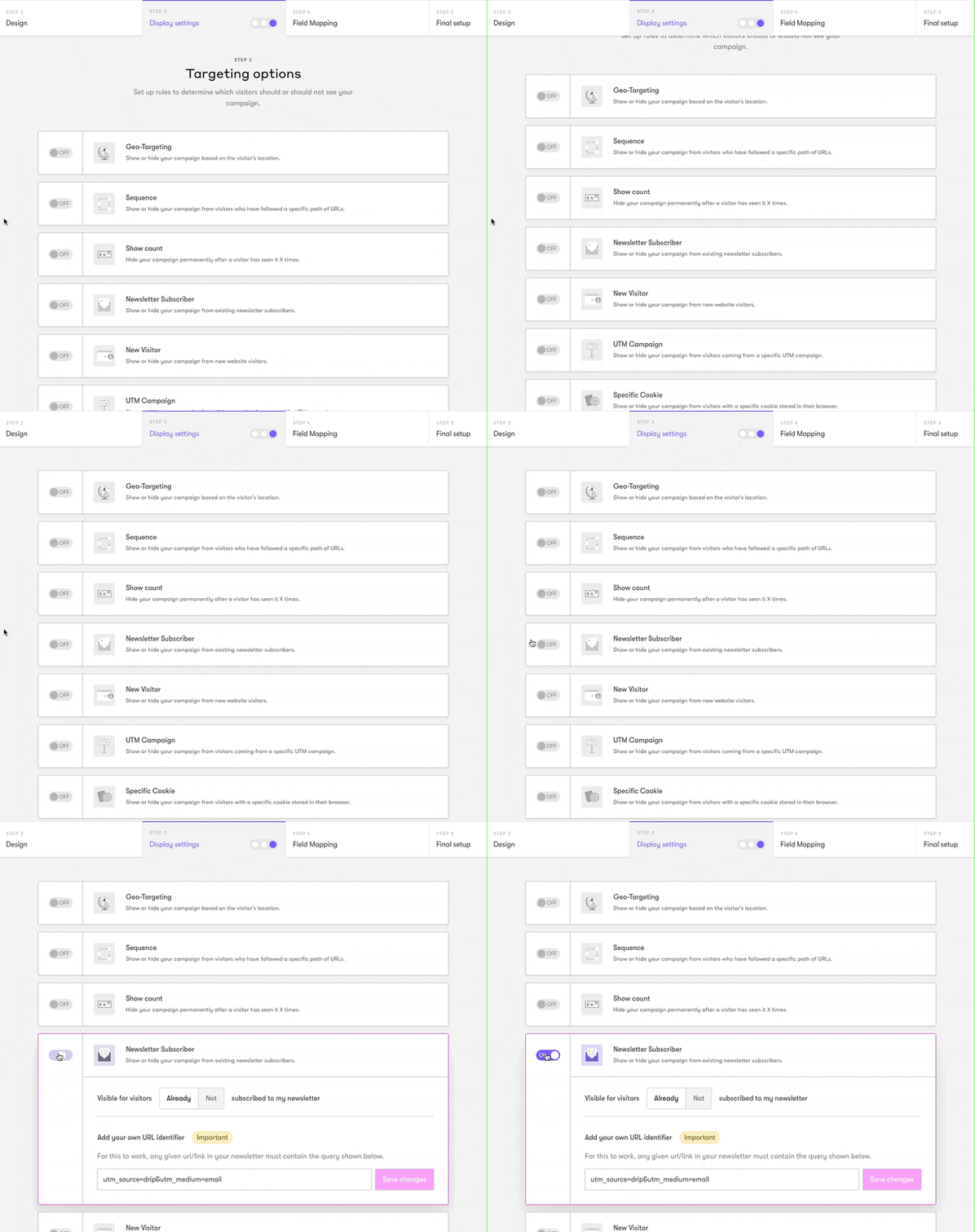
To make sure your campaign shows only to existing subscribers, use our Newsletter Subscriber targeting option.
 If you want to go the extra mile for your customers, you can create a special sales campaign for your loyalty club members and promote it with a popup like this:
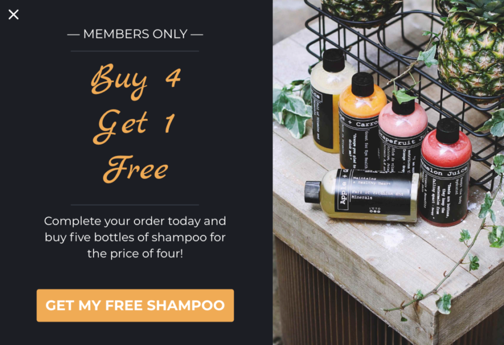
Ideal for engaging return visitors and retaining your customer base.
Drip Insider Tip
With our SiteData condition, you can set this campaign to show only to logged-in members.
6. Cross-Sell Campaigns
It’s no secret that cross-selling is the perfect tool to increase customers’ average order value (AOV).
However, cross-selling only works as intended if you do it at the right place and at the right time. Otherwise, you’ll end up with annoyed visitors who’ll never return to your site, and likely move on to a competitor.
The key to successful cross-sell campaigns is to show the right product recommendation popups to the right users—when they need them.
Take a look at this example:
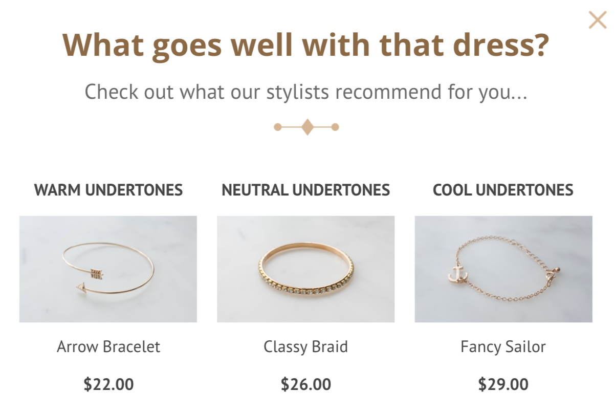
With a promotional popup that shows on your product pages, you can recommend similar or complimentary items and increase your AOV. (Just remember to give visitors some time to look around before showing your campaign.)
If you want to nudge customers to spend more when they’re closer to placing their order, you can show a popup during checkout that invites them to buy more products.
For this popup to convert well, however, you need to fulfill at least two criteria:
- Recommend relevant products; and
- Offer a compelling incentive.
Just like this:
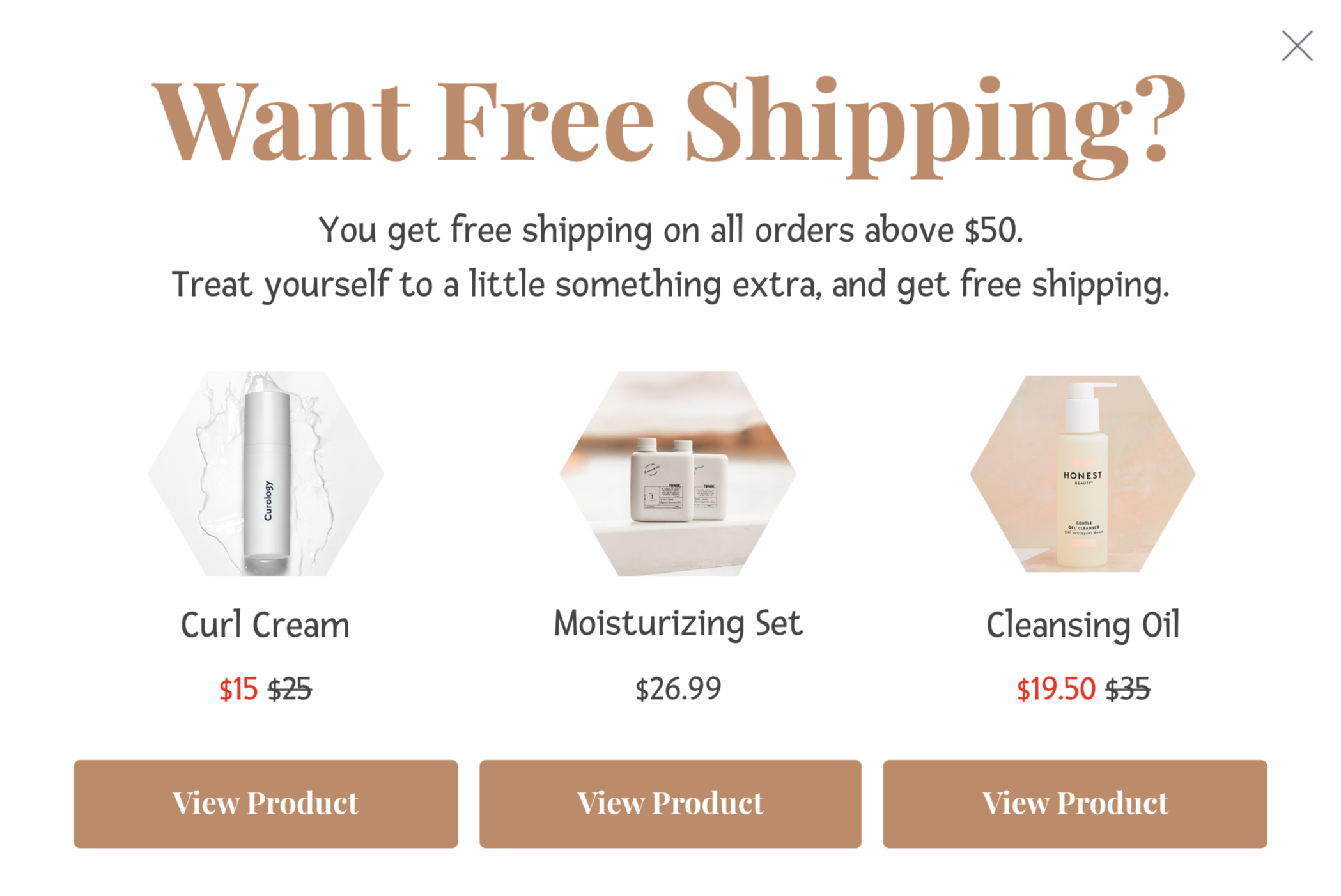
Whether it’s free shipping, a free sample, or a free product, adding a compelling incentive to your popup encourages customers to spend more, without hurting the user experience.
7. Surprise Deals
Although most sales promotion popups can’t go beyond being a simple “10% off” announcement, yours don’t have to be the same. After all, who says you can’t have a little fun with your popups?
By adding the element of surprise to your campaigns, you can make your deals more interesting and memorable.
While the only limit to how you can use mystery in your campaigns is your imagination, I’ll show you three of my favorites.
Surprise deals are a year-round sales promotion tactic, but they’re most effective when they’re least expected. Around a time like Black Friday or Valentine’s Day, when every online store kills the element of surprise with fifty-percent-off banners, you can make your popups click-worthy by hiding your offers:
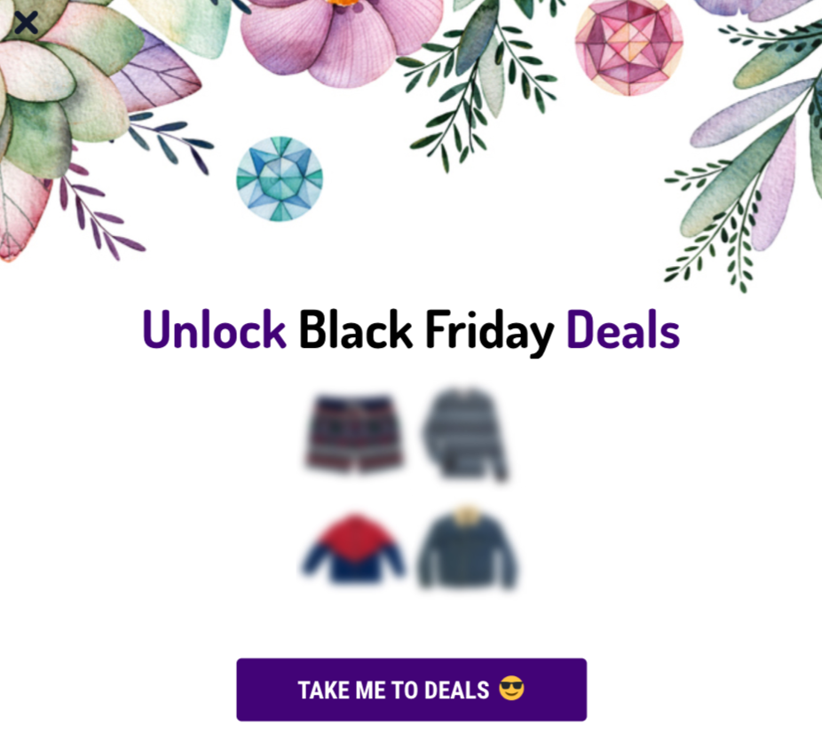
Another way you can add mystery to your popups is by building anticipation for your upcoming sales campaign or product launch:
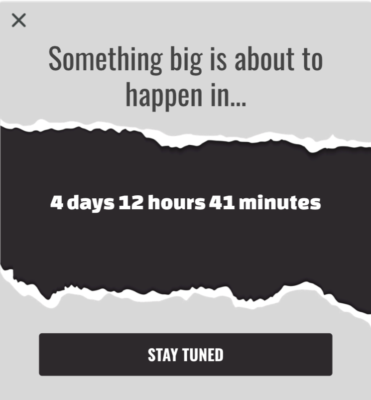
This is the perfect chance to tease your new product line or your next big sales campaign by combining mystery with FOMO.
My all-time favorite mystery tactic comes from Harry’s. When you add a product to your cart and proceed to checkout, Harry’s show you this popup asking you to add some mystery to your box:
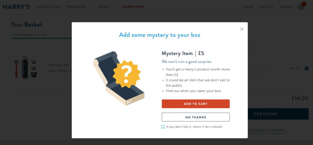
By paying only £5, you can add even more excitement to your unboxing experience. And if you’re a more rational buyer, Harry’s appeals to you too by saying your mystery product will be worth more than £5.
This is a brilliant tactic to increase AOV with a mysterious product recommendation popup that you can easily replicate for your business.

Conclusion
When used right, popups are nowhere near being annoying or intrusive.
Whether you want to collect targeted emails or promote your popular products, popups help achieve your conversion goals.
With timely sales promotion popups and the right incentives, you can also make the most of your website traffic and increase your sales without making drastic changes.


