If you’re reading this, you’re likely struggling with cart abandonment.
You know abandoned cart emails can recover lost sales, and you’re looking for good examples to help inspire your strategy.
If that’s you, then you’re in the right place. In this blog post, I’ll share everything you need to know about sending good abandoned cart emails.
We’ll look at abandoned cart emails from top brands as well as best practices to follow using abandoned cart popups and everything in between.
Abandoned Cart Emails: Here’s What You Need to Know
What Is an Abandoned Cart Email?
An abandoned cart email is an automated email a potential buyer receives after failing to check out. Inside, the reader will usually receive a coupon to incentivize them to complete their purchase. (Although, as we’ll see in the examples below, offering a discount isn’t always recommended, especially if you’re using abandoned cart popups.)
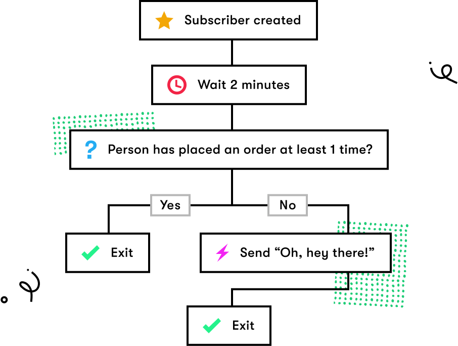
Abandoned cart emails are typically part of a workflow that triggers automatically after someone leaves their basket behind. An abandoned cart workflow often consists of a series of emails trying to convince the shoppers to return and complete their orders.

But are abandoned cart emails effective? Julie Macken from Neve's Bees says they are. She opened up about her most recent abandoned cart success rates, stating that they get double the percentage of opens over their average campaigns, and have earned her thousands in extra revenue.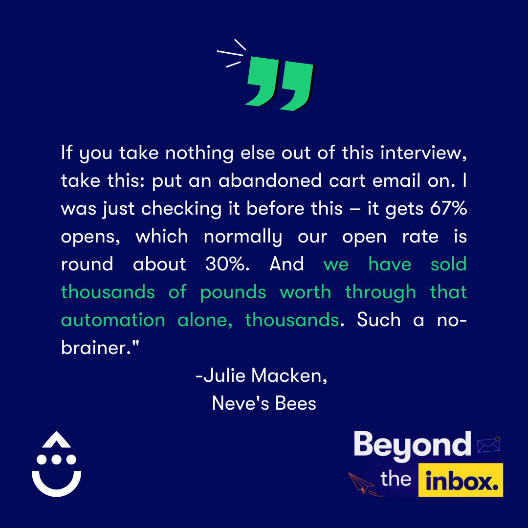
Best Abandoned Cart Email Examples
Here are nine of the best-abandoned cart emails we found in our inbox:
1. Warby Parker
Have you ever received a vague abandoned cart email with little to no information about what’s in your basket? I know I have, and it’s annoying. I rarely click through in generic cart recovery emails because I never remember what I added to my cart in the first place.
Including a prospect’s abandoned items in an email is one of the simplest yet overlooked best practices. Fortunately, more brands are becoming aware of that, including Warby Parker. After abandoning my card, the brand reminded me of the item I added, complete with the item’s name in the subject line.
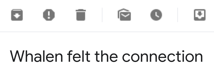
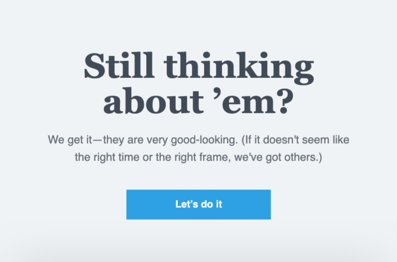
When I opened the email to learn more about the alleged connection, I saw a question, followed by an assurance of similar items and a call to action to complete my checkout.
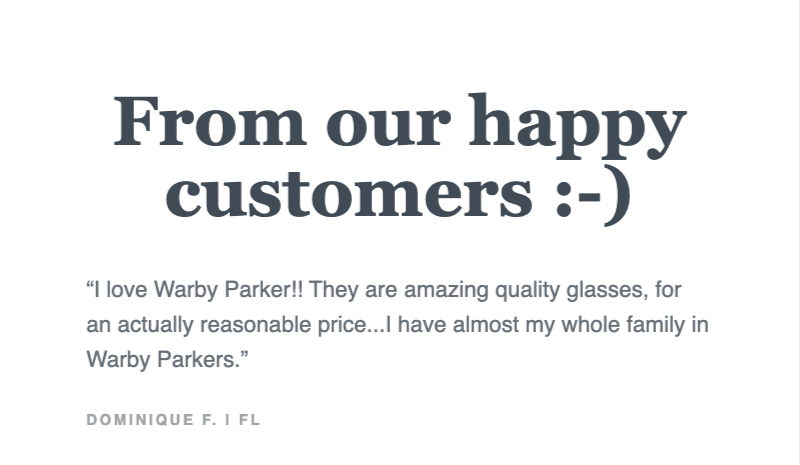
The brand also adds two customer testimonials praising Warby Parker, its prices, and perhaps most importantly, its product quality from a potential buyer’s perspective.
And if that wasn’t enough, the brand also signs off with a second, albeit slightly worded, call to action to return to checkout.
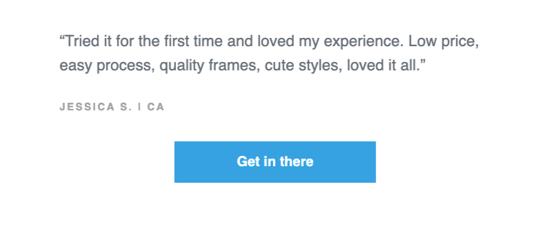
Warby Parker’s email is a fine example of good practices to follow and can easily be modeled for your business.
2. Zalando
While many companies wait several hours or days to send abandoned cart reminders, Zalando waits to give prospects a compelling reason to return to their cart. Timing is everything here, as I learned after abandoning my cart.

That’s right: rather than reminding me of my cart items for no reason other than it’s a best practice, Zalando informed me that the items I wanted before abandoning were now on sale.
The brand explained in its email that it “Today is my lucky day,” and it was “my chance to grab a bargain,” provided, of course, that no one beat me to it first (“Get it fast before everyone else.”)
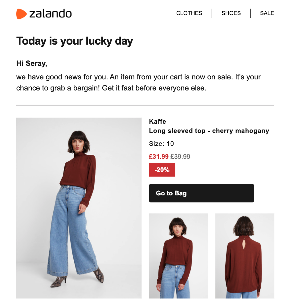
After reminding me of my cart items, along with images and price information, Zalando also tried boosting my average order value by recommending similar products I might be interested in.
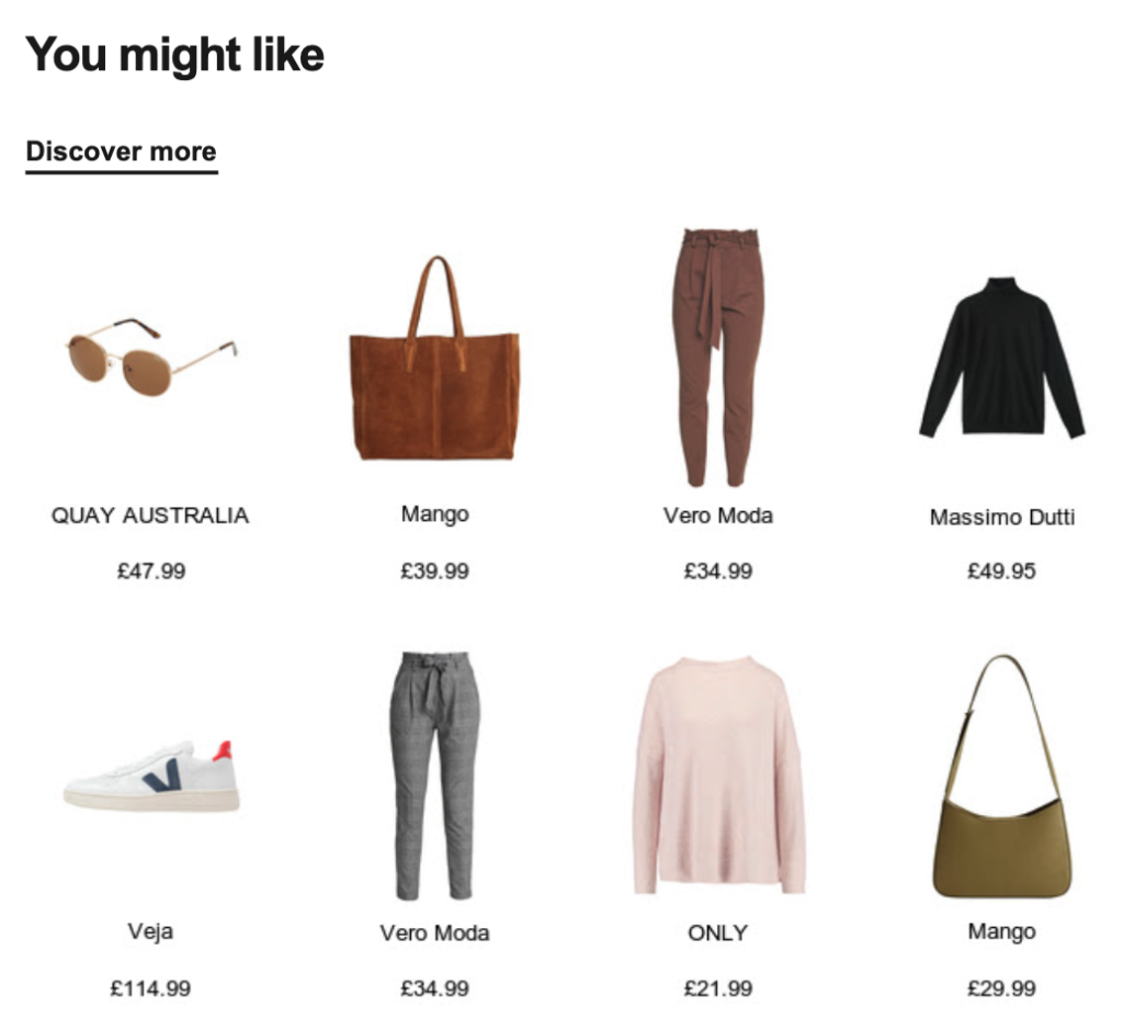
Given that I was considering buying this item eventually, I snagged the item at the new, lower price. And, I couldn’t help check out some of the suggested items, too.
Zalando’s approach isn’t for everyone; waiting for an item to go on sale isn’t a bad strategy if you’re looking to incentivize prospects to complete their purchase without offering discounts.
3. MAC Cosmetics
We have a desire to behave consistently with our past behavior. In psychology, this is known as consistency, and it’s a phenomenon some brands know all too well, including MAC Cosmetics.

Inside the email, MAC Cosmetics addresses a few reasons prospects abandon their cart, opening with perhaps the most common: forgetting to check out.
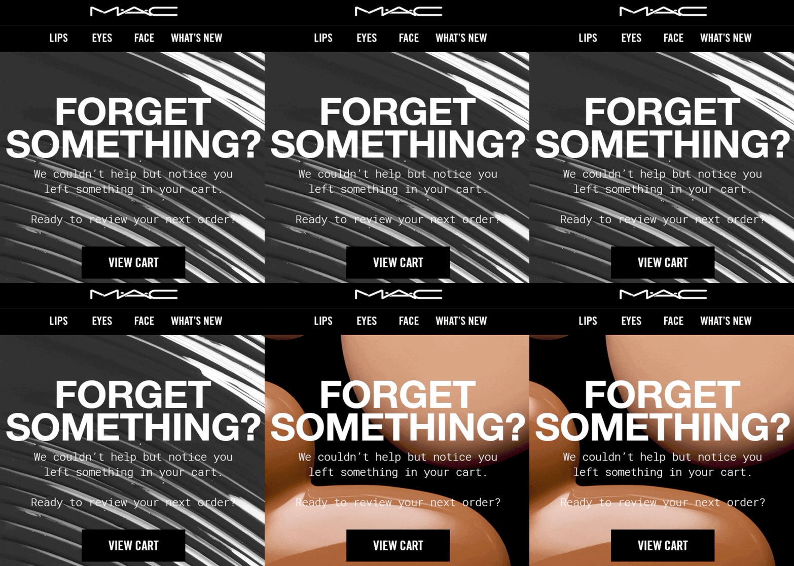
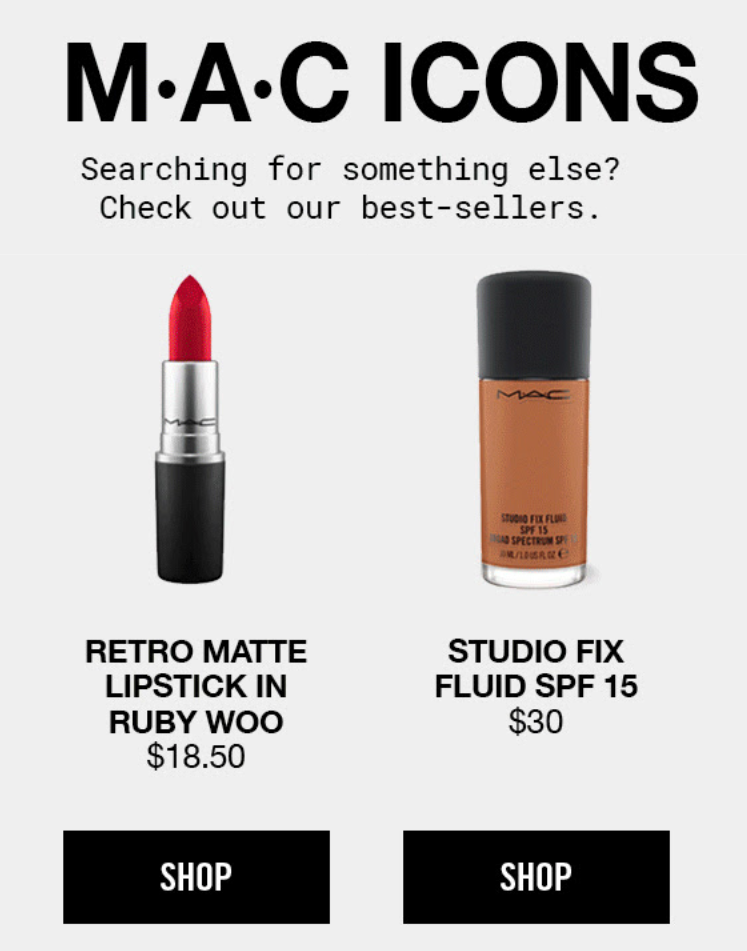
Following that, the brand invites you to consider one of two “bestselling” alternatives in the event the original item wasn’t for you and prompted your bail at checkout.
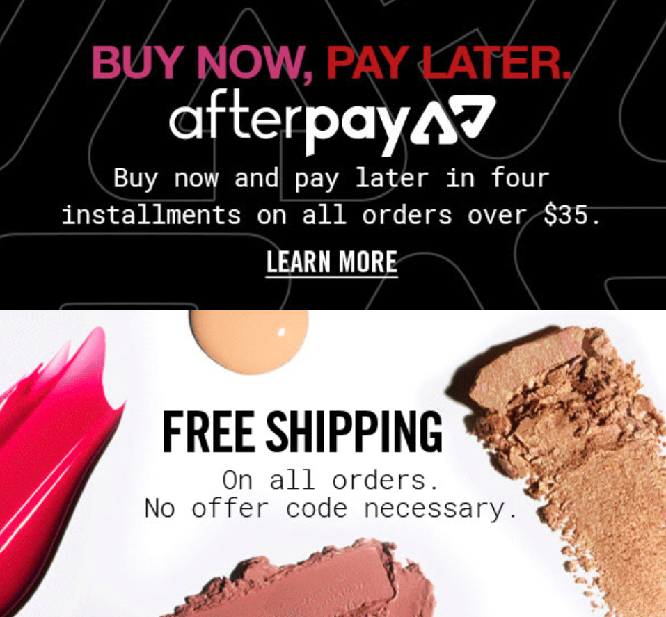
Finally, in the email’s footer, the brand reminds you about its free shipping and buy now pay later option to further remove any possible obstacles to completing your purchase.
Don’t be afraid to raise and overcome your buyer’s objections to completing their order. As MAC Cosmetics illustrates, you can clinch the sale without resorting to aggressive salesmanship.
4. Vinomofo
While email best practices and persuasion triggers work like a charm on potential buyers, great copywriting separates good brands from those who recover lost sales with their emails.
Vinomofo, in my eyes, is one of the few brands that get “it.” Beginning with its movie-inspired subject—“The 2nd rule of Vinomofo: never leave a wine behind”—the brand wastes no time getting down to business.
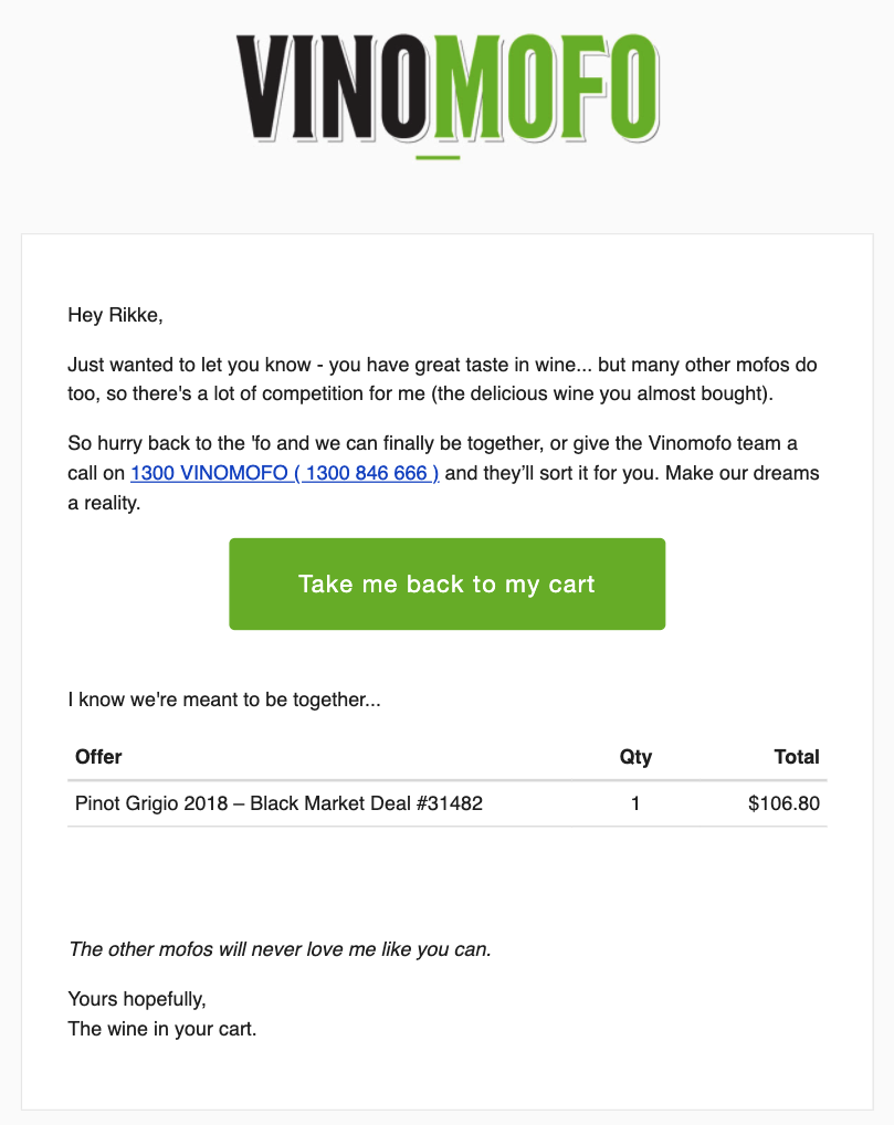
Notice the character copy in the body: the email is written by the item Rikke abandoned in her cart. Not only does writing like a bottle of wine put a fun and unique twist on such an email, but it also reflects the brand’s personality inside and out.
One particular highlight is its use of “you have great taste.” Not because it flatters the reader, but rather it reminds the reader others to have great taste too, and for that reason, you better act fast if you want to avoid missing out.
There are few ways to drive urgency without implicitly saying it, but Vinomofo strikes a balance between conveying humor and nudging visitors to make a purchase.
5. Shinesty
One of the best, most memorable abandoned cart emails I’ve received comes from Shinesty, a retailer known for its fun, unique brand of marketing. When you abandon your cart, you get an email with the following subject line:

The brand not only references a line many can relate to, but it also makes you wonder what you might have left if anything. Shinesty, then, continues playing off the missing angle in the email by asking you to identify your “missing” cart items, humorously placed on a milk carton for good measure.
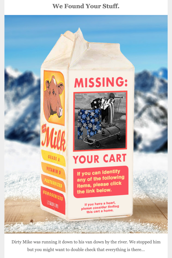
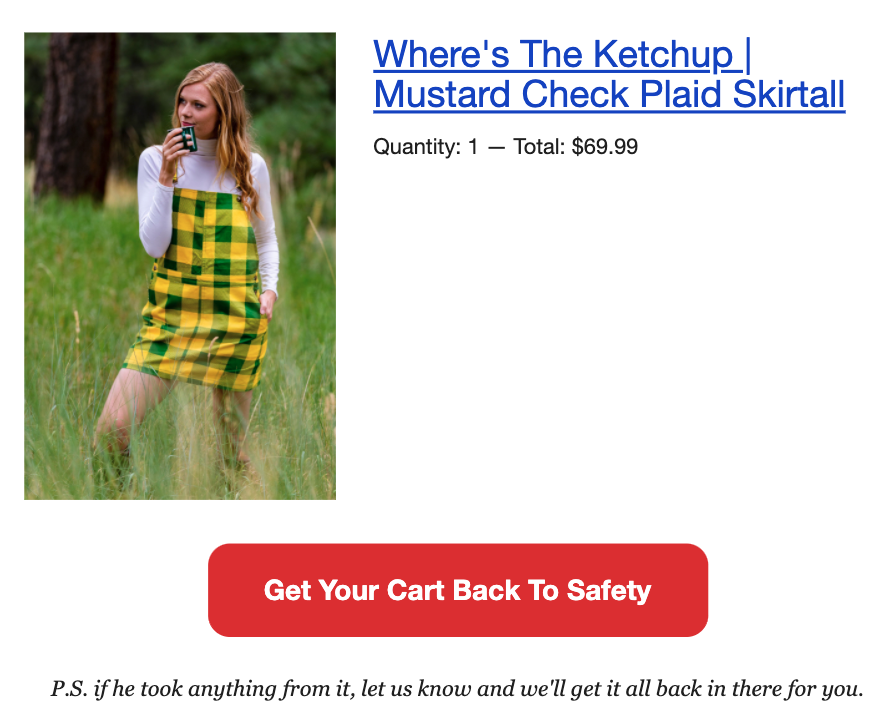
As expected, the brand also links to your abandoned items below so you can reclaim what’s rightfully yours and “get your cart back to safety.”
A day later, Shinesty follows up with another email prefaced with the subject “found it.” (Note the play-on-word sender name.)

Unlike the previous email, Shinesty’s private investigator Carter E. Covery comes bearing good news declaring he was able to “track down your Shinesty cart … in a van down by the river.”
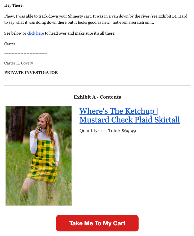
In this two-part abandoned cart email sequence, Shinesty does an outstanding job at not only reminding you of your pending purchase but also standing out from its competitors in the reader’s inbox.
6. AYR
If you’re a fan of simplicity over sophomore humor, you’ll appreciate my next example.
Known for its minimalist emails and razor-sharp copy, AYR’s abandoned cart emails are in a league of their own.
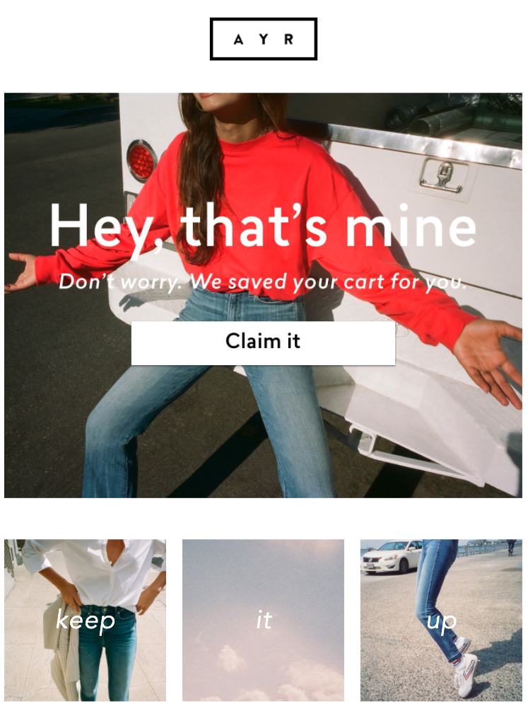
When you abandon your cart, you get as many as three emails. The first starts with the subject “Ooh ooh” before inviting you, in the email, to claim an item they’ve saved for you:
If you fail to do that, you receive a second email a day later with a friendly subject that reads, “Just lookin out for you :).”
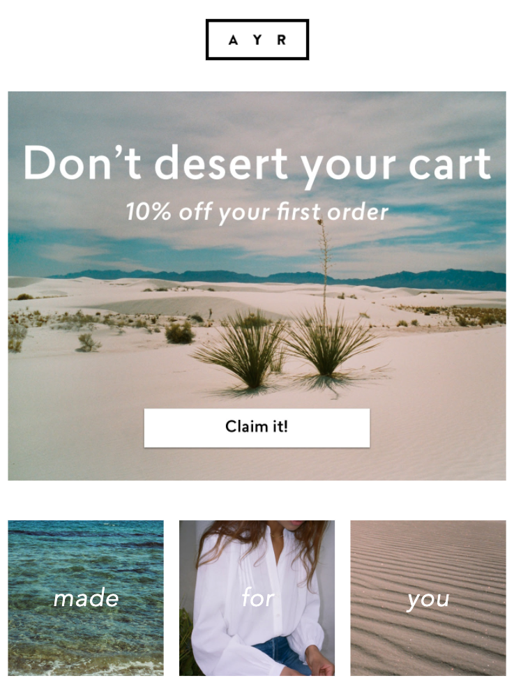
In this email, AYR invites you to complete your order with a 10 percent discount—on the condition that you’re a first-time buyer.
AYR segments its audience and adjusts its incentives accordingly, rather than overusing discount codes for every abandoning shopper. And if AYR still can’t persuade you? You get a third email with AYR asking you to “Hit refresh.”
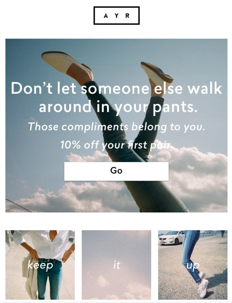
In its final follow-up email, AYR tries triggering a sense of pride with the headline, “Don’t let someone else walk around in your pants.”
The brand refrains from showing your cart items or using too much copy in its emails. Yet, it works surprisingly well; it fits the brand’s value proposition and provides basic pieces for women in a simple manner.
If you, too, are about minimalism, try simplifying your abandoned cart emails as AYR does.
Try out different angles and incentives in your abandoned cart emails by setting up a split test in your workflow.

7. Esqido
Converting abandoning shoppers with a discount code is one of the oldest tricks in the book. Still, many marketers overestimate their impact and influence on potential buyers.
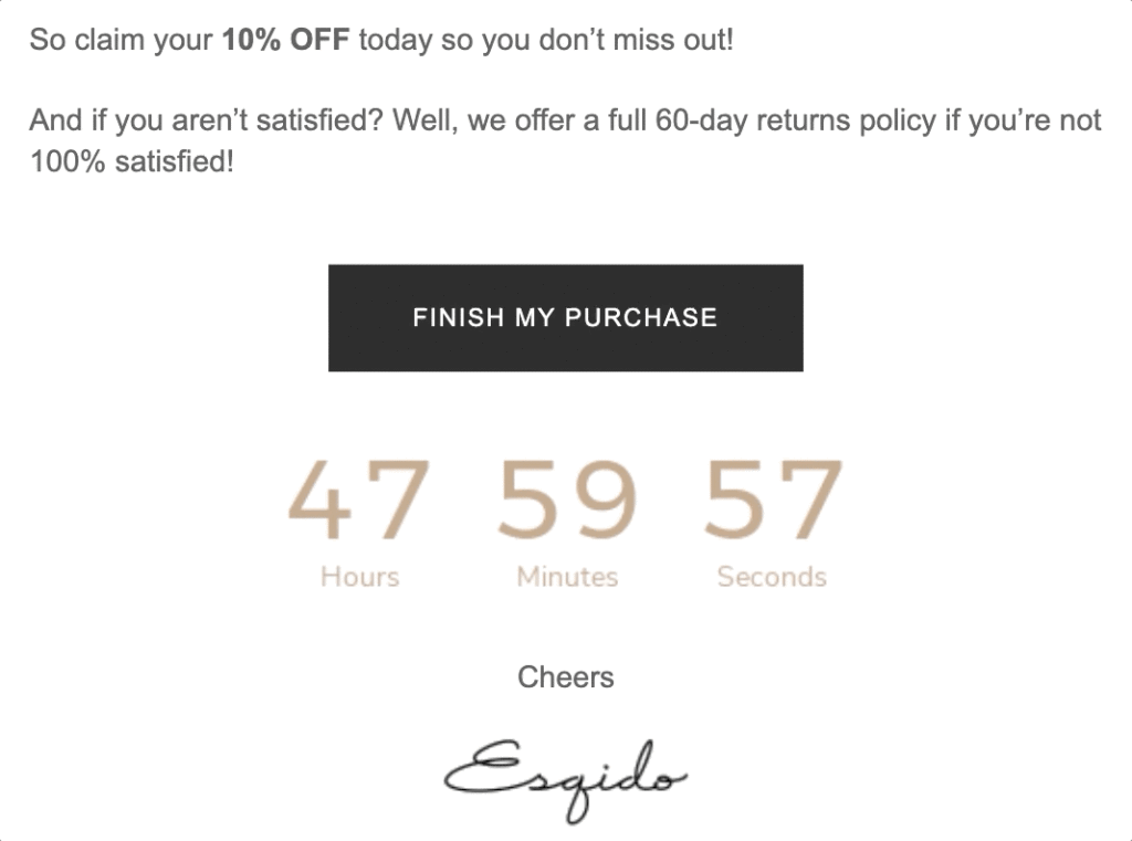
While AYR’s ten percent offer is tempting, making it time-bound would certainly enhance its effectiveness. That’s what Esqido does in its emails, turning its incentive into a limited-time offer.
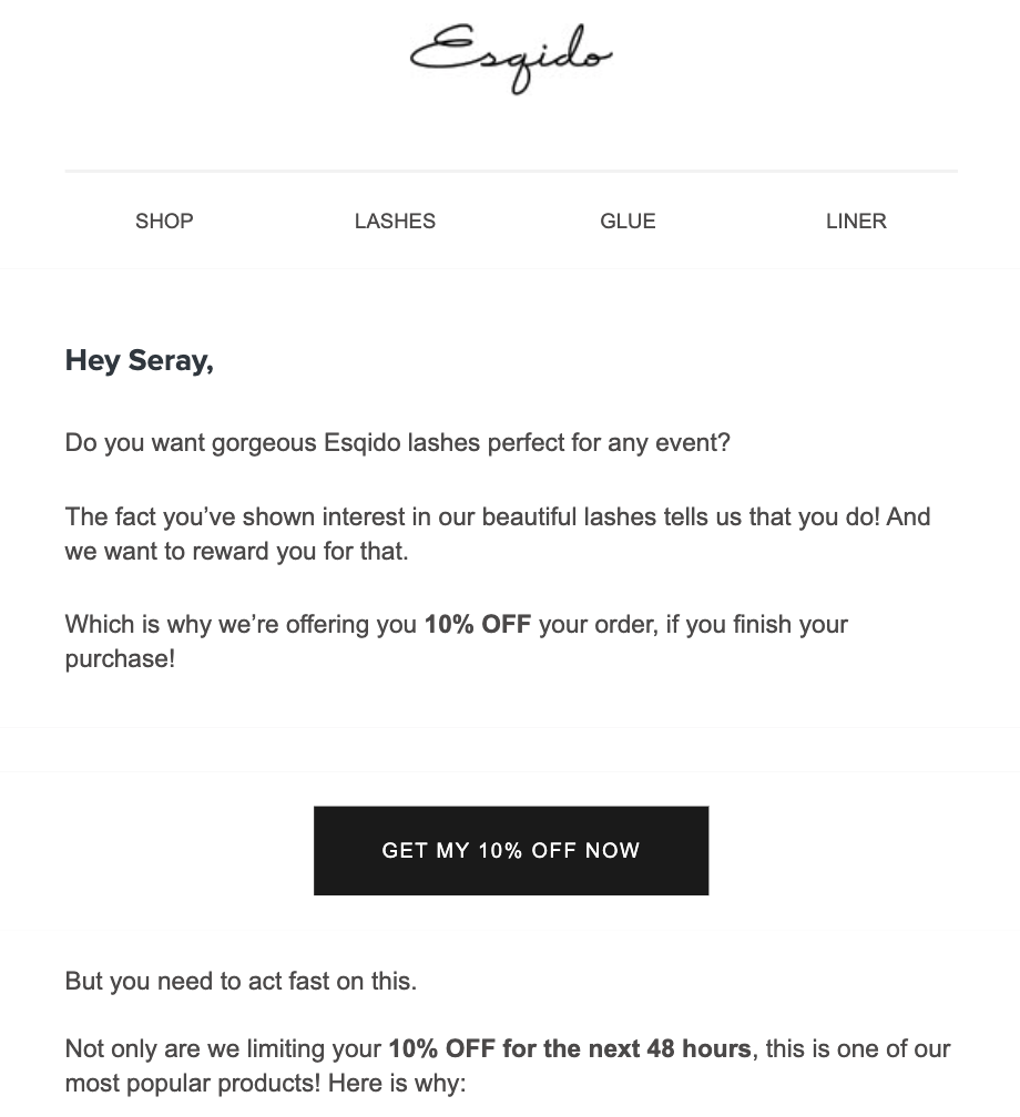
The first part of the email is nothing special. But if you scroll down, you learn that the offer on one of its most popular items is only valid for 48 hours. Can you say scarcity?
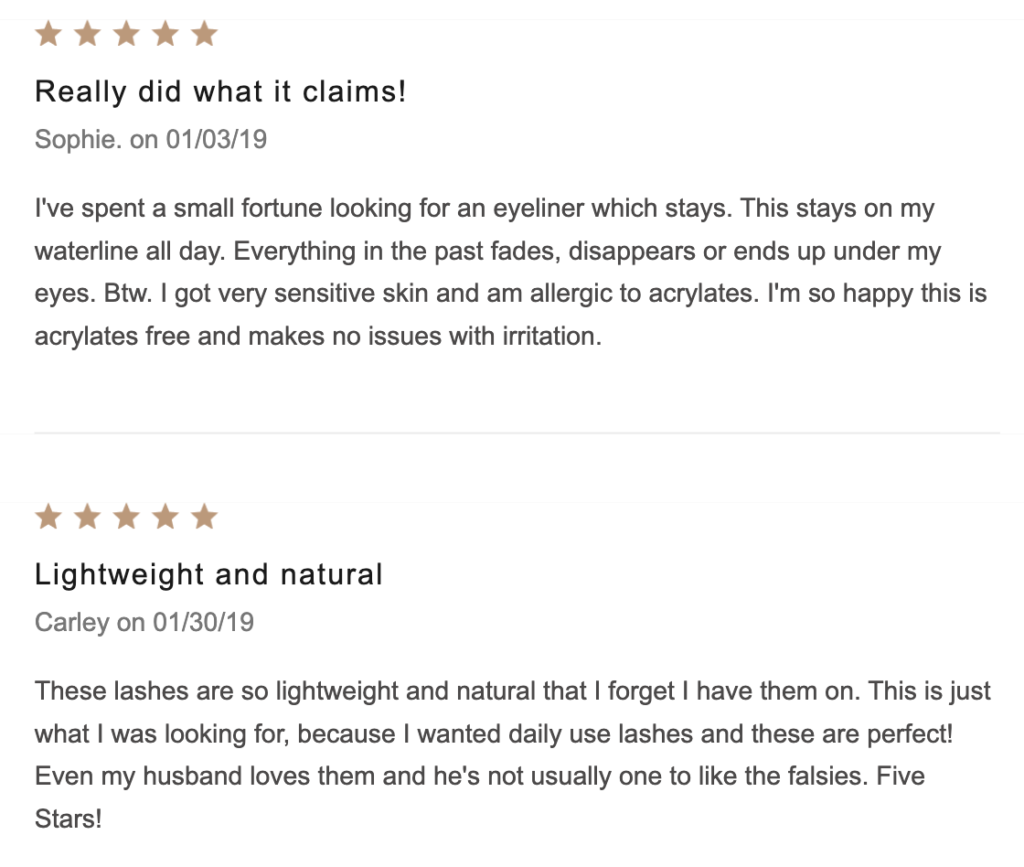
To back up Esqido’s claims and demonstrate social proof in its email, the brand displays some of its most positive customer testimonials.
Next, the company reminds you of its satisfaction guarantee to remove any obstacles to buying before driving further urgency with a countdown timer (which is a GIF that you can easily recreate for your emails.)
Esqido’s abandoned cart email might not cover new ground, but that doesn’t mean it’s ineffective. The social proof. The scarcity. There’s a lot to learn from here.
8. Kat Von D
Discounts are a double-edged sword when it comes to abandoned cart emails. On the one hand, discount codes can help recover abandoned carts. On the other hand, they can also lower your products’ perceived value.
An equally, if not more, compelling alternative to discounts is offering free shipping, as Kat Von D is well aware of in its marketing.
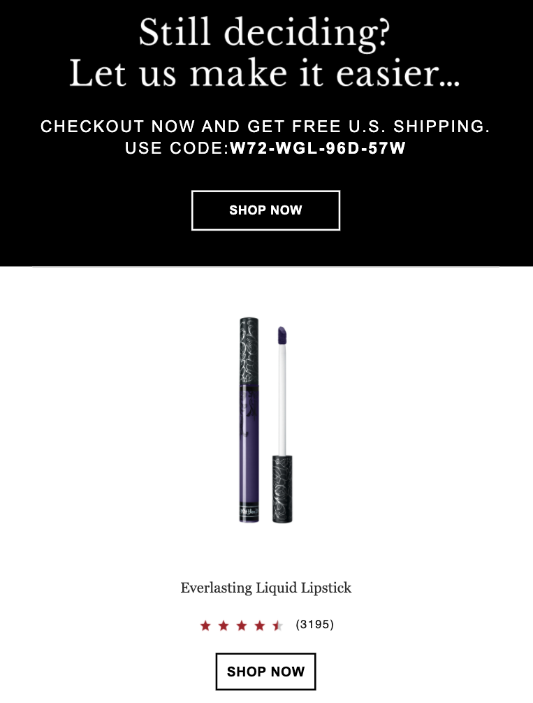
In its email, the brand asks if you’re still deciding on your purchase and if so, offers to sweeten the deal. To do that, the brand includes the product’s ratings as well as the number of reviews, adding social proof in the process.
In the remainder of the email, Kat Von D builds more social proof by displaying its bestsellers:
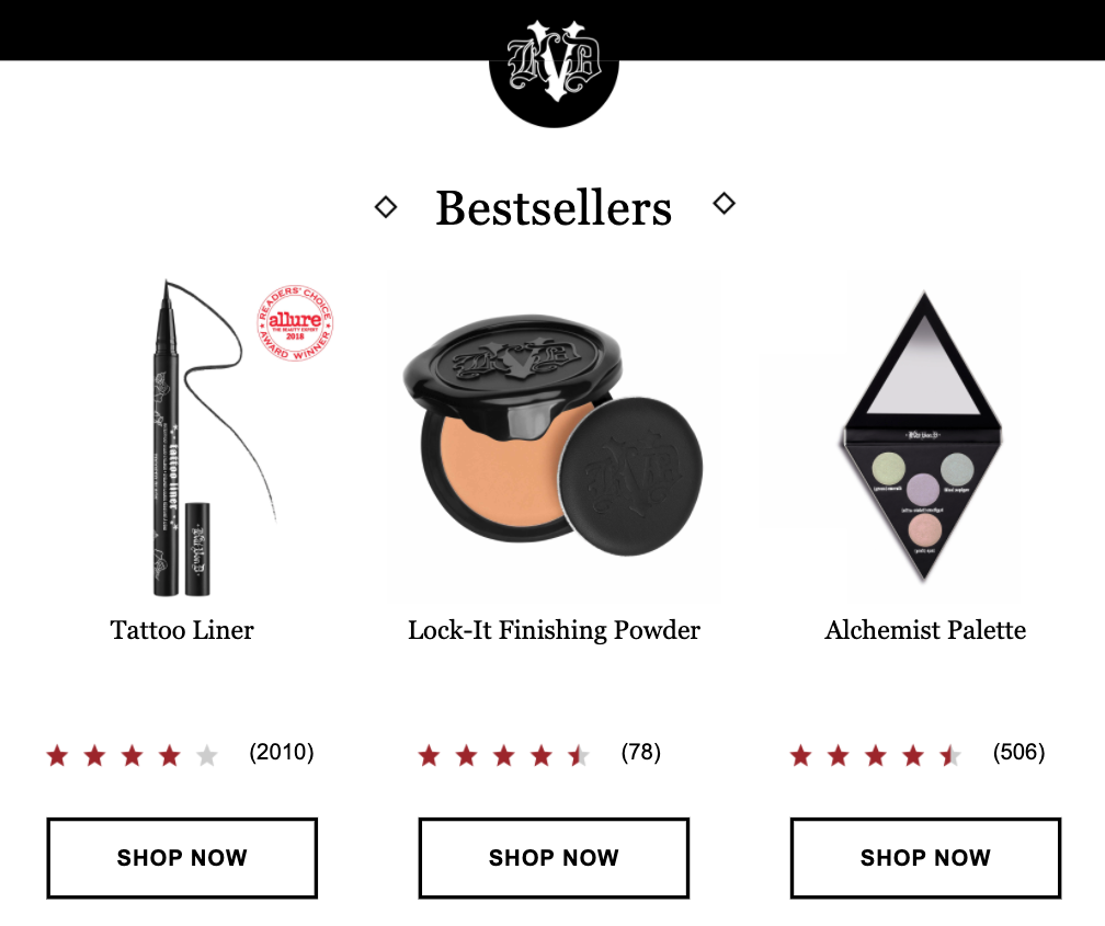
Bottom line: Even if you’re not convinced by the popularity of your abandoned item and Kat Von D’s free shipping offer, it tried converting you with several customer-approved alternatives. A great strategy for sure and one worth stealing.
9. Prose
What if you can’t keep your products in a shopping cart for too long? Or, your products can’t go out of stock? How can you think about recovering lost sales when scarcity isn’t an issue?
One approach is to follow Prose’s example and wait until the prospect is ready to complete their order.
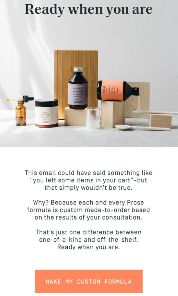
I got the above email after completing a lead quiz on its website and leaving before making a purchase. Now, given that Prose’s products are custom-made based on your test results, it can’t promise “your items are waiting.”
But what it can do is send a gentle reminder saying they’ll wait until you’re ready to place your order. Later in the email, Prose features a testimonial and invites you to contact them if you have any questions.
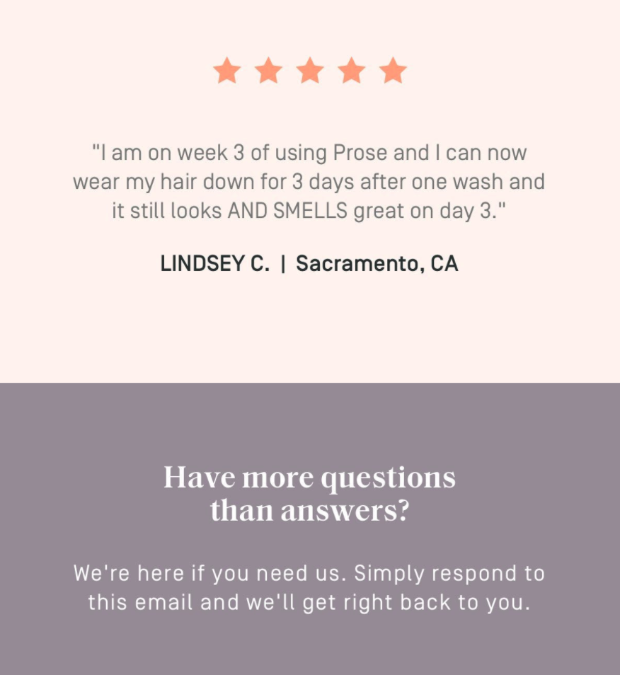
However, instead of giving a phone number or a contact email, Prose simplifies reaching out. All you need to do is to respond to their email, and they’ll be there if you need them.
Genius.
Abandoned Cart Email Best Practices
One of the best ways to reduce abandoned carts is by triggering an onsite campaign the moment a visitor is about to leave your checkout. Below are seven strategies that work alongside sending abandoned cart emails.
1. Trigger Popups Based on Basket Value
2. Use Free Shipping in Two Different Ways
3. Convert Subscribers with an Exclusive Offer
5. Use Personalized Social Proof
6. Offer Help to Abandoning Visitors
1. Trigger Popups Based on Basket Value
If you ever googled “how to reduce cart abandonment,” you know the number one best practice is offering a discount code the moment a buyer is about to abandon their cart.
Granted, offering coupons will convert a percentage of abandoning visitors into buyers. But it won’t work for everyone. Moreover, offering discounts carries two inherit problems:
- You risk decreasing the perceived value of your products; and
- A percentage of regular visitors will come to expect discounts and leave their carts on purpose.
Fortunately, there’s another incentive you can offer abandoning shoppers, and it doesn’t involve discontinuing your products.
After analyzing 15 billion popup sessions, we found that offering physical products can, in some cases, convert twice as better than offering discount codes.
“But I can’t afford to offer a product to everyone who abandons my cart,” you might say. Few can. And that’s why we recommend offering different incentives based on the visitor’s basket value.
Let me illustrate with an example. Say a visitor has several products valued over a certain amount in their basket. With our SiteData condition, you can show the visitor a popup informing them that they qualify for a free skincare set.
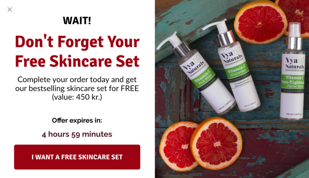
Another browser, by contrast, has one product, meaning they’re below the target amount. You can then show a different popup, letting them know that you’ll enter them into a giveaway if they complete their purchase.
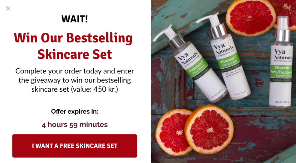
Using data you already collected on your website, you can show two different visitors two targeted offers and, in doing so, nudge them to complete their order without you having to resort to discounting your products.
2. Use Free Shipping in Two Different Ways
It’s no secret that free shipping is a proven incentive for reducing cart abandonment and, in some cases, increasing a buyer’s average order value.
According to Invesp, online consumers find free shipping twice as compelling as discount offers. What’s more, 93 percent of consumers tend to buy more products when offered free shipping.
But what if you can’t afford to offer free shipping to everyone? How can small to medium businesses combat cart abandonment when many buyers are conditioned to expect free shipping right out of the gate?
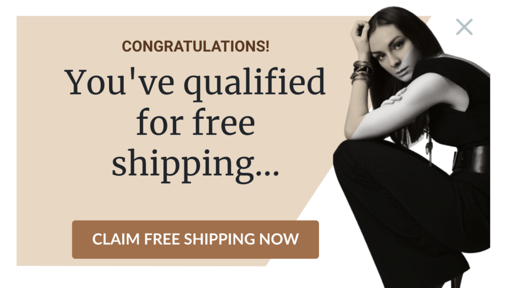
Similar to my earlier suggestion, you can offer free shipping on select orders that exceed a certain amount. Let me illustrate with another example. Say you’re offering free shipping on orders above $75.
If a visitor’s cart items are worth more than $75, you could show them an exit-intent popup that informs and nudges them:
And if their basket value is below $75? You could remind them that they’re missing out on free shipping. You could even recommend products they could add to their cart to qualify for free shipping:
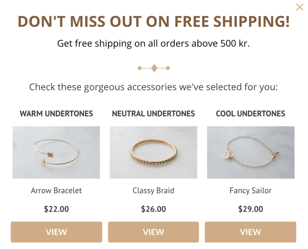
Like the above example, you could also combine with a product recommendation popup from a certain category and price range to help visitors make easier buying decisions.
3. Convert Subscribers with an Exclusive Offer
First-time visitors and returning subscribers are at different stages of their journey. The former has recently discovered your brand. The latter, by contrast, is closer to becoming a first-time or repeat buyer.
Why, then, treat both segments the same when you can target your offers and incentives to convert each into buyers? Why not give each segment what’s needed to move them down the funnel?
To illustrate with a simple example, you might thank subscribers for their loyalty and offer a discount if they abandon their cart in the middle of purchasing.
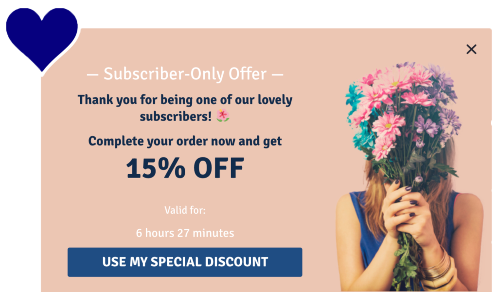
To boost subscriber loyalty further, you could specify that the offer is “subscriber-exclusive.” You could also add a countdown timer to drive urgency. (We found adding a countdown timer to a popup boost conversions.)
Setting up this strategy is easy if you’re a Drip customer. Log in, add the “Newsletter Subscriber” condition to your onsite campaign and add the provided UTM at the end of any URLs you include in the email.
4. Reward Loyal Customers
Many ecommerce marketers only think of customer retention in terms of email marketing. But it’s important to remember how you welcome and incentivize returning customers impacts revenue more than you might think.
According to Smile.io, 40 percent of your ecommerce site’s revenue comes from repeat customers. Meaning if a customer adds products to their basket with the intention to buy, it’s a golden opportunity to reward them.
If a subscriber-specific campaign is too costly for you, or you want to reward customers for their loyalty, you could create a login-specific onsite campaign that only targets customers.
Creating a customer-specific campaign would help you to identify when a user is logged in to your site—as found when using a brand customer loyalty program—and show specific popups for them.
Here’s an example of how such a campaign could look.
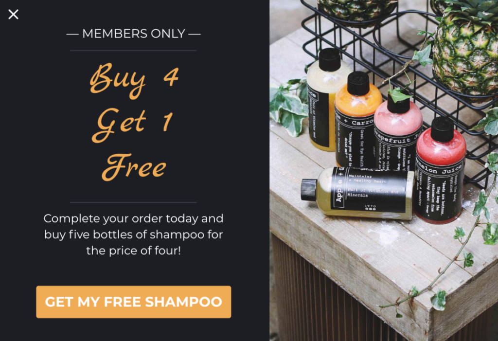
Sometimes, all it takes is an unexpected message to know you’re appreciated as a customer. Brands know that, but few take advantage of such. Remember that if you’re using popups for email collection only.
5. Use Personalized Social Proof
There are many reasons shoppers abandon their carts, including but not limited to:
- Complicated checkout processes
- Unexpected shipping costs
- Inadequate payment options
However, one common reason for visitors abandoning their carts is their skepticism of a product’s quality.
As the principle of social proof goes, when we’re uncertain about things, we look at other people’s behavior to determine the right action to take. If people like us are behaving similarly, they must know something that we don’t.
After all, it’s one thing to read a seller praising their products, but it’s another thing entirely to read it from customers, like us, in the form of glowing testimonials.
Not only do testimonials make your products’ positive features more credible, but they also create the strongest form of social proof as they come from people similar to us.
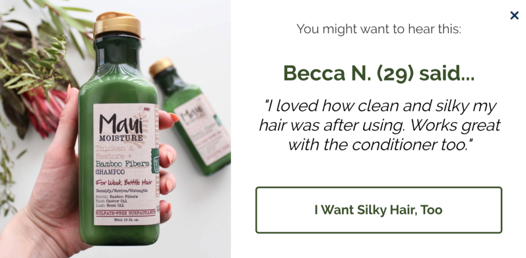
Adding testimonials to popups, then, is a cart abandonment strategy few marketers leverage. You can also enhance your popups by personalizing them based on the items your prospects are interested in.
For example, if a visitor has a hair care product in their cart, you could show them an onsite campaign with a testimonial from that category.
Similarly, if they have wellness products in their cart, you could show a campaign like this:
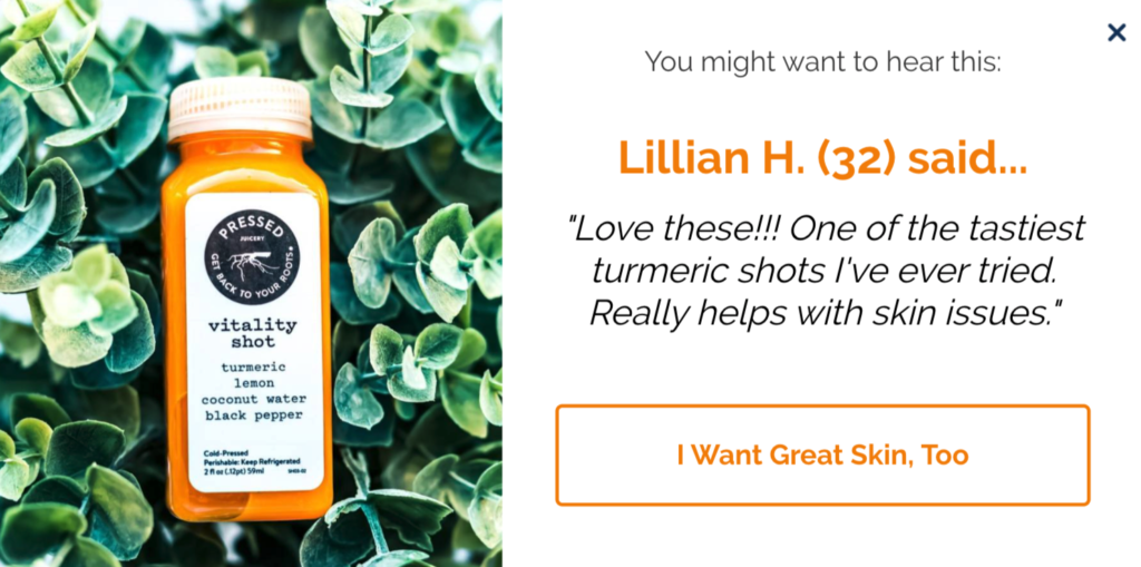
Giving the right social proof to the right prospect at the right time in the form of a website popup is oftentimes what’s needed to make a conversion from even the most skeptical of buyers.
6. Offer Help to Abandoning Visitors
Many prospects abandon their carts because of unexpected shipping costs. Others couldn’t find a coupon code or had concerns about the website’s payment security.
A small minority, though, will have questions about your products, especially if they’re complex or high-end, and for that reason, it’s worth connecting with those visitors the moment they need help.
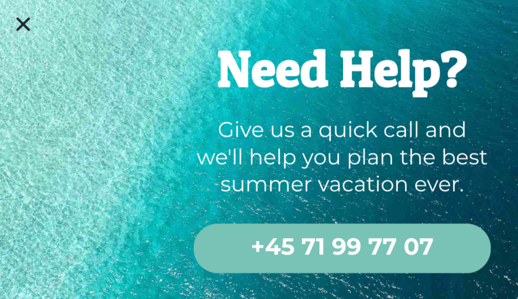
One way to do that, no surprise, is with an onsite campaign. But there’s a caveat to using them. Ideally, you only want to offer assistance if you’re available when they need help. Otherwise, visitors will be left wondering when you will reply.
We recommend creating two separate popups and scheduling them in advance based on the time of the day. For instance, during your working hours, you can show a popup inviting your visitors to get in touch, like in the example below.
And outside of office hours, you can ask visitors to leave their contact information so you can help them when you reopen. (You could even include a number for emergencies if you have one).
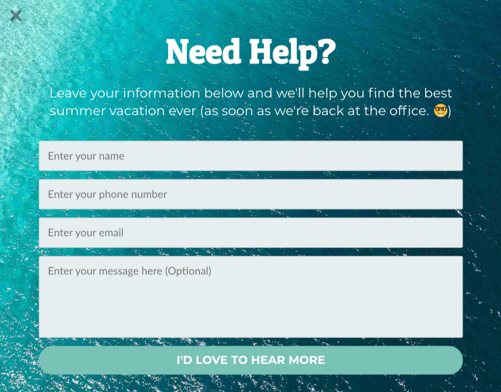
Using onsite campaigns is a rarely-used way to converse with prospects and help them make better buying decisions. You even get a chance to convert visitors who would have otherwise left your website, never to return.
7. Run Personalized Giveaways
Marketers love giveaways. Businesses expand their reach, gaining new followers in the process, and followers stand to win free prizes they might not have been privy to otherwise.
But the problem with many ecommerce giveaways is twofold:
- Giveaways rarely offer prizes relevant to all consumers; and
- Timing is sometimes an issue.
Many giveaways, for that reason, result in a hodgepodge of irrelevant, freebie-seeking email subscribers.
If you visit a store intending to buy an electric guitar, you wouldn’t be enticed to join a giveaway promising a children’s toy, right?
To make the most out of your onsite giveaways, you need to:
- Keep prizes highly relevant to certain visitors, and
- Let visitors join when deserved.
In other words, you need to identify the category your abandoning shoppers are most interested in and offer a relevant prize before they leave your website. For sentence, if a visitor has cart items from an electronics category, you could show them a popup like this:
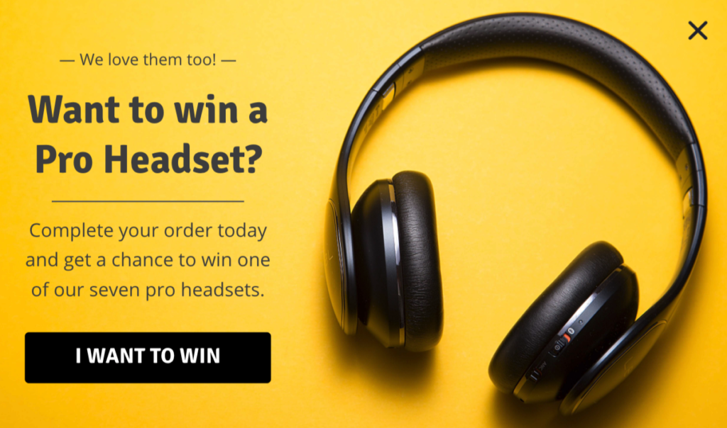
Similarly, if they’re interested in products from an apparel category, you could show a popup like this:
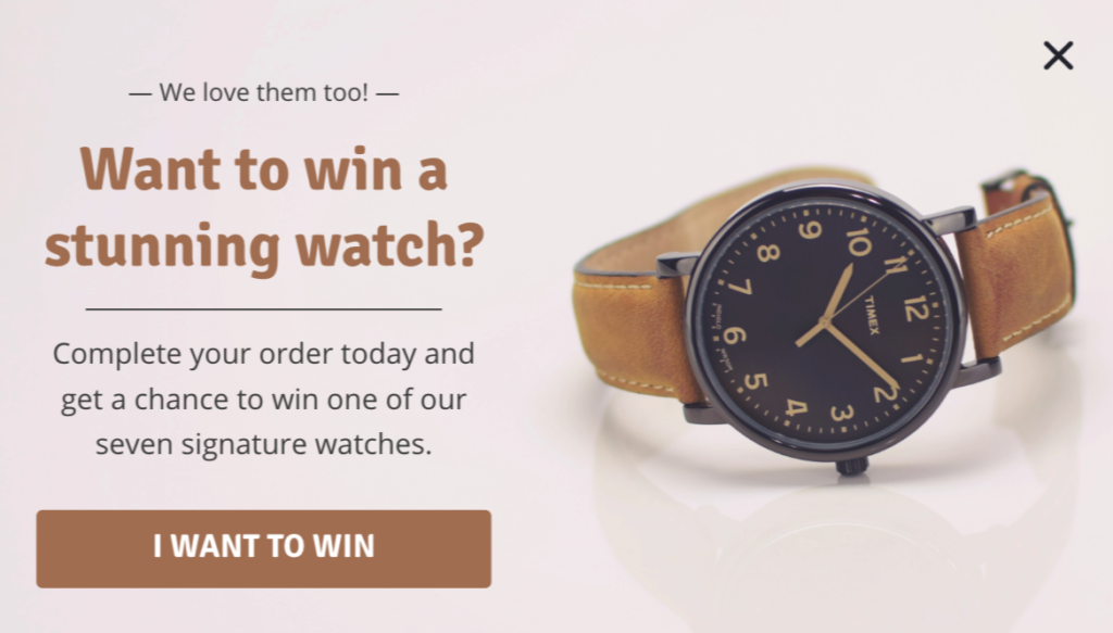
Not only will you grab your visitor’s attention with a prize of interest, but you’ll also boost the likelihood they’re complete their order and become a customer. Win. Win.

Conclusion
Abandoned cart emails are a crucial part of any good email marketing strategy. But writing good emails—emails that convert prospects into buyers and recover lost transactions—rarely happen overnight.
Instead, it’s a process of constant building, refining, and improving. Finding the right tone. Pitching a better, more relevant offer. That’s how you write a winning cart recovery email.
Learn from the above, be patient, and in no time, you, too, will have an email or sequence of emails that help you clinch even the most difficult of otherwise lost sales.


