
The e-commerce industry is absolutely booming. Recent data from Statista predicts worldwide e-commerce sales will reach over $3.45 billion by 2019 and a staggering $4.87 billion by 2021.
That’s a massive increase from just a few years ago.
So the opportunity is definitely there.
Unfortunately, conversion rates for most brands leave a lot to be desired.
The average landing page conversion rate across all industries is 2.35 percent.
However, the top 25 percent of brands are at nearly double that at 5.31 percent or higher.
And the top 10 percent are at 11.45 percent or higher.
That’s where you obviously want to be. But how do you get there?
There is a myriad of factors involved, but you could argue that a big part of finding success is constructing a rock solid e-commerce landing page.
If you can nail that part, you can increase product awareness, improve engagement and capitalize on a larger percentage of your leads.
In this post, I’m going to closely examine what all goes into the process of building a successful landing page and offer insights into what visitors are looking for.
So let’s get jump right in.

Table of Contents
E-Commerce Landing Pages vs. Product Pages
One of the first things you may be wondering is what’s the difference between an e-commerce landing page and a product page?
Is there even a discernible distinction?
Yes, there is. And it all boils down to one thing—purpose.
The purpose of a landing page is to persuade visitors to complete a specific action (e.g. buy a product, sign up for a newsletter or download a whitepaper).
“A landing page removes the distractions of a regular product page, by focusing on only one message, with one goal in mind,” writes Makiko Ara in Total Product Marketing. “The key to a successful landing page is that it has a single purpose and not multiple messages.”
Here’s a good example from content marketing platform Percolate.
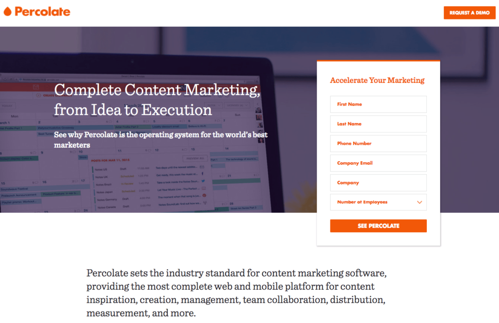
Notice that it’s only focused on getting visitors to sign up and click on “See Percolate.”
That’s it.
A product page is different because its purpose is to inform visitors about your product.
It basically serves as a starting point where you introduce your brand, and it often facilitates browsing so visitors can navigate through the rest of your site.
Ara adds, “The content is usually very general, as its mission is to appeal to the masses.”
Here’s a good example from Urban Outfitters.
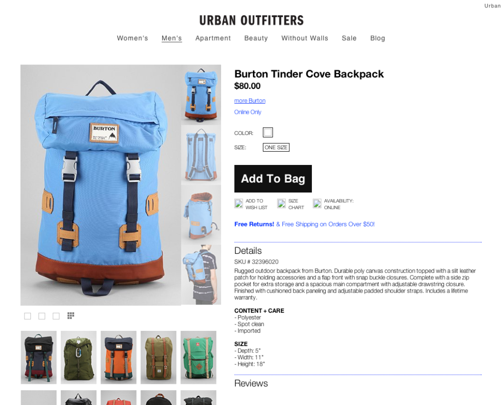
Notice how visitors can easily navigate their way to other sections of the site like “Women’s,” “Men’s,” “Apartment,” “Beauty,” and so on.
In other words, an e-commerce landing page is bottom-of-funnel and close to the final sale, while a product page is middle-of-funnel where visitors are learning about your product and exploring their options.
Understanding the key differences is critical for taking the right approach to each.
With that being said, here are what I find to be the most potent techniques for optimizing an e-commerce landing page and boosting conversions.
1. Include Only One Offer…
Again, your goal is to have visitors zero in on just a single offer.
In fact, e-commerce landing pages with multiple offers receive 266 percent fewer leads than those with just one.
It’s all about grabbing and holding a visitor’s attention and ensuring that you’re not throwing too much at them at once.
So it’s critical that you keep it super simple and focus on just one offer at a time.
Shopify does this well with this landing page.
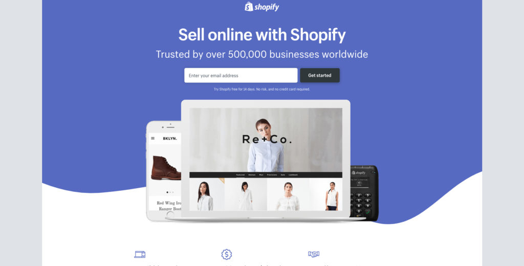
There’s really no confusion as to what they’re supposed to do so people don’t have to overthink it.
So I can’t stress enough just how important this is.
Remember that you can always create other landing pages.
In fact, that’s something that I highly recommend doing.
The more the merrier, and brands see a 55 percent spike in their number of leads by increasing the number of landing pages from 10 to 15.
It’s a good idea to create highly targeted landing pages for all of your core products and amplifies your conversion opportunities.
Just be sure that you’re only featuring one offer for each page.
2. …But Provide Multiple Call-to-Action (CTA) Buttons
Although you’ll only want to include one offer, there should be multiple CTA buttons.
Each button should feature the exact same CTA but should be placed in different positions throughout the landing page.
This is a technique that Hearst Magazines pulled off flawlessly with this landing page.
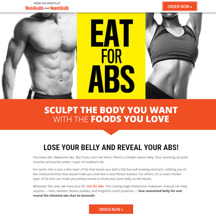
Notice how there are two “Order Now” CTA buttons at the top and bottom (there are even more scattered throughout the rest of the page).
All of which direct visitors to the order section at the bottom where they can conveniently enter their shipping and payment information.
It’s all incredibly seamless and allows prospects to get to where they need to go with very little effort on their end.
And the less effort that’s required, the higher your conversions should ultimately be.
3. Create it for a Targeted Segment
Personalization is everything these days.
Unlike a product page which is more generic in nature, a landing page should be hyper-targeted and go after a specific segment of your customer base.
Ideally, every single landing page you make will have a particular segment in mind.
Take this one from Salesforce for example.
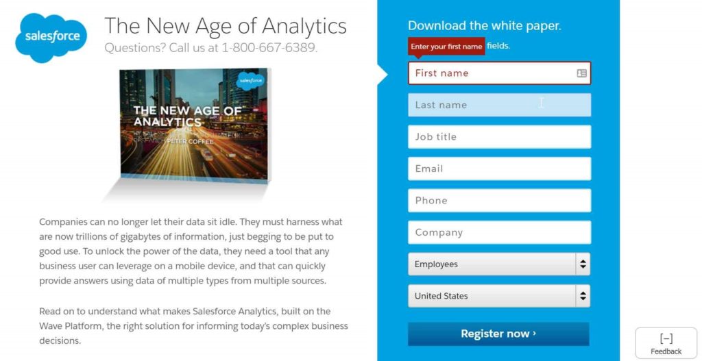
It specifically targets prospects that are interested in analytics.
Although they offer several different products like sales, marketing, and collaboration software, this particular landing page is meant to appeal to those seeking high-level analytics.
And you can pretty much bet that this had a positive impact on their conversions.
If it was generic, however, that conversion rate would likely be much lower.
So this is a strategy you’ll definitely want to implement.
Most consumers don’t want to fuss with offers that aren’t specifically tailored for them.
This is only wasting their time and will lead to squandered opportunities.
But if you nail it and design each landing page with a unique segment in mind, you should get noticeable results.
A study by Evergage even found that 88 percent of US marketers saw measurable improvements through personalization initiatives.
Further, 53 percent saw a lift greater than 10 percent, and 10 percent witnessed a lift greater than 30 percent.
4. Remove Site Navigation
Besides clear CTAs, there shouldn’t be any other click-through opportunities.
This is only going to provide a distraction that will inevitably take the visitor’s focus off of what’s important—converting.
One of the easiest ways to eliminate distractions is to remove site navigation on your e-commerce landing page.
That way people will be far less inclined to click on other links and hop over to other pages on your site.
Take this example from peer-to-peer lending company Lending Club.
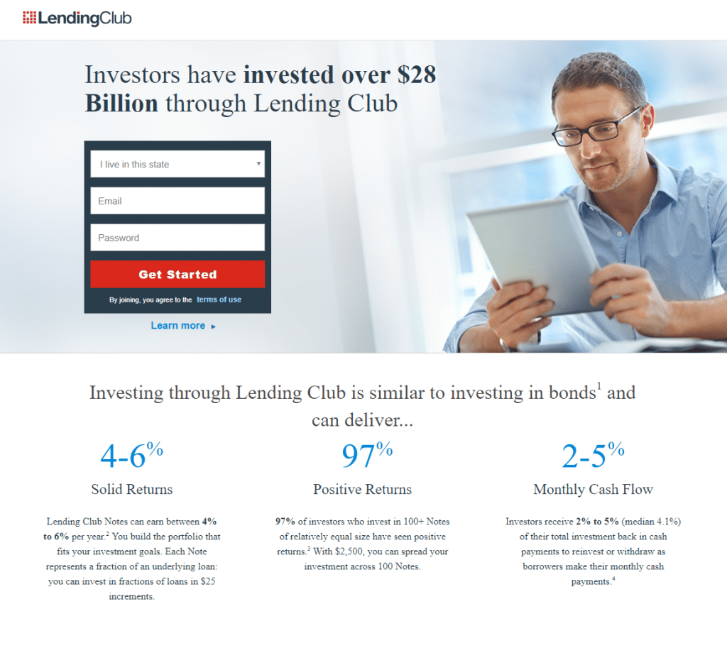
It’s really bare bones, and the straightforward design encourages people to sign up and nothing else.
5. Show Pricing Information
While this won’t apply to non-sales landing pages like signups and downloads, it can be hugely beneficial to include the pricing information on those that are directly selling products.
After all, most people want to know how much something is going to cost before they commit to making a purchase.
If they’re not sure, it can create anxiety, and you can get that a sizable percentage will simply leave.
But including the pricing information (especially in a way that’s easy to digest) can improve conversions dramatically.
In fact, KlientBoost explains, “Showcasing your price on your landing page can improve conversion rates by over 100 percent, compared to simply not showing it.”
This is something that Spotify does really well.
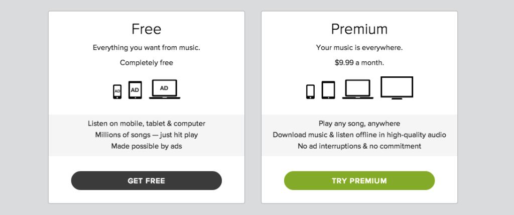
With just a quick glance, people can see the difference between their “Free” and “Premium” plans to see which is the better option for their needs.
In turn, they should feel more comfortable signing up.
6. Address Shipping Concerns
While we’re on the topic of transparency, a lack of shipping information can also be a dealbreaker.
Before they take the plunge, most people want to know what the total cost will be, including shipping.
If they’re not sure exactly what that number is, they may be inclined to go elsewhere.
In fact, 25 percent of customers cite an unexpected shipping cost as being a key reason for shopping cart abandonment.
So you can do yourself a huge favor by clarifying what the shipping cost will be along with any other adjustments that will impact the total price—like this.
7. Consider Free Shipping
This brings me to my next point.
Free shipping is a big plus and is often a deciding factor in whether or not someone chooses to go through with an order.
When unburdened by the additional cost of shipping, many visitors will feel compelled to purchase.
It’s really that simple.
A 2016 study by Walker Sands Communications actually found that nine out of 10 digital shoppers say that free shipping was their number one incentive to shop online more frequently.
So this proves firsthand just how big of an impact free shipping can have, and it can be huge for getting someone over the hump.
Although it will obviously take a slice out of your profit margins, it’s wise to at least consider free shipping because many brands find it to be advantageous in the long run.
8. Add a Video
You have only a finite amount of time to get your point across on a landing page and prove why a person should complete the desired action.
You need to present some very critical information and in a hurry.
One of the best ways to do that is through video.
Most people eat it up, and nearly half (44 percent) now view a video when searching for a product.
Millennials, in particular, are especially fond of it, with seven in 10 watching a company video when shopping online.
So it should come as no surprise that it can help improve e-commerce landing page conversions.
This is a technique that Crazy Egg has executed with perfection.
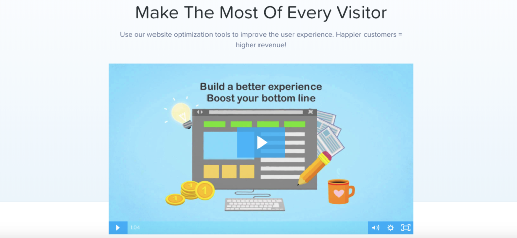
After arriving on the landing page, the first thing visitors see is a video that explains how the product works and the key benefits of using it.
Everything is presented in a clear, concise manner, which eliminates many of the question marks that potential users may have.
Just be sure to do what Crazy Egg does and keep it brief (their video is just over a minute) because many of your visitors will be reluctant to watch a lengthy video in its entirety.
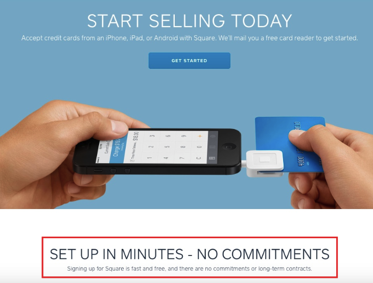
9. Make it Easy
There’s one last thing that I need to touch on and that’s the simplicity factor.
We live in a complicated world, and anything you can do to streamline things for customers should prove beneficial.
To prove this point, 28 percent of US online shoppers have actually abandoned an order at some point because of too long or overly complicated checkout process.
Some specific actions you can take include:
- Writing crisp, clean copy that’s easy to read
- Shortening forms and only requiring people to fill out essential information
- Making CTAs clearly visible so visitors don’t have to struggle to find them
And don’t forget to tell prospects just how simple and pain-free it is to do business with you.
This can certainly work to your advantage.
Square does a great job at this when they explain that new customers can get set up in minutes and there are no commitments.
Conclusion
While an e-commerce landing page is similar in many ways to a product page, the two have very different purposes.
A product page is mainly intended to introduce your brand and generate some initial interest, whereas a landing page is meant to present a singular message and get people to complete a very specific action.
So you need to have the right approach when constructing a landing page and an understanding of what your visitors are most receptive to.
The strategies I’ve outlined here should cover all of the angles so that prospects can fully absorb your offer and grasp the features and benefits.
That way they’ll be more responsive, which should result in an upswing in conversions.

