
Does this sound familiar? You’re attracting a decent amount of traffic to your e-commerce site but only a handful of your visitors become customers.
If the answer is yes, you’re not alone.
On average, only 2.42% of e-commerce site visits convert into purchases.
And in many cases, poorly designed product pages are to blame.
An under-optimized product page will cost your online store lots of potential revenue.
Optimizing your product pages with best practices will give your visitors the final push to take action and move them down your sales funnel.
Good e-commerce brands implement at least one CRO technique on their product pages. They use customer testimonials, trigger visitors’ fear-of-missing-out, make product recommendations, and so on.
Exceptional e-commerce brands combine these techniques and add something more to them.
Here are 13 of the best e-commerce product page examples we’ve seen and why they work so well.

What Makes a Product Page Effective?
An effective product page does more than display your product—it persuades visitors to buy. The best product pages combine clear information, compelling visuals, and strategic conversion elements that guide shoppers toward purchase.
The 8 Essential Elements of High-Converting Product Pages
1. High-Quality Product Images
Multiple angles, zoom functionality, and lifestyle shots showing the product in use. Studies show products with 6-8 images convert better than those with fewer. Include close-ups of key features, different color options, and context shots that help customers visualize the product in their lives.
2. Compelling Product Title and Description
Clear, benefit-driven headlines that immediately communicate what the product is and why it matters. Descriptions should answer questions, not just list features. Focus on how the product solves problems or improves the customer's life. Use scannable formatting with bullet points for key benefits.
3. Clear Pricing and Value Proposition
Transparent pricing with any discounts clearly displayed. Show the value ("Save $50") rather than just stating prices. If offering installment payments through services like Afterpay or Klarna, display those options prominently. Compare to original prices when running sales to highlight savings.
4. Social Proof Elements
Customer reviews, ratings, testimonials, and user-generated content. 91% of consumers trust reviews as much as personal recommendations. Display your star rating above the fold, show the number of reviews, and make it easy to filter reviews by rating, verified purchase, or customer attributes.
5. Strong Call-to-Action (CTA)
Prominent "Add to Cart" or "Buy Now" buttons in contrasting colors. Make it obvious what action you want visitors to take. The button should stand out visually and use action-oriented language. On mobile, consider a sticky CTA that remains visible as users scroll.
6. Trust Signals
Shipping information, return policies, security badges, and guarantees. Address common objections before they arise. Make it clear when the product will arrive, how much shipping costs (or that it's free), and what happens if customers aren't satisfied. Display payment security badges and any relevant certifications.
7. Product Specifications
Size charts, material details, dimensions, and technical specs. Give shoppers all the information they need to make confident decisions. For apparel, include fit information and model measurements. For furniture, show dimensions in context. For electronics, list technical specifications clearly.
8. Strategic Cross-Selling and Upselling
Recommend complementary products or premium versions. Done right, this increases average order value without feeling pushy. Show items that genuinely enhance the original purchase—matching accessories, required add-ons, or bundles that offer savings.
13 Product Page Examples You Need to See
Now let's look at how top ecommerce brands put these principles into practice. Each example highlights a specific strategy or technique you can adapt for your own product pages.
1. Lush: Educate Your Visitors with Content
There’s one thing you should always keep in mind when optimizing your product detail pages: everything you do has to be in line with your value proposition.
Before starting, ask yourself what value you want to convey to your site visitors. Is it your fast shipping option, bulletproof satisfaction guarantee, broad product range, natural ingredients, or something else?
Knowing this well, Lush builds their product pages around their nature-conscious products and fresh ingredients.
That’s why they add a detailed list of ingredients under their product descriptions:
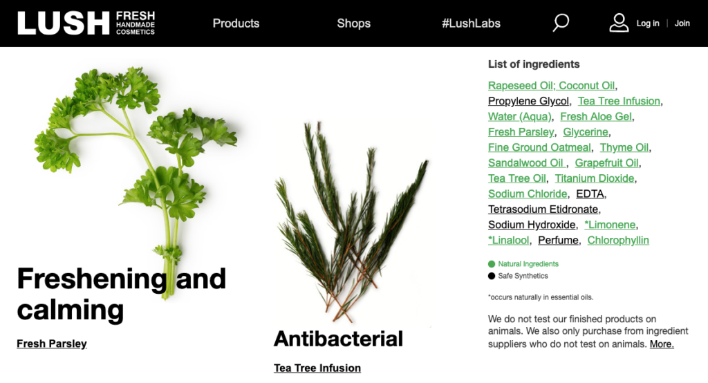
The company both informs and educates site visitors about their products.
And the education goes further with their content.
When you scroll down the page, you’ll see a “Related Article” section:
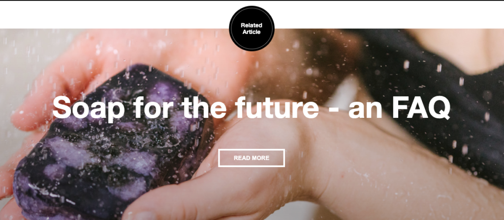
In this example, the company explains transparently how and why they changed their product formula and educate the readers about their ingredients.
To further support their position as a conscious brand, they use badges and certifications, which resonate with their buyer persona:

Finally, Lush goes beyond classic product videos and greet visitors with a featured video showing the product in action:
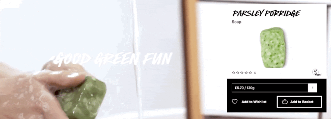
This way, the product becomes more concrete and easy-to-understand for their visitors.
Takeaways
- Keep your product pages in line with your value proposition.
- Write detailed and helpful product descriptions.
- Educate your visitors with content and link to relevant content on product pages.
- Use featured videos to show how to use your products.
2. Allbirds: Collect Warm Leads on Product Pages
We all want what we can’t have.
A product suddenly becomes more attractive when it’s no longer available. And the scarcity of an item makes it more desirable.
That’s why Allbirds differentiates between their classics and limited edition items and highlights the scarcity of the latter:
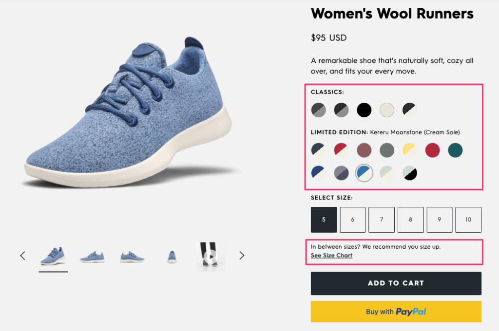
To help site visitors better understand their products, the company offers a size chart that opens on the same page. This way, they prevent the risk of losing the visitor on a new tab.
Allbirds removes the barriers to purchase by offering more than one payment option on their site. And visitors can see those options before going to the checkout page.
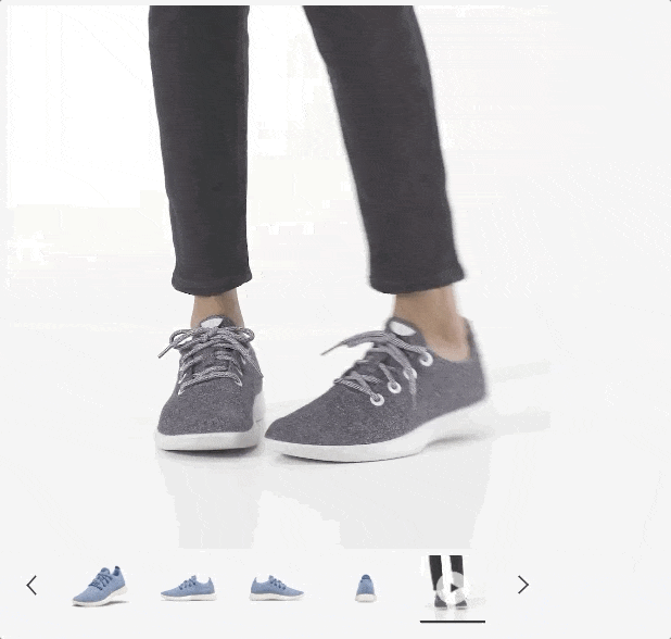
In addition to displaying the product from multiple angles, the company also uses a model video to show how the shoes look and feel when you walk in them:
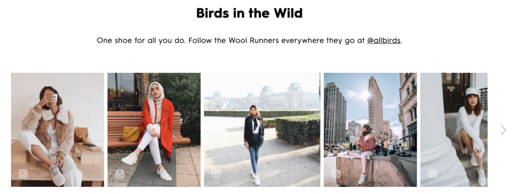
Scrolling further down the page, you see a section dedicated to user-generated content that shows the products in real life:
Finally, Allbirds uses out-of-stock notifications to grow their email list with warm leads:
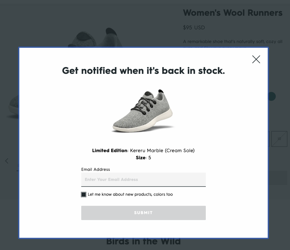
In addition to notifying you when the item is back in stock, they also ask if you’d like to join their email list. Yet, they do it with a value-driven copy (“Let me know about new products, colors too.”) and a pre-selected checkbox.
This way, the company collects highly interested leads that they can target with personalized email campaigns.
Takeaways
- If you’re selling products limited by time or stock, make them stand out on your product pages.
- Offer charts and guides that open on the same page.
- Consider adding multiple payment options to your e-commerce site.
- Use a video editor to create product promos and short ad videos to highlight the item in action.
- Curate user-generated content with a third-party app, such as Olapic or Curalate.
- Implement out-of-stock alerts and ask users for permission to add them to your email list.
3. Away: Explain Product Options in Detail
How do you understand if a product is worth checking out?
If you’re like most of us, you look at the reviews it has.
According to one survey, 91% of consumers trust reviews as much as recommendations from personal contacts.
Away knows the importance of product reviews. That’s why the average product rating and the number of reviews is the first thing you see when you visit one of their product pages:
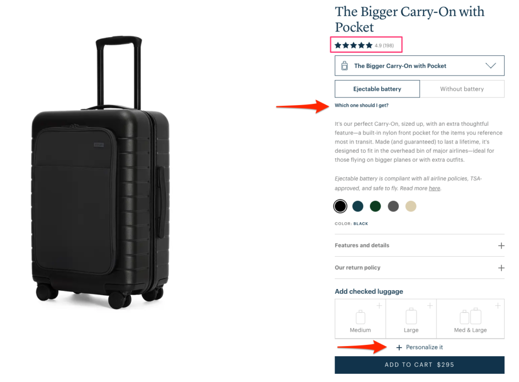
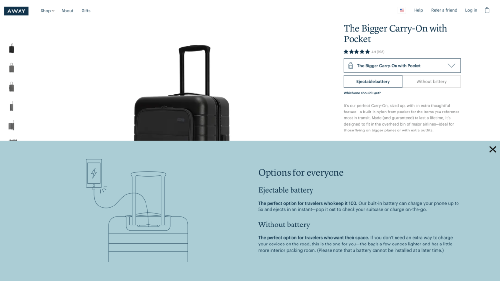
When they offer two different product options (ejectable or without battery), they clarify what these terms mean to the reader.
Clicking the link “Which one should I get?” opens a slide-in text and you can decide which option is best for you:
Away also hides their “Features and details” and “Our return policy” sections by default to avoid taking up too much space. If you’re interested in finding out more, you can simply click the plus button and read about it.
Lastly, they offer a personalization option before you add the product to your cart.
Personalization is a great way to upsell prospects on your product pages and increase your average order value.
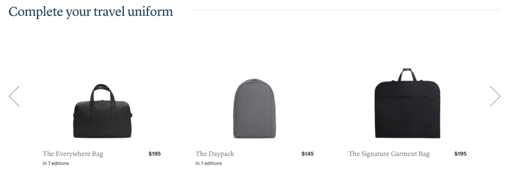
The company also cross-sells in two different ways:
- Through the “Add checked luggage” section above the Add to Cart button; and
- Offering complementary products with compelling copy:
Away doesn’t only offer a Reviews section at the end of their product pages. They also allow visitors to ask product-related questions and display their answers in that section.
This way, they remove the visitors’ doubts and help them make better purchasing decisions.
Takeaways
- Display product ratings under product headlines.
- If you’re offering different product options, explain them clearly.
- Try hiding longer pieces of information to save up space.
- Consider offering a personalization option for your products.
- Recommend products that really complement the original item.
- Allow visitors to ask questions on product pages and answer them as soon as possible.
4. Ban.do: Add Persuasion Triggers to Product Images
When a product is popular or trending, we think that it’s for a good reason.
Bestsellers gain legitimacy because they have the approval of past customers.
That’s exactly what Ban.do tries to highlight on their product pages:
They use the bestseller tag on both product listing and detail pages to combine social proof with the fear of missing out (FOMO).
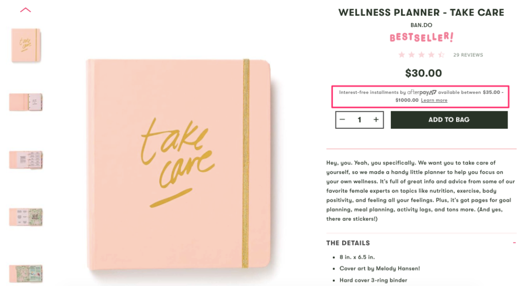
Similar to Allbirds, the company offers more payment options but with a different approach.
Using a third-party service called Afterpay, they allow customers to pay in installments. This allows visitors to make easier purchase decisions and help them convert into customers.
They write product descriptions with a friendly and personal tone which is in line with their brand voice.
The company also cross-sells with a subtle tone that reads “Goes Well With”:
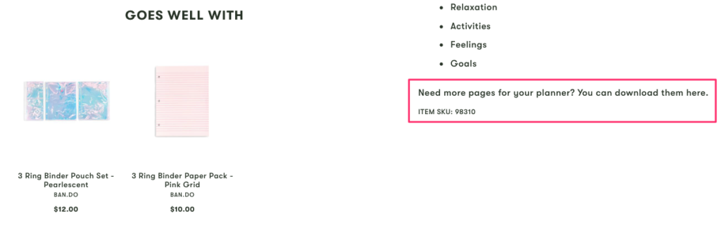
And what’s better is, they offer free add-ons whether or not you purchased the product.
If you need more pages for your planner, you can download and print them for free. This way, you never have to think if you’ll run out of pages because Ban.do removes that obstacle for you.
Finally, the company uses the authority of experts and user-generated content to create social proof:
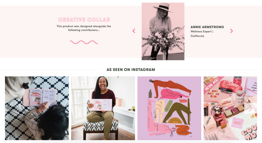
First, they borrow authority from several experts who contributed to the design of this product. Then, they display happy customers who use the product to create further social proof.
Takeaways
- Use “bestseller,” “trending,” or “selling fast” tags on product pages to create social proof and a sense of urgency.
- Consider implementing a third-party tool to allow customers to pay in installments.
- Write product descriptions that align with your brand’s voice.
- Use a subtle tone to cross-sell without being salesy.
- Offer free additions or refills that complement the product.
- Show the faces of your employees and highlight their expertise within the field.
5. Brooklinen: Reduce Cart Abandonment with Messenger
As I wrote before, top e-commerce brands follow best practices AND add something extra.
Take a look at this product page by Brooklinen:
Similar to many other examples above, they display product ratings and the number of reviews.
Since they offer different weight options, they help you choose the best one without you having to leave the page.
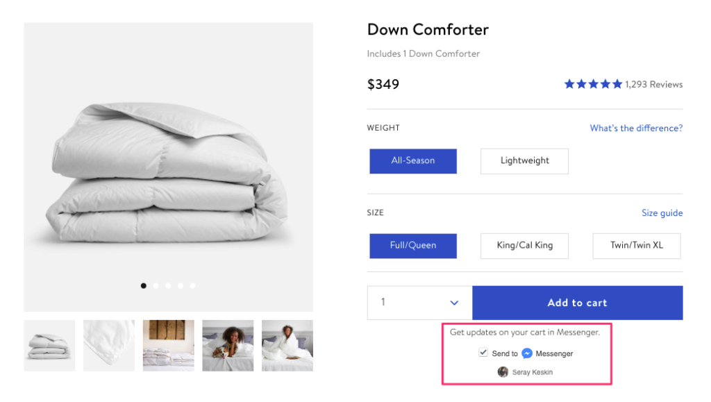
Now that you’re persuaded by the product’s five-star rating and you’ve easily made a choice between the two options, you’re ready to add the item to your cart.
That’s when Brooklinen offers you the option to get cart updates on Facebook Messenger.
When you select that option, they send you a message shortly after:
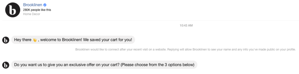
When you don’t complete your order, first, they remind you about it, and then, they offer you an exclusive deal.
This is the message you get after saying “yes” to that offer:
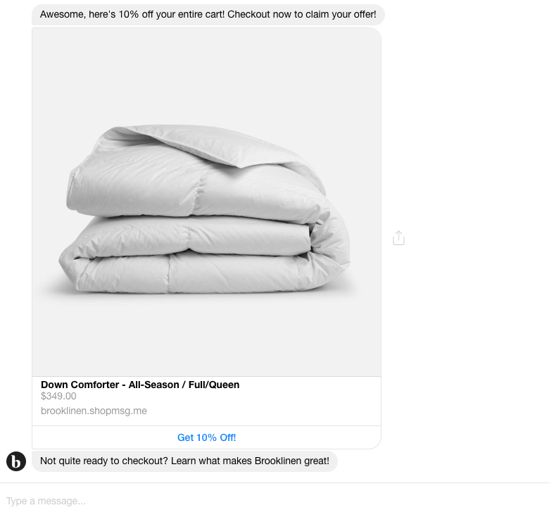
You get a 10% discount that is automatically applied to your cart on checkout. This is a great way to reduce cart abandonment and convert prospects into customers.
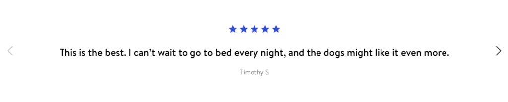
Brooklinen also wants to make the most of their product reviews.
That’s why they display selected testimonials on a slider before the Reviews section:
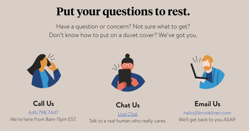
Last but not least, they explain how dedicated they are to answer any questions you might have before buying their products:
Takeaways
- Recover abandoned carts on Messenger with third-party tools, such as Klaviyo and Octane AI.
- Pick your best customer testimonials and display them separately on your product pages.
- Invite visitors to ask you any questions before making a purchase.
6. Fabletics: Evoke Curiosity to Increase Signups
Price is among the top three reasons why American consumers buy from a particular e-commerce site.
If you’re offering better prices than your competitors, or, if you have discounted items on your online store, make sure your visitors are aware of it.
One way to highlight your price advantage is to contrast it with the original price.
Here’s how Fabletics does it on their product pages:
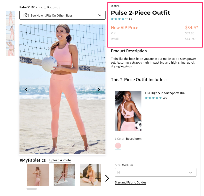
Their “New VIP Price” is discounted twice compared to the retail price. And it encourages visitors to consider buying the product (together with a VIP subscription.)
Even though companies try to display their products from as many angles as possible, it won’t look the same when two different people wear the same thing.
That’s why Fabletics help you guess how their products might look on you with the option to choose different models:
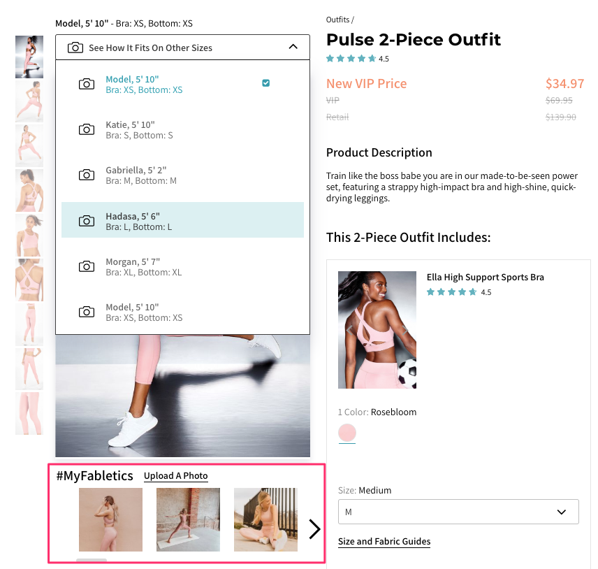
And if you want to see the products on real people, rather than only models, Fabletics curate customer photos under the model pictures.
When you move down to product recommendations, you’ll see that the company hides some of the items which can be unlocked upon signing up:
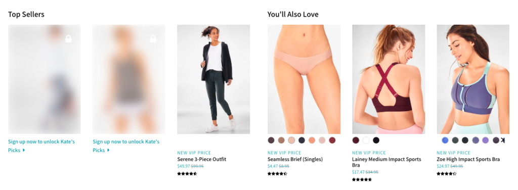
Hidden products evoke a feeling of curiosity and a strong sense of membership exclusivity.
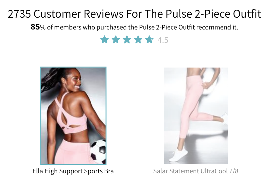
Using a summary section on top of product reviews, the company helps you get a quick overview of the product without reading all of the testimonials:
Takeaways
- Compare your membership prices with regular retail prices.
- Add multiple product pictures in different contexts.
- Use customer photos as part of your product photography.
- Add a few hidden products or articles that can only be unlocked upon signing up.
- Provide a short summary of product reviews.
7. Glossier: Show Your Products in Real Life
An optimized product page doesn’t only help you convert more visitors into customers.
It can also boost your revenue by increasing customers’ average order value.
That’s why Glossier tries to upsell you on product pages by offering product bundles:
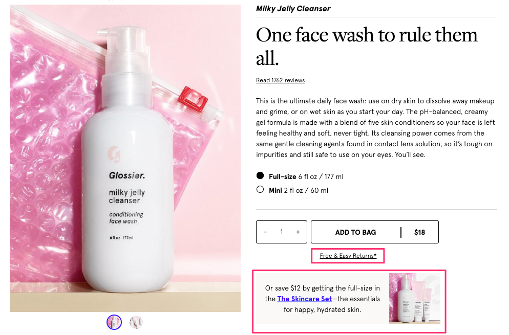
While doing that, the company gives customers a valid reason to choose the more expensive option: saving $12.
If you’re a rational consumer, you’ll consider buying the set, even though it’s more expensive (and Glossier will earn more from your order).
Notice how the company adds “Free & Easy Returns” information under the buy button. This way, their visitors can more easily buy a product on their webshop because Glossier removes an important obstacle for them.
The company goes beyond customer photos to show the product in action and, instead, displays the product in real life:
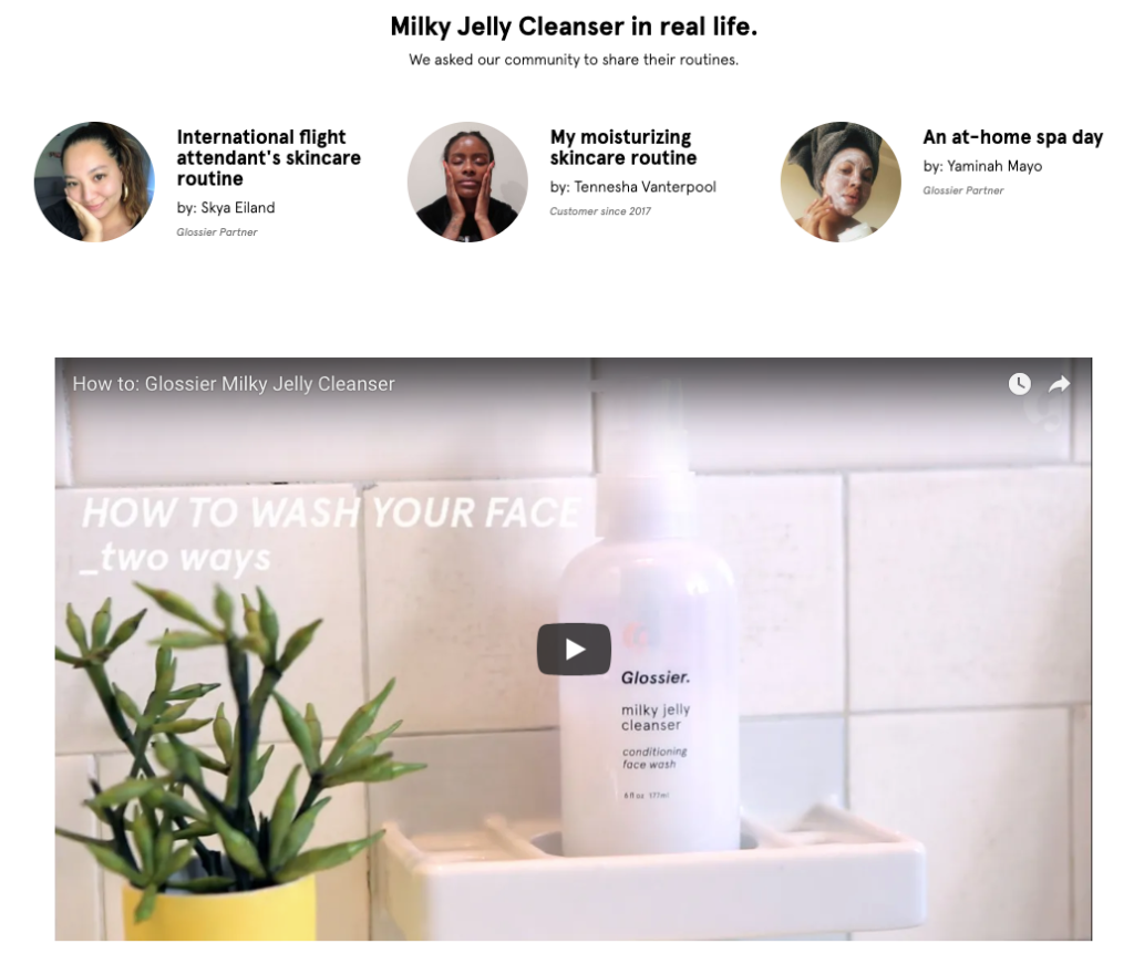
Glossier creates content with their customers and partners where they explain how they use the company’s products in their everyday lives. Then, the company uses that content on relevant product pages.
They also embed a short video where the company’s CEO walks visitors through how she uses the product. It’s a simple yet personal touch that educates visitors about Glossier’s products.
Finally, Glossier lets visitors easily read and filter product reviews:
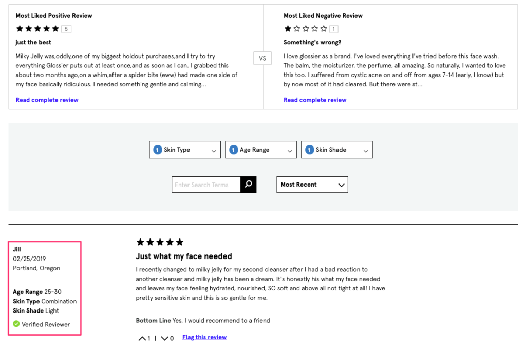
They display the most liked positive and negative reviews side-by-side and build trust for the brand.
Their product reviews are easy-to-filter according to skin type, age range, and skin shade to make the testimonials more relevant and valuable to the reader.
Takeaways
- Upsell on product pages by highlighting price savings.
- Make your shipping and return information easily visible.
- Collect insights from your customers about how they use your products, and turn them into site content. Then, link to your content on relevant product pages.
- Add filters and a search function to your product reviews to make them easier to read through.
8. Vinomofo: Help Customers Make the Most of Your Products
As I mentioned in Example #6, if you’re offering better prices than your competitors, make sure your visitors know about it.
Here’s how Vinomofo contrasts their offer with the full retail price and focuses on how much you’ll save when buying their product:
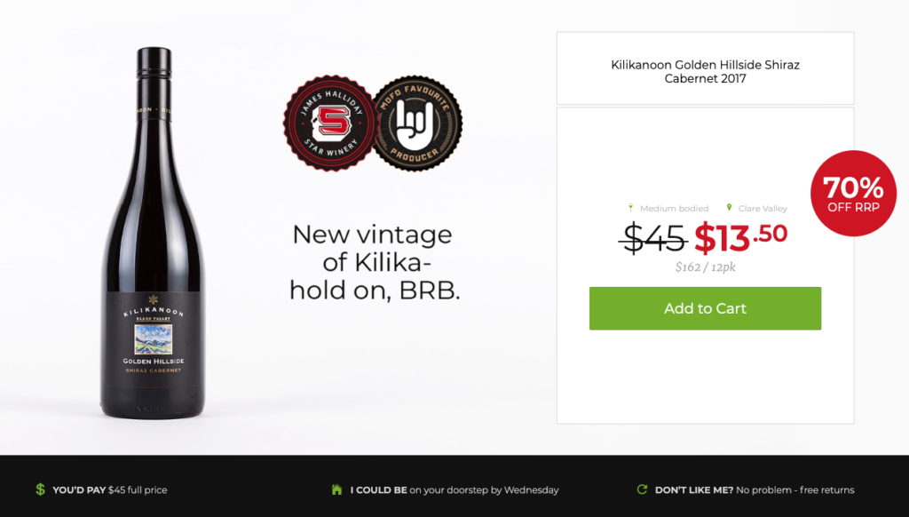
The company gives visitors an estimated delivery date to set expectations and remove any doubts.
Next, they guarantee customer satisfaction by offering free returns.
When you move down the page, you see that they also promise an unbeatable price:
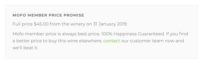
With these small additions, Vinomofo eliminates any concerns visitors might have about delivery, returns, and price.
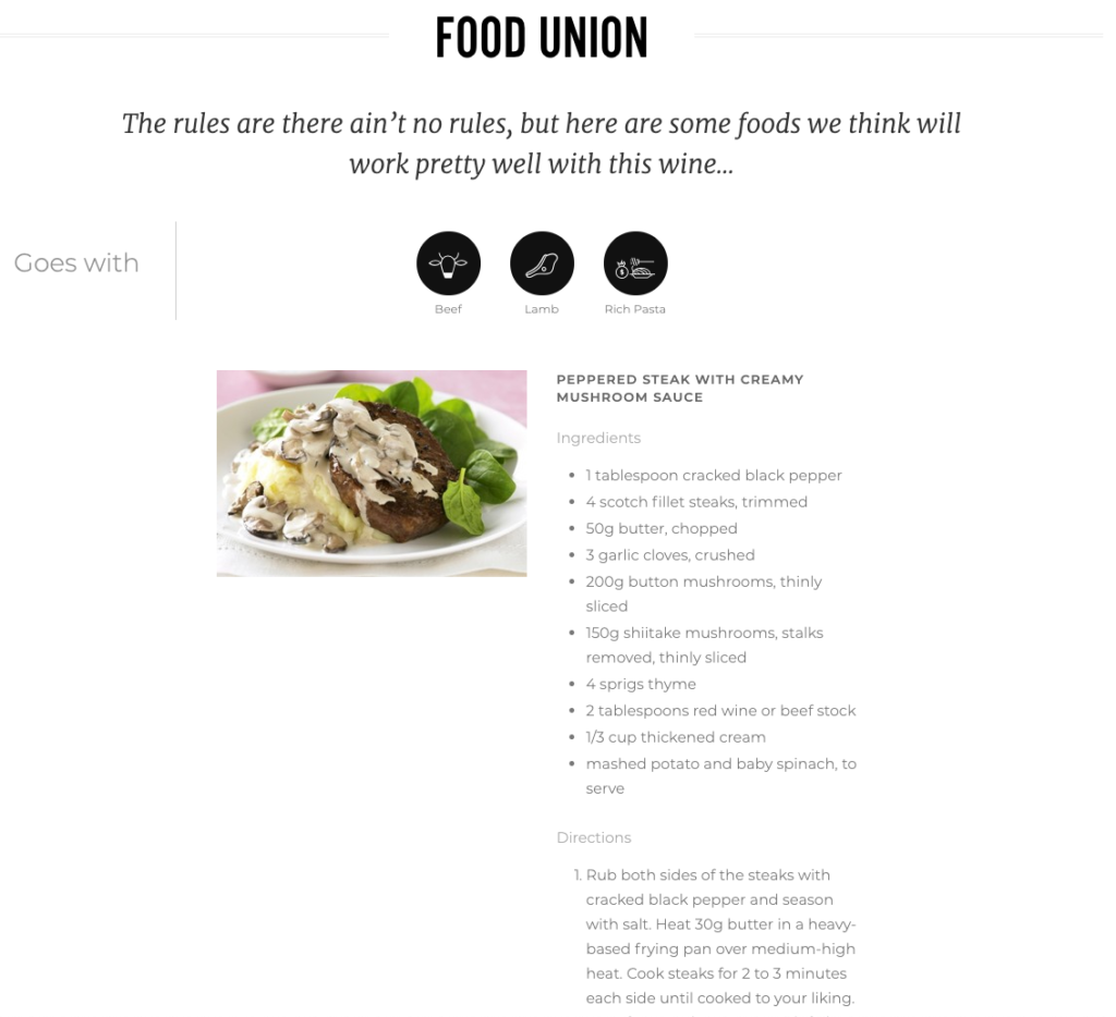
On the rest of the page, Vinomofo shows that they genuinely want to be useful to their customers.
Instead of simply suggesting food pairings, they actually give recipes you can recreate and enjoy your wine with:
In addition to “food union,” they also paint a picture for you with the “life union” section:
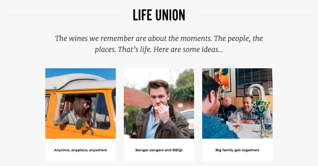
Now you know that you’re not only buying wine—you’re buying a great experience.
Lastly, they pick a song that goes well with that product so that you can enjoy those moments better:
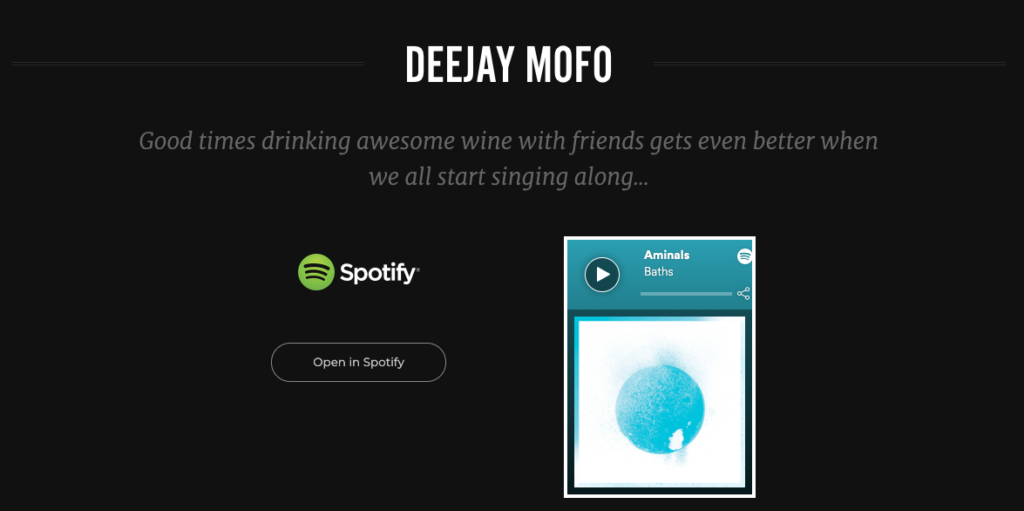
It’s a simple tactic that you can duplicate on your e-commerce site, and it proves that you’re willing to go the extra mile for your customers.
The key is showing your customers how they can make the most of your products and simply being useful to them.
Takeaways
- Compare your discounted prices with full retail prices and focus on the savings.
- Give visitors an expected delivery date.
- Consider offering free returns and a price guarantee.
- Make suggestions on how to make the most of your products.
9. Bellroy: Help Visitors Make Better Decisions
Online shopping carries a certain amount of risk for consumers.
They can’t touch or try on products as they can in brick-and-mortar shops.
Luckily, many online stores have found a smart way around this and Bellroy is one of those companies:
The company’s goal is simple: They try to help you as much as possible so that you can make better-informed purchasing decisions.
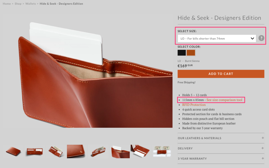
They offer customers two size options based on their wallets’ use cases.
Assuming that you wouldn’t know the exact dimensions of your national currency, Bellroy helps you find the best option for you.
When you click the question mark symbol, a text pops up on the same page and gives you more information:
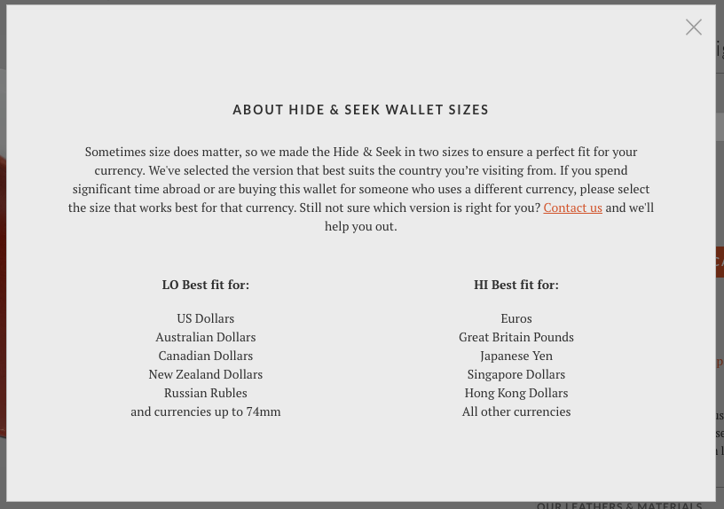
If you’re still unsure, Bellroy invites you to contact them and they’ll be happy to help you out.
Bellroy also helps you picture the product better by using a size comparison tool:
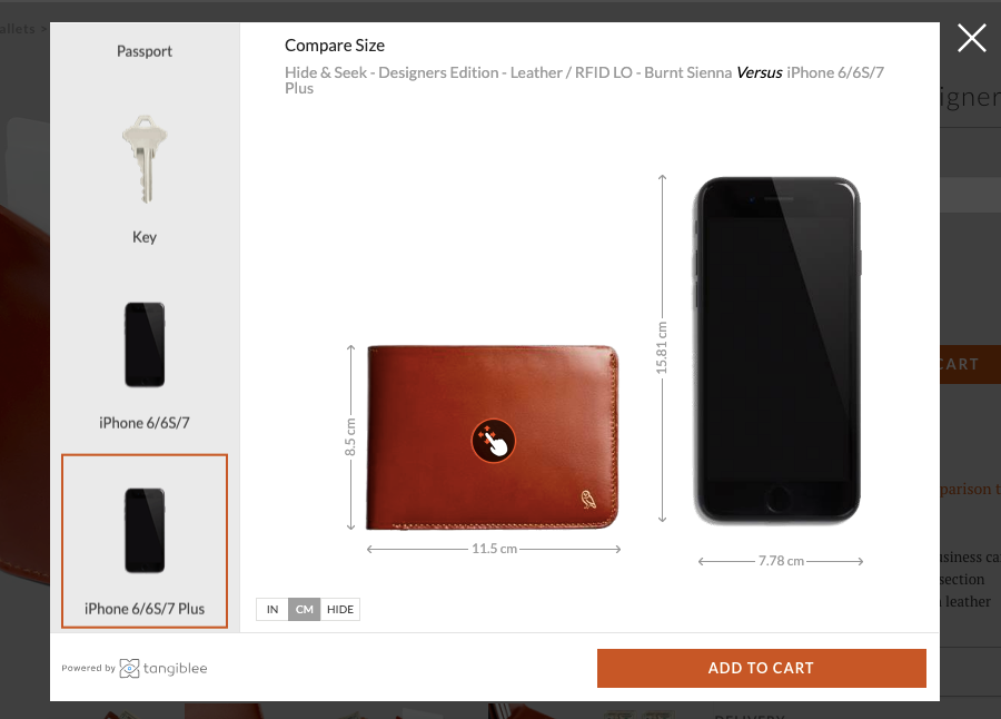
Using a third-party service, called Tangiblee, the company lets you compare the product with some of the items you might have lying around, such as an iPhone, a key, or a credit card.
Since customers can now picture the product in their minds, there’s a smaller likelihood that they’ll be disappointed when they receive it.
Takeaways
- Guide your visitors to choose the best product option for them.
- Explain the different options in detail by using real-life examples.
- Ask visitors to reach out to you if they need further help in choosing a product.
- Compare your product sizes with simple items or use a third-party tool, such as Tangiblee.
10. Missguided: Cross-Sell with Complementary Products
When a visitor lands on one of your product pages, it often means that they’re interested in your online store and considering buying from you.
A gentle nudge can move those visitors from consideration to the decision stage of your marketing funnel.
Often, persuasion triggers are the perfect nudge you need on product pages.
Take a look at this example by Missguided:
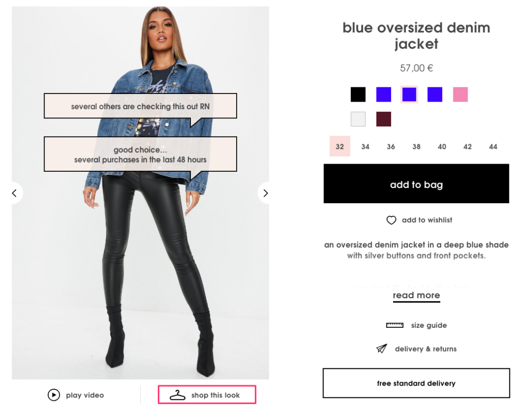
They combine social proof with scarcity by adding labels on product images.
First, they affirm your interest in the product by saying “good choice”. Then, they support it with social proof by writing “several others are checking this out right now.”
Although they don’t directly tell you to hurry up, knowing that many others are viewing the product creates a sense of urgency without disturbing you.
Missguided aims to cross-sell on product pages through the “shop this look” option:
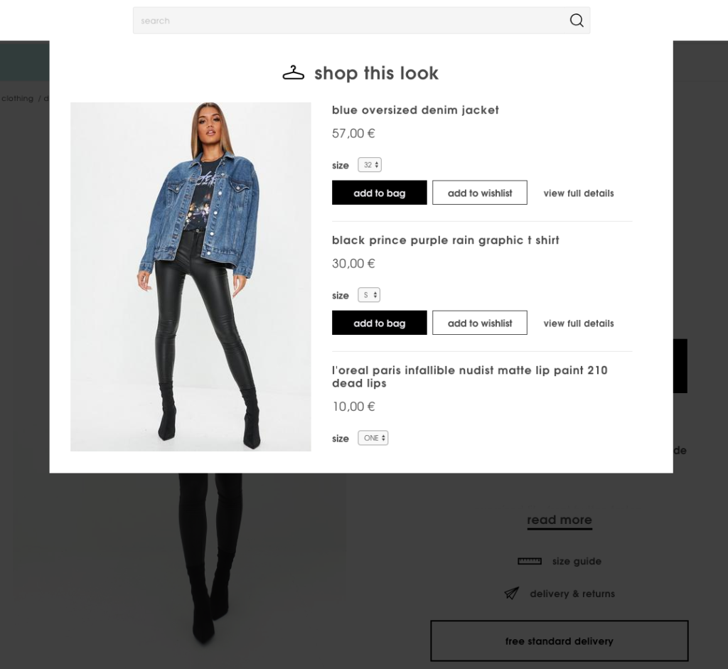
When you click the button, you can quickly view the other items the model is wearing and add them to your cart. And the best part is, you can do that without leaving the page.
Takeaways
- Add persuasion triggers to product images.
- Cross-sell complementary products without forcing visitors to leave the product page.
11. Forever 21: Use Customer Feedback in Product Descriptions
When you’re writing product descriptions for your online store, you have an idea about your products.
You can guess how a sofa might look in an average living room or how a dress might fit an average person.
But you are not your customers.
In some cases, customer reviews can give you valuable insights about your products.
Here’s how Forever 21 uses customer feedback on their product pages:
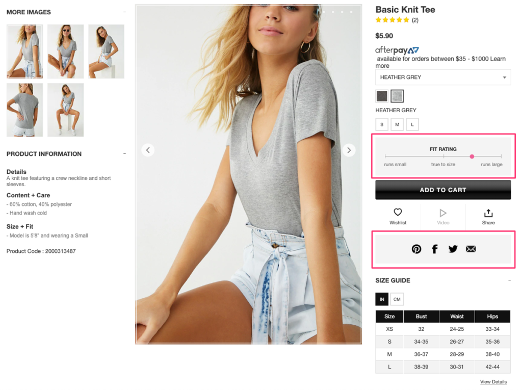
Under the color and size information, the company displays a dynamic “Fit Rating” for their products. This way, their visitors know what to expect from the product so they can make more accurate decisions.
What’s more, the rating is updated based on real customer reviews.
The company also lets you share the product on social media and via email in case you want to get a second opinion or make a suggestion.
After the basic product information, you’ll see a short section with the headline “Why did you choose this?”:
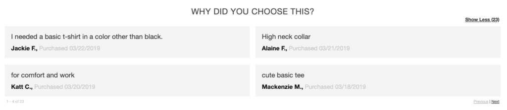
Here they display quotes from real customers explaining why they bought the item in one sentence.
It’s a quick and simple way of collecting product reviews and using them to persuade potential customers.
Takeaways
- Update your product descriptions based on customer reviews.
- Add social sharing buttons to product pages.
- Ask customers to write one or two words about why they chose that product.
12. Pandora: Add a “Hint” Option to Product Pages
Some purchases require more than one visit. And some decisions involve more than one person.
If you’re selling giftable products on your e-commerce site, you should make it easy for your visitors to drop a hint to their friends and family.
Here’s how Pandora does that successfully:
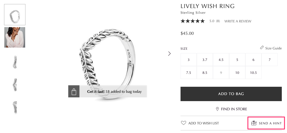
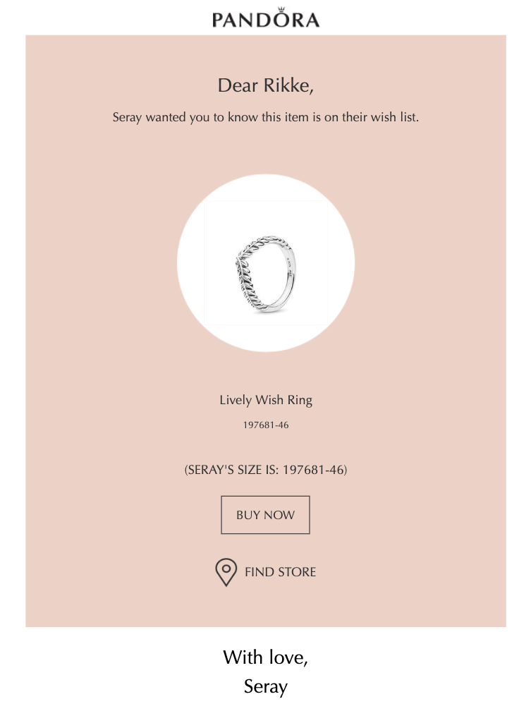
In addition to using product ratings, a size guide, and persuasion triggers, Pandora offers a “Send a Hint” option on their product pages.
When you click the button, a form with a pre-written text opens on the same page:
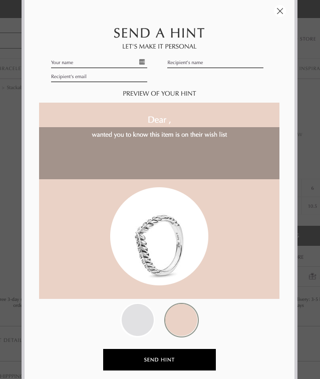
After you fill out the form, the recipient gets a simple email that looks like this:
And you get a success message alongside product recommendations:
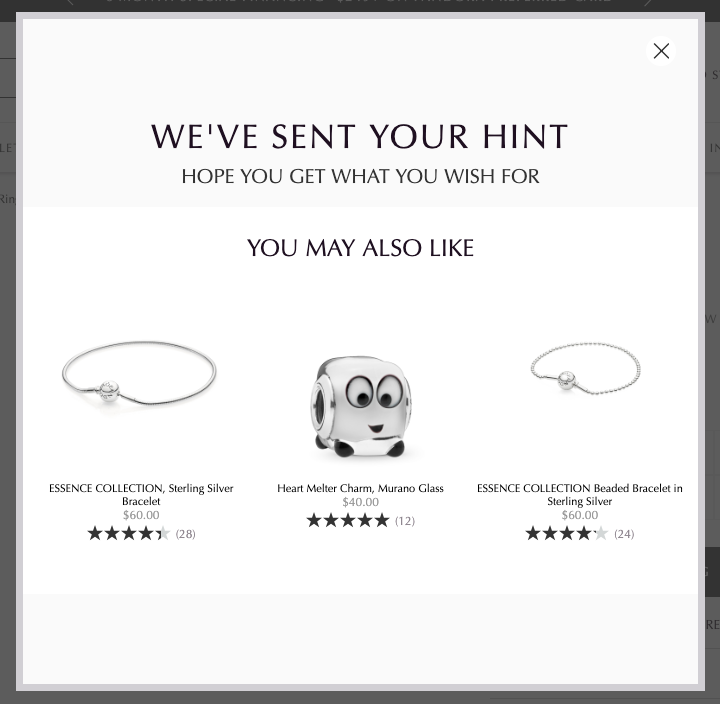
Pandora knows that you are a highly interested visitor so they don’t miss this chance to suggest you more products you may like.
Takeaways
- Add a “Send a Hint” button to your product pages.
- Make sure the form opens on the same page and comes with pre-written text.
- Recommend similar products at the success step.
13. Nordstrom: Create an In-Store Shopping Experience
In most cases, consumers want and need guidance when shopping—whether online or offline.
When you’re in a brick-and-mortar store, you can simply approach a sales rep and get the answers right away.
But this is not the case for online shopping.
Luckily, there are smart ways to create an in-store experience on e-commerce sites and Nordstrom is a great example of that:
If you visit one of their product pages, you’ll see a video between their product photos.
At first sight, you might think that it’s just another product video. But here’s what it looks like:
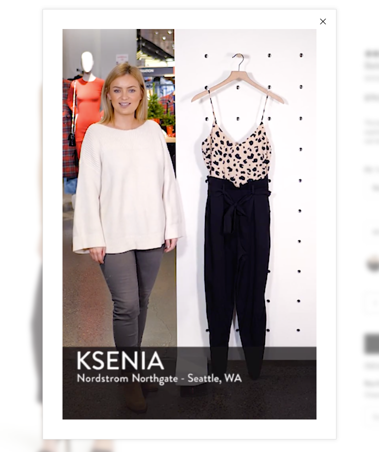
Nordstrom uses videos of their sales reps explaining the product as if you’re in one of their physical stores.
The sales rep talks about what makes the product special and how she would style it.
This way, the company improves your online shopping experience by combining it with a more traditional approach.
When you scroll down the product page, you’ll see a section called “Looks”:
Nordstrom styles the product using different items from their store and inspires you with different looks. You can use the shuffle button to get a new recommended look and find the best option that fits your style.
This way, the company not only helps you style the item but also cross-sells on their product pages.
Takeaways
- Take videos of your employees talking about the product and add it to the photos section.
- Cross-sell by combining the product with other items on your e-commerce site.
2026 Product Page Checklist
Use this checklist to audit your product pages and ensure you're following current best practices:
Visual Elements
- 6-8 high-quality product images from multiple angles
- Zoom functionality on all images
- Lifestyle images showing product in use
- 360-degree view or video (if applicable)
- Mobile-optimized image sizes (loads in under 3 seconds)
- Alt text on all images for SEO and accessibility
- Product videos showing item in action
- Color/variant switcher with image updates
Product Information
- Clear, benefit-driven product title
- Detailed product description answering common questions
- Specifications and dimensions clearly listed
- Material/ingredient information with explanations
- Size chart or fit guide (for apparel)
- Care instructions or usage guidelines
- Country of origin or manufacturing details
- FAQ section addressing common concerns
Pricing & Value
- Price displayed prominently above the fold
- Discounts or savings clearly shown ("Save $50")
- Multiple payment options visible (Afterpay, Klarna, PayPal, etc.)
- Price comparison or value proposition stated
- Shipping costs mentioned (or "Free Shipping" highlighted)
- Tax information or total price preview
- Bundle pricing or volume discounts displayed
Social Proof
- Product rating (stars) visible above the fold
- Number of reviews displayed prominently
- Review filtering options (by rating, verified buyers, most helpful)
- User-generated photos from customers
- Testimonials or featured reviews highlighted
- "Bestseller" or "trending" badges when applicable
- Real-time purchase notifications ("5 bought in last hour")
- Expert endorsements or awards
Trust & Security
- Shipping costs and timeline clearly stated
- Return policy easy to find and understand
- Security badges (SSL, payment processor logos)
- Money-back guarantee or warranty information
- Contact information for support questions
- Live chat or chatbot availability
- Privacy policy link
- Secure checkout indicators
Conversion Optimization
- Clear, contrasting "Add to Cart" button
- Product availability status (in stock, low stock, out of stock)
- Urgency elements (limited time offer, stock countdown)
- Cross-sell recommendations ("Complete the look")
- Upsell options (bundle deals, premium versions)
- Wishlist or save for later option
- Email capture for back-in-stock notifications
- Exit-intent popup with offer or lead capture
Mobile Experience
- Responsive design (looks good on all screen sizes)
- Easy-to-tap buttons (minimum 44x44 pixels)
- Streamlined checkout process
- Sticky "Add to Cart" button on mobile
- Fast load time on 4G connections (under 3 seconds)
- Hamburger menu for easy navigation
- Thumb-friendly interface elements
- Mobile-optimized images and videos
SEO & Technical
- SEO-friendly URL (includes product name, not just numbers)
- Meta title and description optimized with keywords
- Structured data markup (Product schema)
- Breadcrumb navigation for easy browsing
- Internal links to related categories/products
- Sitemap includes all product pages
- Canonical tags to avoid duplicate content
- Open Graph tags for social sharing
Advanced Features (2026 Best Practices)
- AR/VR try-on capability (for applicable products like furniture, glasses)
- AI-powered personalized recommendations
- Live chat or chatbot support with product expertise
- Email or SMS abandoned cart recovery
- Subscription or auto-replenish options
- Gift wrapping or personalization options
- Carbon footprint or sustainability information
- Accessibility features (screen reader compatible, keyboard navigation)
Scoring Your Product Page
Count how many items apply to your product pages:
- 0-15 items: Needs major work - Start with Visual, Pricing, and Trust sections
- 16-30 items: Good foundation, room for improvement - Focus on Social Proof and CRO
- 31-45 items: Excellent, competitive product page - Add Advanced Features
- 46+ items: Industry-leading product page - Maintain and test continuously
Priority Levels:
- Critical (must-have): Visual Elements, Product Info, Pricing, Trust, CTA
- High Impact: Social Proof, Mobile, SEO
- Competitive Advantage: Conversion Optimization, Advanced Features
Conclusion
Product pages are the heart and soul of your e-commerce site.
With minor improvements, you can convert more visitors into customers and increase your sales revenue.
Take inspiration from these high-converting product pages and start implementing some of these strategies on your online store.
Combine the ones that fit you the best and always test different options.
Next Steps:
- Use the 2026 checklist to audit your current product pages
- Identify your top 3-5 improvement priorities
- Implement changes on a high-traffic product page first
- Track metrics (conversion rate, bounce rate, average order value)
- Scale successful changes across your catalog
Want to take your product page optimization further?
Drip's automation tools can help you recover abandoned carts, send back-in-stock notifications, and create personalized follow-up campaigns based on product page behavior.
Try Drip Free for 14 Days → No credit card required.

