Product pages are the heart and soul of your e-commerce store. Think about it for a moment. All those emails you send, campaigns you create, ads you pay for…
Everything you do, in fact, is to convince your visitors to land on your product pages—hopefully, with an intention to buy.
But product pages are not really the end of the customer journey. They’re only the beginning.
As of Q3 2018, only 2.42% of e-commerce site visits converted into purchases.
So, if you’re driving traffic to your product pages, but it’s not converting into sales, this article is for you.
Today, I’ll share 11 of my favorite product page optimization strategies used by top e-commerce brands. Plus, how you can easily implement them on your online store.
How to Create High-Converting Product Pages
1. Add Personal Details to Testimonials
3. Leverage User-Generated Content
5. Use 360-Degree Product Images
7. Give Estimated Shipping Dates
9. Upsell One-Time Products with Subscriptions
Make the Most of Customer Testimonials
When was the last time you bought something without checking how many positive reviews it got?
Unless you’re an outlier, the chances are pretty low.
According to research, almost 95% of online shoppers read customer reviews before making a purchase.
The same study found out that displaying reviews on your site can increase conversion rates by 270%. Crazy, isn’t it?
Displaying customer testimonials on your product pages can drive a lot of sales. But how you display them can also affect your conversion rates.
Highlighting your favorite flattering reviews is one option. But there’s always something more you can do to guide your visitors.
Remember, the reason you put those reviews there: To help your potential customers.
To do that, try making your testimonials relevant and easily readable, to help them even more.
Want to learn how? Here are my favorite methods.
1. Add Personal Details to Testimonials
To make the most of testimonials, display them in a way that visitors can get the most value (and help) out of them.
One way to achieve this is to provide personal details of the reviewer.
This way, your visitors can more easily relate to the commenter and get a clear idea of the product.
Take this example from MeUndies:

They don’t only display the reviewer’s username, but also personal details, such as location, gender, age, height, and weight, which may have an impact on how you enjoy the product.
It also helps the reader develop a liking for the reviewer. Here, you can compare the commenter to yourself and decide if their comments are relevant to you.
Birchbox takes this one step further and lets you filter the reviews:
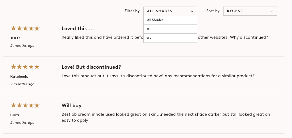
If you’re interested in this skin product, you can filter the reviews by shades and only read the comments you need, based on your skin tone.
Not all feedback is equally valuable for everybody. Try giving visitors more information so they can decide what’s more relevant to them.
2. Make Reviews Easy-to-Read
If you manage to get long and detailed customer testimonials, kudos to you.
The more in-depth the product reviews, the more value it provides the reader.
But let’s admit it: Not everybody has the time to read through all those long reviews. (Especially if they’re not about a complex or high-end product.)
Sometimes, customers have a lot to say. And you should always let them speak their minds.
Instead of cutting them short, find a way to make your reviews easier to read for the visitor.
Here’s how Glossier does it successfully:
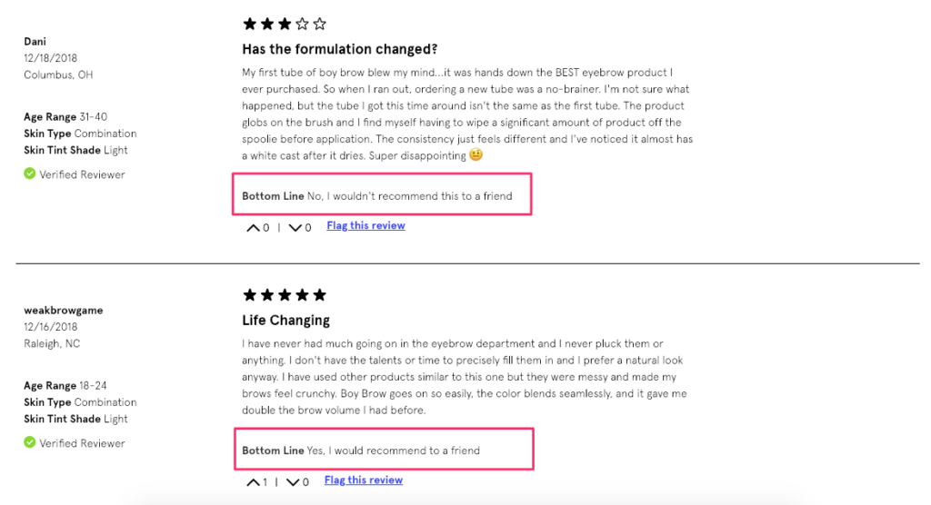
Yay or nay. Sometimes it’s that simple for the visitor.
3. Leverage User-Generated Content
Adding a “Bottom Line” to all customer reviews, the company makes sure that you get the point, even if you don’t have time to read the whole text.
One of the coolest buzzwords of the last decade, user-generated content, is a great source of social proof.
In a survey by TINT, 80% of the respondents agreed that user-generated content makes marketing more authentic—and authenticity is a huge driver of sales.
In fact, Photoslurp found user-generated content is five times more likely to convert when compared with branded content.
Adding user-generated content to your product pages is not only a way of displaying social proof. Content created by your customers can also help guide your visitors better.
Think of it as a more creative and visual type of customer feedback. It makes the reviews more personal and relatable.
Let’s take a look at this example by Wool and the Gang:
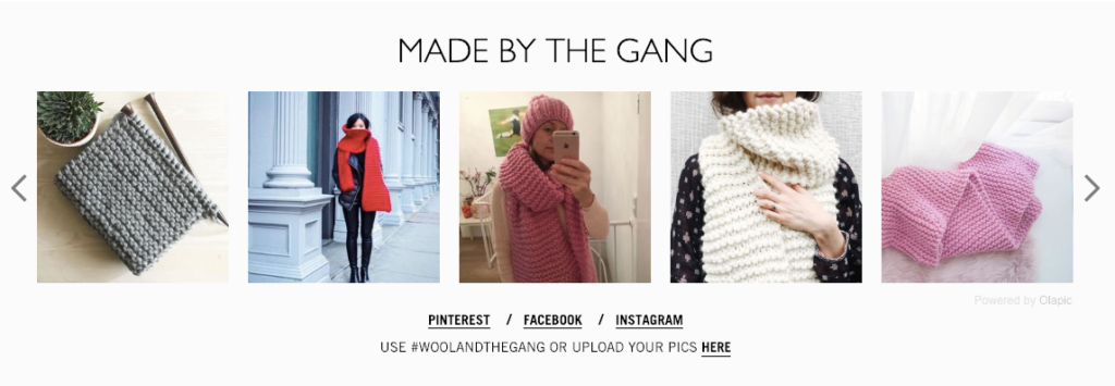
Due to the nature of the company’s products (knitting kits), it’s important for visitors to see the end result in real life.
The company gets visual aid from actual customers to display their end products.
(Notice the headline “Made by the Gang” and the feeling of belonging it evokes.)
They also make it clear how you can be a part of “the gang” by using their hashtag or uploading your pics to their site.
Going one step further, you can also offer an incentive for your customers to create content for you.
Here’s how ThinkGeek does that:
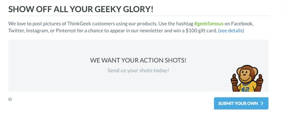
They ask for customer pictures in exchange for a chance to win a $100 gift card.
If you need an easy way to connect user-generated content with your e-commerce site, you can try a third-party tool such as Olapic.
Showcase Your Products
Picture two online stores selling the same item: One with unfocused and blurry product pictures, and the other with clear and high-quality images.
Which one are you more likely to buy from?
I think I can guess the answer.
In online shopping, the inability to see the product with one’s own eyes is an obstacle for visitors. That’s when you need to step in and help as much as possible.
Displaying your products in a better and clearer way can improve conversions and decrease the likelihood of returns.
Here are my favorite ways to do this.
4. Create Product Videos
A video is probably worth more than a thousand words.
According to Google, almost 50% of Internet users look for a product-related video before visiting a store.
Why not offer visitors a product video when they’re on your online store?
Using videos is one of the most realistic ways to display your products. Whether it’s an explainer video or a product close-up, it gives you a chance to describe the item as vividly as possible.
Everlane does this well on their product pages:
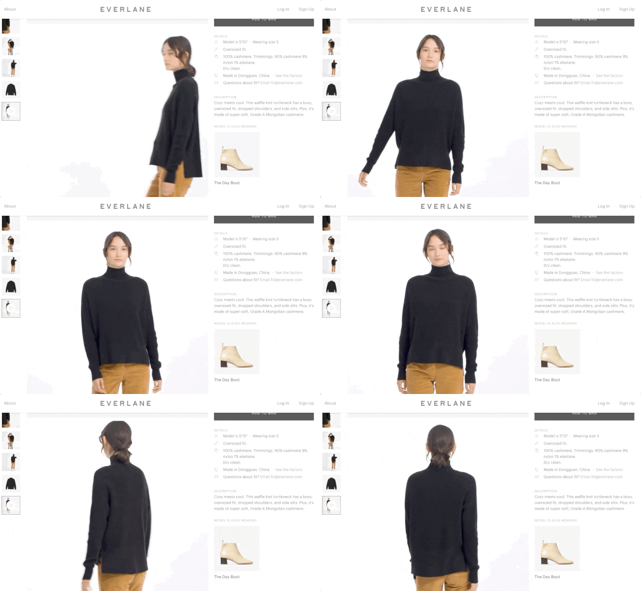
If you’re in fashion or selling products that need more visualization, use videos whenever possible.
Giving detailed product information is a great practice; showing the product in action is even better.
Seeing the item in relation to an actual person can make it easier for visitors to visualize. It also helps them make more informed buying decisions.
5. Use 360-Degree Product Images
I know, not all products are suitable for little runway videos or close-ups.
Luckily, there’s always a smart way you can display your products in detail.
And my favorite method is 360-degree product images.
Well-written product descriptions can tell a lot, but 360-degree images can explain the product in a much quicker way (and from all angles).
Check out this example by Away:
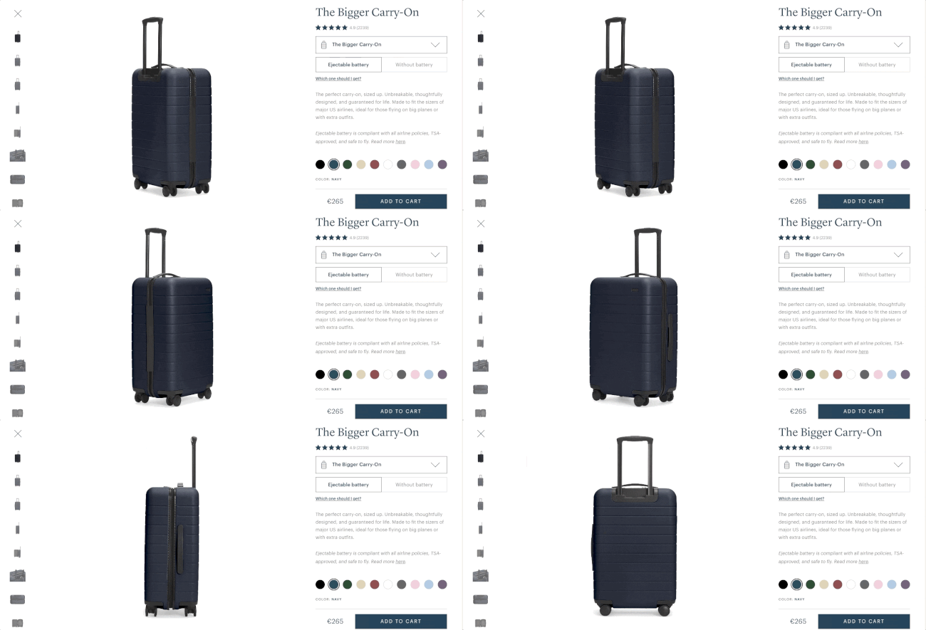
By clicking on the 360-button, visitors can view the carry-on from different angles and get a better idea about the product.
360-degree images also give more detail without taking up too much space.
Potential customers encounter fewer surprises, which means less frustration and fewer returns.
You can implement 360-degree images on your online store using third-party tools, such as Magic 360, and get started right away without coding.
6. Show Products In Action
Even if you can’t use product videos or 360-degree images on your online site, you can still find other ways to display your products in detail.
One great way to do this is to show your products in action.
Displaying your products in real life makes it much easier for the visitor to picture them.
Let’s look at this example by Bellroy first:
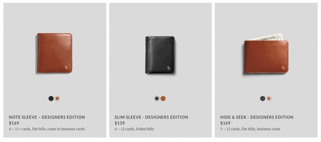
When you scroll through Bellroy’s product listing pages, you’ll see a little button that reads “Show Inside.” When clicked, you can see what you can fit into that specific wallet, together with a short description and visualization of the items.
And it gets better.
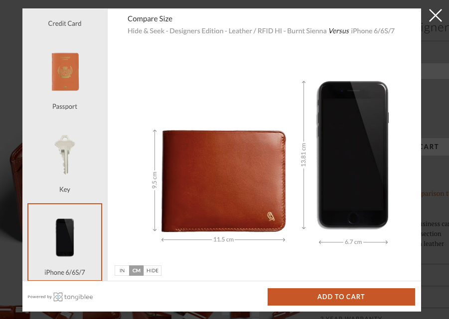
When you visit one of their product pages, you’ll see a “Size Comparison Tool” which allows you to compare the wallet to several items that you are certainly familiar with: Credit card, passport, key, iPhone or Dollar Bills.
Knowing the struggles of online shoppers, Bellroy successfully solves this common problem and helps visitors picture the product in real life situations.
Warby Parker has another solution to this problem:

Instead of only displaying the product in isolation, they also give you the option to see how their glasses look on the model’s face.
And when you move your cursor on the image, you can see the glasses from different angles and have an idea about how it might look on your face.
How cool is this?
Provide Clear Shipping Information
You got your visitors interested in your product with great customer reviews and creative visuals.
They’re now in the next stage: Considering to purchase.
There’s one huge element that influences visitors’ buying decisions at this stage and that’s shipping.
According to a study by BigCommerce, shipping cost and speed are influential factors in determining where people shop.
At this stage, visitors want to see clear and detailed shipping information. If they meet any bad surprises during checkout, they’ll most likely abandon their carts and never return.
Here are two smart ways how you can provide better shipping information on product pages and how you can use shipping to increase revenue.
7. Give Estimated Shipping Dates
When people shop online, they want to know when they’ll receive the delivery.
And they want to get their items as soon as possible.
Providing an estimated delivery date will help visitors make better and faster buying decisions.
The more precise you are, the easier it is for visitors to know what to expect.
Avoid using a confusing language, such as “2-5 business days”. Instead, focus on the date that they’ll receive the item.
Be careful, though. Overpromising can turn into disappointment if you fail to deliver on the expected date.
One thing you can do to keep this in check is to ask for partial address information in order to provide a more accurate guess.
Here’s how Man Crates does that:
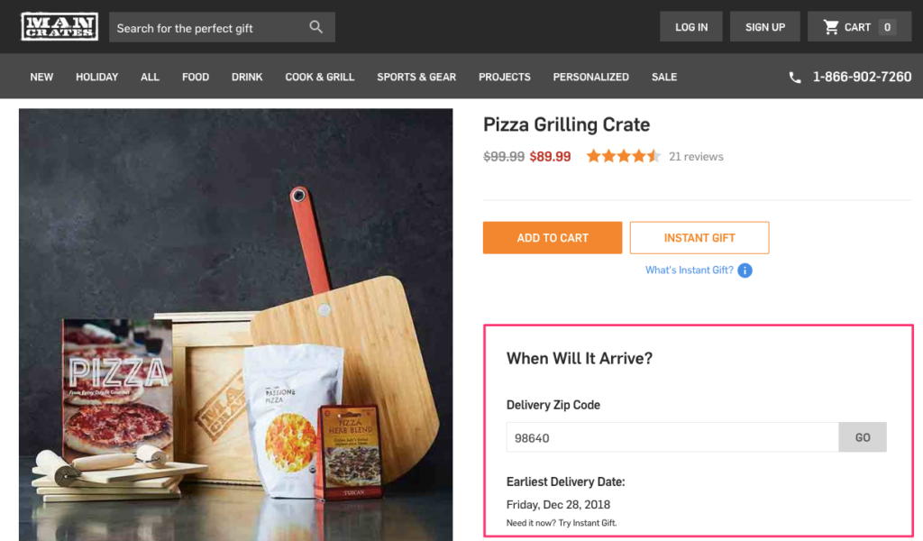
Entering your zip code in the box, you can learn when to expect your delivery. (Notice how they offer an alternative e-card option if you need the item earlier.)
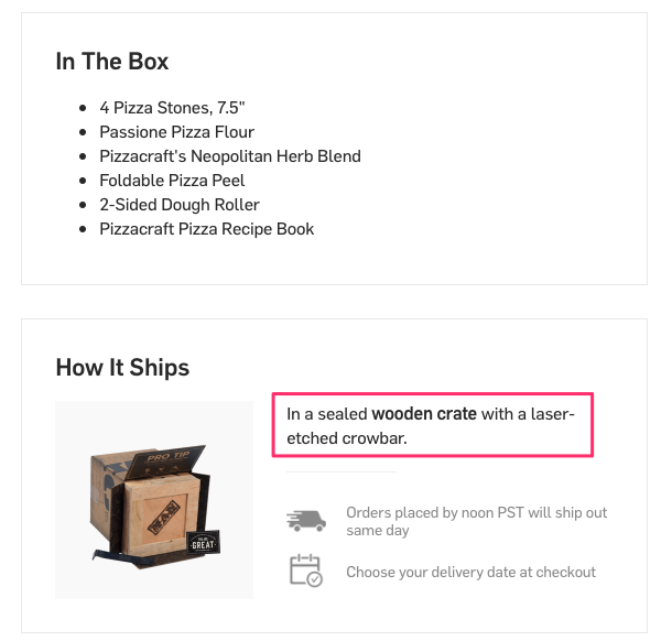
When you scroll down a bit, the company also tells you how exactly the item will ship.
Fewer surprises. Happier customers.
8. Promote Free Shipping
The two magic words of e-commerce: free shipping.
Now, you know that shipping options are highly influential in buying decisions.
So much so that 60% of consumers are likely to abandon their carts when free shipping is not an option.
But free shipping isn’t just an incentive to complete the purchase. It also helps the customers spend more.
In fact, in one retail study, 9 out of 10 consumers said that free shipping is the number one incentive to shop online more.
Offering free shipping can increase both your conversions and average order value. But in the end, they both mean higher sales revenue.
One thing you need to be clear about is how and when customers qualify for free shipping.
Instead of simply listing your shipping policy, give visitors more information. For example, add a little message on your product pages if the item they’re browsing already qualifies for free shipping.
Here’s how Beauty Bay does that:
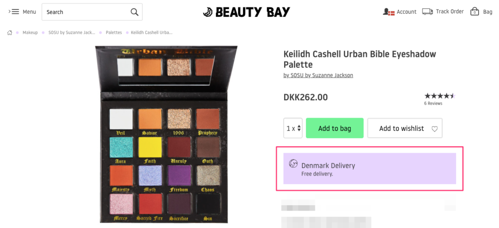
The company provides free shipping to Denmark for orders over 170 DKK. When I visit this product, which costs more than that, they nudge me with this little message.
If I buy this product, I don’t have to think about shipping costs. Now I know that and I’m more willing to add it to my cart. Quite rational.
What if visitors don’t qualify for free shipping yet?
Then you gently remind them about it. Just like ASOS does here:
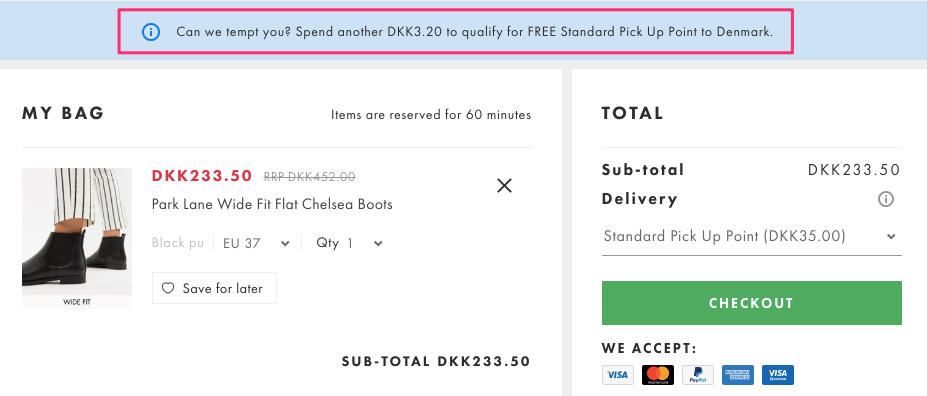
Simply remind visitors what they need to do to get free shipping on product and checkout pages.
If you’re willing to go one step further, suggest to visitors related products they can add to their carts in order to meet the free shipping minimum.
For example, you can easily create an onsite campaign that looks like this:
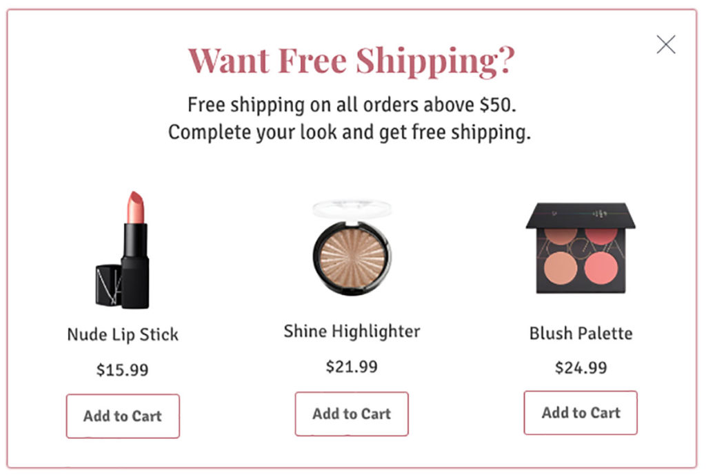
Increase Your Average Order Value
Getting more orders is one way of reaching a larger sales revenue. Increasing the value of those orders is another.
If a visitor is already on your product pages and considering making a purchase, there’s a good chance that you can sell them more or higher-priced products.
And that’s exactly what we know as upselling and cross-selling.
Upselling and cross-selling, however, are two big strategies. And there are many different ways you can use them on your product pages to increase revenue.
Today, I’ll share two of my favorites that you might have overlooked. They’re simple but highly effective.
9. Upsell One-Time Products with Subscriptions
The most traditional upselling method is recommending the visitor a more expensive product alternative.
But there are better and more profitable ways to upsell.
Turning one-time purchases into subscriptions on your product pages is one of the smartest upselling strategies.
By upselling with subscriptions, you can increase the lifetime value of your customers.
Instead of a one-time order, you can get regular payments and potentially gain loyal customers.
But how do you convince visitors to make such a big commitment?
For this upsell strategy to work, you need to be clear about the benefits of choosing the subscription model. If you don’t give visitors a good reason to become a long-term customer, they wouldn’t be willing to spend more.
Check out how Beardbrand upsells on their product pages:
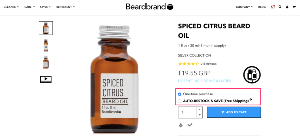
When you visit a product page, the company offers you two options: One-time purchase or Auto-Restock & Save.
Take a closer look at the second option now.
Notice how benefit-oriented the text is, rather than simply saying “Subscribe.”
Instead, they clearly talk about the benefits: Getting auto-restocks, saving money, and free shipping (which we just praised.)
The subscription option is written in bold and capitalized, and displayed in sharp contrast with the first option. It’s much more noticeable and attention-grabbing.
10. Use Subtle Language to Cross-Sell
Cross-selling, in simple terms, is suggesting visitors complementary or related products.
When used in moderation, cross-selling can be a highly effective e-commerce marketing strategy that improves sales revenue.
But it can start getting really annoying if you ask visitors “Would you also like to buy this and that?” over and over again.
The visitor is already interested in one of your products at this stage. There’s no point at scaring them away with hard-selling, right when they’re about to buy something.
The key to cross-selling is, actually, how you frame it.
Take a look at how Firebox cross-sells without being pushy or intrusive:
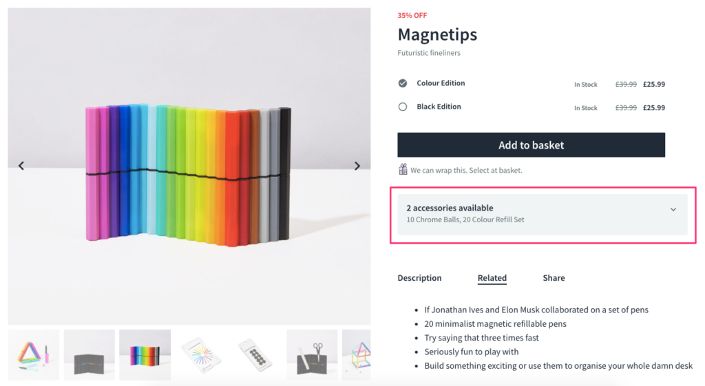
Instead of making it sound too salesy, they simply let you know that two accessories are available for that item.
This strategy works because it’s not forced—it really is a complementary product that I might consider adding to my basket.
Violet Grey also uses a subtle language to cross-sell, but in a different way:
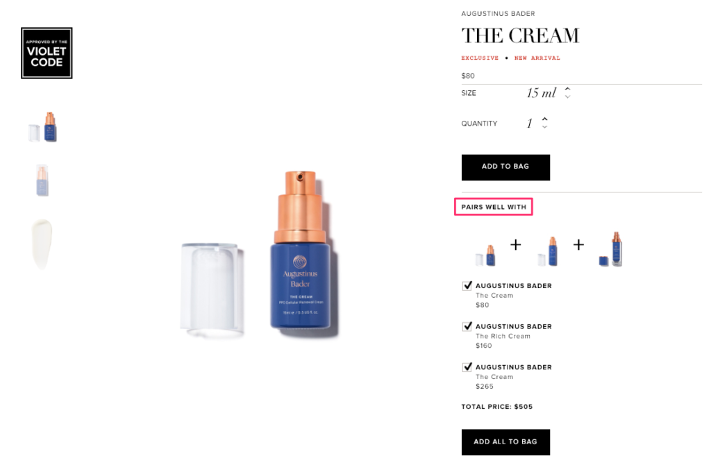
The wording they choose in cross-selling is “Pairs well with.”
This phrase makes it clear that these are complementary products and they’ll all work in harmony to do wonders for my skin.
Notice how all complementary products appear with a pre-selected checkbox and an “Add All to Bag” button that make it easier for me to buy them all.
Make Your Products Easily Shareable
I don’t know about you, but I can always use another pair of eyes when shopping…
That’s why I always look for easy ways to share a product with my friends to get a second opinion, recommend them something, or ask for a gift. (I can’t be the only one doing that, right?)
Many online stores implement social sharing buttons on their product pages, but they can be problematic.
Social sharing is a less private way of exchanging opinion. So, it doesn’t really serve my goals as a potential customer.
Plus, social sharing is hard to track and you can’t follow every step of the buyer’s journey—unlike email.
Email is a much easier sharing option and there’s a brilliant way you can incorporate it into your product pages.
Here’s how.
11. Add a “Hint” Option
Many of us turn to online stores for gift shopping now.
We want to avoid crowds and enjoy special deals. And we exchange gifts all year round.
What’s the best way to ask for a gift from friends and family?
Dropping them a little hint.
A simple hint button is a great opportunity to convert potentially lost revenue on your product pages.
Even if the current visitor doesn’t complete the purchase at that point, they can call out to someone else who has a chance to buy the product for them.
In a way, your visitors are reaching out to potential customers for you. Isn’t that the dream?
Mulberry uses a “Hint Hint” option on their product pages to make gift recommendations much easier:
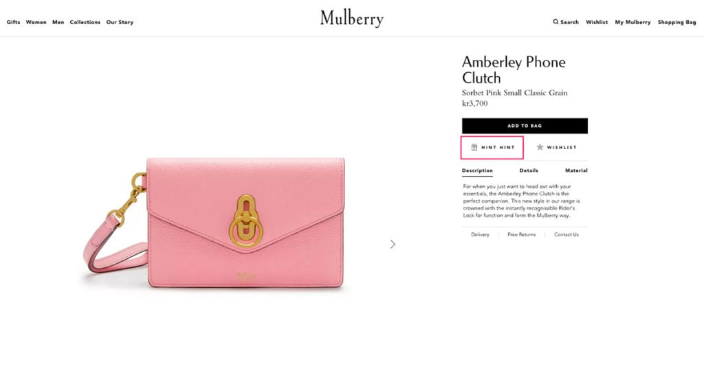
When you click the hint option, you see a form where you can fill sender and recipient details, and personalize your message:
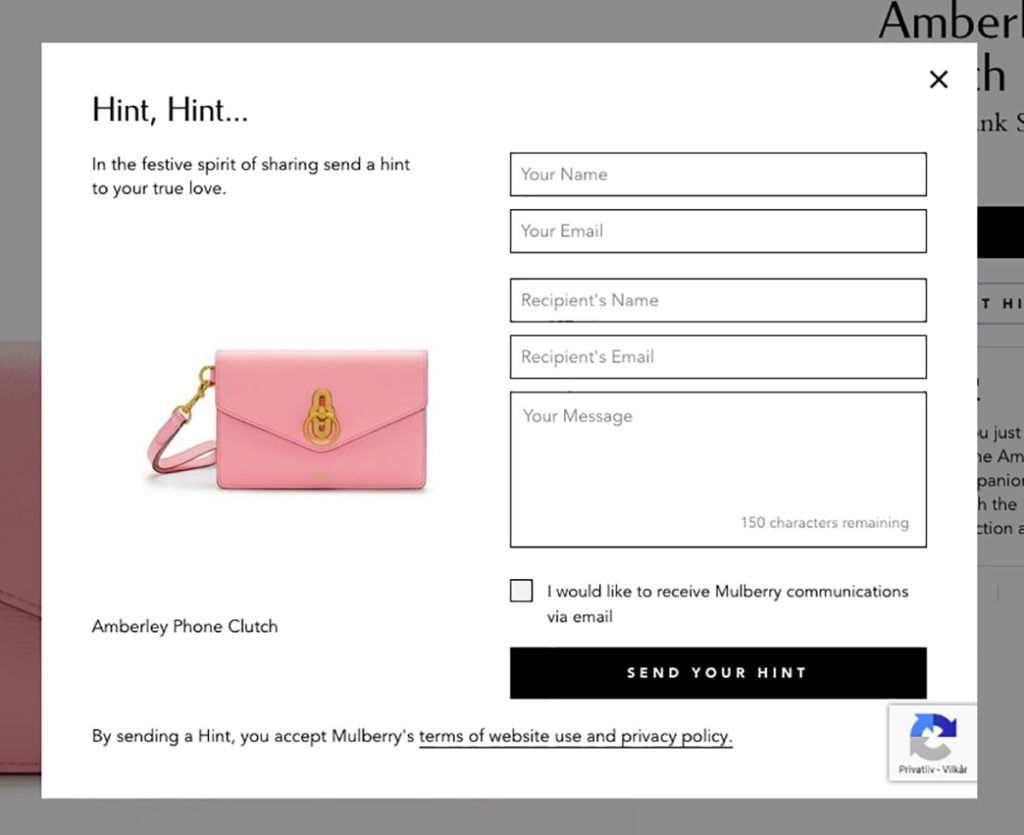
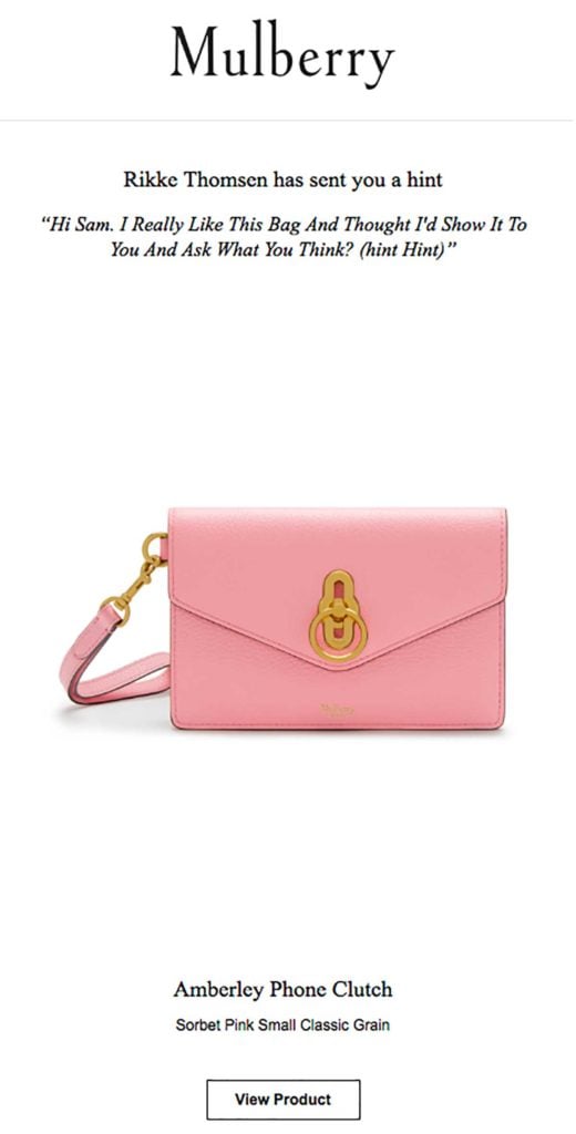
Once you submit the form, the recipient gets an email containing your message and the product details.
Here’s a hint Rikke recently sent to Sam:
Let’s take a moment and think. How can you make this process even easier for the visitor?
Here’s an idea by Roccamore:
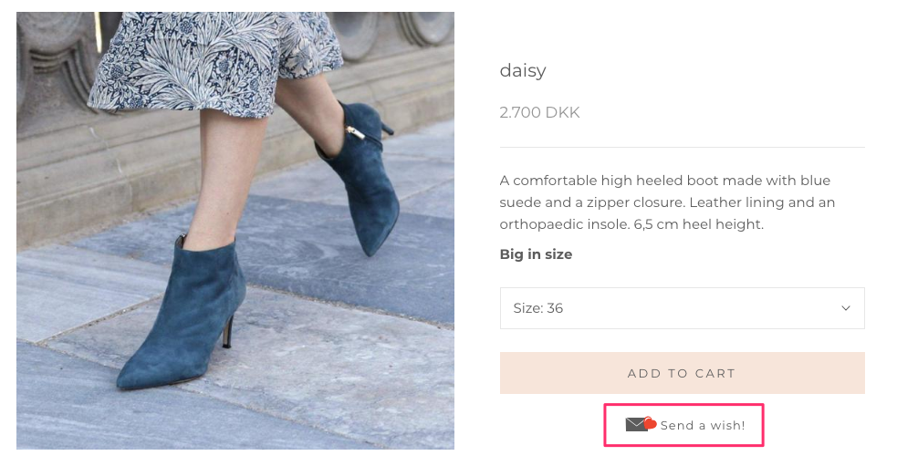
Roccamore uses a “Send a wish!” button on product pages, similar to Mulberry.
But when you click it, you see a pre-written text and a form that only requires basic information:
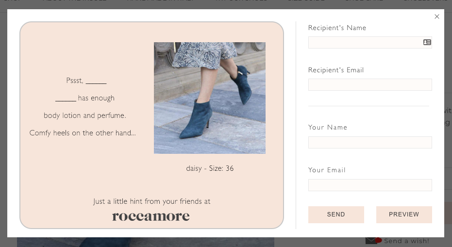
Once you write the name and contact details, you can see a preview of your hint card and send it easily:
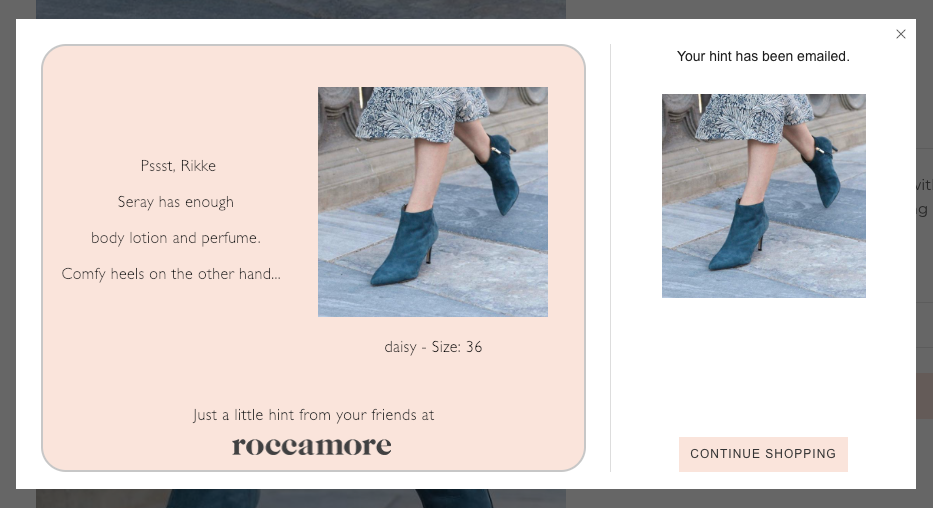
This form works great because it takes seconds to fill and it comes with a fun, pre-written text.

Conclusion
That was 11 of my favorite product page optimization strategies.
With small additions and minor improvements, you can also increase conversions on your product pages.
In the end, it all comes down to making things easier for your customers.
Try helping your visitors make better decisions and give them as much information as possible. Lastly, remember not to make it sound too promotional.


