

If you’re like most e-commerce marketers, you’re continually optimizing your homepage or product detail pages.
But there’s one important page that you might be overlooking, one that’s an untapped goldmine for clicks and conversions…
Your product listing page.
Often taking the form of category pages or search results, product listing pages act as a catalog on your e-commerce site.
But they can do more than improve users’ shopping experience.
Listing pages act as a gateway to your product pages. And when optimized right, they can help you convert more visitors into customers.
If a visitor is already browsing through your product listing pages, it means that they’re interested in your online store. So this is where you lead them to product pages and persuade them to buy.
With minor improvements, you can start driving more visitors to your product pages and increase your conversions.
Here are the seven best strategies you can use to optimize your product listing pages, and why they’re so effective.

Table of Contents
1. Add Persuasion Triggers to Product Images
Best-sellers sell a lot for a reason. Or at least that’s how we think.
When a product is popular, trending, or best-selling, it gains legitimacy.
Because we tend to think that other people’s actions are the correct behavior in a given situation. And we decide to do the same.
In simple terms, that’s how social proof works.
You probably know by now that social proof helps increase your e-commerce sales. But it works even better when you combine them with persuasion triggers, such as urgency and scarcity.
Adding urgency and scarcity labels to your product images can trigger your visitors’ fear-of-missing-out and make them take action.
Showing these labels on your listing pages helps you lure visitors into product detail pages, and it increases their likelihood of making a purchase.
Check out how Missguided adds small labels to product images on listing pages:
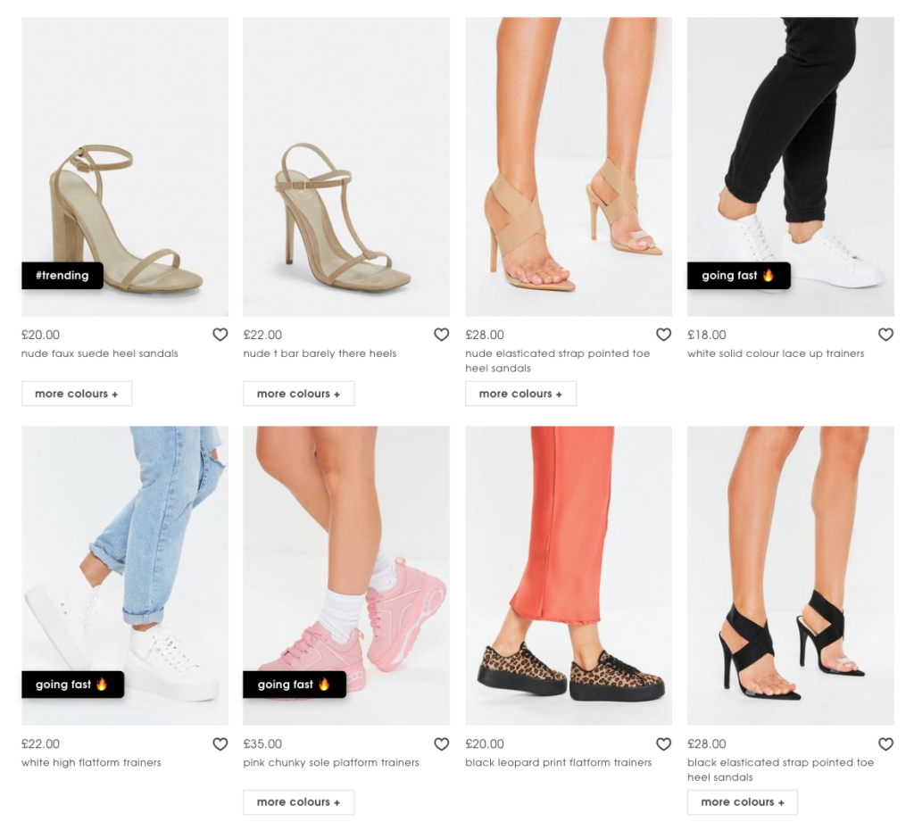
The company highlights popular products with “trending” and “going fast” labels to make them stand out among the others in the same category.
Products with those labels grab more attention and the use of emojis helps with that too.
Missguided doesn’t only rely on social proof. They also focus on the scarcity of the product by suggesting that it may sell out if you don’t act fast.
The sense of urgency nudges visitors to view the product and take action as soon as possible. Because nobody wants to miss out on something so good.
Vinomofo takes a different approach on product listing pages and they change the call-to-action (CTA) buttons for their fast-selling items:
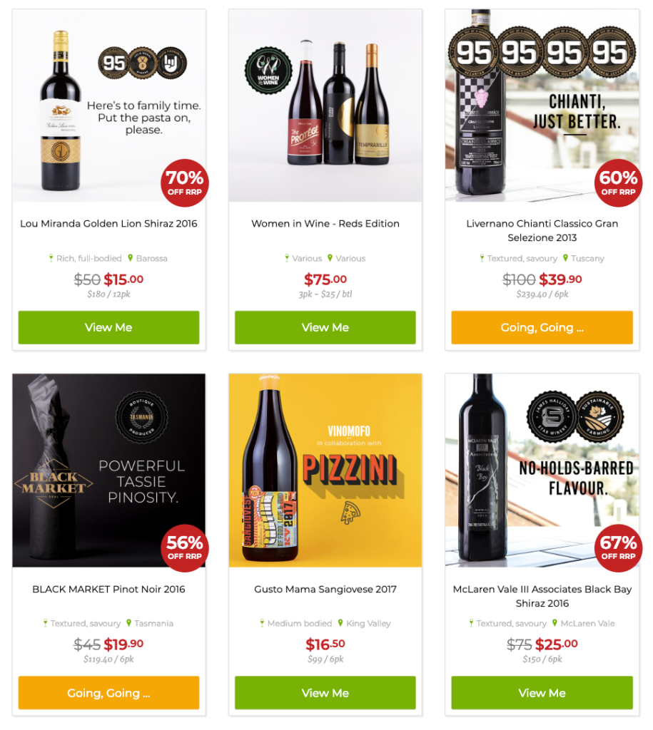
The company uses a CTA that reads “Going, Going…” for popular items, instead of the regular “View Me” button.
Also, notice how they change the color of the button to make fast-selling products stand out.
Vinomofo uses psychological triggers on product images too:
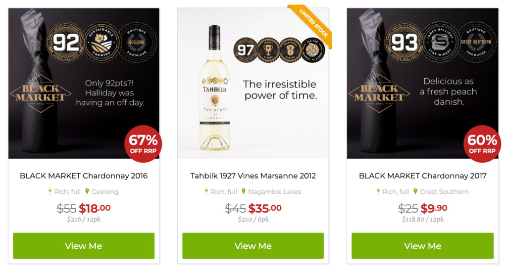
They focus on the product’s scarcity of availability by using the “Limited Stock” label.
If you’re selling products with limited stock, make sure your visitors are already aware of it before they go to the detail page.
2. Personalize the Shopping Experience
E-commerce marketers often talk about personalization and how it works like a charm, and they have every right to do that.
Your visitors want a more personalized shopping experience.
In fact, 91% of consumers are more likely to buy from online stores who remember them and provide them personalized offers.
Personalization might scare some e-commerce marketers off.
But you don’t necessarily have to personalize every corner of your store according to each visitor.
You can easily start from your listing pages and personalize them based on your visitors’ preferences.
Here’s a brilliant example by The Iconic:
Their category pages look just like any other, until you notice the little button on the images.
The button reads “See Similar” and this is what happens when you click it:
The order of the products changes and you see personalized recommendations first.
You still view the same category but now you have a better chance of finding something you like.
This is a smart way to help visitors find their favorites quickly. And they don’t have to leave the listing page to get personal recommendations.
3. Focus on Price Savings
Price is an essential determinant in consumer behavior and purchase intention.
In online shopping, consumers can compare prices with one click and easily switch to another store that offers a better deal.
In fact, price is one of the top three reasons why American consumers choose a certain online store.
If you’re offering price deals or discounted items on your e-commerce site, make sure your visitors see them without having to go to product detail pages.
Focus on how much customers will save upon purchasing the product, rather than only showing the discounted price.
Here’s how Bombas highlights the price saving on product listing pages:
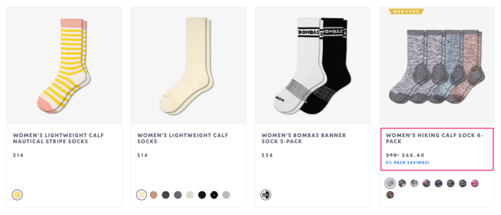
The company not only compares the regular price with the discounted price on bundled products. They also write out how much you’ll save when you buy a 4-pack instead of individual products.
This way, visitors will see that buying a bundle is a rational option and they’ll be tempted to click the product with a higher price tag.
Glossier plays around with different wordings on listing pages:
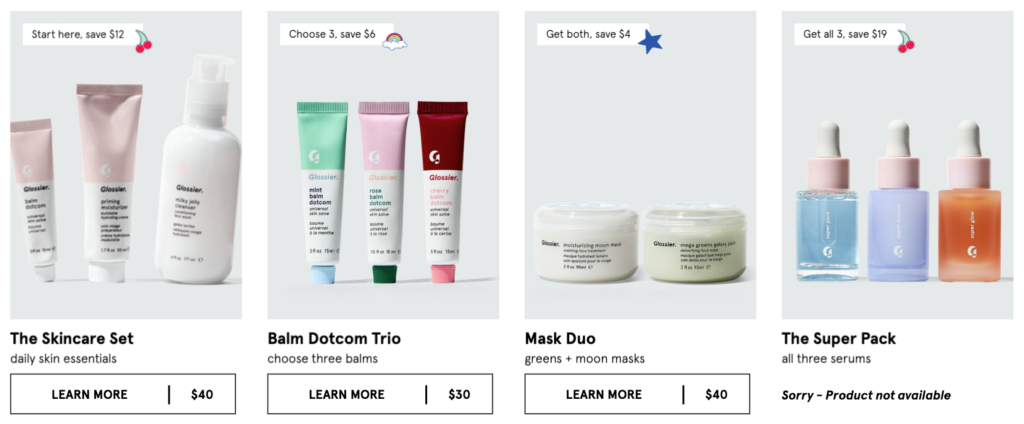
They alternate between “start here,” “choose 3,” “get both,” and “get all 3,” to show how much you can save on buying a product set.
They combine benefit-driven copy with small icons to make their sets stand out in design.
This way, the company positions their higher-priced items as a better option and upsells even before you visit a product page.
4. Give Visitors More Information
There are probably hundreds of different ways you can describe and promote your products.
Will you highlight the material, the price, or any other important feature?
Given that you have limited text space in listing pages, you shouldn’t overwhelm visitors with too much information from the beginning.
It’s a common practice to add labels to product images (see Strategy #1) and use a short text to describe the product.
But what if you have much more to say about your products?
There are at least two companies who found clever ways to give visitors multiple messages at a time without using up too much space.
One of them is Weekday:
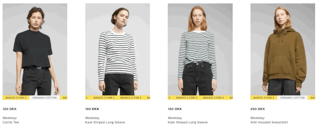
The company uses scrolling text to display different messages at the same time.
The text slides and shows messages like “3 for 2,” “Organic Cotton,” or “Online Exclusive” to inform visitors.
It’s a simple animation that helps users see multiple product features and discount information without being bombarded by different messages or too much text.
Harry’s has a similar approach to highlighting their most important product features:
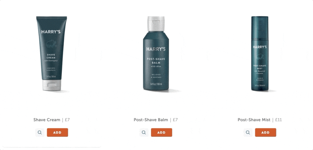
At first sight, they don’t tell much on product listing pages. But when you move your cursor to the viewfinder icon, you’ll see a few bullet points describing “what’s good” about the product.
It’s a smart way of summarizing product descriptions and grabbing your visitors’ attention.
If visitors are interested in the product, they’ll visit the detail page to find out more. If they’re already convinced, they can click the “add” button and easily complete their purchase.
5. Make the Most of Product Images
As you’ve seen in the previous examples, top e-commerce brands are aware that they have limited space on product listing pages and they’re working hard to convert visitors without disturbing them.
If you’re in e-commerce, you’re probably aiming to design a listing page that can showcase as many products and as much information as possible, too.
And persuasive product photography is the key to get your visitors to click product links.
In a recent survey, 83% of the respondents stated that product images are “very” and “extremely” influential in their purchase decisions.
Your goal, then, should be to impress visitors with compelling images on your listing pages and make your products worth a click.
With small improvements, you can easily fit more visuals into one place, without making the user leave the page they’re viewing.
Here are three of my favorite methods:
i. Change Product View on Hover
You’ve probably seen this feature before: You move your cursor on a product image and see it from different angles.
It’s a small but effective detail that can give visitors a better view of the product.
But that’s not the only way to go.
See how Topshop lets you switch between different product images on hover:
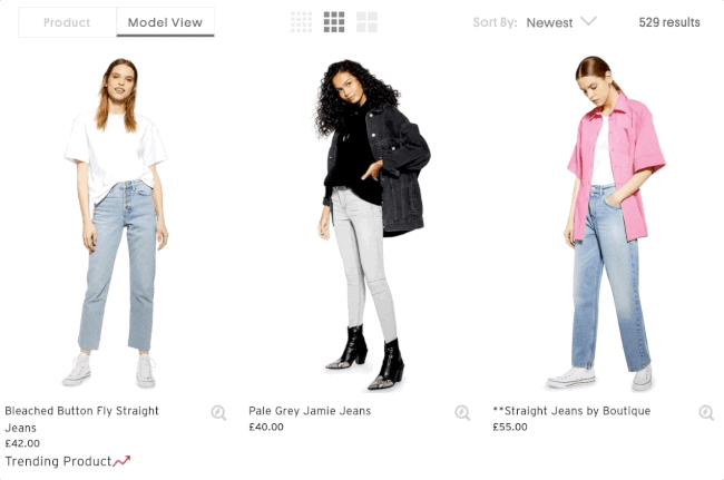
Topshop knows that some visitors would like to see the product itself without any distractions, whereas for others it makes more sense to see the product in action.
That’s why they offer visitors two alternatives: Product View and Model View.
Using the filter on top, you can choose which view you’d like to see as default. And when you hover on an image, you’ll see the other view.
This gives visitors the ability to see more versions of the same product image, and it improves their shopping experience.
ii. Give Visitors a Quick Look Inside
Product listing pages act as a virtual catalog on your e-commerce site—but they’re only better than a catalog.
Adding a “look inside” feature to your images can help visitors learn more about the product without leaving the page.
Here’s how Bellroy lets you take a quick look inside of their products on listing pages:
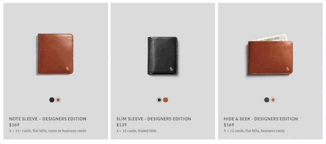
When you click the “Show Inside” button on wallets, bags, or phone covers, you’ll see approximately what you can fit into the product.
They also give you the possibility to view the product in a different color without jumping to another page.
This feature works great for Bellroy because it’s compatible with the nature of their products and their value proposition: slim your wallet.
iii. Show Products in Action
Luckily, the strategy above doesn’t only work well with accessories.
The key is to find something that complements your value proposition and your products.
See how Tarte, a cosmetics brand, uses a similar approach to show their products in action:
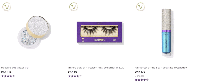
If the picture of eyeshadow in a bottle doesn’t make much sense to you, try hovering on the image and you’ll see how it applies to the skin. (And you’ll even see more colors of the same product.)
The best part is, it’s only a GIF. So, it doesn’t take much to copy this strategy for your online store.
6. Display Product Ratings
Perhaps the best thing about social proof is that it works in every stage of your sales funnel.
You can convince and convert prospects at any phase, through any channel with social proof.
And product listing pages are no exception.
Adding rating and review information on listing pages can help you build social proof at first sight.
Even if a product doesn’t have five stars, displaying ratings will still encourage visitors to click it because it shows that there have been others who bought and evaluated the product before.
Here’s a basic way of using ratings on listing pages by Fabletics:
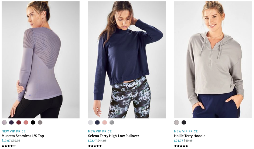
Following a common practice, the company displays ratings with stars and it somewhat gives you an idea about the product.
If you want to go beyond this approach, you can highlight products that have outstanding ratings.
Birchbox, on the other hand, does something else:
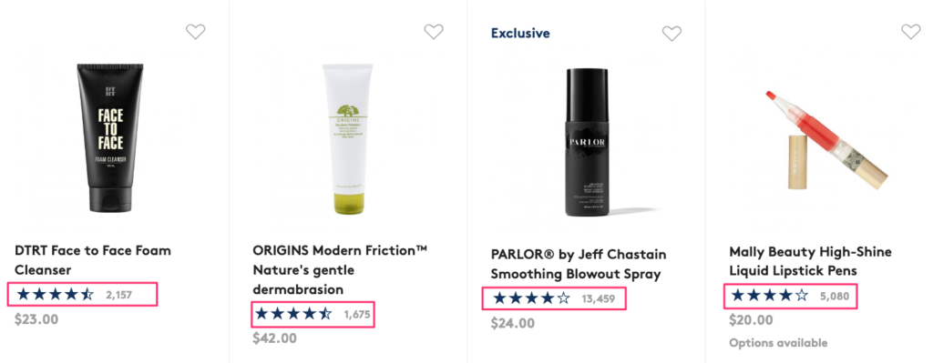
They go one step further with star ratings and show the number of ratings the product has.
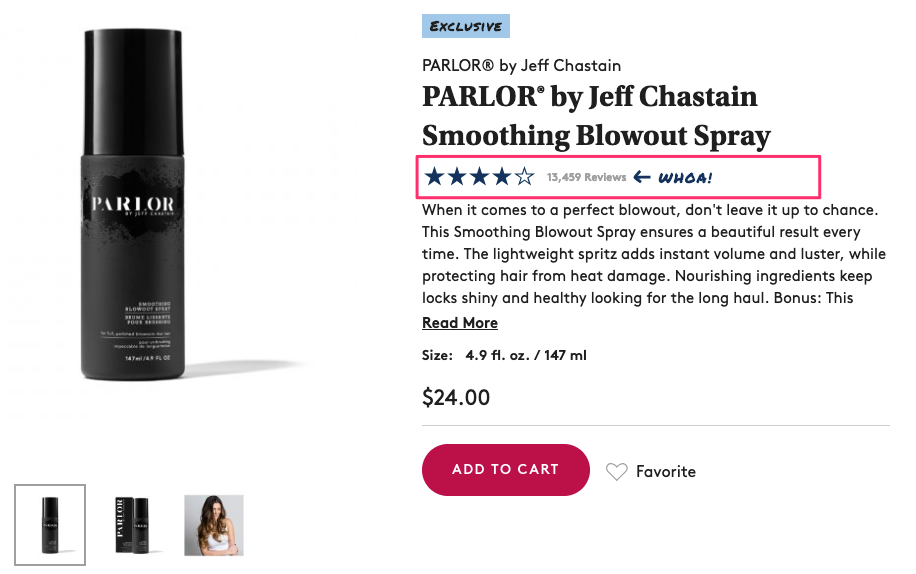
Now when you see a product rating, you’ll have a better idea about how popular it is or how many times it’s been reviewed.
And when you click a product with lots of reviews, you’ll see that they add a small detail that draws attention to it:
Man Crates takes a totally different approach and displays partial customer testimonials under product descriptions:
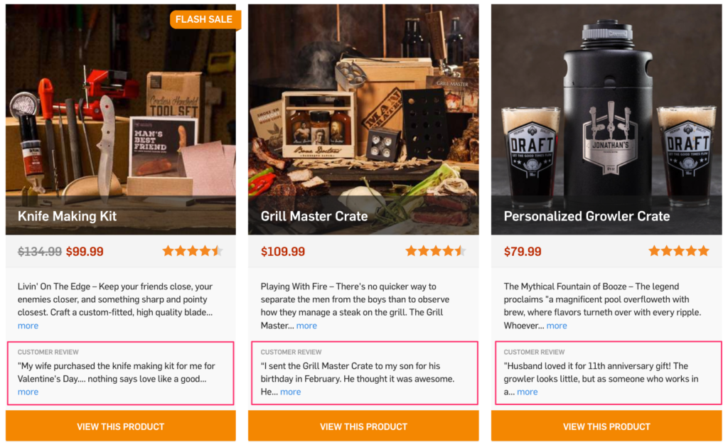
Be careful with this approach. If you don’t provide the reader with enough space, you’ll end up confusing them with too much information.
Make sure your listing pages are spacious and you’re mindful about using product descriptions and customer testimonials together.
7. Use Quick Add Buttons
No two online stores are the same—neither are their products.
Some consumer goods don’t need much consideration before buying. And some visitors already have enough knowledge of your products.
Maybe some are repeat customers who know what they want to buy.
In those cases and many more, having quick add buttons on product listing pages can help visitors take fast actions without going into detail pages.
You can test out adding different action buttons, depending on the type of product you’re selling.
Try add to cart buttons if your products don’t require much information prior to buying, and go with add to wishlist buttons for higher-end or complex items.
Poo~Pourri, an e-commerce site selling toilet sprays, prefers add to cart buttons on listing pages:
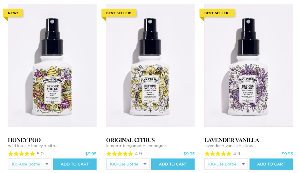
Assuming that you don’t need to check too many details or product images before buying a toilet spray, the company offers quick buttons that let you choose the bottle size and add the item to cart.
(Notice how they also use product ratings and best-seller labels too.)
Chairish, a company that sells high-end decor and art, uses quick add to wishlist buttons instead:
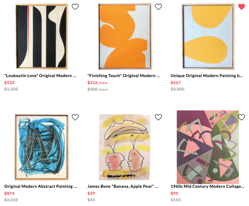
By clicking the little heart button, you can easily save your favorites and return to purchase them later.
It’s a great opportunity for visitors who are browsing through products and making shopping lists.
Chairish knows that some purchases take more than one session and nudges users when their wishlist items go on sale:
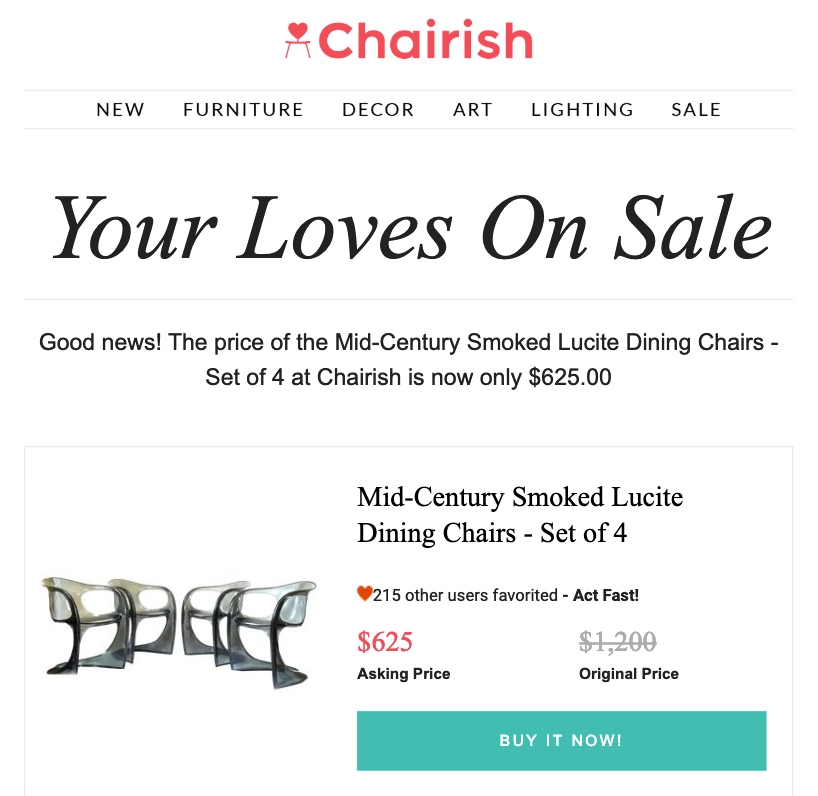
(Notice the focus on urgency and social proof in the email too.)
Conclusion
The bad news is, most e-commerce product listing pages I’ve visited are still under-optimized.
But the good news is, it doesn’t take much to turn it around.
Listing pages act as a path to product pages. And attracting more visitors to product pages means more users in the consideration stage of your e-commerce sales funnel, which means a better chance of converting them into customers.
That’s why optimizing your e-commerce product listing pages can have a tremendous influence on your conversion rates.
Give these strategies a try and find out what works best for your online store.

