Popups are one of the most versatile conversion optimization tools at your disposal. You can use them to collect emails, increase sales, guide visitors, contact prospects, and more.
Best of all, you don’t even need to be a designer to create a beautiful, high-converting popup.
So, whether you’re creating your first email popup, or need help increasing the conversion rates for your existing campaigns, I wrote this post for you.
In it, I’ll give you 11 popup design best practices, using real-world examples, and share how to create design-friendly popups, element by element.
Table of Contents
1. Match Your Popup with Your Site
6. Choose the Right Type of Form
7. Customize Design for Devices
1. Match the Design of Your Popup with the Design of Your Site
No matter what type of popup you create, it needs to compliment your website.
At the same time, though, paradoxically, it needs to distinguish itself from your website’s content. (If it’s going to capture your visitors’ attention, that is.)
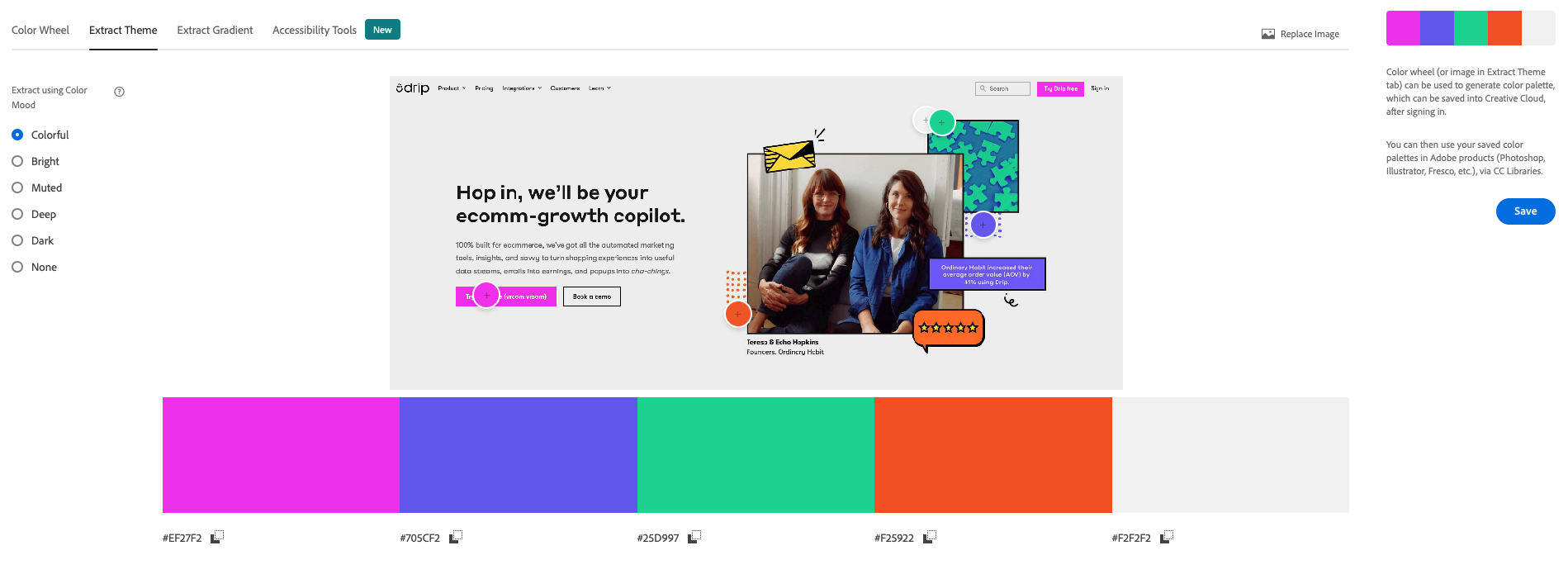
One way to match your popup design with your site is by using a color palette like Adobe Color.
Upload a screengrab of your website—or the page you will show the popup on—and Adobe Color will tell you which colors appear in the screenshot.
 A great example of a brand using their website’s design in its popup is Platinum Trading Academy:

Their popup matches the colors on the page without disappearing into the background. Moreover, the dark blue color differentiates itself from the light gray colors on the site, making it stand out further.
When creating popups based on your site’s color scheme, they will come across as less intrusive–making your visitors more likely to click through and convert.
2. Experiment with New Shapes to Capture Attention
Did you know a popup’s content doesn’t have to stay inside the box?
You can experiment with different shapes in your popups to make them more unique and eye-catching. In fact, the more distinctive a popup is, the more likely it will stand out.
Fortunately, they’re just as easy to create as square popups. You simply create images in different shapes and then add them as floating images to your popup.
Here’s a unique example from WoodUpp:
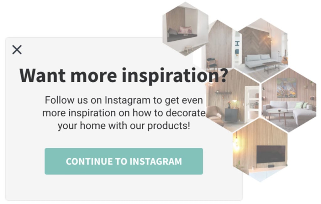
By having the images in uncommon shapes around the edges of the popup, WoodUpp shows more product images without hiding the popup’s copy.
Pretty clever, huh?
To learn more about how to create images in different shapes using Photoshop, read this in-depth guide.
3. Use Color Blocks on Background Images to Increase Readability
I’m a big fan of background images in popups.
And for good reason:
They ensure your popups are more noticeable and showcase your products better.
When you use a background image in your popup, it’s sometimes hard to read the copy because it often clashes with the image’s colors.
Fortunately, there’s a fix for that.
Use see-through color blocks to highlight your copy.
Let me show you an example.
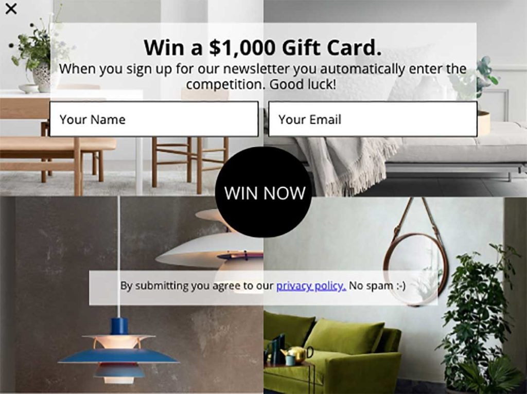
Danish furniture store, Møbelhuset 2, use white see-through blocks behind their copy:
Now, watch what happens when I remove the color blocks:
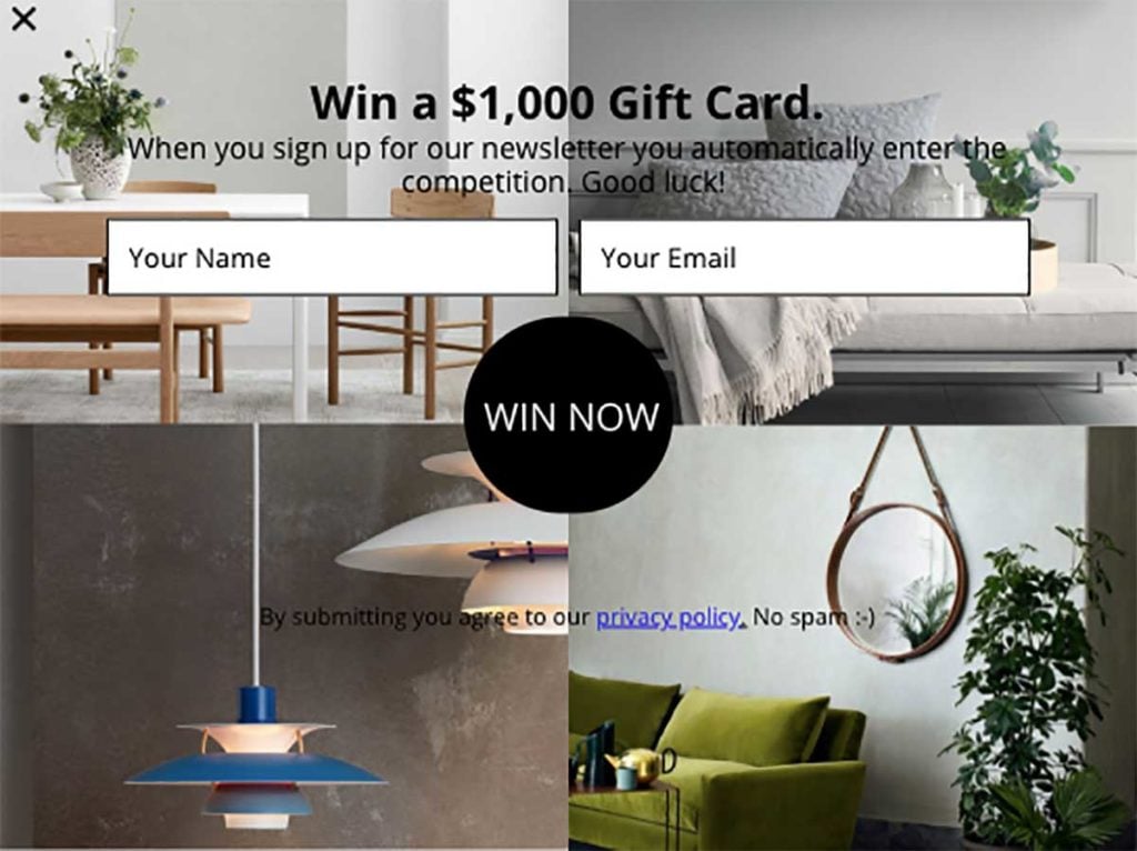
Big difference, right?
The color blocks make the copy much easier to read—and without blocking the background images.
To create a color block, create a new image in Photoshop using the dimensions you want. Then, change the opacity of the color. (In the above example, the opacity is set to 80%.)
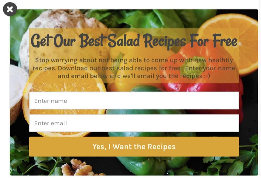
You can add blocks in different colors depending on the colors found in the background image:
4. Make Your Call-To-Action Button the Center of Attention to Drive More Clicks
Your visitors should NEVER feel confused about what to do or where to click when they see a popup.
So, with that in mind, you need to ensure that your call-to-action (CTA) is a key part of your popup and uses benefit-driven copy to encourage visitors to click through.
Take this example from Eva Solo:
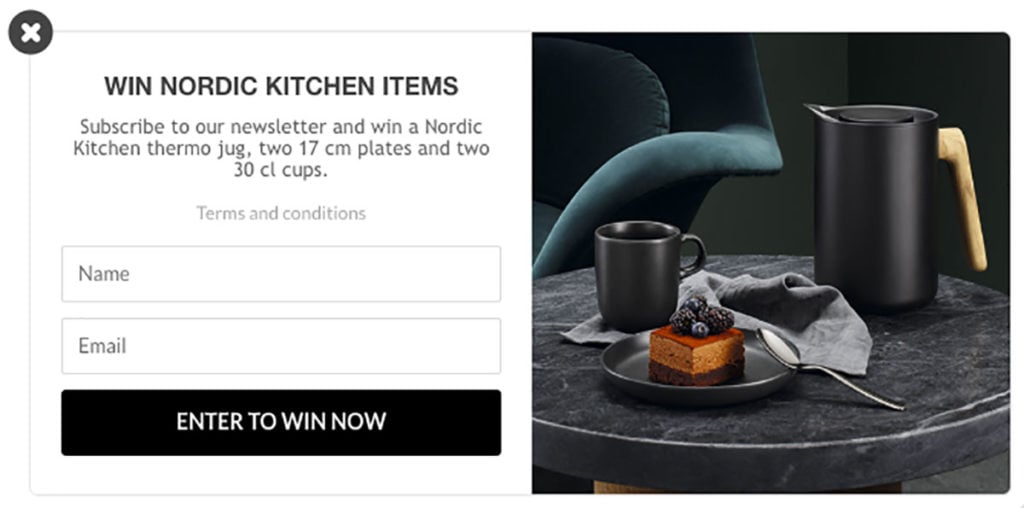
The CTA button focuses on the value of the offer: “Enter to Win [the competition] Now,” and the black color against the white background ensures that the user won’t overlook it.
The same applies if you use two CTA buttons:
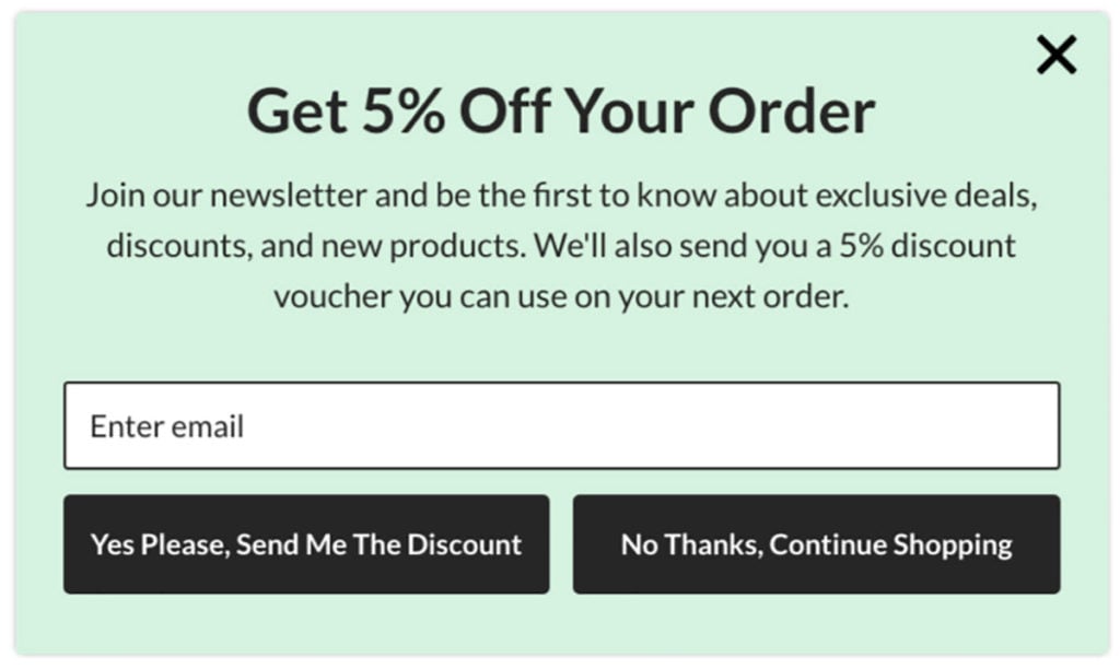
Many e-commerce sites use two CTA buttons to force visitors to make a choice. But many use negative language in their second button copy to get more people to sign up, such as “no, I don’t like discounts” or “No, I want to pay full price.”
Just because visitors don’t click through in your popups, doesn’t mean they won’t turn into customers.
So refrain from using negative language in your CTA buttons, and give them the option to continue browsing your site instead of annoying them.
5. Use Fewer Input Fields to Increase Conversion Rates
Let me ask you a question:
Can you remove an input field from one of your popups and still get in touch with those who sign up?
If the answer is yes, you probably have too many input fields.
I know it’s always nice to have as much information about your prospects as possible, but our data tells us that every time you add an input field you can expect your conversion rate to decrease by 50 percent.
Keep in mind that if you only ask for an email address, you can always follow up via email and ask for more information.
Let me show you an example.
Here’s a campaign with two input fields:
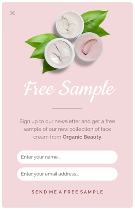
Here’s the same campaign, but with four input fields and radio buttons:
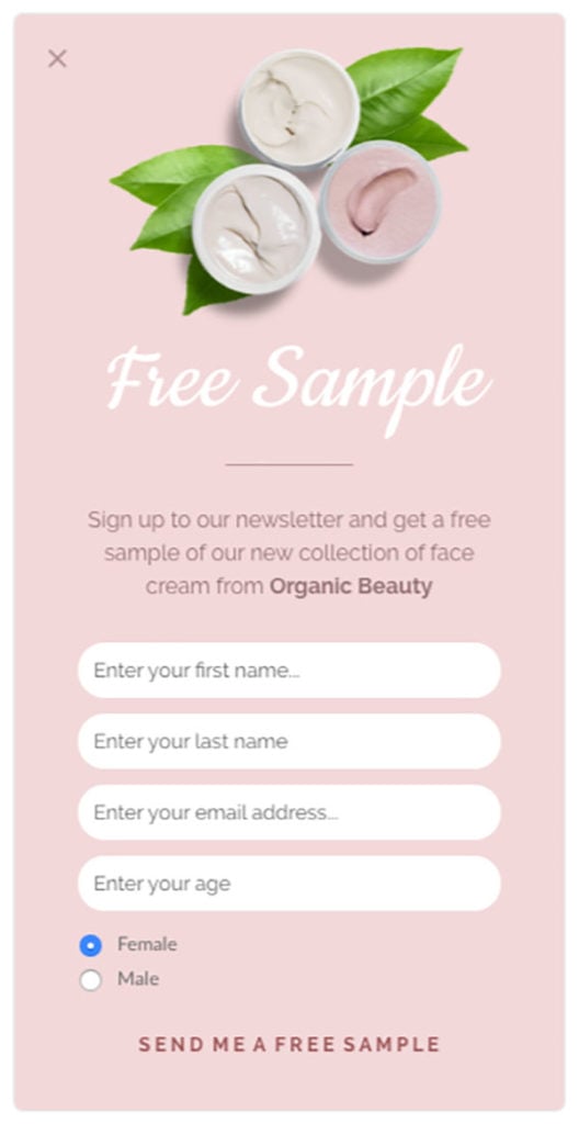
Which one would you most likely want to fill out?
The one with fewer input fields, right?
Consumers are less willing to part with personal information, so keeping your input fields to a minimum will not just make your campaign look better, it’ll also increase your conversion rates.
6. Choose the Right Type of Form for Your Message
Your popup’s design isn’t just about colors—it’s also about deciding what type of popup to use.
At Drip, we offer many different types of onsite campaigns, including:
- The popup
- The slide-in
- The bar
Let’s go through each briefly.
i. The Popup
This is the message that pops up in the middle of the screen on top of the page content.
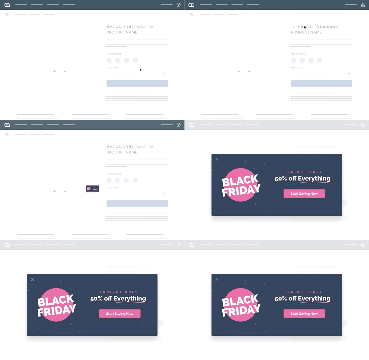
It’s the most “aggressive” type of onsite campaign and we recommend using it the exit-intent trigger or when visitors trigger a popup with the click of a button. That way, you don’t interrupt visitors while they’re browsing your site.
When you use an exit-intent popup, you should make your form as attention-grabbing as possible. It’s your last chance to catch your visitors before they leave, so avoid creating a popup that blends in. It needs to stand out.
ii. The Slide-In
This is one of the most used types of onsite campaigns because it subtly slides in from the bottom of the screen without blocking your site content.
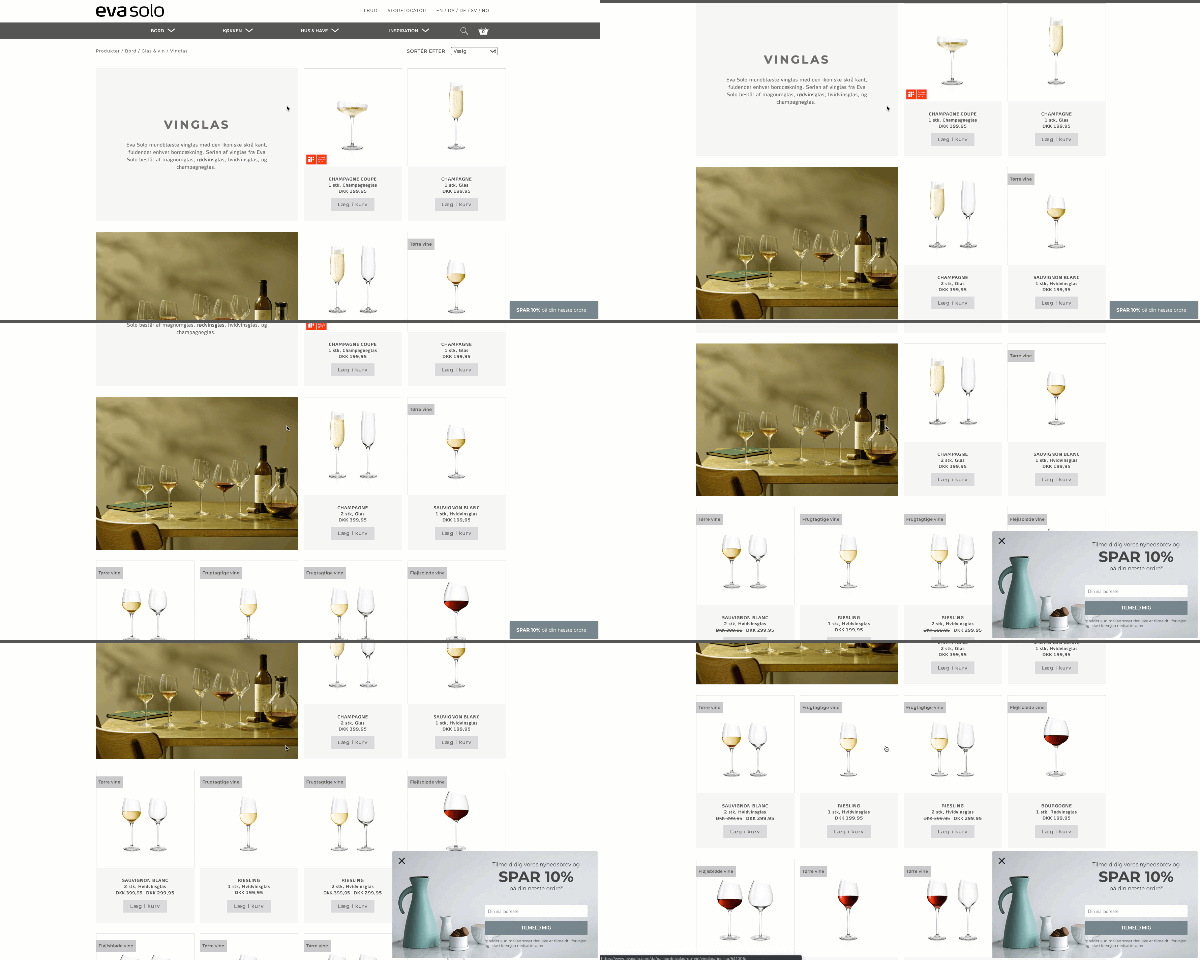
That means visitors can continue to browse your site without having to close the slide-in.
The most important takeaway to remember when designing a slide-in is to match it with the design of your site. (See strategy #1 for more on this).
With a slide-in and popup, you also have the option to include a teaser.
The teaser isn’t an actual form on its own, but rather an addition to your popup and slide-in forms.
The teaser is a small bar that sits at the bottom of your screen when your onsite campaign hasn’t been triggered or closed.
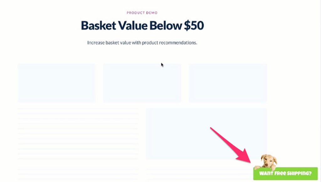
It’s also the only thing your mobile visitors will see when you have a popup or a slide-in form on your mobile site.
On mobile, your campaign will only trigger when a visitor clicks the teaser, ensuring a smooth mobile experience:
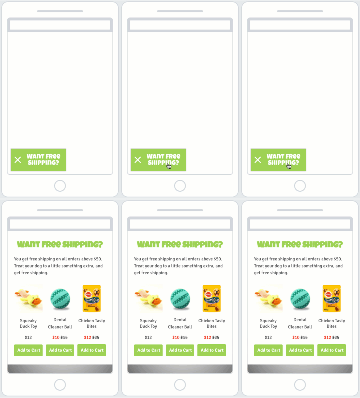
Your teaser should “tease” the content in your form (hence the name), and thus, shouldn’t include much content.
Create a compelling headline and a background color or background image, and that’s all you need.
iii. The Bar
The bar sits at the top or bottom of your screen.
Here’s an example from Kings & Queens:
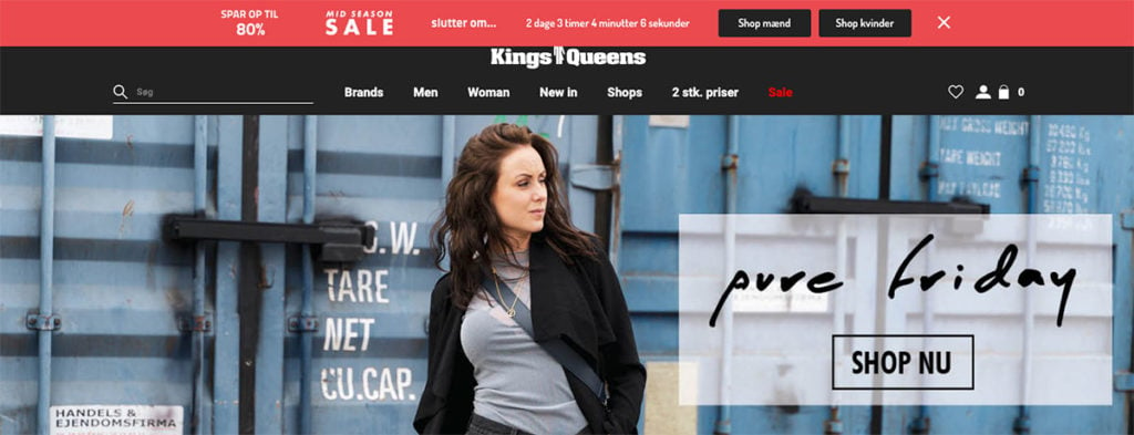
This type of campaign is perfect for announcing an upcoming sale, promoting new product lines, or giving visitors an important message.
Because the bar doesn’t take up much screen space, you can be bold with its colors.
So, if you’re teasing an upcoming sale, you can use a background color that contrasts the colors on your site.
7. Customize Design for Different Devices to Avoid Annoying Google
A few years ago, Google announced its new interstitials policy.
That scared a lot of marketers because it meant site owners could be punished if intrusive popups were misused on mobile.
But that doesn’t mean you can’t use them, period. It just means you have to know how to design mobile popups to follow best practices.
Because you have less screen space on mobile, you need to reduce the number of elements included in your popup.
With Drip, you can create a desktop popup and then switch to mobile view and unlink and edit the elements you want to change for mobile.
That way, you don’t have to create two separate popups, but only adjust the mobile version of your popup.
There are a few things to consider when editing the design of your mobile popup:
- You should always unlink the elements you want to change so the changes you make in your mobile popups doesn’t affect your desktop version.
- If you have a background image on your desktop popup, you should remove it on mobile (it tends to look confusing with the limited space).
- Don’t use more than two input fields in your mobile popup. If people have to scroll on their mobile screen to see your entire mobile popup, it has too much content (which will show in your conversion rates).
- You should shorten your copy to only include the most essential information.
- You should use smaller fonts to make better use of the limited space.
Let me show you what it looks like in action.
Here’s a desktop popup I designed:
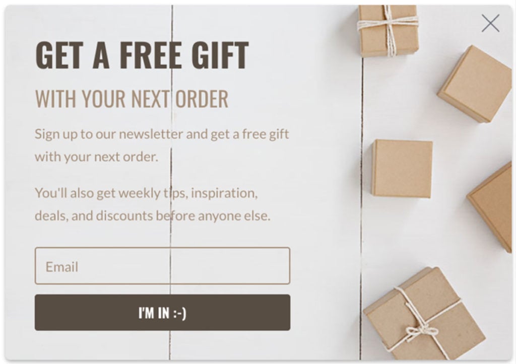
And here’s the mobile version adjusted to follow the above best practices:
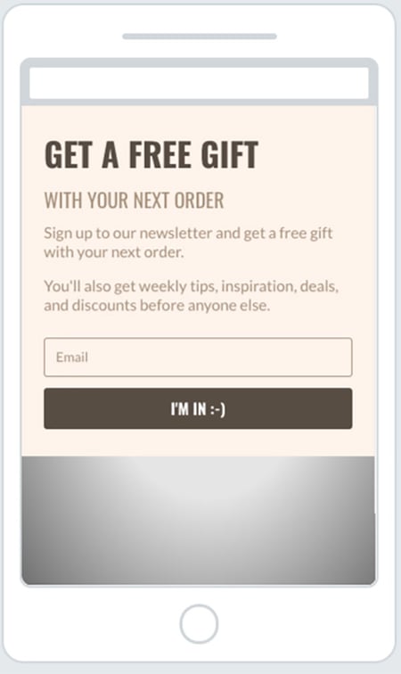
As you can see, the two popups still match in design and the message is the same in both. But the design has been tweaked specifically for the device they’re shown on to account for the change in screen space.
I know, there’s a lot to think about. But when done right, mobile popups work.
8. Use Color Contrast to Highlight Text and Actions
Finding the right colors to use in your popups is tough if you’re not a designer (trust me, I know).
A good rule of thumb is to avoid using the same color throughout your popup. If you’re keen on one color, use different shades of that color to make your popup look more attractive. You can also use contrasting colors. (This especially applies when you use background images.)
When your popups have background images, it can be hard to match the font color to the background without making it look unreadable.
So, find a contrast color to the main color in your background image and use that for the elements you want it to stand out.
For example, your headline and your CTA button:
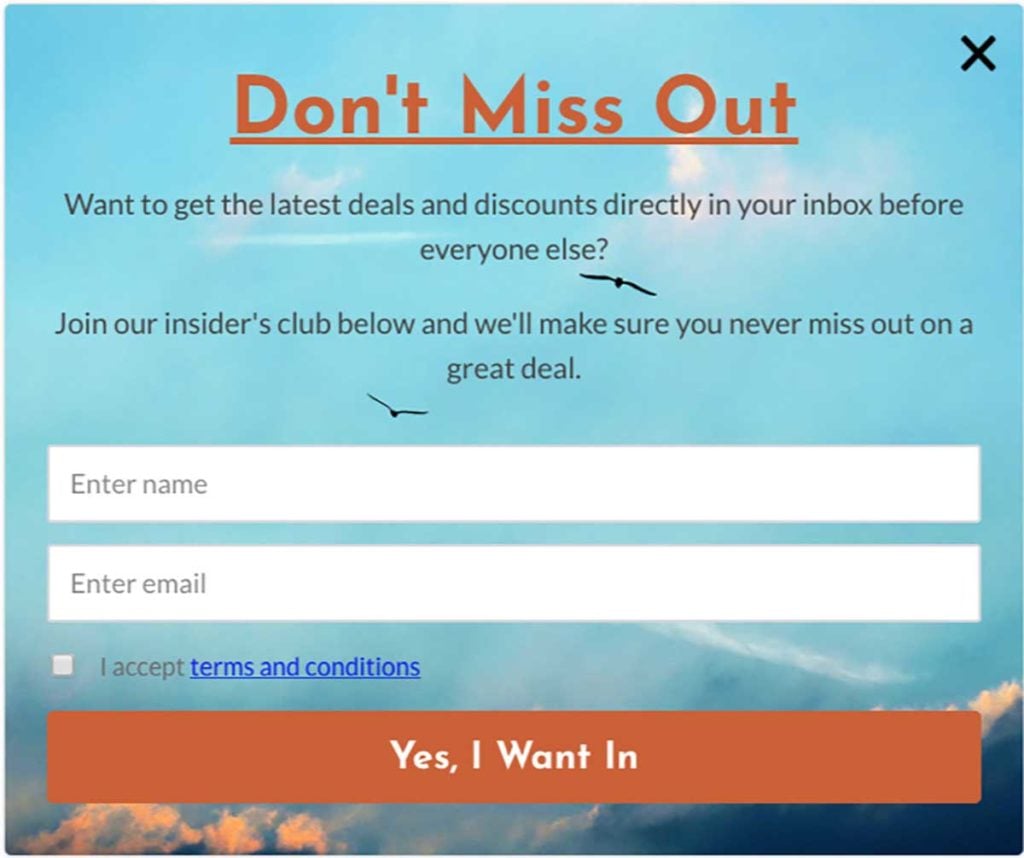
Using contrast colors will help draw attention to your popup without making it look unattractive.
9. Get Your Spacing Right (Without a Graphic Designer)
Many marketers forget spacing when they create their popups. The spacing is the “invisible” content in your popup. And if the spacing in your popup is off, it will look bad and likely affect your conversion rate.
The most important thing when you deal with spacing is consistency. Avoid using different spacing on all four sides of your popup.
In fact, it’s best if you always have the same spacing in the top and bottom of your popup:
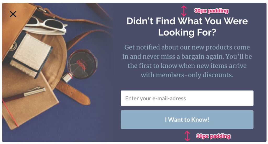
Another important spacing rule is adjusting the spacing so you don’t have single words on one line in your popup. If you do, you can drag the spacing out or in so you get one less or one more sentence depending on what looks best:
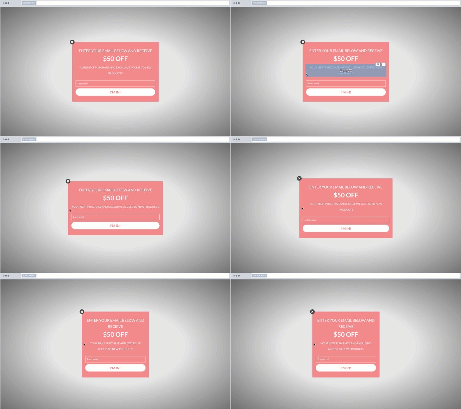
When you get your spacing right, your popup will look much more professional and that will show in your conversion rates.
10. Create New Shape Illusions with .png Images
I’ve already mentioned how you can experiment with different shapes in your popups.
But there’s another way to make the shape of your popup stand out:
Using .png images with a transparent background.
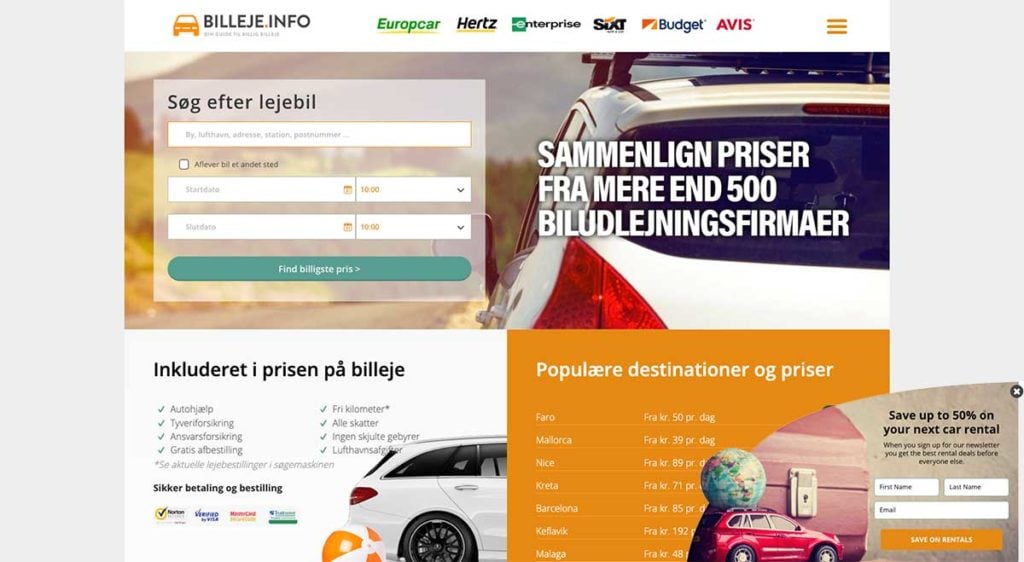
When you set a .png image as the background of your container and set the background color of your popup to transparent, your image will create the illusion of a unique shape.
Let me show you an example. This is from Billeje.info.
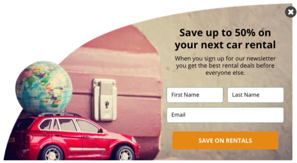
The actual popup is rectangular but because the background is transparent, the image defines the shape of the popup.
Here it is on the website:
And here’s what it would look like if the background of the form was white instead of transparent:
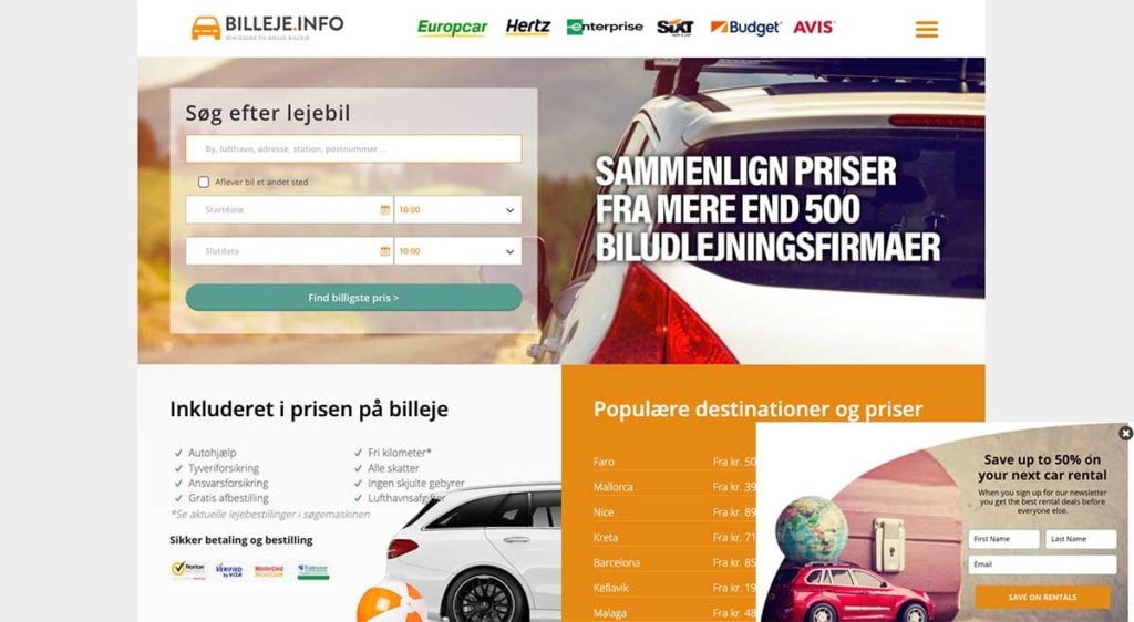
Looks much better with the transparent background, right?
When your popup stands out on your site and looks creative, your visitors are more likely to notice it and take action.
11. How to Choose the Right Fonts for Your Popup
We can’t talk about design best practices without talking about fonts.
If you’re ever in doubt about which fonts to use in your popup, go with the most used font on your website.
Being creative with your fonts can pay off if you do it right.
When you alternate between different fonts in your popup, there are a few best practices to follow:
- Use creative fonts for headlines to capture attention.
- Use your standard website font for the copy to increase readability and ensure your message isn’t lost.
- Don’t use more than three different fonts in your popup.
Here’s an example of how you can experiment with different fonts:
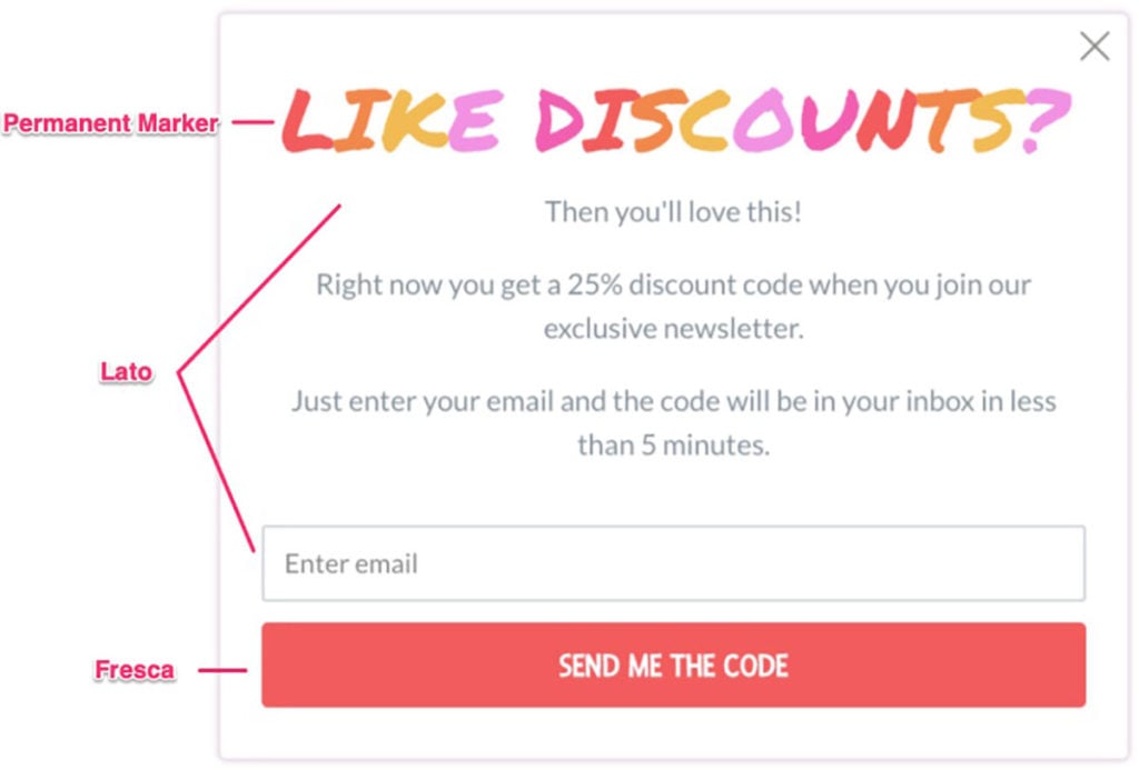
When you create your next popup, try using a fun font for your headline and test it against your standard website font.
Just make sure that your copy is always easy to read and understand.

Conclusion
There are a lot of design elements to consider when you design a popup for your site.
But when you get it right, your popups will not only look good, they’ll also generate amazing results.
Try creating a popup using some of the design principles from this post and see what a difference it makes.

