A few years ago, Google announced that they were making two big changes to how users access content on mobile.
One was simplifying mobile search results. The other, which scared marketers, was their crackdown on “intrusive interstitials.” Or, as they’re more widely known, “popups.”
“Pages that show intrusive interstitials provide a poorer experience to users than other pages where content is immediately accessible,” wrote Doantam Phan, Google’s product manager. “This can be problematic on mobile devices where screens are often smaller.”
If you’re reading this, I’m guessing you’re facing a dilemma all marketers have experience:
- You want to capitalize on mobile traffic; but
- You’re also mindful of giving a good user experience and meeting Google’s interstitials guidelines.
The good news, you’ll be relieved to hear, is that the two aren’t mutually exclusive.
Today, I’ll show you how to create a mobile-friendly popup that not only complies with Google’s interstitial guidelines but also converts like gangbusters. I’ll also share with you how we, as a company adapted to the change, best practices to follow, examples, and more.
Mobile-Friendly Popups: What You Need to Know
To help you better understand how Drip helps you stay compliant with Google’s interstitial policy, I’ve broken down every misconception about Google’s update, one-by-one.
Note. This is not to be confused with the Coalition for Better Ads Experience Program which Google began rolling out in January 2018. To learn more about least preferred ad experiences for desktop web and mobile web, read this article.
1. This Does NOT Affect Desktop
Google’s mobile-friendly rule applies to ONLY mobile search results.
In other words, you can create a popup that ONLY engages desktop visitors, if you prefer.
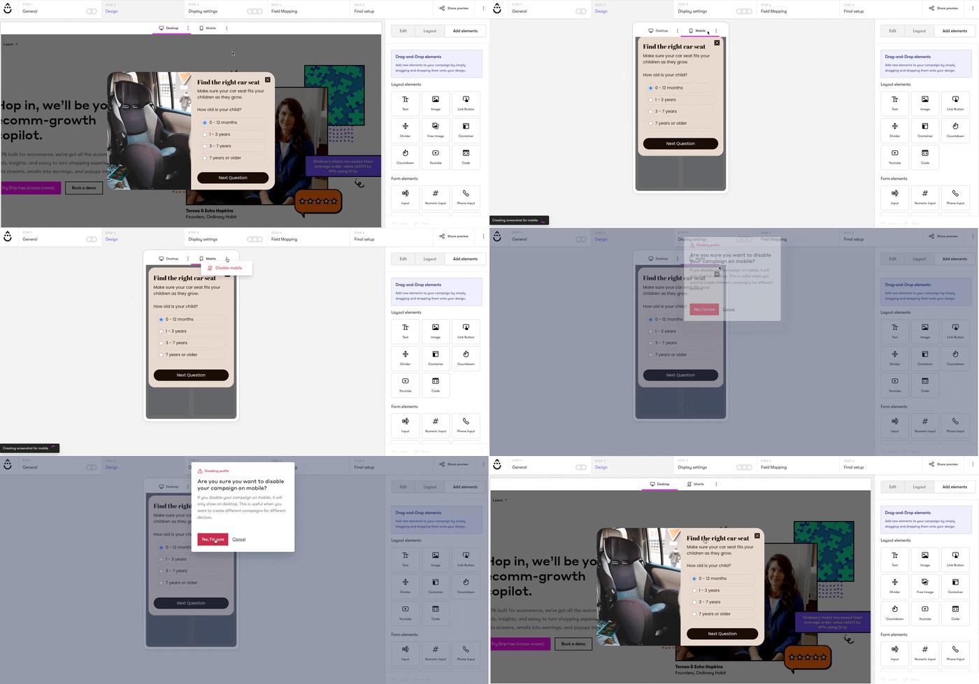
At Drip, we have device specific-targeting rules to help you engage the right users at the right time on the right page—regardless of the device they’re using.
To make a change, go to the Onsite Campaign Builder and enable/disable the device of your choosing.
2. This is Not Just For Popups
Google defines an interstitial as “a layout where the above-the-fold portion of the page appears similar to a standalone interstitial, but the original content has been inlined underneath the fold.”
In other words, this isn’t specific to on-page messaging or choice of software; it’s about your website’s entire user experience (UX).
Google is as likely to penalize someone using an oversized ad or hero image as they are using an on-page message.
Their goal, remember, is to help users quickly find the best answers to their questions—without having to scroll or have their view blocked.
3. Screen Space Matters
Google knows that list building, conversion rate optimization, and email marketing are crucial marketing channels for online businesses. That’s why they give an example of screen space they deem “reasonable” for mobile lead generation:
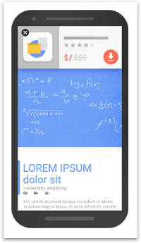
At Drip, our popups are Google-ready for all mobile devices. In fact, you can even use our device-specific rule to create targeted on-page messages for ONLY mobile users. (More on that later).
How Drip Helps You Stay Compliant with Mobile-Friendly Popups
If you’re like most marketers, you want to engage your website visitors and turn them into buyers—without hurting the user experience.
So, with that in mind, here are five ways Drip helps you stay compliant with Google’s mobile-friendly rule.
1. Use Device-Specific Display Rules
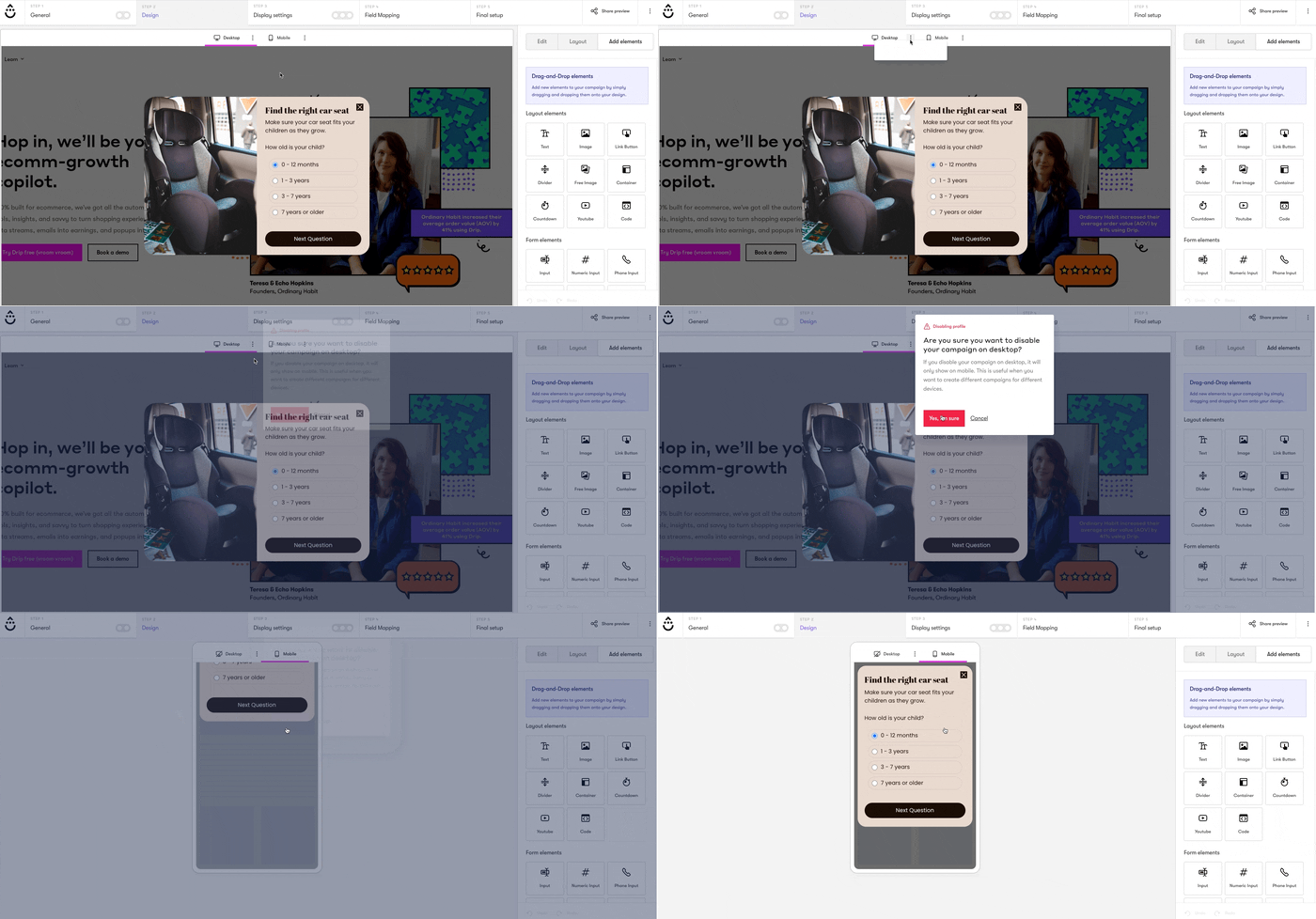
Did you know that our mobile popups are more than responsive versions of their desktop counterparts? It’s true. With our signature mobile-only editor, you can easily create and customize campaigns that are mobile-specific.
Here’s an example of it in action:
2. Show Non-Obtrusive Popups
We’ve all encountered obnoxious popups at one time or another. You know the ones I’m talking about. You go to leave a site only to see a popup where you have to check a box that says something like “No, I don’t want to generate more leads for my business.”
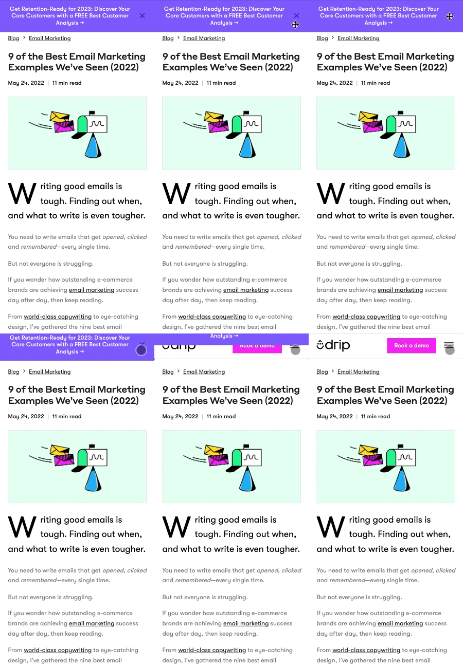
Well, we had enough of abusive messages like that, so we made it easy for visitors to close any campaign, at any time, with the click of a button regardless of device.
Here’s an example on our website:
3. Exclude Return Visitors
Imagine you sign up for a company’s weekly newsletter.
Then, a few days later, you receive an email promoting a flash sale. You click the link in the email and go back to the company’s site. But when you do…
You see a popup asking you for your email address.
Yes—the SAME popup that got you on their email list, to begin with.
Not only is this far-too-common; but it’s also incredibly annoying for return visitors.
No one wants that.
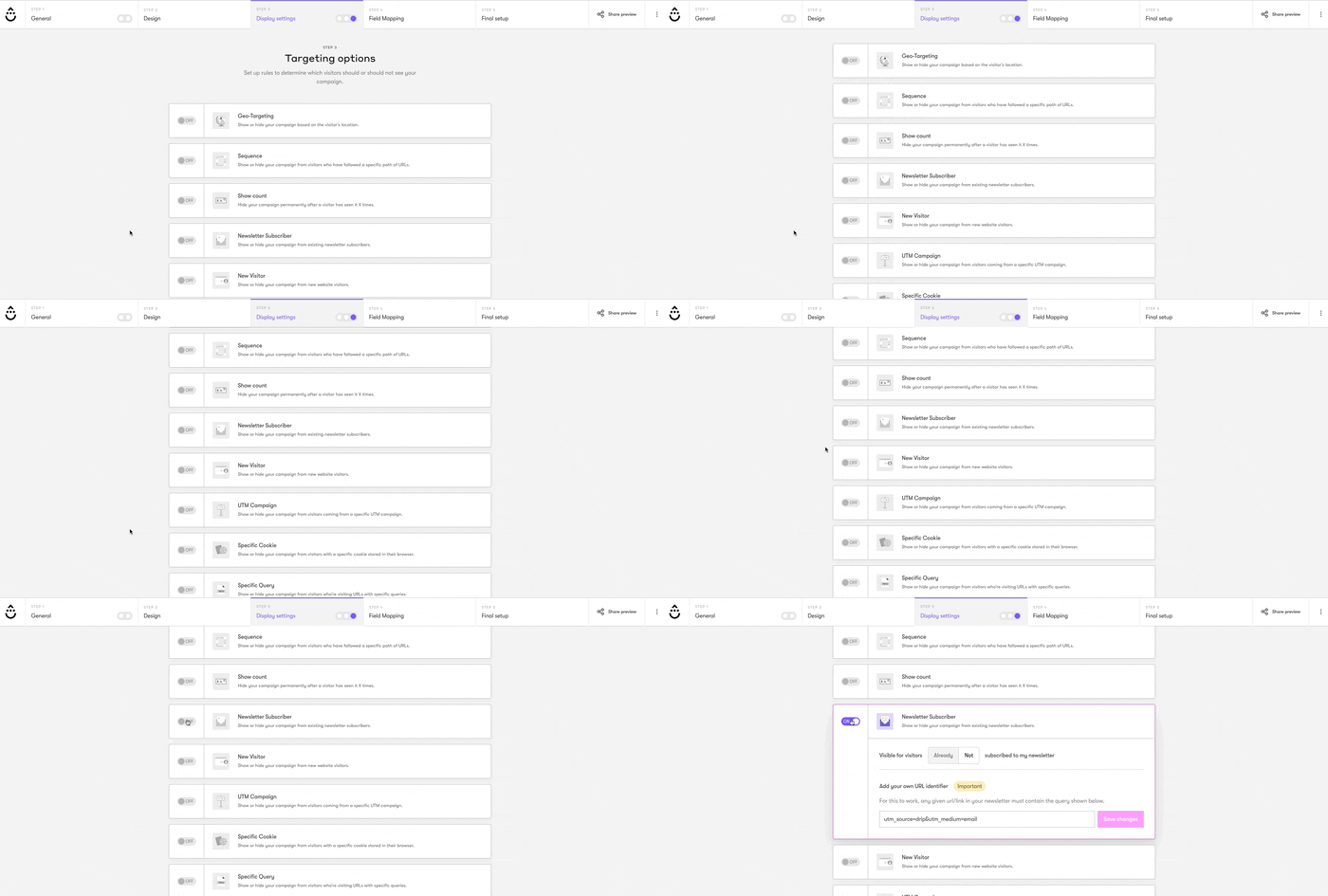
We give you the technology to hide your popups from existing subscribers.
To do that, choose “Newsletter Subscriber” under “Targeting Options”:
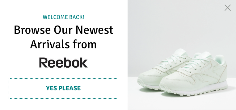
 If you want to go one step further, you can create a popup for return visitors ONLY. Perfect for rewarding customer loyalty, recommending popular, and more.
4. Use Screen Space Compliant Teasers
As mentioned above, Google allows for “reasonable” use of screen space, providing that it’s used responsibly.
On mobile, you have the option to show visitors a “Teaser” before showing your popup. This gives visitors a “preview” of your popup’s message. That way, if they feel it’s interesting and relevant, they can click it to learn more.
Here’s an example in action:
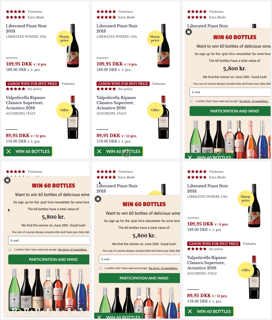
To ensure all mobile onsite campaigns qualify under the “reasonable” screen space rule, we restrict the height size of ALL mobile teasers.
With each new popup you create, you can rest in the knowledge that it’s user-friendly and optimized for mobile conversions.
5. Choose One of Our Conversion-Optimized Conditions
If you’ve ever walked into a store only for the cashier to immediately ask you if you’re looking for something … then you know how annoying of a request it is.
Yet, the same thing happens online every day. You enter a site and within one second or less, you’re asked to join a newsletter, opt in for a bonus, request a call …
Like the earlier comment about asking visitors to join your newsletter when they’re already on it—it’s annoying.
To make life easier for you and your visitors, Drip's onsite campaigns have a few triggers to help you engage your visitors based on their behavior.
Here’s a quick overview:
i. Scroll-Based Trigger
If you have a page on your site with long-form content, like a blog post, you might want to trigger a popup based on far down a reader scrolls down the page.
Why? Because the longer readers stay on your page, the more engaged they are … meaning the more likely they are to opt in when given a call-to-action.
Let’s say, for example, that you have a heatmap running on a page and it shows that the average scroll depth is 70%. With that information, you could create a popup to show just before that percentage to ensure that you capture your visitors’ email when they’re most engaged.
ii. Referrer Detection
Imagine you’re running a promotion on another website.
You’re expecting a lot of referral traffic and you want to capture as many leads as possible.
You know personalization is important, and you want to address the referring site in the copy, but you also don’t want to show the message to visitors arriving from Google.
So, what could you do?
With our referral detection condition, you can create a popup to show for a specific referral URL or a UTM parameter. Remember, the more personalized your marketing messages are, the higher the likelihood they’ll convert.
iii. Use Click Triggers
It’s no secret that content upgrades are AMAZING lead magnets. In fact, we saw a 28.83% boost in our on-site conversion rate when we added them to our blog.
But did you know you can use them in ecommerce, too?
With our Click-Trigger condition, you can show a popup when a visitor clicks an image or button. A good example is offering a size guide for certain items as Chubbies does on their website.
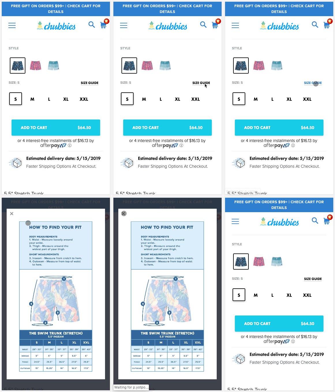
The best part is, unlike other providers, our mobile popups aren’t affected by Google’s rule because they use a two-step optin (meaning it requires users to click to show the popup).
Conclusion
Google’s interstitials policy concerned many marketers when it began rolling out a few years ago.
But, now, years on, few sites are capitalized on mobile traffic out of fear of annoying Google. But those who adapted to the change and improved their user experience, are enjoying the lion’s share of the traffic (and conversions).
Now it’s your turn:
To create a mobile-friendly popup on your site today, start a free 14-day Drip trial.


