Lead generation is changing every day. And nowhere is this more evident than online.
Paid advertising costs more, while technology is evolving to meet the public’s concerns around data privacy—making owning zero-party data more critical than ever.
However, to obtain that data, you need to make it worthwhile for new visitors without putting them on guard. Fortunately, a good lead magnet can help you do that and more.
In this post, I’ll share seven e-commerce lead magnets to help you collect more details from new visitors, which you can later use to send better, more targeted email campaigns.
7 E-Commerce Lead Magnet Ideas You Need to Know
What Is a Lead Magnet?
A lead magnet is a freebie offered to a new website visitor in exchange for their email address. In B2B, this is usually a PDF or whitepaper, but in e-commerce, which I’ll explore below, a lead magnet can range from a discount to early access to new products and everything in-between.
1. Discount
Offering a discount to new visitors is one of the more common lead magnets found in e-commerce.
The idea is simple: you offer a discount—usually between five and ten percent—in exchange for the visitor’s email address.
There are a few approaches to consider here. One is combining an email popup with a landing page, as ASOS does for students.
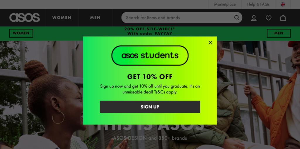
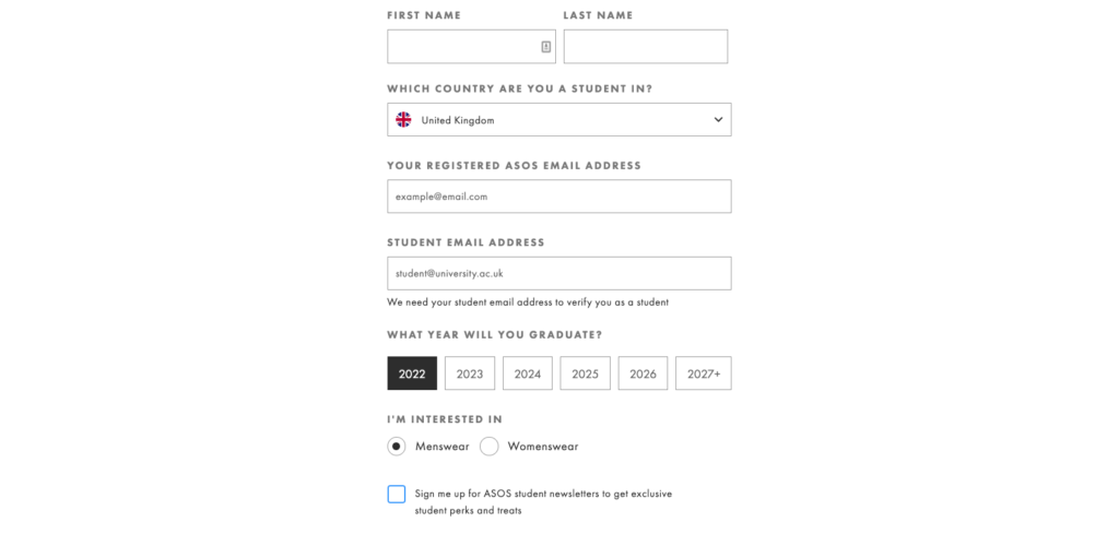
After clicking “Sign Up,” the brand redirects you to a landing page where you’re asked to enter more details, including name, email, the year you will graduate, and more.
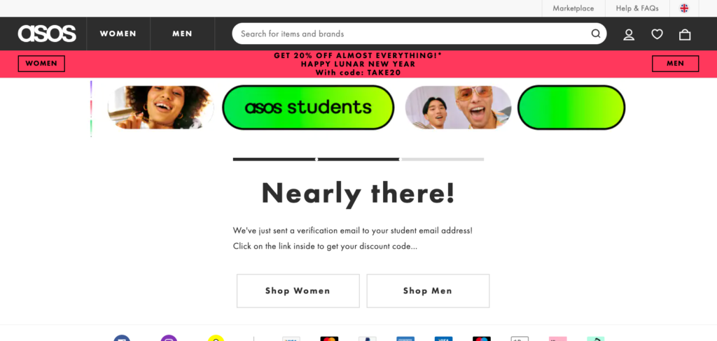
After inputting your details, ASOS emails you a discount as well as links to its Men and Women’s product pages.
Another approach to offering a discount is using an email popup to enrich the lead instead.
Mori asks new visitors for their email but also asks them to self-segment based on whether they are expecting a child, are a parent, or a gifter.
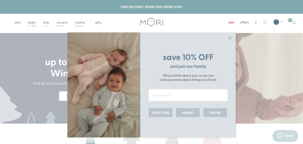
Mori can then pass this data to its email service provider (ESP) to send better, more personalized email campaigns.
You might think adding additional steps will lower conversions, and you’re right in assuming as much, especially when directing visitors to a landing page and adding multiple input fields. But as we’ve found from our research, that’s not always the case.
When we looked into the data behind multistep popups—popups that collect the visitor’s email in the first step and more data (gender, interests) in the second step—popups with a second step see a staggering 76 percent of its users enter more details.
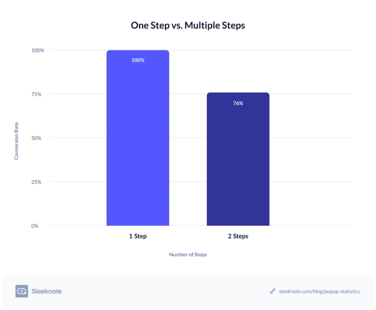
Offering a discount is an effective way of collecting more leads. But collect as much relevant information as you can from the start. Your future self will thank you for doing so.
2. Loyalty Program
Offering a discount is one way of capturing a new visitor’s email. But what’s more effective is offering a discount as a benefit of joining your loyalty program.
Let me share two examples using two popular online retailers to illustrate what I mean.
Origins, a cosmetics brand, wants to convert its new visitors into subscribers. But rather than offer a discount, it offers a discount if you join its “Origin Rewards” program.
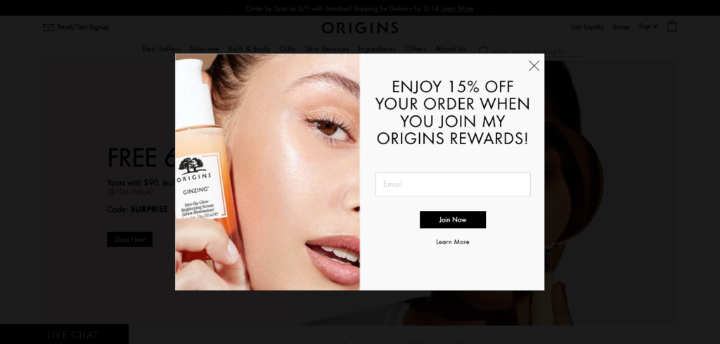
After entering your email, the brand redirects you to a landing page and invites you to create a free account.
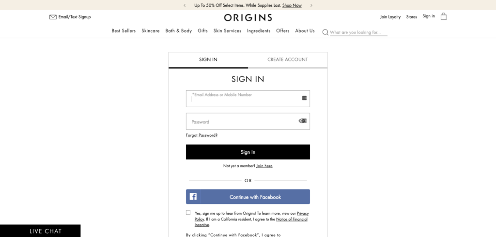
After registering an account, Origins emails you the discount as promised, complete with everything you would expect from a well-written welcome email.
Tarte Cosmetics, similarly, follows Origins’ example but changes its incentive, offering free credits instead of a discount.
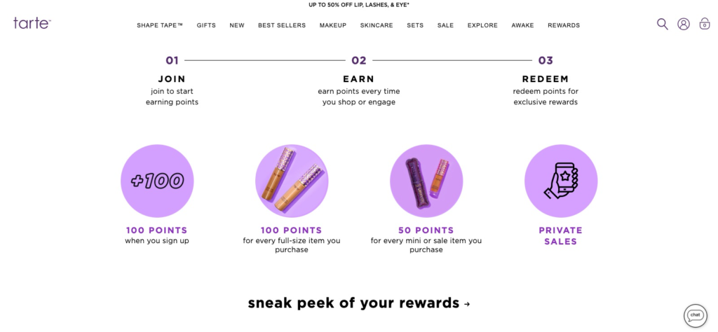
When you click through to Tarte’s “Sign Up / Log In” page, the brand reminds you of the benefits of joining Team Tarte.
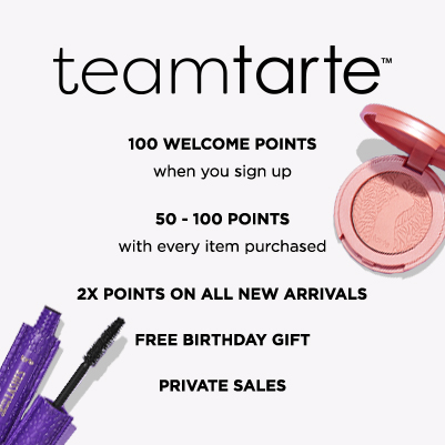
If you have a loyalty program and want to nurture your subscribers to spend more, offer a discount but as a bonus to joining.
3. Free Shipping
Say you’re offering discounts already, but as a reward for subscribers who return to your store and buy something. How else can you incentivize new visitors to opt in, assuming you don’t have a loyalty program?
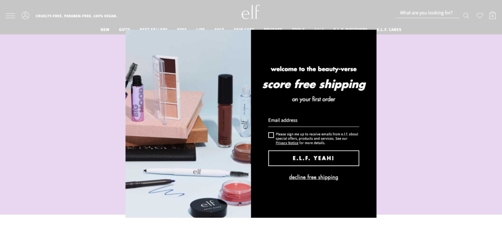
One lead magnet growing in popularity in the beauty market is offering free shipping. Elf, for instance, welcomes new visitors to its “beauty-verse” by offering free shipping as an incentive to join its email list.
Kate Spade is another brand that offers free shipping—but with a new twist on an old favorite.
Rather than mention it offers free shipping, the brand tells the reader they have “qualified” for such, and if that’s not enough, free returns as well.
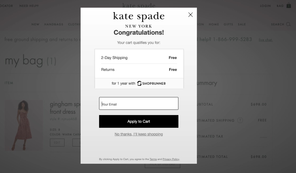
If you can’t afford to offer free shipping, look at any “stored” value in your business—free returns, a gift guide—and reframe it as an incentive to subscribe.
4. Giveaways
Giveaways are synonymous with social platforms like Instagram. But they’re as—if not more—effective when managed on your website due to you having more control over who can enter.
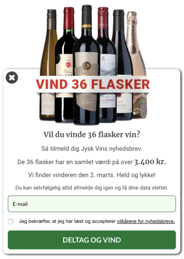
One brand known to run on-site giveaways is Danish wine merchant Jysk Vin. One of my favorite examples was when the brand was running a giveaway to “Win 36 Bottles.”
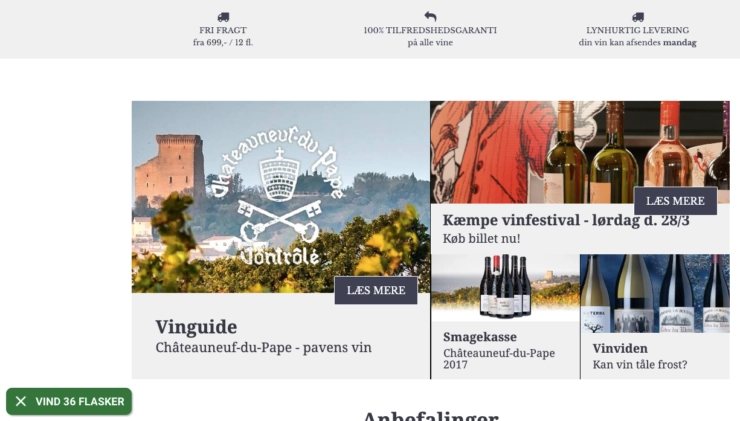
After clicking the popup’s teaser, the visitor saw a popup inviting them to enter their email for a chance to win $516 worth of wine.
Another brand that experiments with giveaways from time to time is Barkbox. Depending on when you visit its site, the brand offers a freebie, a free Barkbox, or anything in between as a way to win new business.
At the time of writing, the brand was promoting a free blink mini camera via a slide-in popup—but only while supplies were in stock.
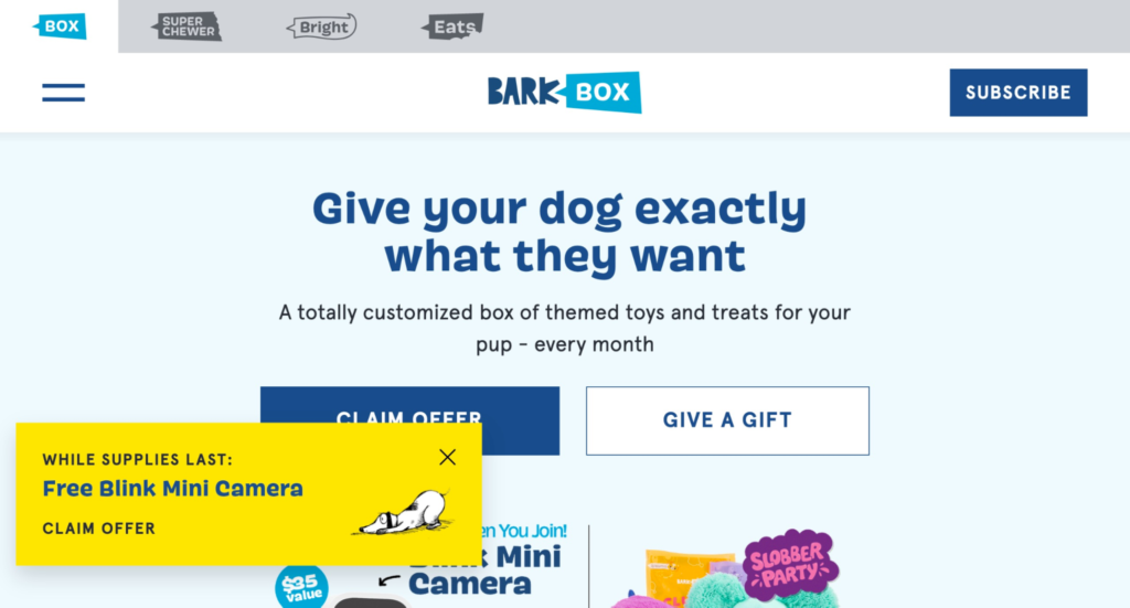
After clicking “Claim Offer,” Barkbox asked me a series of questions about my dog, his/her name, and more.
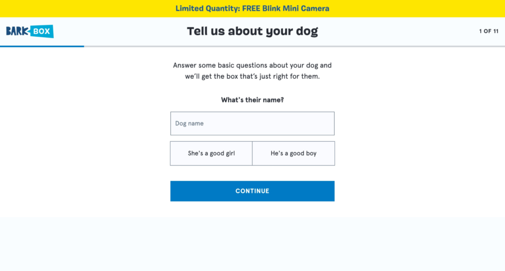
What’s interesting is that, at the halfway mark, the brand asked for my email and permission to “Send me more ways to keep my dog healthy.” In other words, promotional emails.
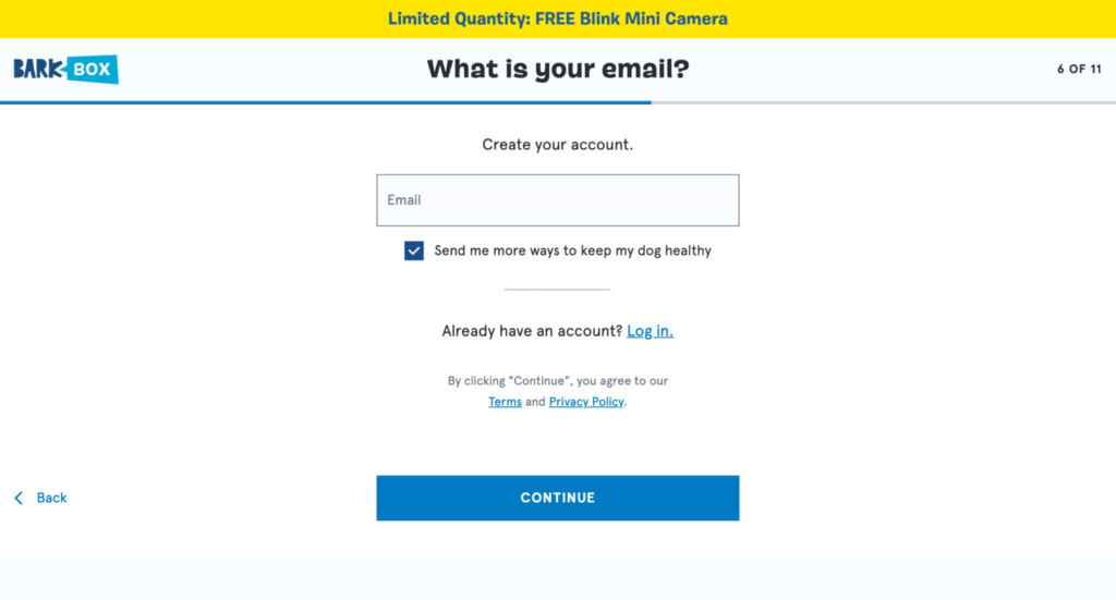
After entering my email, Barkbox pitched me its monthly subscription service with the option of doubling my first box (which makes for the perfect upsell, if I thought so myself).
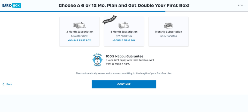
I didn’t become a customer. But it didn’t matter: Barkbox already captured my email in the previous step—along with my consent to them emailing me new offers in the future.
Despite the examples mentioned, giveaways don’t always involve giving away physical items. For more inspiration on giveaways ideas, read Seray’s blog post (particularly the Charlotte Tilbury example).
5. Quiz
One lead magnet that’s growing in popularity, partly due to its ability to capture and convert leads into buyers with relative ease, is a quiz. However, there is a caveat to using them correctly: you need to solve a hyper-specific problem for your audience.
Let me walk you through my favorite example. Care/of offers “premium vitamins, personalized for you, at a not-so-premium price,” with “personalized for you” being a key part of its lead generation strategy.
If you visit Care/of’s homepage, you notice a hello bar at the bottom of the page, inviting you to take a quiz. (The copy says, “Feel great every single day in 2021. Your 50% discount on orders over $30 is waiting for you at cart. Take the quiz.”)
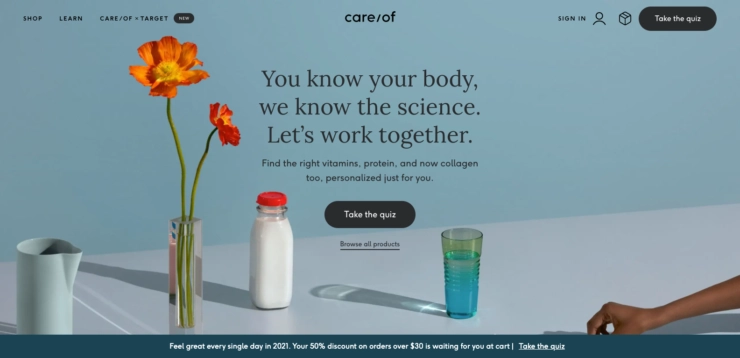
Care/of then asks a series of questions to better understand who you are and what you’re looking for in a vitamin.
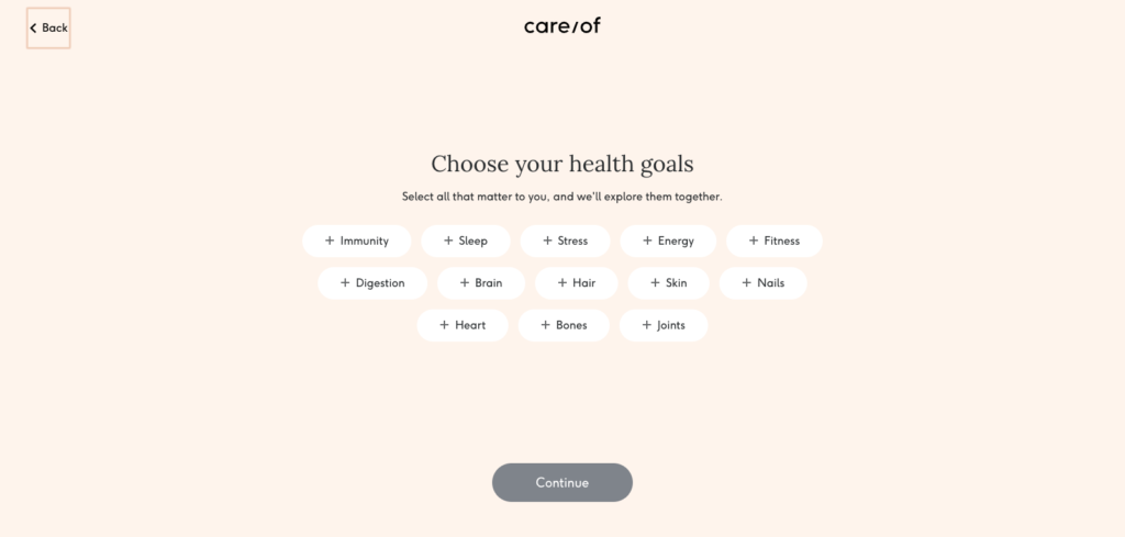
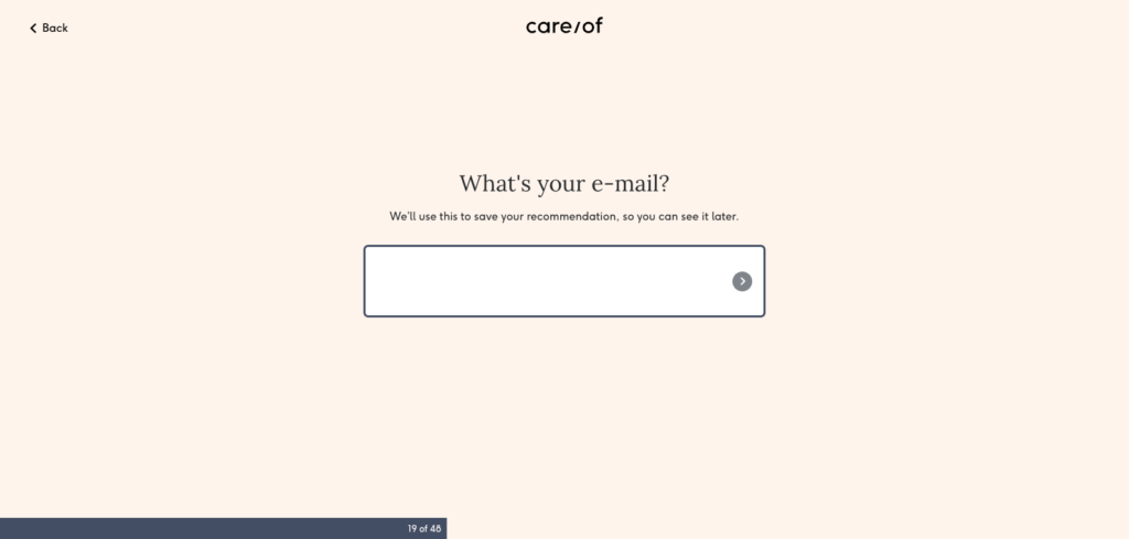
Interestingly, like BarkBox, Care/of asks you for your email halfway through promising to send you personalized recommendations. (The progress bar appears for the first time, too.)
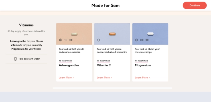
After completing the quiz, Care/of recommends three products it feels suit you before linking to each product’s respective page, where you can learn more and make a purchase.
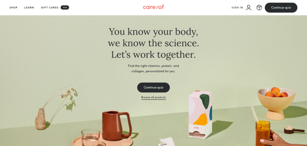
Best of all, if, under any circumstances, you leave the quiz by mistake or otherwise, you can resume anytime by returning to the homepage and clicking “Continue Quiz.”
Quizzes are effective lead magnets because they leverage the time and effort a visitor has already invested. You’re more likely to complete the quiz if you’re halfway through, and as a by-product, enter your email as a safeguard against losing your progress.
What’s more, you’re more likely to trust a brand that not only offers a solution to your problem—in Care/of’s case, which vitamins to take and the reason(s) behind taking them—but does so having asked for your input first and tailored its recommendation to that input.
6. Credit
One way to collect more emails is by offering a discount. Another similar—albeit uncommon approach—is offering credit on a future purchase.
Following are two very different approaches to offering credit, starting with the easiest and what I recommend trying first if you go down this route.
Vinomofo is an Australian wine e-tailer that promises “good wines, real people and epic deals, without all the bowties and bs.”
And to do that, the brand offers $30 off your first order when you join its email list.
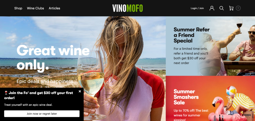
Rather than collecting the visitor’s detail’s in one step, they instead send you to a landing page, where they reinforce their value proposition.
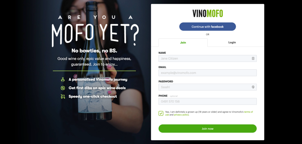
To keep things simple, Vinomofo also gives you the option to opt in via Facebook. And if you prefer to subscribe via the provided form? The brand included some (sometimes humorous) helper text to aid you in submitting your details.
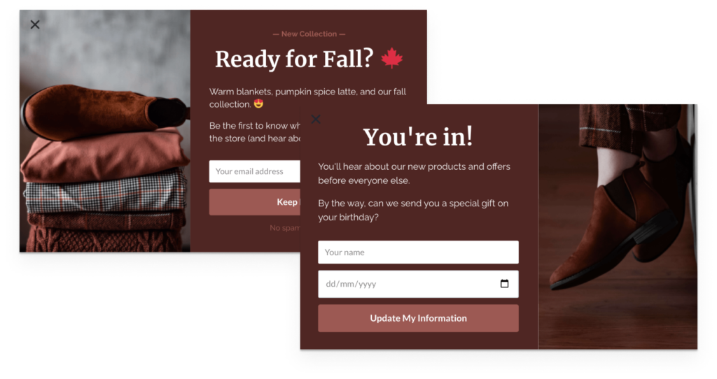
You don’t have to go to Vinomofo’s lengths to achieve a similar result. Even a simple multistep popup like the example below would capture what’s needed. (We found in our research that popups with a second step see a staggering 76 percent of its subscribers input more information.)
Onto the other approach to offering credit. Wayfair is an e-commerce brand that sells furniture and home goods. But what differentiates it from its competitors is its approach to collecting leads.
In its homepage welcome bar, you might notice a link to a credit card, which, after clicking, leads you to the following page.
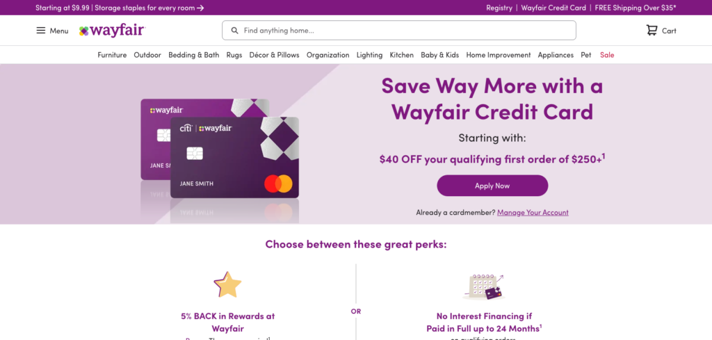
On it, the brand offers $40 off your qualifying first order over $250, and from there, includes a call to action to “Apply Now.” Further down, Wayfair promotes a choice of perks, aside from the above discount, such as 5 percent back in rewards or no interest financing if paid in full up to 24 months.
Granted, this isn’t for every business. And it might not be for yours (if that’s the case, see Vinomofo’s example). But if you have the resources to pull it off, offering a credit might be up your alley.
7. Early Access to New Products
I get it. Gaining early access to new products might not have you jumping up and down with excitement like the above incentives. But I decided to include the following example for two reasons.
Glow Recipe prides itself as “cruelty-free, clean, fruit-powered skincare designed to help bring out your inner glow.” And like many of the brands we’ve looked at, it includes a form in its footer to collect emails.
What it does differently, though, is, in addition to asking for the visitor’s email, asks for a mobile number as well. What’s more, it’s testing a different offer than what it’s offering in exchange for the visitor’s email.
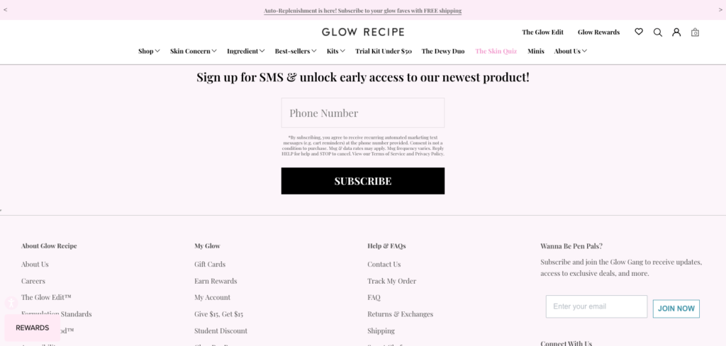
If you opt in via email, the brand offers updates and access to exclusive deals. But if you opt in via SMS, you unlock early access to Glow Recipe’s newest product.
The second reason I’ve mentioned Glow Recipe here—in addition to collecting mobile numbers as well as email addresses—is how it’s framing its incentive.
Having looked at many incentives while researching this post, offering access to a brand’s newest products isn’t anything new. Oftentimes, it’s a throwaway line in its copy.
What is new, however, is the difference one letter makes. Or rather, the admission of one letter. Not “Products.” Product. As in singular. I don’t know about you, but unlocking one product is far more intriguing. To me, it sounds like they’re working on something big. And that makes me want to be the first to know more.
Of course, unlocking early access doesn’t have to be limited to new products. You can offer first-dibs on anything you know your market is interested in and willing to jump to the front of the line to stay in the know.

Conclusion
I think most articles that talk about e-commerce lead magnets miss an important point: You’re not limited to one idea. If an incentive doesn’t work, replace it for another, better option depending on who you’re targeting.
Heck, if you want to go the extra mile, don’t be afraid to test multiple offers at once, as Shein does by offering a discount, free returns, and buy now, pay later. (Again, offering existing value from within the business.)
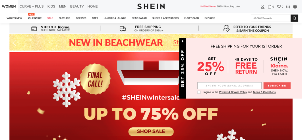
I’ve mentioned seven ideas in this blog post. And while there are countless others, you won’t know what’s best for you unless you keep testing. You’ll know when you’ll be on the money. (Or is that “in” the money?)


