An e-commerce landing page is designed to do one thing—persuade shoppers to buy.
Here you’re targeting people toward the middle or bottom of the funnel that are seriously considering making a purchase.
In order to convert, you need to properly engage with them and push the right buttons to make them feel comfortable with buying.
Do that correctly, and you’ll be positioned to go well beyond the average conversion rate of 2.35 percent and reach 3, 4, or even over 5 percent.
Although every landing page will differ, there’s a repeatable formula that successful brands use.
And that’s exactly what I’m going to cover in this post—the specific strategies they use to win over shoppers, along with some of the best e-commerce landing page examples to learn from.
Let’s not waste any time.
What Is an E-Commerce Landing Page?
An e-commerce landing page is a web page where a visitor “lands” after they click on a link in an email, ad, or similar places online. Unlike traditional web pages, e-commerce landing pages are designed with a single conversion goal in mind and use elements such as testimonials to compel visitors to buy.
5 E-Commerce Landing Page Examples You Need to See
1. The Kolibree Ara Smart Toothbrush
2. The Everpillow From InfiniteMoon
Core Strategies Top E-Commerce Brands Use
Here are some of the essential strategies that you’ll see used in top e-commerce landing pages time and time again:
- Focusing on a single product or offer
- Beautiful design
- Providing a strong unique value proposition (UVP)
- Using a logical, sequential layout that seamlessly unpacks information
- Offering a succinct explanation of what a product is, its benefits, why a shopper should buy, etc.
- Writing sharp, concise, clever copy
- A clear CTA
- Social proof
And here are some real-life examples of these strategies in action.
1. The Kolibree Ara Smart Toothbrush
Kolibree is a company that sells smart toothbrushes that use cutting-edge technology to create better oral health while offering a fun, enjoyable experience.
The product they’re selling in this e-commerce landing page is called the Ara, which is the first toothbrush with Artificial Intelligence to help you get a better smile.
The first thing I want to point out in this example is the UVP located above-the-fold which lets shoppers know what distinguishes the Ara from any other run-of-the-mill toothbrush.
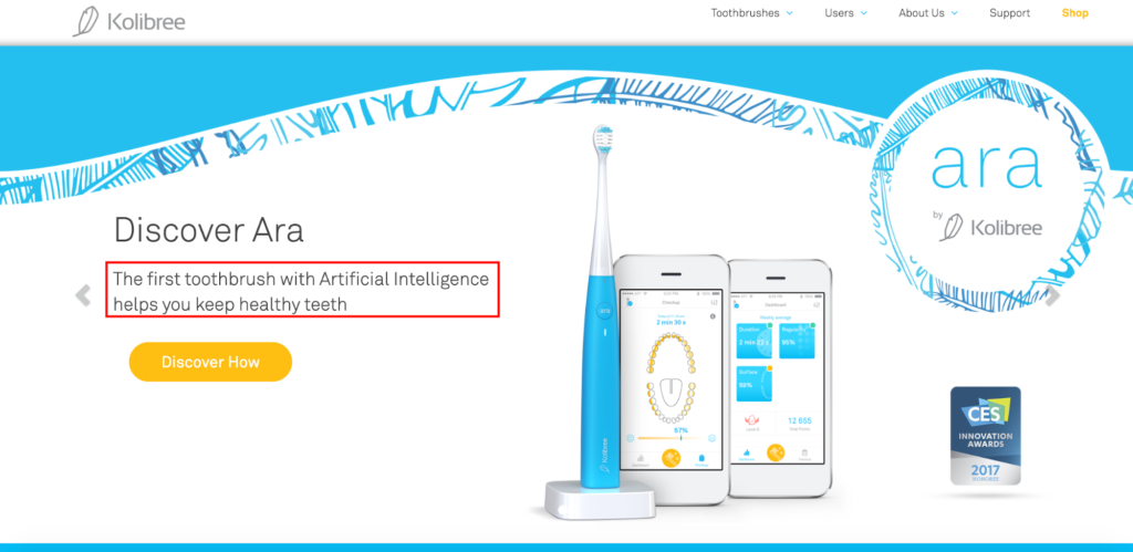
It’s definitely an attention grabber, and knowing there’s a toothbrush with AI should pique many people’s interest.
Next, let’s talk about aesthetics. This landing page checks all of the boxes here.
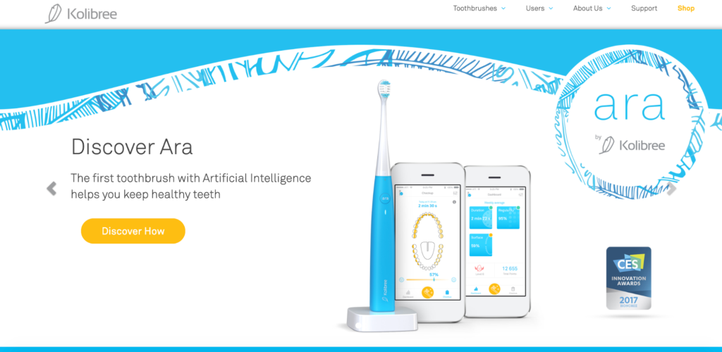
It features a crisp, clean, uncluttered background. It also includes a beautiful image of the product, so shoppers instantly know what it looks like. And as they scroll down, it’s more of the same with the other pictures.
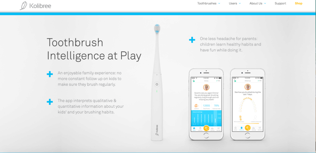
Also, note that this landing page focuses on only one product. This is important because “putting multiple offers on your landing page can decrease conversions by up to 266 percent.”
But only having one offer keeps shoppers dialed in and acts like horse blinders to keep them on track. Kolibree also does a great job of explaining exactly what the product is and highlighting its benefits.
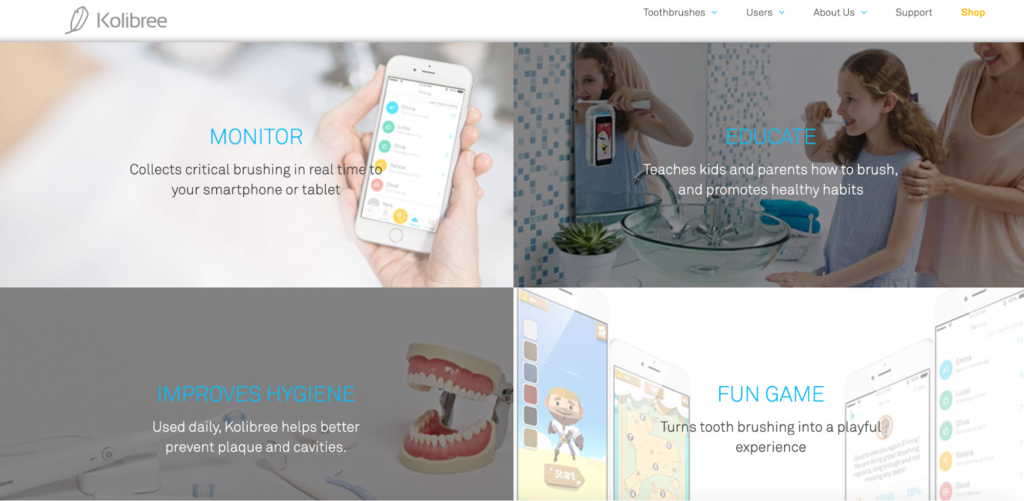
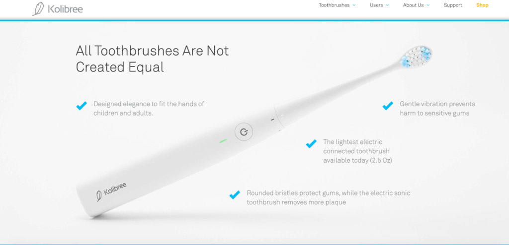
They even include a video that offers a full rundown on the smart toothbrush right here.
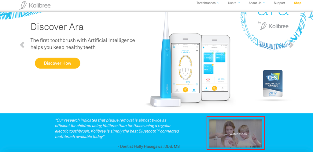
Finally, they include social proof in the form of listing an innovation award they received, as well as testimonials.
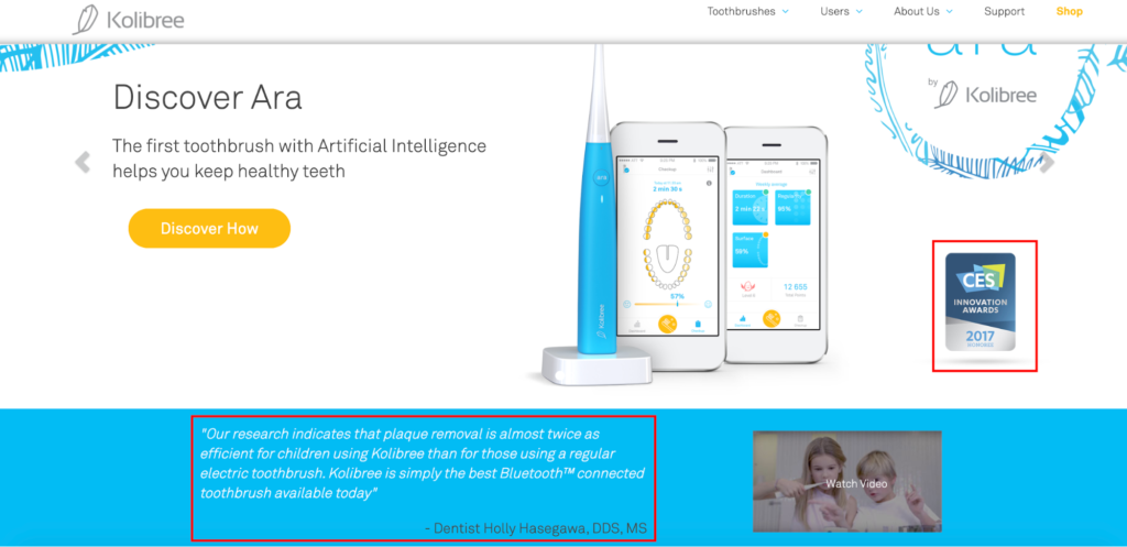
They really covered all of the bases here, making this an awesome example to draw inspiration from.
2. The Everpillow From InfiniteMoon
InfiniteMoon is a brand that specializes in sleep improvement products, with their most popular item being the Everpillow, which has been dubbed “the world’s most comfortable and customizable pillow.”
Here’s the first thing shoppers see above-the-fold when arriving on the Everpillow landing page.
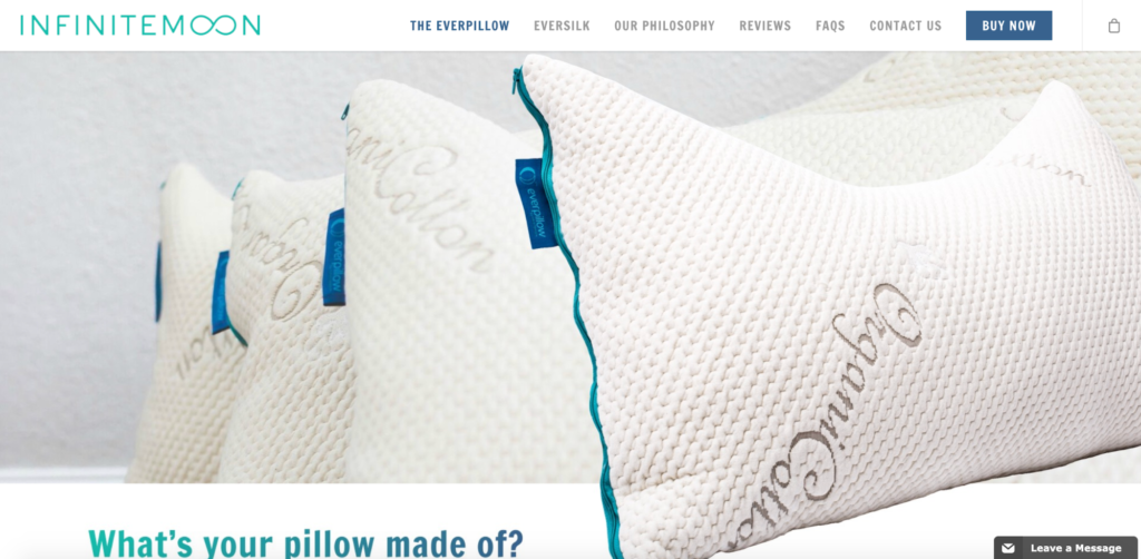
It’s a simple yet stunning view of the product that takes a very minimalist approach—a trend that’s caught on like wildfire in recent years.
Scroll down just a bit, and shoppers learn about the customizable fill options they can choose from with the Everpillow.
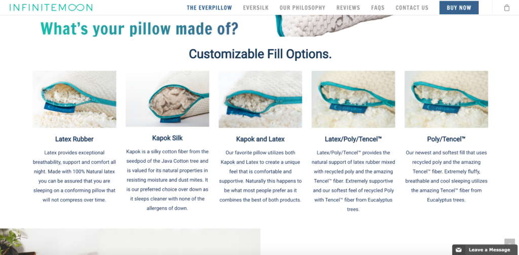
I like this section because it kills two birds with one stone. First, it quickly gives shoppers an overview of the different ways they can customize their pillow to find the product that best fits their needs. Second, it simultaneously serves as a UVP.
As I mentioned earlier, InfiniteMoon is the world’s most comfortable and customizable pillow, and this section matter-of-factly shows shoppers just how it can be customized.
From there, they go over the other benefits of the Everpillow and get into more details as to what differentiates this product from your average pillow on the market.
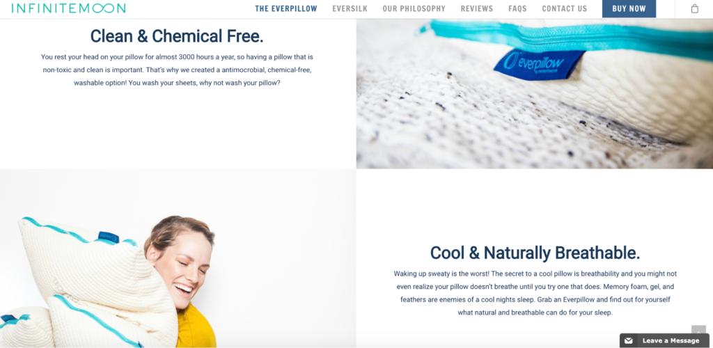
For starters, it’s super comfortable.
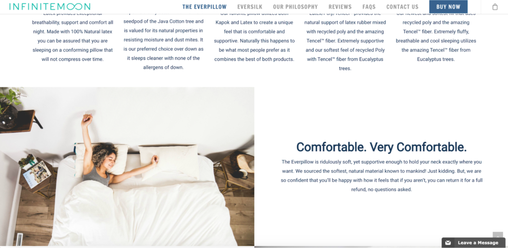
It’s clean, chemical-free, cool, and naturally breathable.
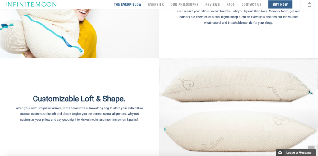
It also has a customizable loft and shape.
And at the bottom, there’s a video about unboxing the Everpillow, featuring president and founder of InfiniteMoon, Steve Van Diest.
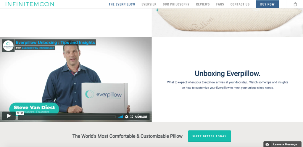
In it, he lets shoppers know what to expect when they receive their pillow and explains that they can remove part of the pillow filling for optimal comfort.
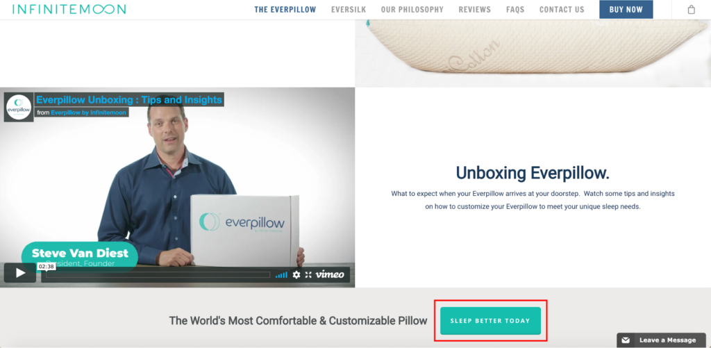
Considering that “using videos on landing pages can improve conversions by 86 percent,” this is a smart move and can provide the extra push needed to get leads to convert. And when it comes to a CTA, they nail it with a simple green button that enticingly says, “Sleep Better Today.”
The only real area that could use improvement would be adding some sort of social proof to this landing page. While they do have testimonials on their homepage, InfiniteMoon doesn’t place any on their landing page. But aside from that, this is one of the best e-commerce landing page examples I’ve come across.
3. BarkBox
BarkBox is an e-commerce brand that offers a monthly subscription box for dogs, featuring a “surprise of dog toys, treats, and goodies!” When visitors arrive on this landing page, they’re greeted with this.
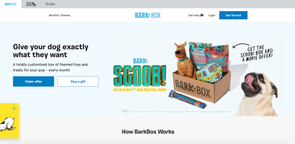
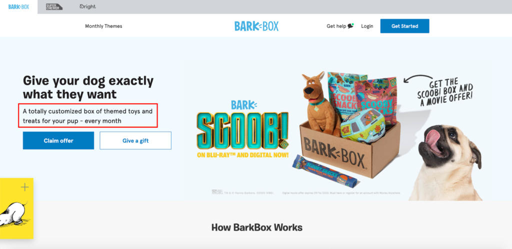
There’s a clear UVP.
And there’s a picture of one of the boxes they sell, along with an adorable pug who looks absolutely ecstatic about it.
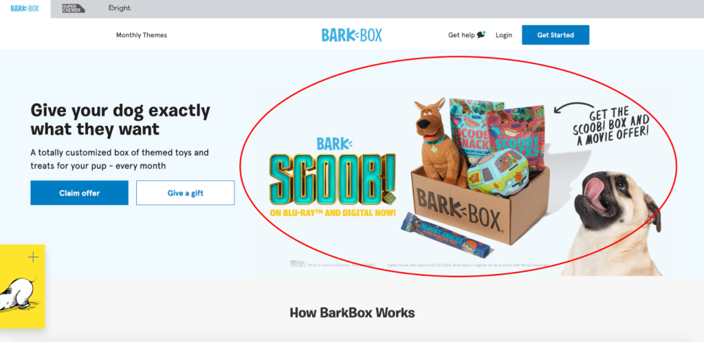
So, BarkBox starts off on a great note, allowing shoppers to get a bird’s eye view of what they’re offering and why it’s interesting. Given that you have a max of seven seconds to grab a shopper’s attention, this is a critical first step to make.
Now, anyone who’s considering buying this type of subscription box will inevitably have questions. Mainly about the cost, shipping, when boxes are sent out, and so on. And that’s exactly what BarkBox addresses in the next section of their landing page.
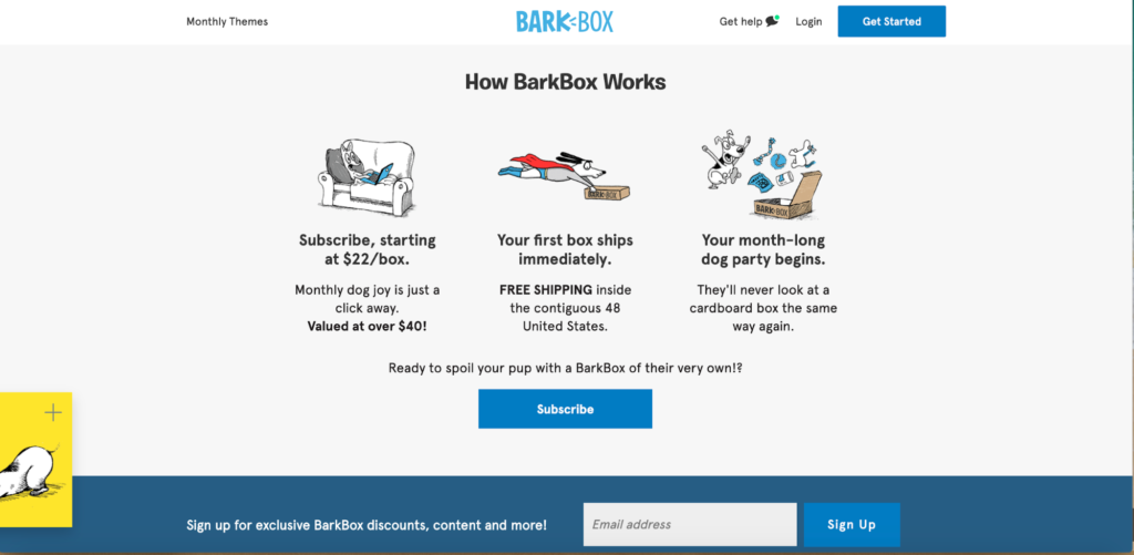
Here, they clearly state that boxes start at $22 per box but have a value of over $40. They mention that the first box ships immediately, and there’s free shipping inside the contiguous 48 United States.
That way visitors don’t have to do any sleuthing to figure out what’s going on. And just below that, they get even more details, including one of the actual themes BarkBox has offered.
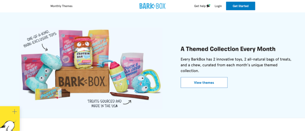
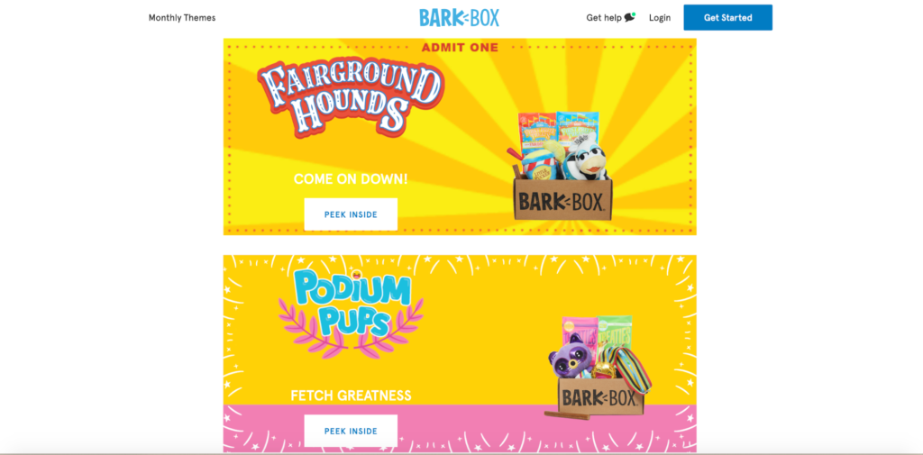
If a visitor wants to know more, they can simply click on “View themes,” which takes them to this page.
Where I think this brand really nails it with their landing page is the section just below that, which zeroes in on appealing to their demographic, which is people who really love their dogs.
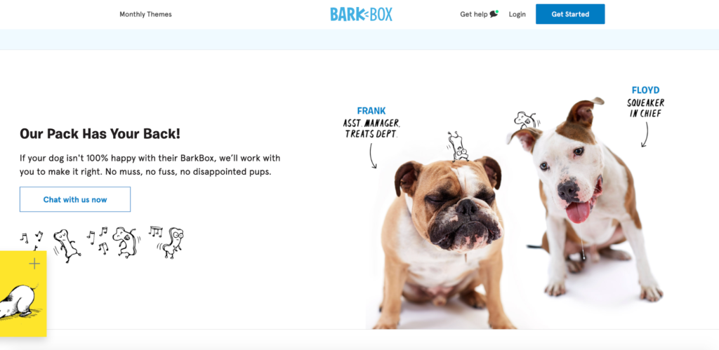
There’s sharp, clever copywriting, with “No muss, no fuss, no disappointed pups.”
Also, giving their in-house dogs, Frank and Floyd, titles like the assistant manager of treats departments and the squeaker in chief is a nice comedic touch.
At the bottom of the landing page, BarkBox offers some well-placed social proof, pointing out that over two million dogs have been served, which instantly adds a ton of legitimacy.
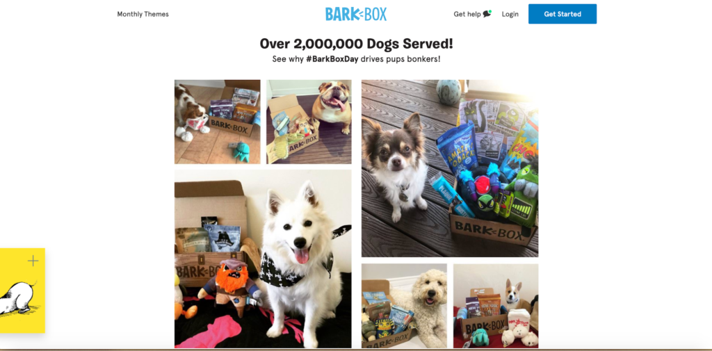
And showing off pictures of some satisfied pooches alongside their BarkBoxes helps bring it all together. Lastly, the CTA is really straightforward and lets shoppers know exactly what to do next.
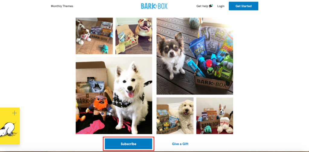
The easy to follow layout helps move visitors from the top to bottom of the landing page and provides them with all of the information they need to make a buying decision. It’s very friction-free and gets them where they need to go, which is to the subscription page.
4. Harmless Harvest Organic Coconut Water
When it comes to e-commerce landing page examples that “pop” visually, it doesn’t get much better than this one from Harmless Harvest.
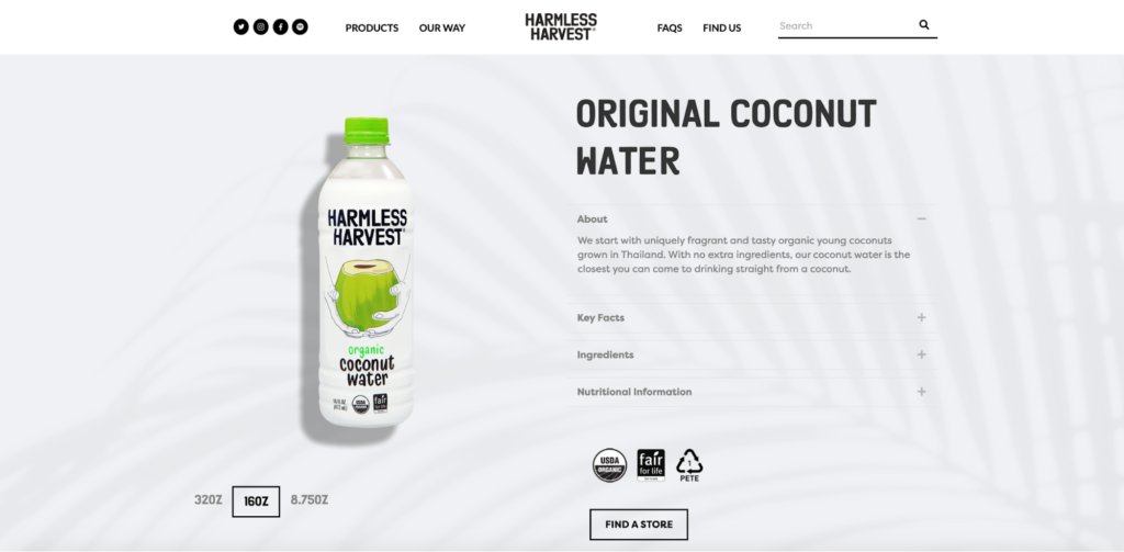
Like most other smart brands, they take a minimalist approach, with a clean white background, which helps the product stand out while creating a sharp contrast. So their aesthetics are definitely on point.
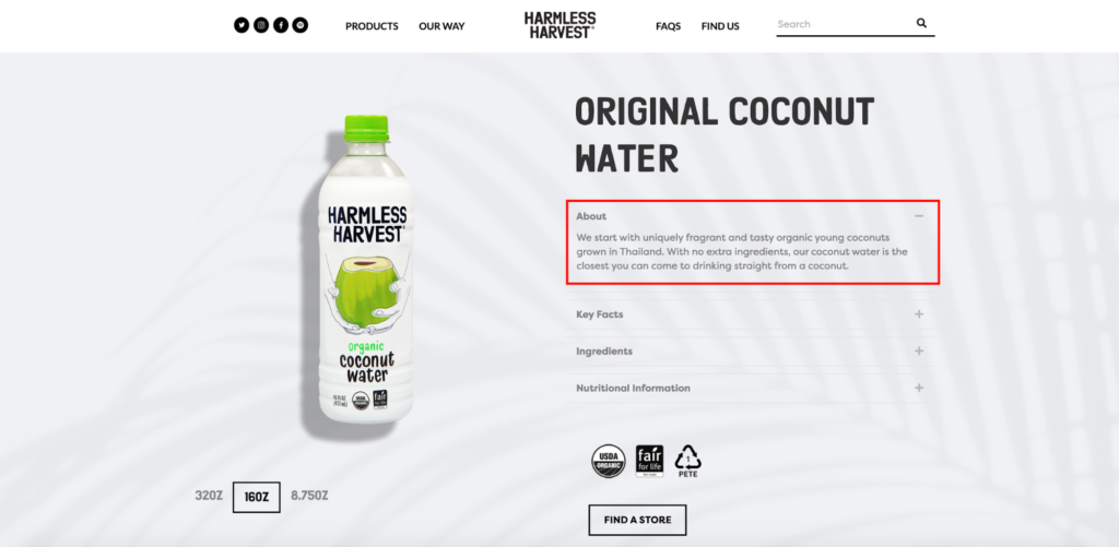
They also incorporate minimalism into explaining exactly what their product is and the ingredients that go into it. Without having to scroll whatsoever, shoppers can check out four sections:
- About
- Key Facts
- Ingredients
- Nutritional Information
It’s set up so they can seamlessly shift from one section to another to learn key details without making the text feel cluttered.
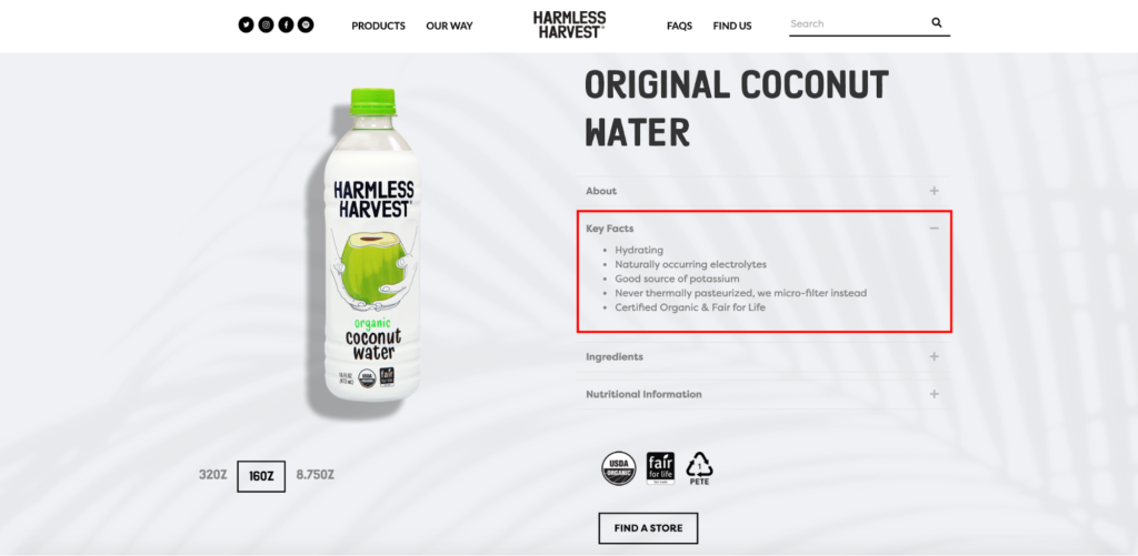
From there, Harmless Harvest smoothly segues to a list of the key benefits of their coconut water and points out what distinguishes this product from others on the market. For instance, it’s naturally pink and organic.
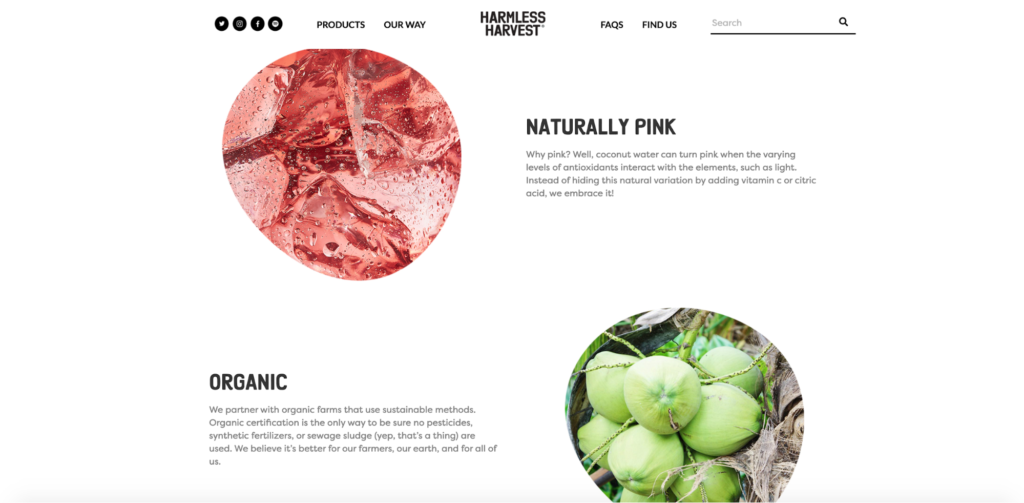
Harmless Harvest also uses multi-step filtration, and they’re Fair for Life certified, meaning they uphold social accountability.
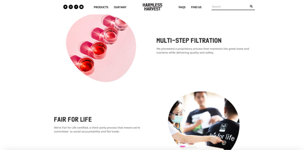
They also throw in some visuals to create true aesthetic bliss.
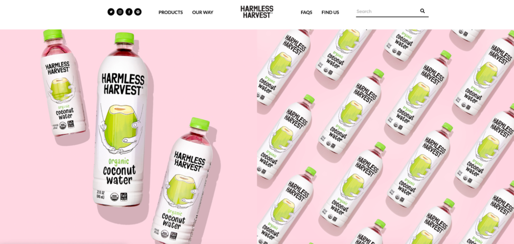
When it comes to offering a single product, using stunning design, and creating a strong UVP, they’ve got it all covered. One other cool idea you can borrow from Harmless Harvest is adding an FAQ section like they do at the bottom of the landing page.

This quickly answers any pressing questions many shoppers have for a high level of transparency.
5. LOU Electric Skateboard
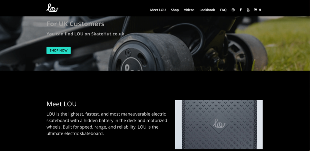
For the last of my e-commerce landing page examples, there’s this one from LOU Board, makers of “the REAL electric skateboard.
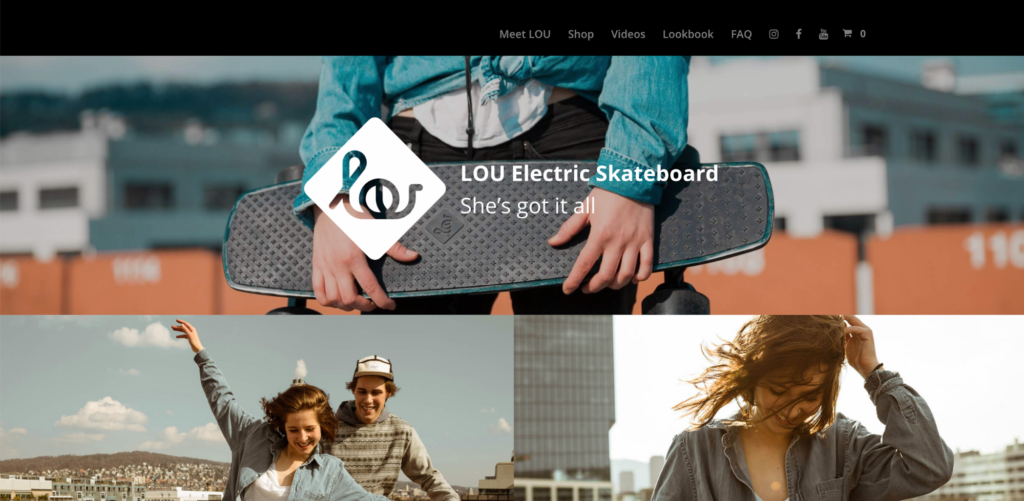
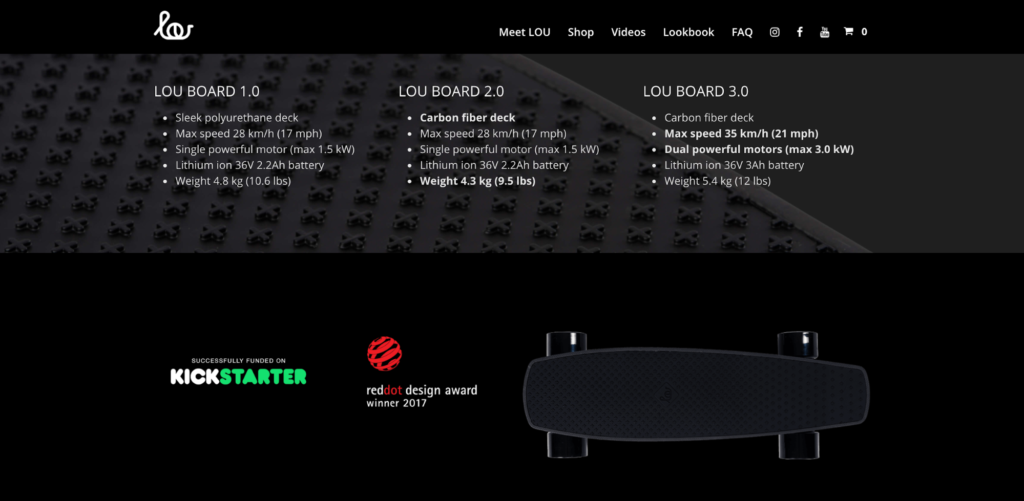
Stunning visuals right out of the gate…check. A concise overview of what the product is, UVP, and product specs…check.
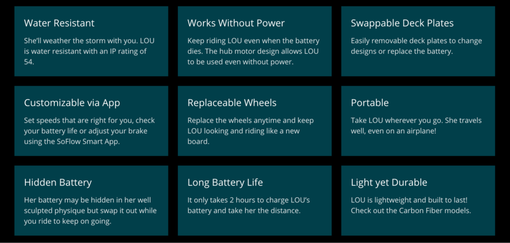
A beefy list of specific benefits…check.

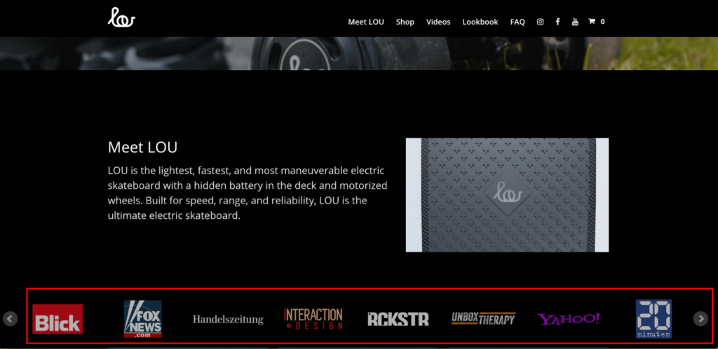
Social proof via logos of press and publications that LOU Board has been featured on…check.
Well placed CTA at the bottom of the landing page that follows best practices…check.
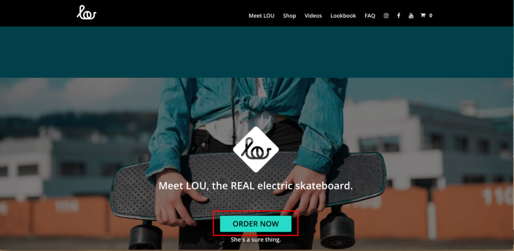
This e-commerce landing page has everything covered and fills visitors in on all of the essential information they need. There’s a smooth flow from the top to the bottom, and shoppers get all of the pertinent details without having it weighed down by extraneous copywriting.
Instead, LOU Board clearly places an emphasis on brevity, which is extremely important.
It’s all about getting your message across without needlessly rambling on. The only thing I would have done differently is placed an explainer video directly on the landing page to really connect the dots for shoppers.
While they do have a video section on their site, I think it would be smart to make it a little more convenient for visitors to access, considering that something as technologically advanced as an electric skateboard with a pretty steep price tag requires a thorough explanation.
But overall, this landing page is very well done, and there are a ton of takeaways you can apply to build your own.
One Final Point
There’s one last thing I need to mention. There’s a clear correlation between having multiple landing pages and getting more leads.
In fact, “Companies get 55 percent more leads when they increase their number of landing pages from 10 to 15.” Further, “Companies that create 30 or more landing pages get 7 times more leads than those that use fewer than 10.”
So, if you’re an e-commerce brand that sells several different products, it’s usually best to create individual landing pages for each of them. Not only should this help you generate more leads, but it should also have a positive impact on conversions because you’re clearly outlining the details and benefits of each product.
Conclusion
I’m a firm believer in the power of examples. I find that the best way to figure out how to do something correctly is to learn from experts and see how they approach it.
When it comes to building a rock-solid e-commerce landing page, these are all winners that hit the mark. They’re all fully customized to resonate with their core audience but follow the same basic formula, which includes:
- Concentrating on just one product or offer
- Creating a great UVP
- Using eye-catching visuals
- Writing above-average copy
- Following an intuitive layout and flow to present information
- Filling shoppers in on important product details and benefits
- Placing a clear CTA in a logical, conspicuous location
- Adding social proof to make your product and brand more credible

