First impressions matter in marketing—just as they do in real life.
Your welcome emails are the perfect opportunity to leave a great first impression on new email subscribers. One that signals the beginning of a long-term relationship and moves prospects forward in their buyer’s journey.
Best of all, welcome emails are the types of emails that your subscribers want and expect to see in their inboxes. That’s why welcome emails enjoy higher open rates than other emails.
According to Invesp, welcome emails have an average of 50 percent open rate, which is 86 percent more effective than regular newsletters.
Once you get your email opened, this is your chance to:
- Introduce your brand and values;
- Engage new subscribers with a special discount;
- Get clicks to your bestselling products;
- Set expectations for upcoming emails;
- And more.
In this post, I’ll share the seven best welcome emails I’ve ever received, and explain how they achieve the above goals and more.
What Is a Welcome Email?
A welcome email is the first email new subscribers receive after signing up for your email list.
Welcome emails typically confirm that someone was successful in joining your newsletter, and deliver the incentive that was promised to them upon signups, such as a discount code or a lead magnet.
When used correctly, welcome emails can be much more than a simple confirmation message. Let’s take a look at seven brands that get welcome emails right.
1. The Body Shop
Offering welcome discounts in email popups has long been a tried-and-true tactic to collect more email addresses.
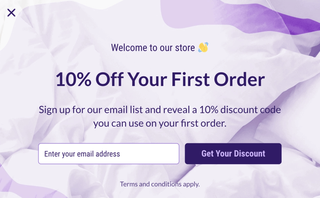
The Body Shop is a company that uses this strategy. In its welcome email, the company makes sure to deliver on its promise before giving more information.
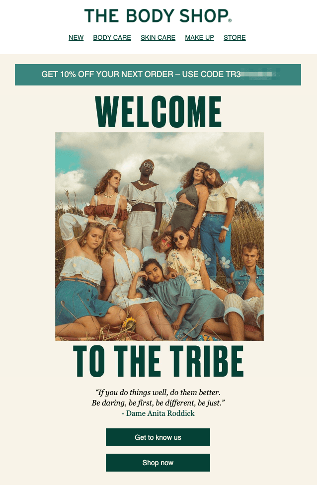
After delivering your discount code, the brand welcomes you to the tribe, which creates a sense of community for its new subscribers.
Next, with a quote, The Body Shop smoothly transitions into its brand story—a story that likely aligns with the quote you just read.
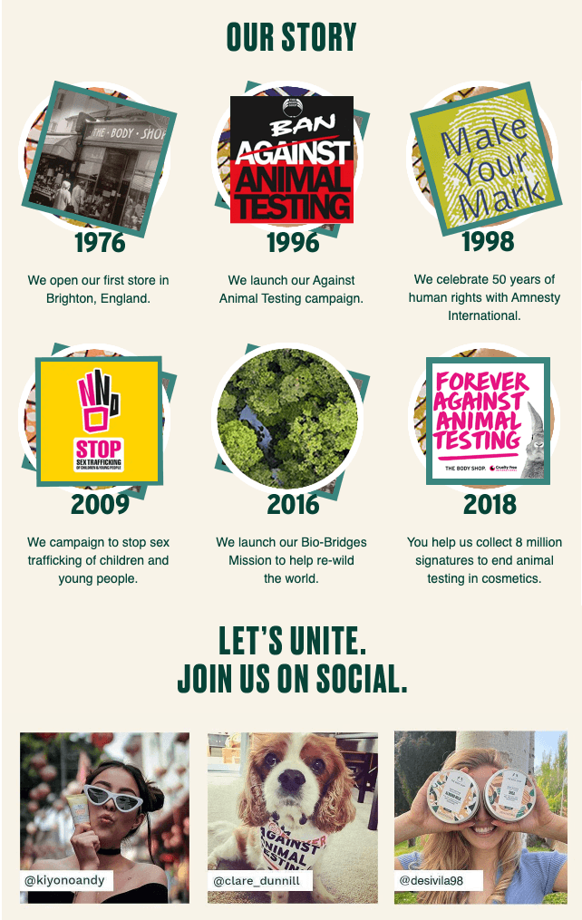
In this part of its welcome email, The Body Shop explains its value proposition in the context of a brand story. It’s not the story of how the company grew and reached millions of customers—but how they contributed to resolving environmental and social issues year by year.
Now, as a new subscriber, you also feel like a part of The Body Shop’s good cause and its tribe. This is the perfect time for the company to invite you to its social profiles.
The language of solidarity continues here too. The Body Shop’s headline reads “Let’s Unite” rather than “Follow Us On Social Media.” The use of customer photos also contributes to the feeling of a community.
The Body Shop uses its welcome email for more than delivering a discount code. It introduces its story and invites you to be a part of a long-term relationship with the brand. All the promotional stuff is purposefully left for future emails.
2. Poo~Pourri
You don’t necessarily have to be a 45-year-old company with a heavy focus on corporate social responsibility to tell your story in welcome emails.
Use this chance to introduce your brand’s personality and tone of voice, in case new subscribers aren’t familiar with you. Poo~Pourri masters this with every email it sends, and its welcome messages are no exception.
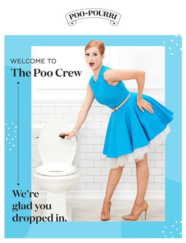
From the very first email you receive, you get to know the Poo~Pourri brand and start expecting some funny emails in your inbox.
In this welcome email, Poo~Pourri welcomes you to a community as well, The Poo Crew, which may not sound like a team you’d want to be a part of in real life.
With its signature wordplay, the company puts a smile on your face and stands out among hundreds of boring welcome emails.
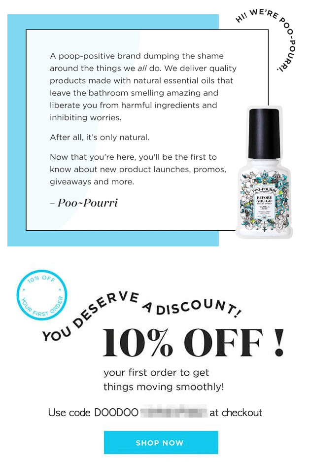
In the second part of the email, Poo~Pourri explains what it’s all about: a poop-positive brand with quality products. The company also sets expectations for future emails by sharing that you’ll be the first to know about new products, offers, and giveaways.
Finally, Poo~Pourri finishes the email off with a nice 10 percent discount code (hilariously starting with “DOODOO”) so you can already place your first order if you like what you read.
Poo~Pourri’s welcome email is a great example of showcasing your brand’s personality in email marketing from day one—whether it’s all about humor, body positivity, or else.
3. Supergoop
Using humor is only one way to make your welcome emails memorable.
Supergoop, the skincare brand, takes the road less traveled and ships its welcome email from its founder.
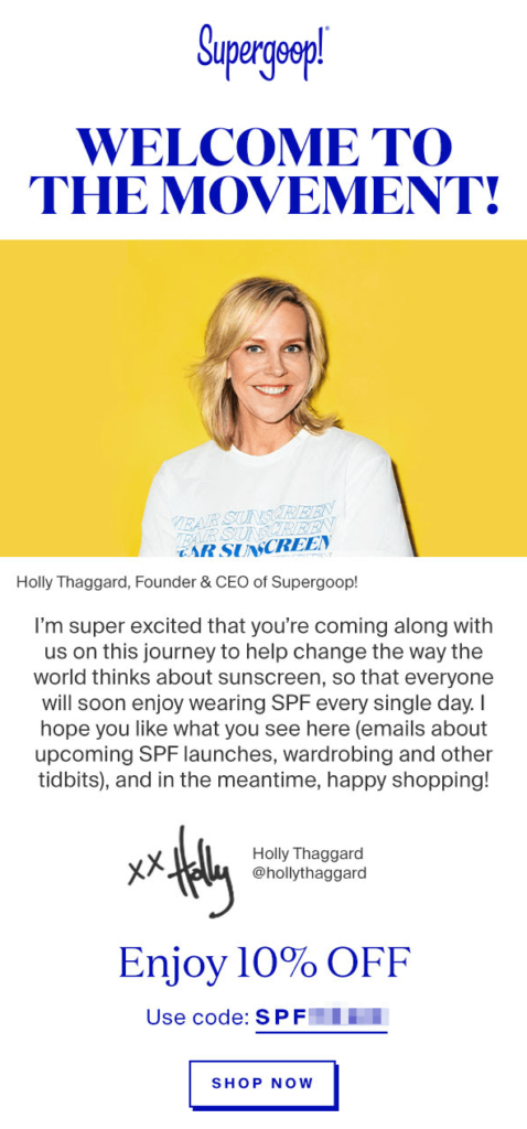
In it, Holly Thaggard, the company’s CEO and founder welcomes you to the movement—a movement to change the way everyone thinks about sunscreen.
If this email were written differently, giving you a discount code and featuring a few bottles of sunscreen, you would think Supergoop is yet another skincare brand. By making it part of a movement, the company shows its position in the market and demonstrates its brand values.
The founder’s picture and signature, as well as the welcome letter written in the first person add more personality to Supergoop’s brand. And the 10 percent discount is the cherry on top.
Granted, this is an automated, mass-mailed welcome message, but it still feels more personal than most ecommerce emails that sit in my inbox. Next time I receive an email from Supergoop, I know I’ll read it through a personal lens and be more likely to click through its products.
4. L’Occitane
All three welcome email examples I’ve covered so far contained discounts of some sort. But that’s not the only way to go.
If your company doesn’t offer discounts, there are more actions you can invite subscribers to take in your welcome emails. L’Occitane does that well.
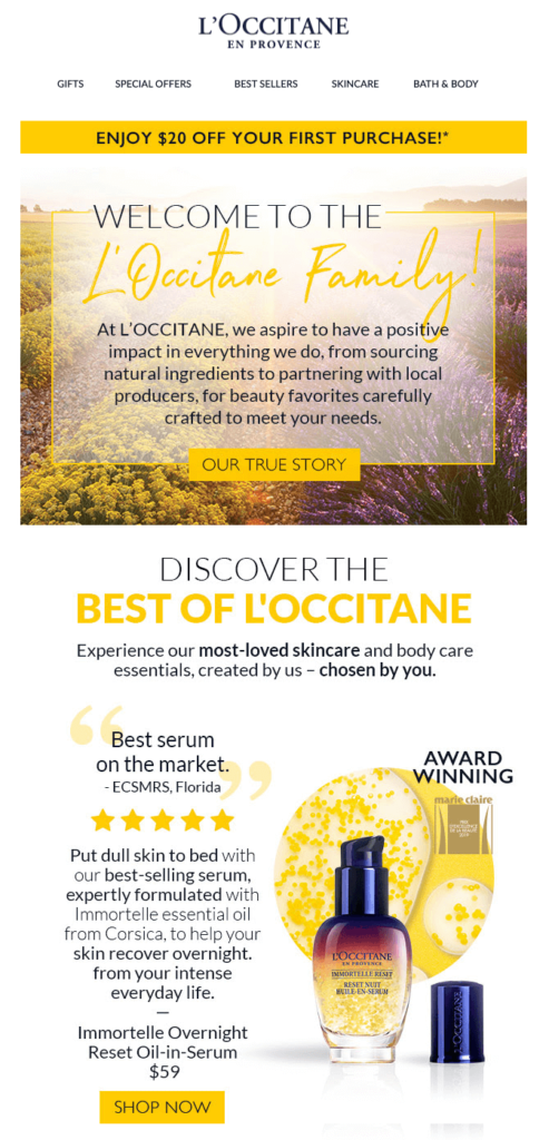
When you join the company’s email list, you receive a warm greeting—similar to all previous examples—welcoming you to the L’Occitane Family.
In the body copy, L’Occitane explains its values and aspirations in a short story. The button “Our True Story” takes you to a landing page where you can read more about the company’s values and commitments if you’re interested.
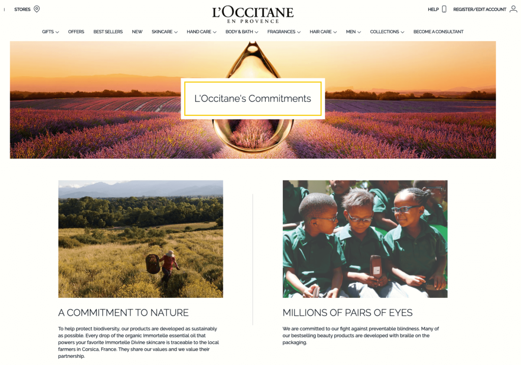
It’s a nice way to summarize your brand values without taking the focus away from the excitement in your welcome email.
Next in the email, you see some of L’Occitane’s bestselling products.
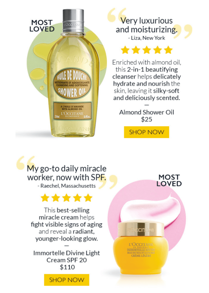
Here, the company doesn’t simply highlight its top items with images and buttons. A glowing customer testimonial accompanies each product.
Assuming your new subscribers don’t know a whole lot about your products, it’s a great idea to introduce your bestsellers in your welcome email, together with their descriptions, benefits, and positive reviews.
5. The Sill
It’s also dangerous to assume that your subscribers know what your company is and does simply because they joined your email list through a footer opt-in form.
The Sill, a plant delivery company, finds the perfect balance in its welcome emails where it explains its platform and sets expectations without overwhelming new people with too much information.
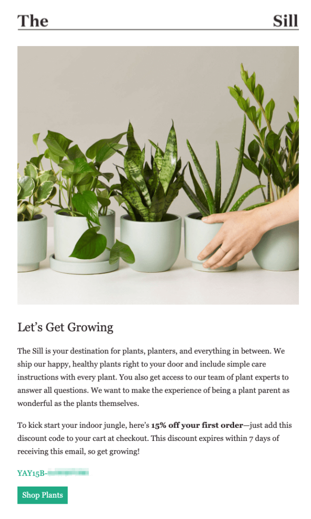
The company begins with a simple definition of what it offers. Already in the third sentence, The Sill highlights its support team’s expertise—a strategy vastly underused in ecommerce.
Next, the company offers you a 15 percent welcome discount that is valid for seven days only. The urgency of the limited-time offer is a smart touch to capitalize on new subscribers’ enthusiasm.
Following best practices, the second part of The Sill’s welcome email features a few products so you can click through and use your discount right away.
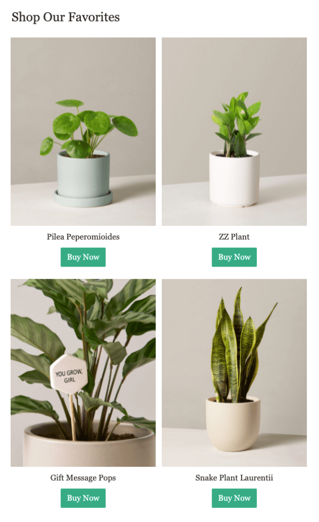
Something more interesting happens in the last part of the email.
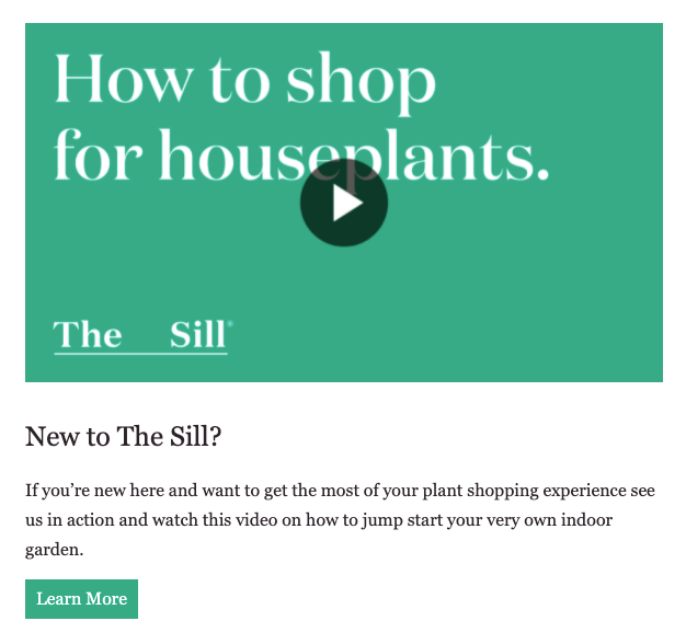
The company includes video content in the email (which is another underrated ecommerce strategy) to educate new subscribers on how to shop for houseplants.
When you click the link, The Sill takes you to a landing page, where it, first, recommends beginner-friendly products.
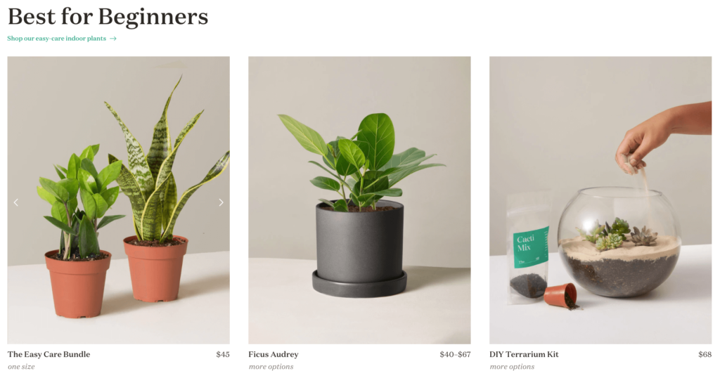
Then, the company teaches you how to shop for plants with a video walkthrough of its online store.

Shopping for plants is no easy task for those without a green thumb, and The Sill knows this well.
You don’t need to go this far if you’re selling basic t-shirts, but if you operate in a niche, like The Sill does, helping out your potential customers in welcome emails can be a wise investment.
6. Mavi
Welcome emails not only allow new subscribers to get to know you—but they also help you learn more about them.
If you’re not already segmenting your new subscribers during signup with a multistep form, welcome emails are the perfect opportunity to do so.
Let’s see how Mavi does it in a brilliant way.
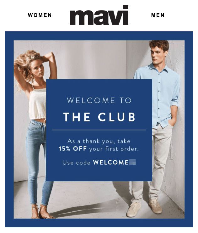
In a traditional fashion, the company, first, welcomes you to the club and offers a generous 15 percent discount on your first order.
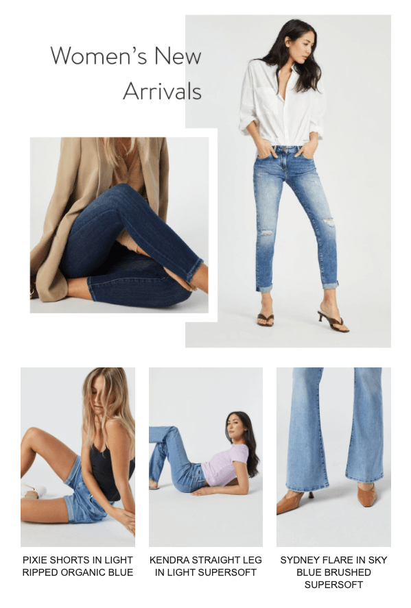
In the remainder of the email, Mavi recommends products from both women’s new arrivals…
…and those in the men’s category.
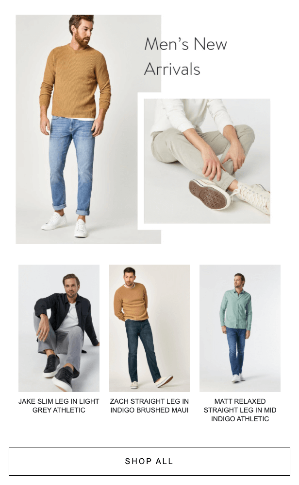
Based on the products you click, Mavi can now tailor its future emails to fit your interests.
But that’s not all. At the bottom of the email, Mavi also invites you to self-segment.
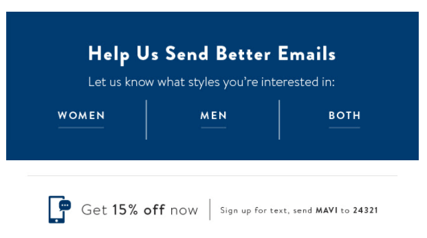
Short copy explaining the benefit of self-segmenting and three buttons do the job. It doesn’t need to get more complicated than this.
Mavi sends you a follow-up email three days later, reminding you to use your 15 percent discount.
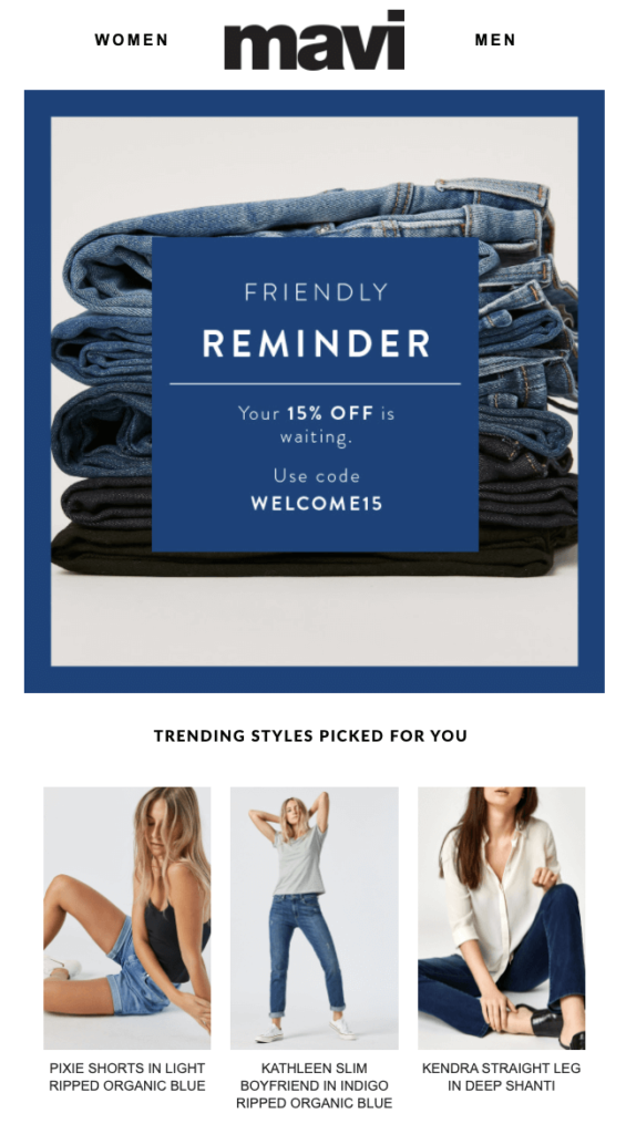
But this time, the company only features products from the category they know you’re interested in. Segmentation is already in action.
Follow-ups are underused in welcome emails, and Mavi’s example is a brilliant one, combined with the power of personalization.
7. Beauty Bay
Not all welcome emails have to look like the ones above.
You may choose to focus only on your products or completely refrain from being promotional.
Beauty Bay’s welcome email falls closer to the second category. No product or offer is directly promoted, yet you close the email learning a great deal about its online store.
A lot is happening in Beauty Bay’s email so I’ll break it down.
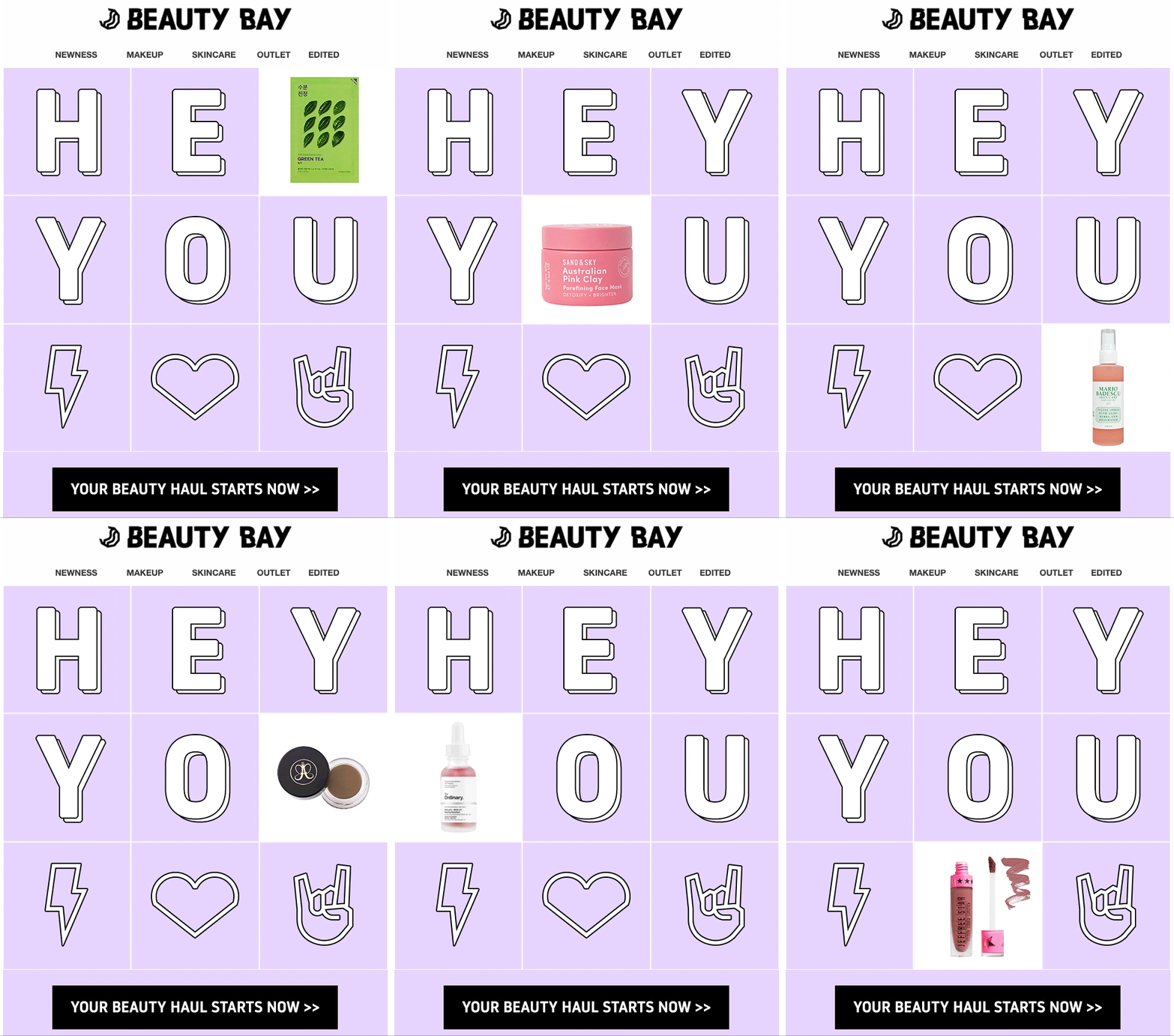
Sent with the subject line “are you beauty obsessed? ⚡”, Beauty Bay’s welcome email opens with a GIF hinting at some of the popular products you can find in its store.
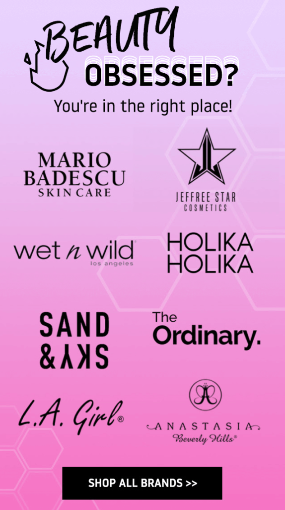
Asking the same question once more, Beauty Bay features a few of the brands it carries and confirms your decision to sign up by saying “you’re in the right place.”
After that, Beauty Bay informs you of some other ways you can stay engaged with the company. One of them is to download its app and shop 24/7.
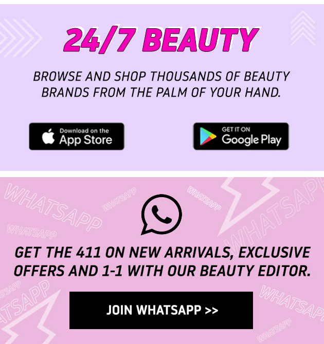
You’re also invited to join Beauty Bay’s WhatsApp group for announcements and 1:1 chats with its beauty editor.
Last but not least, Beauty Bay highlights its product categories once more, but this time around different themes, rather than individual brands.
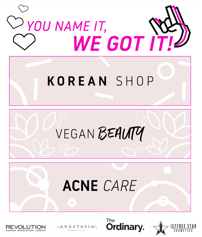
Whichever type of beauty products you’re interested in, you can click through and start browsing. Beauty Bay is quite confident that they got it.
Next time you think about shopping for beauty, the company will be top of mind. If you think this can be more valuable than a mindless product page click you can get from your welcome emails, follow Beauty Bay’s example.
Bonus: How to Set Up a Welcome Email Automation
Now you know what type of emails you need to send as part of a welcome email workflow, it’s time to learn how to put these ideas into action.
1. Choose a Workflow Template
Let's assume I have a Shopify store and want to drive first-time purchases. To avoid building a workflow from scratch, I can install a premade template with predefined Triggers and recommended Delays and Decisions.
First, I’ll filter “Sales” by “Category” and “Shopify by Platform.”
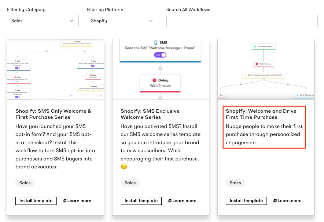 Then, I’ll install the template “Shopify: Welcome and Drive First Time Purchase.”
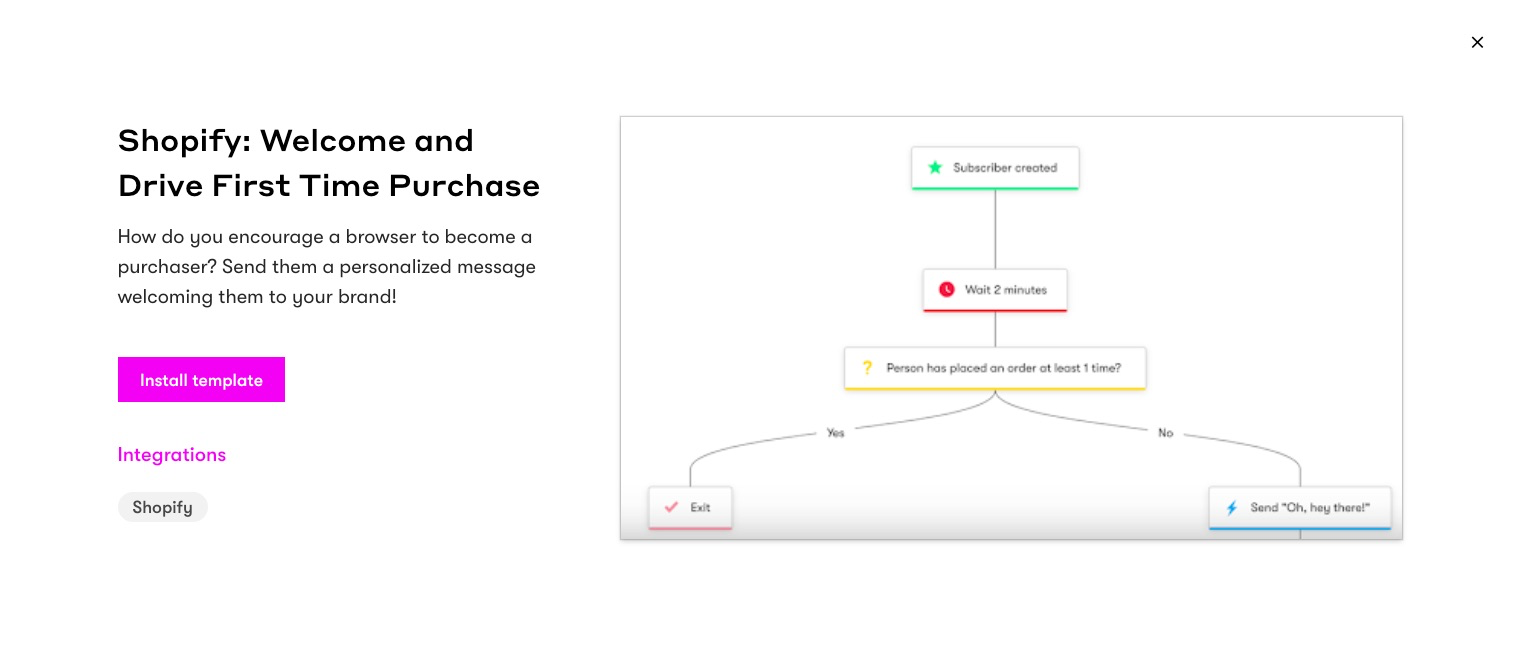 2. Review Your Setup
As mentioned above, premade templates come with predefined Triggers and recommended Delays and Decisions. However, if you want to customize each further, it’s important to keep the following in mind:
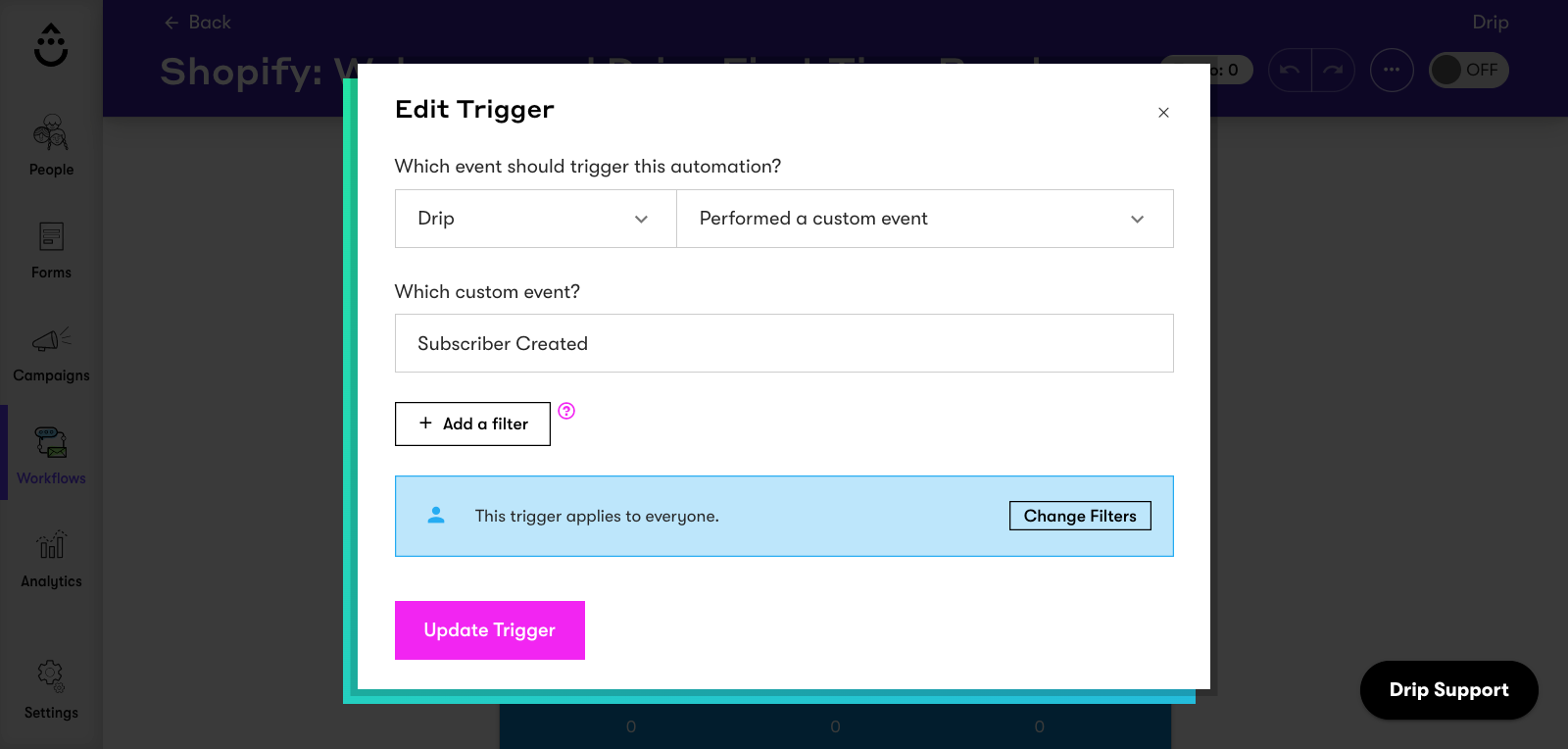
i. Triggers
The “Subscriber Created” event adds anyone who is created in your Drip account to your welcome automation, including:
- Anyone who submits a form;
- Completes an order for the first time; or
- Is imported via CSV file
 ii. Delays
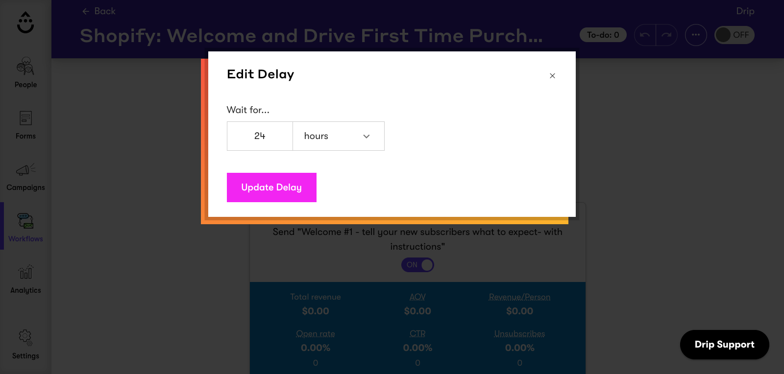
Delays are pre-set to ensure people hear from you at the right time. You can always change the Delays to fit your needs or customer base by clicking on the Delay step.
iii. Decisions
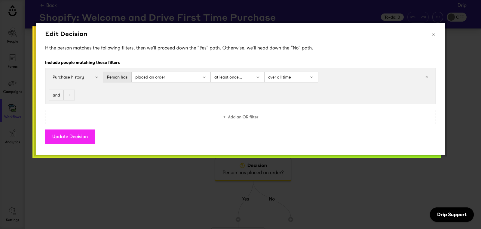
A Decision temporarily splits a workflow into two separate paths. When a person reaches a Decision, they continue down the Yes path if they meet the criteria in the Decision. Otherwise, the person will go down the No path.
For this particular automation, there’s an optional Decision at the end of the workflow to incentivize anyone that hasn't made a purchase during their first week on your list.
3. Edit Your Emails
The “Shopify: Welcome and Drive First Time Purchase” automation includes three email templates to help structure your workflow with an optional fourth to incentivize new signups.
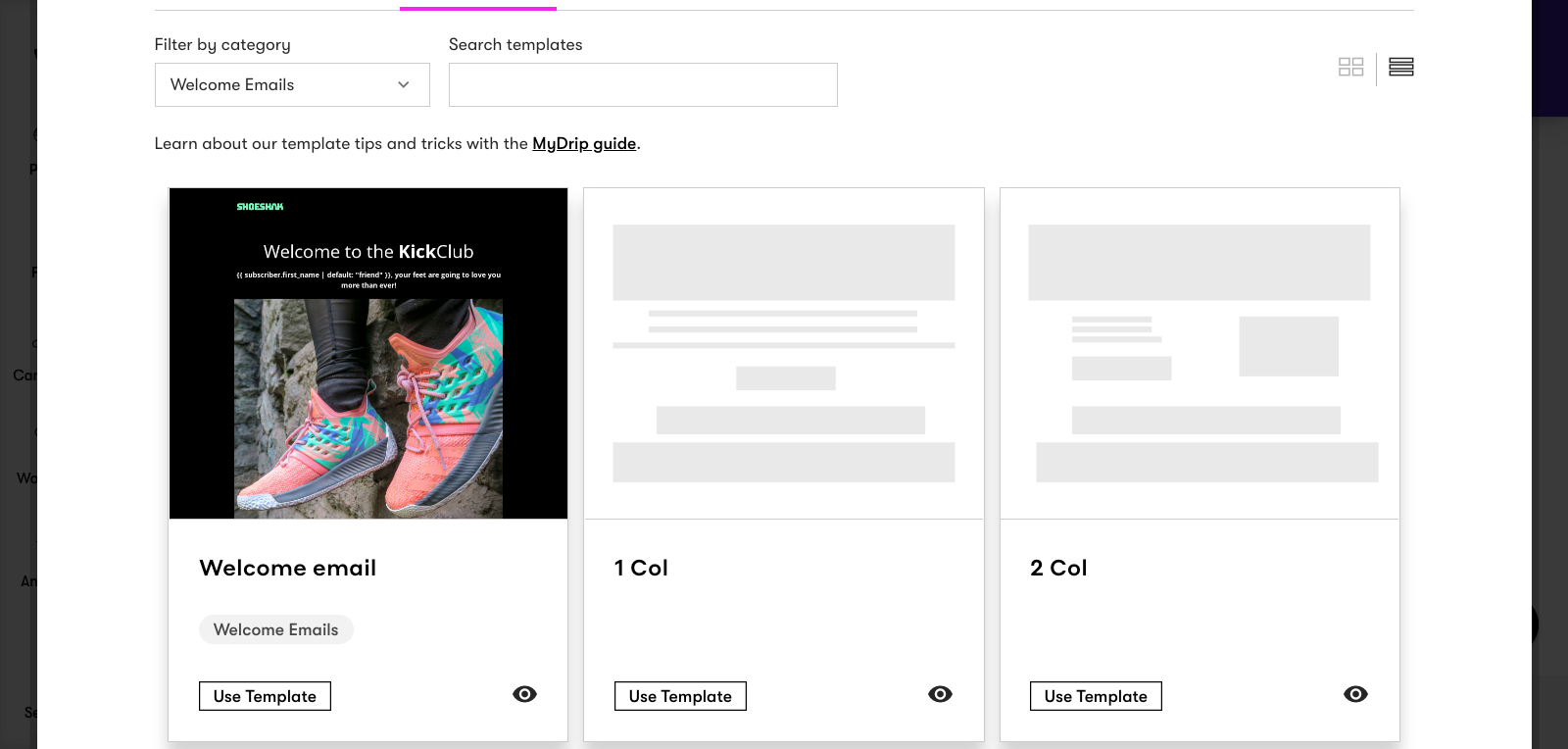
Using the Visual Email Builder, you can customize each welcome email from scratch, or if you prefer, use a prebuilt template. I’ll try the “Welcome Email” template as I liked what I saw in the preview.
All I need to do now is ensure my email matches my brand's style guidelines. To do that, I need to:
- Add my header logo;
- Edit the font and button colors under settings and default styles; and
- Write a subject line and email copy in my brand’s voice.
Once I’ve built my email, I can click “Preview” to see how it looks on desktop, tablet, and mobile devices. Then, I can navigate back to the workflow editor and edit my other emails.
Lastly, once I've written my emails and double-checked my Triggers, Delays, and Decisions, I can toggle my workflow ON to welcome new subscribers and drive first-time purchases.
And that’s it! If you’re more of a visual learner and want an overview of the entire process from beginning to end, watch this video:
And if you’re new to email automations and want to know best practices to follow, we got you covered:

Conclusion
Whether you’re hoping to get more subscribers to redeem their discount code, click through your products, or simply learn more about your brand, these seven welcome email examples will inspire you.
Remember to capture the subscriber’s excitement of joining a new community in your copy and make them feel welcomed, rather than going straight for the sale.
Building the foundations of a good relationship in your welcome flow will reward you with more benefits in the long run.

