Writing good emails is tough. Finding out when, and what to write is even tougher.
You need to write emails that get opened, clicked and remembered—every single time.
But not everyone is struggling.
If you wonder how outstanding ecommerce brands are achieving email marketing success day after day, then keep reading.
From world-class copywriting to eye-catching design, I’ve gathered the nine best email marketing examples I’ve seen to inspire your future email campaigns.
In this post, you’ll find:
- The number one strategy to make your emails read until the end;
- A brilliant way to sneak into prospects’ calendars;
- The smartest abandoned cart email flow you’ll ever see;
- And more.
9 Best Email Marketing Examples to Inspire Your Own:
- 1. Speak Your Buyer’s Language (Wool and the Gang)
- 2. Stand Out with Your Design (Function of Beauty)
- 3. Keep Your Readers Engaged (Boxycharm)
- 4. Make Your Sales Memorable (Brooklinen)
- 5. Tease Your Black Friday Campaign (Chubbies)
- 6. Follow Up on Sale Campaigns (Rifle Paper Co.)
- 7. Recover Abandoned Carts without Being Salesy (Tuft & Needle)
- 8. Re-Engage Inactive Prospects (Beardbrand)
- 9. Appreciate Your Subscribers (Glossier)
- Bonus: How to Make an Email Campaign
1. Speak Your Buyer’s Language (Wool and the Gang)
We like people who are similar to us.
More than that, when we know, and like someone, we tend to say “yes” to their requests. And it’s no different for brands.
Brands that speak their buyers’ language evoke a sense of “liking,” which helps them persuade prospects more easily.
Wool and the Gang is one of those brands. Check out one of their recent subject lines that resembles a friendly conversation-starter:
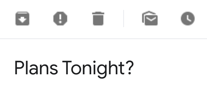
What looks like a message from your best friend is, in fact, a subtle promotional email:
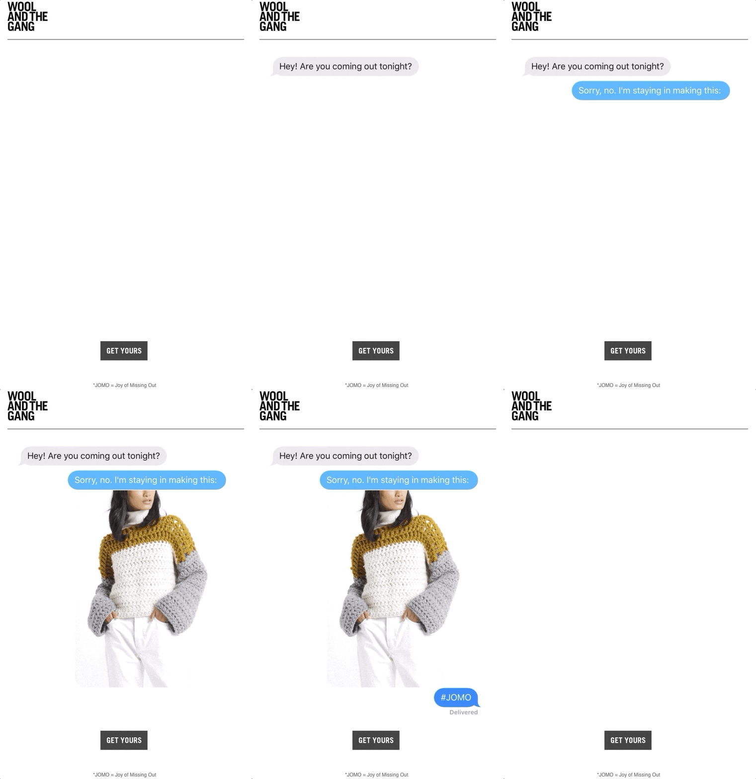
In this email, Wool and the Gang smartly use a GIF to imitate a conversation between two friends.
If you’re in the company’s target audience, this iMessage view is likely familiar to you.
And in case you’re interested in knitting, Wool and the Gang reminds you of the joy of missing out (JOMO), simply by being at home and spending time on your hobbies.
By speaking their buyer’s language and associating positive emotions with their brand, Wool and the Gang creates demand for their products.
Next, they introduce a how-to video, in case you want to recreate the jumper from the conversation above:
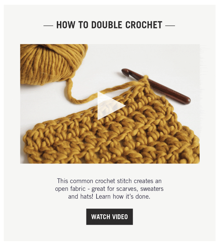
After creating excitement around their brand, Wool and the Gang recommends products that you might enjoy:
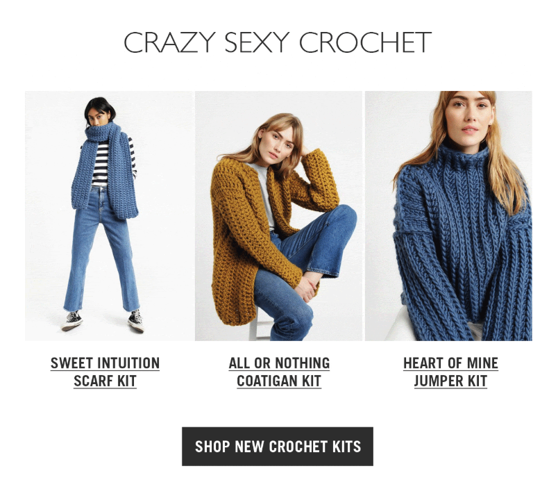
Wool and the Gang know what resonates with their audience and trigger their subscribers’ JOMO in a conversational tone.

2. Stand Out with Your Design (Function of Beauty)
While Wool and the Gang mimics you chatting with your friends, Function of Beauty lets you talk to your hair.
Sounds weird, right? Let’s see how they do it.

With the subject line above, the company sends out a promotional email that stands out in subscribers’ inboxes, thanks to its unique design:
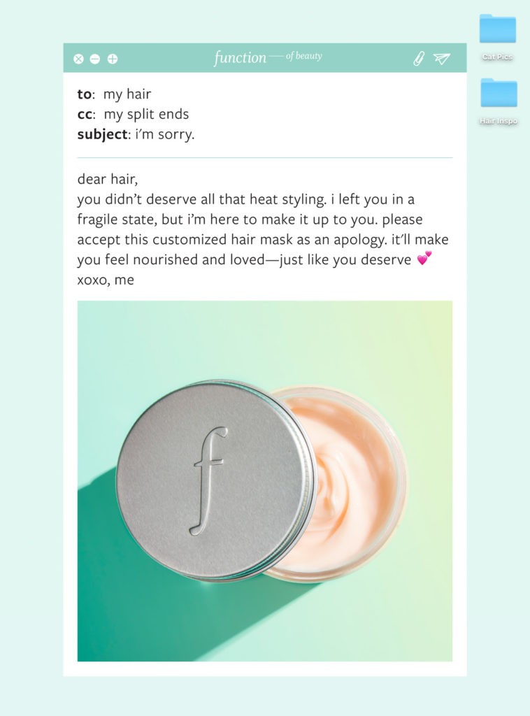
What looks like an apology letter that you write to your hair, this email addresses a pain point that resonates with the company’s audience.
In this cleverly designed email campaign, you promise to take care of your hair, and the way to do this is, unsurprisingly, using Function of Beauty’s products.
In the rest of the email, you see a headline that reads “Meet Custom Hair Mask,” after which the company asserts your wants and needs:
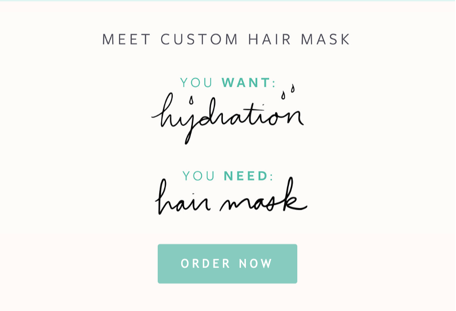
The call-to-action (CTA) button “Order Now” sends you to a hair quiz you can take to create and purchase your custom hair mask.
Thanks to this fun promotional email, Function of Beauty explains the problem they’re solving (read: their value proposition) in a creative and memorable way.
3. Keep Your Readers Engaged (Boxycharm)
It’s no secret that eye-catching subject lines get your emails opened. But what makes people read your emails all the way to the end?
With more than 250 billion emails sent and received every day, users can’t help but skim through their busy inboxes.
In other words, the emails you spent hours writing can go unnoticed (even with an outstanding subject line.)
This is especially true if you’re writing long emails containing several products.
By using visual cues, you can guide subscribers to the most critical part of your emails, and nudge people to read through your emails.
Evoking curiosity is the best way to achieve that, and Boxycharm has a great example of that.

Coupled with a scarcity-infused subject line, the company promotes its products with the following email:
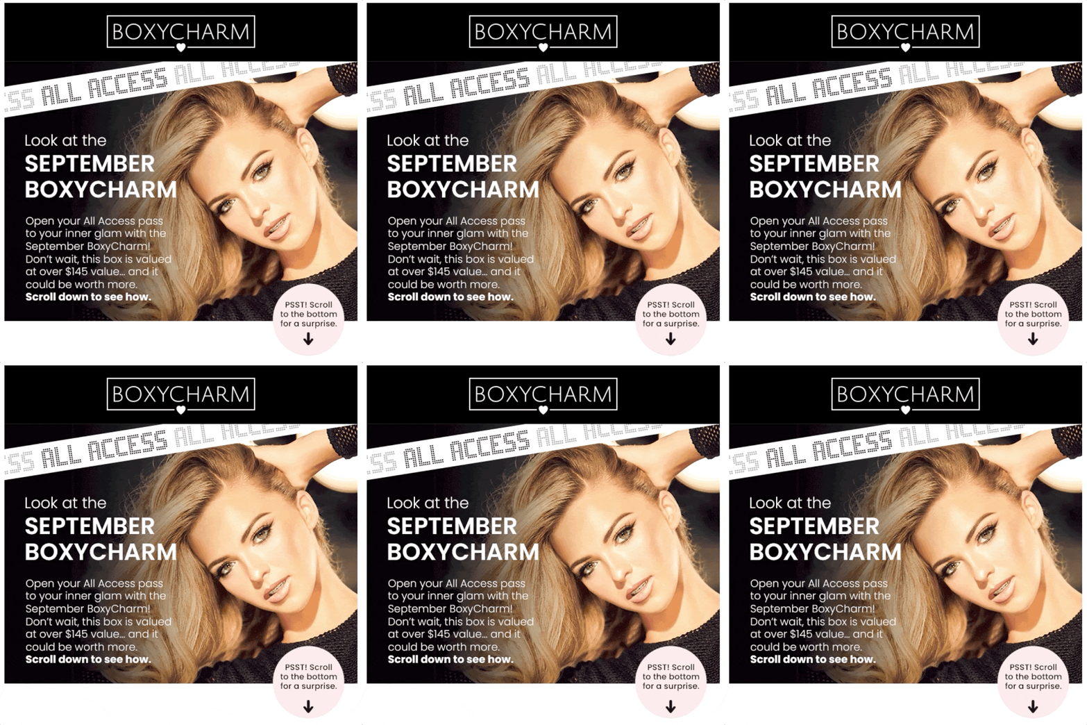
What’s interesting is Boxycharm uses an animated arrow to direct your attention several times throughout the email.
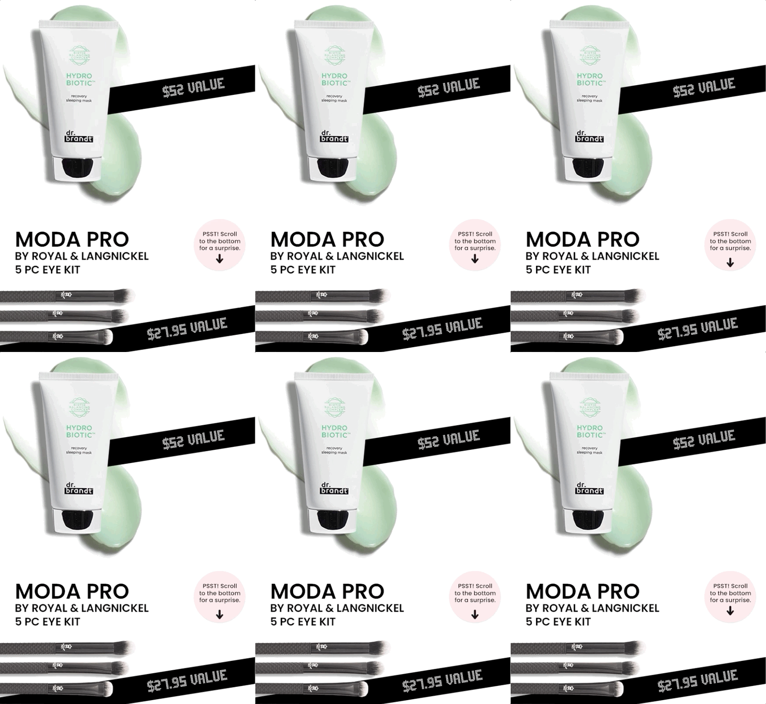
Knowing that we all love surprises, Boxycharm holds your attention with the promise of a surprise.
And when you scroll down, Boxycharm delivers on its word: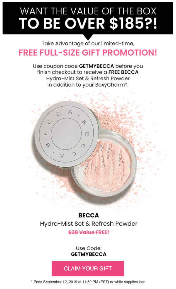
It’s a limited-time freebie you can claim when you buy the company’s products.
In this email, Boxycharm, first, highlights the scarcity of their products. Then, they focus on the value you’ll get upon purchasing them. Finally, they try to convert you with a time-bound, free gift.
The best part is, they help you read through all of these messages, using visual cues.
You don’t necessarily need to draw down arrows to get your emails read until the end. Tease your surprise offer or set expectations about the content of your emails in the introduction copy, and you’ll evoke subscribers’ curiosity.
4. Make Your Sales Memorable (Brooklinen)
It’s a question all marketers consider:
How can you sell with email when most customer inboxes are full of promotional emails?
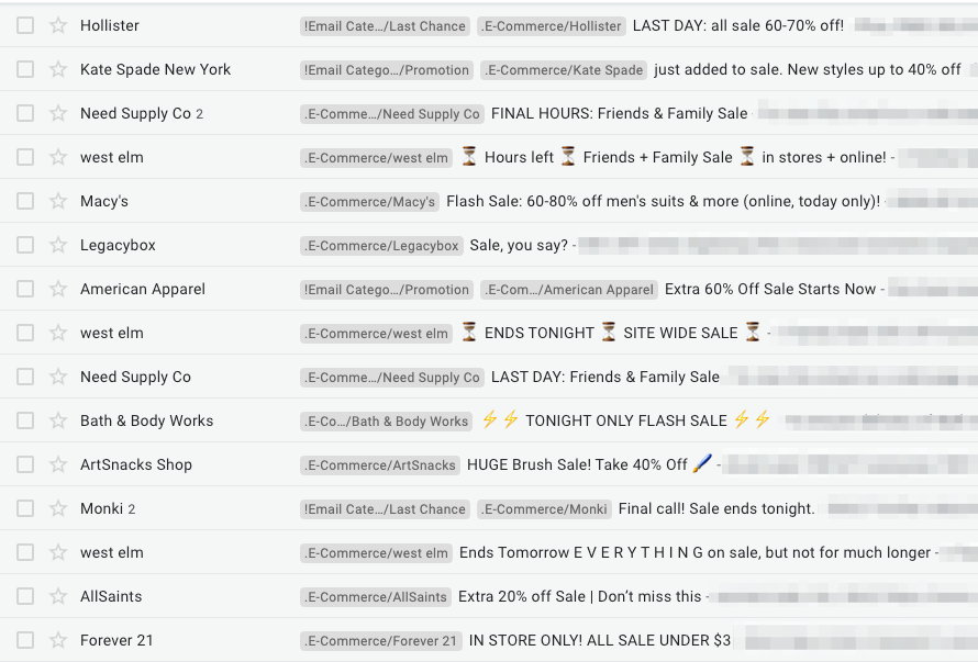
Just SOME of the sales emails sat in my inbox.
Once again, curiosity is the answer.
Check out this subject line by Brooklinen:
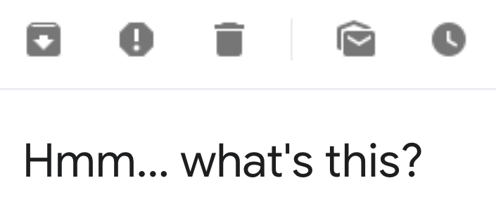
It’s almost impossible to resist such a curiosity-triggering subject line. As a result, you open the email immediately to see this:
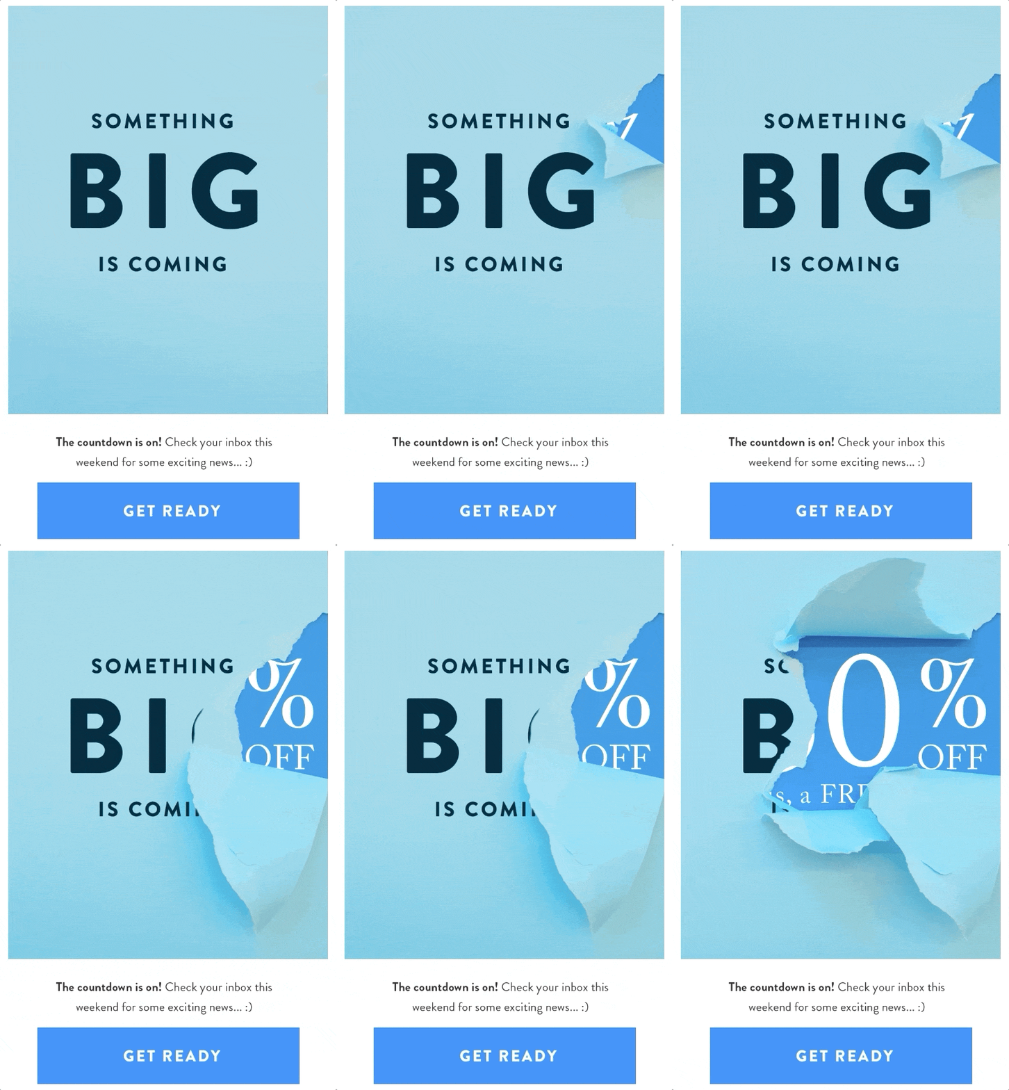
Similar to many good email examples, Brooklinen uses GIFs to make their promotional emails more interesting.
With copy like “Something big is coming” and a GIF unwrapping itself before you, Brooklinen further evokes your curiosity by teasing their upcoming sale.
They don’t let you see the discount amount, but they make sure you’re hooked enough to check back again.
Brooklinen even goes beyond asking you to remember: they invite you to set reminders.
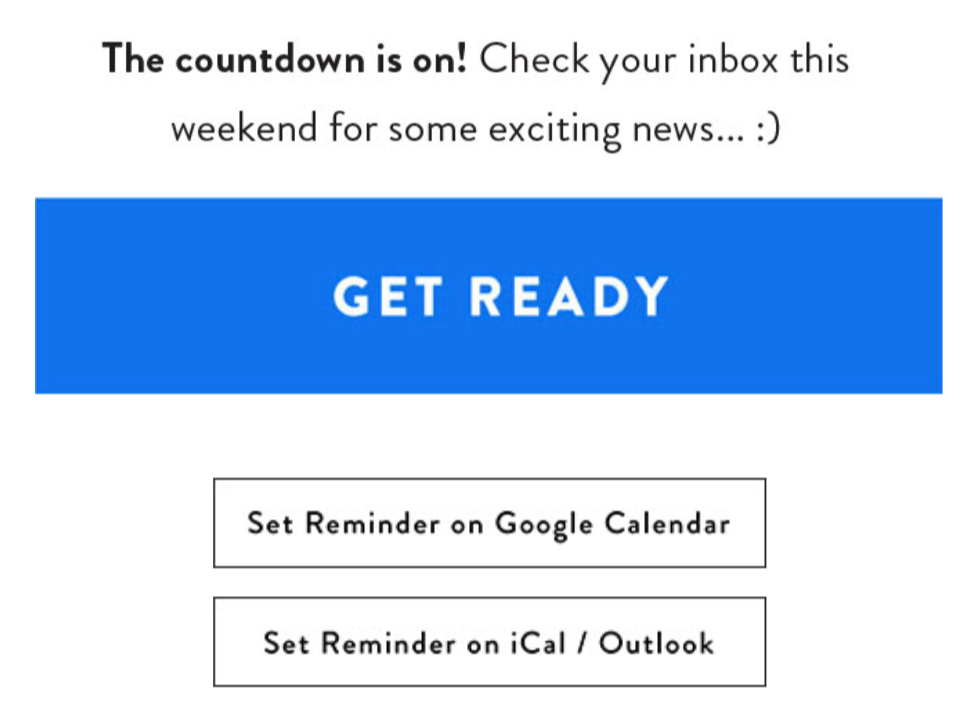
When you set a reminder by using one of the two suggested options, Brooklinen’s mystery sale is added to your calendar:
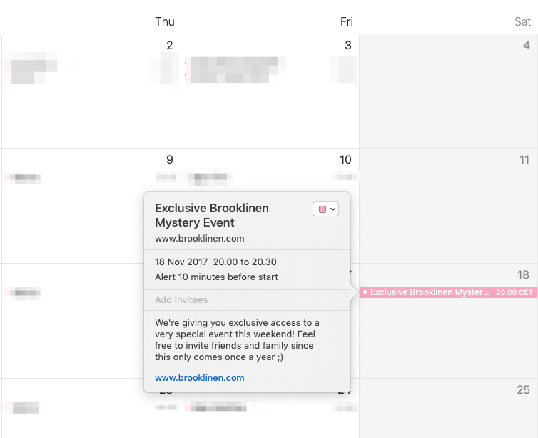
With this email, Brooklinen creates excitement and sets expectations about their upcoming sale. Plus, they keep their brand top of mind, with Black Friday around the corner.
5. Tease Your Black Friday Campaign (Chubbies)
It’s impossible to ignore Chubbies when discussing Black Friday and good email examples.
Known for their exceptional email marketing and humorous tone, Chubbies takes Black Friday campaigns to the next level.
Take a look at this subject line and sender name Chubbies uses a week before Black Friday:
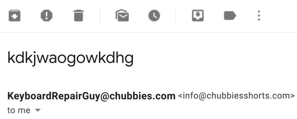
I don’t want to be the type that explains a joke, but with this absurd subject line and matching sender name, Chubbies easily grabs your attention and makes you open the email right away.
In the body of the email, Chubbies promotes its upcoming Black Friday offers…
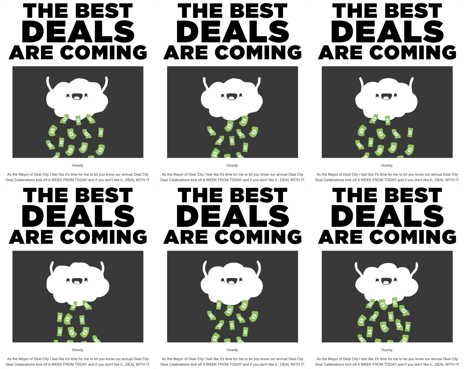
…with a twist.
Instead of openly announcing their offers, they tease what you should expect from Black Friday:
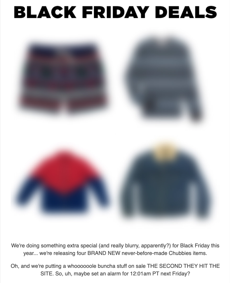
By using blurred images of their new product line that’ll soon go on sale, Chubbies creates mystery around them.
Next, they move on to tease their branded holiday that follows Black Friday, a.k.a. Thighber Monday:
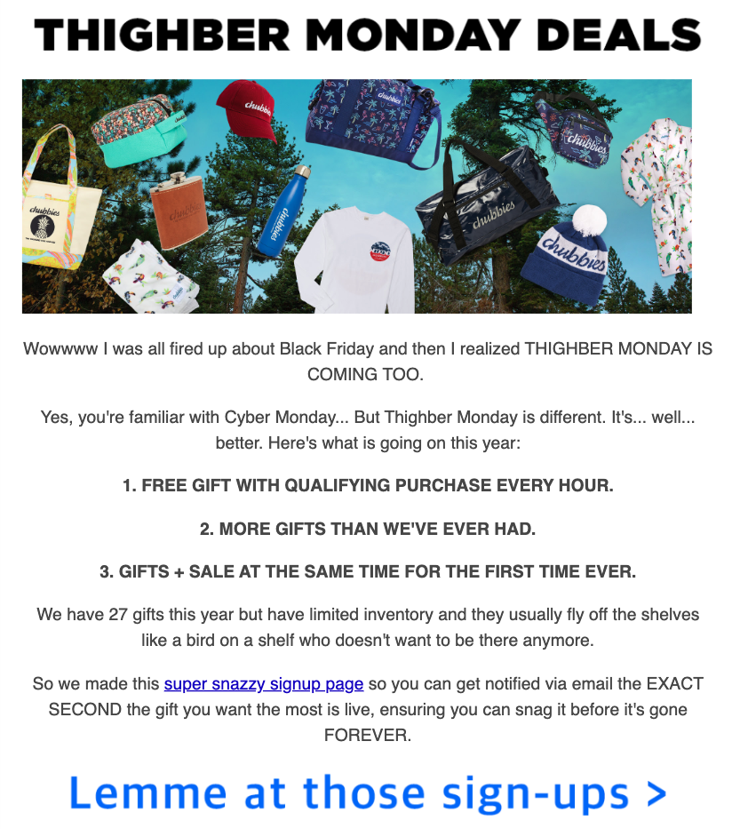
After setting expectations and describing what Thighber Monday looks like, Chubbies invites you to sign up for a special list (which they can later use to offer you targeted deals.)
Thanks to this email, Chubbies gets you excited about both Black Friday, Thighber Monday, and their new product line in one fell swoop.
6. Follow Up on Sale Campaigns (Rifle Paper Co.)
Not all subscribers are ready to buy from you. That’s a given.
Some will take more persuasion, which means more follow-up emails. One challenge facing many marketers, however, is to follow up on a sale campaign without being pushy.
Luckily, Rifle Paper Co. found a solution to that problem:

With this subject line, the company informs you that they now have more products on sale. No “last chance.” No “hurry up.”
This is what the email looks like:
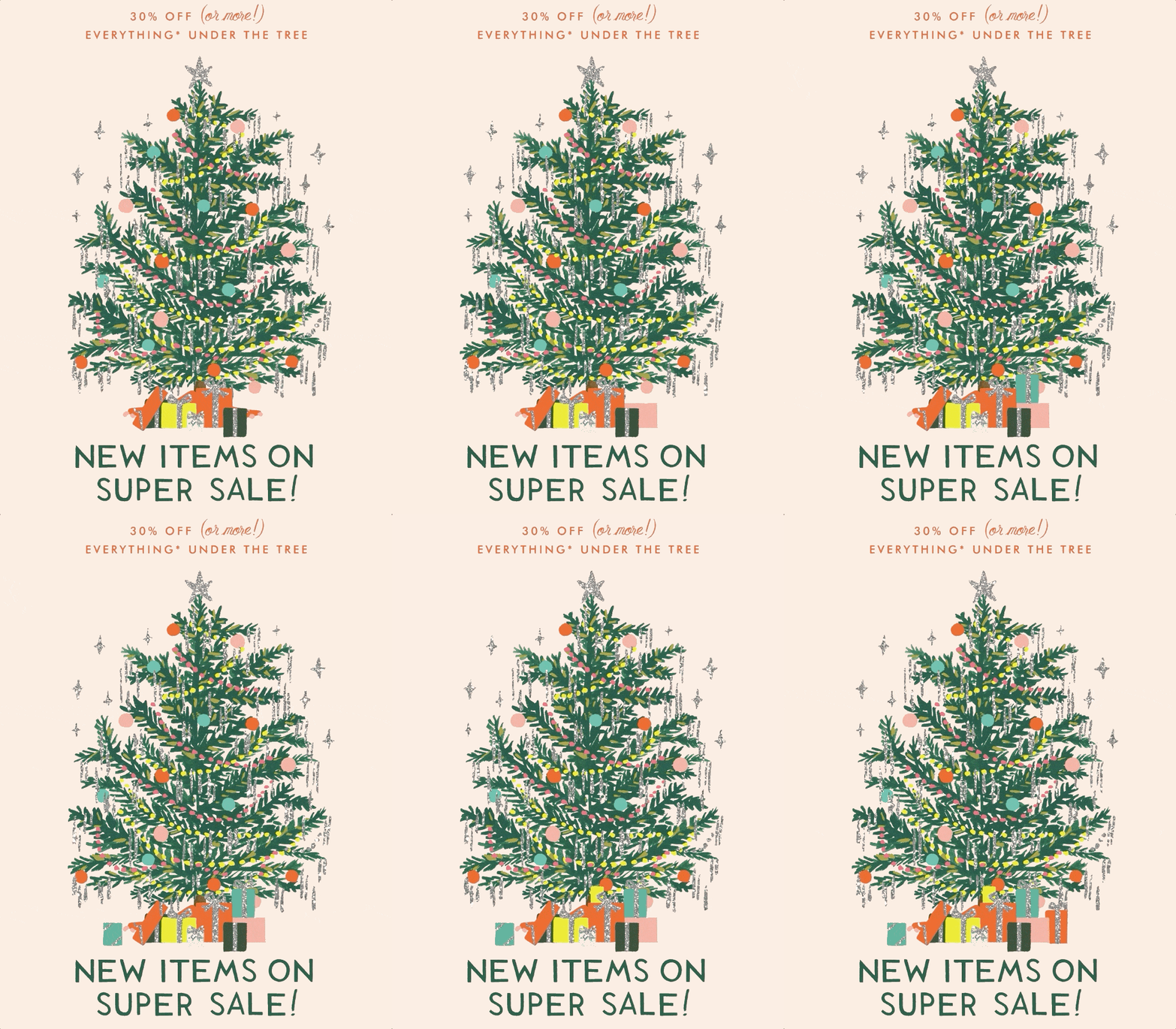
Rifle Paper Co. finds a valid excuse to follow up on their sale campaign, especially during the busy holiday season.
In the remainder of the email, the company recommends product categories you might want to browse:
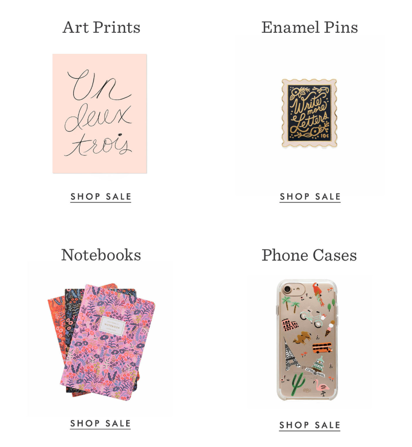
Rifle Paper Co. knows that it takes more than one email to convert some subscribers.
And with this subtle approach to follow-up emails, they get another chance even if they couldn’t grab your attention the first time.
7. Recover Abandoned Carts without Being Salesy (Tuft & Needle)
If you’re an ecommerce marketer, reducing cart abandonment is likely one of your primary goals.
And, chances are, you’re combining timely popups with email marketing to combat cart abandonment.
If so, you know that it’s hard to convince users to complete their purchases without sounding too salesy.
Tuft & Needle has the solution for you: A three-part abandoned cart email flow.
Let’s look at each.
When I left my cart on the Tuft & Needle website, first, I got an email with this subject line:

Who doesn’t like a good story, right?
Honestly, I didn’t think this was a promotional email until I opened to see this:
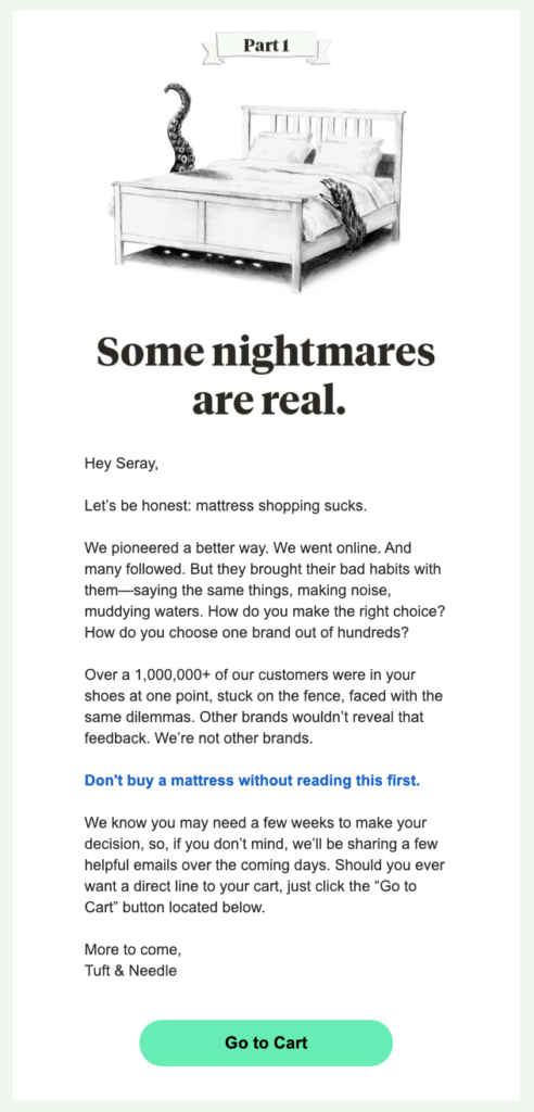
In the first part of their cart abandonment flow, Tuft & Needle joins the conversation in your head by acknowledging that mattress shopping sucks. (Yes, this is coming from a mattress brand.)
After positioning themselves as the frontrunners of mattress e-tailers, they ask the questions that are likely in your head: How do you make the right choice?
Next, they create social proof by comparing you to their one million customers.
In the middle of the email, you see a warning with a hyperlink on it: Don’t buy a mattress without reading this first.
When you click the link, you’re sent to this landing page where the company further handles your possible objections:
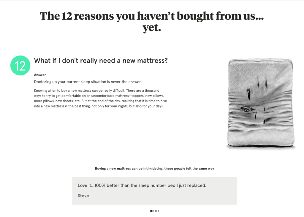
On this page, Tuft & Needle, first, raise any top-of mind questions you might have about their products. After answering them for you, they use customer testimonials to support their point.
A few days later, Tuft & Needle sends the second part of their email flow:
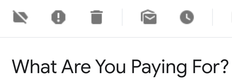
Again, what doesn’t look like an abandoned cart email subject line turns out to be a follow-up email:
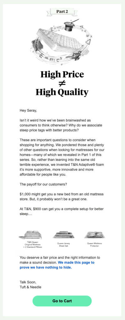
In this email, the company highlights its fair pricing and transparency.
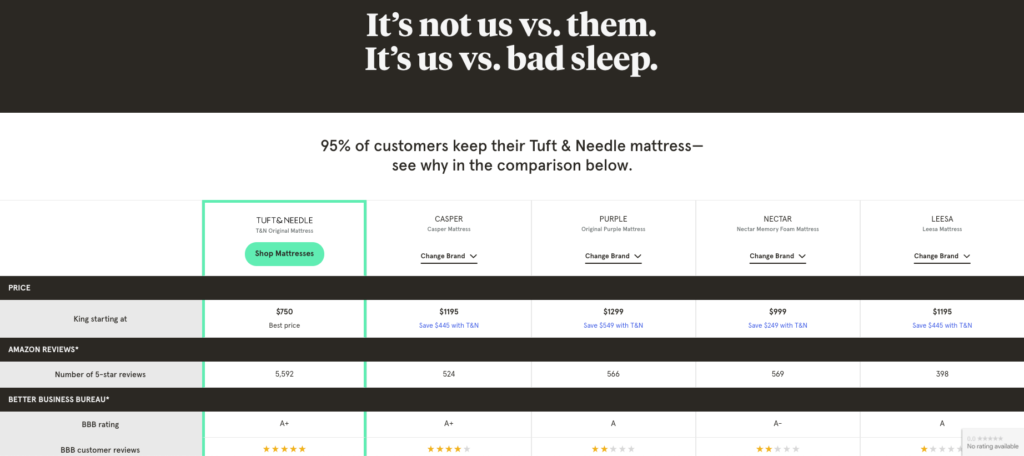
Next, they invite you to another landing page with a sentence that reads, “We made this page to prove we have nothing to hide.”
On this landing page, Tuft & Needle compares itself to their competitors, such as Casper, in a transparent way:
In the final part of their sequence, the company sends you this email:

With a statement that is hard to disagree, the company grabs your attention and makes you open the email:
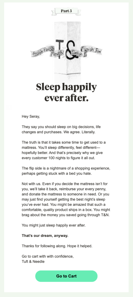
As a final attempt to convince you to revisit your abandoned cart, Tuft & Needle focuses on their satisfaction guarantee.
If you’re still on the fence, the company reassures you by showing how easy it is to return your mattress.
Overall, this is a brilliant email flow to convert abandoned carts. What’s better, you can easily replicate Tuft & Needle’s persuasive copywriting by following these three steps:
- Handle possible objections in prospects’ minds;
- Show how different you are than your competitors; and
- Ease prospects’ minds with your satisfaction guarantee.
8. Re-Engage Inactive Prospects (Beardbrand)
Most marketers spend valuable hours (and resources) to grow their email lists.
Yet, a dormant email list with little to no engagement means nothing for your business.
Knowing this well, Beardbrand finds a creative way to re-engage their inactive subscribers and get back on top of prospects’ minds.
It’s been a few months since I last visited the company’s website, until one day I saw this email in my inbox:
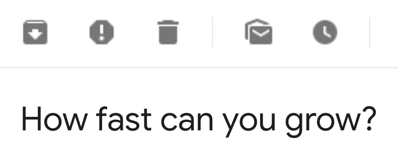
In full honesty, I’m not in Beardbrand’s target audience, and my relationship with them is simply marketing-related. Even so, this subject line piqued my interest, and I opened the email to see this:
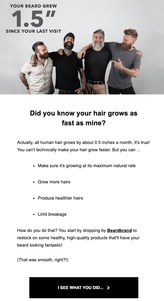
Sent by the company’s founder, Eric Bandholz, this re-engagement email is built on a simple fact: Human hair grows about 0.5 inches a month.
Instead of writing that I haven’t visited their website in three months, the company cleverly uses this trivia by saying, “Your beard grew 1.5″ since your last visit.”
After stating a simple fact about my browsing behavior without guilt-tripping, Beardbrand changes the subject to their products with a smart twist:
While you can’t make your hair grow faster, you can make it healthier.
Unsurprisingly, the key to healthy facial hair is Beardbrand’s products.
After catching your interest with this smooth, engaging introduction, they conclude the email with product recommendations:
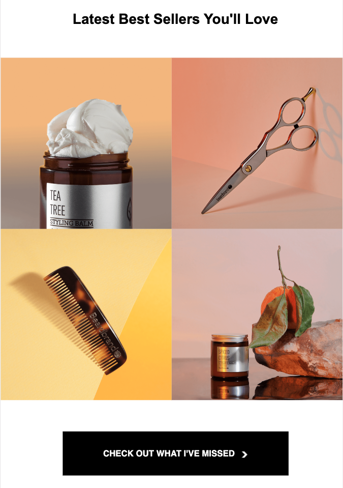
However, rather than write “Recommended Products,” they trigger your fear-of-missing-out (FOMO) with a CTA button that reads “Check Out What I’ve Missed.”
9. Appreciate Your Subscribers (Glossier)
While inactive subscribers are worth your time and energy, your active subscribers are equally, if not more, important for your brand.
With the right messages and incentives, you can turn your active subscribers into brand evangelists, let alone lifelong customers.
Contrary to popular belief, you don’t always need to hand out discount codes or free products to keep your subscribers happy.
Sometimes, all it takes is a heartfelt thank you note.
Glossier doesn’t take their subscribers for granted. I know this because, recently, I got this email from them:
Since I’m used to receiving (almost only) promotional emails from ecommerce companies, this simple subject line stood out in my inbox, and I opened the email immediately.
To my surprise, this was the content of the email:
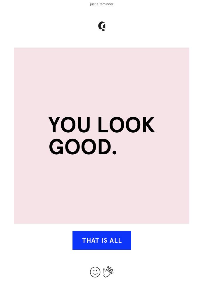
Glossier doesn’t have any products, announcements, or CTAs in this email. They compliment me because I often visit their website and open their emails.
But here’s the catch: All elements in this email, including the image, the button, and icons, are linked to their product pages. Meaning, any place you click in this email takes you to browse the company’s products.
This way, Glossier subtly lures you into their product pages. But they also create a positive brand image in the eyes of their active subscribers.
Bonus: How to Make an Email Campaign
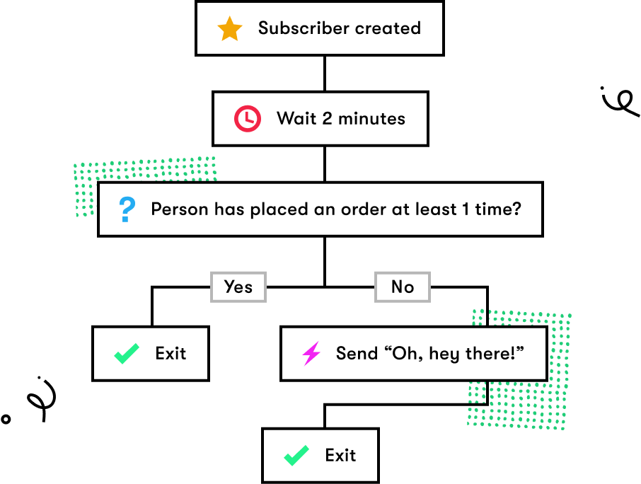
Say you want to send a single email campaign to non-buyers to promote an upcoming holiday sale. Let me walk you through the process, step-by-step.
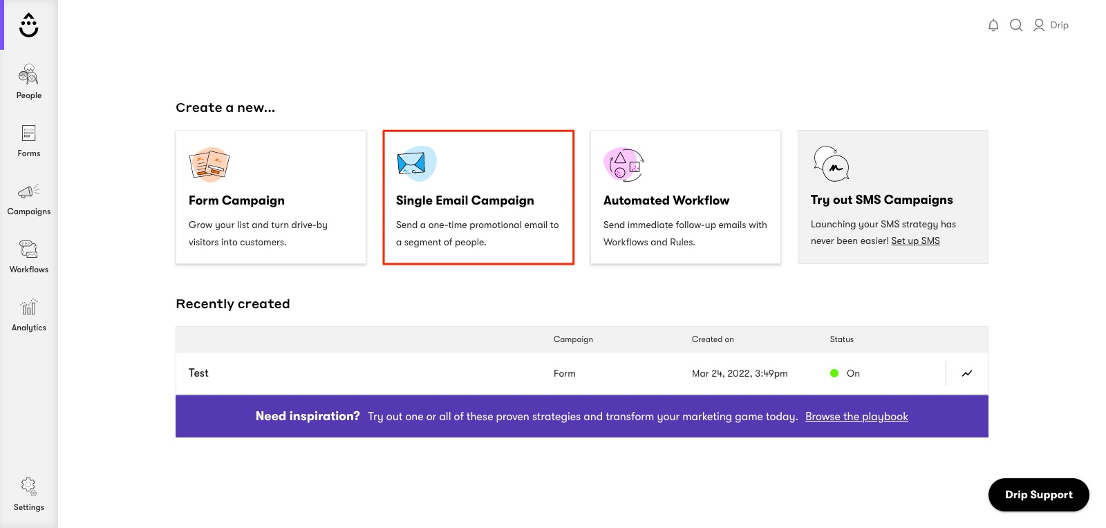
1. Create a Single Email Campaign
First, click “Single Email Campaign” and name it based on a suitable naming convention.
2. Choose a Segment
Then, choose a saved segment or crate a one-time-use segment. Let’s target subscribers that haven’t placed an order in the last month.
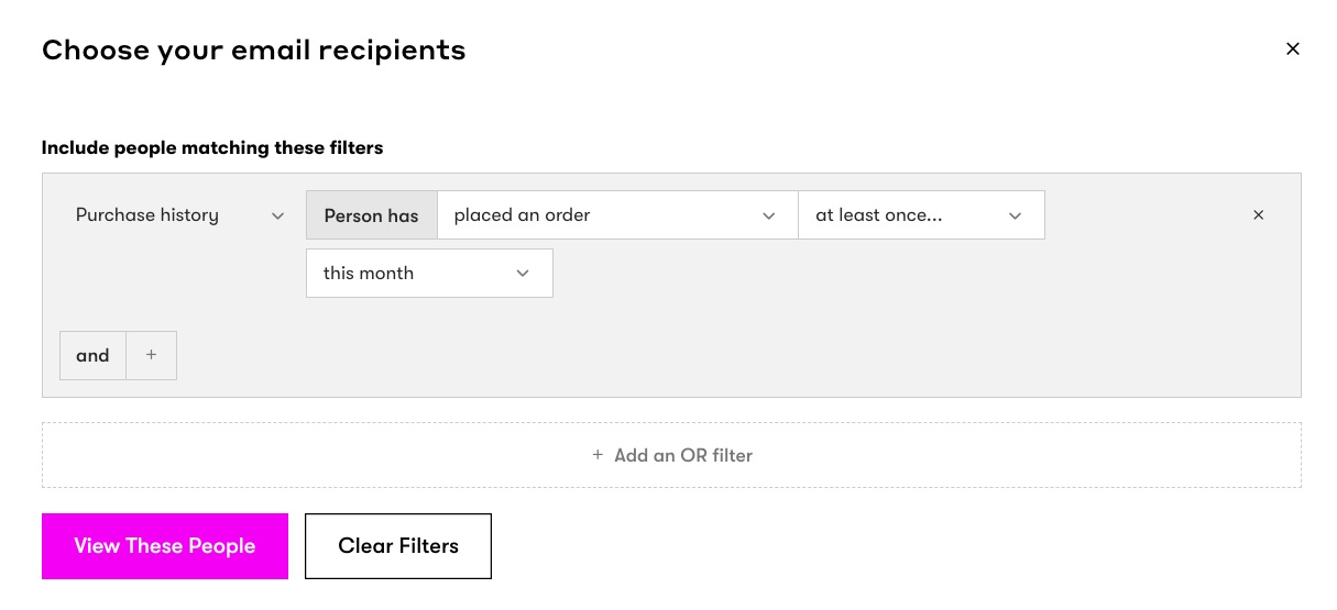
3. Choose a Template
Next, you need to design your email. You can do that by either building an email from scratch or using a template. I’ll use this Black Friday template:
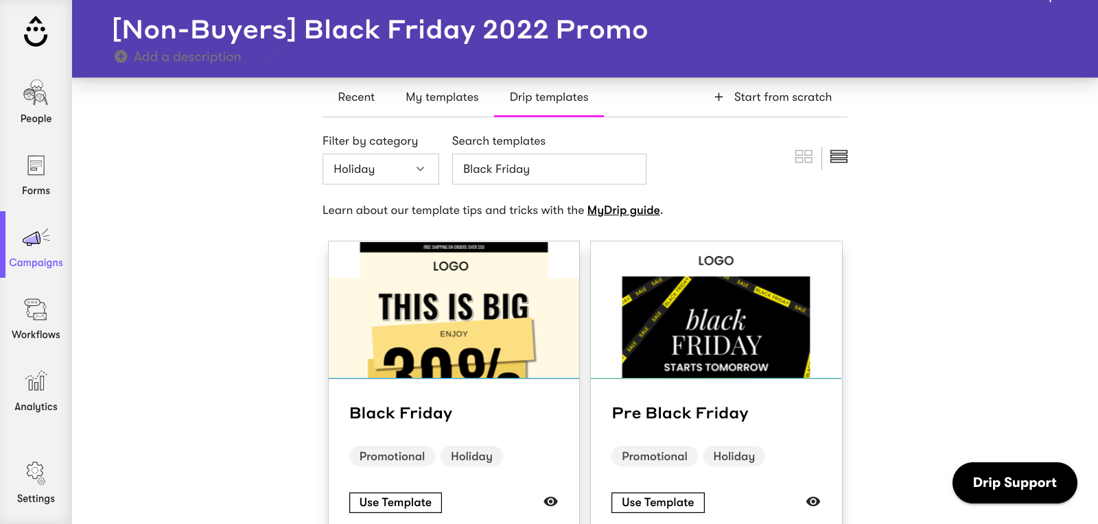
4. Customize Your Email
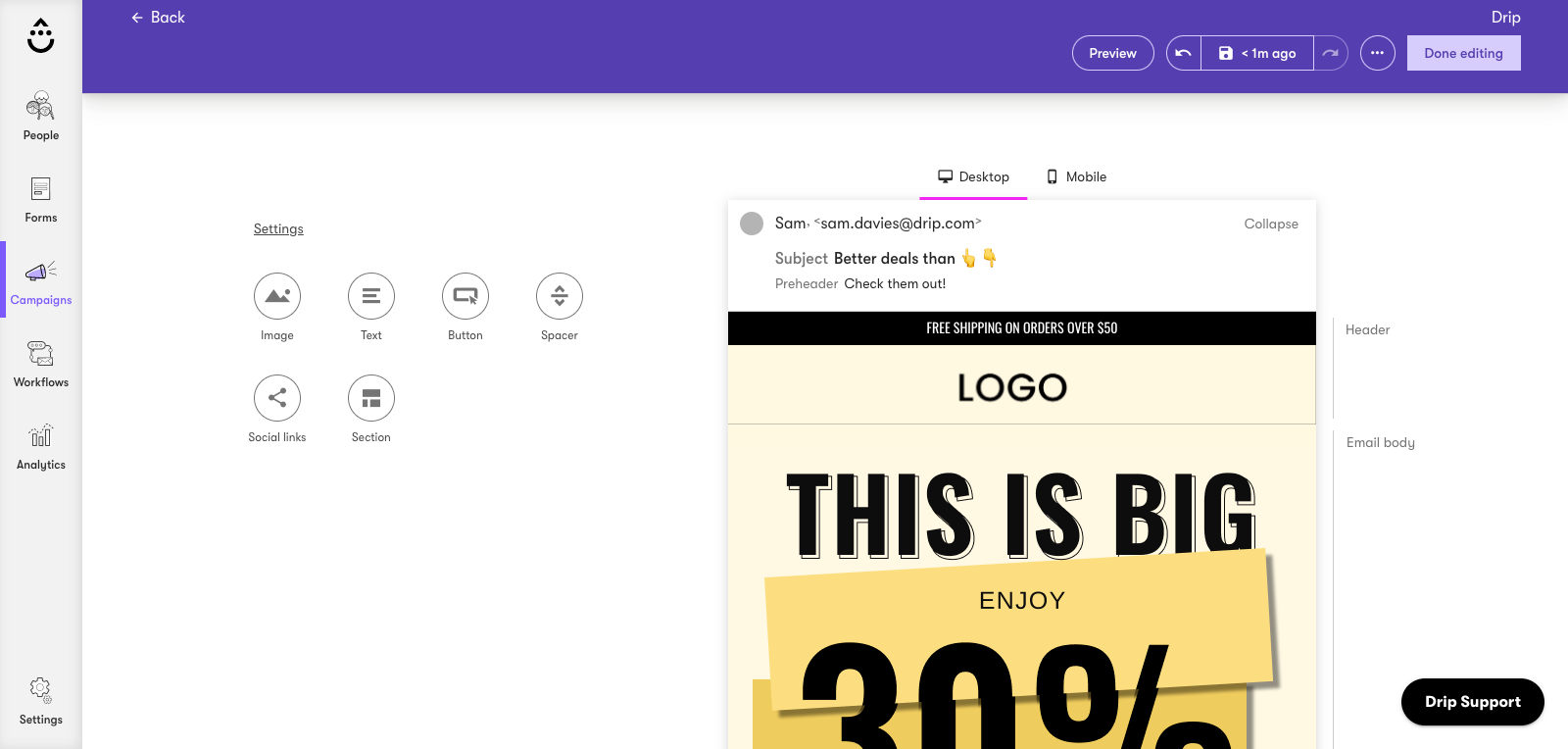
After, you need to ensure your email matches your brand's style guidelines. To do that, you need to:
- Add your header logo;
- Edit the font and button colors under settings and default styles; and
- Write a subject line and email copy in your brand’s voice.
Once you’ve built your email, you can click “Preview” to see how it looks on desktop, tablet, and mobile devices.
5. Split Test Your Subject (Optional)
Testing subjects against one another affords fresh insights into what resonates with your audience, particularly if you’re new to email copywriting or struggle with writing good subjects.
Depending on the email service provider you’re using, you can test up to four subject variants as well as body variants if you’re looking for deeper insights into your campaign’s performance.
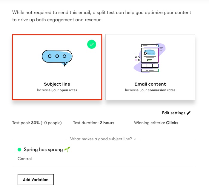
You can also decide your test pool size, test duration, and winning criteria (open or click-through rate) if you want to be more specific.
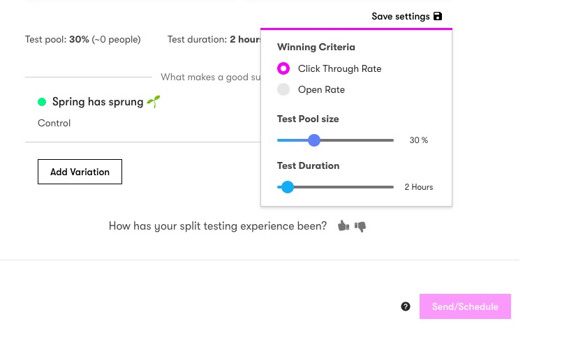
You can declare a winner if the results are obvious before the duration of your test ends, or, have one decided for you once the test runs for its full duration.
And that’s it! If you’re more of a visual learner and want an overview of the entire process from beginning to end, watch this video:
And if you’re curious about improving your open and click-through rates with split testing, watch this video:
Conclusion
Now and then, we all feel stuck while writing a product launch email or a weekly newsletter for our blog.
Chances are, the same thing happens to you, too.
That’s why I wanted to share the nine best email marketing examples I’ve seen that’ll hopefully inspire your next email campaign.
No matter what your email marketing goals are, you can always find room for improvement.

