Web design is obviously important. Visitors are heavily influenced by your design, and it affects their behavior on many levels.
It can motivate them to browse through your site, engage with your content, click your calls-to-action CTAs, check out your products, and so on.
But design plays an even bigger role than you may think. In fact, 94 percent of first impressions are design-related.
Understanding design-based psychological principles that affect consumer behavior—and basing your web design around them—can have a huge impact on conversions.
While this can include many different practices, there’s one particular concept I want to cover here—visual cues.
This is one of the more basic design strategies and doesn’t take a CRO expert to figure out.
Yet it can have a tremendous impact on visitor behavior and send conversions through the roof.
For this post, I’ll provide you with an in-depth explanation of visual cues, offer examples and discuss best practices for getting the most from this technique.
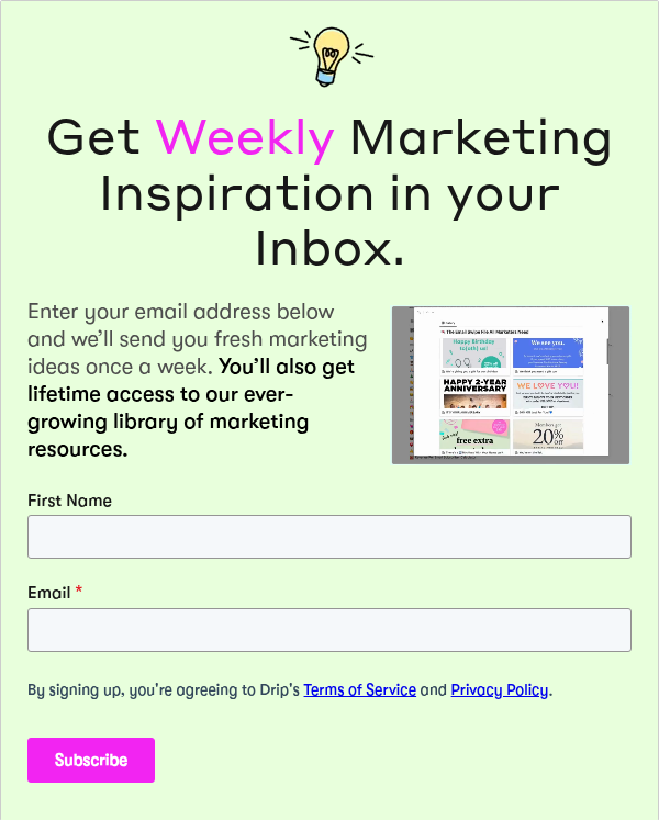
What Are Visual Cues?
According to UX Planet, visual cues, or directional cues, are the elements on a web page that subtly draw attention to the areas of importance and help users interact with the site.
They serve as a means of directing a person’s attention to a certain section like a CTA or a product. Rather than browsing through the entirety of a page, visual cues narrow it down so visitors know exactly what they should be looking at.
You can think of it as an unobtrusive way of saying, “Hey, check this out.”
Explicit and Suggestive Visual Cues
Unbounce elaborates, explaining there are two main types of visual cues— explicit and suggestive.
Explicit cues involve lines or arrows pointing to an area of importance, while suggestive cues use images of people looking at an area.
Here’s an example of an explicit cue.

You can’t help but notice the orange arrow and follow it to the “Download Now” section.
There’s no guessing what’s most important on this page and where your attention should go.
Explicit cues are one of the most straightforward techniques, and they’re commonly used on landing pages to guide visitors to a particular section.
This can be a quick cure for low converting sites. And for those with solid conversions, it can increase them even more.
Now here’s an example of a suggestive cue.
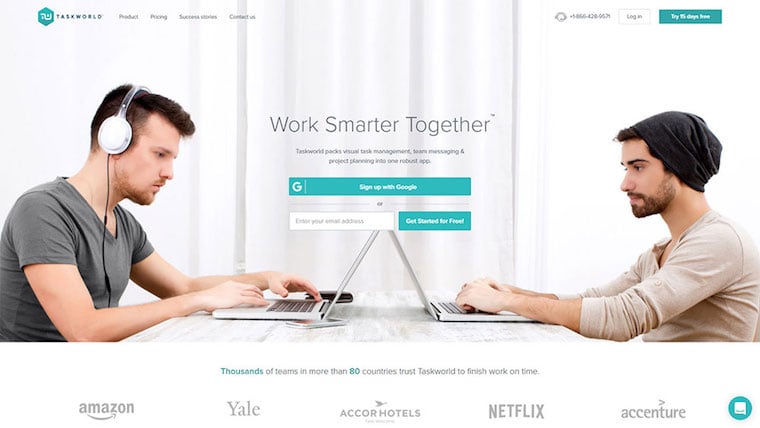
These two guys are both facing forward looking at their laptops. Just above their laptops is the CTA to sign up for the product, Taskworld.
The way they’re situated make your eyes gravitate toward the center of the page to the CTA.
Here’s another example.

It’s the exact same concept except there’s just one guy facing the copy on the right, which mentions product benefits.
Suggestive cues work well because of our ability to instantly determine where another person is looking. We have an evolutionary knack for it.
So designing a page where a person is looking at an important area may increase the odds that visitors will shift their attention to that spot.
While explicit and suggestive are the most common, there are a few other types as well.
White Space
Areas of emphasis are surrounded by white (or negative) space, which guides the visitor’s attention to that area.
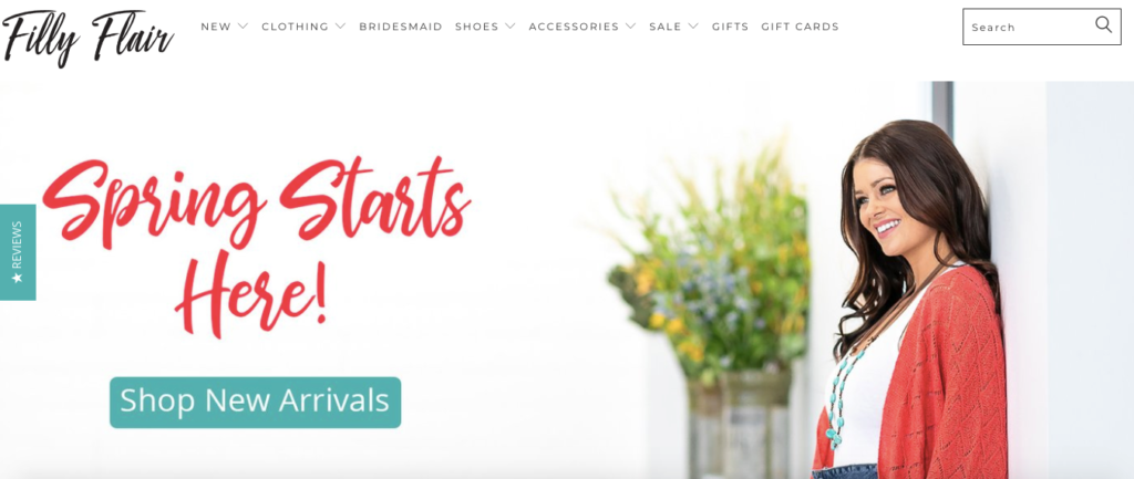
Notice how the abundance of white space on the homepage of women’s clothing store, Filly Flair, naturally draws your eye to the “Shop New Arrivals” button.
The green CTA in a sea of white makes it stand out.
Here’s another example from shaving company, Harry’s.
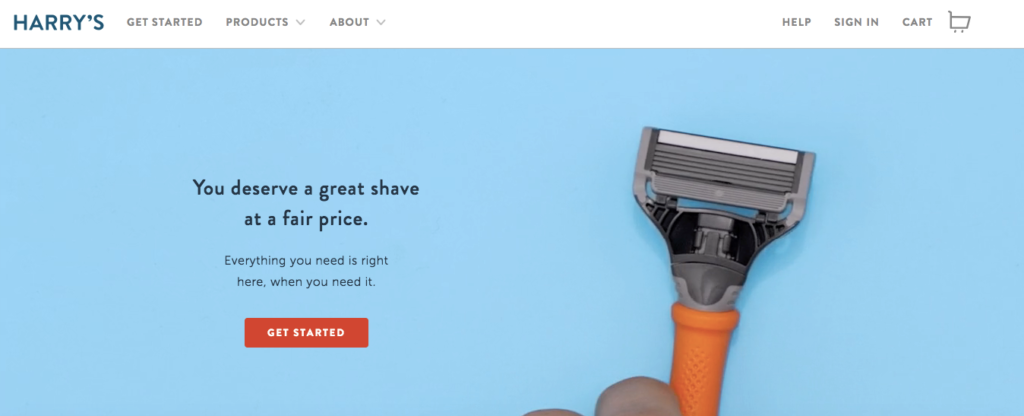
The minimalist feel of the page with a red CTA box surrounded by blue easily grabs your attention.
Including plenty of white space is actually a core component of writing scannable text that readers can easily digest in blogging.
And the concept also applies to visual cues because it helps isolate the primary area of interest where eyeballs can’t help but be drawn to it.
Color Contrast
This technique is just like it sounds.
A page uses contrasting color schemes to bring a visitor’s attention to a particular section.
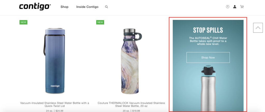
That’s what travel mugs/water bottle company Contigo does to bring attention to the “Show Now” CTA for their AUTOSEAL Chill Water Bottle.
Notice the left side of the page is white. But the right side has a contrasting green box with the CTA inside of it.
The difference in color should make most visitors focus on the contrast, thus increasing their odds of clicking on the CTA.
Encapsulation
“Encapsulation, or the framing of elements, is another way to highlight what’s important on the page by creating an enclosed window of focus,” Instapage explains. “Designers often do this with boxes, outlines, and/or contrasting colors to reduce page clutter and draw attention to specific elements.”
This is a technique Instacart uses to highlight important information.

This particular example involves a box where customers enter their ZIP code to find local stores in their area.
The CTA is encapsulated in the box in the center of the screen and is nearly impossible to miss.
Why Do Visual Cues Work?
It’s quite simple. How visitors experience a site is largely based on the design.
We’re so visually-oriented by nature, we can’t help but be influenced by visual cues.
What’s more, most people pay way more attention to the superficial elements of a page—like visual cues—than they do the actual content.
Now I’m not saying that content doesn’t matter. It matters a lot. But the overall design of your site matters even more.
After all, you could have the greatest content in the world. But if your design sucks, very few people will hang around long enough to explore it.
Visual cues are perfect for steering visitors to a particular area so that critical information isn’t overlooked.
There may be a lot of information on a web page, but a visual cue shows us exactly where we should be looking.
ConversionXL did extensive research on visual cues and produced eye-tracking heat maps to see what people looked at and for how long.
Here’s a classic explicit cue in the form of an arrow.

And here’s where people looked according to a heatmap.
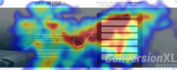
This shows us firsthand the impact a well placed visual cue can have.
There’s arguably no better way to guide visitors to the areas you want them to look at.
And the thing I love is that they’re so easy to use. It’s just a matter of slightly adjusting your design.
Do Some Work Better Than Others?
At this point, we’ve established what visual cues are, that there are different types of visual cues and that they work.
But are some naturally more effective than others? And if so, is there a particular type of visual cue that should take precedence over the rest?
To answer that question, I’m going to reference the ConversionXL study once more.
The heat map I mentioned earlier featuring the explicit visual cue with the arrow was the one they found to be most effective.
But they tested seven different versions to come up with their results, including the following.
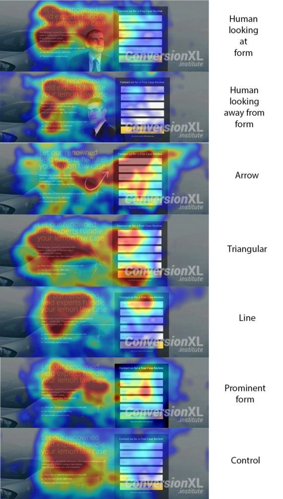
According to their findings, visitors responded the best to a good old fashioned arrow (explicit cue) than the other six options.
It should be noted that the arrow outperformed the suggestive visual cue of a man looking at the contact form.
The heat map suggests people’s attention hovered more on the man and the headline directly above him than it did on the contact form they were trying to bring attention to.
ConversionXL also makes an interesting point about suggestive visual cues, saying “people do look where others are looking, but the effect is less present in people on different parts of the Autism scale and also varies by gender and even political temperament.”
A separate eye tracking study by EyeQuant concurs and found the human gaze doesn’t isn’t as powerful as marketers may think.
Looking at the results of this study shows that it only had a marginal impact.
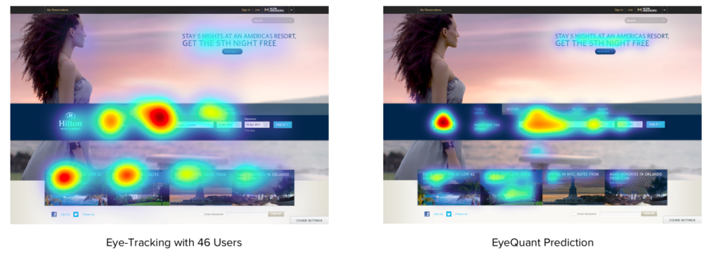
“Faces are emotionally powerful, but they don’t always attract as much attention as we think they do,” EyeQuant writes.
This isn’t to say that using an explicit visual cue in the form of an arrow will work best 100 percent of the time. And it doesn’t mean that suggestive visual cues won’t work well.
But it clearly shows that some visual cues work better than others, which brings me to my next point.
Experiment to Find the Optimal Visual Cue
Like many other aspects of e-commerce, finding the perfect formula usually requires some testing.
Every site is different, so I suggest performing some basic experiments to see which visual cue works best for you.
While you may not go to quite the same lengths as ConversionXL, it’s still a good idea to test out two or three different types of visual cues.
For example, you might try one design with an arrow pointing to your CTA, one design with a person looking at your CTA and another with white space surrounding it.
If you’re satisfied with your findings, you could stop there and implement that design.
Or if you want to take it even further, you could experiment with different variations of the design.
In the case of an explicit cue, you could use a straight arrow, a curved arrow, and a triangular arrow.
Or in the case of a suggestive cue, you could use a female model and a male model.
And you don’t even have to use eye-tracking heat maps. You could simply see how the conversion rates differed for each version and base your decision around that.
Visual Cue Best Practices
Like I said before, there’s no magic formula.
Every site is different, so it will likely require some tinkering before you get it just right.
That said, there are a few strategies I recommend across the board.
The most important thing is to keep it simple. You certainly don’t want to get too cute with visual cues and over complicate it.
For example, you probably wouldn’t want to include three arrows coming from different directions pointing at an area.
That’s only going to disrupt the design and make the page feel cluttered. Instead, just use one, well-placed arrow.
It’s also critical that your CTA stands out.
No matter how great a visual cue is, it probably won’t have much of an impact if your CTA itself isn’t noticeable. Remember that your CTA is the main attraction. The visual cue’s job is merely to bring attention to it.
Ideally, you’ll use a smooth, seamless visual cue in conjunction with an easily identifiable CTA.
Finally, the whole package should look good aesthetically.
I know that’s a subjective statement, but you can tell when a page looks good and when it doesn’t.
At the end of the day, what’s important is that it has high-quality, professional looking aesthetics.
As long as you do that and use visual cues to emphasize an area of importance, you should be in good shape.

Conclusion
So much of how visitors perceive a website revolves around design. It’s the key driver of first impressions.
The overall look and feel of a site determine how long visitors will hang around, how much they want to explore and the likelihood of them converting.
Visual cues are one of the more basic aspects of design but can have a big influence on a visitor’s perception.
In many cases, people pay more attention to visual cues than the content itself. So it’s definitely a weapon worth adding to your arsenal.
As we’ve just learned, there are a few different ways to go about this.
Explicit and suggestive visual cues are the most common, but there are other techniques like white space, contrast, and encapsulation that can work as well.
The key to success is to base your visual cues around your goals, follow best practices and experiment.
Do that, and you should see a noticeable spike in conversions.

