“Popups are @#$%ing annoying!” How often have you read, or thought that, after visiting a website and seeing an intrusive interstitial?
I know I have. And as someone that strongly advocates using user-friendly email popups, it pi**es me off.
That’s why, in this blog post, I’ll share how to use website popups the right way using slide-ins.
To do that, I went through 1,297 customer campaigns to find what I feel are the best in terms of copy, design, and of course, conversions.
Let’s dive in.
The 7 Best Slide-In Popup Examples
1. Cykel Experten
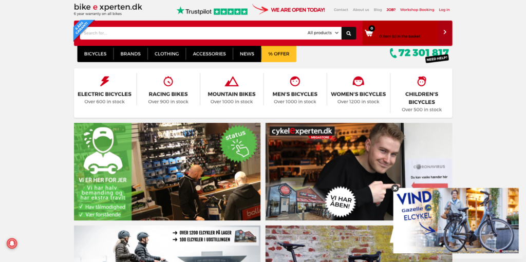
Cykel Experten is an online retailer known for its vast collection of electric bicycles. When you visit its homepage, there’s an image-focused teaser, inviting you to win a free bicycle.
When you click the teaser, the retailer invites you to input your email address to enter a free prize draw.
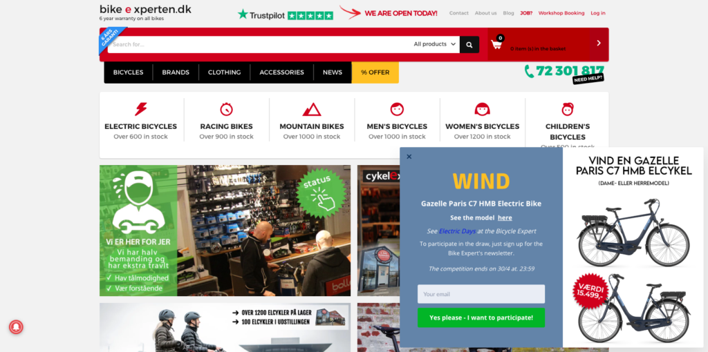
Giveaways are a common optin incentive for online retailers, but what I especially like about their campaign is threefold:
- There’s an arrow, or visual cue, in the teaser telling you where to focus;
- The form includes the bicycle’s price to increase its perceived value; and
- There’s an option to click through to a product page to read more about the bicycle, thus, adding to the validity of its perceived value.
And if that’s not enough, when the giveaway ends, Cykel Experten will have an email list of visitors who were interested in that specific bicycle… which is a perfect remarketing opportunity, later, via email.
In closing, we’ve written before about giveaways, so I won’t repeat what we’ve covered previously here. I will, though, emphasize the importance of testing giveaways before discrediting them.
They might not work for your industry, but if they do, there are more than a few benefits to take advantage of, which I’ll return to later in the article. (See: Real Coffee.)
2. Georg Jensen Damask
Georg Jensen Damask is a Danish design house known for its “outstanding craftsmanship and creative collaboration with several world-leading designers from both last and this century.”
On its homepage, the retailer uses a nicely-designed teaser in the bottom right-hand corner, inviting visitors to “Send an Easter Gift to Your Loved Ones.”
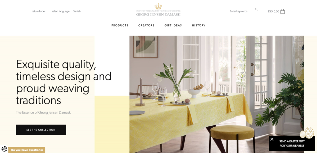
After clicking the teaser, you see a form that delivers on the promise made in the teaser.
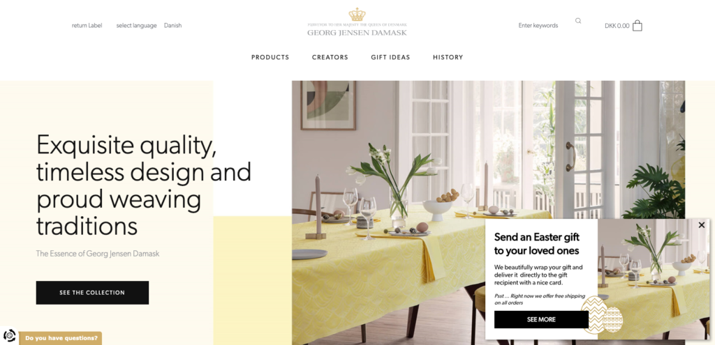
With compelling copy and an image that compliments the home page, the campaign earns its place nicely on Georg Jensen Damask’s site. But what’s most interesting is the journey it takes the visitor on after clicking the call-to-action…
After clicking “See More,” the retailers redirects you to their Spring category page:
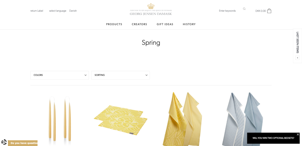
And, as you can see, there’s another teaser, only this time, Georg Jensen Damask asks you to enter your email in exchange for entering, you guessed it, a giveaway.
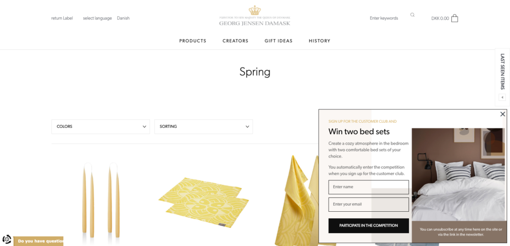
What I like about Georg Jensen Damask’s campaign is that it builds compliance before you opt-in. From the homepage to opting in, it’s four clicks—more than the average number one would expect when entering an email.
You would assume that many clicks would hurt conversions, but given the length of time this campaign has been running, that’s likely not the case.
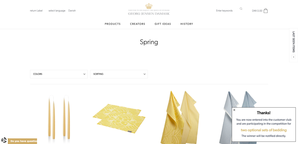
The success step the reader sees after opting in.
Georg Jensen Damask is a good example of a brand optimizing their campaigns for each step of their funnel. Given that they’re a customer of our done-for-you service, we know that promoting its spring collection is Georg Jensen Damask’s first priority, followed by collecting leads.
The brand knows well that not everyone is ready to buy on their first visit. But by asking for the visitor’s email, they’re able to market to them later via email.
3. Soxy
Soxy is a premium lifestyle brand with an “emphasis on designing bold socks to help empower individuality and self-expression.”
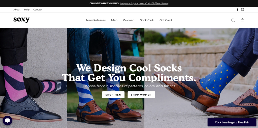
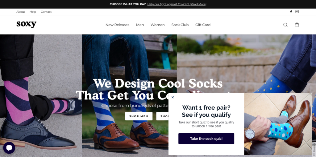
On its home page, Soxy lure visitors to click its campaign teaser by flaunting a free pair of socks.
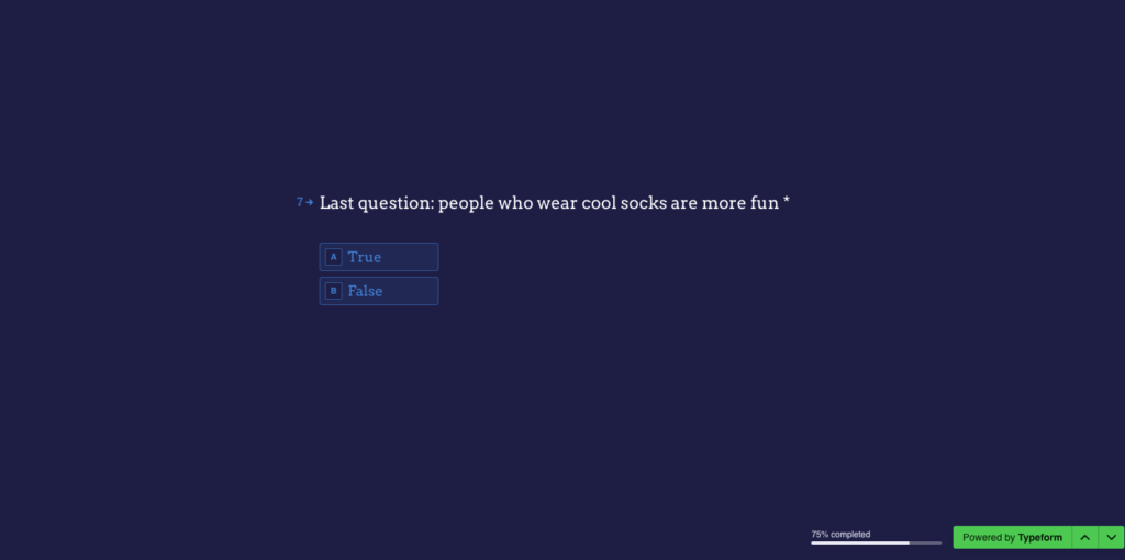
When you take the quiz, Soxy asks what you’re looking for, the types of socks you usually wear, your preferred colors, as well as a few fun questions such as this true or false question:
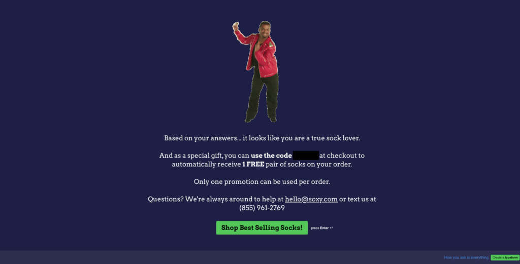
After offering to email your results, Soxy then gives you a code to get a free pair of socks with your next purchase.
Like giveaways, we’ve written about lead generation quizzes before, but there are a few best practices worth repeating here.
- Disguise surveys as quizzes. Incentivized or not, no one enjoys completing surveys. Quizzes, by contrast, are fun and hard to say no to (especially when you have to “qualify” as Soxy frames in its copy).
- Help people find what they’re looking for. One of the advantages of quizzes is they help new visitors find what they are looking for. “You said X, so Y would be perfect for you.” Don’t be afraid to put buyers in boxers. It makes everyone’s life easier.
- Offer to email recipients their results. Entering your email at the end of the survey isn’t compulsory; it’s an assumption. And the assumption means more people are likely to opt in to get their results before clicking through to the final page.
If you’re already using lead generation quizzes, promoting them in slide-in popups is a great way to drive more submissions.
4. Spruce
Spruce is an online retailer that produces American made, highest quality, lab-grade Cannabidiol (CBD oil).
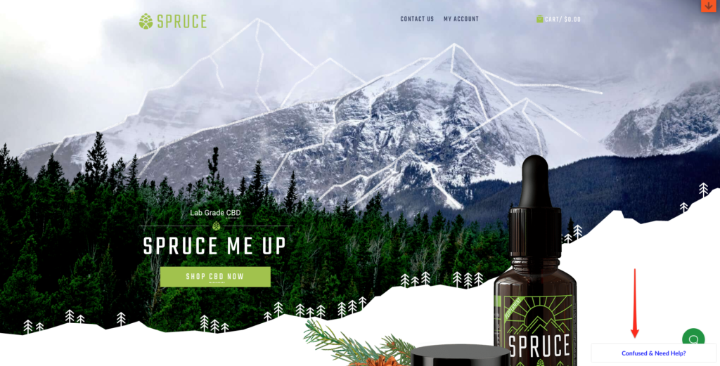
Prior to writing this post, I’d never heard of CBD oil. And judging from its campaign teaser, I’m assuming I’m not the only one.
When visiting its website, Spruce uses its teaser copy to address any concerns you might have with making a purchase:

When you click the teaser, Spruce, much like Soxy, asks you to take a quiz.
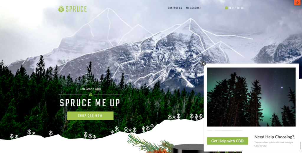
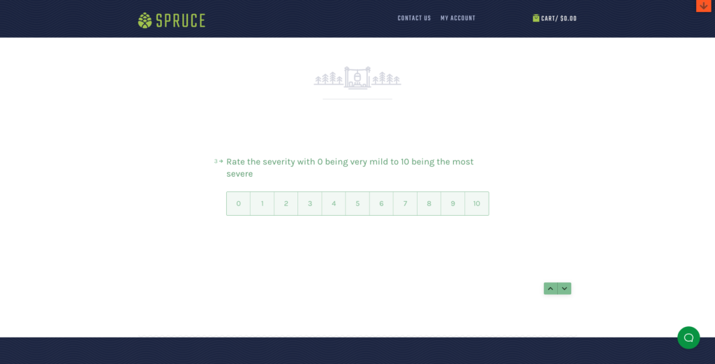
After clicking its remedy-focused copy, “Get Help with CBD,” Spruce surveys you on which problem you’re trying to solve (pain, anxiety, sleep) before asking you to rate its severity.
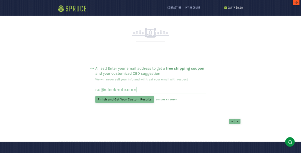
After asking you to enter your email to get your results—a best practice we discussed above—Spruce invites you to enter your email to get free shipping before inviting you to “finish and get your custom results.”
Finally, Spruce recommends a product that’s the best fit for you based on the answer you gave.
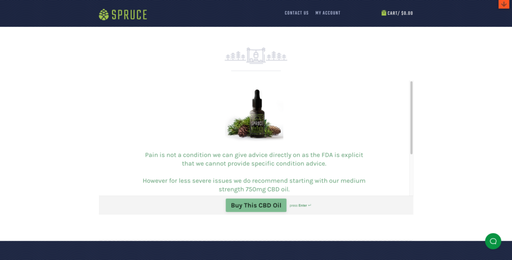
Where I like most, though, and what differentiates Spruce from other retailers using lead generation quizzes, is it’s not afraid to tell you their products are not for you.
For instance, if you answered that you’re worried about drug testing, Spruce recommends NOT to buy ANY of its products.
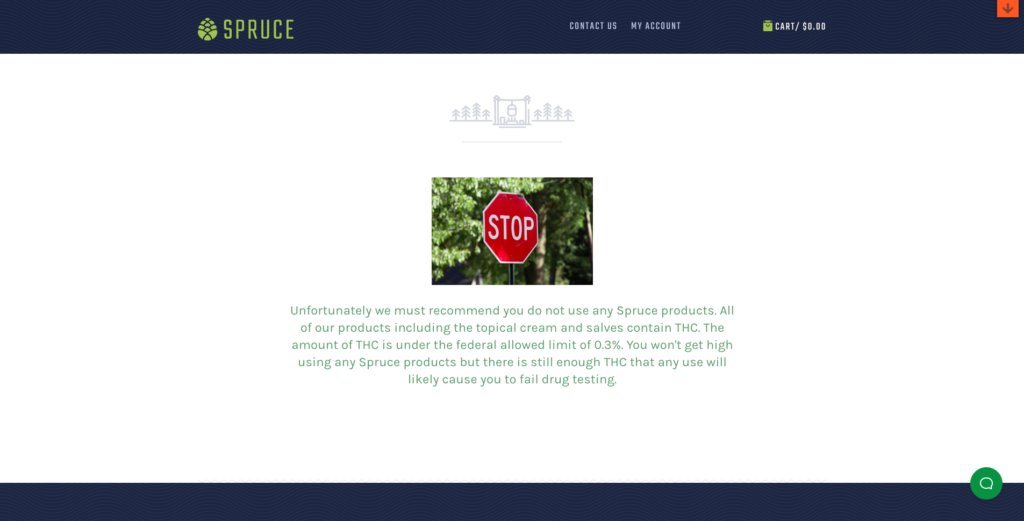
“Takeaway selling,” as it’s known, is nothing new. But combining it with a slide-in campaign and a lead generation quiz is something I’ve haven’t seen before.
So, if you’re in a market governed by strict laws, and you’re looking to get an edge on the competition, it might be worth considering.
5. Real Coffee
Of all the customer campaigns I saw during my research, Real Coffee was one of my favorites.
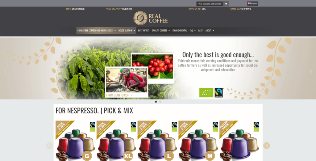
Based in the United Kingdom, Real Coffee offers affordable, high-quality Nespresso® and Dolce Gusto® compatible coffee capsules for coffee aficionados in the UK, Denmark, Sweden, and Norway.
If you visit one of its product pages, you immediately notice a beautifully-designed teaser offering the chance to “get a free milk frother as a gift.”
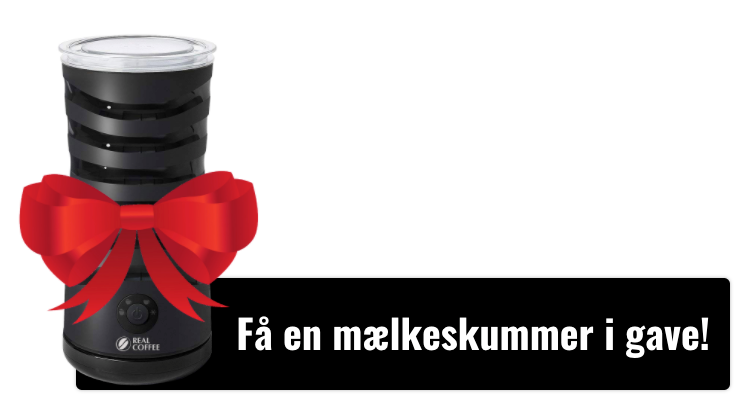
When you click the teaser, Real Coffee invites you to click through and learn more about the offer:
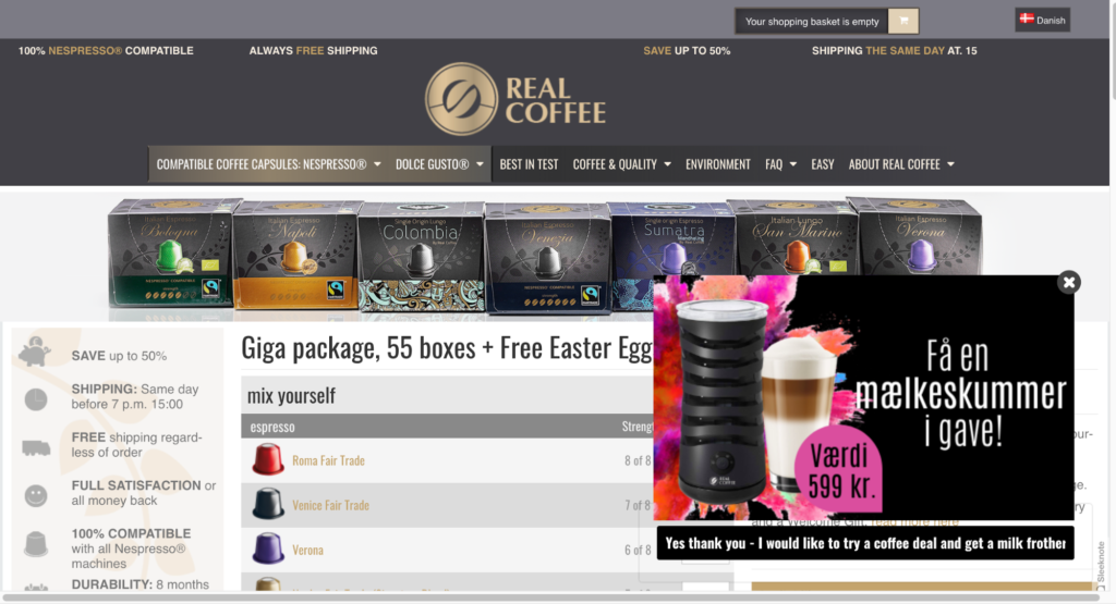
After clicking the CTA, Real Coffee redirects you to a page where they try to sell their monthly continuity program.
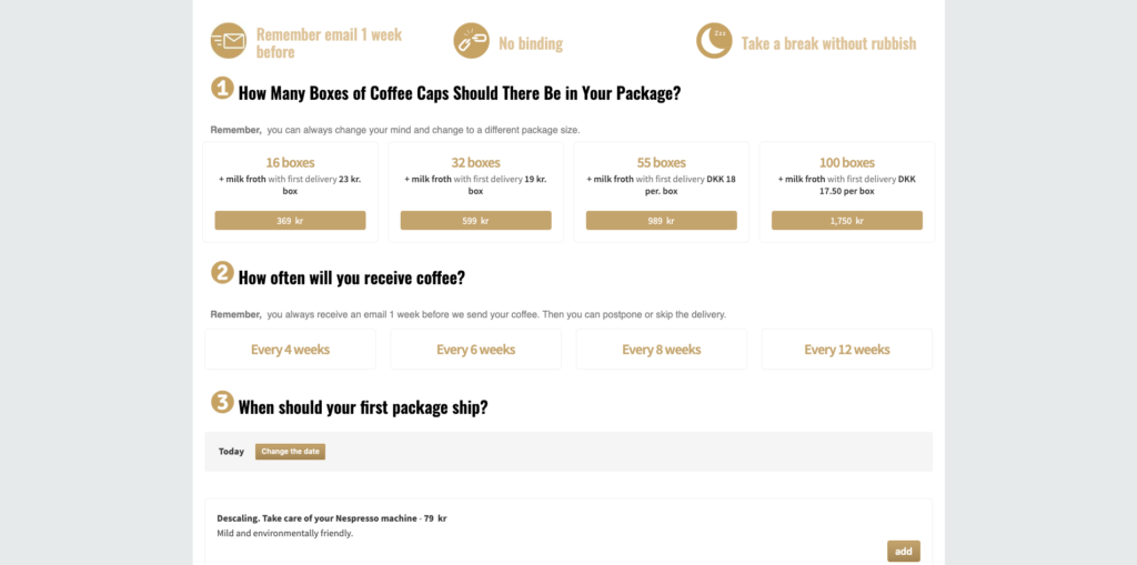
I mentioned above that it’s one of my favorite campaigns. And that’s for three very specific reasons.
- First, the teaser commands attention. With its floating image and alluring copy, the teaser alone more than enough to entice any potential buyer.
- Second, the offer is relevant. A milk frother is something customers are likely to have interest in, given its compatibility with Real Coffee’s core offer (capsules).
- Third, Real Coffee offers a subscription. Promoting a bestseller is a common practice many are familiar with. But this brand knows recurring revenue is where the real money lays.
What I like most about this strategy is you don’t have to offer a subscription. In fact, any high-priced product will work, provided it has a strong value proposition.
6. Apuls
Apuls is an online retailer that specializes in “affordable exercise equipment” for those “passionate about exercise, health, and wellness.”
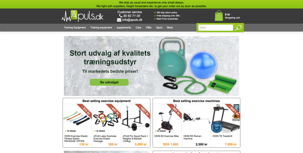
What’s interesting about Apuls, and the reason I’ve included them in this post, is how they’re using a slide-in to increase product sales.
For instance, if you visit its product page for exercise bikes, you see a teaser asking, “Have You Considered These Exercise Bikes?”
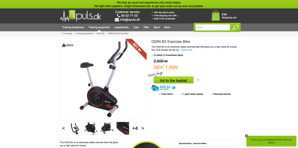
After clicking the teaser, Apuls shows three different bikes, each with its own CTA.
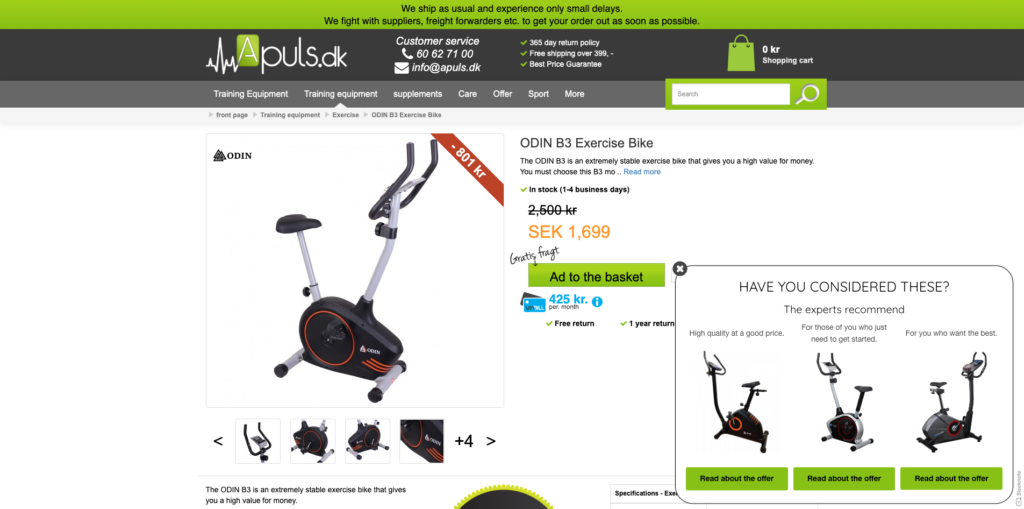
Upon closer inspection, you can see that each bike is accompanied by a recommendation based on your budget:
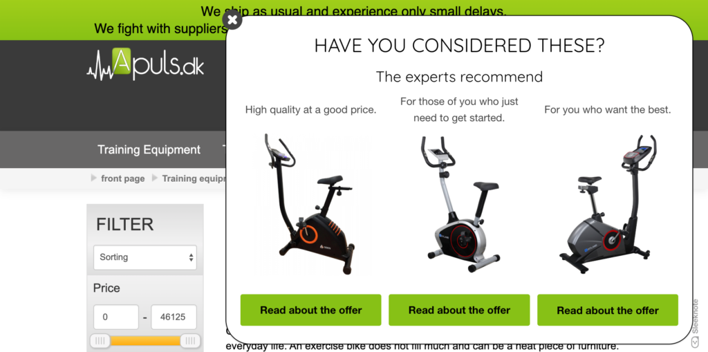
Offer one is “high-quality at a good price,” offer two is “for those who just need to get started,” an offer three is “for those who want the best.”
Apuls’ phrasing is clever because:
- Offer one (1,699 SEK) appeals to visitors that want a bargain without compromising on quality;
- Offer two (6,000 SEK) appeals to impulse buyers (if you’re browsing bikes, you’re likely ready to buy); and
- Offer three (7,500 SEK) appeals to ego. As Dan Kenndy says, “There is a percentage of people in every customer population who typically buy the most expensive option […] because that’s how they see themselves and how they want to be seen by others.” [Source.]
But that’s not all.
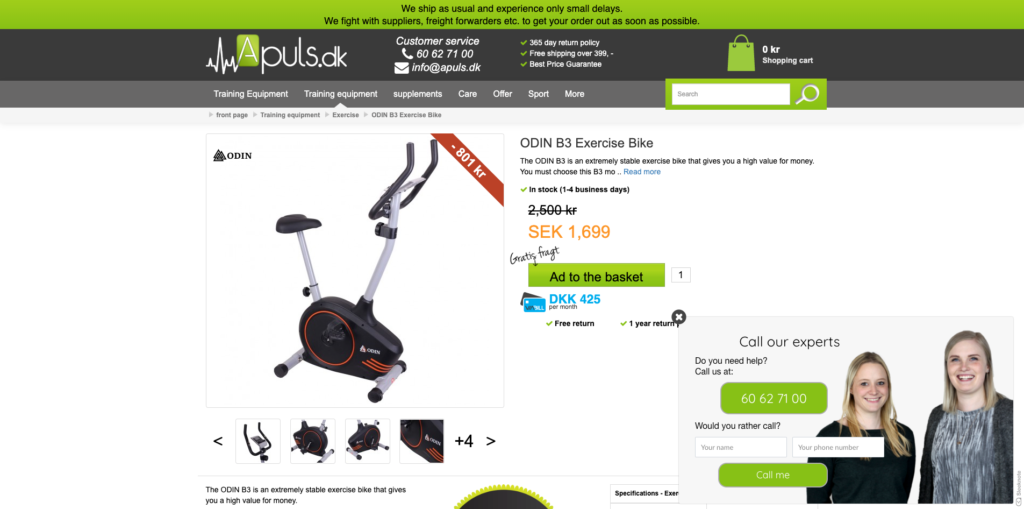
After clicking through to one of the pages, a new slide-in appears, offering assistance if needed.
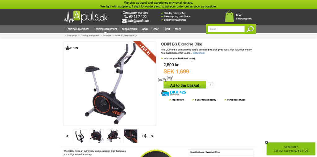
From there, visitors can call customer service if they have any further questions.
To learn more about the strategy mentioned above and how Apuls grow its business with Drip, read this in-depth case study.
7. Samuel Thomas Davies
In-between managing content at Drip and fighting organized crime, you can usually find me working on my personal blog.
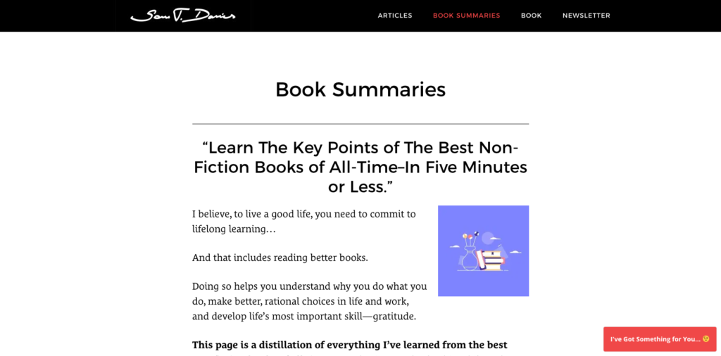
On it, I mostly summarize the best non-fiction books of all time, among other book-related resources.
To get relevant emails, I have a slide-in that invites readers to give me their email in exchange for free book summaries.
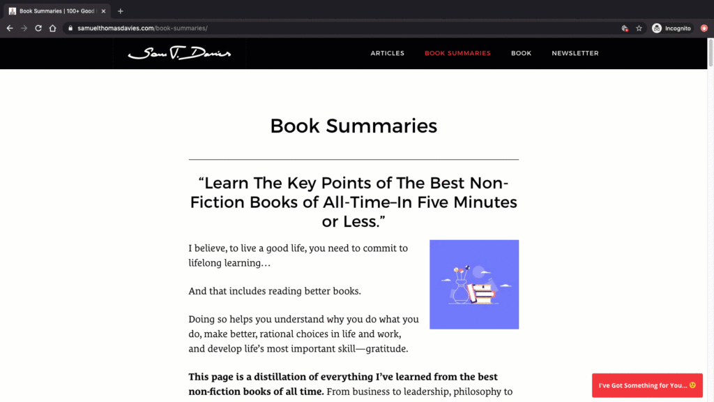
I made this campaign when I first joined Sleeknote (now Drip) in 2017. And since then, I’ve collected more than 10,000 emails with my conversion rate averaging around 2.1 percent.

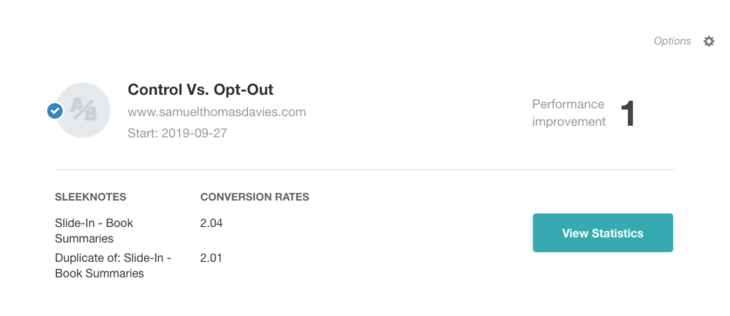
While I haven’t changed the campaign much since creating it, I have made a few interesting findings having run a few a/b split tests.
For instance, I recently tested a single opt-in like this:
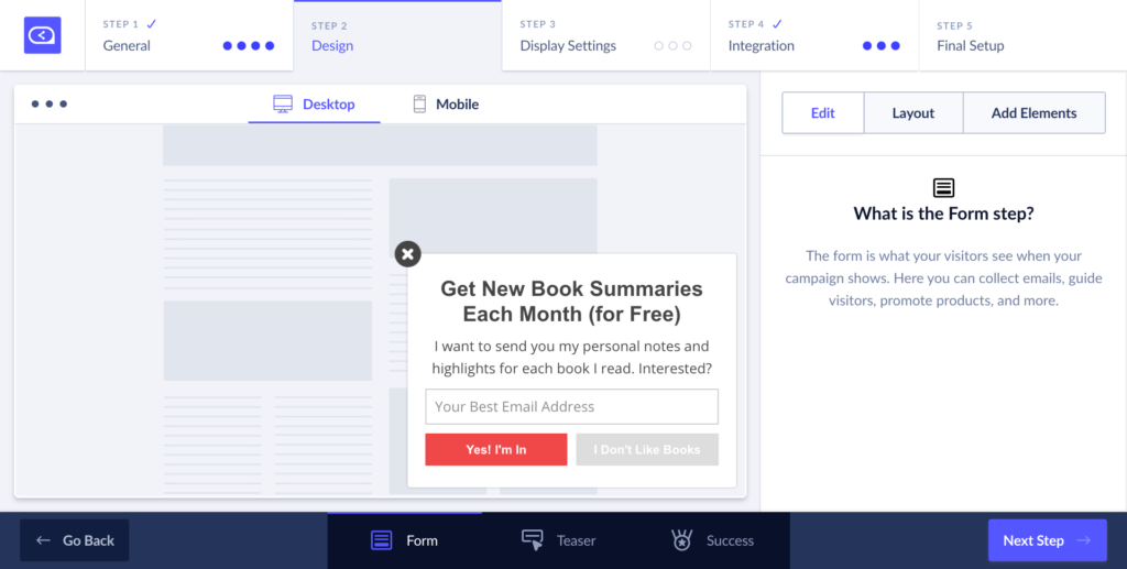
… against an opt-out version:

Which do you think converted better?
If you thought the latter, I thought so, too.
But I was wrong.
The single opt-in outperformed the opt-out option—but only by 1 percent.
However, when I tested my newsletter subscription versus my free eBook, I was even more surprised.
Often, we’re recommended to avoid offering newsletter subscriptions. But in my experience, I found the opposite.
In fact, when I tested my free newsletter subscription versus my free eBook, I found the former outperformed the latter by an impressive 23 percent.
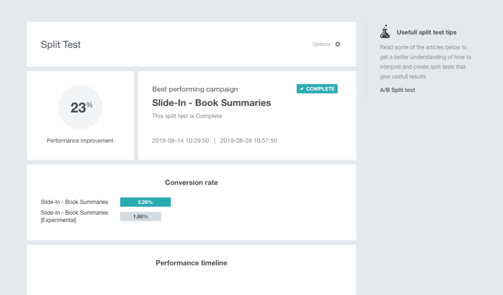
As you can see, a good popup design isn’t always necessary. Oftentimes, showing the right offer to the right audience is more than enough to get a nice conversion rate.

Conclusion
Popups are ugly, intrusive, and worse of all, hurt the user experience…
…But only if you ignore best practices (and copy what everyone else is doing.)
By learning from the brands mentioned above, and creating a slide-in popup of your own, you can grow your list, guide your visitors, and drive more orders, without hurting the user experience.


