In 2022, the fashion ecommerce revenue grew to reach $713 billion worldwide. With this pace of growth and the ever-increasing competition, more and more apparel retailers are focusing on growing their online traffic.
While doing that, however, many apparel marketers forget that it’s not a matter of bringing visitors to your store anymore. Rather, it’s about how you treat those visitors.
If you’re showing a single, generic popup to every visitor on all your pages, you’ll likely convert a tiny portion of them—at the cost of annoying a bigger percentage.
What I suggest (and what exceptional fashion e-tailers are doing) is using multiple popups, each serving different goals at different times. This way, you can nudge each visitor to take action depending on where they are in the buyer’s journey.
To help with that, I’ve gathered seven high-converting fashion popup examples that every apparel store should use (plus how you can easily set them up).
The 7 Best Fashion Popup Examples
2. Kaufmann’s Customer Club Popup
3. Helm’s Product Recommendation Popup
4. Miinto’s Sales Promotion Popup
5. Minimum’s Cart Abandonment Popup
1. Ny Form’s Giveaway Popup
Fashion or not, on-site giveaways are a foolproof way to quickly grow an email list for any e-tailer.
Although giveaways are effective in collecting email addresses, the quality of your new signups, however, depends heavily on your giveaway’s prize.
Choose an irrelevant (albeit expensive) prize and you’ll only attract spammers. Put your own products on display, however, and you’ll collect relevant leads who are interested in your products, whether or not they win the competition.
Ny Form, a Danish sports clothing company, is aware of this. That’s why they’re using one of their products as a prize and running a giveaway directly through their website popups.
But unlike many others, Ny Form invites you to join their giveaway gently, first, with a teaser:
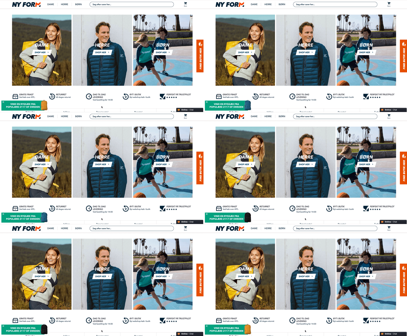
In this eye-catching teaser (that acts as a preview of the popup), the company cleverly uses a GIF to reveal the prize. And the teaser copy reads, “Win a Backpack from 2117 of Sweden.”
When you click the teaser (or stay on the page for a few seconds,) this slide-in appears:
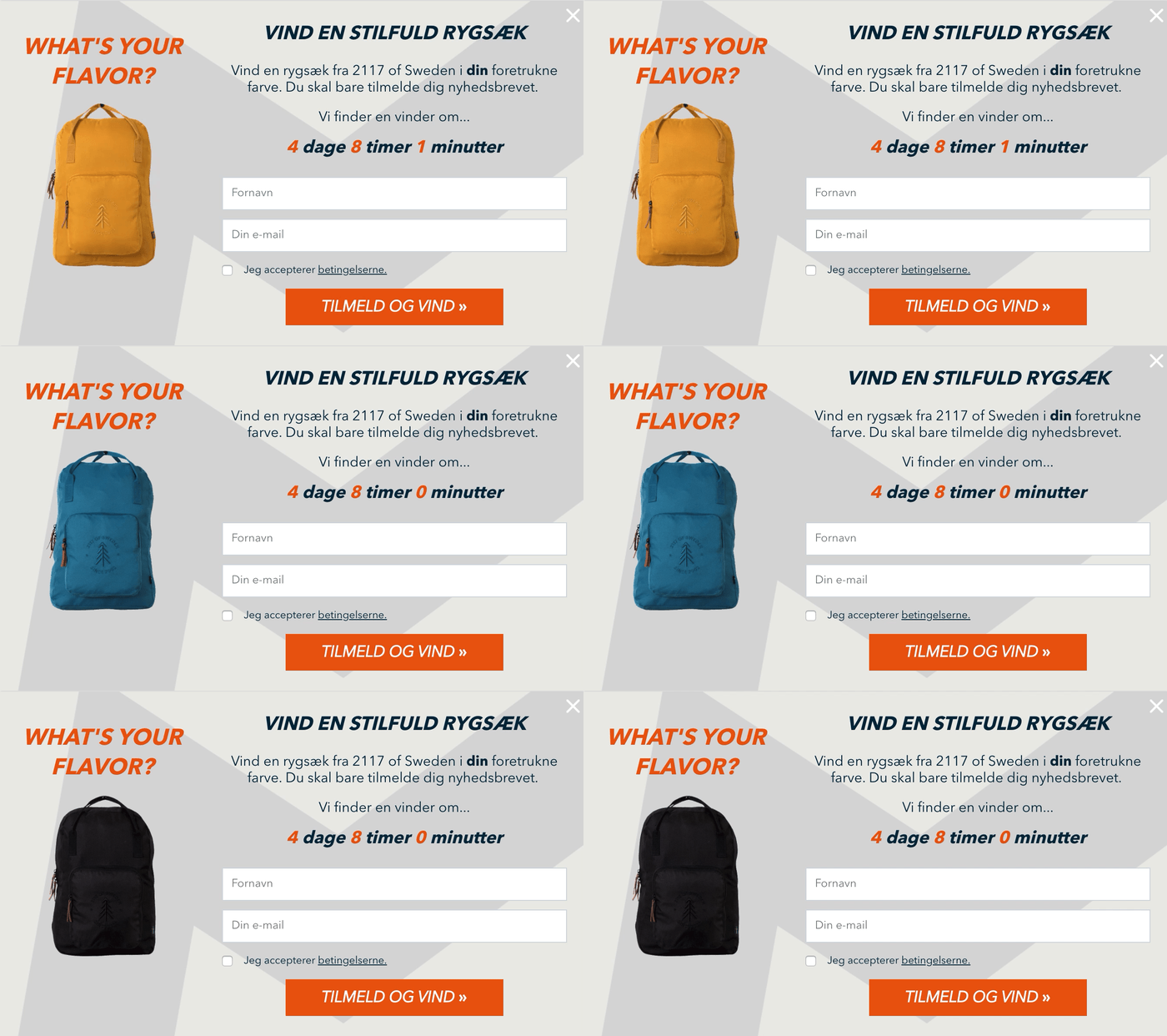
(Translation: Win a backpack from 2117 of Sweden in your preferred color. Just sign up for our newsletter. We’ll find a winner in 4 days, 8 hours, 1 minute.)
Once again, Ny Form uses a GIF with rotating images of what you can win. It’s smart because when you read the popup copy, you learn that you can win a backpack in your preferred color (which all the visual cues point to).
Ny Form’s giveaway popup works well for at least a few reasons:
- Benefit-driven teaser copy and a compelling headline: “Win a Stylish Backpack”;
- A well-positioned prize;
- Clear and straightforward instructions: “Just sign up for our newsletter”; and
- An evocative call-to-action (CTA) that evokes a feeling of success: “Sign Up and Win.”
Ny Form also uses a countdown timer in its popup to communicate when the giveaway will end. This drives a sense of urgency, which nudges their visitors to sign up before the time runs out.
2. Kaufmann’s Customer Club Popup
There are countless ways to collect emails on your fashion site: offering discount codes, lead magnets, quizzes, giveaways, and more.
While a one-time giveaway gives your email list an immediate boost, men’s fashion store Kaufmann uses a more sustainable strategy.
When you visit the website, Kaufmann, first, shows you a teaser that reads “Win a 1,000 kr. Gift Card”:
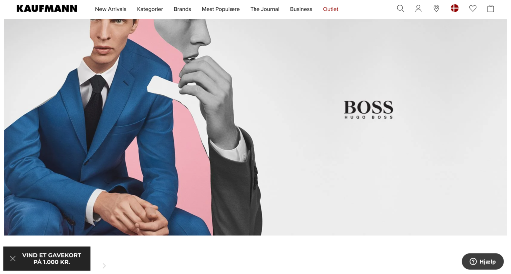
Win a 1,000 Kr. Gift Card
At first, it looks like any other giveaway, but when you see the popup itself, you learn that it’s part of a long-running email capture strategy.
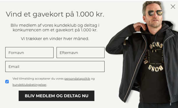
Become a member of our customer club and enter the giveaway to win a 1,000 kr. gift card. We draw a winner every month.
Instead of hosting a time-limited giveaway campaign, Kaufmann uses the incentive of gift cards to attract new signups and selects a winner among those every month.
Moreover, rather than choose a physical product that may be subject to taste, the company offers you a gift card to make sure that you come back to their store and, thereby, spend above the amount. Even if you don’t win, Kaufmann gets to market to you with relevant offers.
Kaufmann also frames its email popup around a sense of exclusivity by asking you to become a member of its customer club. You may not be a Kaufmann customer at this point yet, but if/when you do sign up, you’ll be one of the insiders.
So, even if the chance of winning 1,000 kr. store credit didn’t convince you, Kaufmann can still do that with its persuasive copywriting.
3. Helm’s Product Recommendation Popup
There’s a widespread misconception among ecommerce marketers: “Popups are only for collecting emails.” Although most fashion shops still run on this old-school belief, modern apparel brands know how to use popups for more than collecting emails.
Helm, a popular bag and suitcase retailer, is a great example of that. When you visit its homepage, the company, first, greets you with a giveaway popup, similar to the examples above.
In addition to that, Helm knows the importance of timely and relevant product recommendations. For example, when you visit the page “Gift Ideas for Him,” they show you this popup:
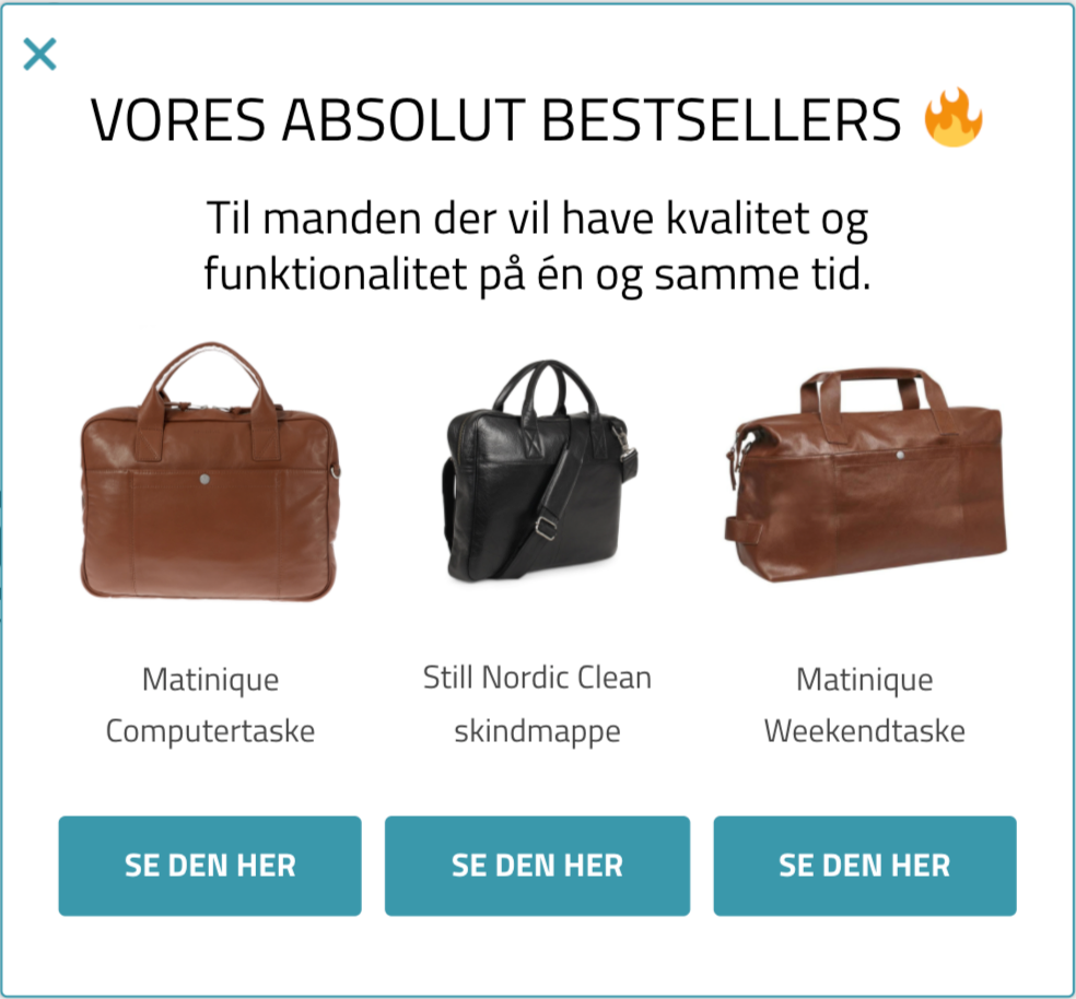
(Translation: Our Absolute Bestsellers: For men who want to have quality and functionality at the same time.)
However, if you’re on the page “Gift Ideas for Her,” this is what you see:
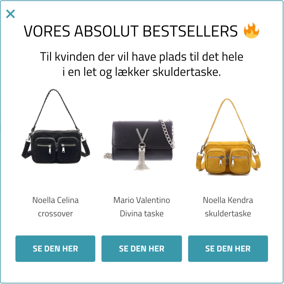
(Translation: Our Absolute Bestsellers: For women who want to have space for everything in a light and beautiful shoulder bag.)
The content of both popups is the same: three bestsellers from each category. But the page-specific targeting makes Helm’s product recommendation popups highly unique and personalized.
In both popups, Helm also uses a brilliant copywriting strategy by describing its ideal buyer: “For men who want to have quality and functionality in one.” If you identify yourself with this definition, it becomes easier to click through the popup.
Helm finds another use case for their popups, this time on its product pages. When you’re about to leave certain product pages on the shop, Helm shows you this exit-intent popup:
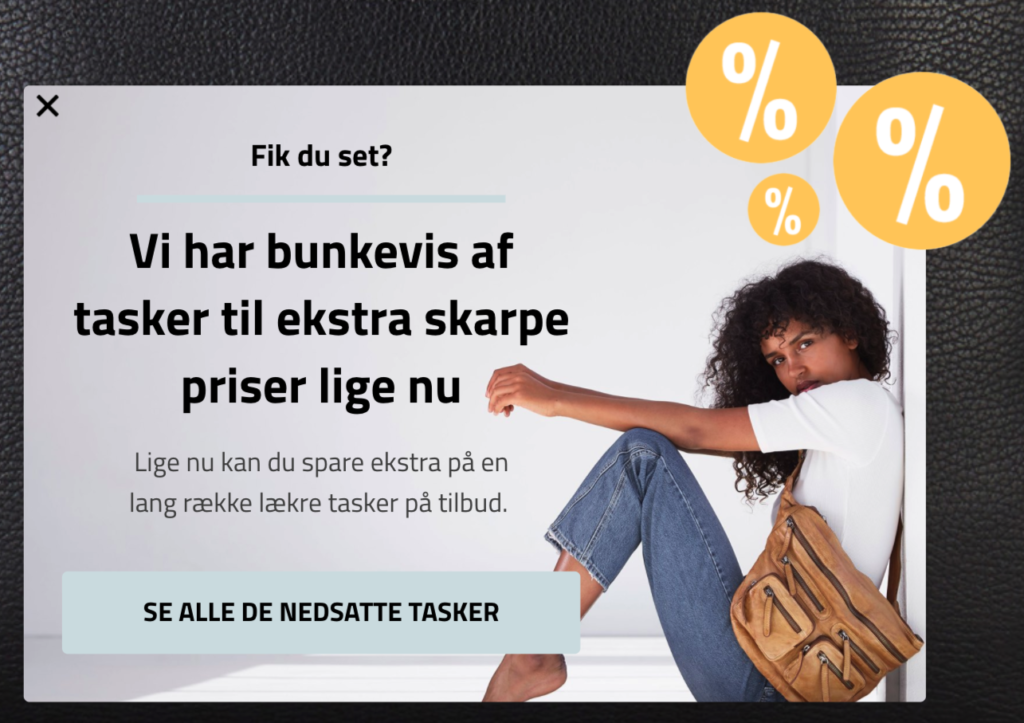
(Translation: Did you see? We have lots of bags at extra sharp prices. Now you can save more on our beautiful bags on sale.)
The company knows that one of the reasons why you might be leaving can be the price. That’s why they smartly guide you to their discounted products with this popup.
4. Miinto’s Sales Promotion Popup
If you’re running a fashion store, you’re likely experimenting with different sales promotion campaigns, be it clearance sales, seasonal offers, or daily deals.
If so, you also know that email is one of the best channels to promote your sales campaigns. For that to work, you need an email list with subscribers interested in your upcoming sales. Luckily, there’s a smart way of making that happen and Miinto, the fashion store, knows this well.
Following popup best practices, when you visit its website, Miinto shows you a subtle bottom-right teaser, first:
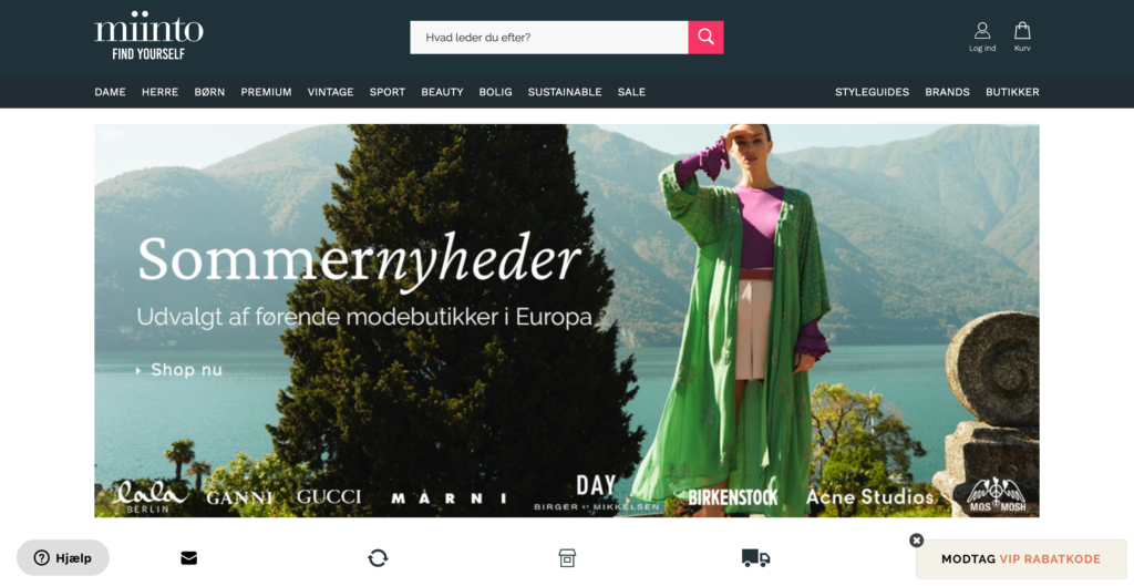
Once you see the teaser that reads “Get VIP Discount Code” and scroll down the page, this popup shows:
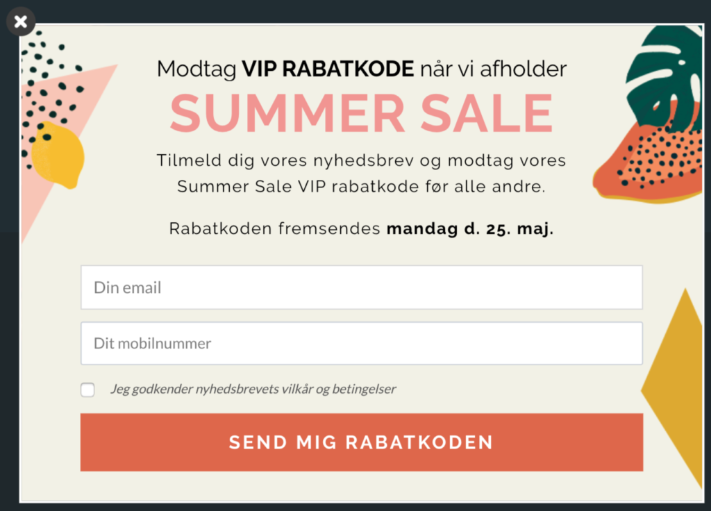
(Translation: Get a VIP Discount Code when we hold our Summer Sale: Sign up for our newsletter and receive our Summer Sale VIP code before anyone else. The code will be sent on Monday, May 25th.)
In it, Miinto offers you the chance to get a VIP discount code for their upcoming summer sale before anyone else. (In exchange for your email address and phone number, of course.)
With this popup, Miinto aims to capture your email address with the exclusivity of its offer, while promoting its summer sale at the same time.
What I particularly like about this early access popup is how Miinto openly writes the date they’ll send your discount code. They set the expectations right from the offset so you know when to revisit the site to grab this deal.
When you sign up through this popup, Miinto asks about your gender in the next step.
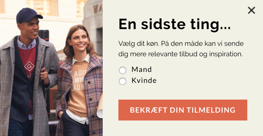
(Translation: One last thing… Select your gender. This way we can send you more relevant offers and inspiration.)
By using a multistep popup, Miinto easily segments its new signups and sends them only relevant offers.
When it’s time for their summer sale, they can show a simple popup with the discount code on it, just as they did earlier for their 10th birthday:
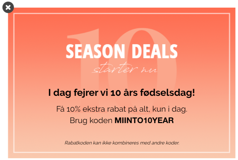
(Translation: Today we’re celebrating our 10th birthday. Only for today, get an extra 10 percent discount on everything.)
5. Minimum’s Cart Abandonment Popup
Whether you work in fashion or not, all ecommerce marketers struggle with cart abandonment.
While the average cart abandonment rate reaches almost 70 percent, smart e-tailers work hard on optimizing their abandoned cart emails for higher conversions.
Even smarter e-tailers, however, know the impact of popups on reducing cart abandonment, and that’s why they use them the right way. Online apparel shop minimum is one of those brands.
When you leave its store without buying your cart items, minimum shows you this popup:
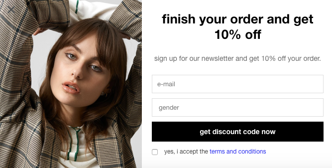
It’s a simple, straightforward email popup. The message is clear, and the benefit is obvious.
With a popup like this, minimum can convince you to complete your order at this time. And even if it doesn’t work, they can still target you with email marketing.
While minimum collects emails to solve the problem of cart abandonment, that’s not the only way. You can stop abandoning visitors with an incentive that’s too good to miss out on—such as a discount code or free shipping. Even better, you can recommend alternative products they might be interested in.
Simply update the products with your bestsellers, set your popup to show on relevant pages only, and you’re set for lower cart abandonment rates.
6. Rosemunde’s Navigation Popup
Not every popup is meant for sales or conversions.
When used right, popups can act as shopping assistants, helping visitors find their way around your store. This means a better shopping experience for your visitors and a lower bounce rate for your site.
Rosemunde, a Danish fashion e-tailer, has a brilliant example of that. When I visited its website with the .com domain, the company showed me this popup:
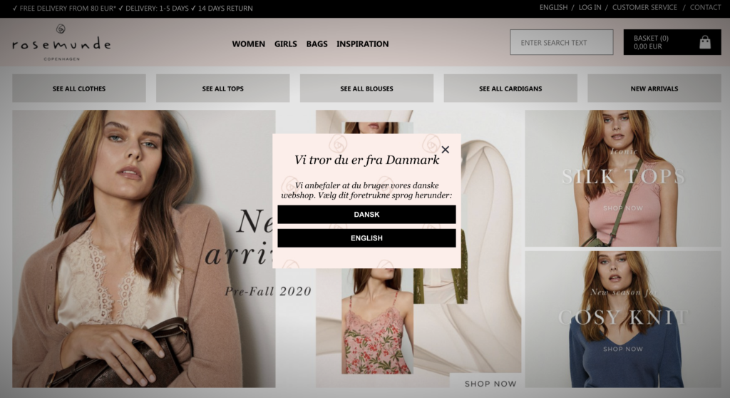
With the help of geo-targeting, Rosemunde’s popup detected that I was in Denmark. That’s why the popup copy reads “We think you’re from Denmark. We suggest you use our Danish webshop.” And using the two buttons below, I could select my preferred language.
With this simple popup, Rosemunde guides you to the right store. And now, they can just personalize the website based on your language preferences and, naturally, show you popups in that language, too.
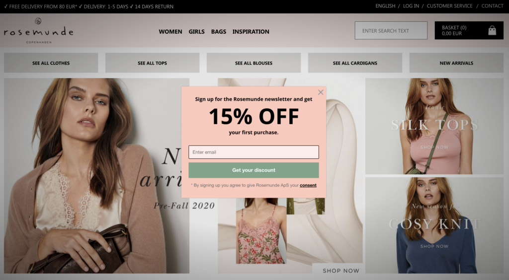
Geo-targeted popups are a must for fashion stores, especially if you have localized shops, country-based delivery options, or geographical restrictions. They’re also ideal for announcing new store openings or helping customers find the nearest physical shop.
7. Floyd’s Shopping Assistance Popup
With customer acquisition costs going through the roof, many ecommerce marketers have begun acknowledging the effectiveness of content marketing.
Yet, there’s still a major obstacle stopping most e-tailers from creating content, and it’s the misconception that they need to start a blog with long articles or an active YouTube channel with high-production videos.
If you’ve been thinking of creating relevant and useful content for your audience, small guides are the perfect place to start.
Are you selling sports equipment? Write up a quick at-home workout guide. Do you run a kitchenware store? Create easy recipes and cooking guides.
But what if you’re in fashion?
Norwegian apparel store Floyd has the perfect answer to that. The company regularly creates style guides to help you find the right product, and uses popups to promote them on relevant pages.
For example, in December, they give tips on finding the perfect Christmas party dress:
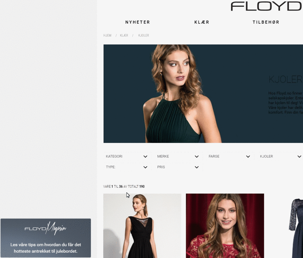
Translation: Styling Tips: The Perfect Dress for the Christmas Table
Throughout other times of the year, they might help you find the right type of neckline that fits you best:
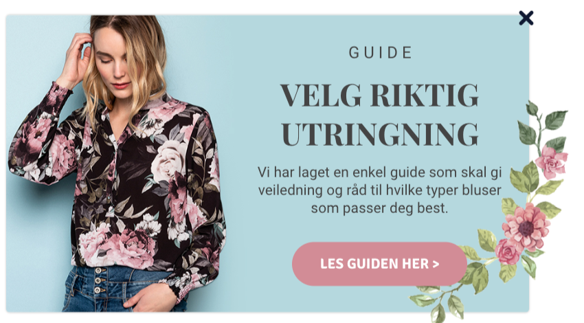
Translation: Guide—Choose the Right Neckline
The key is to show your assistance popups on the right pages. Make sure to use page-level targeting and help visitors on, say, the jeans category with a small “how to find the right pair of jeans” guide.

Conclusion
Fashion ecommerce is huge. And it’ll only get bigger.
If you want to stand out from the competition, you need to grow an email list with interested subscribers, give your visitors the best shopping experience possible, and nudge them with timely recommendations.
Luckily, with these seven fashion popup examples and your favorite popup tool, you can start working towards these goals already today.

