Never before in history has there been a better time for nonprofits to ask for donations.
Not only are donations at risk, according to Charity Navigator, but for every 1,000 website visitors, a nonprofit raises $612. (G2).
As impressive as those numbers are, though, Double the Donations reports that many organizations are leaving serious money on the table.
“Philanthropic giving continues to grow, but organizations should be prepared to pursue new opportunities as they emerge.” writes the for-profit. “Demographic changes, growth in corporate giving trends, and the dominance of mobile web browsing must all be taken into account when developing updated fundraising strategies in the coming years.”
Those “new opportunities,” as Double the Donations put it, are what I’m going to cover today.
In this post, I’ll share seven ways nonprofits can use popups to drive more donations, recruit potential volunteers, and more.
Table of Contents
1. Ask for Donations
One of my favorite, albeit most obvious ways, for nonprofit to use popups is by asking for donations.
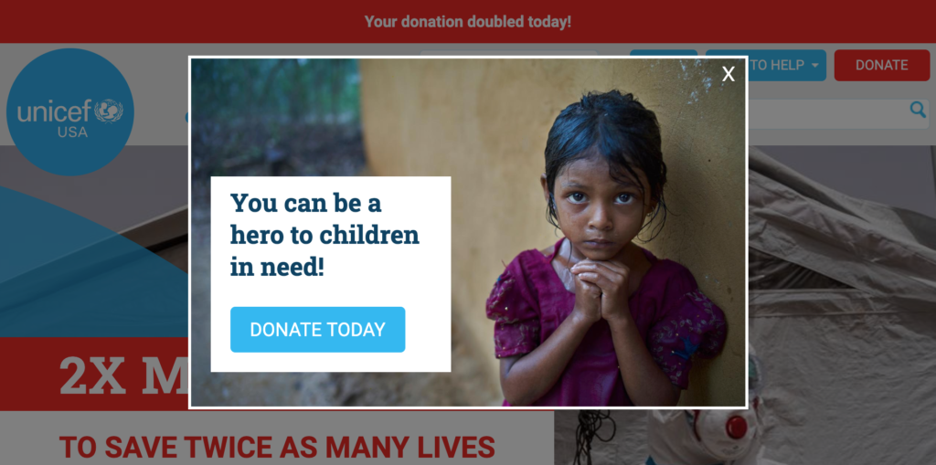
Unicef USA illustrates this perfectly.
Merging a provocative image of a girl praying with personalized popup copy (“You can be a hero to children in need!”), the nonprofit grabs your attention before inviting you to “Donate Today.”
When you click the popup’s call-to-action (CTA), Unicef USA redirects you to a second form where it gives you the option to donate once or monthly. (See: Use Giving Tiers).
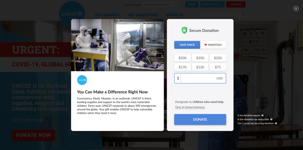
The nonprofit also reminds you that “You can make a difference right now,” before explaining clearly where your donation goes (vulnerable children).
We found from our research that as much as 75 percent of users that complete a form’s first step complete the second step. With numbers like that to go from, we can safely assume that Unicef USA is driving a decent amount of donations with this campaign.
You don’t have to use a popup, of course. Rescue.org, by contrast, uses a bar at the bottom of their page.
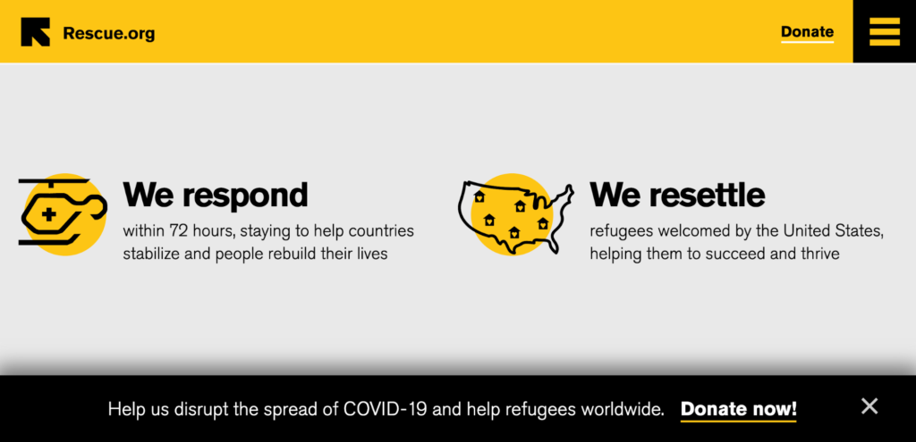
When you click the CTA, the nonprofit redirects you to a page where you can learn more about the Syrian crisis and make a donation.
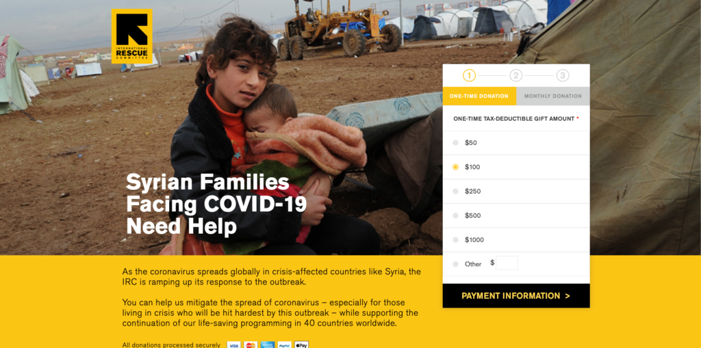
Asking for donations through a popup—either directly, through the popup itself, or by redirecting visitors to a donations page—is a proven way of raising funds without being too pushy.
2. Use Giving Tiers
One of the single, most effective ways nonprofits can get more donations is by offering giving tiers, which are predetermined donation amounts (e.g., $25, $50, $100).
In fact, one study saw a 12 percent increase in average donations when subjects were given donation levels to inform them of the “appropriate” amount to give.
While giving tiers are often found on donation pages, they can also be used in website popups, as San Diego Zoo is currently doing with the below campaign.
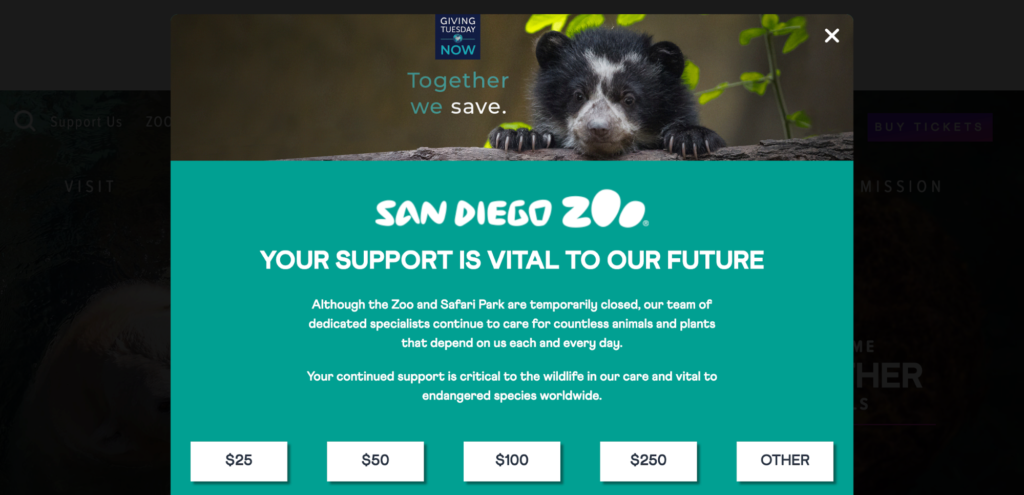
What I particularly like is, when you click one of the predetermined amounts, the nonprofit redirects you to its donation page with the choice pre-filled out.
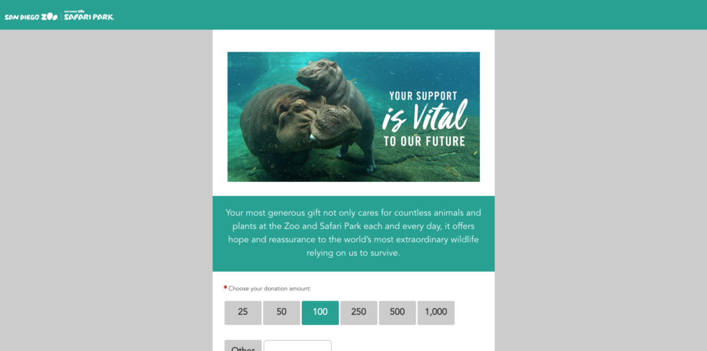
When I clicked $100, that’s what I saw on the donation page.
Adding giving tiers to a popup might not feel like a big change to the user experience, but it is another way of saving a click and reducing friction, which is paramount when asking for donations.
Cancer.org is another nonprofit that uses giving tiers, but what’s particularly interesting is it limits itself to three options: $75, $125, and $175.
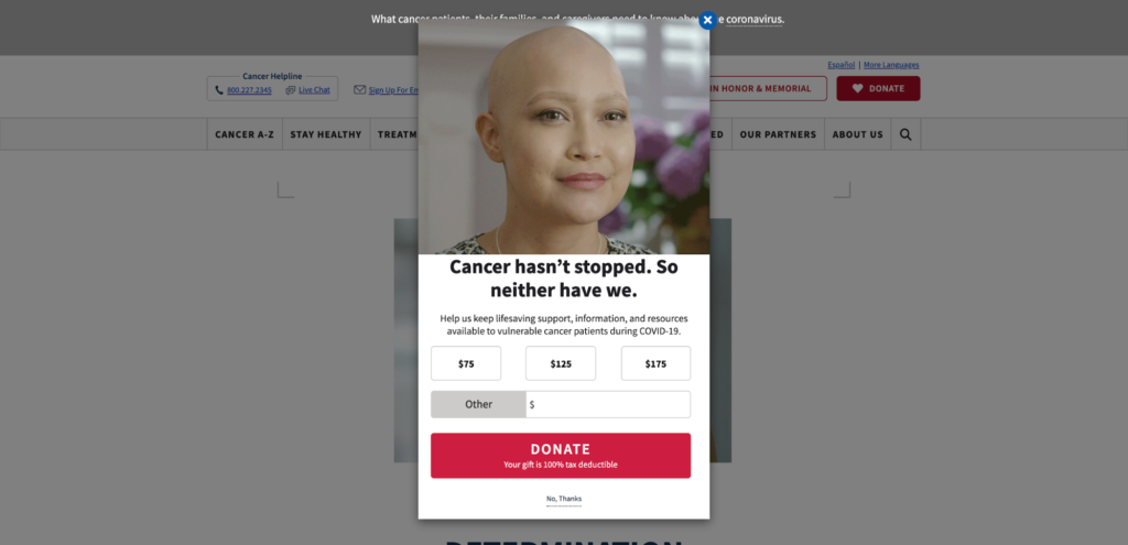
Seventy-five dollars feels a little on the high end compared to other minimum predetermined amounts. But it’s a variable Cancer.org have likely tested and are getting good results from, given that it’s been running for a while.
Simplify giving by adding three to five donation tiers to your popups.
3. Match Donations
Matching donations, according to My Cause, is a way of motivating website visitors to give more by offering to “match” their donations. Moreover, nonprofits utilize corporate sponsors or philanthropies who act as “Donor Matchers.”
Finding a Donor Matcher might not be feasible for your organization, but if it is, it’s something you’re going to want to communicate in both your popup copy and on your donation page.
In fact, this is what Catholic Relief Services (CRS) was doing recently with its popup. When I visited its page for the first time, I saw a popup offering to double my donation.
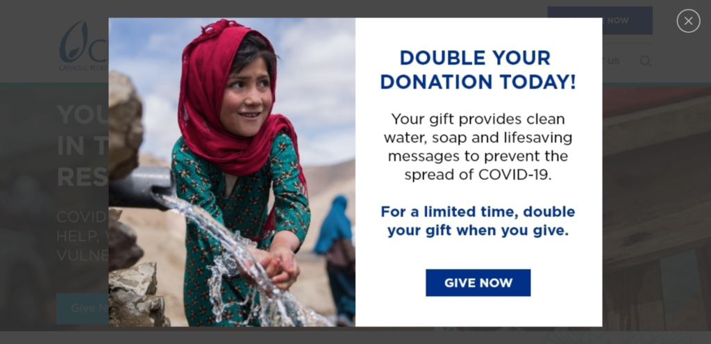
When I clicked “Give Now,” it redirected me to its donation page where I learned a Donor Matcher was matching all donations—for a limited time only.
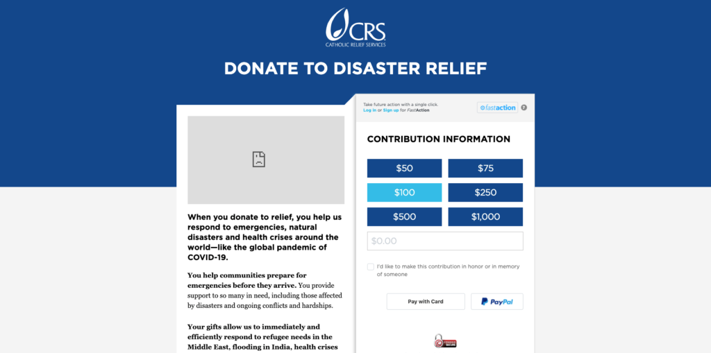
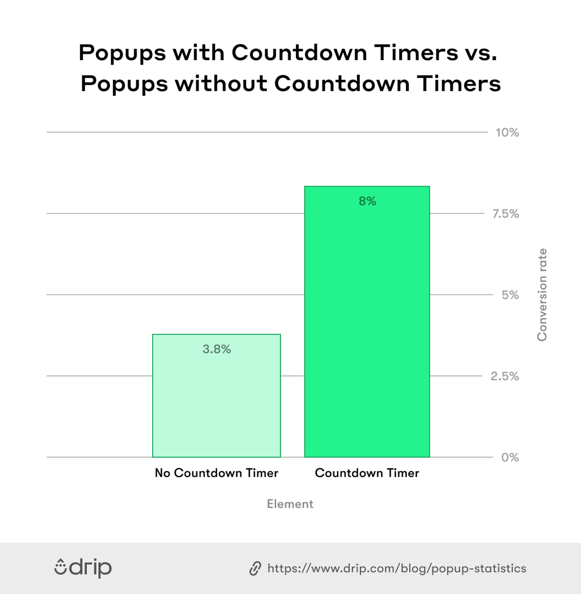
What I liked most about this popup was the reminder that the donor matching was limited. In an analysis of 1+ billion popup views, we found that, when urgency is communicated in popups, it drives more conversions.
4. Ask for Donations on Behalf of a Character
I’ve written about character copy before here.
But as a refresher, character copy involves writing from the perspective of an animal or even, in a few rare cases, an inanimate object.
Utilizing character copy to its full advantage is something the Humane Society of The United States does masterfully in a recent campaign they were running.
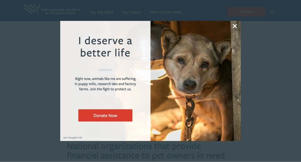
From its evocative headline, “I deserve a better life,” to its treacly copy, “Right now, animals like me are suffering in puppy mills, research labs, and factory farms. Join the fight to protect us,” this campaign has a powerful effect on the reader. (Which is entirely the point, of course.)
You won’t always be able to write from an animal’s perspective. But if your cause centers around helping those in need, human or otherwise, it’s a powerful tool in your arsenal.
5. Grow Your List
We all know that for every $1 marketers spend on email marketing, they receive $42 in return.
But is that true for nonprofits?
In one report, Double the Donations found that, for every 1,000 fundraising emails sent to subscribers, nonprofits raised an average of $42, with small organizations (fewer than 100,000 subscribers) receiving the most donation revenue per email.
If you’re not collecting emails, then creating an email popup, ideally, with a teaser, is a surefire approach. And that’s what the MET Museum does to perfection.
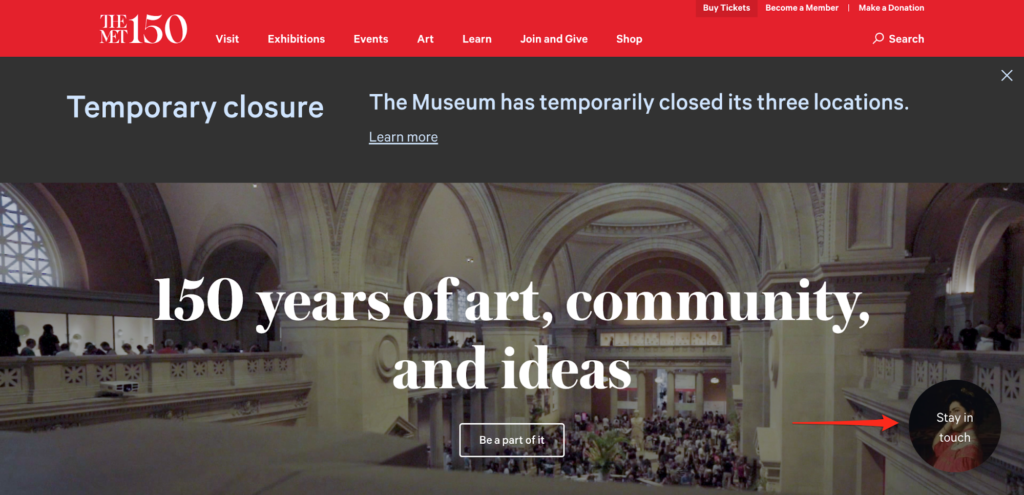
When you visit its homepage for the first time, the nonprofit invites you to “Stay in Touch” by clicking a teaser (which is the popup’s preview, if you will).
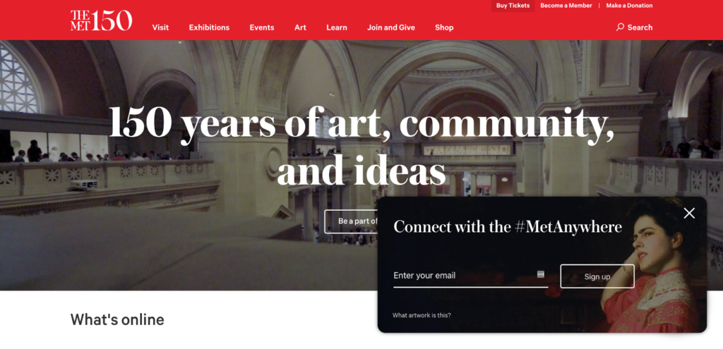
Then, using a slide-in popup, they invite you to “Connect with the #MetAnywhere” by entering your email.
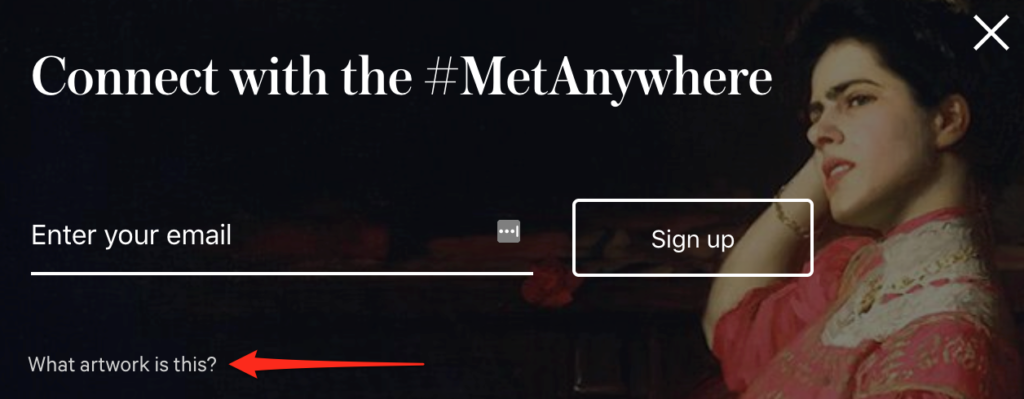
What I love most, though, is what they include in the bottom-left hand corner: there’s a secondary call-to-action to learn more about the artwork featured in the popup.
When I clicked the link, the nonprofit redirected me to a page to learn more about the artwork.
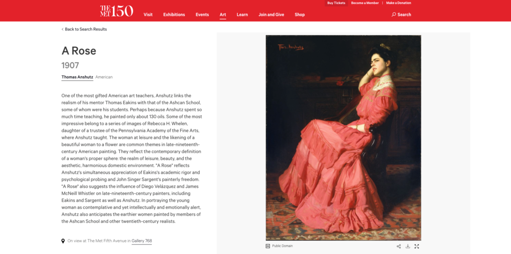
Inviting readers to learn more not only improves their dwell time, but it also gives you a second chance to make an impression if it’s the visitor’s first time on your website.
Getting a visitor’s email is a great way of asking for donations through targeted email campaigns. You can build goodwill, first, and then ask for a donation—without the occasional character constraints of a popup.
6. Recruit Volunteers
While generosity is on the rise, volunteering, according to one report, is declining.
With that in mind, organizations are now doing more to reach out and recruit volunteers through any means.
One of those means is through website popups.
The Royal Mencap Society, or Mencap as it’s more commonly known, is a charity based in the United Kingdom that works with people with a learning disability.
When I visited its homepage recently, I saw a teaser that read, “We urgently need support workers.”
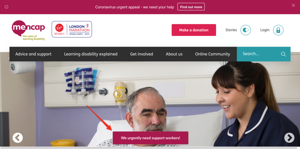
When I clicked the teaser, Mencap informed me that they were recruiting and invited me to apply.
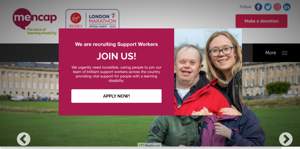
After clicking “Apply Now,” Mencap redirected me to a page where I could learn more about the position and submit an application.
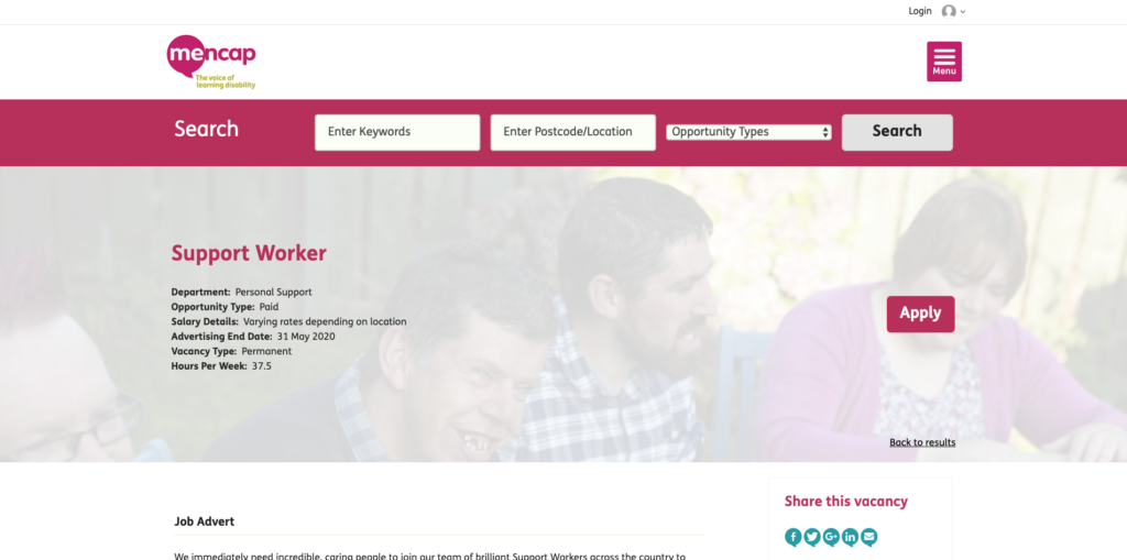
While not related to asking for donations, it’s an effective way of recruiting new volunteers, which, given the numbers and the current climate as of writing, is more important than ever.
If you’re happy with your existing popup strategy, you could create a page-specific campaign that shows only on a careers page. That way, you could continue asking for donations AND recruit new talent.
7. Guide Visitors to Relevant Pages
So far, we’ve looked at how you can leverage popups to recruit volunteers and drive more donations.
Now let’s look at one more use case that might benefit certain organizations:
Guiding visitors to pages of interest.
Rather than redirecting visitors to a donation page and nudging them to take action, as seen above with donations, the goal here is to redirect visitors to a page that might be of interest to a certain segment of your audience.
Let me illustrate with an example.
Lake District National Park is a popular vacation destination in Cumbria, England, known for its glacial ribbon lakes, rugged fell mountains and historic literary associations.
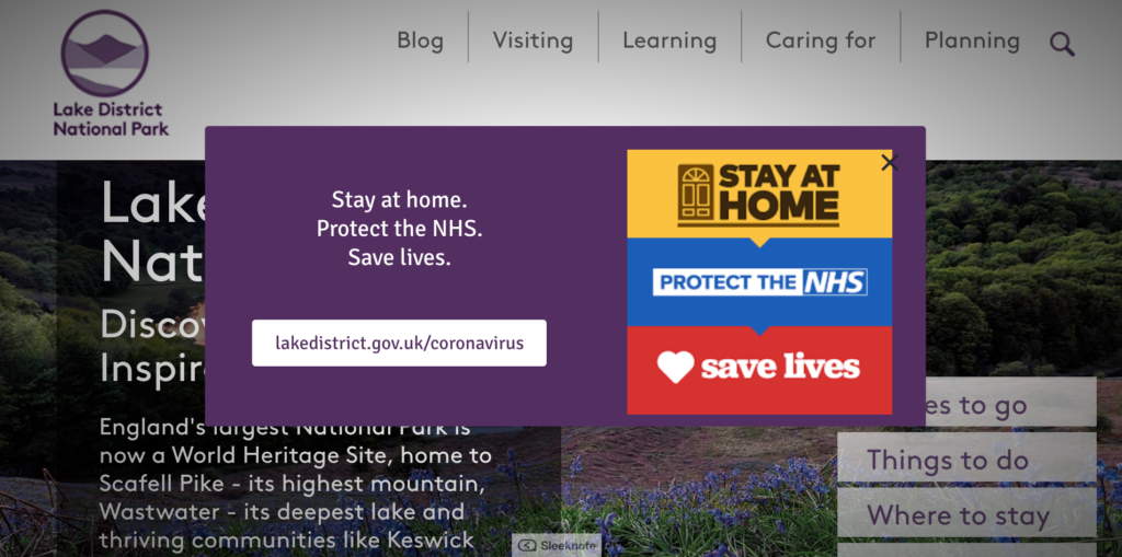
At the time of writing, we’re in the grip of the COVID-19 pandemic. Given the popularity of the Lake District National Park, the organization is using a popup to inform visitors of its response.
First, by using a nonintrusive teaser that urges visitors to “Stay at home. Protect the NHS. Save lives.”
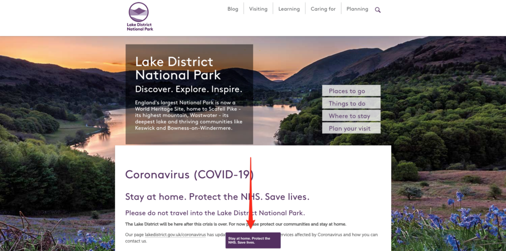
Then, with a call-to-action, inviting visitors to learn more.
And, finally, with a page regularly updated with news regarding the latest on the pandemic.
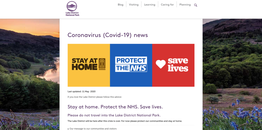
While a campaign like this is useful for informing visitors of critical information, it could be modeled for nonurgent updates, such as limited donor matching campaigns, as mentioned above, or general news concerning your organization.

Conclusion
There’s more to popups than lead generation.
Organizations, be it for-profit, or as we looked at here, nonprofits, can also use popups to drive more donations, update website visitors, recruit potential volunteers, and more.
If you are involved with a nonprofit, and you’re thinking of using popups for any of the above reasons, browse our 115+ pre-built popup templates and get started today.


