This is the most definitive guide to e-commerce optimization on the planet.
Whether you’re looking to recover lost sales at checkout or turn more visitors into subscribers, there’s something for you here.
Let’s get started.
E-Commerce Optimization: What You Need to Know
What Is E-Commerce Optimization?
E-commerce optimization is the process of using controlled experimentation to improve an online store’s ability to turn visitors into customers.
What Is a Good Conversion Rate?
A good conversion rate from a new visitor to a buyer is anywhere between 0.6 and 5.5 percent, depending on your category. (Source: Statista.)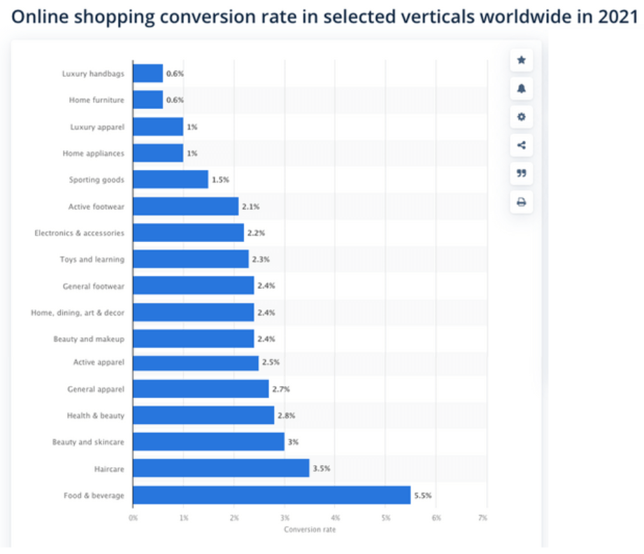
E-Commerce Optimization 101: 9 Pages You Need Prioritize
There are many good optimization tips, but there’s no better place to start than by looking at each page on your website and improving each accordingly.
Here are nine pages worth looking at and improving:
- Homepages
- Category Pages
- Product Pages
- Checkout Pages
- 404 Pages
- FAQ Pages
- Landing Pages
1. Homepages
On average, visitors form an opinion of an e-commerce site in just half a second. If their initial opinion is positive, they’ll likely engage with your site, check out your products, and consider making a purchase.
If it’s not, however, you’re fighting an uphill battle and your odds of making a sale decline dramatically. More often than not, the first page a visitor lands on will be your homepage. It’s like your virtual front door.
If you can make a great impression, it should put you in a good position and set the stage for maximum conversions. That’s why you need to go out of your way to design a winning e-commerce homepage.
i. Desktop
One brand that places an emphasis on bold, vibrant colors is Henry J Socks, which is a subscription-based sock service.
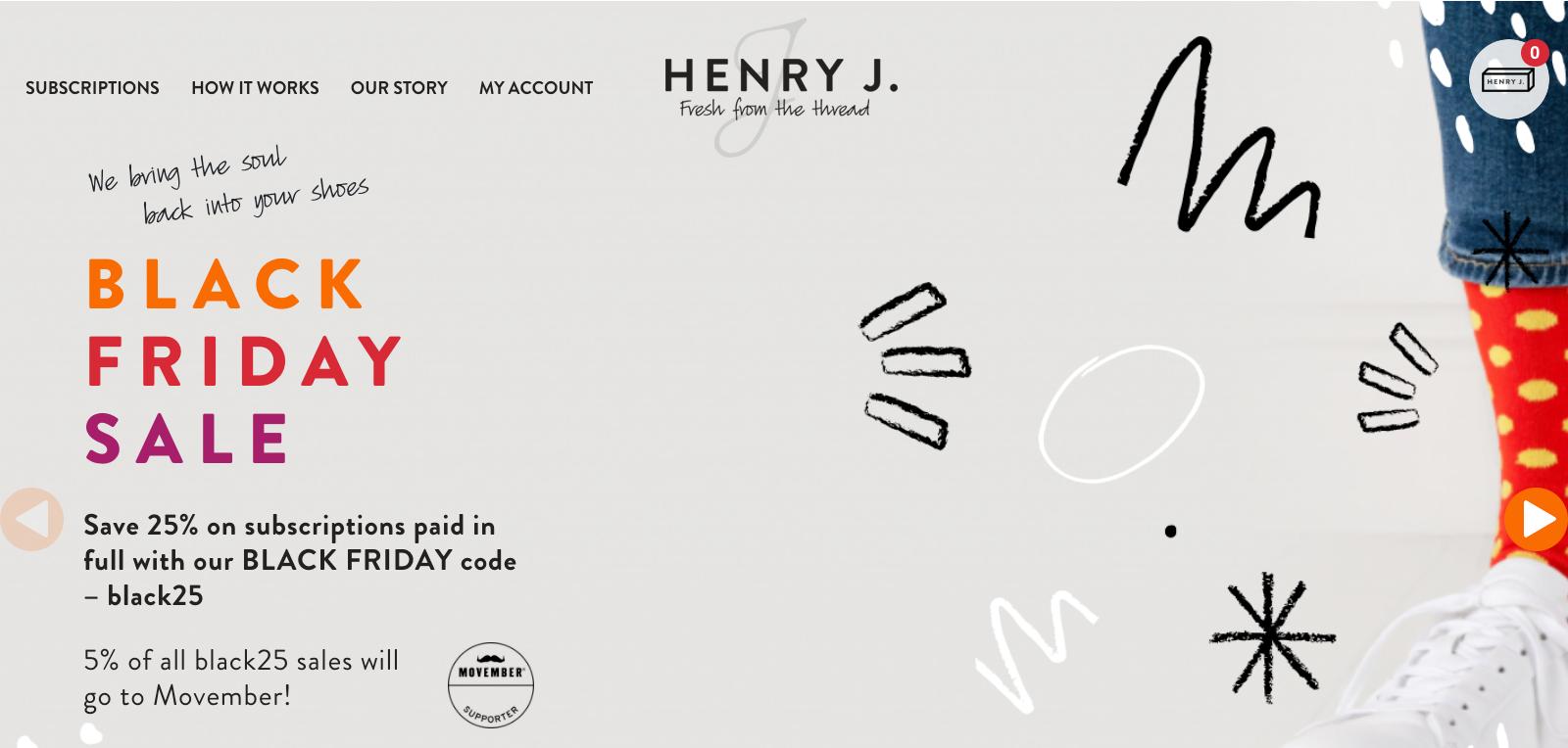 The header features a slider where shoppers first see the image of socks featured above with the funky orange and blue design.
But after a few seconds, they see this image with green and blue polka-dotted socks, which acts as a visual one-two punch.
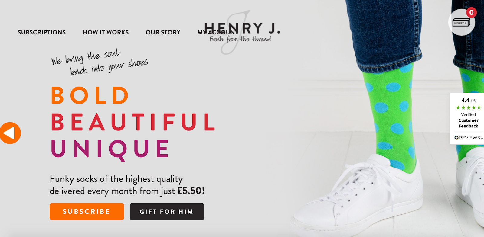 Without even having to read a word of copy, shoppers can surmise what this brand is selling and why they should care.
In this example, the product does the talking, and shoppers can see what distinguishes Henry J Socks from the competition.
But of course, this is accompanied by some simple yet powerful copywriting.
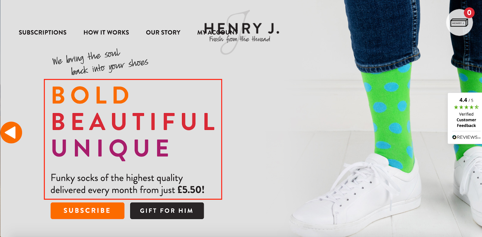 With just a glance, shoppers see a well-written value proposition and get an idea of how much the products cost.
After scrolling down a bit, shoppers find some nice reviews from actual customers...
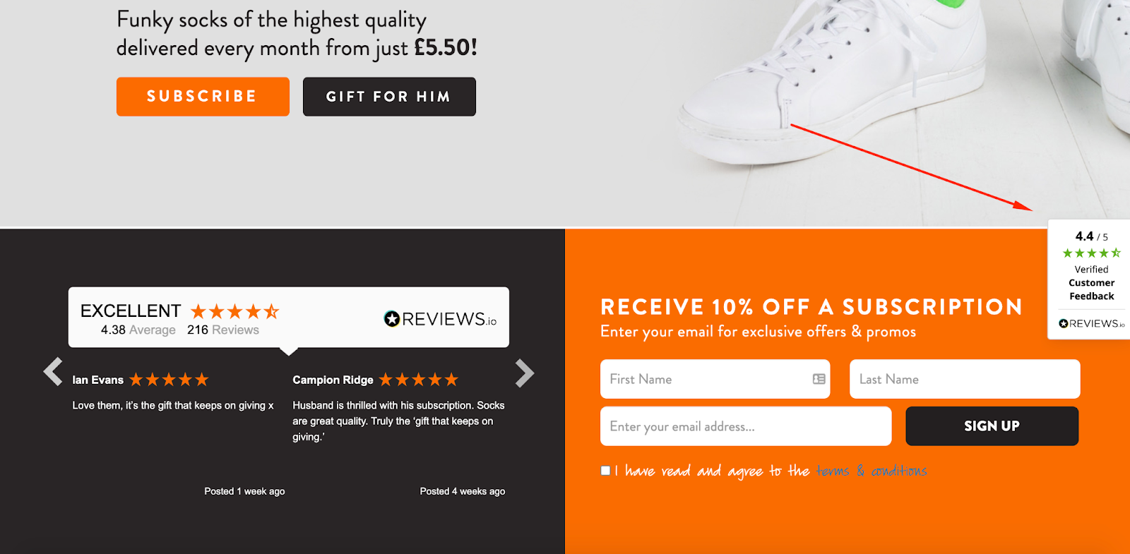
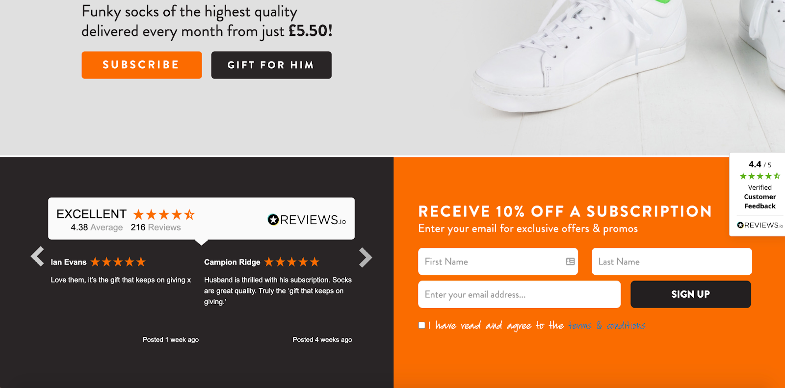 ...and there’s also this sticky review on the right-hand side that remains visible as shoppers scroll through the entirety of the homepage.
 Further down is this section on how the sock subscription process works.
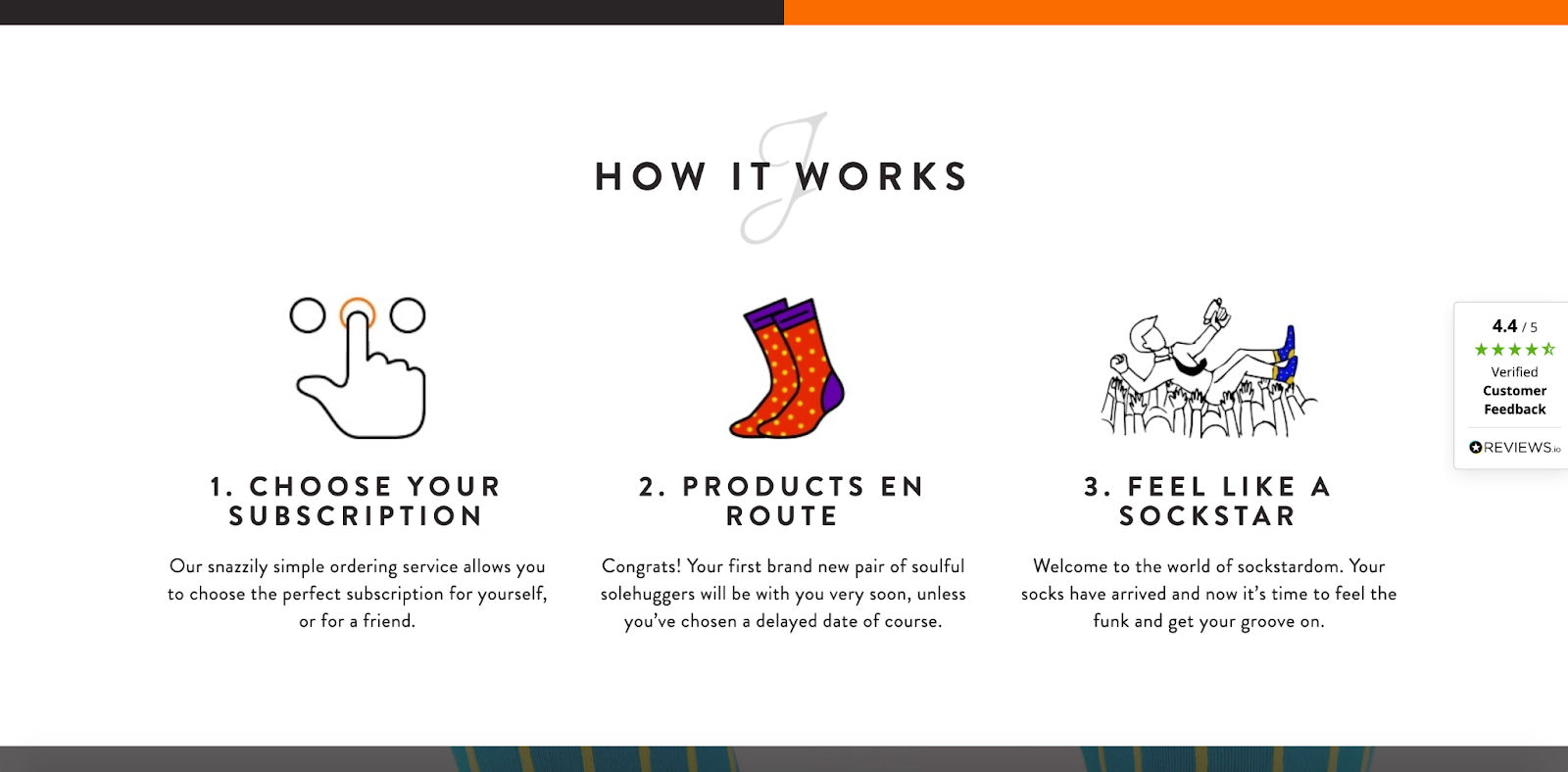 The brand breaks this process down into three simple sections to get shoppers up-to-speed in a hurry and uses creative, playful wording like “feel like a sockstar.”
Finally, there’s a section on the different sock subscriptions that are available—for three, six, or 12 months.
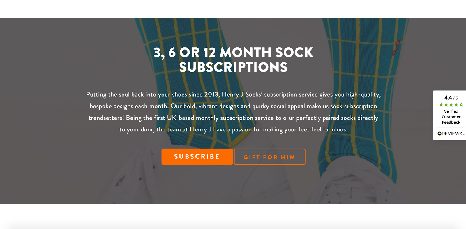 Notice how Henry J Socks succinctly shows off its top products, displays its value proposition, personalizes its homepage, and makes navigation a breeze.
They include everything they need while avoiding unnecessary, extraneous details and making it look like a work of art.
If you’re going for a homepage that’s to the point but gets shoppers excited, this is the perfect example to base your formula on.
ii. Mobile
Nowadays, your e-commerce site should be designed primarily with mobile in mind.
Why?
Mobile commerce is expected to account for 72.9 percent of e-commerce sales by 2021.
More and more people are shopping on mobile, meaning you need to prioritize mobile UX.
KKW Beauty is a perfect example of this:
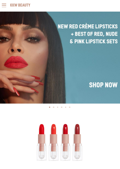 The site’s structure and features are no doubt designed for mobile-first. It goes beyond being responsive.
This makes sense when you think about their customer base, i.e. young people who are constantly on their phones.
Make like KKW Beauty and use mobile-friendly design elements on your homepage.
Examples of such are big tap-friendly call to action (CTA) buttons and a hamburger navigation menu.
Make life easy for the mobile user.
2. Category Pages
To reduce the number of pages that shoppers must click through, many retailers have augmented category landing pages with lists of products. Visitors can also use filters or facets to narrow them down based on what they’re searching for.
One of my favorite product category pages comes from lifestyle, clothing, and accessories retailer, American Eagle.
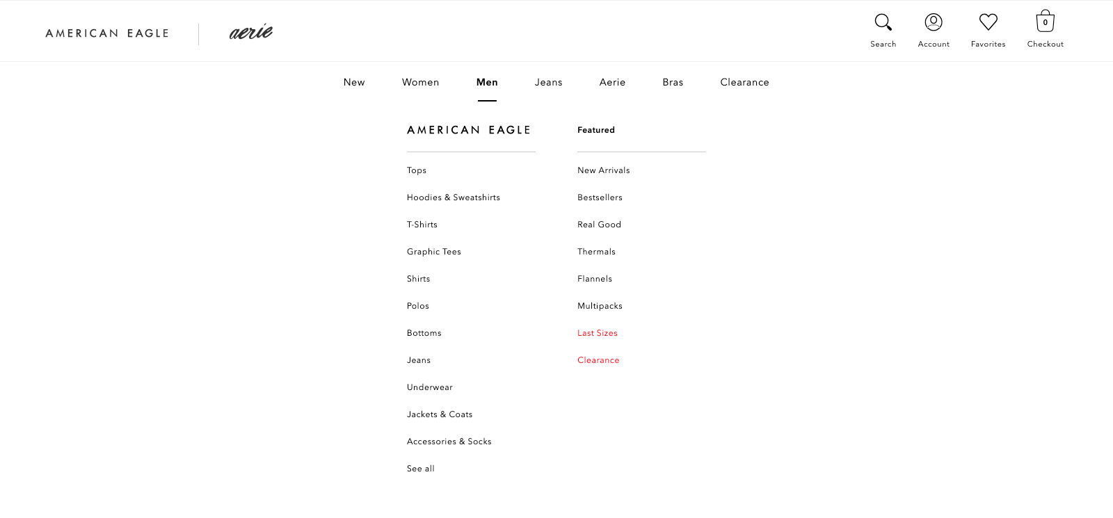
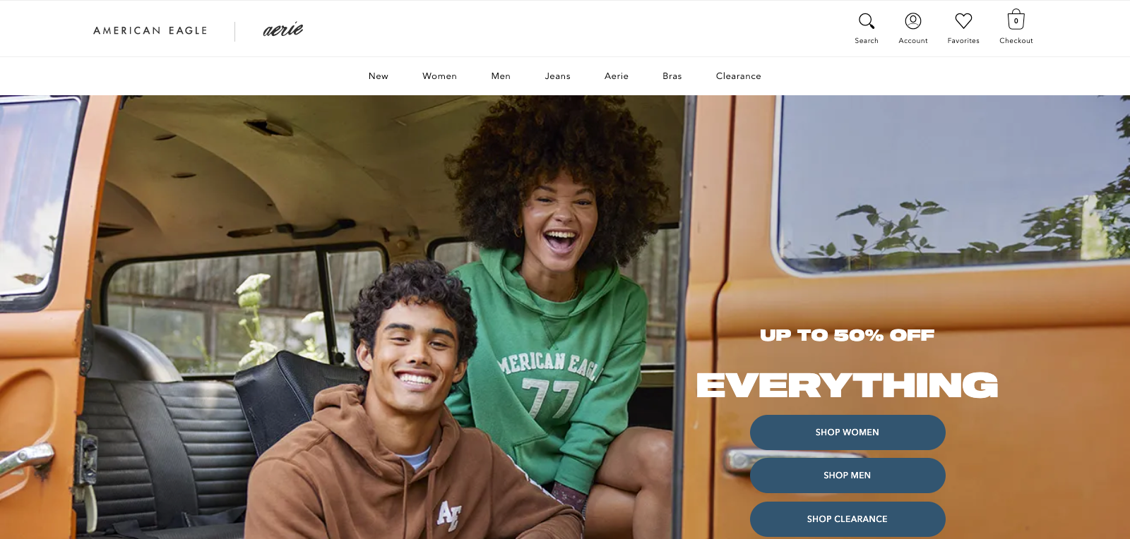 If you go on AEO’s website and hover over its menu, a dropdown menu appears, showing the brand’s popular categories. This polyhierarchy allows visitors to browse, say, skinny jeans under Jeans, while others can browse the Men or Women categories and shop by “Jeans.”
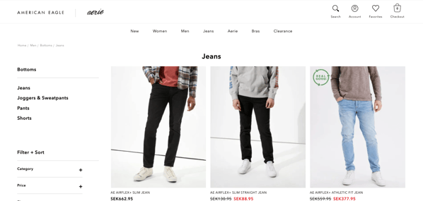
 After clicking on “Jeans,” AEO redirected me to its “Bottoms” category page.
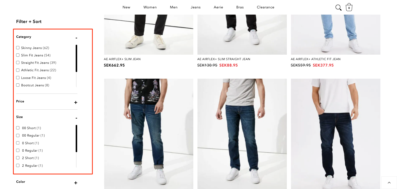
 Here, I can click a dropdown and add multiple filters depending on what I’m looking for, from price to fit type and everything in between.
 And to capture organic traffic, AEO has a landing page for each product, too.
Here’s the filtered view for skinny jeans:
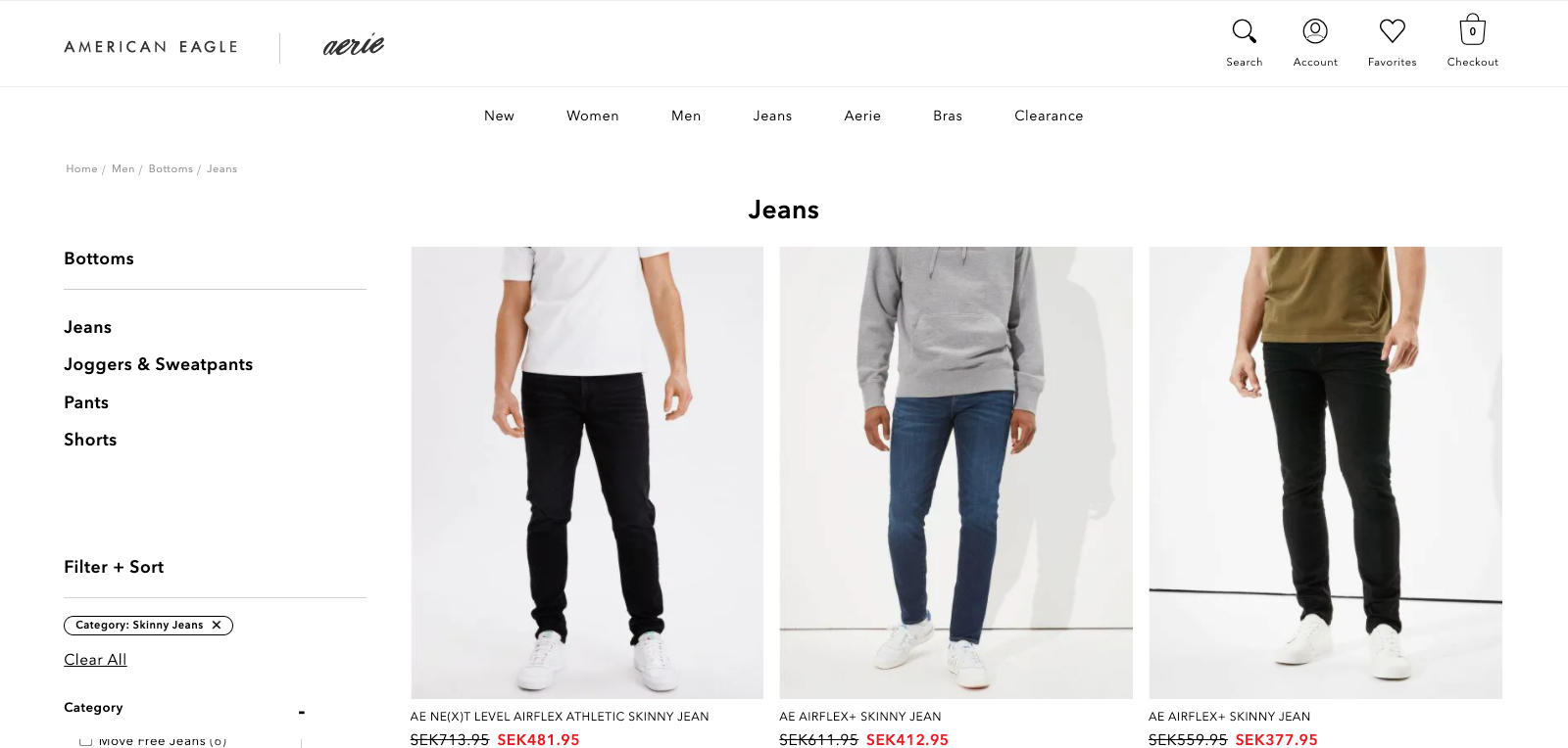 And here’s the landing page for the product category:
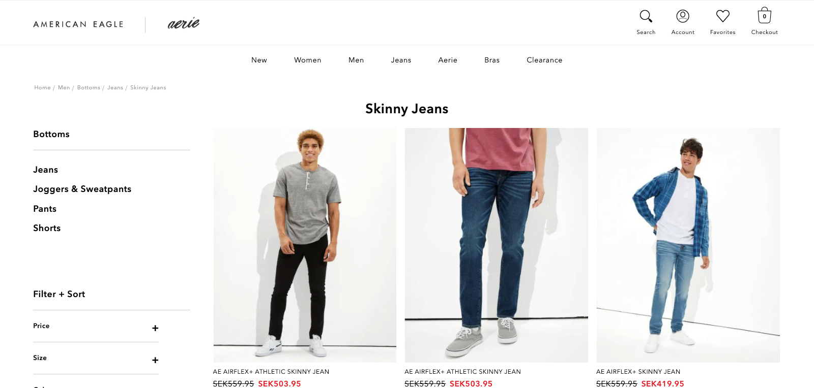 It’s not much, but it goes a long way in giving visitors a seamless browsing experience and nudging them closer to making a purchase.
3. Product Pages
Working in tandem with the category page, the product page is arguably the most important page on an e-commerce website.
Allbirds, a New Zealand-American company that designs and sells footwear and apparel, has one of the best product pages I’ve seen.
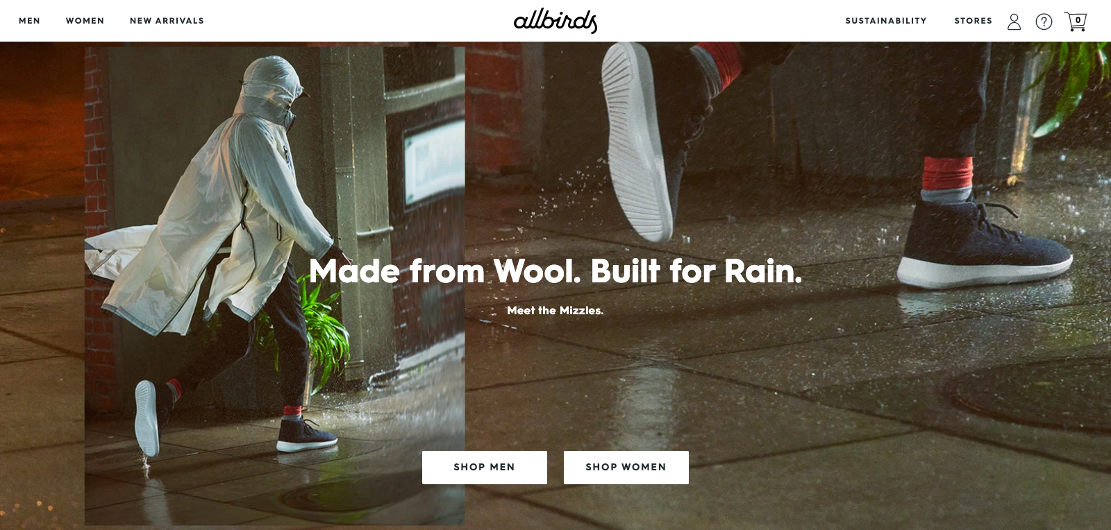 Here’s how the brand optimizes its product pages for higher conversions and more revenue.
i. Out of Stock
Few retailers want visitors to leave empty-handed, especially when they’ve expressed interest—like trying to add an item to their cart.
Allbirds know that all too well. On its product pages, it uses a strikethrough for sold-out sizes.
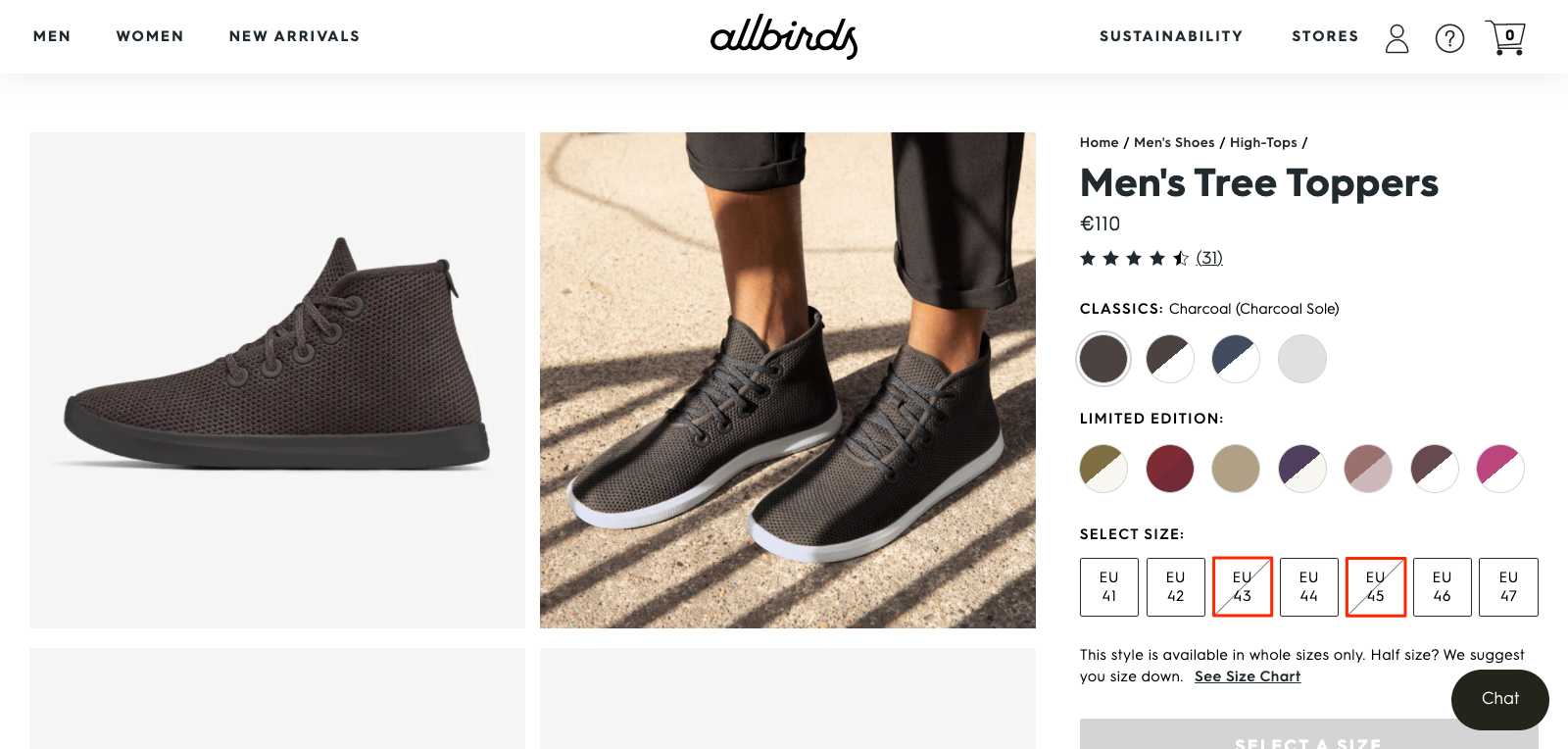 But when you click one, Allbirds invites you to “Get Notified.”
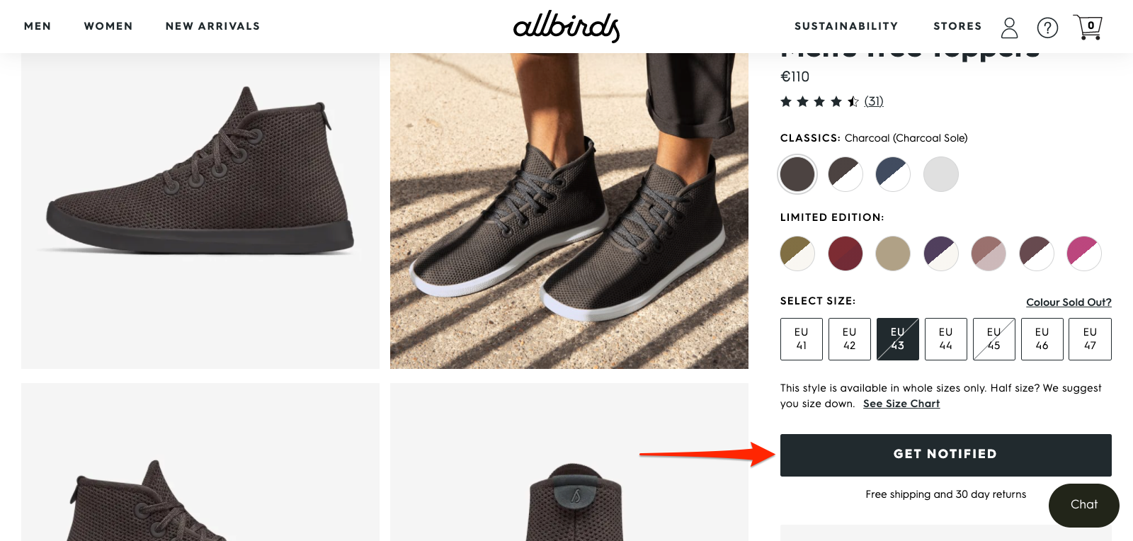 And when you click the button, the brand shows a popup inviting you to enter your email to get notified.
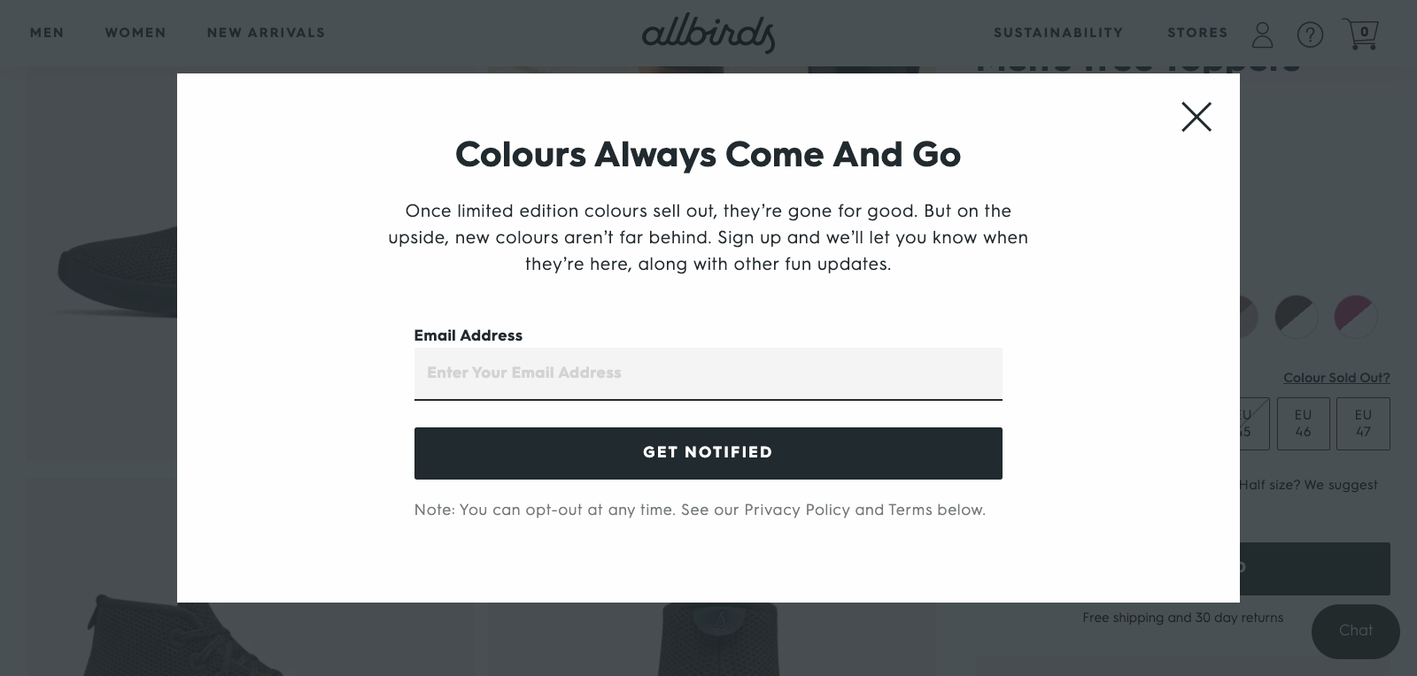 Not only does Allbirds capture a warm email, but it also demonstrates that the product is popular and increases the product’s perceived value in the process.
ii. Promote Your USP
Your product page is often reserved for selling the product’s features and benefits.
But Allbirds goes a step further by tying its features and benefits to a value: sustainability.
Allbirds knows that sustainability is important to its audience, so it reminds potential buyers of what makes its footwear unique.
For its Tree Toppers, for instance, the brand talks about how its materials are “responsibly sourced” and “carbon negative.”
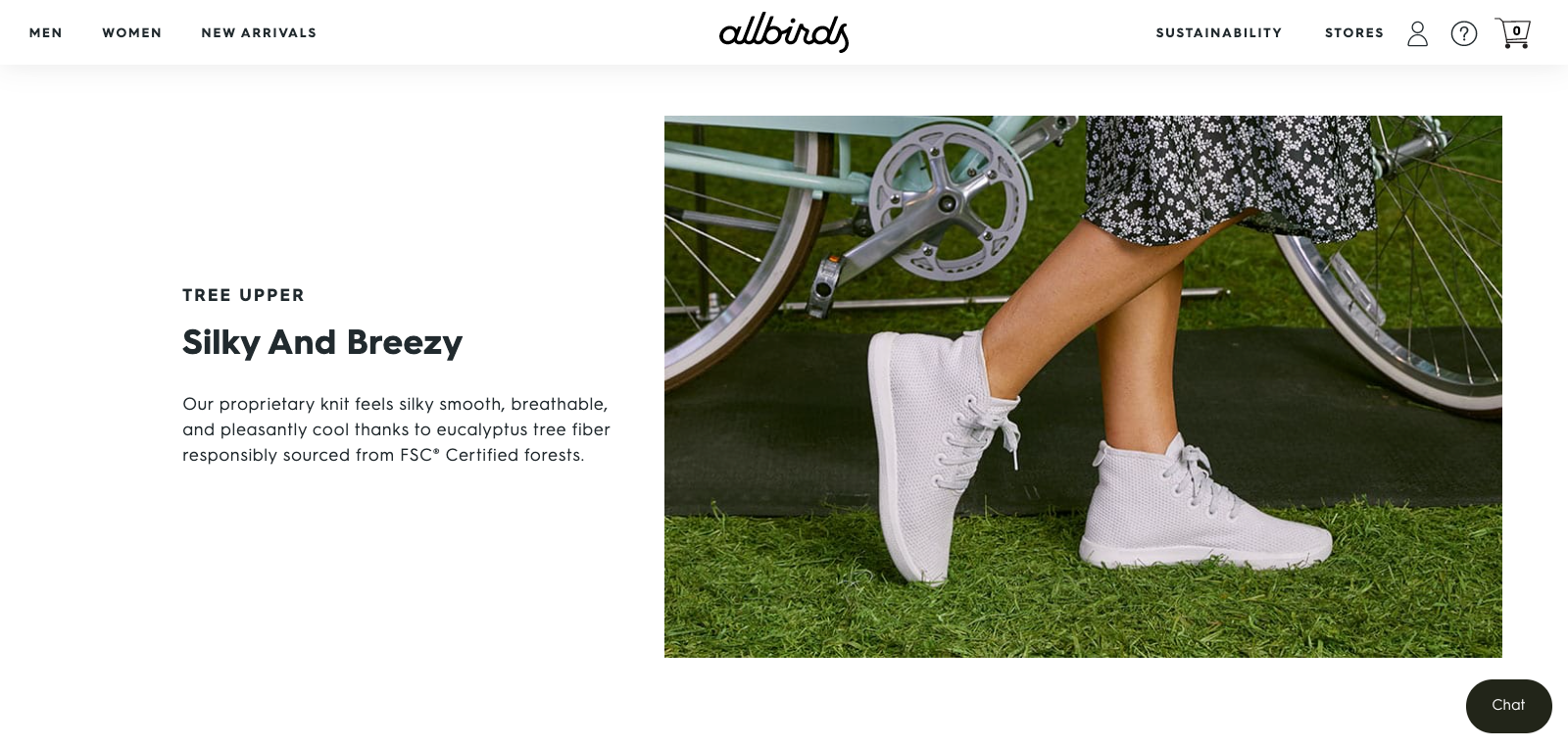 Allbird’s Tree Toppers feel, “silky smooth, breathable, and pleasantly cool” (benefit) because they’re made from eucalyptus tree fiber (feature) which is responsibly sourced from FSC® Certified forests (value).
Don’t assume visitors know about your brand’s core value(s). (They don’t.) Tell them.
iii. Sort Review by Usage
It’s no secret that customer reviews sway our buying decisions. But what matters is that the reviews come from customers who are like us.
A customer buying, say, a pair of shoes and rating them as “good” is one type of testimonial.
But a customer buying a pair of shoes for walking, a pastime we’re fond of, and rate them highly? Now that’s persuasive.
Allbirds features customer reviews on its product pages. Nothing new there.
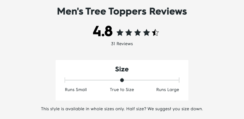 But what is new, is adding “activity level” to each review, as Allbirds does here:
 Adding an activity level is an effective way of not only helping potential buyers decide whether a product is for them given how others like them have used it, but also promoting a product’s range of usage.
4. Checkout Pages
In 2021, mobile retail commerce sales are expected to surpass 345 billion dollars in the US and account for around 72.9 percent of all retail e-commerce worldwide.
To keep up with this massive increase in mobile shopping, companies must deliver seamless shopping experiences on tablets and smartphones especially.
While most e-commerce brands focus on designing beautiful landing and product pages, they often forget the final part of the funnel: their checkout pages.
Imagine how disappointing it would be to find the product and add it to your cart, only to let it all go because it was too complicated to complete the order.
Let’s discuss how to improve your checkout page on both desktop and mobile.
i. Desktop
The best e-commerce checkout pages aren’t necessarily the most flashy or visually compelling. By the point your customer adds something to their cart, you’ve already persuaded them to buy.
In other words, there’s no need to wow them with branding or fancy language. Instead, it’s all about getting them to complete their purchase as quickly and smoothly as possible.
That’s exactly what ASOS’s e-commerce checkout page achieves:
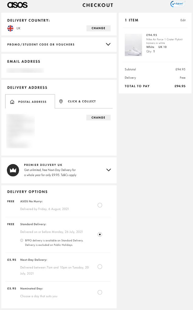 There’s no unnecessary imagery or wasted words here—just a streamlined form that reminds you of the thing you’re so eager to buy, clearly displays the price and any additional costs, and makes it easy for you to choose the right shipping option.
There are also many trust factors at play here, from the DigiCert verification logo at the top right of the screen to the wide choice of payment methods available. That’s more than enough to put even the most skeptical of buyers at ease.
ii. Mobile
Cart abandonment is a perennial battle in e-commerce. But since the advent of mobile shopping, the battle has become more complicated. The sad truth is mobile shoppers are more likely to abandon their carts than tablet or desktop shoppers.
One way to streamline a linear mobile checkout experience is to eliminate distractions. Unlike the desktop experience with variable and expansive screen sizes, multiple tabs, and a wide-open shopping experience the mobile user is fairly limited.
Tablets extend that functionality to some extent, but the mobile user doesn’t have that luxury. Smartphone screens have a limited amount of real estate, so what you display during checkout needs to be minimal in order to eliminate distractions.
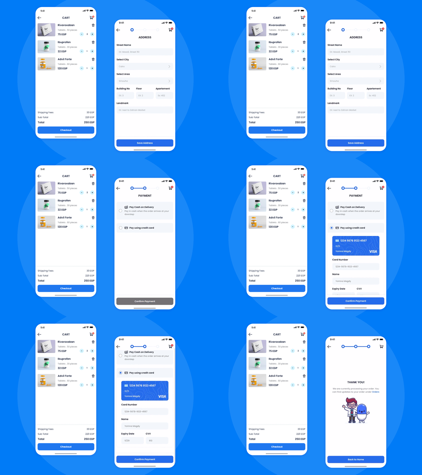 Source: Dribble
The goal is to get them to complete the purchase, so don’t add elements that could lead them away from checkout.
Remember, the browsing space is limited, so anything that leads them to another page or screen can lead to abandonment.
Instead, remove unwanted elements from your checkout or use text links that are less likely to draw attention, and will reveal the field when clicked on.
5. 404 Pages
Whether it’s a visitor mistyping a URL or revisiting an old promotion, 404 pages are inevitable. But that doesn’t mean you can’t use them to your advantage, including driving more orders.
One common practice I see is redirecting 404 pages to the brand’s homepage. But this might confuse the visitor away if they don’t understand what happened.
Another, better way, is optimizing your error page copy to allay confusion, reduce buying friction, and nudge visitors to make a purchase.
Take, Beauty Bay, for instance:
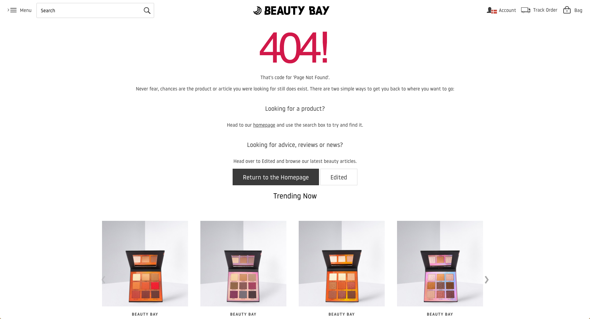 First, the brand explains why you see this error code and reassure you by saying “Never fear, chances are the product or article you were looking for still does exist.”
Then, they show you the ways to find what you were looking for. (And they consider that it can be something other than a product.) Lastly, they suggest some trending items, in case you want to continue shopping.
It doesn’t take much effort but you can see how they try to connect and empathize with the visitor to ease their frustration. Another position you can take is demonstrating humor as Vinomofo does on its 404 page:
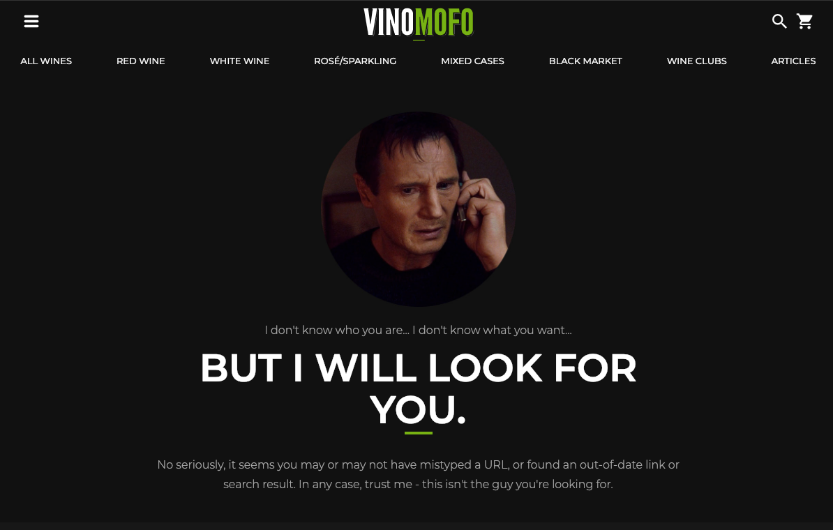 Using Liam Neeson’s famous lines from the movie Taken, the brand tries to make you laugh and create an understanding.
Of course, this may not be an option for you, but it’s worth considering, especially if you’re trying to demonstrate more personality in your marketing.
Another brand that optimizes its 404 pages to perfection is Tattly, a brand that makes “temporary tattoos by professional artists.”
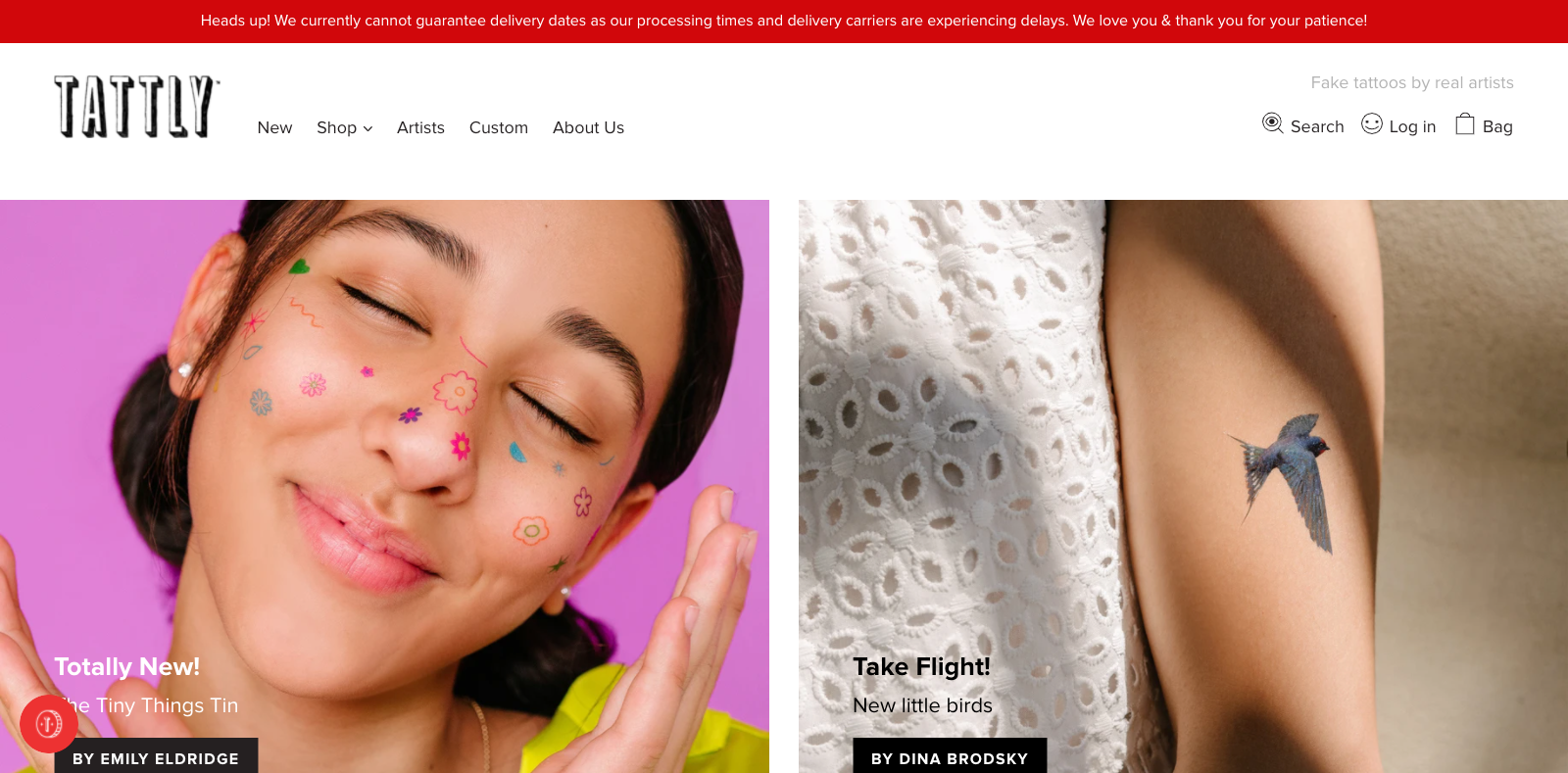 If you land on a 404 page, you don’t see generic 404 copy; you see a secret product:
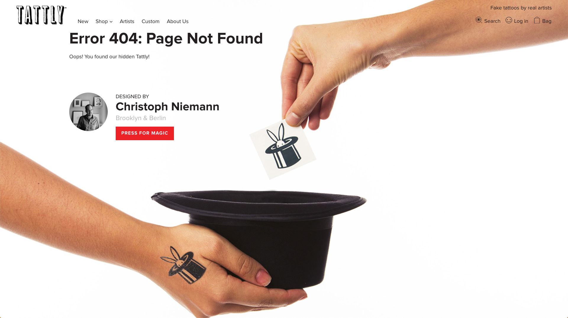 And when you click “Press for Magic,” it takes you to a special product page:
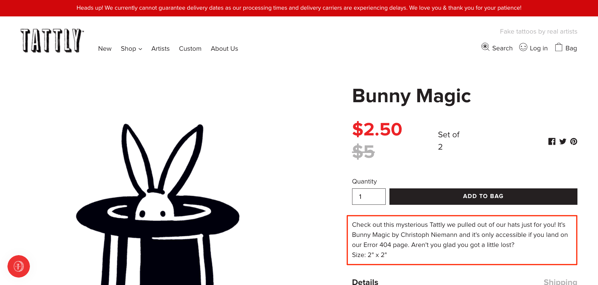 The product description reads that “it's only accessible if you land on our Error 404 page. Aren't you glad you got a little lost?”
When Seray reached out to Cristina Gómez, Tattly Design Director, for comment, she replied,
Tina, our founder, loves it when 404 pages are joyful or fun, and at Tattly we love injecting fun into whatever we can. Hiding a product on our 404 page seemed like the best way to bring the Tattly spirit to a normally mundane page on a site.
A 404 page can offer visitors more than a deadline. Sometimes, as Tattly demonstrates, it’s also a massively-underused selling opportunity.
6. FAQ Pages
An FAQ page is essential for clarifying the questions and uncertainties of your buyers. The additional information serves as a trust-builder that instills confidence in customers to buy products from your store.
Customers want instant answers to their pressing questions with 88 percent of buyers expecting a response to their queries within two hours. Any brand that falls short will lose customers.
According to Invespcro, 54 percent of millennials make their purchases online, and 41 percent will check out a store’s FAQ page for answers before contacting customer support.
Yet, many marketers and store owners treat an FAQ page as an afterthought. The three companies below have mastered the art of crafting well-designed and effective FAQ pages for their online stores.
i. Ruby Love
Ruby Love manufactures and sells stylish female leak-proof, odor-free underwear designed to make women’s periods more comfortable.
They base their products on a built-in absorbent organic cotton liner technology that is unique to the company.
The FAQ page is a single static page with a clean and efficient design. The first question and answer are about the company’s novel technology, which is the first thing many new customers will be curious to learn about.
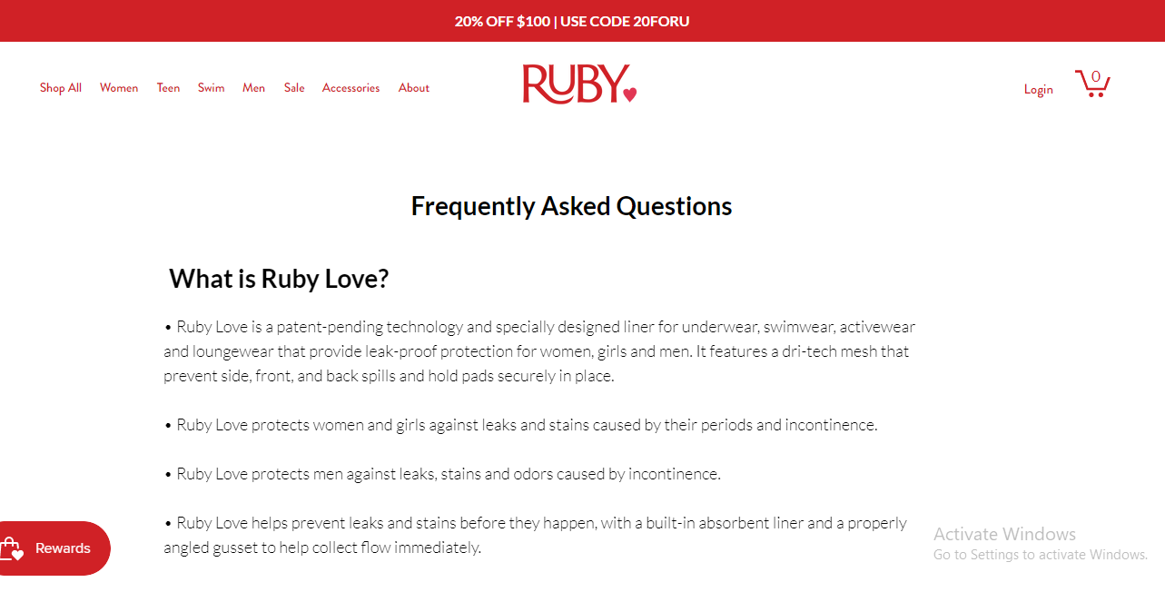 The company also recently changed its name from PantyProp to Ruby Love. The second Q&A addresses the change of name.
 Other questions and answers focus on how to use the company’s products, shipping information, and the store’s wholesale program.
The focus on the company’s technology and how customers can use its products is important for a store like Ruby Love because of the novelty of its offerings.
ii. Greats
Greats is a Brooklyn-based sneaker brand that sells trend-resistant footwear.
The store divides its FAQ page into four sections including general FAQs, Size Guide, Shipping, and Returns.
The links to each section are at the top of the page, and clicking on a section’s link will take the reader to that section. The list of links remains visible on each page to help the reader navigate from one section to another.
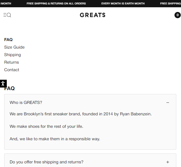 Each section opens with a primary Q&A that is followed by a list of related questions and answers.
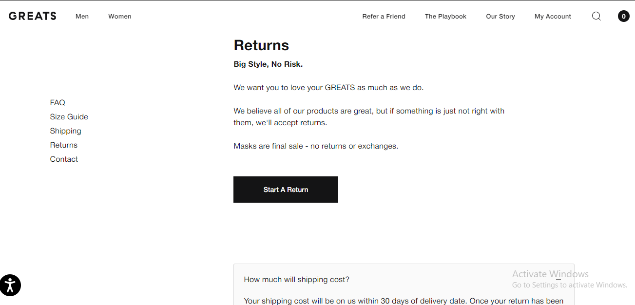 To cap it off, each section ends with a page-specific contact box that contains customer support details for buyers who need additional help.
 iii. Haven
Haven sells premium clothing that is built to be used in all four seasons. It also sells complementary accessories from Japanese and other international brands.
It sells its products to an international customer base, and the contents of its FAQ page reflect this.
It is in a single-page format, and it is written in formal business language.
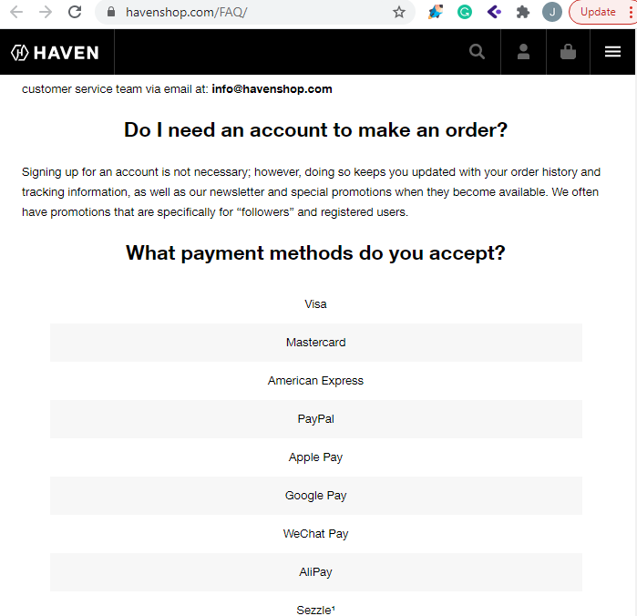 Its audience of international shoppers is the primary reason for this formal and straightforward writing style.
The focus is also on a few select popular customer queries as opposed to the more comprehensive approach taken by some other stores.
Question and answers primarily address issues that international buyers will be interested in, like shipping information, currency issues, payment options, and product tracking.
7. Landing Pages
An e-commerce landing page is designed to do one thing—persuade shoppers to buy. Here you’re targeting people toward the middle or bottom of the funnel that is seriously considering making a purchase.
In order to convert, you need to properly engage with them and push the right buttons to make them feel comfortable with buying.
Although every landing page will differ, there’s a repeatable formula that successful brands use.
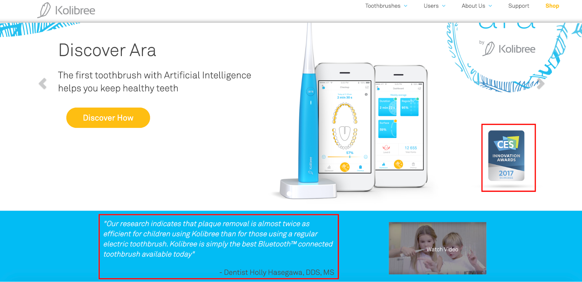
Take Kolibree, for instance, is a company that sells smart toothbrushes that use cutting-edge technology to create better oral health while offering a fun, enjoyable experience.
The product they’re selling on this e-commerce landing page is called the Ara, which is the first toothbrush with Artificial Intelligence to help you get a better smile.
The first thing I want to point out in this example is the UVP located above the fold which lets shoppers know what distinguishes the Ara from any other run-of-the-mill toothbrush.
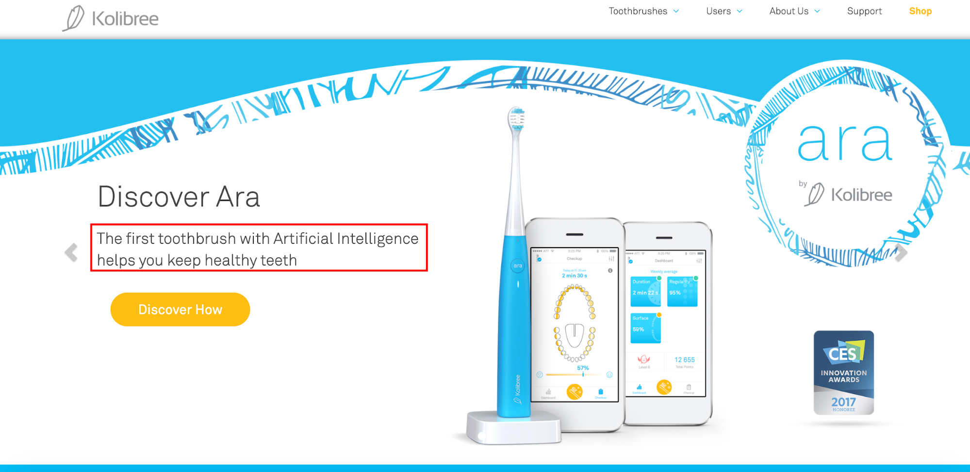 It’s definitely an attention grabber, and knowing there’s a toothbrush with AI should pique many people’s interest.
Next, let’s talk about aesthetics. This landing page checks all of the boxes here.
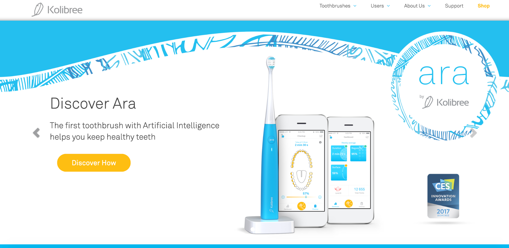 It features a crisp, clean, uncluttered background. It also includes a beautiful image of the product, so shoppers instantly know what it looks like. And as they scroll down, it’s more of the same with the other pictures.
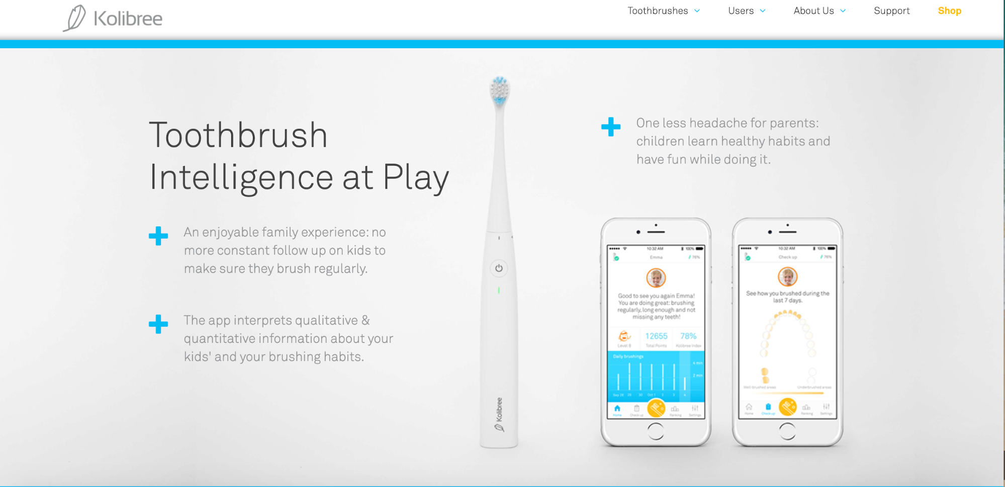 Also, note that this landing page focuses on only one product. This is important because “putting multiple offers on your landing page can decrease conversions by up to 266 percent.”
But only having one offer keeps shoppers dialed in and acts like horse blinders to keep them on track. Kolibree also does a great job of explaining exactly what the product is and highlighting its benefits.
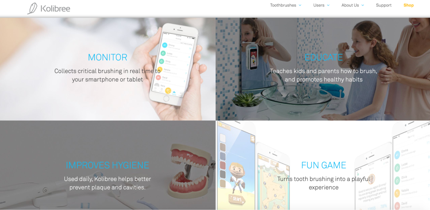
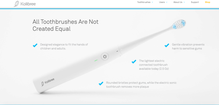 They even include a video that offers a full rundown on the smart toothbrush right here.
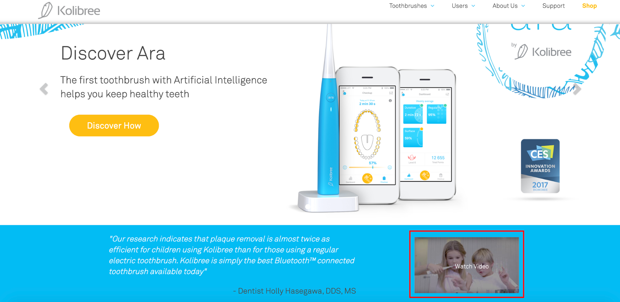 Finally, they include social proof in the form of listing an innovation award they received, as well as testimonials.
 They really covered all of the bases here, making this an awesome example to draw inspiration from.
Bonus: 7 Must-Know Strategies to Optimize Your Site
So far, we’ve discussed optimizing key pages to improve conversions. If you want to go one step further, consider one or more of the following optimization strategies.
- Promote Pay Later Options
- Collect Details in Multiple Steps
- Offer Seasonal Gift Guides
- Reduce Cart Abandonment
- Split Test Your Campaigns
- Follow Copywriting Best Practices
- Cross-Sell Relevant Items
1. Promote Pay Later Options
Many online retailers offer the option to buy now, pay later (BNPL) at checkout. And with benefits for both merchants and buyers, it’s not hard to see why it’s earned its place in e-commerce.
One brand that offers BNPL and promotes such in its hello bar is cosmetics and beauty manufacturer, Morphe. After visiting the brand’s website recently, I saw the option to buy now and pay later.
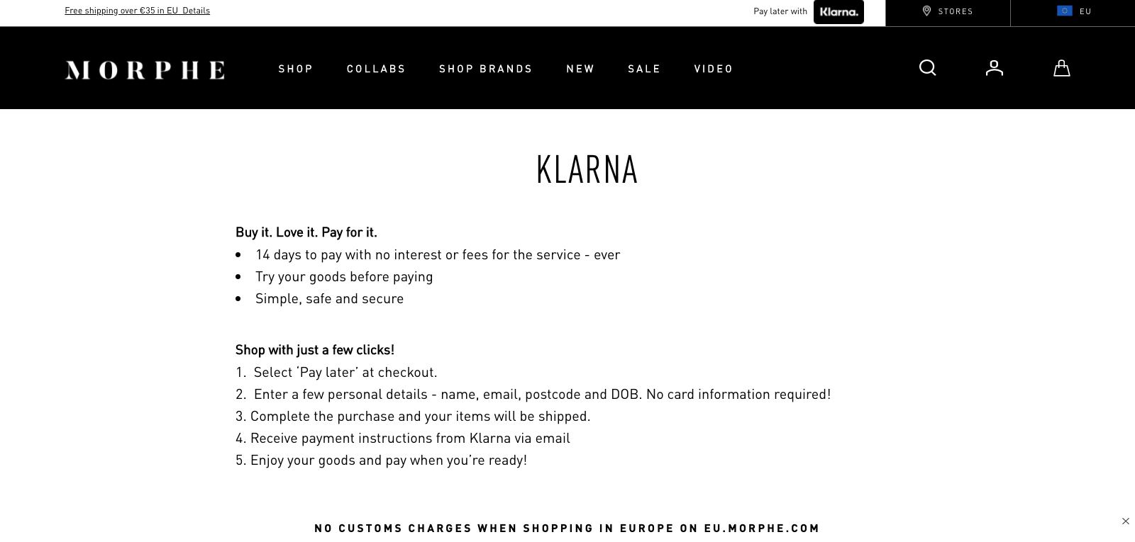
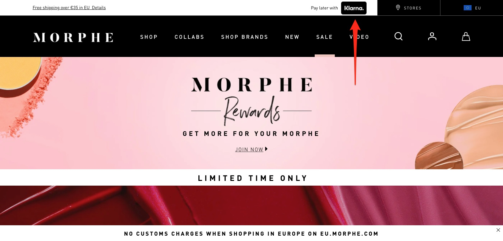 After clicking the link, Morphe redirected me to a dedicated page on its website, promising me a chance to try before I buy, as well as the option to make a purchase with just a few clicks.
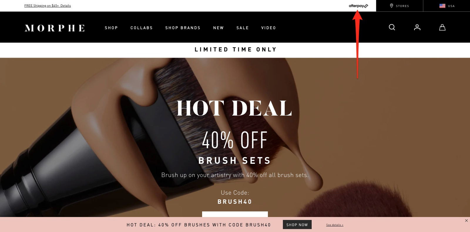
 Morphe also changes its payment processor based on the viewer’s location. For Swedish visitors, like me, I saw Klarna, but when I visited the US store, I saw Afterpay.
 There is one alteration I would make, however. When I tried to check out, I only saw Morphe’s second bar—the one at the bottom that offers “60% off brushes with code [Redacted].”
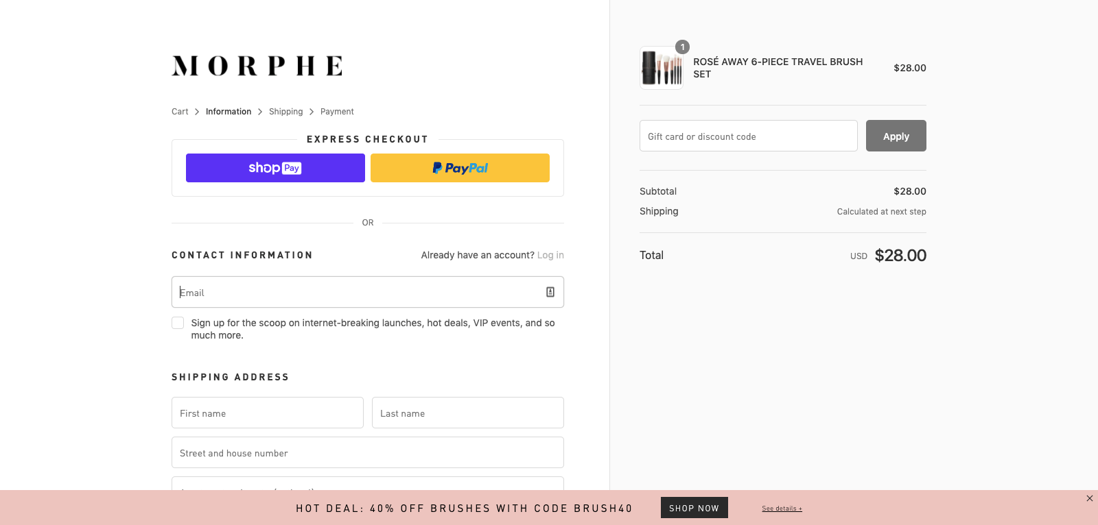 I would remove the bottom bar and add the top bar from the homepage to continue reminding buyers that they can BNPL. Here’s how that might look.
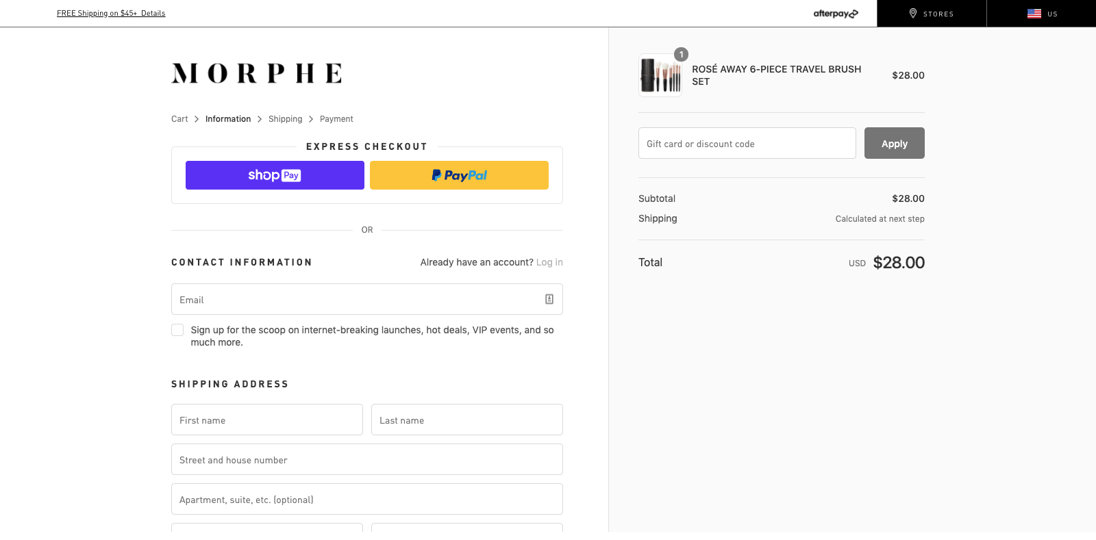 It’s easy to assume visitors will remember or have even read key buying details on the homepage, but that’s rarely the case. Offer gentle reminders to simplify the buying experience and put the buyer at ease.
2. Collect Details in Multiple Steps
If you want to collect more emails on your website, you need an email popup. With a popup, you can capture the visitor’s email and market to them later in your email marketing.
There are many ways to capture the visitor’s email with a popup, but the easiest is to offer a discount on a future purchase. In fact, this is precisely what Calvin Klein does.
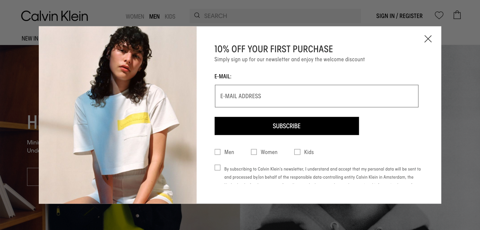 The brand offers “10 percent off your first purchase” before asking the visitor to enter their email and choose a gender. (You can use this information to send better-targeted email campaigns later.)
If you don’t want to discount your products and services, another incentive is entry into a giveaway, as Danish brand Ny Form tried with its recent popup.
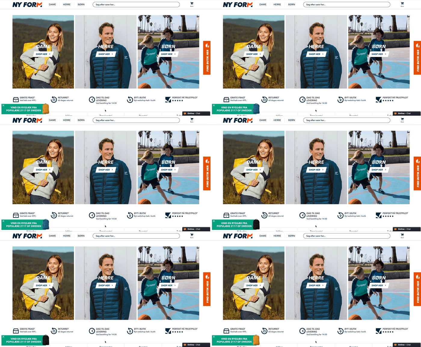 The brand first used a teaser to bait the visitor into clicking before showing a popup promoting a giveaway to win a free backpack in a preferred color.
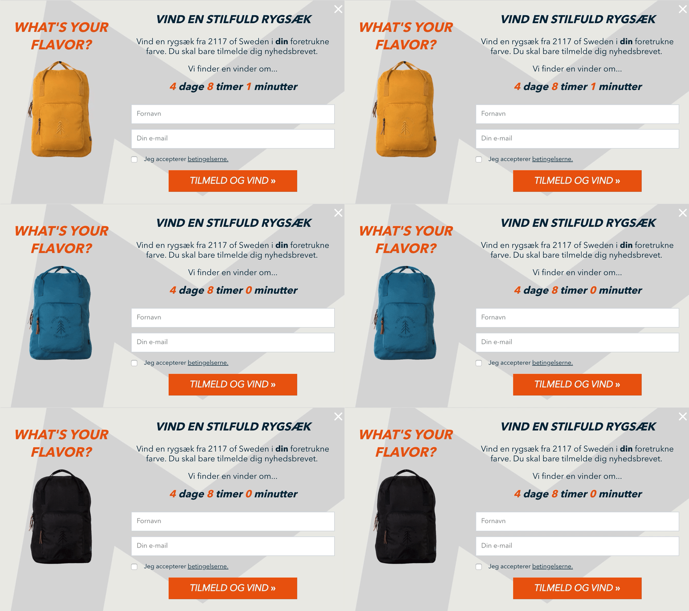 By using GIFs in its teaser and popup, Ny Form differentiated itself from other brands using popups, driving more engagement and optins in the process.
Of course, if you wanted to go a step further and enrich your email leads without losing conversions, you could create a multistep popup to collect more information in a follow-up step, like this:
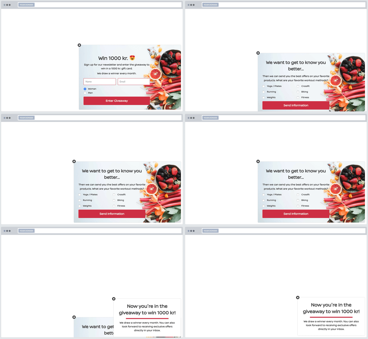 In our research of 1+ billion popup views, we found that popups with a second step see 76 percent of its subscribers input further details.
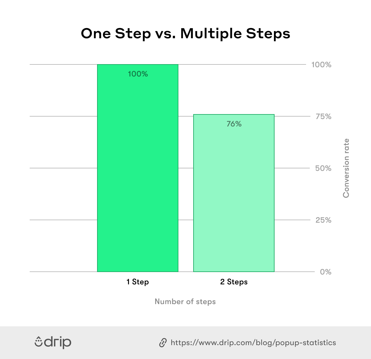 Bottom line: using multistep will give you more details on new visitors, and give them a better browsing experience, without costing you conversions on-site.
3. Offer Seasonal Gift Guides
Offering gift guides, especially during the holiday season, is a great way of guiding potential buyers to improved buying decisions, and boosting seasonal profits.
One brand that does that exceptionally well is cosmetics brand Origins.
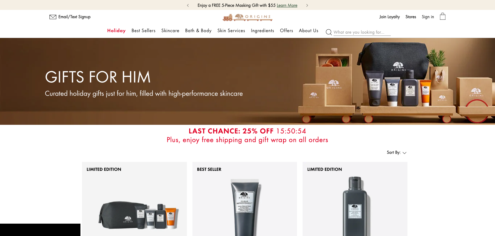
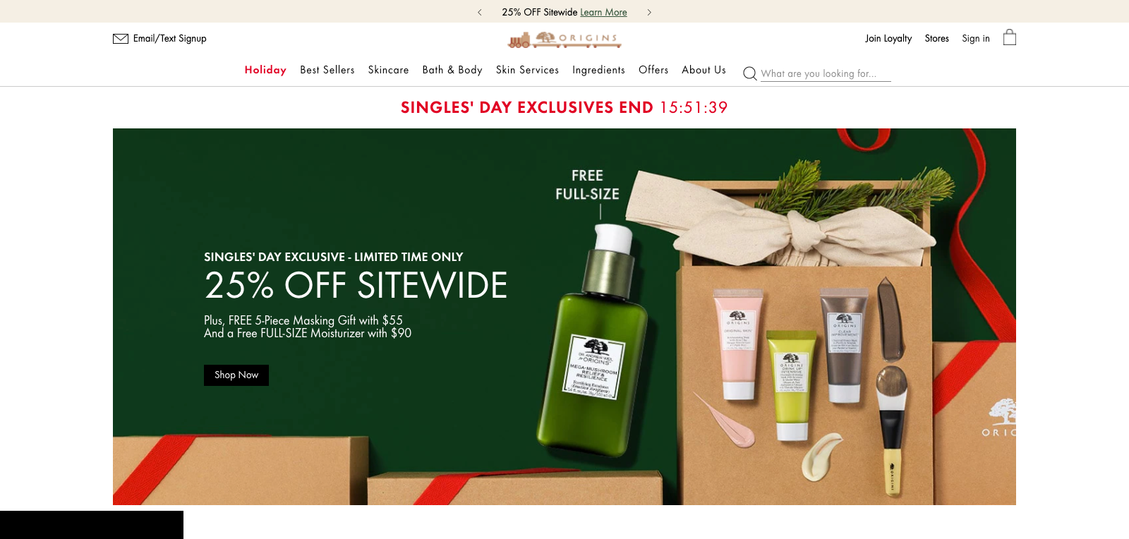 If you go to its website and hover over its navigation menu, you will see a dropdown with several options. I’ll choose, “Gifts for him.”
 On the category page, the brand lists several of its bestselling items, as well as a few limited-time offers for those driven by their fear of missing out.
The brand also uses a countdown timer to further drive urgency, but not without reminding visitors that they can enjoy, “free shipping and gift wrap on all orders.” What’s not to like?
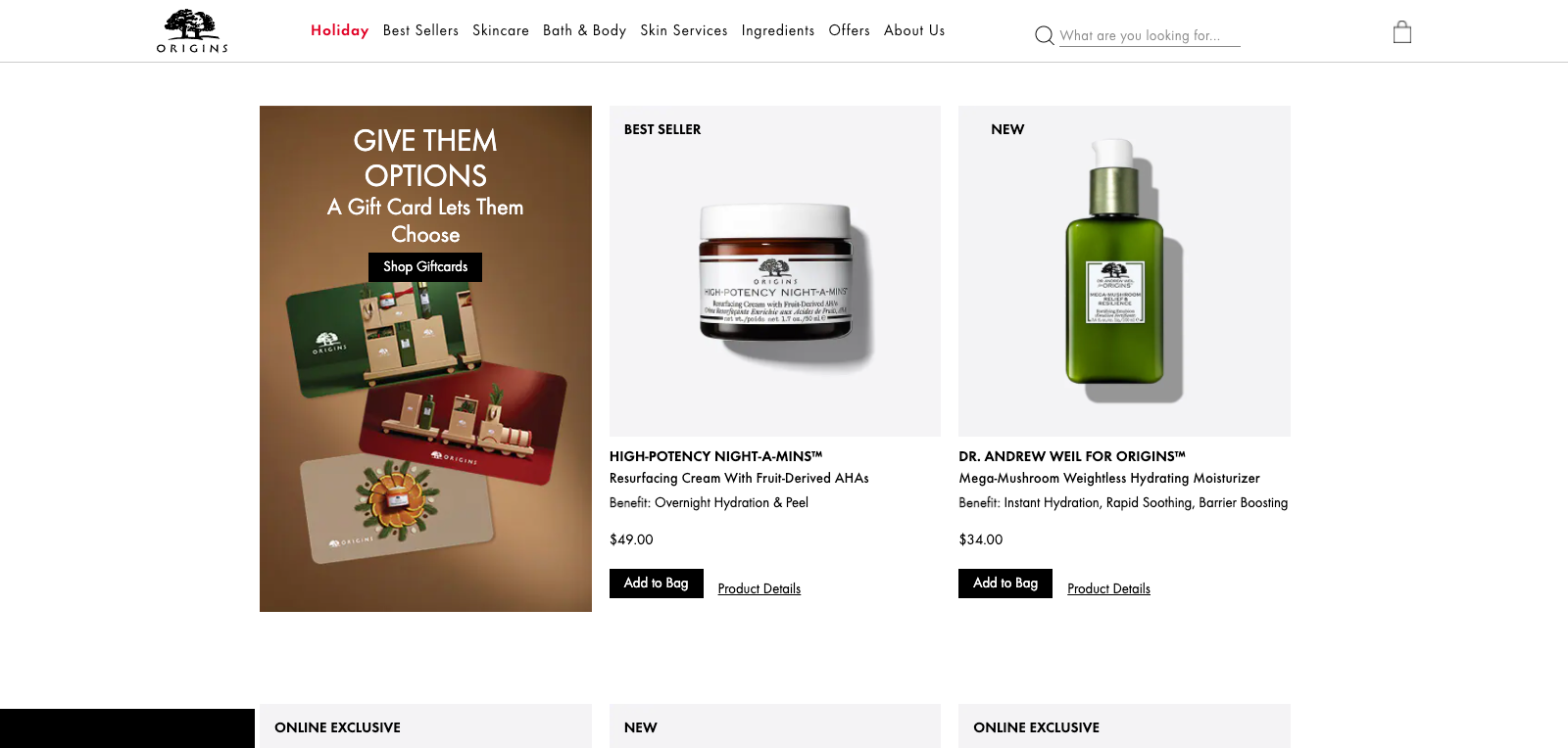
 What I enjoy most about Origin’s gift guide, though, is how it meets the visitor where they are based on how far down they scroll. If the visitor hasn’t found what they’re looking for after scrolling through half of the page, the brand invites the visitor to consider a gift card, instead.
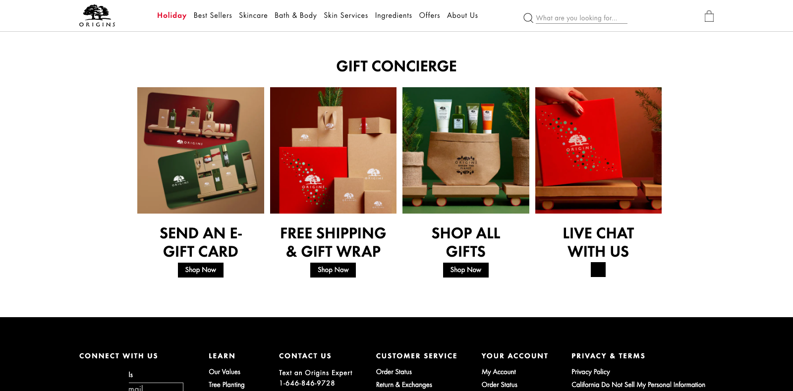
 And if the visitor is still undecided by the time they scroll to the bottom of the page, the band offers a “gift concierge” complete with live chat to help the visitor find what’s right for them.
 Origins offer a unique, and highly-enviable example of going the extra mile for its customers during the holiday season, but it’s not the only brand worth highlighting. Get more inspiration here.
4. Reduce Cart Abandonment (The Right Way)
If you ever googled “how to reduce cart abandonment,” you know the most common recommendation is to offer a coupon code the very moment visitors are about to leave your checkout page.
While doing that will certainly convert some abandoning visitors into subscribers (and later, customers, hopefully), the strategy isn’t free from problems:
- You might decrease the perceived value of your products; or, worse
- Your regular visitors will start expecting discounts and leave their carts on purpose.
A better strategy, in our experience, is to offer a physical product, rather than a coupon, to some abandoning visitors based on their basket value.
Say a visitor has products valued over a certain amount in their basket, you can show them a free product campaign that they qualify for:
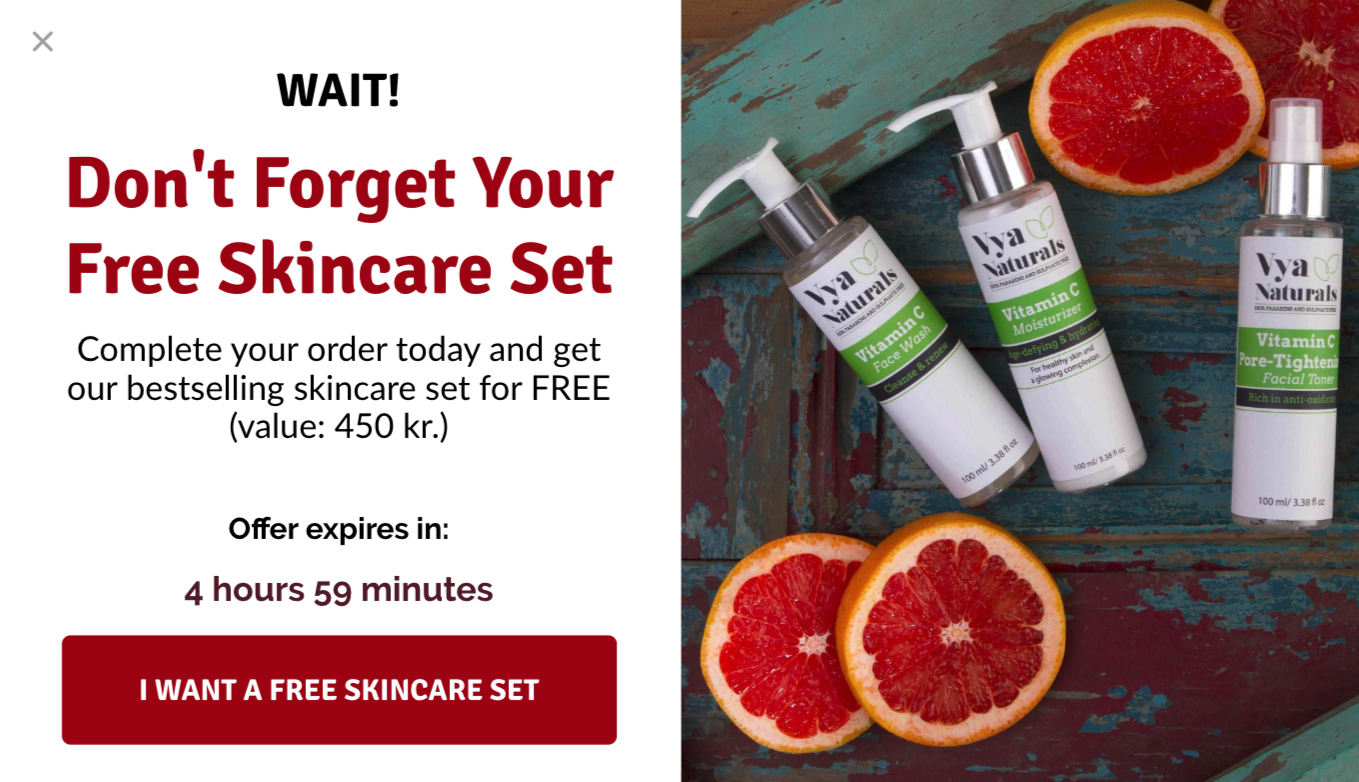 By contrast, if they’re below that amount, you can trigger a different campaign to let them know that they’ll enter a giveaway if they complete their purchase:
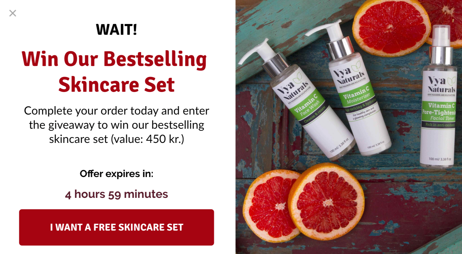 Not only are you offering incentives that are most relevant to where they are in the funnel, but you also convince the visitors to complete their order, without lowering your products’ perceived value.
To learn more about recovering lost sales, check out our articles on cart abandonment popups, Shopify abandoned cart popups, and cart abandonment strategy.
5. Split Test Your Campaigns
If you’ve ever browsed online, chances are you’ve noticed that many online retailers include an image when using a website popup.
And it makes sense: if, as a website visitor, you’re asked to opt in for a lead magnet, you want to know what you’re getting, right?
We thought so, too. But after several previous tests, we were unsure why our control was performing so well, despite showing what our visitors would receive in exchange for their email.
After consideration, we realized the bullets, describing the offer, played a bigger role than we initially thought.
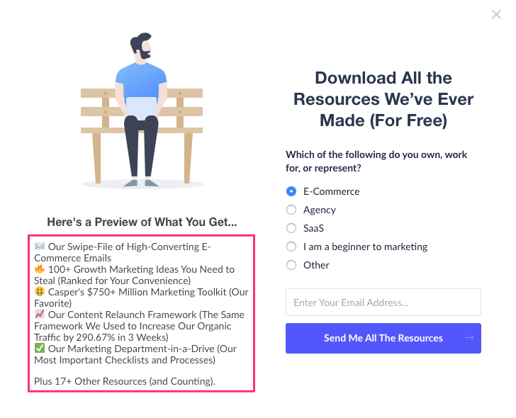 To ascertain that for certain, we ran an experiment testing it against a similar design with an image, instead, previewing the offer:
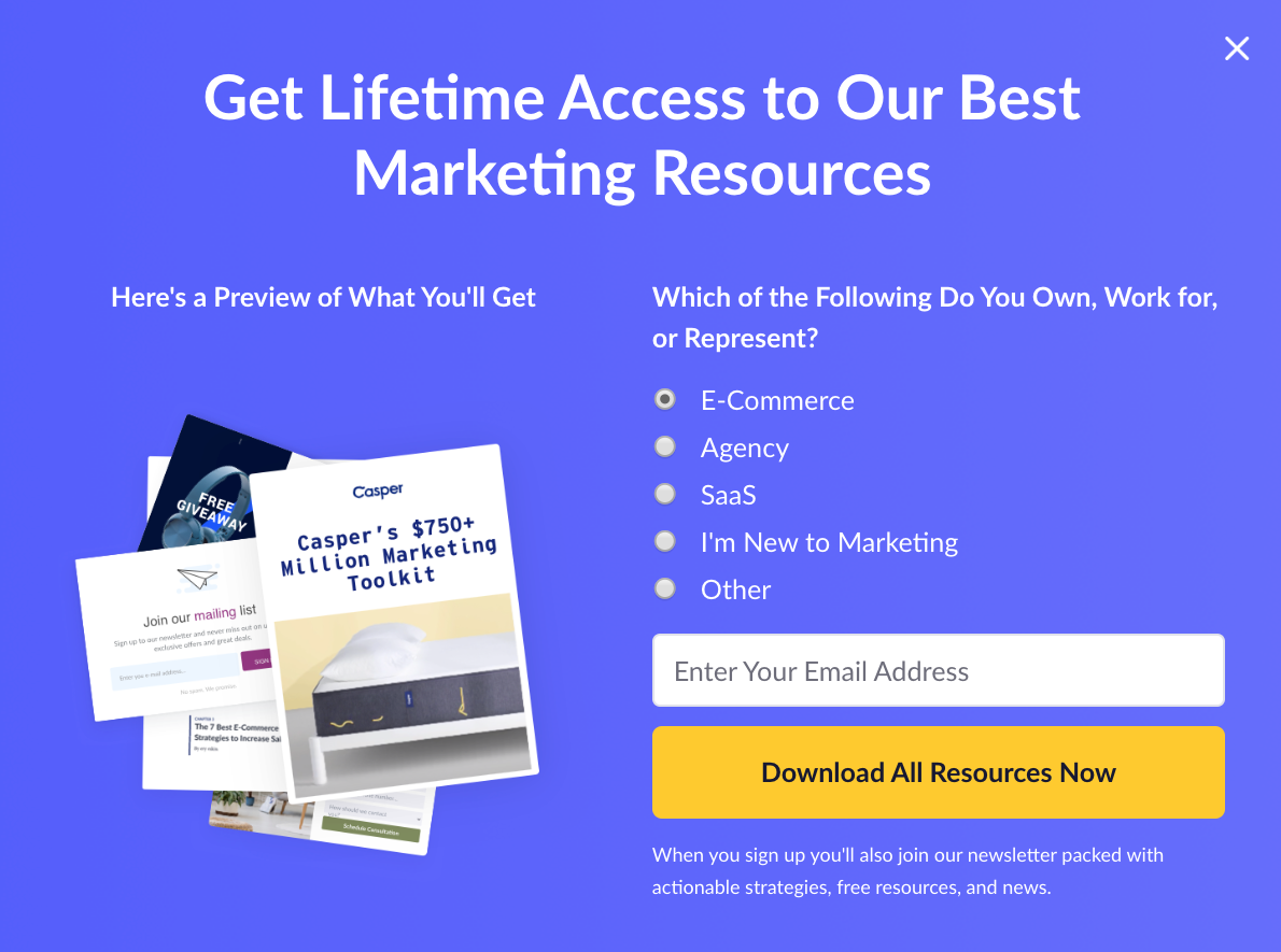 After testing for 49-days, the results were clear:
A popup describing the offer with bullet points boosted our conversion rate by 167.21 percent.
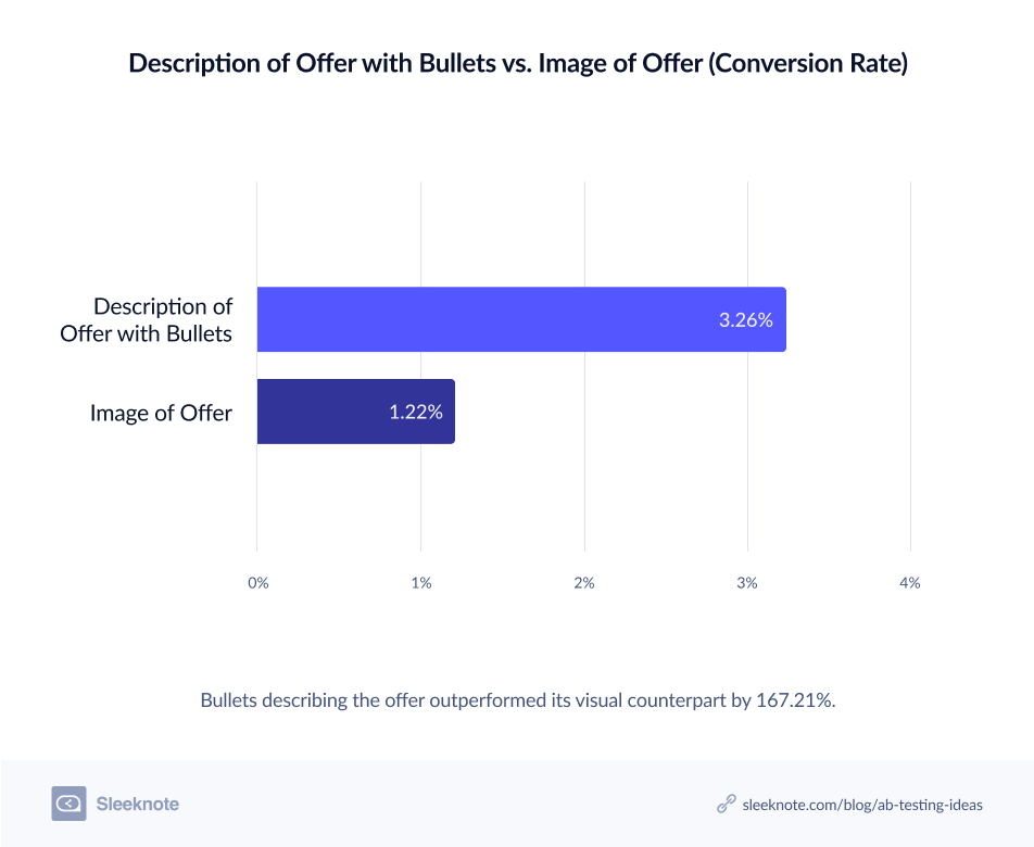 The winning campaign also accounted for 72.8 percent of ALL our blog leads within that period.
“A picture’s worth a thousand words,” says the old English adage. But in our experience, good, compelling bullets are worth far more.
6. Follow Copywriting Best Practices
There are many copywriting best practices worth following. But one of the most important is writing like how your audience talks.
One of our favorite brands to do that is Barbox, a monthly subscription service providing dog products, services, and experiences.
We’ve featured the brand on our blog several times (namely, here and here).
And after browsing their website for a few minutes, it’s not hard to see why. I mean, cute images of puppies and charming wordplay, need I say more?
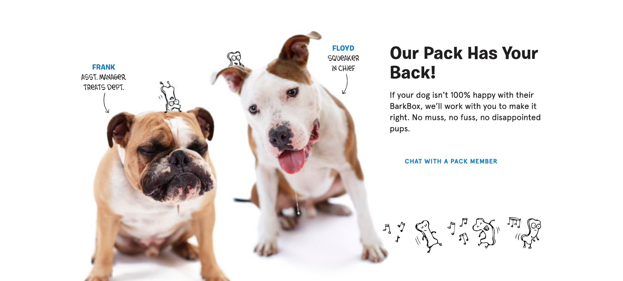 Joking aside, BarkBox is a brand that gets its audience, through and through. From using their target buyer’s language to selling directly to the buyer’s dog(s), BarkBox is a brand that is often imitated but rarely duplicated.
 Notice how, in Step 2, BarkBox sells, not to the buyer themselves, but the buyer’s pet. Dogs can’t verbalize their dissatisfaction (or anything for that matter, sadly) so it’s a clever marketing ploy on BarkBox’s part.
It doesn’t matter what industry you’re in, or whether you’re selling affordable dog toys or something more extravagant, people want to feel understood by the brands they invest in. That might be how they feel about themselves, or the person they’re aspiring to become.
If you demonstrate that, both in your copy and other marketing materials, and articulate their goals, desires, hopes, and fears better than they can, your products will fly off their digital shelves faster than you can restock them.
7. Cross-Sell Relevant Items
There are many ways to boost your e-commerce revenue.
One option is to simply put more money and effort into driving a higher volume of traffic to your site. Another, and often more efficient technique, is to use e-commerce cross-selling.
Rather than constantly trying to generate new leads, this is where you squeeze the most out of existing shoppers and customers, thereby raising your profits.
To inspire your next cross-selling campaign, here are two examples from brands that use cross-selling at the pre-checkout stage where shoppers are still browsing.
i. Madewell
Madewell is a women’s clothing brand that specializes in jeans, shoes, t-shirts, and dresses.
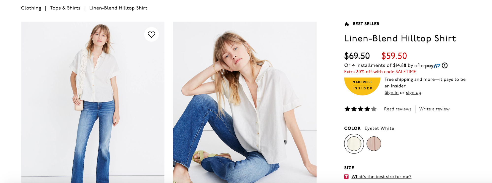
One of the top products it sells is the “Linen-Blend Hilltop Shirt.” At the top of the page, shoppers can get detailed info on the shirt, color options, product images, sizing information, and more.
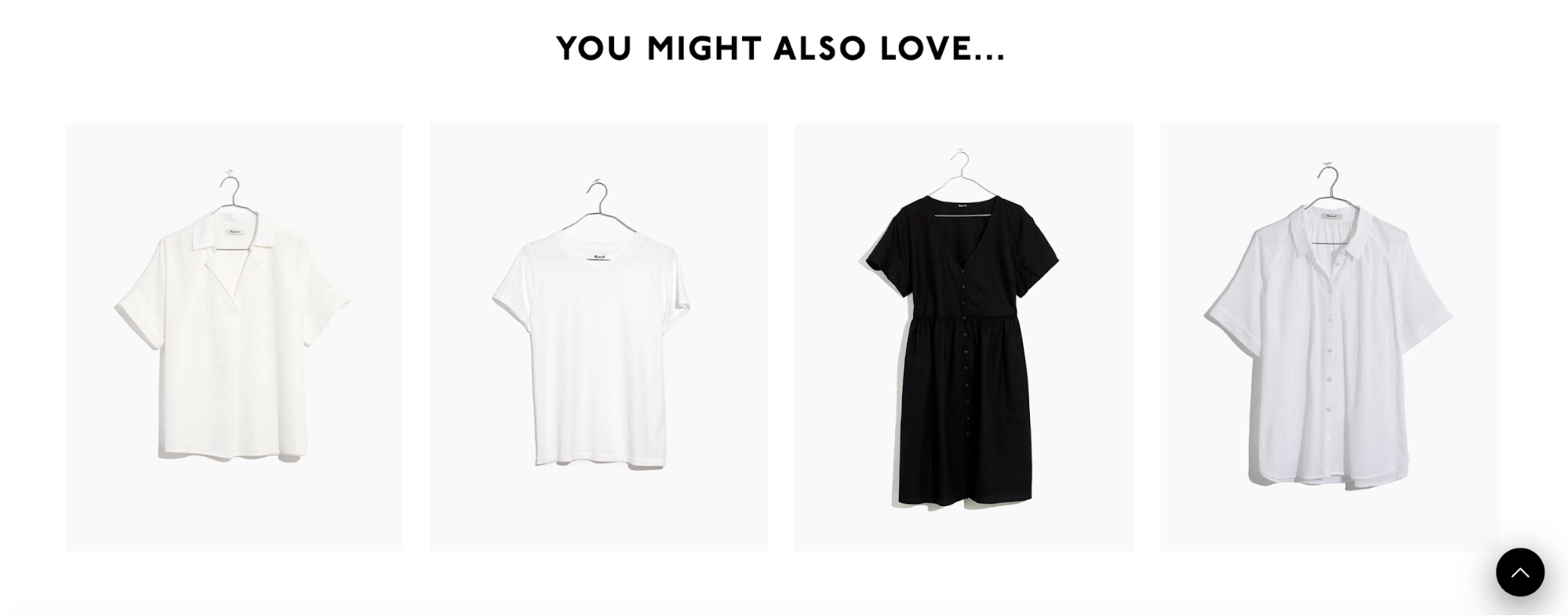
 And if they scroll down a bit more, they’ll find a section called “You might also love…,” which includes links to other products that have a similar style as the Linen-Blend Hilltop Shirt.
 So, if a shopper clicks on the shirt on the far left hand, they’re taken to this product page where they can get the details and add that to their cart as well.
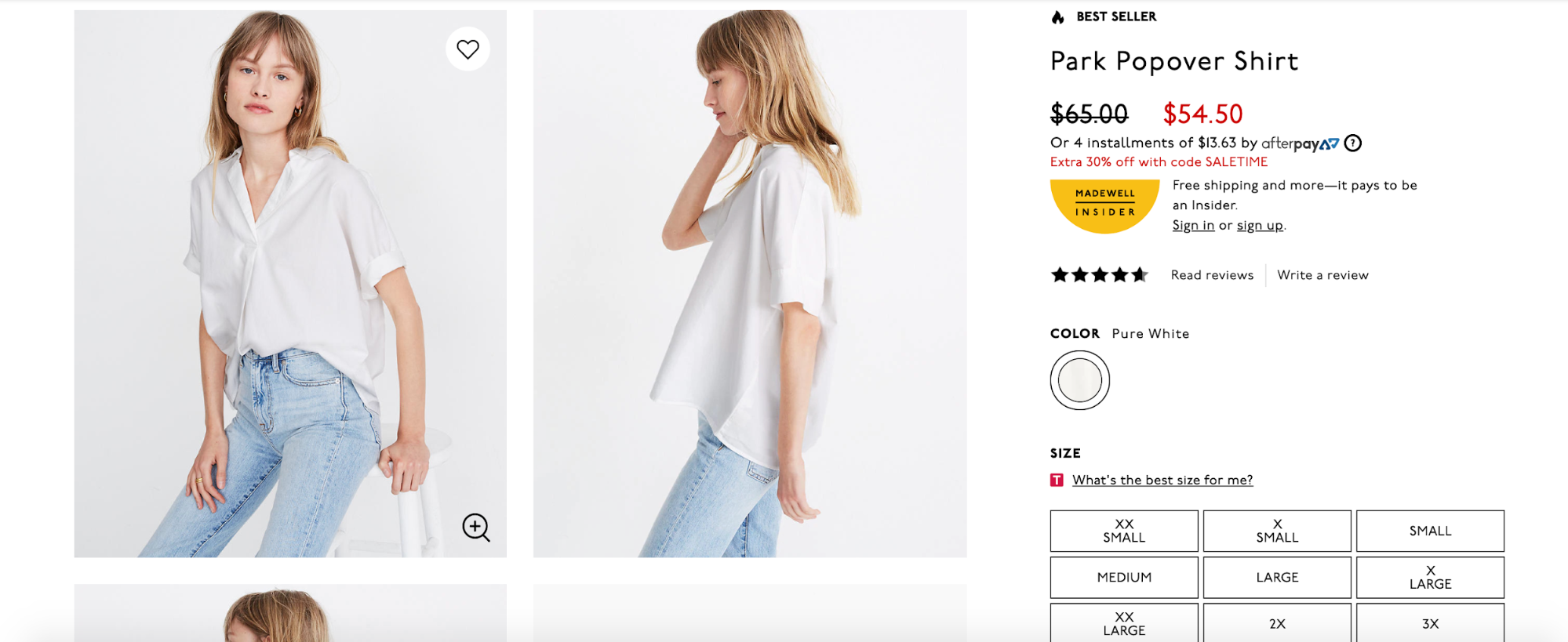 This technique allows Madewell to seamlessly promote relevant products that a shopper is likely to be interested in without creating any friction along the way.
ii. Lush
Lush is a brand that sells fresh handmade cosmetics. One of its top products is a soap called “Honey I Washed the Kids,” which is cleverly designed as a honeycomb.
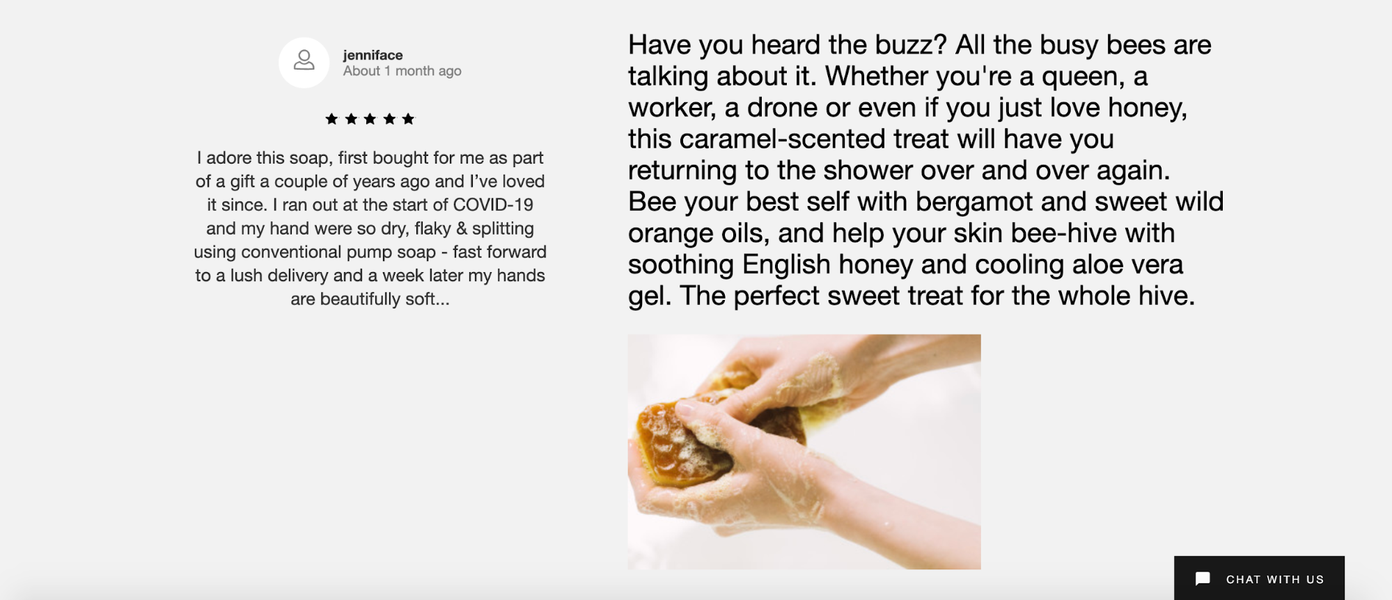
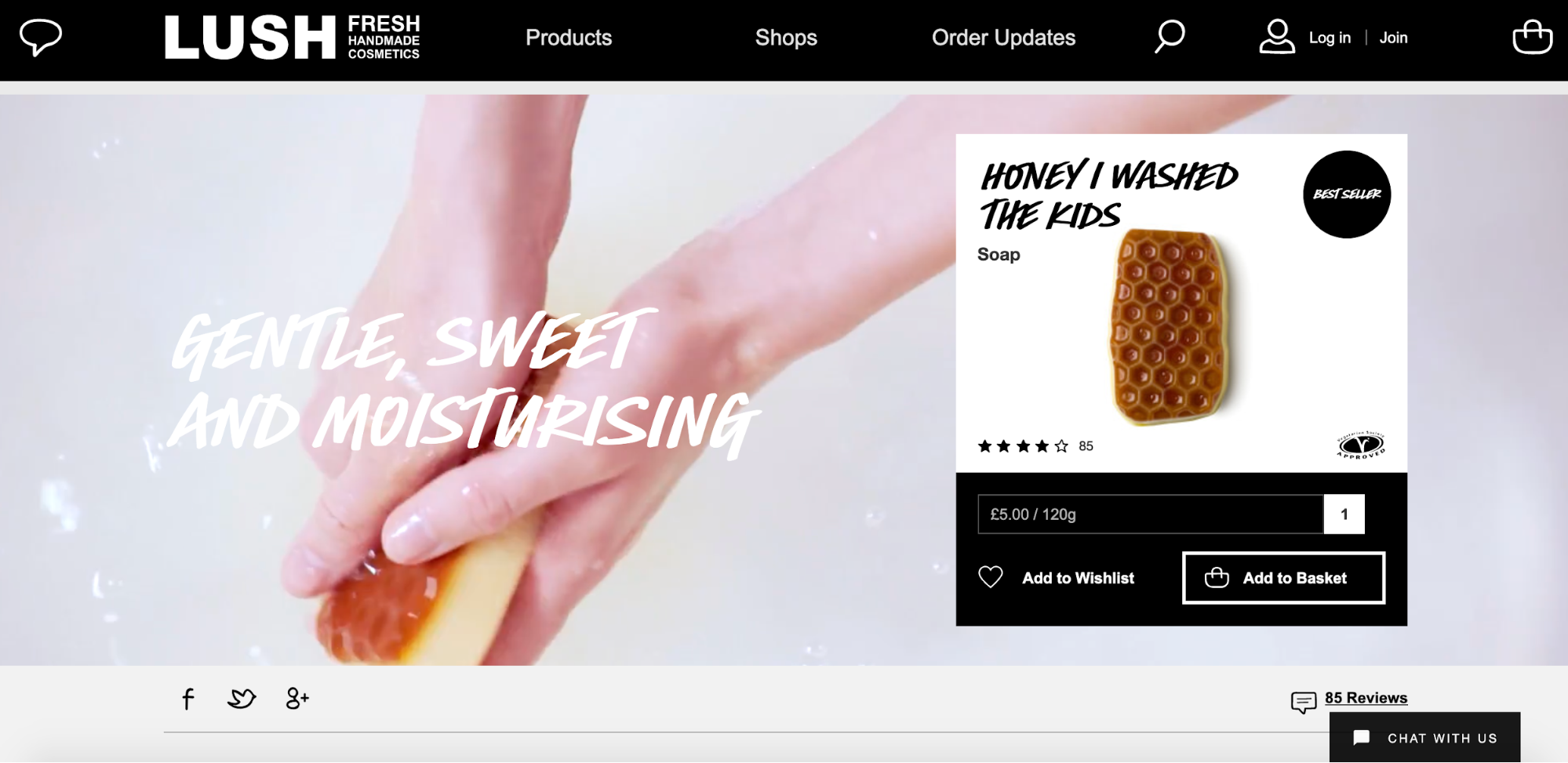 Shoppers can get all of the information they need on the product page, including reviews, ingredients, and FAQs.
 And toward the bottom, there’s a related content section, which features other honey-themed items a shopper may also be interested in.
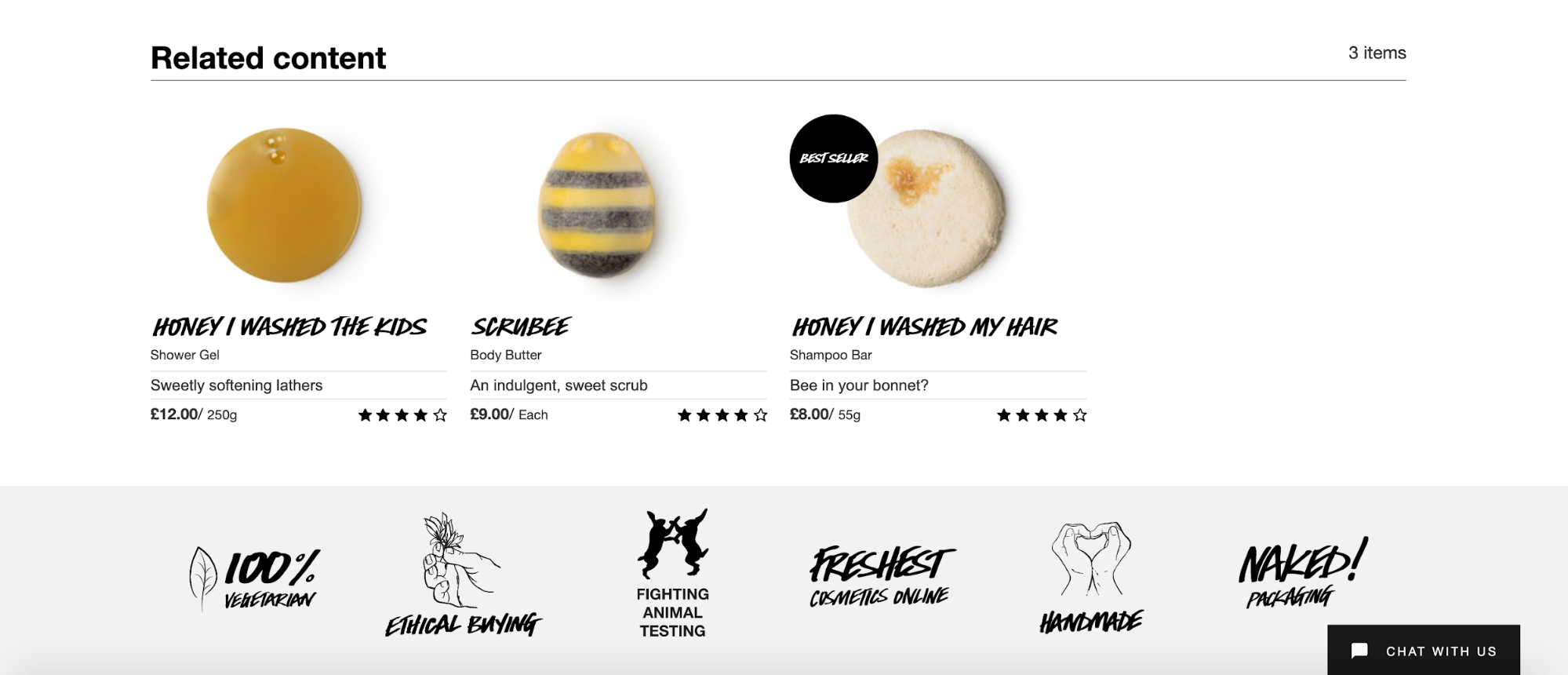 With just a quick click, they can learn about similar products such as the “Scrubee” body butter and conveniently add them to their cart.
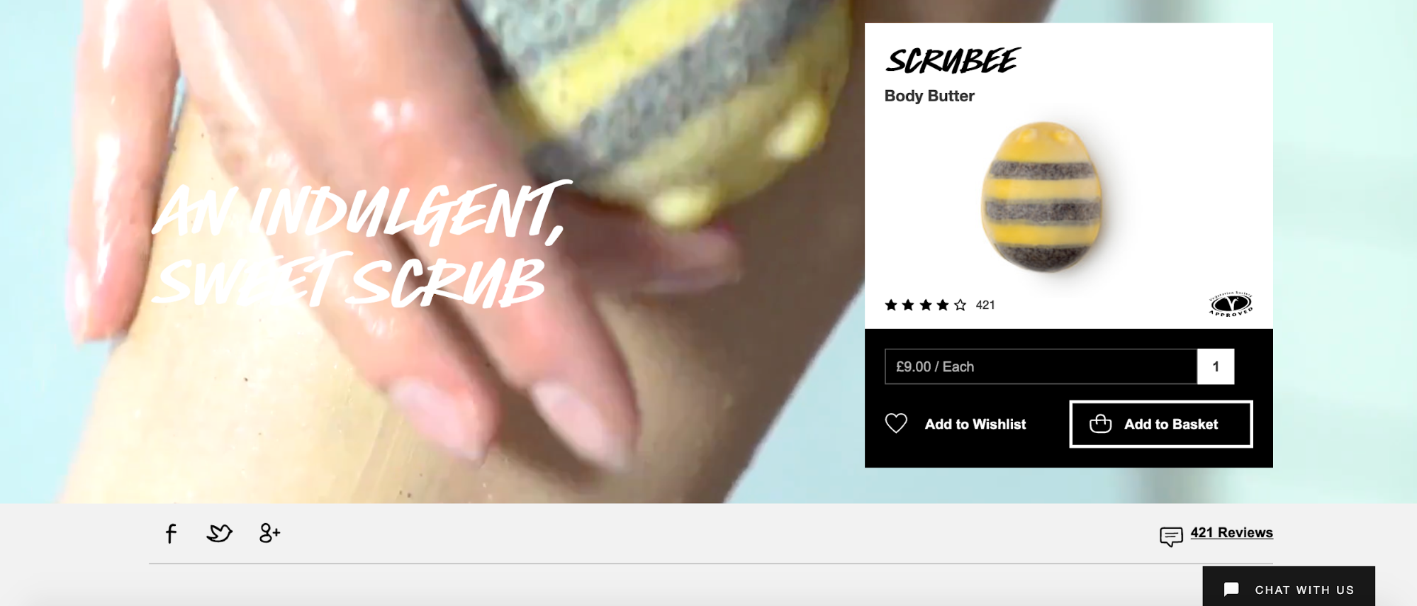 There’s zero hassle for shoppers, and many will appreciate being able to learn about other products without having to manually search Lush’s website.
![]()

Conclusion
And that’s it! I’ve covered a lot here. But e-commerce optimization is a broad topic, and what I covered in this guide is only the beginning.
If you’re interested in keeping abreast of what’s working today, bookmark our category page.
Got a question? Let me know on Twitter @SamThomasDavies.

