Last year I wrote a blog post called “13 E-Commerce Homepage Best Practices for Conversions.”
In it, I discussed the essentials for building an enticing homepage—one that’s informative, intuitive, easy to navigate, and most importantly, looks amazing.
In that article, I provided a few examples. But for this post, I’m going to dive even deeper and give you several more next-level examples of high-converting e-commerce homepages.
So without further ado, here are five of the most eye-popping e-commerce homepage examples I’ve recently seen, along with a breakdown of the best practices they’ve followed.
1. Good Dye Young
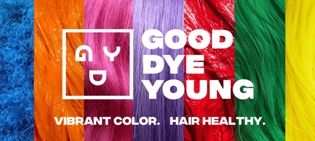
Good Dye Young “is a vibrant, semi-permanent vegan and cruelty-free hair dye company.” It was founded by Hayley Williams of the band Paramore and celebrity hairstylist Brian O’Connor.
The first thing I have to say about this homepage is, wow.
The colors above the fold immediately grab the attention of shoppers and thoroughly nourishes their eyeballs. The Good Dye Young brand name (which is a fantastic name, by the way) and unique value proposition (UVP) are featured front and center.
This along with the rainbow of different hair colors is more than enough to let e-commerce shoppers know:
- Who the brand is;
- What they’re selling; and
- Why shoppers should be interested.
While your visitors, especially mobile shoppers, scroll far more than they used to, it’s always a good idea to include the essentials above the fold to help them get their bearings.
Below this colorful introduction is a section with some of Good Dye Young’s most popular products called the “I’m Bored” dyes.
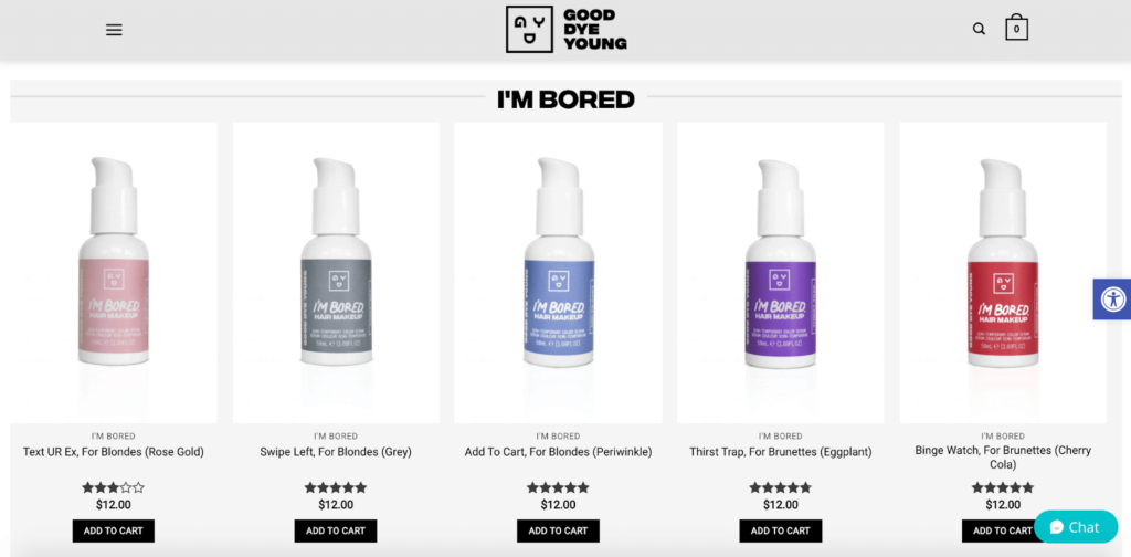
Number six in my e-commerce homepage best practices post mentions featuring your top products, and this is a great example of that.
Beneath that is a video on how to use “I’m Bored,” featuring co-founder Hayley Williams.
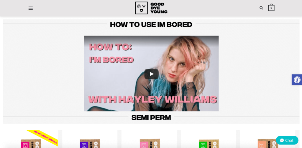
This is smart because it shows shoppers firsthand how to use a product, while at the same time featuring a well-known public figure (who also owns the company.) Having her in a brief instructional video kills two birds with one stone.
Then, Good Dye Young includes another popular line of products…
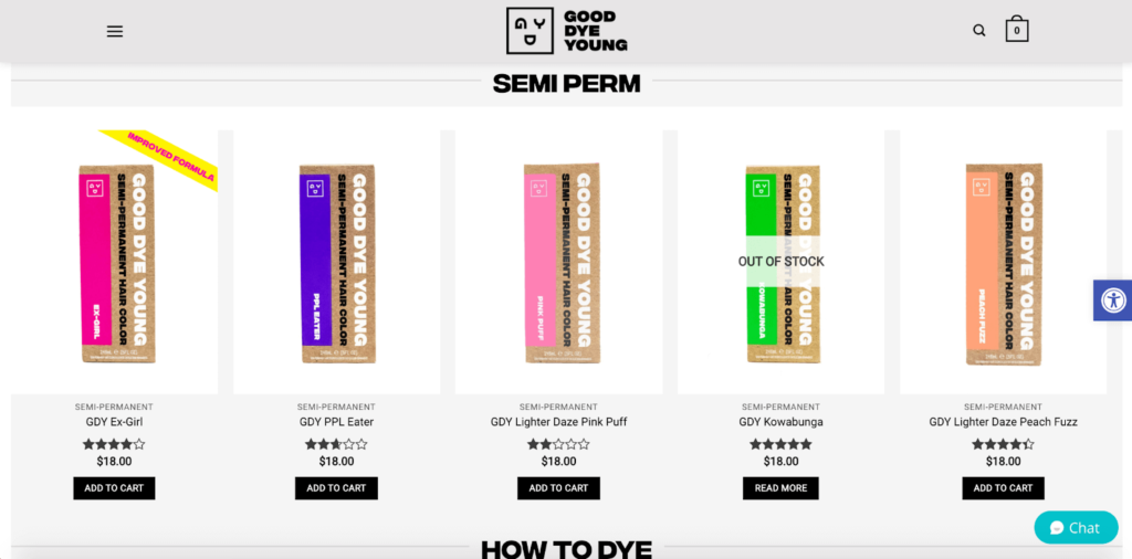
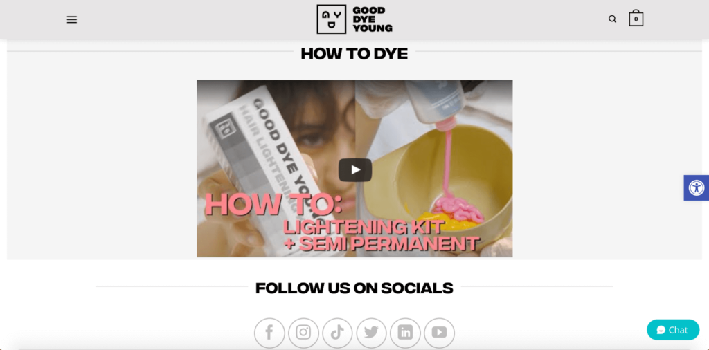
…which is followed by another instructional video on how to use those products.
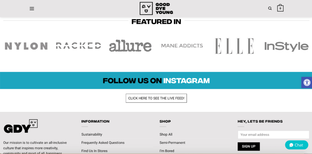
Next, the company wraps everything up with some notable publications they’ve been featured in, such as Nylon, Allure, and Elle.
The brilliant aesthetics of this e-commerce homepage example combined with an eye-catching product selection, simple navigational structure, educational content, and social proof all come together to create a killer experience for shoppers.
And it’s one you can draw a lot of inspiration from.
2. Henry J Socks
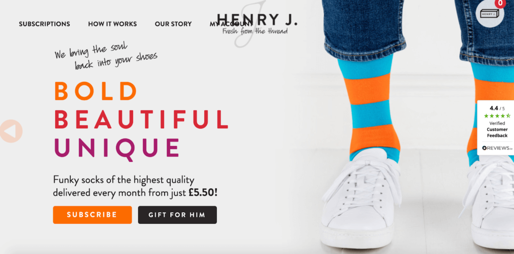
Another brand that places an emphasis on bold, vibrant colors is Henry J Socks, which is a subscription-based sock service.
The header features a slider where shoppers first see the image of socks featured above with the funky orange and blue design. But after a few seconds, they see this image with green and blue polka-dotted socks, which acts as a visual one-two punch.
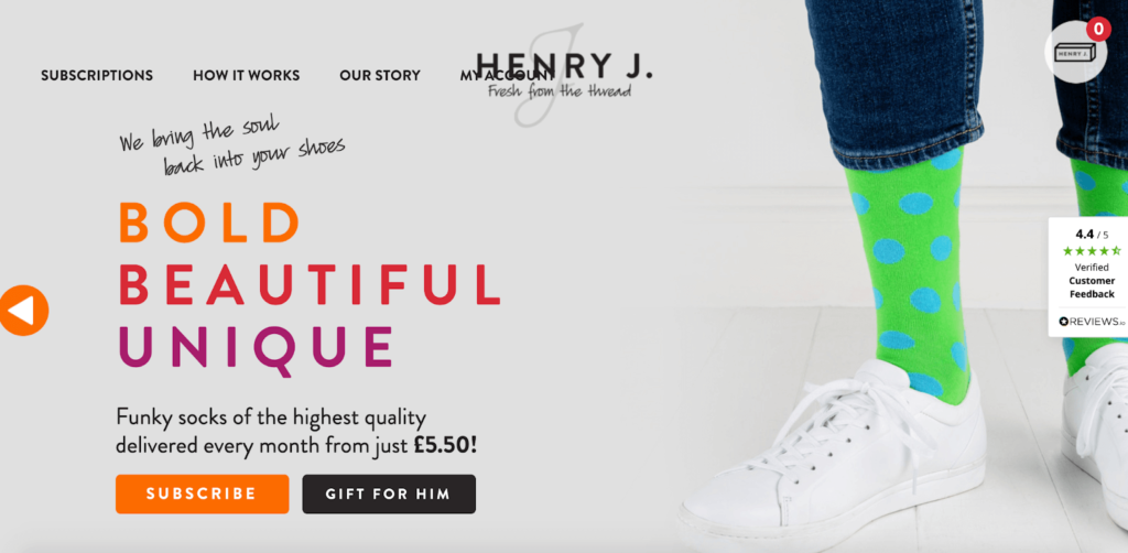
Without even having to read a word of copywriting, shoppers can surmise what this brand is selling and why they should care.
In this example, the product does the talking, and shoppers can see what distinguishes Henry J Socks from the competition. But of course, this is accompanied by some simple yet powerful copywriting.
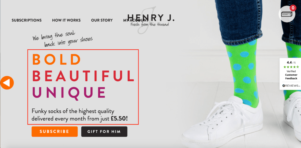
With just a glance, shoppers see a well-written UVP and get an idea of how much the products cost.
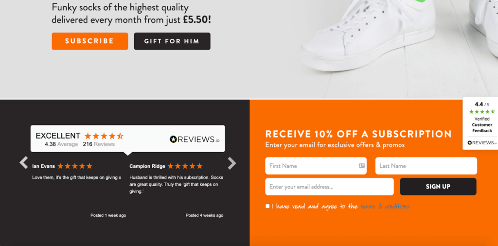
After scrolling down a bit, shoppers find some nice reviews from actual customers…
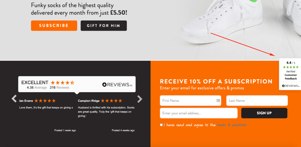
…and there’s also this sticky review on the right-hand side that remains visible as shoppers scroll through the entirety of the homepage.
Further down is this section on how the sock subscription process works.
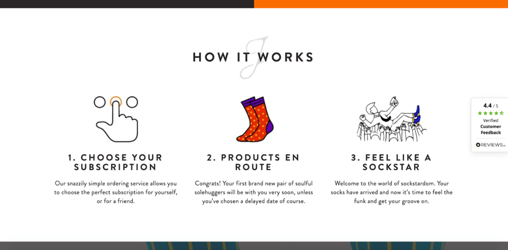
The brand breaks this process down into three simple sections to get shoppers up-to-speed in a hurry and uses creative, playful wording like “feel like a sockstar.”
Finally, there’s a section on the different sock subscriptions that are available— for three, six, or 12 months.
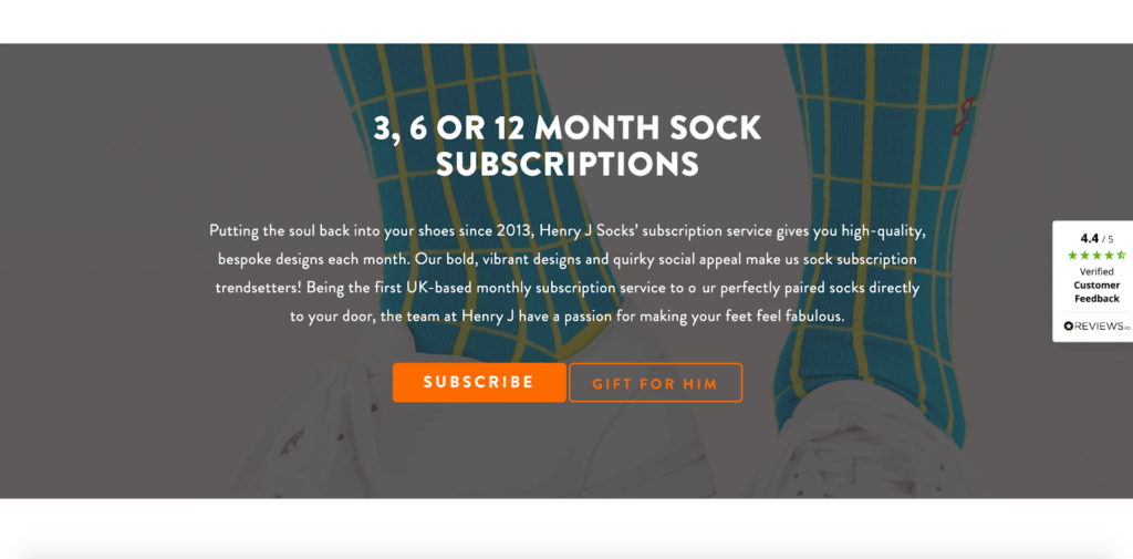
Notice how Henry J Socks succinctly shows off its top products, displays its value proposition, personalizes its homepage, and makes navigation a breeze.
They include everything they need while avoiding unnecessary, extraneous details and making it look like a work of art. If you’re going for a homepage that’s to the point but gets shoppers excited, this is the perfect example to base your formula on.
3. Magna-Tiles
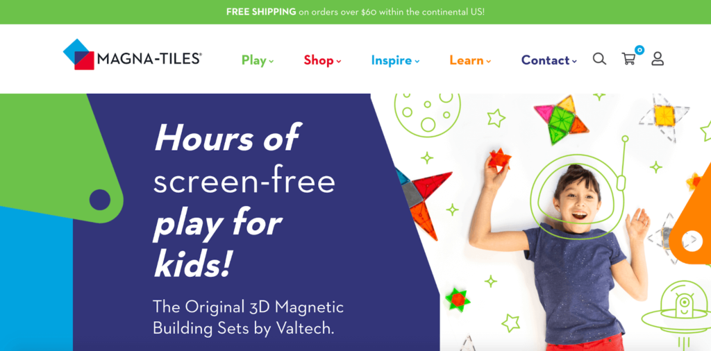
Next up is this e-commerce homepage example from Magna-Tiles, a children’s toy company that sells one-of-a-kind 3D building sets.
Browse through it, and you’ll quickly see that this homepage checks all of the boxes. It starts with a stunning on-brand image above the fold, along with a concise UVP.
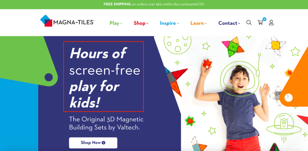
I’m sure “hours of screen-free play for kids” sounds pretty good to parents with children up to their ears in TVs, computers, tablets, and smartphones.
Again, without having to scroll any lower than the above-the-fold section, Magna-Tiles establishes what they sell and why their products have value.
Then, they swiftly jump into their featured Magna-Tiles Sets, which highlights their best products with more amazing visuals and intuitive navigation.
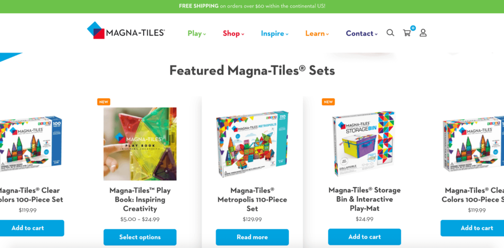
I also like how they include these arrows that allow shoppers to see even more featured products without having to do any manual searching.
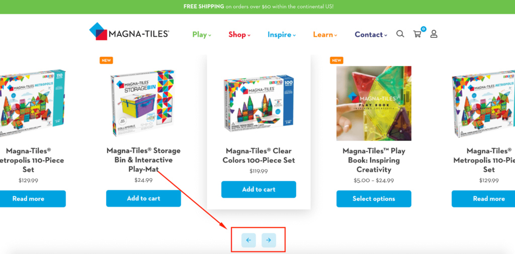
It’s all about making it dead simple for shoppers to find what they need without having to do any heavy lifting.
Beneath that, Magna-Tiles features some of their top collections like their Magnetic Blocks, along with an easy-to-follow link.
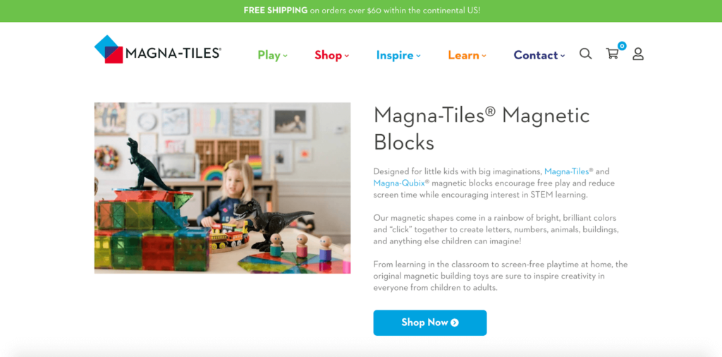
Then, they explain the key benefits of children playing with their unique products. For example, they mention how children can learn through play…
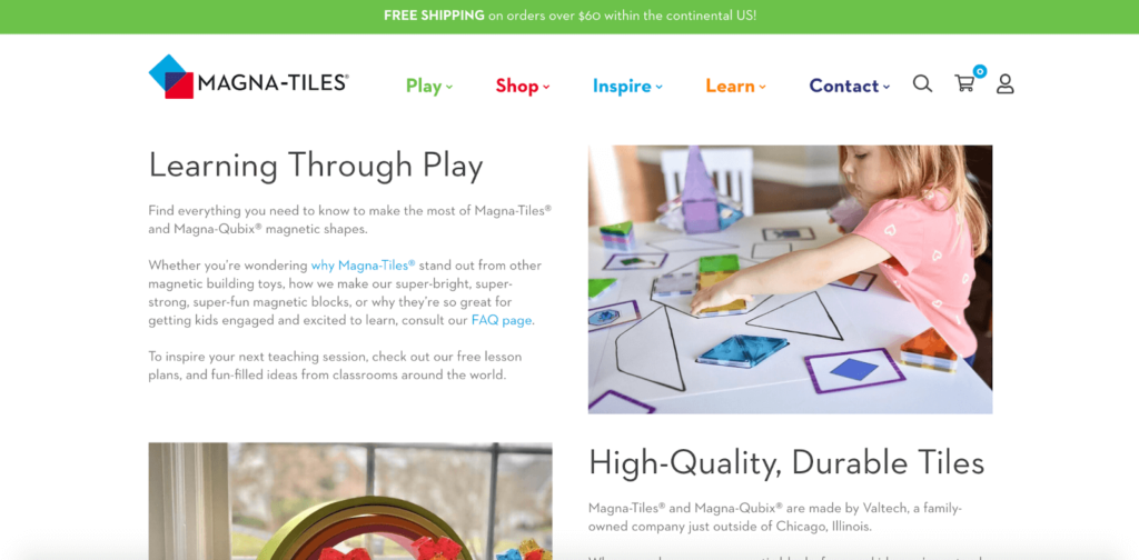
…and become more inspired and creative.
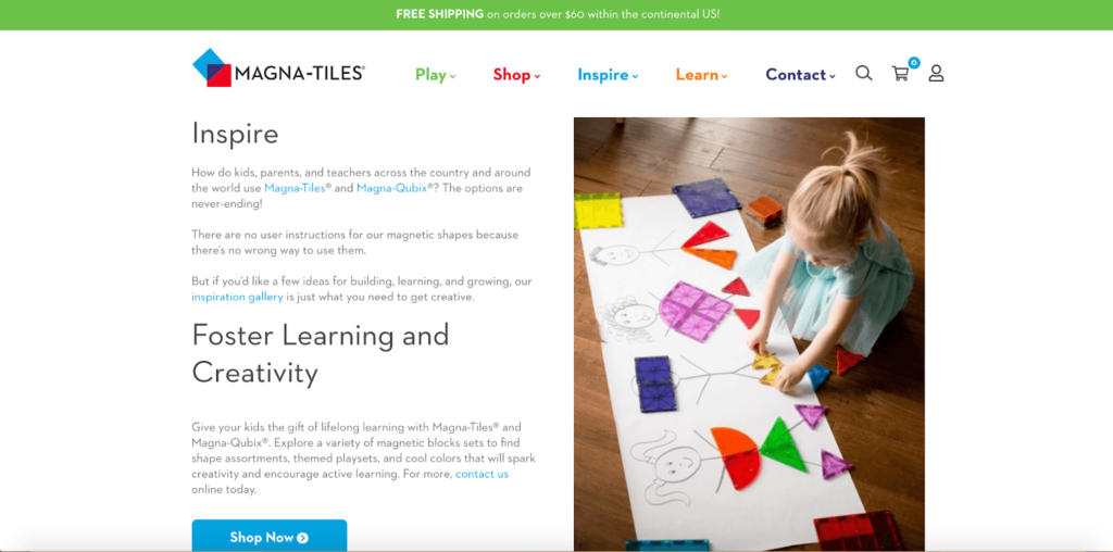
I also like how they elaborate more on their UVP with this section.
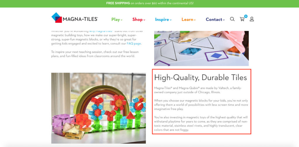
Here, they let shoppers know their products are made from top-of-the-line materials that are built to last and they’re a family-owned company.
One last thing to point out is the sticky navigation menu that’s always visible regardless of how far shoppers scroll down.
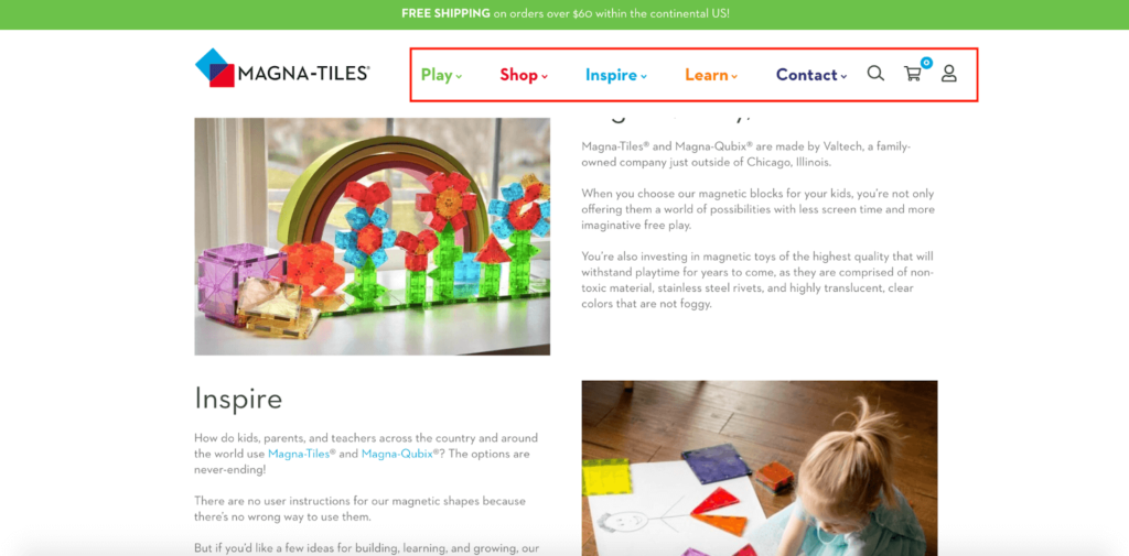
It’s a nice way to keep shoppers oriented at all times and allows them to conveniently search for whatever products they may be interested in. The different colors also add a nice visual touch.
This homepage creates a smooth, seamless journey for shoppers that provides them with a nice introduction to Magna-Tiles and then fully unpacks their products.
4. Burrow
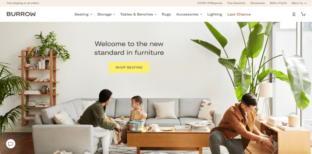
Burrow makes “clever, uncompromising furniture and other nice things fit for modern life at home.”
I love this e-commerce homepage because it’s robust with plenty of jaw-dropping visuals, but it still incorporates minimalist design practices that prevent it from feeling uncluttered.
Their above-the-fold content hits its mark by featuring multiple products, including a couch, shelf, and coffee table, and features an A+ UVP of “welcome to the new standard in furniture.”
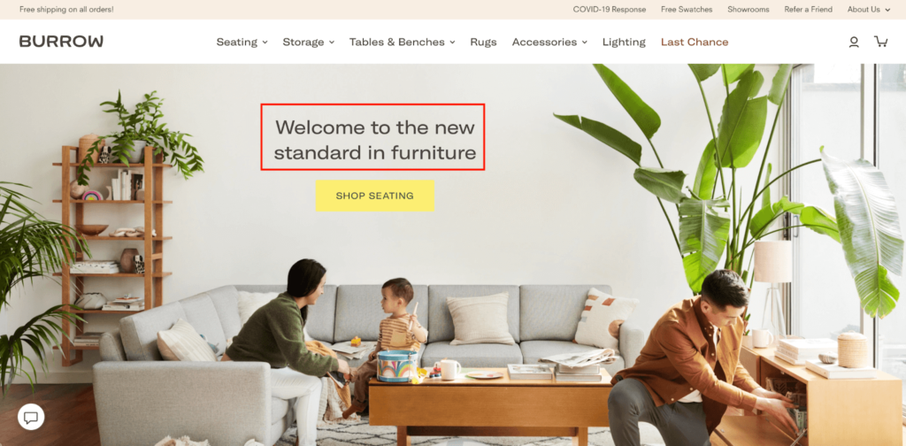
This helps Burrow get started out on the right foot with shoppers and is more than enough to motivate them to explore their e-commerce site.
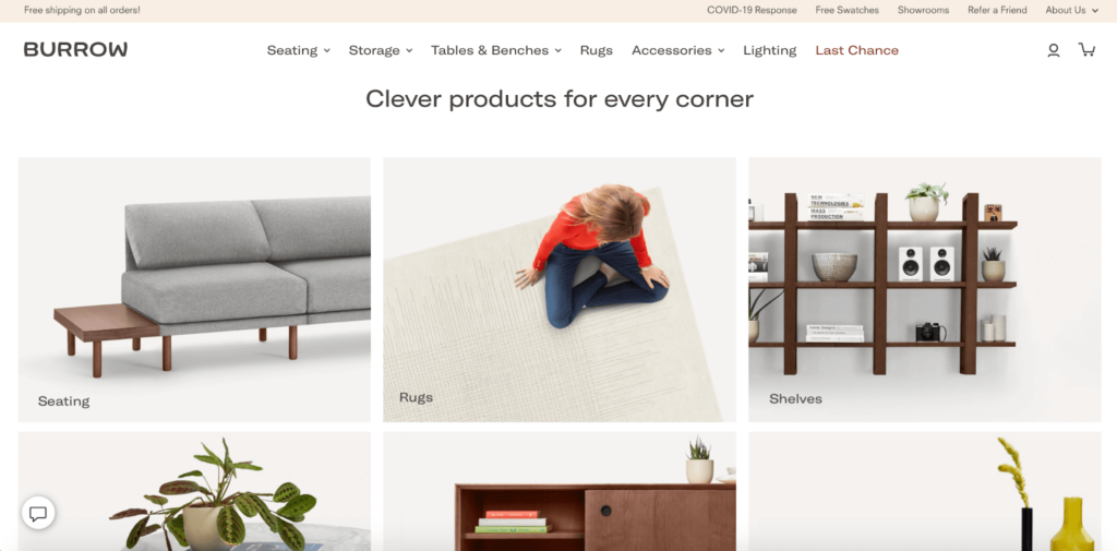
The section below that features collections of some of their top products, like seating, rugs, and shelves, which makes for simple browsing.
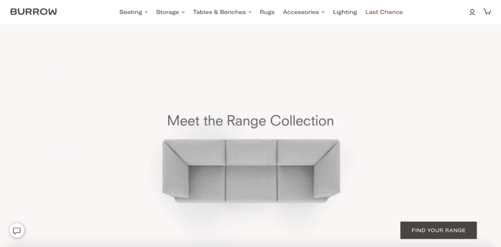
Beneath that is this section featuring “The Range Collection,” which offers “innovative sofa and sectional configurations in Burrow’s contemporary modular seating system.”
It’s totally dynamic and changes shapes, instantly giving shoppers a sneak peek at just a few of the possibilities. Here’s the first thing shoppers see.
Then it transitions into this…
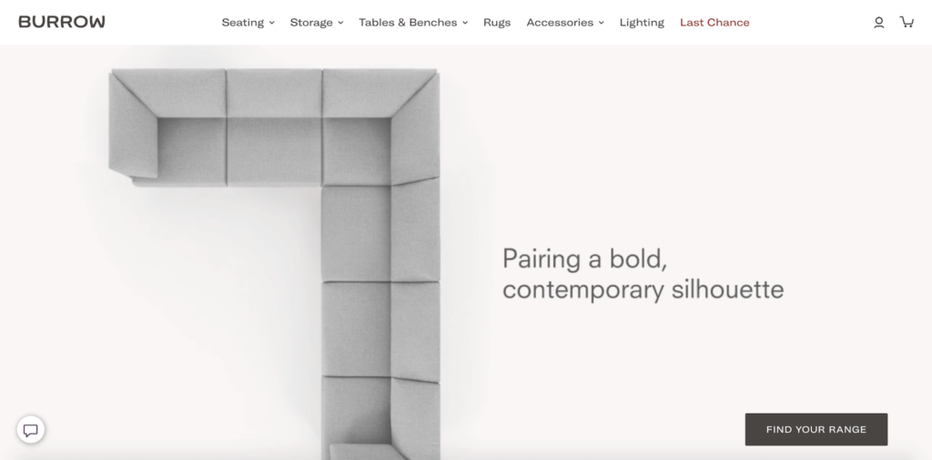
…then to this.
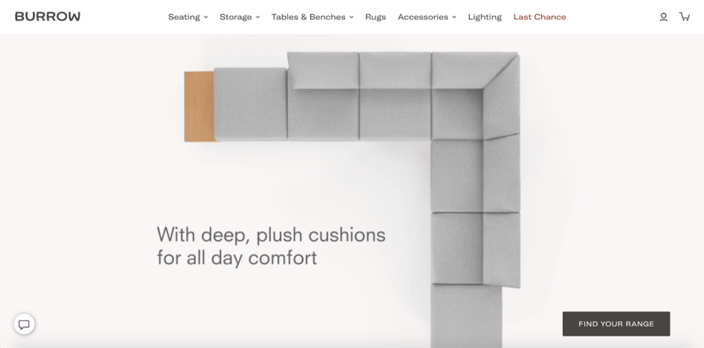
It truly is eye-popping and is a massive attention grabber. Make sure to check out Burrow’s homepage to see the full sequence in action for yourself.
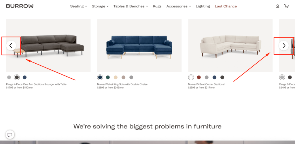
After that, the brand highlights a few additional sofas and sectionals, along with color options and pricing information.
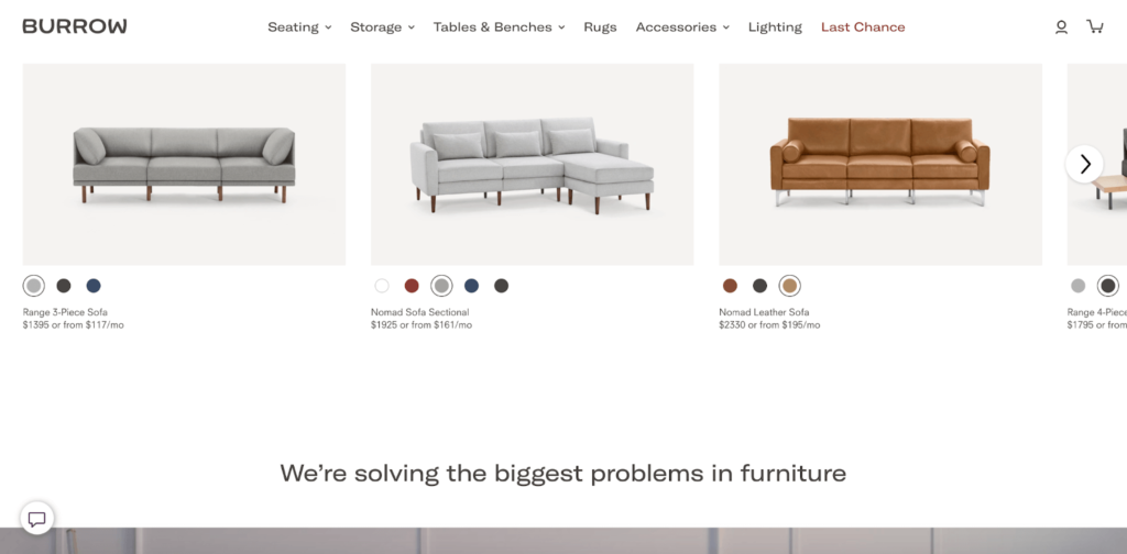
And by clicking these arrows, shoppers can see even more products than the three that are initially displayed.
Scroll down and you’ll see an additional video featuring a couple unboxing and setting up one of Burrow’s couches at home.
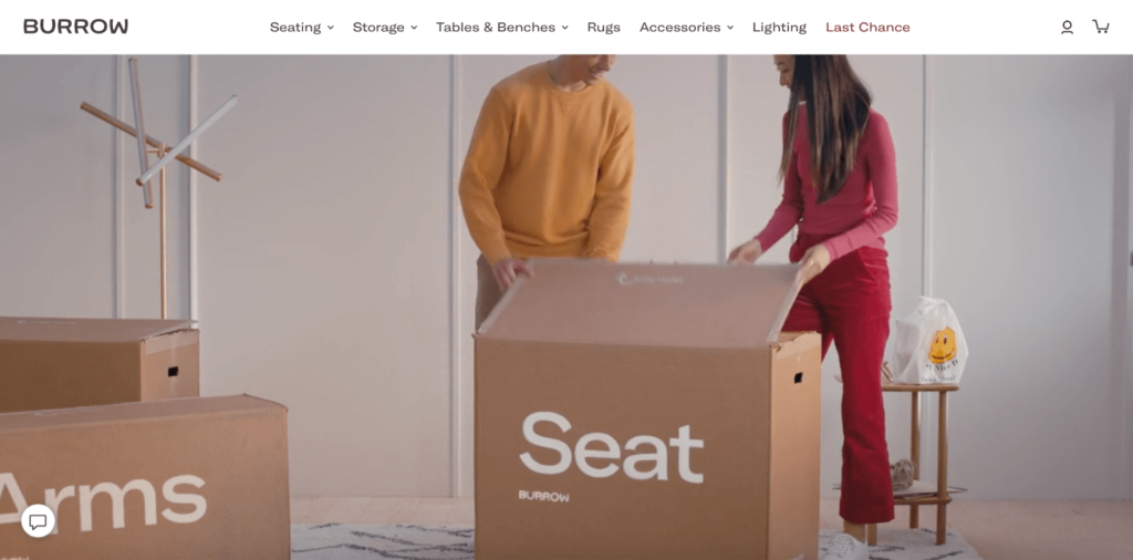
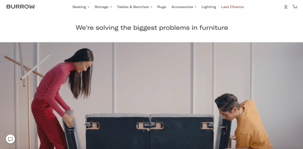
It shows how easy the process is and how customers don’t have to deal with the typical drama of moving around big, bulky furniture like they’re used to.
This video helps bring the concept to life and connect the dots for shoppers so they can fully grasp the benefits of buying from Burrow. And beneath the video is this section that unpacks the benefits even more.
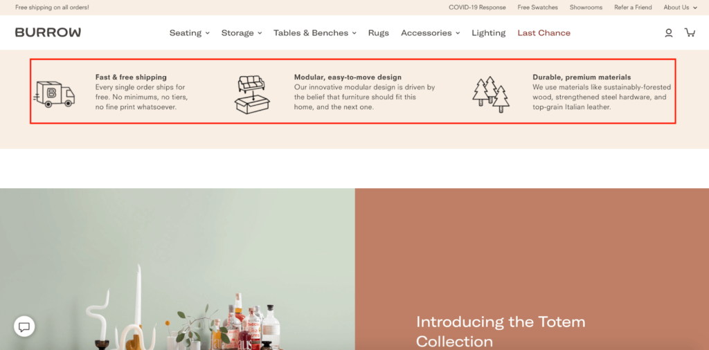
Here they mention there’s fast and free shipping on every single order, modular, easy-to-move design, and products are made from durable, premium materials that are sustainably sourced.
The last thing I want to point out is the amazing testimonials Burrow includes.
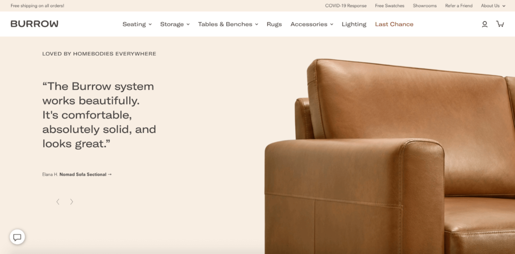
This adds even more credibility and can be just what it takes to get many shoppers over the buying hump where they feel compelled to make a purchase.
So, there’s a lot you can take away from this e-commerce homepage example and apply to your own design.
5. Leaf & Clay
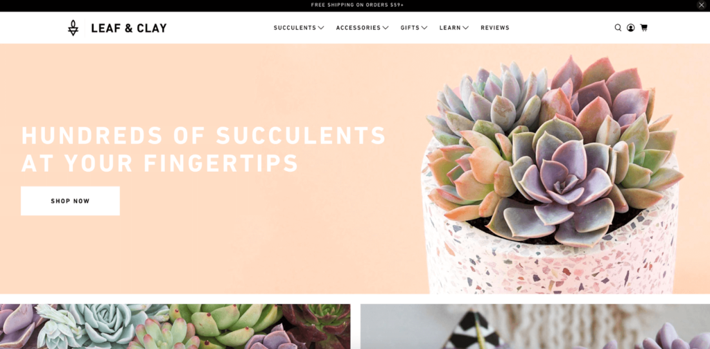
This final example is from the Internet’s go-to company for beautiful succulent plants, Leaf & Clay.
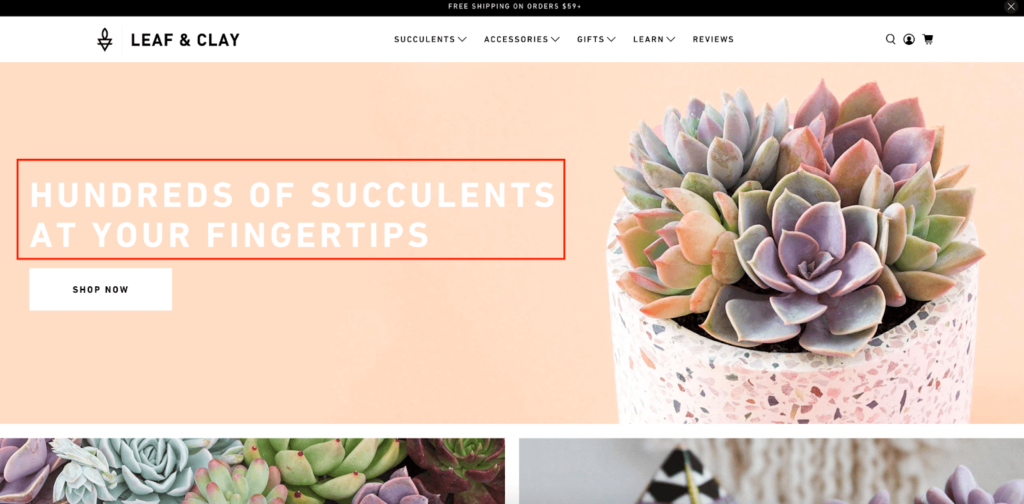
As you can see straight away from their above-the-fold content, visuals are baked into this company’s brand identity, and shoppers are instantly hit with aesthetic bliss right out of the gate.
There’s a great-looking succulent in a pot and a rock-solid UVP of “hundreds of succulents at your fingertips” where Leaf & Clay doesn’t waste any time explaining who they are and what they’re all about.
Below that is this section which also features drool-worthy images with quick links to their plants and pots.
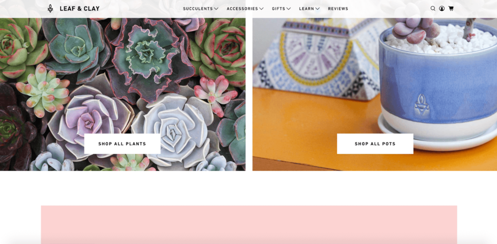
With virtually no cognitive effort, shoppers have a clear idea of what Leaf & Clay is selling and can get directed to product selections.
Then, shoppers see a testimonial section, which includes a flattering customer review, along with a link to over 3,000 more.
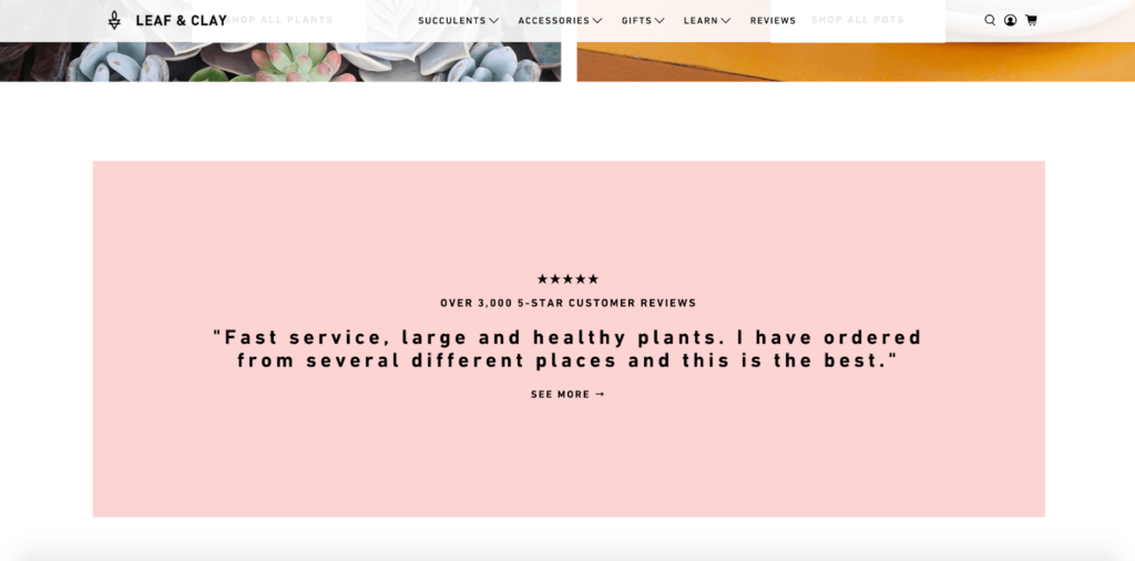
Typically, you see reviews a bit further down on e-commerce homepages, but I think this works well here.
After the testimonial, Leaf & Clay makes it easy for customers to shop by category.
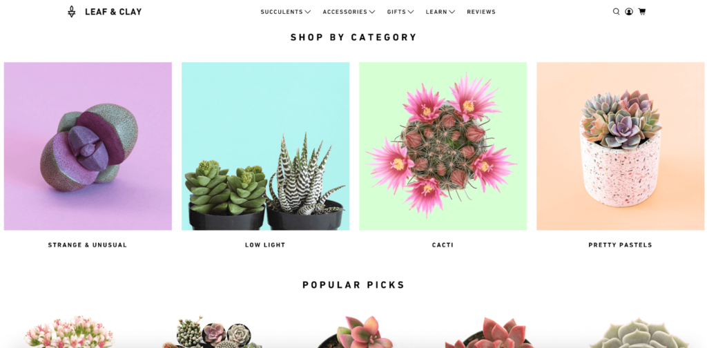
Again, the visuals are next level and contrast wonderfully with the clean, white background.
Next, there are popular picks where shoppers can see the top-selling products, along with pricing information to give them an idea of how much they can expect to pay for a particular type of succulent.
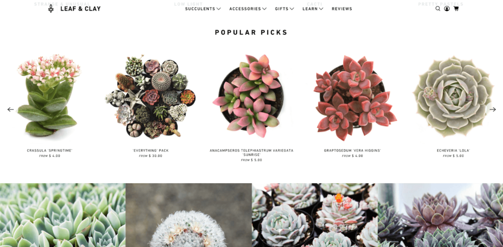
Last but not least is this area at the bottom of the homepage which displays yet even more brilliant pictures of their products.
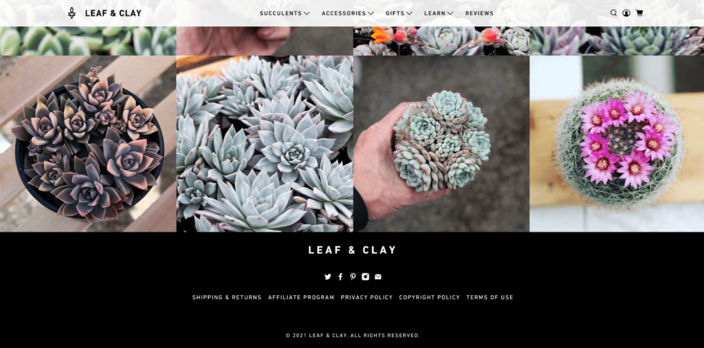
Surprisingly, these images don’t link to anything else on the site. They’re simply there to show in vivid detail how beautiful Leaf & Clay’s succulents are.
When it comes to eye-popping e-commerce homepage examples, it doesn’t get much better than this.
And it definitely incorporates several of the best practices I went over in my previous post, mainly:
- Using a simple yet stunning design;
- Displaying key information first;
- Giving a clear UVP; and
- Featuring top products.
This homepage is the total package and shows how big of an impact great aesthetics can have.

Conclusion
I can’t stress enough the importance of visual appeal in e-commerce homepage design.
With 94% of first impressions being design-related, this is what gets your foot in the door with shoppers and makes them want to explore your store.
On top of that, it’s vital to follow best practices like providing a winning UVP, making your site simple to navigate, and making your top products stand out.
The e-commerce homepage examples I’ve included above all do an amazing job of (1) captivating shoppers with brilliant images and (2) creating a streamlined experience to increase the odds of making a conversion.
Taking the time to analyze and apply these concepts to your own e-commerce homepage should ensure your design fires on all cylinders so you can turn more visitors into paying customers.


