Fashion and apparel brands earn an average of $36 for every dollar they put into email. That puts email ahead of paid social, search ads, and influencer partnerships for pure return on investment.
Yet most fashion emails still look like they rolled off the same assembly line. Same hero image, same "Shop Now" button, same sitewide 20% off.
The brands winning inboxes right now treat every send as a brand experience. They match the email type to the customer's lifecycle stage. And they let voice, not discounts, do the heavy lifting.
Below, you'll find 15 fashion email marketing examples from real apparel brands, organized by lifecycle stage: welcome and engagement, promotional and seasonal, conversion and urgency, and retention and loyalty. Each includes a teardown of what works and how to steal it for your own store.

Table of Contents
- What Makes a Great Fashion Email?
- Welcome and Engagement
- Promotional and Seasonal
- Conversion and Urgency
- Retention and Loyalty
What Makes a Great Fashion Email?
A great fashion email does four things well.
It's visual-first. Fashion is a visual category. The strongest fashion emails feel like a lookbook, not a newsletter, because the design sells the product before the copy gets a chance.
It's mobile-optimized. Most fashion email opens happen on phones, so layouts need to be thumb-friendly with stacked sections and large tap targets.
It carries a distinct brand voice. Fashion subscribers sniff out generic copy in a single scroll.
Your emails should sound like an extension of your website, your Instagram, and your packaging.
And it's segmented by lifecycle stage. The welcome email shouldn't look or feel like the win-back. The fashion email examples below are organized by that exact principle, from first touchpoint to referral program.
15 Fashion Email Marketing Examples by Lifecycle Stage
Every fashion email below comes from a real apparel brand's actual sends. I've grouped them by lifecycle stage so you can skip straight to the examples that match your current priorities. For each one, I'll break down what the brand did, why it works, and how to apply the approach.
Welcome and Engagement
1. Cart Recovery That Runs on Brand Voice, Not Discounts

The first thing you notice about Shinesty's abandoned cart email isn't the product. It's the sender address: [email protected].
 The entire email leans into absurdist humor. A milk-carton "missing" graphic features the abandoned product, and the copy references a fictional character named Dirty Mike. There's no discount anywhere in sight.
That milk-carton creative is doing copywriting work all on its own. When your brand voice is this well established, a strong visual can replace an entire paragraph of persuasion.
Most cart recovery emails lead with a coupon code. Shinesty leads with personality. The click-through is curiosity, not savings.
If you're building cart recovery flows in a tool like Drip, try split-testing a voice-led version against your discount-led one. You might find that humor recovers more carts than 15% off ever did.
The lesson: Cart abandonment doesn't have to be discount-driven. When the brand voice is strong enough, it becomes the offer.
2. Browse Abandonment That Weaponizes Scarcity

"Caught you lurking."
That subject line does the heavy lifting for Rebel8's browse abandonment email. It's confident, slightly cheeky, and perfectly on-brand for a streetwear label. Notice that the subject line and the body speak in the exact same voice. That consistency is what makes the email feel intentional rather than automated.
But there's something else going on. This email is doing two jobs at once: browse abandonment AND scarcity.

Rebel8 reminds the subscriber that their products are limited-edition and "sell out forever."
At the bottom, a "You might also like" cross-sell row hedges the bet. If the original product no longer interests the subscriber, there's still a reason to click.
The lesson: Browse abandonment doesn't need a discount when the product itself is scarce. The threat of missing out is the offer.
3. CSR Communication That Makes the Buyer the Hero
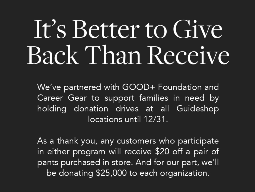
Bombas doesn't just tell you they donate socks. They make you the hero of the donation.
Their partnership emails frame the customer's purchase as the trigger for social impact. Buy a pair, and someone in need gets a pair.
What makes this fashion email stand out is the framing. The customer isn't a spectator watching Bombas do good from the sidelines. They're an active participant. Every purchase is positioned as a reciprocal good deed, which deepens the emotional connection to the brand. For more on this approach, see these social responsibility email examples.
The lesson: CSR emails work when the customer feels like a participant, not a spectator. If your brand has a social mission, put the buyer at the center of that story.
4. Segmented Surveys That Actually Get Responses
The North Face doesn't blast a generic survey to their entire list. They segment it.

The subject line includes the subscriber's first name and references women's apparel specifically.
 "As a valued member of our community" reframes the survey as VIP access rather than a chore. This is what segmented surveying actually looks like in practice.
They're not asking everyone for feedback. They're asking the people whose answers actually matter for that product category.
If you're collecting zero-party data through surveys (and you should be), segment the ask. A survey sent to your most engaged women's apparel buyers returns more useful data than one sent to 50,000 mixed subscribers. Store those responses as custom fields in your CRM, and you've got personalization fuel for every email that follows.
The lesson: Segmented surveys outperform generic ones. Ask the right people, and they'll actually tell you what they want.
Promotional and Seasonal
5. A Giveaway With an On-Brand Prize
Levi's ran a "Lifetime Supply of Jeans" giveaway. The prize itself is the entire strategy.
 It's tempting to give away gift cards or unrelated gadgets because they attract more entries. But those entries are unqualified. Someone who enters to win an iPad isn't necessarily a jeans buyer. Someone who enters to win a lifetime of Levi's? They're already a fan.
An on-brand prize means every entry is a signal of genuine product interest. That's a warmer lead for your welcome flow and a more accurate data point for segmentation.
Ban.do offers a complementary example of a cross-channel giveaway promotion.
 They ran a similar contest on Instagram and used email to amplify participation, proving that the two channels can multiply reach without diluting audience quality. For more inspiration, check out these giveaway ideas.
The lesson: Your giveaway prize should reinforce your brand. On-brand prizes attract on-brand leads.
6. A Product Launch Built on Story, Not Specs
Huckberry doesn't just announce new products. They tell the story behind them.
 Their launch emails lead with why the product was made and who it's for, not just what it costs. There's a narrative arc: the problem, the design process, the payoff. It reads more like a short editorial than a product announcement. See more product launch email examples for this storytelling approach in action.
This approach works because fashion purchases are identity purchases. The buyer isn't just buying a jacket. They're buying the story they'll tell when someone asks where they got it.
The lesson: Product launches that include backstory outperform generic "New Arrival" announcements. Tell your subscribers why you made something, and they'll care more about buying it.
7. A Seasonal Sale That Removes Every Decision
New Look's Christmas email collapses the decision-making process into a single visual. "Gift Yourself With Up To 70% Off" merges two motivations into one headline: look festive and save money.
 Below the headline, a six-product grid shows struck-through original prices next to the sale prices. It's the conventional seasonal sale layout.
The email doesn't ask the reader to think. It shows six concrete options at six concrete prices. No "browse our collection" ambiguity.
When you're designing seasonal clothing brand emails, specificity beats generality every time. Show the products. Show the prices. Remove every decision the subscriber doesn't need to make.
The lesson: Seasonal emails work when they collapse the decision. Concrete products and concrete prices outperform vague "shop the sale" CTAs.
8. A "Just Because" Promotion That Bypasses Skepticism
"$40 off dresses because it's too damn hot out."
 That's AYR's entire justification for the discount. And it works.
Robert Cialdini's famous copy-machine study found that people were significantly more likely to comply with a request when given any reason, even a trivial one. The word "because" itself is the psychological trigger. AYR leans into this: the reason doesn't have to be logical. It just has to exist.
This is one of the simplest boutique email ideas you can borrow. If you're sitting on inventory or want to spike midweek revenue, you don't need a holiday or a product launch to justify the discount. Give a low-stakes reason ("because it's Wednesday," "because summer's almost over") and attach the offer.
The honesty feels refreshing. And refreshing gets clicks.
The lesson: The reason for the discount doesn't have to be good. It just has to be there.
Conversion and Urgency
9. Scarcity That's Specific, Visual, and Believable
Most "selling fast" claims are vague. Fabletics makes scarcity tangible.
 Their email features individual progress bars showing "% claimed" for each product. It's not a generic "limited stock" banner across the top. It's item-level scarcity data, and that specificity makes the urgency believable.
 The subject line ("Seray, this is so you") softens the hard sell. Personalization and scarcity are working together here: the email feels curated rather than pushy. It reads as "we picked these for you, and they're going fast," not "BUY NOW BEFORE IT'S GONE."
If you're using scarcity in your fashion email marketing, make it specific and visual. "Selling fast" is generic. "200 made, 60% claimed" is concrete. Tie the urgency to individual products rather than the sale as a whole.
The lesson: Scarcity converts better when it's itemized and visual. Concrete numbers beat vague urgency every time.
10. A Birthday Email That Knows When to Stop
 The sender address is [email protected]. The headline is "Let's celebrate."
 Even in a birthday email (one of the most templated formats in all of email marketing), Outdoor Voices stays completely on-brand. That consistency matters. The generic "Happy Birthday! Here's 20% off" approach gets lost in an inbox full of identical messages.
What makes this one work is the restraint. One discount, one code, one CTA button. No product grid, no cross-sell row, no secondary offer competing for attention.
Birthday emails succeed because they're expected and welcome. Your subscriber already feels positive when they see the message. Don't overcomplicate it.
The lesson: A birthday email needs one offer, one code, and one button. Anything more fights against the goodwill that got the email opened.
Retention and Loyalty
11. A Win-Back Email That Sounds Like a Real Person Wrote It
 "Goodbye Old Pal."
Mugsy's win-back subject line reads like a breakup text. The opener doubles down: "You haven't read our letters in over a year, buddy."

This is a voice-led re-engagement email, not a discount-led one. The personality is the strategy. It sounds like a real person wrote it, because someone at Mugsy probably did.
Here's the counterintuitive move: Mugsy includes an unsubscribe link right in the body of the email. Not buried in the footer. In the actual copy. That transparency makes the entire message feel honest rather than desperate.
A 5-star review block at the bottom does the closing work without the email having to ask for anything directly. Just social proof reminding the subscriber why they signed up in the first place.
The lesson: The generic "We miss you, here's 20% off" gets ignored. A win-back email that sounds human, and gives the subscriber a genuine out, gets opened.
12. VIP Rewards That Lead With Access, Not Price

"Black FRYEday."
That brand-specific pun earns the open. It's more memorable than any generic Black Friday subject line because it only works for one brand in the world. That's the point.
 But the real strategy here is the framing. This isn't just a sale announcement. It's early access for loyalty members. The discount isn't bigger than what everyone else eventually gets. The access is earlier.
That distinction matters for fashion emails. VIP subscribers don't just want a fatter coupon. They want to feel like insiders. Early access, first dibs on limited drops, exclusive colorways. These are status signals, not savings plays.
The lesson: VIP emails should feel like access, not just a bigger discount. The early-access frame turns a sale into a reward.
13. Two Approaches to Referral Programs
Two clothing brand emails show three different approaches to referral incentives.
ASICS adds structure. "Best. Friend. Ever." is the headline, paired with a 10% discount and a three-step "how it works" breakdown. That structured walkthrough kills ambiguity and increases participation, because when the referral process looks easy, more people follow through.
 Bombas goes a different direction entirely: a free pair of socks instead of a percentage off. The product itself becomes the reward, which reinforces their "comfort everyone deserves" brand message while giving the referrer something tangible.
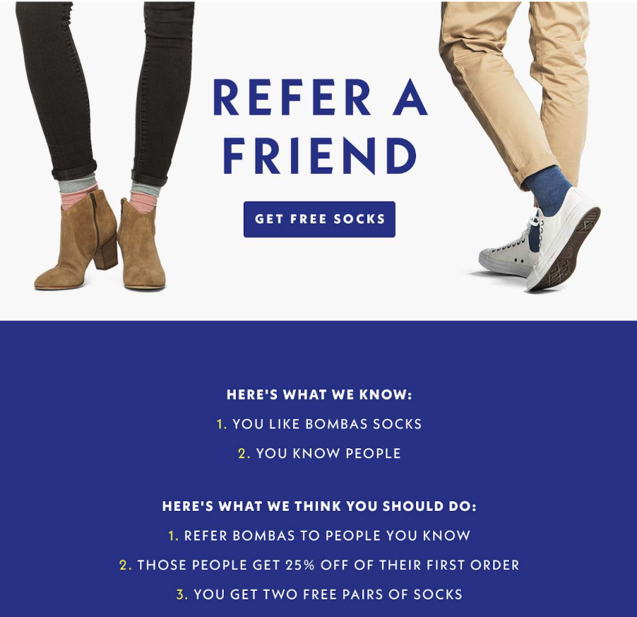 The lesson: Referral incentives don't have to be cash discounts. The right incentive depends on what your brand sells and how repeatable the purchase feels.
Conclusion
The common thread across all 15 fashion email marketing examples isn't budget, design tools, or list size. It's the fit between brand voice and email type.
Shinesty's humor makes sense in a cart recovery flow. Mugsy's honesty makes sense in a win-back. Outdoor Voices' restraint makes sense in a birthday email. Every example above works because the brand matched its personality to the lifecycle moment.
If you're ready to build lifecycle-segmented fashion email flows for your own brand, start your free Drip trial. Automation, segmentation, and a visual email builder, all in one platform built for e-commerce.