Quality email marketing has a lot of moving parts. You’ve got to develop a compelling offer, nail your subject line, craft engaging copy, design a must-click CTA…
…the list goes on. So it’s no surprise that the humble email footer tucked away at the very bottom of your message doesn’t get a ton of attention.
I think it’s time that changed. In truth, grabbing our audience’s attention is difficult. Once you’ve persuaded a reader to open your email, every single pixel counts.
So why would you go to all the effort of designing a fantastic email, only to let yourself down with a sloppy email footer?
With that in mind, in this article, I’ll round up the best email footer examples I could find from trawling our vast email marketing swipe file. With each example, I’ll show you how including the right information in your email footer can:
- Improve click-throughs;
- Boost email deliverability;
- Satisfy your legal obligations;
- Provide customer support;
- Build social engagement;
- Drive conversions; and
- Much more
All that from the innocuous-seeming block of copy and links at the end of your email.
Sounds good, right? So let’s get into it…
The 9 Best Email Footer Examples We’ve Seen
- 1. Drunk Elephant: Make It Easy for People To Unsubscribe
- 2. Cult Beauty: Use Your Email Footer To Drive Referrals
- 3. Scout & Co: Encourage Subscribers To Check Out Your Socials
- 4. Beauty Bay: Ask Subscribers To “Whitelist” Your Email Address
- 5. MORI: Add Social Proof To Your Email Footer
- 6. Mean Mail: Thank Your Customers
- 7. Violet Grey: Help Customers Find Answers
- 8. SSENSE: Encourage Customers To Download Your App
- 9. Taylor Stitch: Remind Customers About Your Mission & Values
1. Drunk Elephant: Make It Easy for People To Unsubscribe
Look, I get it: building an email list isn’t easy.
Indeed, 36 percent of email marketers in one study cited low email subscriber volume as a significant barrier to success, while 50 percent said the same about lacking an effective email list strategy.
But that doesn’t mean you should try to cling to subscribers who simply don’t want to hear from you any longer.
For one thing, organizations are legally required to make it easy for people to unsubscribe from marketing communications.
Under the EU’s General Data Protection Regulation (GDPR), all citizens have “the right to privacy and the right to be forgotten,” while the US CAN-SPAM Act does the same sort of thing.
In the case of GDPR, severe infringements can result in fines of up to €20 million, or four percent of the infringer’s global revenue from the previous year—whichever amount is greater.
But it’s not just about fulfilling your legal obligations.
The thing is, it simply doesn’t make sense to retain subscribers who don’t interact with your email marketing.
In fact, doing so will actively hurt your campaigns.
The lower your email engagement, the more likely mailbox providers and spam filters are to view your messages as junk.
So if a big proportion of your email subscribers never open your messages, your email deliverability will drop through the floor—and that’s very bad news.
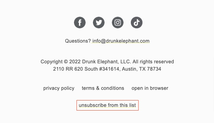
This is why your email footer should include a clear unsubscribe link, just like this example from Drunk Elephant:
 (N.B., it’s not enough to just include an unsubscribe link—you need to honor unsubscribe requests in a timely fashion. Under the US CAN-SPAM Act, this needs to happen within ten business days.)
At the same time, it’s important to bear in mind that people unsubscribe from mailing lists for different reasons.
For some, the content in your emails may not be relevant anymore. For instance, if you’re a baby brand, there’s a good chance people won’t want to receive your communications once their child has outgrown the products you sell.
But the biggest reason, by far, for email unsubscribes, is sending frequency.
HubSpot found that 34 percent of email unsubscribers opted out because they were receiving one or more emails a day from the same brand, while 17 percent unsubscribed because the organization was sending them 1+ emails a week.
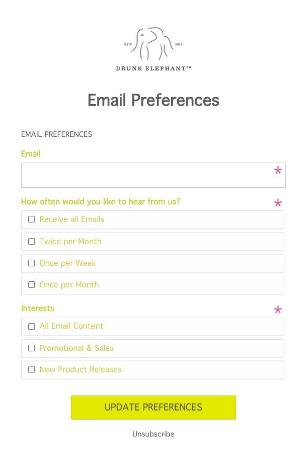
That’s why it pays to give potential unsubscribers the option to reduce the number of emails they receive from you rather than to unsubscribe completely—just like Drunk Elephant does here:
 Sure, it means you’ll reach those subscribers less often.
But if it makes them more likely to open and click through from your emails, it’s a small price to pay.
2. Cult Beauty: Use Your Email Footer To Drive Referrals
Referred customers are worth their weight in gold.
An analysis from researchers at Frankfurt’s Goethe University and the Wharton School of the University of Pennsylvania discovered that customers referred by other customers:
- Are more loyal
- Generate higher profit margins
- Show a higher customer lifetime value
In other words, it’s clearly in your best interests to drive as many customer referrals as possible.
So why not add a refer-a-friend link to your email footer?
That’s what Cult Beauty does in this email footer example:
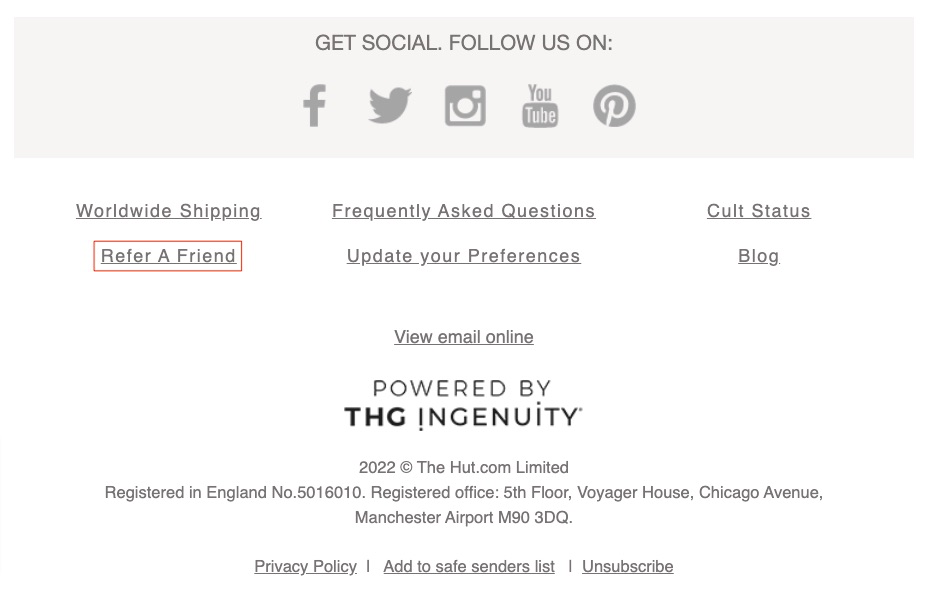 Sure, it’s unlikely that adding a referral link is immediately going to generate a ton of referrals.
But every little helps, so what’s the harm in trying?
(N.B. want more ideas on how to boost customer referrals? Check out my roundup of 13 e-commerce referral email examples that get more sales.)
3. Scout & Co: Encourage Subscribers To Check Out Your Socials
Think how busy your email recipients’ lives are.
They receive literally hundreds of emails every single day.
So if they’ve taken the time to scroll all the way through your email, it likely means one of three things:
- They’re searching for the unsubscribe link
- They’re me, and they’re compiling a list of email footer examples
- They really like you
We’ve already covered the first of those three options, and the second is pretty uncommon.
So what if it’s option three: they love your brand, product, and content?
In that case, it stands to reason that you should give them more opportunities to engage with you.
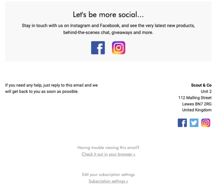
And one of the smartest (and simplest) ways to do that is to add links to your social profiles in your email footer.
But don’t get lazy and simply include a Facebook icon; give your audience some encouragement by explaining what they’ll get from following your socials, just like Scout & Co does here:
4. Beauty Bay: Ask Subscribers To “Whitelist” Your Email Address
We’ve already discussed the thorny subject of email deliverability.
Once you’ve spent a bunch of time crafting a fantastic email marketing campaign, the last thing you want is for half your emails to end up in spam folders.
There are lots of ways to guard against that worst-case scenario.
First and foremost, you can make sure you’re only sending to people who actually want to receive your emails.
If you consistently send them engaging content that they love to read and click, deliverability shouldn’t be a big issue.
But to make doubly sure, you can ask subscribers to “whitelist” your email by adding it to their address book, like in this email footer example from Beauty Bay:
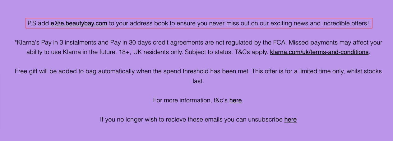 When someone whitelists your email address, your future communications are far more likely to end up in their main inbox (rather than landing in the spam folder or, even worse, being rejected altogether).
It’s definitely worth asking new subscribers to whitelist you in your welcome emails, but it also makes sense to keep asking in your email footer, just in case they missed your request the first time around.
5. MORI: Add Social Proof To Your Email Footer
Everyone in the e-commerce world understands the value of social proof.
But it makes a difference where that proof comes from.
Research from Trustpilot and Canvas8 discovered that among consumers in the US and the UK, family and friends are (unsurprisingly) the most trusted source of recommendations:
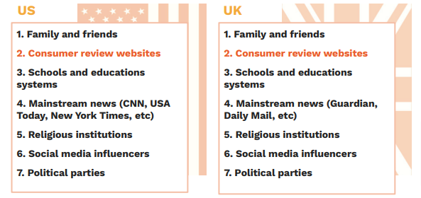 Review websites were found to be the second most trustworthy source, whereas mainstream news publications lagged in fourth place, and social media influencers came in sixth.
Unfortunately, you probably can’t include a testimonial from a friend or family member of everyone on your email list.
But if you use consumer review platforms like Google Reviews, TestFreaks, or Trustpilot, you should definitely include your average rating, as MORI does here:
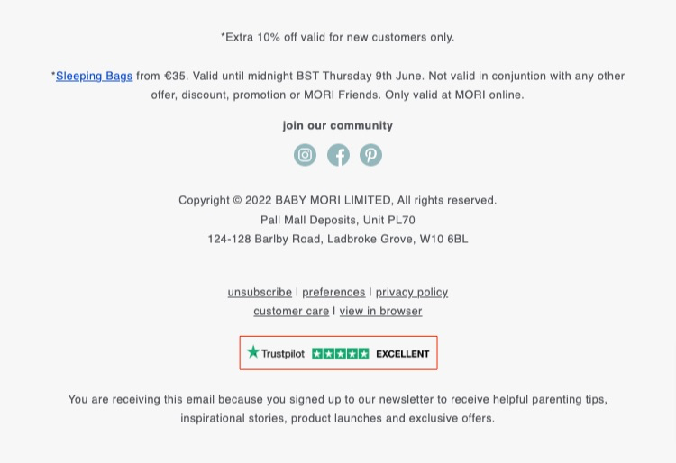 And if you can take things a step further by adding a short but glowing testimonial or two, all the better.
6. Mean Mail: Thank Your Customers
You love your customers, right?
Without them, you literally wouldn’t have a business.
So it’s only natural that you want to thank them every now and again.
You might send them a personalized offer on their birthday or say “thanks” for their latest purchase in your order confirmation emails.
But there’s no such thing as being too polite, so why not take a leaf out of Mean Mail’s book by adding a “thank you” to your email footer as well?
 I love that message because it makes the customer feel good about themselves. They’re not just spending a bunch of money on online shopping; they’re supporting independent retailers.
That could be all the convincing they need to buy again.
7. Violet Grey: Help Customers Find Answers
At the point when a customer opens your marketing emails, they might have any number of questions.
Maybe they want to track their order, check out your shipping policy, or learn about the features of a certain product.
They might have been meaning to find the answer for days or weeks—maybe opening your email has jogged their memory.
So why not include a link to frequently asked questions or your self-help resources (or both) in your email footer?
That’s what Violet Grey does in this email footer example:
 Best of all, once customers realize there’s a help link in your footer, they’ll know where to find it next time they have a question or encounter a problem.
8. SSENSE: Encourage Customers To Download Your App
So you’ve taken the time to develop your own e-commerce app.
Evidence suggests that was a smart decision.
Indeed, research from Heady found that almost three-fifths of customers believe mobile apps are more convenient than other channels for shopping, with:
- 62 percent describing them as more convenient
- 44 percent saying they have easy user interfaces
- 41 percent believing apps offer better prices or promotions
But building an e-commerce app is only one part of the battle—next, you have to persuade people to download (and use) it.
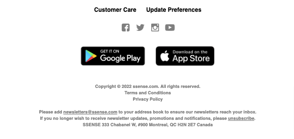
Your email footer could be the perfect opportunity to remind customers that your mobile app exists.
It doesn’t need to be a particularly complicated message. Just incorporate links to your app on Google Play and the Apple App Store, just like fashion retailer SSENSE does here:
9. Taylor Stitch: Remind Customers About Your Mission & Values
Today, consumers don’t just want to know that you sell a great product for a reasonable price—they want to know what you stand for.
That’s particularly true among younger demographics.
Indeed, 83 percent of Millennials say it’s important for the companies they buy from to align with their beliefs and values.
So if you’ve taken the time to formalize your mission statement and brand values, it makes sense to shout about them at every opportunity.
That could mean including your company mission in your email footer, as Taylor Stitch does here:
Conclusion
Want to know the best thing about leveling up your email footer?
None of the examples in this article involve doing anything you weren’t already doing.
Got a referral program? Add it to your footer. Got a great rating on a review platform? Add it to your footer. Built an app? Add it to your footer.
You get the picture.
And while the footer section might not be the most valuable piece of email marketing real estate, there’s a good chance that people who scroll that far down the page will be pretty engaged with your brand.
So why not point them in the direction of your other channels, platforms, content, or promotions?

