Let’s be honest. Your shipping policy page(s) will never be the sexiest part of your e-commerce site.
It won’t be the most visually appealing or the most interesting to read, and it certainly won’t drive the most traffic. It won’t directly make you any money either—no one’s going to buy anything straight from your shipping page.
But I guarantee you, if your shipping policy isn’t up to the mark, it’ll definitely cost you money. To illustrate my point, let’s take a look at the top 10 reasons why consumers abandon their shopping carts during the checkout process, as compiled by the Baymard Institute:
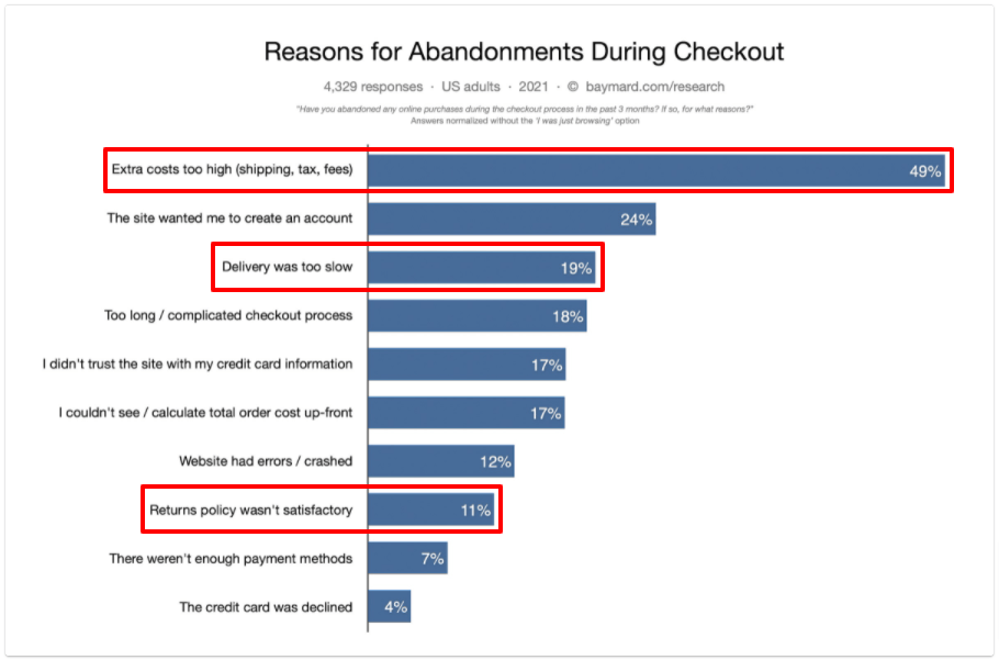
As you can see, two of the top three reasons are directly related to shipping. Another relates to returns—and while your shipping and returns policies aren’t one and the same thing, you should definitely offer a brief overview of your returns policy on your shipping page.
Hopefully, by this point, I’ve convinced you that creating a well-thought-out shipping policy and communicating it effectively through your website is extremely important.
Now, I’m going to talk through what a shipping policy should include, and show off seven of the best e-commerce shipping policy pages I’ve encountered in the wild.

Table of Contents
What to Include in Your E-Commerce Shipping Policy
I’m not going to tell you exactly what your shipping policy should look like.
Obviously, in an ideal world, you’d offer free next-day delivery on all purchases to every single customer. Then you’d never suffer a single cart abandonment over your shipping policy.
But while that might be feasible in a small country like Denmark, it’s not going to work in the US or China—at least, not until Jeff Bezos has enough flying delivery drones to block out the sun.
And if your product is comparatively bulky but carries a low price point, it stands to reason you’re going to struggle to offer free shipping at all.
Those sorts of strategic decisions are ultimately down to you. But I can definitely tell you the types of information to include on your shipping policy page:
- Shipping costs. Spell out your shipping costs, including any thresholds that exist around free shipping. This is your opportunity to break down any potential “surprise” fees, like duties and taxes.
- Domestic and international fulfillment. Again, if you exclusively serve a small domestic market, you’ll likely reach everywhere. But if you’re in the US, do you ship across the whole country, or just to the “lower 48”? Likewise, make it clear which other markets you ship to, and provide estimated delivery times and shipping options.
- In-store pick-up. If you have brick-and-mortar stores as well as an e-commerce site, you might allow customers to order online and collect in-store. In that case, explain how to do it and what information the customer needs to provide.
- Order processing times. Explain how long it’ll take from an order being placed to it being ready for shipping. Make it clear if there are any exclusions, like weekends or bank holidays, or if you have a cutoff time to qualify for things like next-day delivery. Keep this section up to date to reflect changes in your supply chain or periods of peak demand.
- Transparency around returns, changes, and cancellations. This doesn’t need to replace your dedicated returns policy, but it should offer a summary of things like exchange periods, lost or damaged orders, and your process for evaluating returns.
- Potential service outages. There are several reasons why orders may take longer to arrive than anticipated. While you can’t foresee every possible outcome, you should be able to offer some clarity around what sort of delays can be expected.
That’s a good start point, but it’s not the full story. As well as including all the above information, bear the following principles in mind when designing your shipping policy page(s):
- Ensure your essential shipping details are highly visible. Don’t hide your shipping policy away in your website footer; display it at important moments, such as on product pages and during the checkout process.
- Make your shipping policy easy to scan. Trust me: no one wants to read your entire shipping policy from start to finish. Use subheadings, tables, bullet points, bold text, and hyperlinks to make it simple for users to scroll through and pick out the information they need.
7 of the Best E-Commerce Shipping Policy Pages
Now we know all the elements that need to be included on your shipping policy page. But what should it look like? Check out these seven examples for some much-needed inspiration.
1. ASOS
I just mentioned the importance of presenting your shipping policy in a clear, concise format that’s easy for readers to skim through. ASOS shows us exactly how that looks in practice:
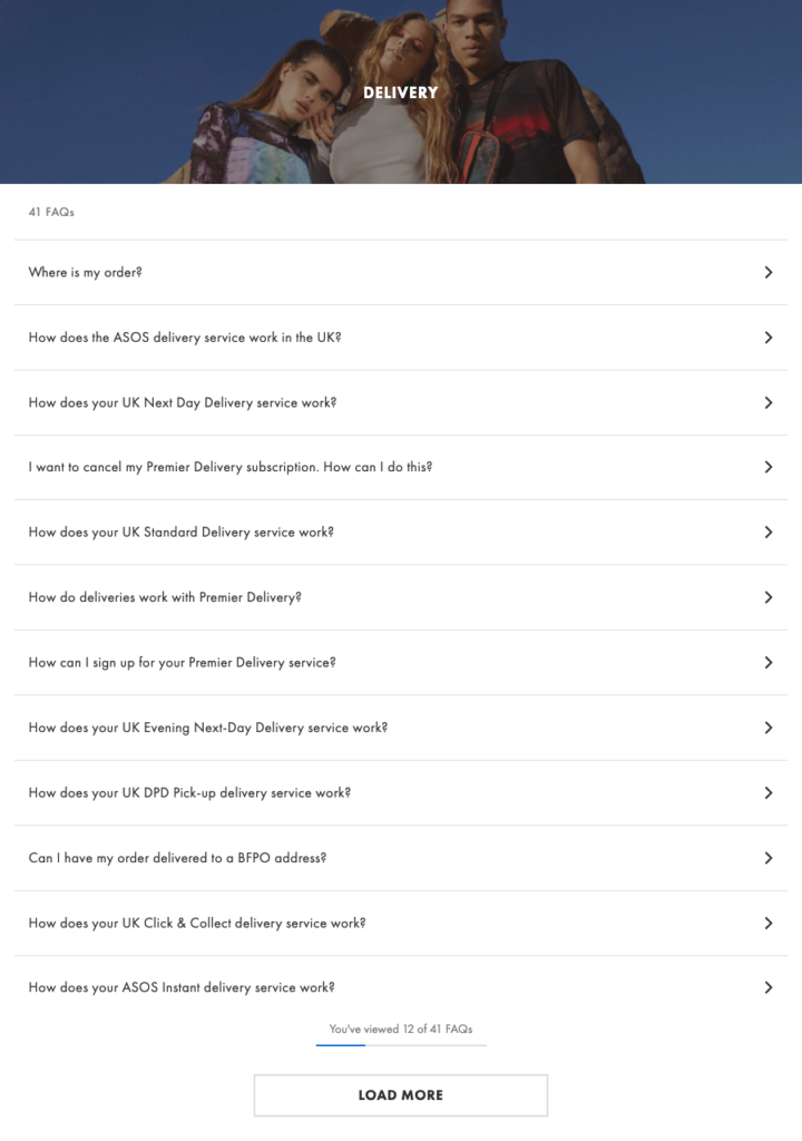
Its main shipping page is a list of 41 frequently asked questions covering everything you could ever want to know before placing your ASOS order.
As well as being super simple to navigate, there’s another clever advantage lurking within this page. You might assume clicking one of those questions will reveal a drop-down answer, but actually, it takes you to a whole new page:
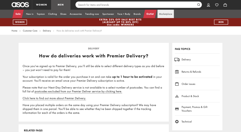
This is a good thing for two reasons.
Firstly, it keeps the main shipping FAQ page uncluttered. And secondly, it means those answers appear on search engine results pages. That makes it easy to find out about the brand’s shipping policy through Google search:

In other words, you don’t even need to visit the ASOS site to learn the ins and outs of its shipping terms and conditions.
2. Wayfair
There’s more than one way to ensure your shipping policy page is simple to navigate.
Whereas ASOS lays everything out in a clear, uncluttered list, Wayfair goes in a different direction altogether. It includes all the main elements of its shipping policy on a single in-depth landing page (I’m not going to include a screenshot because it’s super long but feel free to check it out here).
But things get a little more interesting with the brand’s smart search facility, which makes it quick and easy to find the answers to all your shipping-related questions:
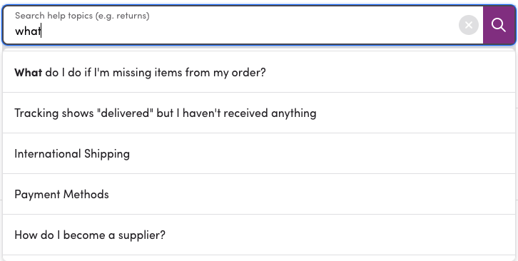
It’s great—just start typing your question and the most relevant answers magically appear.
Click the query you’re looking for and you’ll be taken to a separate page containing all the information you need. Helpfully, that page also features links to other related content:
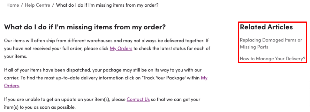
That means even if you didn’t find your answer straight away, there’s a good chance you’ll track it down on one of those other pages.
3. Best Buy
Best Buy is a huge company that sells a vast range of products, from smartphones and laptops to household appliances and outdoor goods. Whether you want the latest iPhone or an inflatable hot tub, you can find it at Best Buy.
But while that’s convenient for consumers, it’s pretty complicated for retailers. All those different products have their own delivery requirements—it’s one thing shipping a games console, and another thing entirely shipping a seven-piece patio dining set.
So you might assume Best Buy’s shipping policy page would be a pretty complex beast. However, you’d be wrong, because it’s actually beautiful in its simplicity:
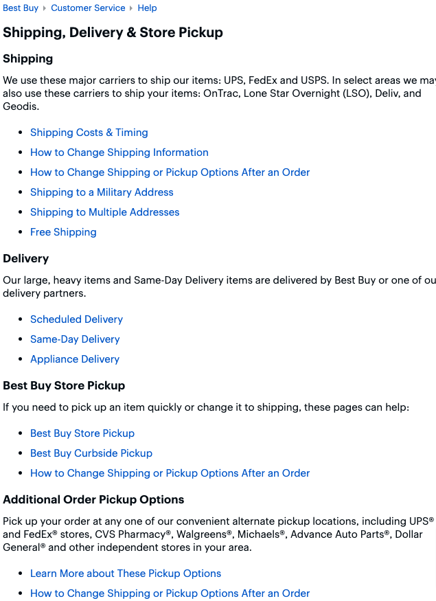
That structure is so easy to work with: you’ve got headings, subheadings, a sentence or two of copy, and a bullet-pointed list taking you to the relevant page. It’s clearly been created with skim reading in mind.
4. Target
From one US e-commerce giant to another, let’s take a look at how Target does it.
America’s eighth-largest retailer takes a similar approach to ASOS, but with one key difference. It’s adopted the “FAQ page” approach to explain its shipping policy, but rather than linking to a bunch of separate pages, all the content is displayed in collapsible accordions:
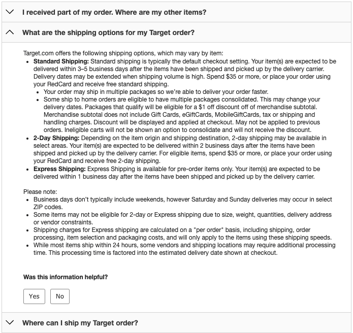
There are positives and negatives to this approach.
On the plus side, everything’s contained on a single page, which means you don’t have to click back and forth to find answers to multiple shipping-related queries.
The trade-off, of course, is that the page looks pretty cluttered, making it harder to navigate once you’ve opened up one of those accordions.
5. Marks & Spencer
I’ve already touched on how tricky it can be to clearly and concisely explain your shipping policy when you sell a wide range of different goods. That point definitely applies to Marks & Spencer, which sells everything from homeware and clothes to groceries and wine.
But the UK-based retailer has come up with an effective solution to highlight all its various shipping information.
Rather than trying to sum everything up in one big chunk of text, its shipping policy is broken down by product type, with all the information displayed in accordions:
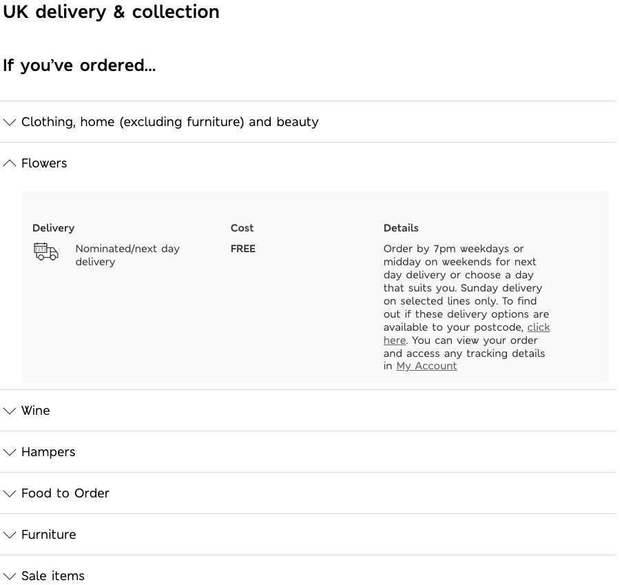
This makes sense because, for the most part, you’ll only be ordering one type of product at a time. I doubt many people go to the M&S site to buy a suit, a dining table, a hamper, and a bunch of flowers in a single transaction.
That means you’ll likely be looking for one specific type of delivery information, so the accordion layout works well.
6. Amazon
Whatever your opinion on Amazon, it’s hard to discuss anything e-commerce-based without taking a look at how The Big “A” does things.
And you won’t be surprised to learn that it does the whole “shipping policy” thing pretty well. Just look at how much useful stuff is captured by this solitary screenshot:
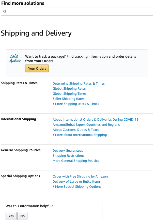
In no more than the length of a regular laptop screen, you’ve got:
- A smart search tool helping you quickly track down the answers to specific shipping questions;
- An order tracker (which makes total sense, because this is the information most people are looking for); and
- Clearly laid-out policies covering everything from international shipping to rates, times, and restrictions.
In particular, that search function is a thing of beauty. Just look at it in action:

The more you analyze Amazon, the easier it becomes to figure out why the site typically sees far higher conversion rates than the average e-commerce store.
7. Zalando
No one said it’s easy to cram all your shipping information into a single page, or even into multiple pages.
That’s especially true if you ship across multiple markets, just like Germany-based fashion and lifestyle brand Zalando does. When you cover a lot of territories, there’s always a chance that someone’s going to ask a question you’ve simply never considered before.
Zalando has found a super effective way to overcome this issue. Beneath all its standard shipping information, the retailer includes three calls to action for its customer services functions:

That way, if you can’t immediately find what you’re searching for, there’s no need to abandon your cart and head elsewhere—you can just give them a call, send an email, or speak to a chatbot.

Conclusion
In a recent article about checkout pages, I noted that designing a checkout page isn’t rocket science and that your ultimate goal is to communicate everything in the simplest way possible.
Exactly the same is true of your shipping policy. This isn’t the works of Shakespeare; it doesn’t have to be a riveting read. It just needs to display all the key information in a way that’s easy to navigate.
With that in mind, I’d offer these three tips to anyone building a shipping policy page from scratch:
- Add a smart search function so users don’t waste time looking for the right information.
- Include frequently asked questions under subheadings, either displaying the answers in drop-down accordions or on separate landing pages.
- Incorporate links to your various communications channels so it’s easy for shoppers to reach your customer service team.


