Forms are vital tools for helping you reach your marketing goals.
According to HubSpot, 74 percent of marketers use website forms for lead generation. And 49.7 percent say that signup forms yield the highest number of conversions out of all the lead generation tools they use.
Especially in ecommerce, forms are crucial for turning website traffic into email subscribers and customers.
We’ve written extensively about website popups and forms on our blog, but for this post, I’ll get even more specific and feature eight brilliant Shopify form examples.
So if you’re a Shopify user, wondering what you can do with forms on your site, this post is for you.
First things first, let’s cover the basics…
How to Add a Contact Form in Shopify
Adding a Shopify contact form to your store is pretty simple. Whether you have a Shopify or Shopify Plus subscription, your theme includes a basic native contact form that can be added by following these steps:
- Log into your Shopify admin then click Online Store > Pages.

- Click Add Page.

- Type your desired page title into the Title box.
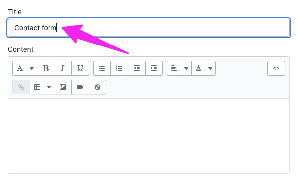
- If you want to add any page copy above the contact form, enter it into the Content box.
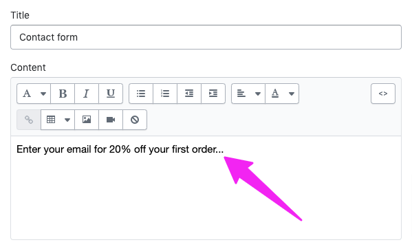
- Head to the Theme Template dropdown menu and choose Contact.
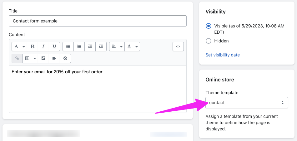
- Click Save at the top or bottom of the page.
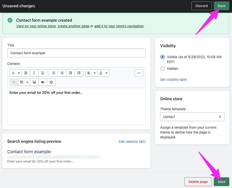
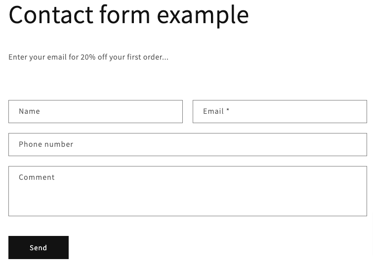
Congratulations! You’ve added a new page to your store incorporating a simple Shopify contact form:
Alternatives to Shopify Email
As the name suggests, Shopify Email is Shopify’s native tool for building, running, and tracking email marketing campaigns. But it’s far from the only way to do email marketing for your Shopify store.
Drip is an ecommerce-friendly alternative. Our ecommerce marketing automation platform helps Shopify merchants:
- Design and send stunning, high-converting emails
- Build email marketing campaigns that run themselves
- Leverage the power of dynamic segmentation to deliver super-personalized messages
And we’re not all about email.
Let’s take another look at that Shopify contact form:
 Pretty basic, right? Not particularly engaging. It’s hard to imagine a customer feeling compelled to fill it in.
It’s a world away from Drip Onsite, our suite of onsite tools to help you reach, engage, and convert shoppers beyond the inbox.
Our intuitive drag-and-drop builder gives you total control over every popup, slide-in, and sidebar you create, helping you design contact and lead capture forms that perfectly align with your store branding.
Best of all, you can try it out right now by signing up for your free 14-day trial.
How to Add a 3rd-Party ESP Form to Shopify Sites
Shopify makes it easy to integrate a 3rd-Party form into your ecommerce site. In fact, you can find excellent apps from the Shopify App Store.
If your ESP has native integration with Shopify, it gets even easier. The steps vary depending on your email service provider, but here’s how it works with Drip:
- Navigate to your Onsite dashboard and click New onsite campaign.
- Choose one of the templates in the Popups category, all of which can be embedded (NB Sticky Bar and Sidebar templates can’t be used in the embedded position).
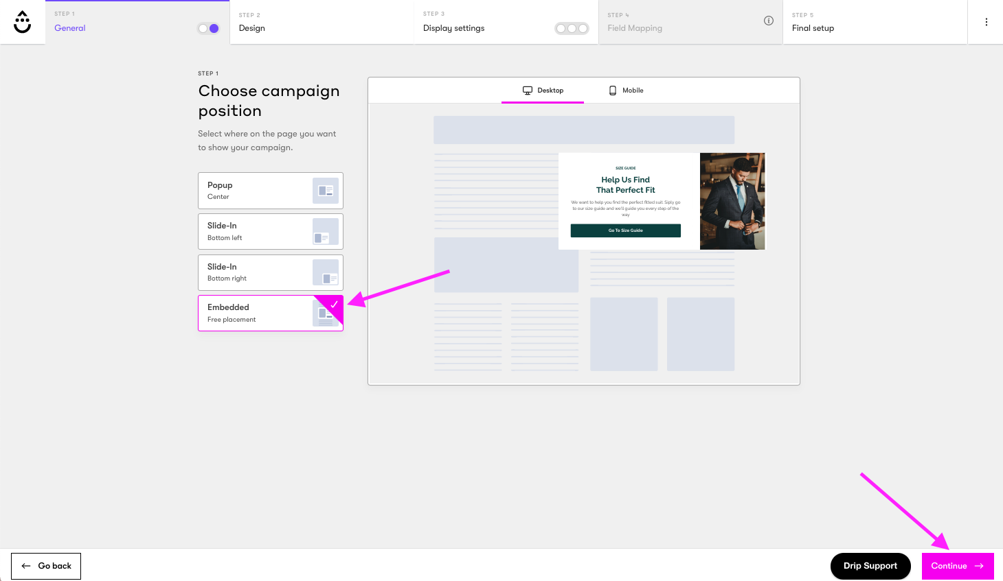
- Continue to the Positions step, choose Embedded, and click Continue.
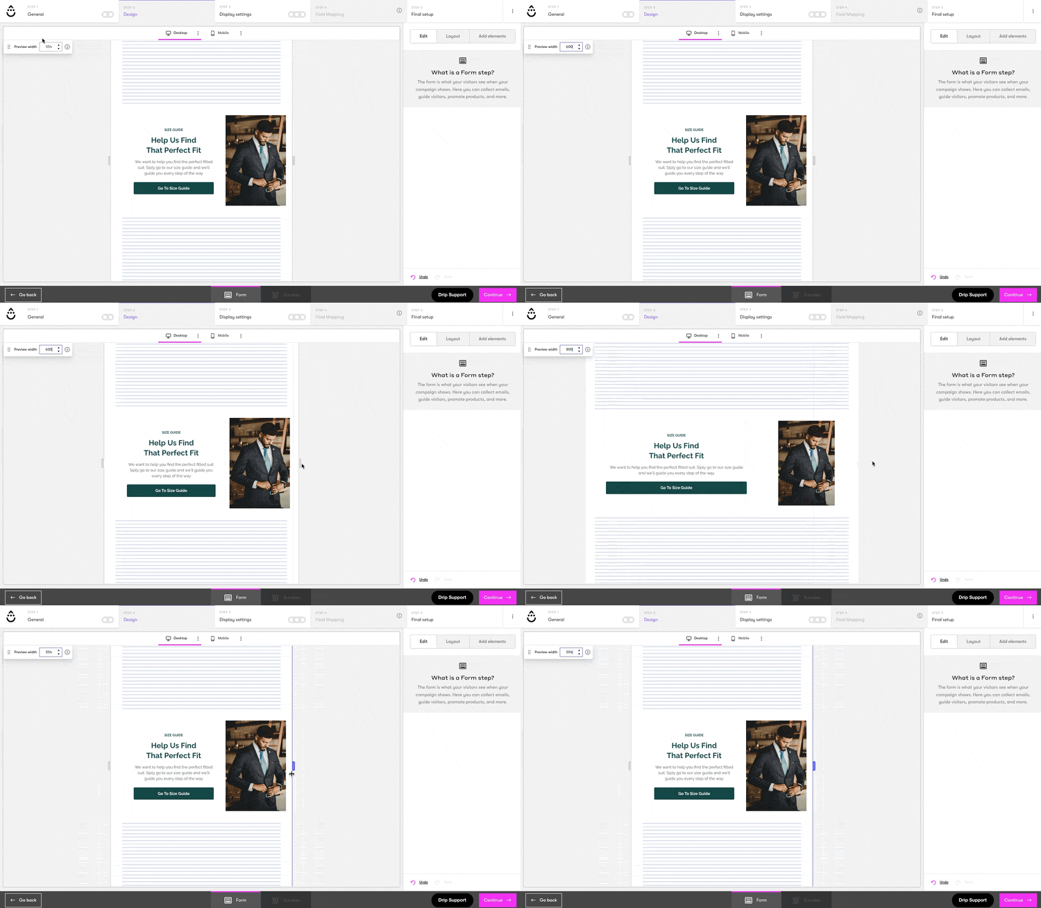
- Fully customize your popup by changing the colors, text, input fields, and more (NB for best results, adjust the Preview Width to match the page element where you plan to embed your popup, either by typing the width in pixels in the Preview Width box or by dragging the resizing handles to the desired dimensions).
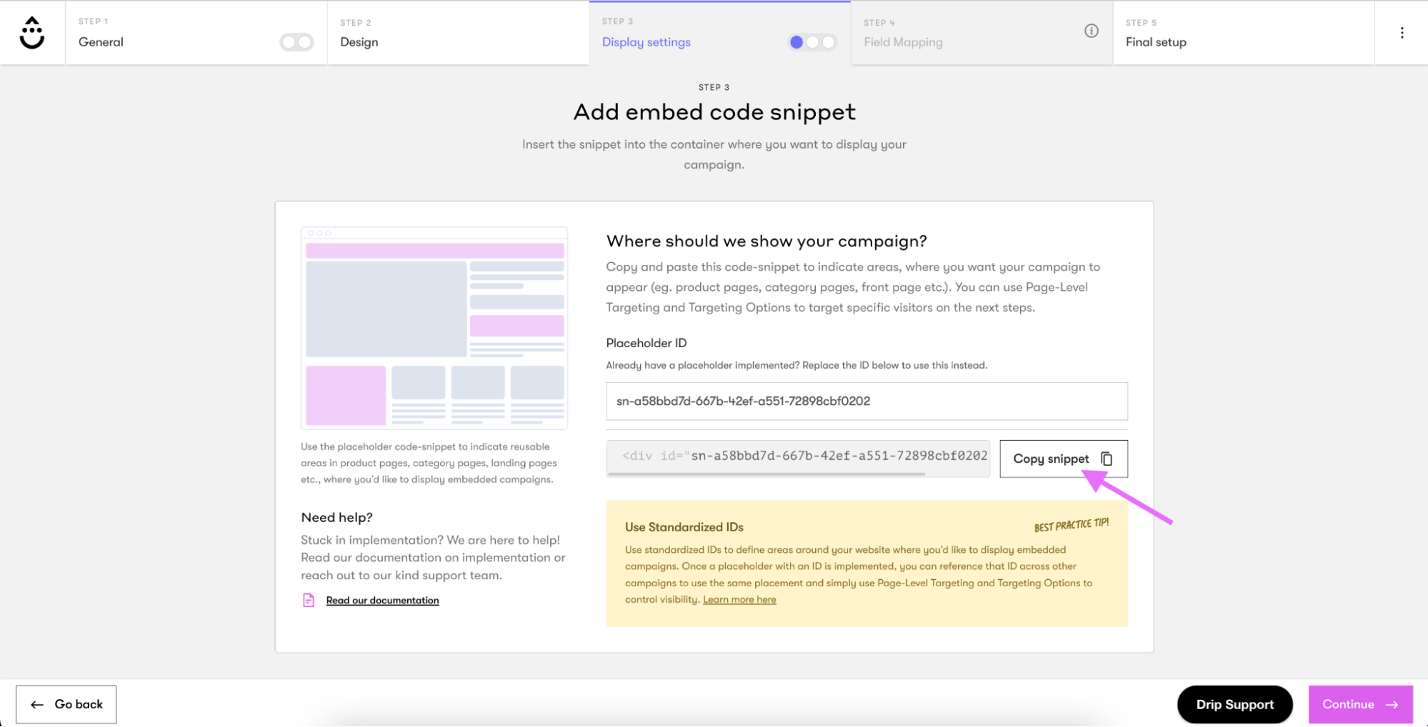
- Happy with your design? Continue to Display Settings and click Copy snippet to grab the code required to embed your new popup on your Shopify store.
- Open your Shopify backend in another tab.
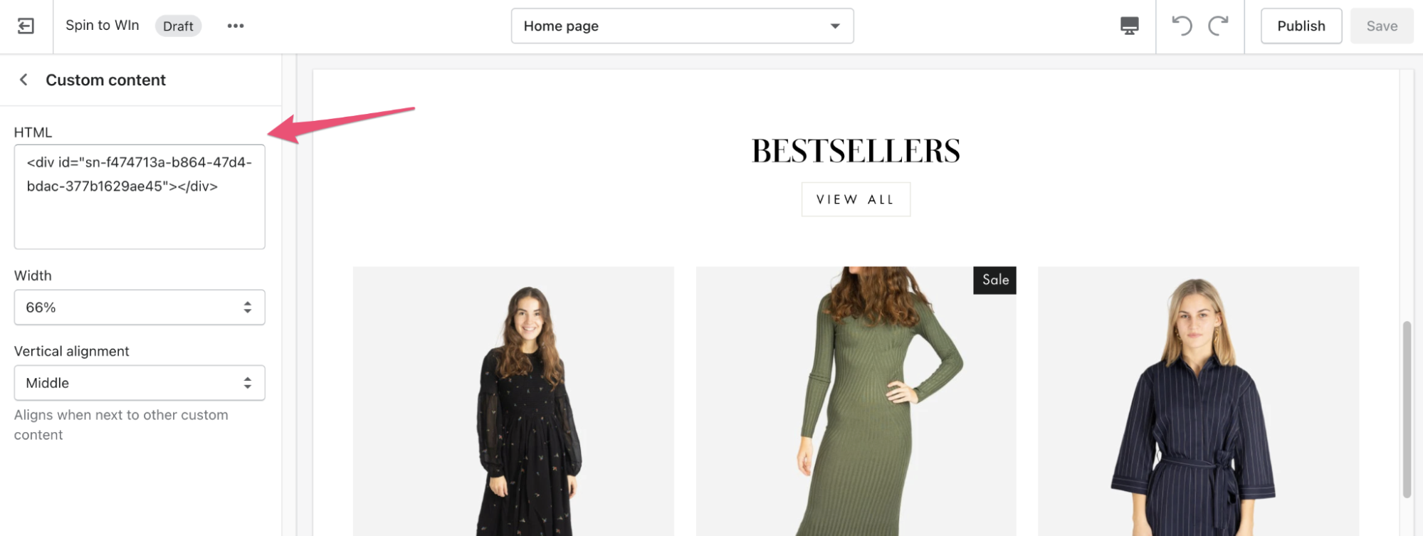
- Edit your theme, add a Custom HTML block, and paste in the code snippet.
8 Best Shopify Form Examples
1. Chubbies
In a privacy-concerned world, it’s hard to get people to part with their information. However, 57 percent of consumers are willing to share their data in exchange for personalized rewards and discounts.
Beach shorts seller, Chubbies, takes advantage of this fact in their homepage opt-in form.
 Chubbies offers an “immediate 15% discount” if customers sign up along with the opportunity to keep up with “hot deals”. This suggests that subscribers will continue to receive great offers from the brand if they subscribe.
Offering discounts, gifts, and store credit for first-time shoppers is common practice for collecting emails in ecommerce. But Chubbies’ discount is available to anyone who signs up, even if they’ve made a purchase from the store previously.
First, this gives newbies the nudge they need to make their first purchase. Second, it encourages previous shoppers that may have checked out as a guest before to make a second purchase. Either way, Chubbies gets to add a bunch of new subscribers to its email list.
Take a leaf out of Chubbies’ book and offer an incentive alongside your Shopify form for all shoppers.
2. Bombas
A lead generation quiz is a fun way to engage site visitors. But, it also works as a sales funnel.
Bombas, an online store built on Shopify, cleverly uses a quiz as a product recommendation engine.
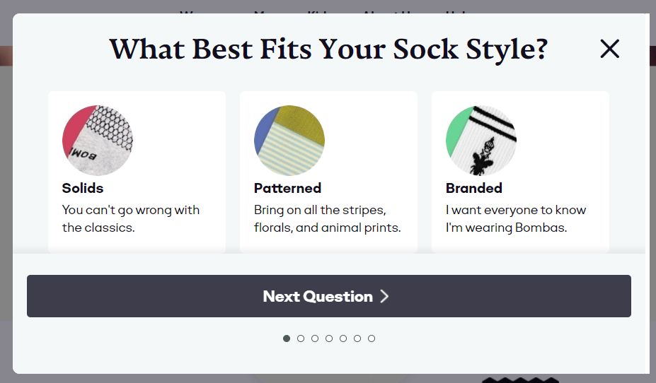 At the end of its style quiz, Bombas suggests the most fitting products based on the visitor’s answers and increases the likelihood of a sale.
Bombas’s example is a user-friendly Shopify form that collects information on customer preferences. Bombas can later use this data to personalize the shopping experience. For instance, the company can make better product recommendations as the shopper browses.
This way, Bombas gets to drive more sales while customers don’t have to deal with irrelevant recommendations. Win-win.
What’s more, the questions Bombas asks in the form allow them to create customer segments.
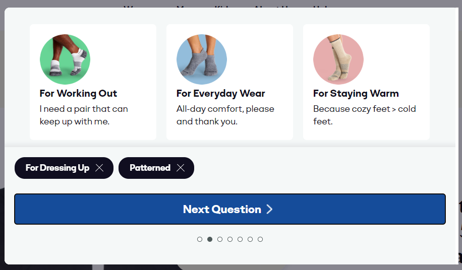 This way, Bombas can create lists of different types of customers with different pain points, and target each group with personalized emails.
3. Dr. Squatch
Popups are an excellent tool for conversion rate optimization. You can use them to collect email subscribers, promote your offers, rescue abandoned carts, and more.
Here Dr. Squatch uses a classic Shopify form to incentivize email signups.
Rather than offer subscribers, say, a discount, they feature a “mystery offer.” It no doubt piques curiosity to encourage more signups.
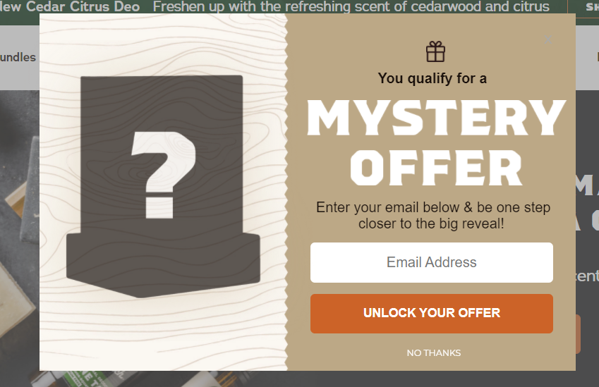 With a mystery gift like the above, you can also create a personalized offer for different groups of users. For example, this can be based on on-site behaviors such as the products visitors previously browsed.
There are at least a few takeaways you can borrow from Dr. Squatch’s form:
- Use imagery or graphics to make your form more appealing;
- Use your company’s brand style, e.g. colors and typography, for a smooth user experience; and
- Use an interesting call to action as in “Unlock your offer” as opposed to “Subscribe”.
4. Allbirds
The average cart abandonment rate hovers around 70 percent. That means a lot of people leaving ecommerce sites without following through.
A user-friendly checkout form is a key to solving this issue. You don’t want people to abandon their purchase at the last minute because of an overly-complicated form.
Allbirds does a couple of things to make the checkout experience quick and easy. First, it offers an express checkout option.
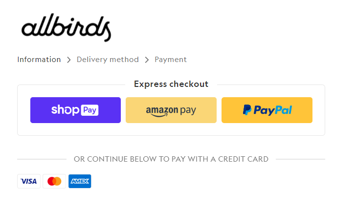 As users are able to check out via Shop Pay, for example, they don’t have to type in any details. It means they can make a purchase in just a few taps or clicks.
You can include these options by activating accelerated checkouts on the Shopify platform.
Allbirds also uses a multistep form in its checkout. It’s a great idea to break the process down into smaller steps rather than asking 20 questions to your customers at once.
5. Isley Lane
Gamifying your opt-in forms can help capture your visitors and make them more likely to share information when they have the opportunity of winning something.
Isley Lane uses a lucky wheel popup where visitors can bag 5, 10, or 15 percent off their purchase—depending on how lucky they are.
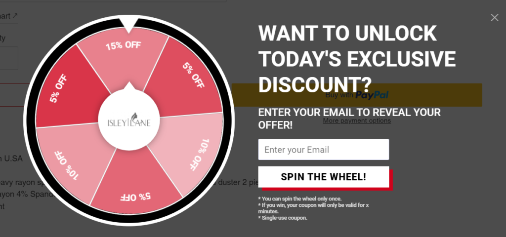 You can follow Isley Lane’s example, yet experiment with different kinds of rewards, such as free shipping or a free gift alongside discounts. Plus, you can try other types of gamification, such as daily offers or quizzes, and see which ones work the best for your audience.
6. Huel
Subscription ecommerce has grown monumentally in recent years. Top-tier ecommerce brands maintain a higher average order value and customer lifetime value using subscription services.
If you’re interested in getting in on the action, offer subscriptions on your product page, as Huel does here.
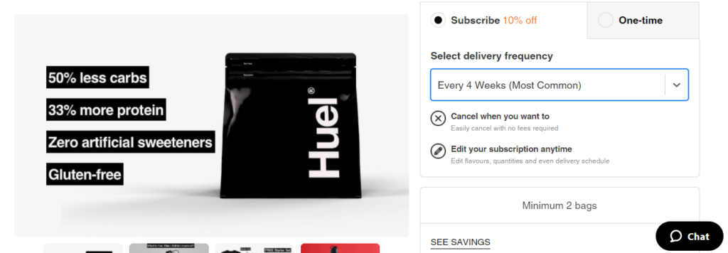 The brand’s form guides users by having a default selection for the delivery frequency.
Next, it clearly states that customers can cancel or edit their subscriptions anytime. This helps prevent barriers of purchasing before they become roadblocks.
Consider what your customers might find important when considering whether to subscribe, such as flexible delivery dates or a money-back guarantee, and incorporate that into your form copy.
Last but not least, check out what happens when customers click the one-time purchase option in Huel’s form.
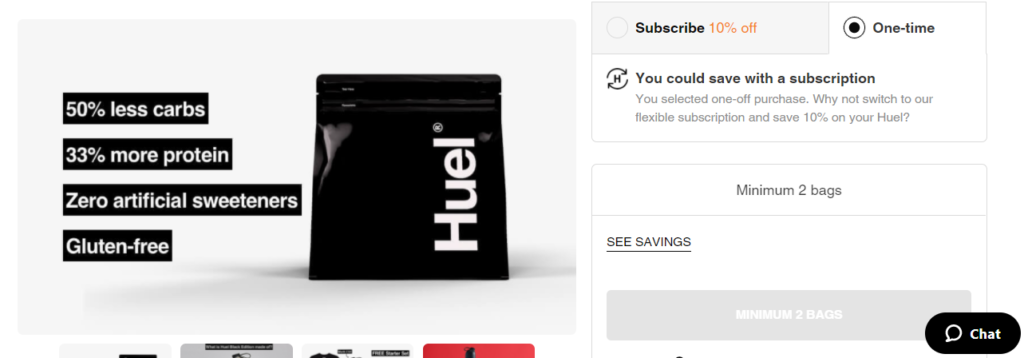 Huel re-emphasizes the fact that you could save 10 percent with a subscription. There are of course customers that will break through and continue with a one-time purchase. But, others will re-think and likely change their mind.
7. Pretty Litter
In our research, we found that popups with images convert 83.57 percent better than those without one. So it’s a good idea to supplement your Shopify forms with images.
Pretty Litter uses visuals to make their subscription form more appealing and fun.
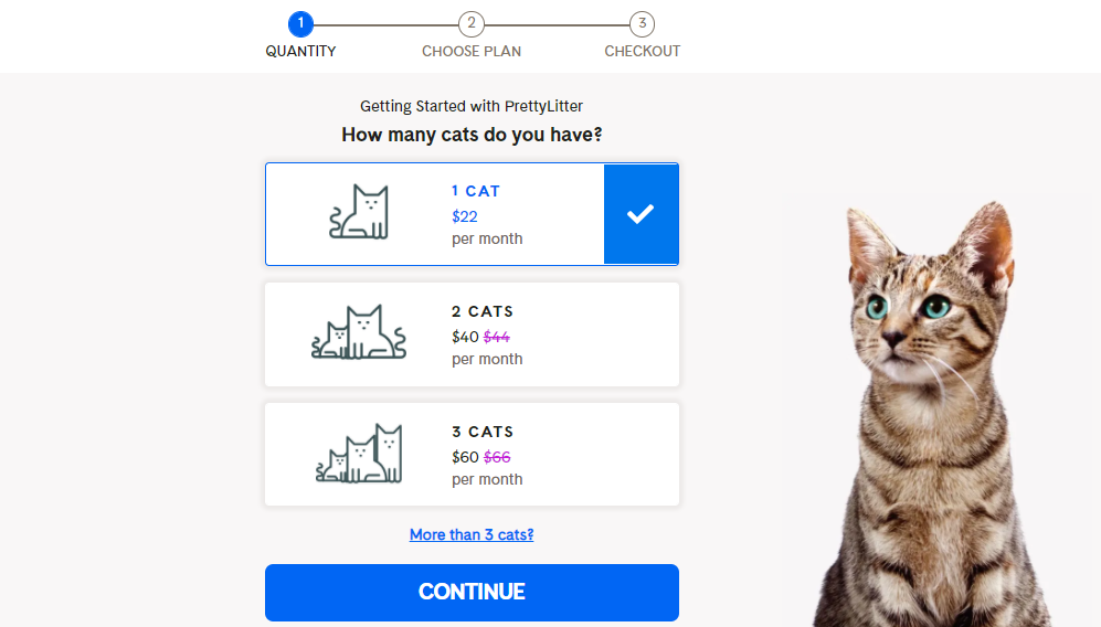 This form design appeals to the eye and improves the user experience. The visual prompts, including images of cats for each option, makes it easier for shoppers to fill out the form.
Sometimes, it’s the small things like this that really help shoppers even if they don’t notice.
8. ILIA
Customer feedback is as tricky as it is important in ecommerce. The problem is, consumers don't always trust product reviews or star ratings.
ILIA has found a way to solve this problem by offering users the option to upload photos and video via their product feedback forms.
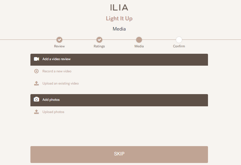 By using this form, customers go through the traditional review process and add their content if they’d like. This is an easy way for the company to gather user-generated content, which adds credibility to the review.
Consider adding this option to your feedback forms as well. Allow customers to upload images to show what a product looks like or how it works in real life compared to product photos. This confirms the quality of a product and encourages purchases.
Conclusion
As you’ve seen, well-designed, user-friendly Shopify forms generate subscribers and boost sales. Follow these examples to create better website forms.
Of course, if you want to create even better forms, you should consider an email capture tool that plays nicely with Shopify and helps you build up your email list quickly. Bonus points if that email capture tool also offers marketing automation on top of it.
Follow the best practices you see here to ensure a smooth and easy experience and experiment with new tactics such as gamification to engage buyers.
