Even with a myriad of new mediums like social media, texting and messaging apps available, email continues to be the most preferred form of communication for modern consumers.
President of Web Marketing Pros, Peter Roesler explains, “The large majority of U.S. adults (72 percent) prefer communication with companies to happen through email.”
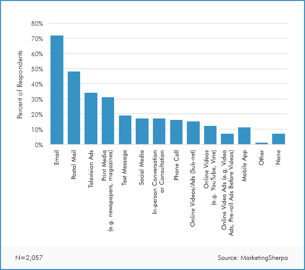
So email marketing remains a strategy you’ll want to devote plenty of time and energy to.
A big part of finding success with email marketing is creating an effective optin form that visitors are drawn to and that compels them to sign up.
And though it may sound simple on paper, there’s a lot that goes into it.
For this post, I’m going to discuss the key elements that go into creating a stellar optin form and offer a handful of optin form examples from e-commerce brands that are crushing it.
So let’s get started.
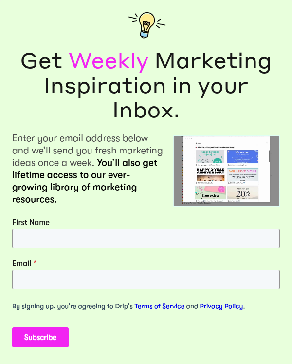
What Makes a Great Opt-In Form?
Common Elements of a Great Optin Form
Above all else, an optin form should address the specific needs of your audience.
It should identify common pain points your customers are experiencing and promise to help them overcome those issues.
Next, it should contain a minimal number of form fields.
Research has found that for each field you add, your conversion rate drops by 11 percent.
So you don’t want to turn would-be subscribers off by asking for too much information.
An effective optin form should contain clear, well-written copy.
It should be succinct and to the point, so website visitors can quickly tell what it’s about and the type of content they can expect by subscribing.
An optin form should be well-positioned so a visitor’s eyes are naturally drawn to it and so that it stands out from other content.
Providing some type of incentive is also important.
Ideally, people will receive something tangible for subscribing such as a discount, promotion or free access to gated content.
It should have a solid CTA so people know exactly which action they need to perform and be interesting enough to compel them to sign up.
Branding consistency is also critical.
Your form should fit in with the look and feel of your overall brand so that it matches customer expectations.
And finally, an optin form should be easy to exit.
If you use a popup, for example, visitors should be able to quickly and painlessly close it.
Now that we have a basic understanding of what constitutes a great optin form, here are some optin form examples you can take a page from.
Example #1: Frank Body
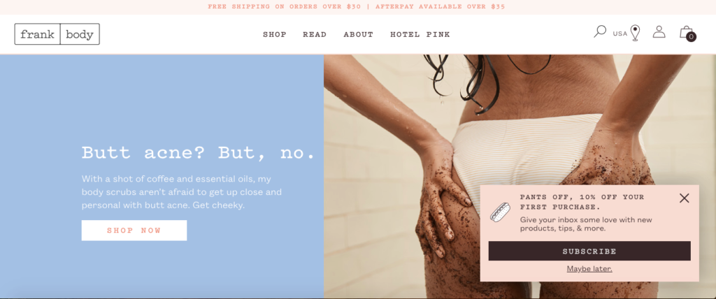
Frank Body is a company that sells a unique coffee body scrub that cleanses and exfoliates the skin.
They have a simple, straightforward optin form that pops up in the bottom right-hand corner a few seconds after you land on their site.
Why it Works
First of all, their optin form has a great location above the fold.
After landing on Frank Body’s website, it pops up, and your eyes can’t help but be drawn to it.
Next, it has a nice incentive of 10 percent off on your first purchase.
This is the first thing visitors see when reading the copy.
Not only does it motivate visitors to sign up for Frank Body’s newsletter, but it also encourages a good portion of visitors to complete their first order.
And the second line that says, “Give your inbox some love with new products, tips, & more,” gives visitors an idea of what they can expect by subscribing and that they’ll have access to products and content that non-subscribers don’t.
So there’s a feeling of exclusivity there.
The combination of positioning, concise copy, incentive and setting expectations make this optin form from a winner and one you can learn from.
Example #2: SurfStitch
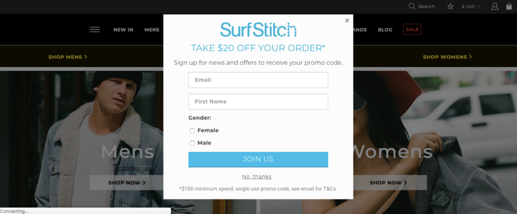
Known for its signature fashion, footwear and swimwear, SurfStitch is a popular Australian brand that was launched back in 2008.
They have one of the more bold optin forms where they place a popup front and center after arriving on their site.
Why it Works
It’s impossible to miss their optin form.
You can’t help but notice it, and anyone who’s interested in receiving news and offers will at least consider signing up.
But at the same time, it’s easy to exit out of.
Click or tap the “X” icon or anywhere else on the site, and you’re able to instantly close the optin form.
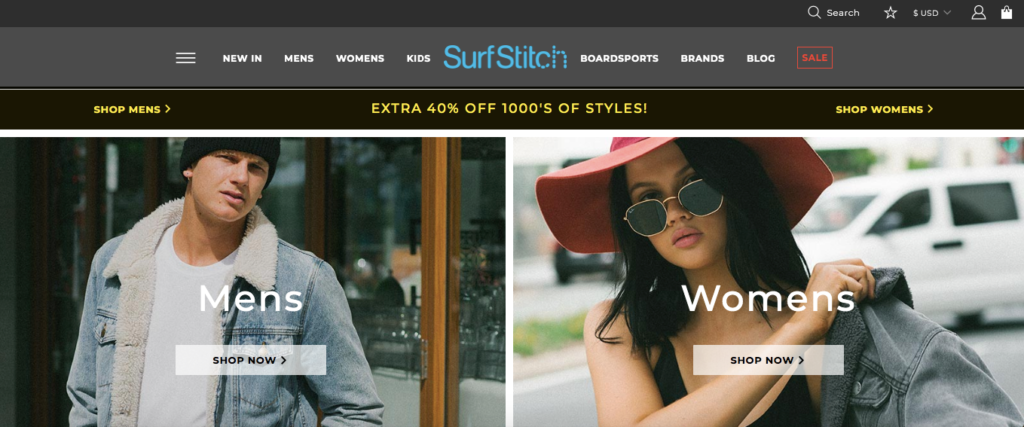
Like Frank Body, SurfStitch has a nice offer of $20 off on your first order that you see right off the bat.
That’s a great incentive that should persuade a decent chunk of visitors to subscribe.
Only having two form fields is nice because visitors only have to enter their name and email to sign up.
And the unique thing about this optin form is the fact that they ask for a subscriber to select whether they’re male or female.
That way they’ll receive personalized offers that are unique to them.
Example #3: Primary
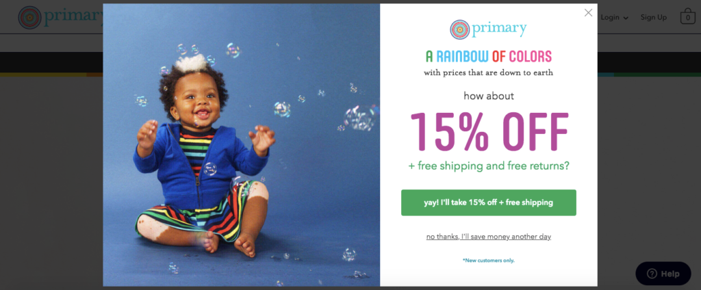
Kids clothing company, Primary sells premium fabrics in a rainbow of colors for a fraction of the price of other digital retailers.
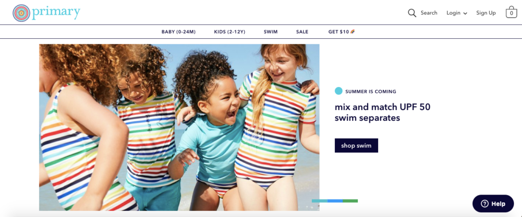
Just like their overall brand identity, this optin form pops and is a definite attention grabber.
Why it Works
Within seconds of landing on Primary’s site, their optin form appears and lets you know you can get 15 percent off, as well as free shipping and returns by signing up for their newsletter.
It’s bright and bold.
And with ultra concise copy, you know exactly how you’ll benefit by signing up.
As I just mentioned, this optin form is very much “on brand” with its vibrant colors—something that you’ll notice if you browse through their site.
I also like their CTA that says “yay! I’ll take 15 % off + free shipping.”
This also jives with the overall message of their brand and is a nice alternative to using something generic like “subscribe” or “sign up.”
Once you click on the CTA, you’re simply asked to enter your email address and select how you heard about primary in a drop-down menu.
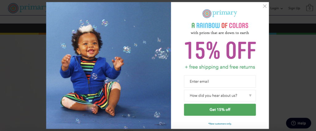
It’s quick and easy and also lets Primary know how their customers are finding them, so they’ll know which marketing strategies are having the most impact.
This isn’t a technique most e-commerce stores use, but it’s not a bad idea.
Example #4: LNA Clothing
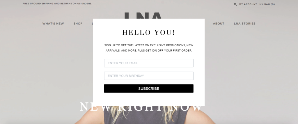
Here’s a California-based fashion brand that focuses on creating men’s inspired t-shirts for women.
Their optin form is super simple with a nice minimalist aesthetic that matches the design of the rest of the site.
Why it Works
I like the succinct, concise yet personable tone of their copy.
Starting with “Hello You!” is a nice way to engage visitors and conveys an amiable tone.
From there, they quickly launch into explaining what people will get by subscribing, with exclusive promotions and new arrivals, as well as 10 percent off on their first order.
So this fills them in on the benefits of subscribing, while simultaneously providing a clear incentive.
The use of a popup certainly grabs a visitor’s attention without being jarring or overly disruptive.
And if they’re not interested, a quick click or tap anywhere outside of the popup allows them to return to the site with ease.
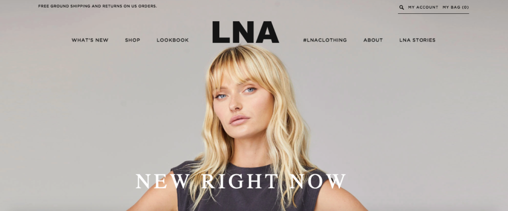
Lastly, filling out two simple form fields is a breeze and can be done in seconds.
And I can only assume that by asking for a person’s birthday—something you don’t see very often—LNA will send them some type of discount or promotion on their special day, which can increase customer loyalty.
And while this optin form isn’t anything showy or flashy, it gets the job done.
This proves that keeping it simple is often the right way to go.
Example #5: Blue Bottle Coffee
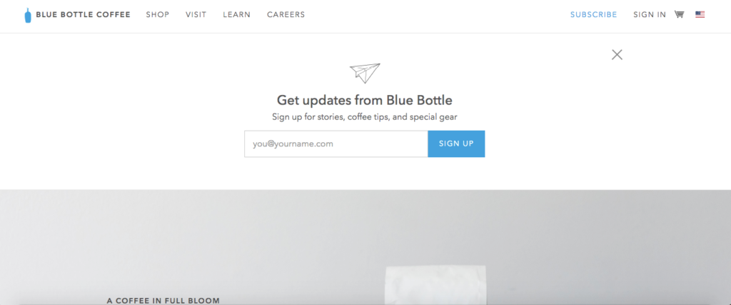
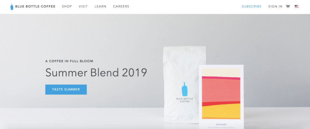
As the name suggests, Blue Bottle Coffee is a coffee roaster and retailer who sells premium coffee and accessories.
Their optin form is by far one of the most simplistic—some might even say too simplistic—but I think it serves them well.
Why it Works
For starters, it’s the first thing you see once you arrive on their website.
So there’s absolutely no missing it.
But at the same time, it’s not annoying because you can exit via the “X” icon on the top right-hand corner or simply scroll down, and you’re ready to browse their site.
Their copy gets right to the point and lets you know you’ll get updates from Blue Bottle along with stories, coffee tips, and special gear—something that should interest serious coffee connoisseurs.
Having only one form field to fill out is nice because people can simply type in their email address and be good to go.
And finally, the uber minimalistic design fits in perfectly with the rest of their site and stays on brand.
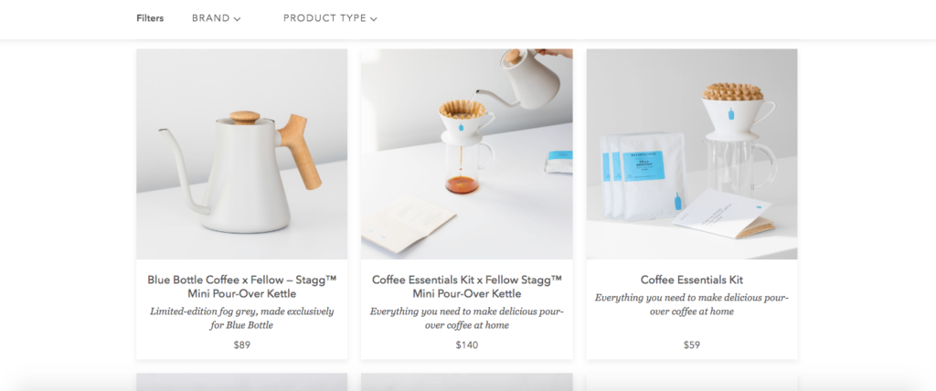
So I think Blue Bottle Coffee did a great job with their optin form.
It shows that sometimes it’s best to stick to the basics and not get “too cute” with your design.
Example #6: Everlane
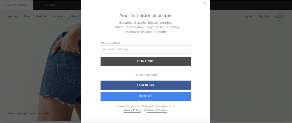
Everlane is a clothing retailer that prides itself on creating quality, modern products through ethical manufacturing.
Like their website, Everlane’s optin form incorporates a simple, straightforward design.
It’s crisp, clean and easy to navigate.
Why it Works
First of all, it captures your attention since the popup appears as soon as you land on their site.
However, a quick click or tap anywhere outside of the optin form allows you to easily exit.
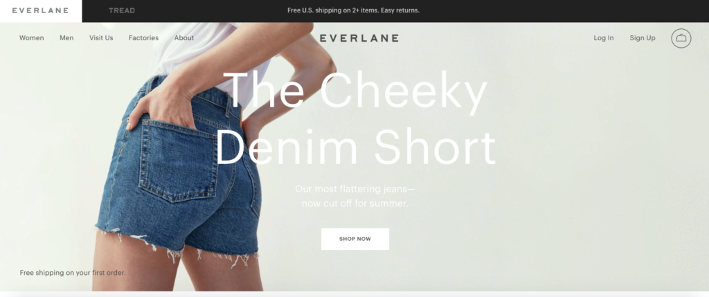
Mentioning that “Your first order ships free” at the very top is another good attention grabber and a nice incentive for shoppers to complete their first purchase.
And considering that nine out of 10 customers say free shipping is their number one reason to shop online, this can provide some strong motivation to buy.
Next, I like that they list three key elements of their brand identity just below that with, “Exceptional quality. Ethical factories. Radical transparency.”
Making your optin form consistent with your overall brand messaging is vital.
Everlane does a great job at that, which is especially important for winning over new leads.
The single form field asking only for a person’s email address minimizes any friction when signing up.
I also like that visitors can connect through Facebook or Google, which provides a nice alternative to just email and sets the stage for ongoing lead nurturing.
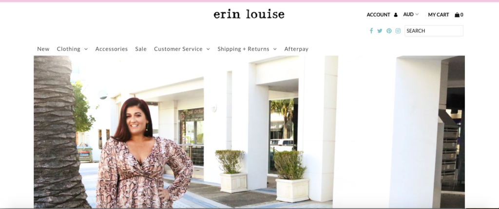
Example #7: Erin Louise
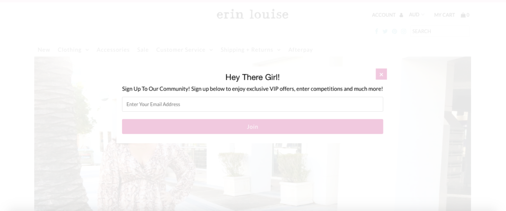
The last of our optin form examples comes from Erin Louise, a leading women’s online fashion boutique.
Its strong point is that it directly addresses its strictly female demographic and appeals to them in a fun, personable way.
Why it Works
Given that Erin Louise is a women’s clothing brand, their optin form wastes no time connecting with female shoppers.
Starting with “Hey There Girl!” is a great way to begin building rapport the second someone lands on their site.
And since it’s a popup, there’s no missing it.
Of course, they make it easy for anyone who isn’t interested to exit the popup with a quick click or tap anywhere else on the screen.
Telling potential subscribers they’ll enjoy exclusive VIP offers and have the option of entering competitions lets them know the perks of joining.
The one form field allows visitors to sign up in seconds.
And finally, the optin form contains the same branding elements found on their website—a clean, light feel with white and pink colors.

Conclusion
Although optin forms will vary, there’s a definite formula e-commerce brands can follow across the board to make them attractive and compelling.
The optin form examples listed above show some of the commonalities between seven successful brands and should give you insight into what works.
That way you can build a highly effective optin form for your e-commerce site to maximize your number of subscribers and bring in a steady stream of qualified leads.
Which of the examples did you like the best? Leave a comment below.

