I know what you’re thinking. Big promises. Too good to be true, right? After all, e-commerce conversion rate optimization (CRO) is a complex thing.
You can’t just put in 10 minutes of work and expect customers to come pouring in.
But what if you can?
It would be a no-brainer, and I’ll tell you why it’s doable.
Yes, conversion funnels are complex.
There are lots of parts that need to be moved to create a system that consistently turns visitors into leads and leads into customers.
The opportunity lies in these small pieces.
I’m talking about landing pages, product pages, form fields, design, copy, checkout pages, etc.
If you make some small tweaks to optimize these individual elements, guess what happens?
They will come together to create a leaner and more efficient conversion funnel.
That’s why I’m confident you can increase your e-commerce conversion rate with a few best practices.
In this article, I’ll share 10 of my favorite with you.
You don’t have to work through all at once. But if you take a few minutes each day to put these steps into action, the results will astound you.
Sound good? Let’s get started.
Table of Contents
1. You Have No Urgency Elements in Your Sales Funnel
2. Your Sales Funnel Is One-Size-Fits-All
3. You Have Poor Customer Support
4. You Display Shipping Costs Too Late
5. Your Site Has Poor Information Architecture
7 Common Conversion Rate Optimization Mistakes (and How to Fix Them)
Before diving into the nitty-gritty tactics, I need to address the elephant in the room.
There's a reason poor CRO is one of the most common ecommerce mistakes.
Conversion optimization has lots of bells and whistles. It’s complex, and it takes time. Add a sales funnel to the picture, and it gets overwhelming, quickly.
I say all this not to scare you, but to show you how crucial conversions are. Get it right, and you’ll be on your way to making more sales and accelerating your profits. Ignore it, and you’ll be stuck in a hamster wheel of mediocre results.
Thankfully, sales funnels are some of the most tested and experimented elements in business.
Business owners, just like you, have gone through the hoops to see what works and what doesn’t.
The result? We have a solid understanding of what kills conversions and what moves them along.
So, let’s discuss the seven common conversion “killers” lurking in your funnel (and how to fix them).
1. You Have No Urgency Elements in Your Sales Funnel
The whole premise of a conversion is to get your prospects to take immediate action.
You want them to buy now and be decisive about it. Nothing kills decisiveness faster than a lack of urgency. If customers believe that time is on their hands, guess what they’ll do? They’ll take their time to consider their options.
You may think this is a good thing.
After all, you want prospects to be comfortable with their purchase decision.
But the Internet is rampant with distractions. The moment your prospects set their eyes on something else, you’ll be forgotten.
Harsh? Maybe. Truthful? Absolutely.
Now, you may have noticed that many marketers are using false scarcity to introduce urgency into their funnels.
I’m talking about scare tactics like these:
“Buy this now, or the world will end.”
“If you don’t buy my product, your business is doomed to failure.”
Exaggerations aside, this kind of hype turns off your prospects.
It is just as detrimental as a lack of urgency. More importantly, it doesn’t work.
So what do I mean by urgency?
This is when you encourage your prospects to take swift action because it’s in their best interests.
Urgency is a strong catalyst for increasing conversions.
There are many authentic ways to do this.
Here’s what I recommend.
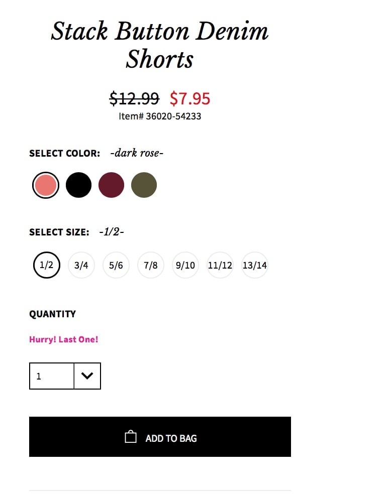
i. Add real urgency elements
This is where you point to an actual circumstance that will cause prospects to miss out if they don’t act now.
It is not made up or implied. It is real.
I’ll illustrate with some examples:
- Limited time offers
- Low stock
- One time offers
You can use a countdown timer and stock notifications to make the point more forcefully.
Here’s an example from AGACI:
ii. Reverse the risk
Another thing you can do is to offer some guarantee.
It could be a money back guarantee or a refund policy.
As long as it reduces the risk and lessens the blow of the commitment, it will increase your conversions.
iii. Imply urgency
Implied urgency is as it sounds. It is not real but hinted through strategic language and other persuasive hooks.
Using words like “Now” and “Today” in your call-to-action is one example that makes a powerful difference.
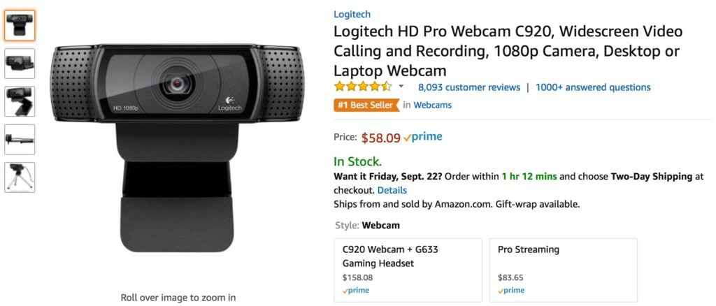
Amazon is brilliant with implied urgency.
They let you know that if you order within a particular time frame, you’ll get your shipment faster.
You won’t miss out if you don’t order within this period, but it plays on your desire for instant gratification.
Here’s what I mean:
Here’s another example from Lipsy:
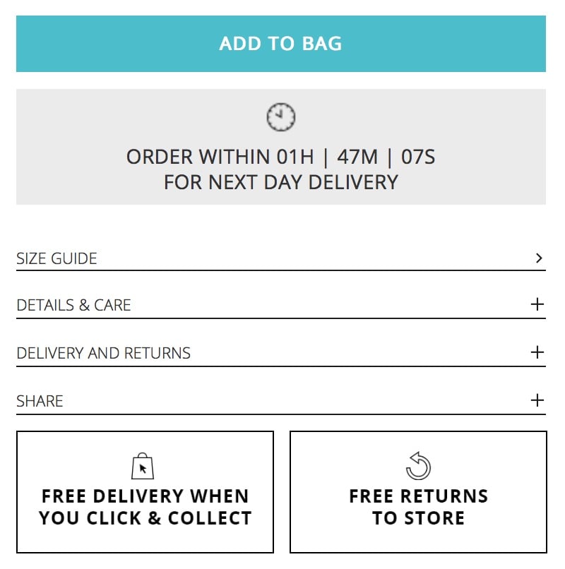
Does this implied urgency do much to increase conversions?
You better believe it.
2. Your Sales Funnel Is One-Size-Fits-All
Every person who comes through your funnel is unique in one way or the other.
They have different desires, pain points, beliefs, etc.
I’m not saying that you need to tailor your sales funnel to every individual.
That’s impossible.
However, you need to consider the nuances that exist within your prospect pool.
This way you can tailor your sales funnel and customer experience for maximum impact.
Your conversions will increase because you’ll be meeting the specific needs of your audience.
Now imagine you completely ignore these differences.
Your prospects will find someone (*cough* your competitor *cough*) who understands their needs and communicates it clearly.
Here’s what you can do about it.
i. Create multiple buyer personas
You’ve heard this advice several times:
“Create personas. They’re essential.”
Most ignore this advice because it’s a tedious and dull task.
I get it.
But you know what?
It’s not even enough to have just one persona. I recommend at least three.
When you have primary, secondary, and tertiary personas, you are better able to serve your customers with an unforgettable experience.
It results in more conversions and the kind of customer loyalty that gives businesses staying power.
It’s been proven that loyal customers are worth up to 10x as much as their first purchase.
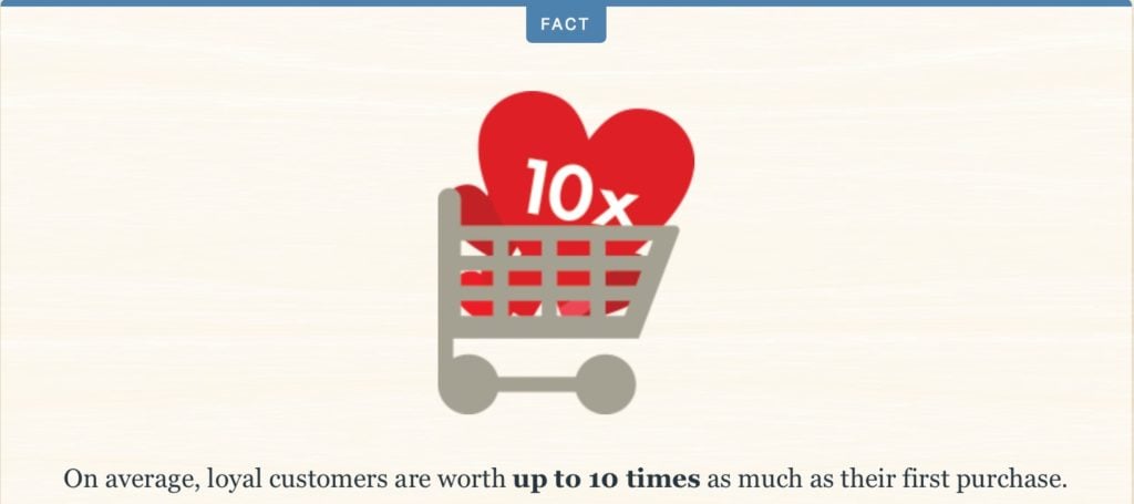
Source: Help Scout
ii. Know your customer journey inside out
Another way to differentiate prospects is by mapping out your customer journey.
This is a map that illustrates the path that customers take when dealing with your business.
It takes into account every interaction. This way, you can determine what stage of the buyer’s journey your prospects are.
You can then provide content appropriate for each stage and help move the conversion along.
iii. Segment your prospect and buyer lists
You’ve created multiple buyer personas and mapped your customer journey.
The natural next step is to segment your lists so you can track the interests of each prospect.
In doing so, you’ll deliver the right messages to the right people at the right time.
This is the kind of customized experience that skyrockets conversions.
3. You Have Poor Customer Support
I think you’ll agree this one goes without saying.
The way to secure a conversion is not to ignore your customers.
So why do so many e-commerce sites fail when it comes to customer support?
Customers will even pay more if you deliver a better experience. I didn’t make this up—86% of people fess up to this fact.
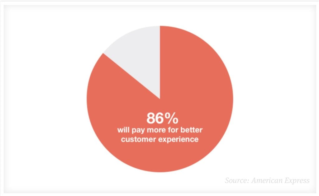
Source: Groove
Let’s imagine that a prospective customer lands on your product page.
If they’re this far down your sales funnel, it’s safe to assume that there’s purchase intent.
What if they have additional questions that your product page doesn’t address?
Or anxieties that need to be put to rest?
Or worse yet, some technical difficulty in completing their purchase?
The list of things that can require your immediate attention is endless.
If there’s no open line of communication to address them, you’re leaving buyers in the dust and money on the table.
That’s bad business, and it’s easy to fix.
First, anticipate problems before they happen.
Either prevent them from happening or have the solutions at hand, so it doesn’t interrupt the sales process.
I have a perfect example.
There’s this entrepreneur who offers exceptional online programs.
The problem?
Every time I go to purchase one of his products, the order form does not work for me.
I have to email support every single time for a different version of the form.
It’s a hassle.
But imagine if they didn’t have a different version of the form at hand.
That’s a lost customer right there.
So, it’s crucial that you have contact information within site. I also recommend live chat on your product pages.
And be prompt in responding to customer queries and concerns. It will save you lots of lost sales.
4. You Display Shipping Costs Too Late
Has this ever happened to you?
You hop onto an e-commerce site with a ballpark budget in mind.
You place items into your cart that fall within that price point.
Halfway through checkout when shipping costs are displayed, you realize that your total is way more than you were willing to part with.
In some instances, shipping costs are so exorbitant that it matches the price of your items.
That’s insane.
And your customers are deterred by it.
In fact, unexpected shipping costs are the top reason for shopping cart abandonment.
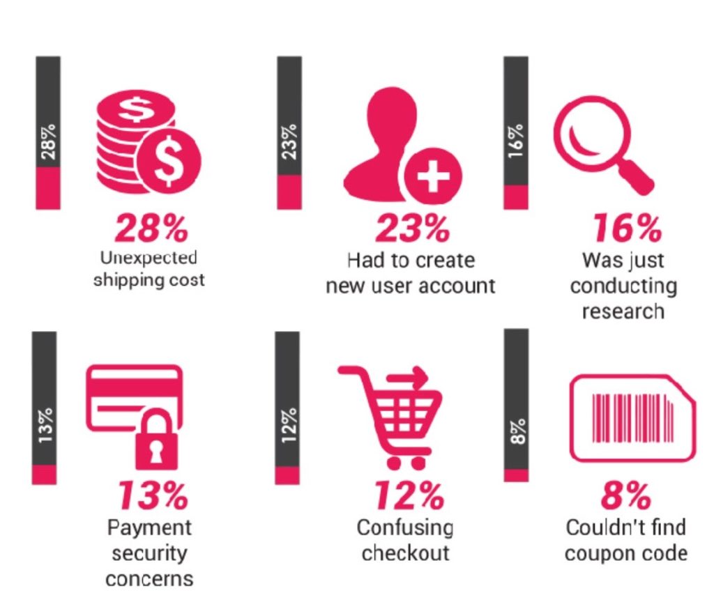
Source: Smart Insights
I get that free shipping is not a possibility for every e-commerce site. If you can pull it off, it will increase your conversions.
But it’s not that customers aren’t willing to pay for shipping.
It’s that these fees are revealed too far into the checkout process.
Use a shipping calculator or predictor, so customers know from the get-go what the additional costs are.
You can also provide coupon codes to minimize the blow of astronomical shipping, handling, and tax fees.
I assure you it will make a massive difference to your conversion rates.
5. Your Site Has Poor Information Architecture
This is a simple concept that is often overlooked.
If customers can’t find what they’re looking for, there’s no way they can check out.
As such, your conversion rates decrease.
That’s what I mean by information architecture.
It describes the way that information is displayed on your site.
Ideally, it should be set up in a way that visitors can find what they want without having to dive in several layers of navigation.
Ease and speed are what you want to go for.
Here are some of the factors that matter.
i. Intuitiveness
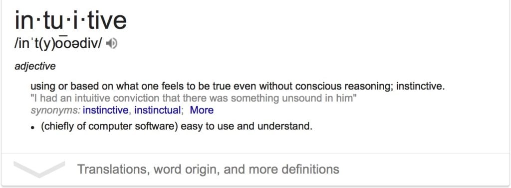
Here’s what it means to be intuitive:
How does this apply to site architecture?
The quicker users understand how your site works, the more instinctive it becomes to navigate.
It’s not something that they even have to put thought into.
They move around with the same ease as if they were walking with a clear destination in mind.
The way to achieve that is through simplicity.
A simple web design with clear navigation is essential.
ii. Feedback
This is about letting visitors know that they are in the right place and on the right track.
You don’t want there to be any information gaps.
Clear categorization, headings, descriptions, instructions, and information-rich pages help in that regard.
This will eliminate all uncertainty and anxiety that lead to visitors exiting your site.
iii. User flow
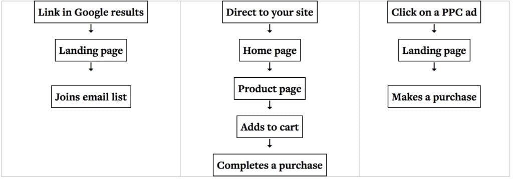
User flow is the path that your web visitors take to complete a task.
That task can be to purchase a product, sign up for a newsletter, etc.
If you don’t understand user flow, there’s no way you can optimize your site to fulfill the needs of your prospects.
Let’s say that your objective is to get customers to complete a purchase.
A visitor may hop on your site, view your homepage, navigate to a product page, add items to the cart, and eventually check out.
That’s just one example.
Here’s an illustration:
Source: ConversionXL
6. Your Copywriting Is Less Than Stellar
If there’s one thing that plagues e-commerce sites, it’s terrible copy.
Sadly, copywriting is something that you just can’t escape.
As the saying goes, it’s “salesmanship in print.”
Emails, opt-in pages, product descriptions, blog posts, sales pages, and website content all revolve around copy.
It needs to tell a clear message, deliver a compelling value proposition, and be persuasive enough to drive action.
I’ll be honest with you—e-commerce copywriting is a super specialized skill.
Sure, it can be learned, but it takes time to perfect it.
The good news?
For one, you can outsource it.
But before you hire a copywriter, you have to get clear on a few things that you can’t hire out:
- Who do you serve?
- What do you help them with?
- How does this problem affect both their external and internal lives?
- What game plan do you have to help them overcome it?
These are just a few elements of your brand story.
So what if you don’t want to hire out your copy?
Afterall, it can cost a fortune.
Consider:
Copywriting is formulaic.
It means there’s rhyme and reason to it. There’s a structure that you can swipe to craft persuasive copy.
That’s why there are so many formulas that you can follow.
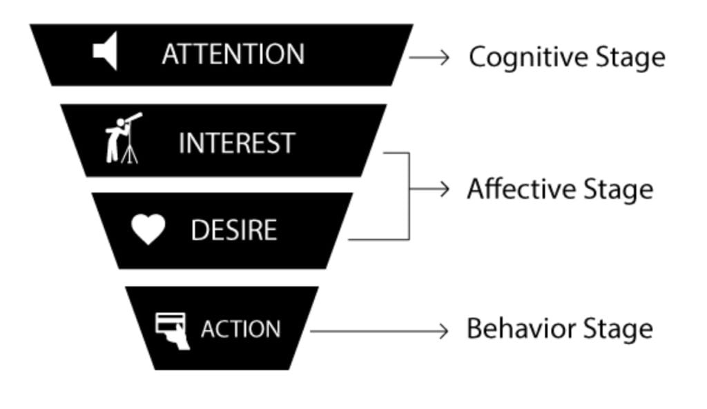
One of the most useful is the AIDA formula.
Source: Businesstopia
- Attention. Remove prospects out of their ordinary thought process and demand their attention with a captivating hook.
- Interest. Get minds working by educating and entertaining your prospects with novel ideas.
- Desire. Appeal to their deepest longing so you can increase their appetite for your product.
- Action. Call on prospects to take a step towards fulfilling their desires.
Before you put out a word of copy, ensure that it incorporates these elements.
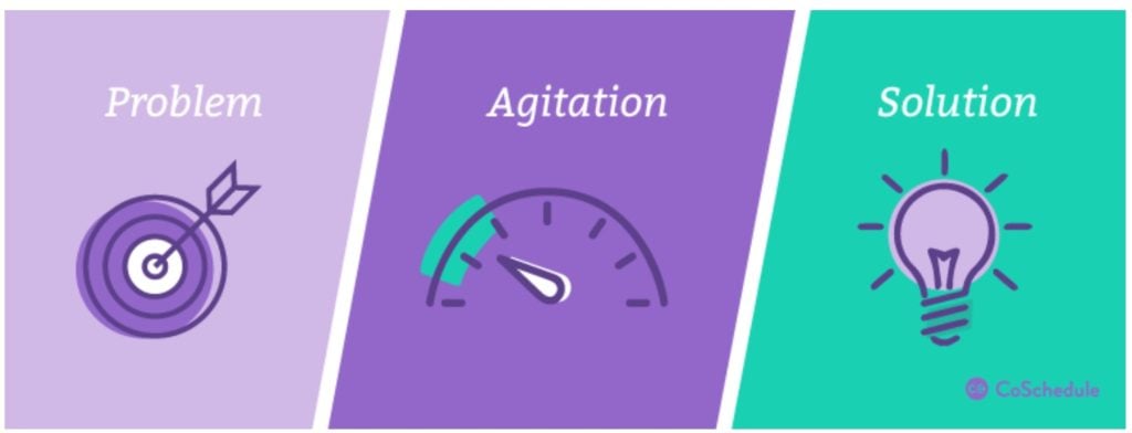
Another powerful one is the PAS formula.
Source: CoSchedule
- Problem. Present the problem that your prospects face.
- Agitation. Dive deep into the turmoil that it causes.
- Solution. Position your product as the ultimate solution.
These give you some food for thought.
Infuse them into your button copy, product descriptions, emails, etc.
7. Making a Purchase Is Too Big of a Jump for Prospects
I get it.
Your goal is to make sales.
There’s no use waiting.
Go straight for the hard sell, right?
Not if you want to turn off your prospects and hurt your conversions.
There are many mistakes that people make which prevent people from becoming a paying customer.
If buying doesn’t feel like a natural progression, prospects will stay on the sidelines. They won’t take action.
What do I mean by natural progression?
A purchase decision shouldn’t feel like a massive commitment.
What you want is minimum viable commitment.
Here’s how.
i. Don’t overpromise
As much as your prospects want the perfect product to solve all their conceivable problems, you shouldn’t promise them that.
Why?
They won’t believe you.
They know that nothing in life happens that way. And it will hurt your credibility.
Bear in mind that credibility is two-fold.
Customers need to believe that you’ll deliver on your promise. They also need to believe in their own ability to achieve that result.
Overpromising kills both of these factors, and it kills conversions.
ii. Have a low-ticket offer
This is also known as a tripwire (a term I don’t care for too much).
Tripwire marketing is not always necessary.
But one thing is for sure:
Price is almost always an objection.
It means that you may need to give prospects a smaller price commitment. This will help to convert spectators into buyers.
You can then convert them onto a higher-ticket offer.
It’s been proven that repeat buyers are WAY easier to convert.
Here’s the likelihood of additional purchases after the initial one:
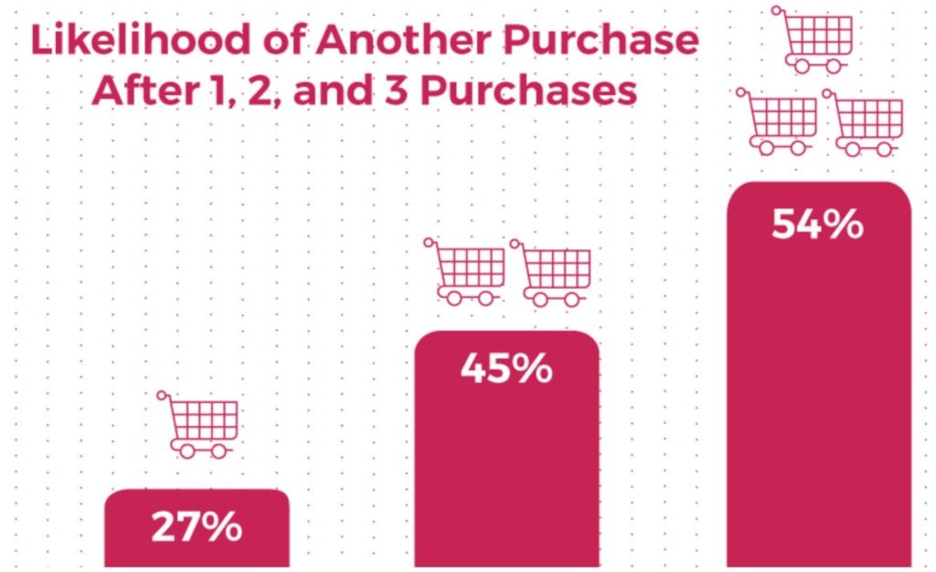
Source: Smartrmail
iii. Give prospects a quick win at no cost
The quicker you can achieve a win for your prospects for free, the quicker they’ll grab your paid offers.
Think about the grand problem that you’re solving.
Now, break it down into steps.
Offer a lead magnet or any free offer that gives prospects an instant solution.
I guarantee you, it will make a difference.
If you don’t at least wet their beaks, you’re alienating people that would otherwise convert.
Improve Your E-Commerce Conversion Rate with These 10 Best Practices
Conversion rate optimization doesn’t always have to be a complicated process. I’m big on starting right where you are. In fact, you don’t have to plunge forward by doing a complete overhaul.
That’s where the strategies discussed in this article come into play.
They’re by no means fancy or novel ideas. Any marketer who’s worth their stuff will tell you that these are simple strategies. But it is often the small and unglamorous steps that make the biggest difference.
Let’s get started.
1. Minimize the Perceived Risk to Your Prospects
Skepticism is the first barrier to conversion that you must destroy.
Online purchases are risky.
This means that prospects will be tight-fisted with their personal information.
To address this objection, you need to minimize the perceived risks.
Think about all the things that make people anxious about online transactions.
Some are afraid that their personal information won’t be safe.
The easy fix?
On your lead capture forms, ensure that you have a statement reassuring prospects that their information is safe.
Some may believe that joining your email list is too much commitment.
In that case, simply emphasize that they can unsubscribe at any time.
You don’t want your subscribers to feel like they’re being held, hostage. In every email, include an option to unsubscribe.

Now:
Let’s talk about sales conversions.
At this stage, it’s even more important to ensure that prospective customers know that risk is minimal.
How do you reassure them?
Two ways.
Trust seals and guarantees.
Many people won’t buy a product if there’s no guarantee.
Here’s an example:
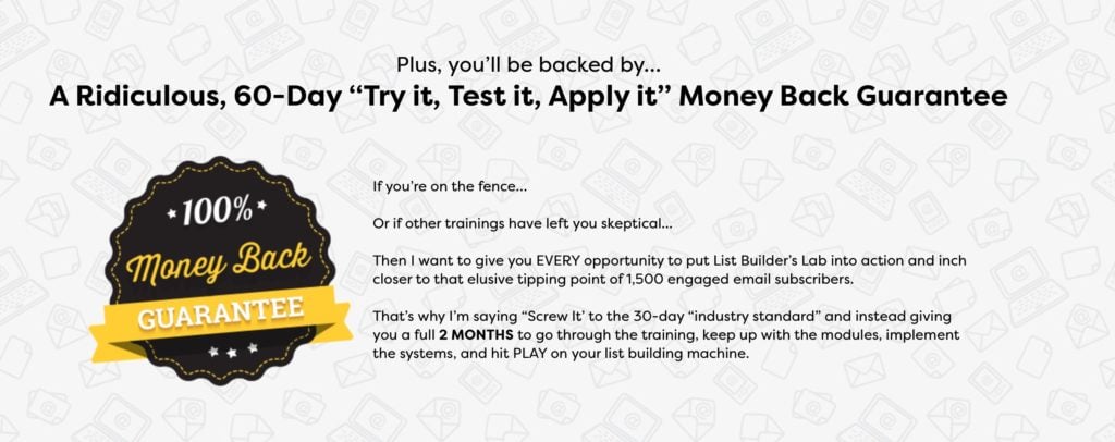
Making this simple tweak to your product pages can do a lot to boost conversions.
Trust seals are also crucial.
The best placement is next to your call to actions on sales pages and order forms.
Take a look at a snippet of this order form:
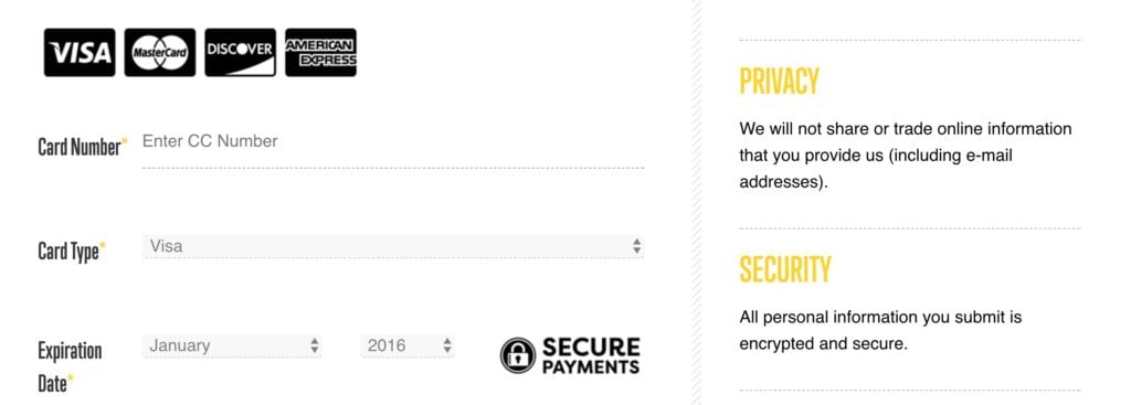
There are four different trust seals on the page.
That’s golden for conversions.
2. Eliminate Unnecessary Form Fields
The longer your forms are, the more people who drop out before they complete the process.
The more complex your forms are the more people who don’t even initiate the process.
You don’t want that.
Fortunately, it’s not a complicated fix.
Here’s the bottom line:
Do not ask for information that you do not need to complete the transaction.
We include one form field on our email capture forms for this very reason:
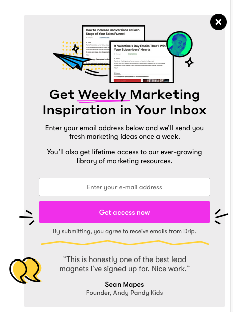
You may want to add a first name field to personalize your communication.
That’s fine.
But do you really need a last name or a phone number? Probably not.
The same goes for order forms.
Fewer fields = less resistance.
Less resistance = more conversions.
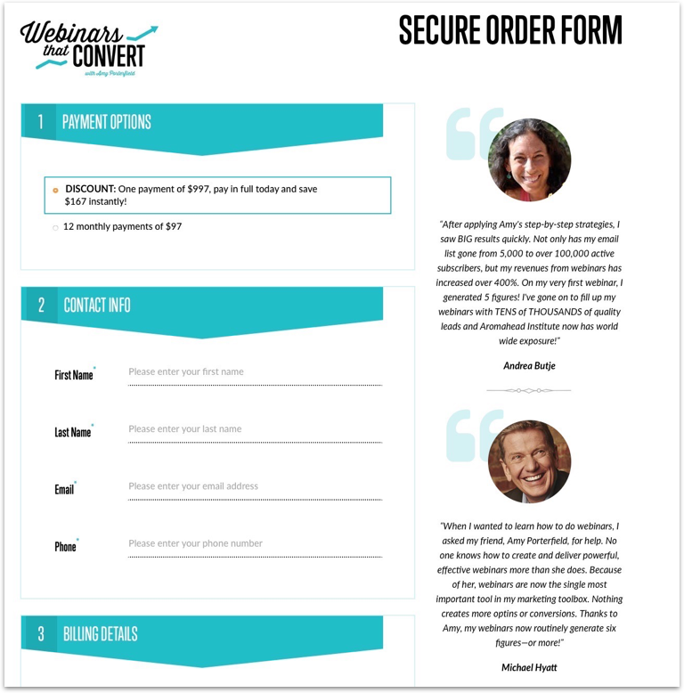
3. Add Social Proof on Site Pages Designed to Convert
Social proof is the granddaddy of conversion tactics.
Ideally, every page on your website should have proof elements.
Customer testimonials, case studies, reviews, endorsements, and user count are a few examples.
These elements close the gap between you and your prospects. Your credibility and trust factors increase because you have something to back up your value proposition.
The result?
Conversions go up.
Here’s the thing, though:
You can still have proof elements on your site and have a poor conversion rate.
In fact, that’s commonplace.
Why?
Placement is crucial.
I’m sure you’ve seen instances where people gather all their testimonials on one page and call it a day.
That’s not effective.
Most types of social proof can’t stand on their own.
You need to use them in the places where your prospective customers will likely have objections.
Since our goal here is to increase conversions, the strategic placement would be on pages designed to convert.
I’m talking about product pages, order forms, and lead capture forms.
Here’s an example from Amy Porterfield:
4. Add Google Site Search to Your Site
Conversions are all about getting people to take action.
There’s no better way to influence the actions that users take on your site than to first understand what they’re looking for.
If you can find out what your potential customers want, you can deliver it to them right away.
And the quicker you give people what they want, the quicker the conversion happens.
Google analytics has the perfect tool to help you gain that insight.
I’m referring to the site search feature.
If you have a search bar on your website, you should have this feature configured.
Here’s how to do it.
Step 1: Go to your site and conduct a search.
It can be anything. What you want to pay attention to is the URL of the results page.
After you’ve done that, leave the window open. You’ll need it in a minute.
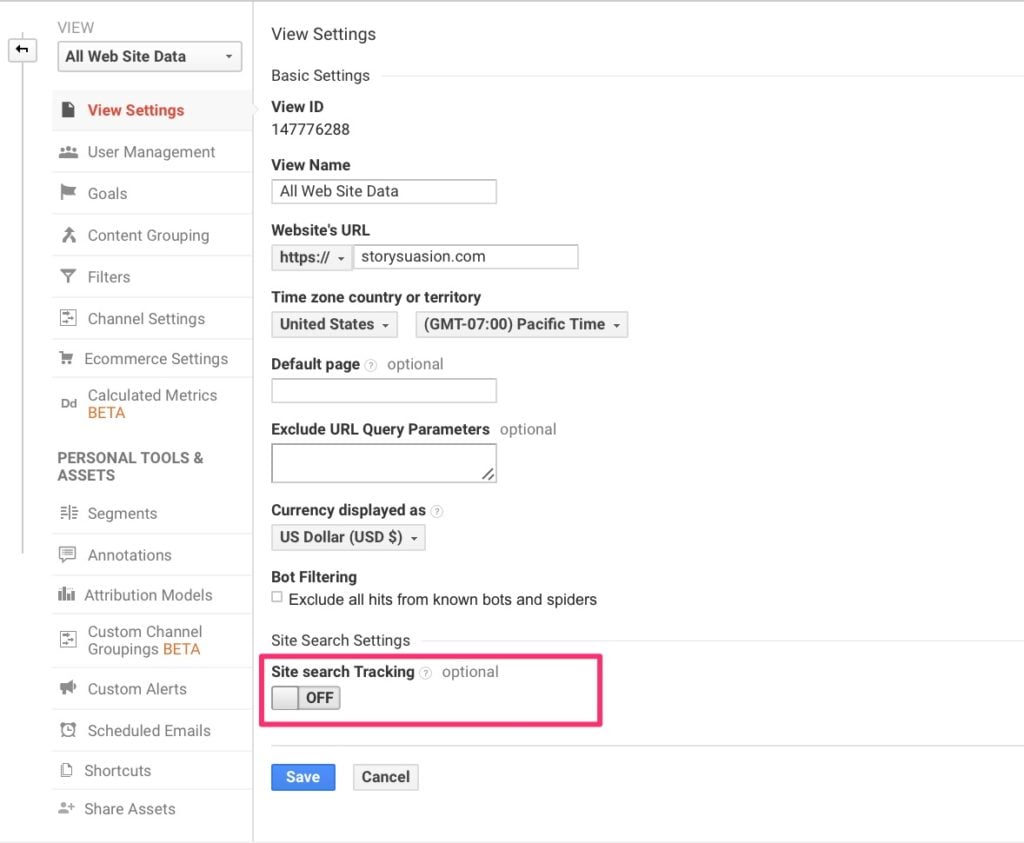
Step 2: In the Admin panel of your Google Analytics account, click on “View Settings.”

Turn site search on at the bottom of the page:
Step 3: Strip the query parameter from the URL of your results page
Remember that search you did in the first step?
You need to find the query parameter. It’s a single letter found within the URL:

In this case, it’s an “s.” Place it in the form field, and you’re done:

You can now track what people are searching for on your site.
My best advice?
Ensure that there’s a clear and frictionless path that visitors can follow to get what they want.
If you run an e-commerce store, the likely search for most users would be a product.
Make it easy for prospects to find that product, add it to their cart, and checkout.
That’s how you secure a conversion.
5. Narrow the Focus of Your Website Pages
Ever heard of decision paralysis?
Here’s the textbook definition:

It’s essentially the complete inability to make a decision.
If your prospects can’t decide what they want, there’s no way they’re taking any action.
The surest way to trigger decision paralysis is to offer too many choices.
Let’s examine this in the context of conversions.
If your website pages have too many goals, it means you’ll need just as many calls to action.
You can imagine that this doesn’t convert well.
But if you were to narrow the focus of each on your website page, you can have one solid call to action.
So, select one goal for each page on your site and have a primary call to action.
That’s it.
Does that mean that you can’t have more than one goal for a page?
You can—but on one condition.
These secondary goals need to serve the primary goal.
I’ll explain.
Let’s imagine that the core goal of your checkout page is to get prospects to complete the process.
Sounds obvious, but most people abandon checkout.
So, it’s a valid goal.
The primary focus of your checkout page should be to get people to fill out the form and press the “Buy Now” button.
But what if they need help completing the form?
Maybe they have an objection or something went wrong.
You’d include the secondary calls-to-action to help these people out so they can eventually complete the checkout process.
Like this:
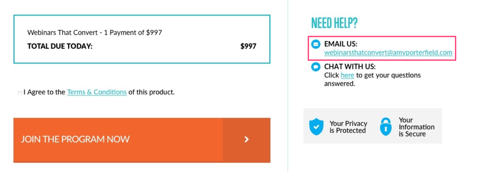
In this case, your secondary call to action serves your core goal.
Does that make sense?
6. Improve the Layout of Your Signup Forms
You’d never guess that something as basic as a sign-up form is one of the most common points of friction.
I’ll admit. This is not the kind of improvement that will send your conversions through the roof.
This is about tightening up your funnel, so people who would’ve otherwise converted don’t fall through the cracks.
The best layout for forms?
A single column.
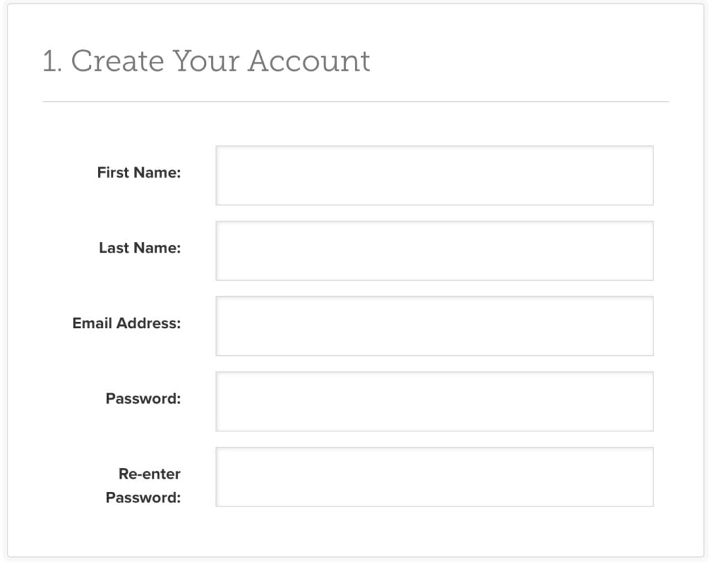
For one, single-column forms are faster to fill out because they’re more linear.
A study by ConversionXL found that multi-column forms take on average 15.4 seconds longer to complete.
Doesn’t sound like a long time?
In the online space, it is.
Think about the last time a website page took longer than 3 seconds to load.
I bet you dived for that back button.
Bottom line?
There’s nothing we value more than our time.
The more time you can save prospects, the easier they’ll be to convert.
7. Tackle Shopping Cart Abandonment with a Simple Email
As I referenced earlier, most people don’t complete the checkout process.
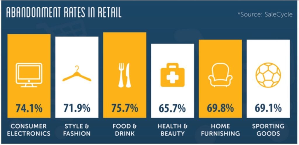
Here are some shopping cart abandonment rates in retail so you can get an idea of how pervasive this problem is.
Source: ConversionUP
What do these rates mean for your business?
Cart abandonment is something that you need to tackle head-on.
It’s worth noting that no matter how robust your conversion funnel is, there will always be a percentage of people who drop off.
Arming yourself with a simple cart abandonment email can make a world of difference to boost your conversions.
The point of this email is threefold:
- Remind prospects that they left items in their cart
- Incentivise them to complete the transaction.
- Make it easy for them to check out.
Here’s a sample email from Bonobos:
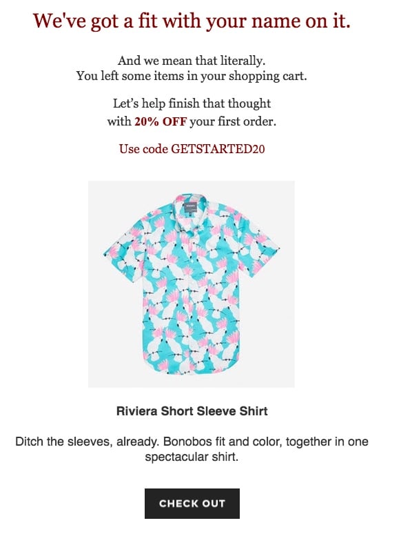
People who’ve placed items in their carts have demonstrated purchase intent.
That’s why this email—and e-commerce email marketing in general—is so effective in increasing conversions.
You’re targeting people who are in the smoldering hot zone as opposed to a cold lead.
8. Display Contact Information or Have a Live Chat Feature
No way this makes a difference, right?
You’d be surprised.
Again, this isn’t a silver bullet kind of conversion strategy.
What it does is to ease any anxieties that prospects may have about online transactions.
You already know that one of the most powerful objections that you have to destroy is lack of trust.
An easy way to give prospects a peace of mind is to display contact information prominently.
Live chat is even more powerful in that regard.
You may have noticed that it’s been gaining massive traction as the gold standard of prompt customer service.
If it serves to help customers through the checkout process, it would no doubt boost conversions.
Note that if you use this feature, it should provide value and not interrupt.
Otherwise, it would hurt your conversion rates.
9. Add at Least One More Payment Option
Your customers want options.
When it comes to parting ways with their money, that’s even more important.
Most people have a preferred payment option.
If you only give them one choice, they won’t be entirely comfortable going through with the transaction.
This uneasiness leads to inaction.
25% of people abandon their carts because their preferred payment was not offered:
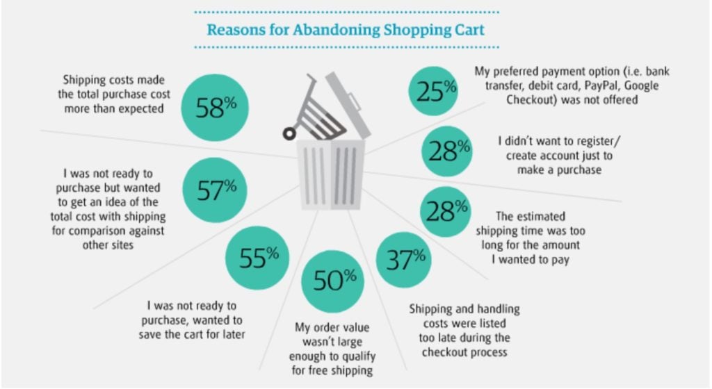
Source: MultiChannel Merchant
The easy fix is to offer 2-3 payment options.
10. Offer Guest Checkout
Take a look at the same chart above.
28% of people abandon their carts because they didn’t want to register for an account.
There are ways to incentivize visitors to create an account. You can offer coupon codes, reward points, etc.
These work exceptionally well.
What doesn’t work is forcing customers to go through this extra step.
It adds more barriers to the checkout process and increases resistance.
The result?
You lose a potential customer.
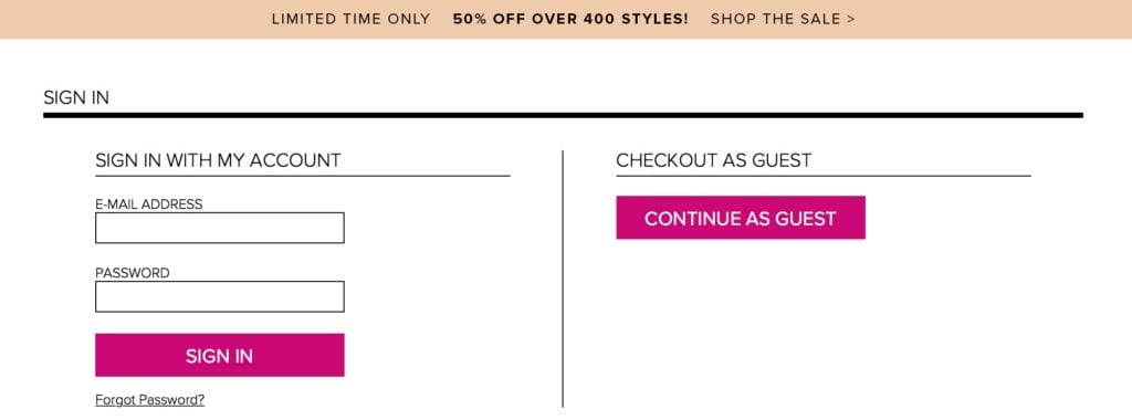
Offer guest checkout because most people would rather not go through the hassle.
Here’s an example from Lulus:

Conclusion
Conversion rate optimization doesn’t always have to be a complicated process.
I’m big on starting right where you are.
You don’t have to plunge forward by doing a complete overhaul.
That’s where the strategies discussed in this article come into play.
They’re by no means fancy or novel ideas. Any marketer who’s worth their stuff will tell you that these are simple strategies.
But it is often the small and unglamorous steps that make the biggest difference.
Start with the system that you already have in place. Take 10 minutes each day to implement these strategies.
I can assure you of one thing:
Your conversion rates will improve and your profits will be headed north with it.

