Capturing leads is one of the most critical steps in promoting your e-commerce business.
When you’re successful at capturing leads, you can more easily move prospects down your sales funnel and nurture them with email marketing.
Although lead capture is a simple concept, many marketers get it wrong and end up annoying their visitors with lengthy, irrelevant questions.
To help you collect quality leads on your website, I’ll share eight real-life lead capture form examples you can use for inspiration.
Let’s jump in.
Table of Contents
What is a Lead Capture Form?
A lead capture form helps you collect valuable contact information from your website visitors, such as an email address or a phone number.
The first element of a high-converting lead capture form is its design. A simple, distraction-free design improves your chances of getting visitors to sign up.
Next, a compelling headline, a limited number of input fields, and an irresistible call to action (CTA) are among the most important lead capture form best practices you should be following.
Let’s look at a few high-performing lead capture form examples to see these best practices in action.
1. MeUndies
MeUndies is an e-commerce store that offers a variety of premium underwear, loungewear, and apparel. The brand is colorful and its email popups certainly reflect that vibrant nature.
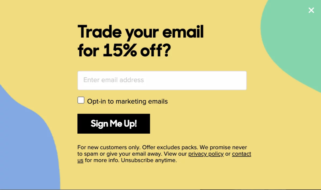
MeUndies’ lead capture form has a clear and attention-grabbing design. The popup’s copy is fun, light-hearted, and, best of all, offers a 15 percent discount code to new signups.
Notice how MeUndies handles objections in visitors’ minds with an additional copy that reads “Unsubscribe anytime.” Signing up is risk-free and the company rewards you with a nice discount. Sounds like a great deal.
This type of a lead capture form works well because it’s simple, containing one input field only.
2. Infinite Moon
Infinite Moon helps people get better sleep with fully customizable pillows made from natural materials.
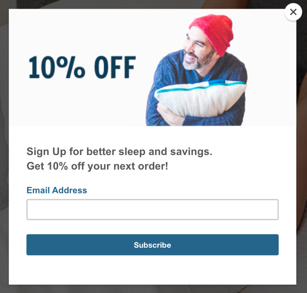
In this lead capture form, the company uses a clear headline, coupled with a fun, personal picture. Infinite Moon sells comfortable pillows, and the image of a well-rested person, happy with their pillow sends a positive message.
Again, signing up is simple as it only asks for an email address. Lastly, the “10% off your next order” is an enticing reason for visitors to subscribe to the company’s emails.
3. Revelry
Revelry helps bridesmaids around the world find the dresses that fit them perfectly, regardless of their size. The festive nature of the brand translates to its lead capture forms too.
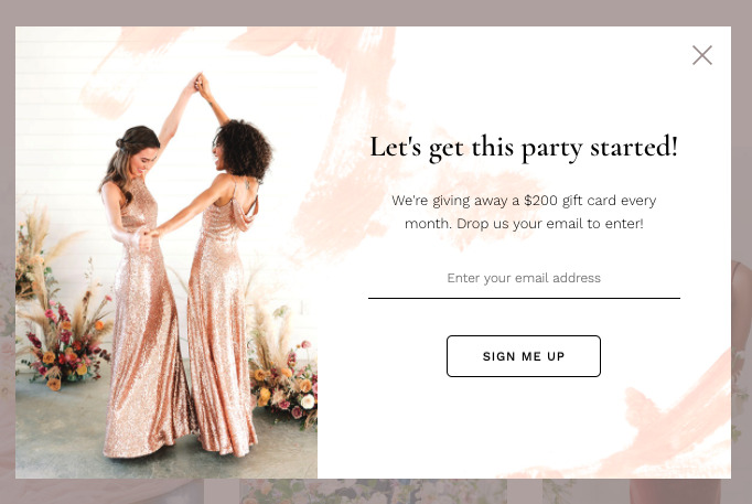
Similar to the examples above, Revelry’s lead capture form is easy to fill out, with only one input field. The lively imagery, design, and headline also match the festive vibe of the company.
The copy cleverly highlights the dollar value of the prize you can win upon signing up. It’s a brilliant use of an on-site giveaway, which helps the company collect more emails every month on autopilot.
4. Under Armour
Under Armour is a leader in sports apparel in almost every major sport. In recent years, the company made big strides catching up to Nike and Adidas by landing stars like Steph Curry as ambassadors. This competitive attitude is often reflected in the company’s marketing material too.
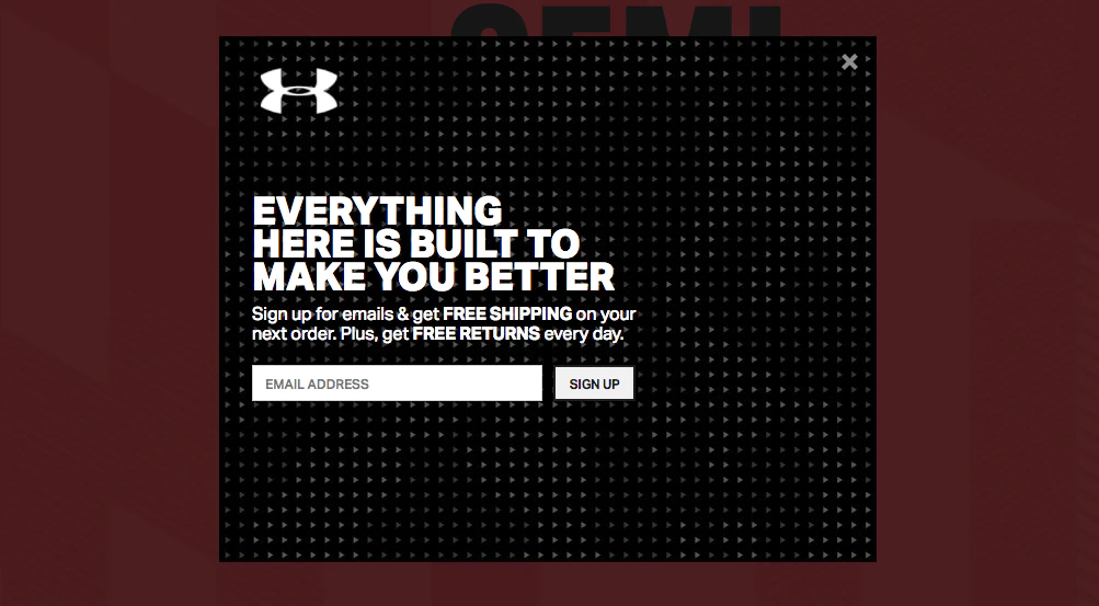
Under Armour’s lead capture form has a powerful headline that pulls you in. By using the power word “you,” the company invites you to the conversation and appeals to your ego.
Next, the copy explains the immediate value of signing up: get free shipping on your next order. You’re one input field away from getting a free shipping code and it’s a no-brainer.
5. Skims
Skims is a shapewear brand, co-founded by Kim Kardashian. It’s also a recent unicorn company (valued at $1.6 billion).
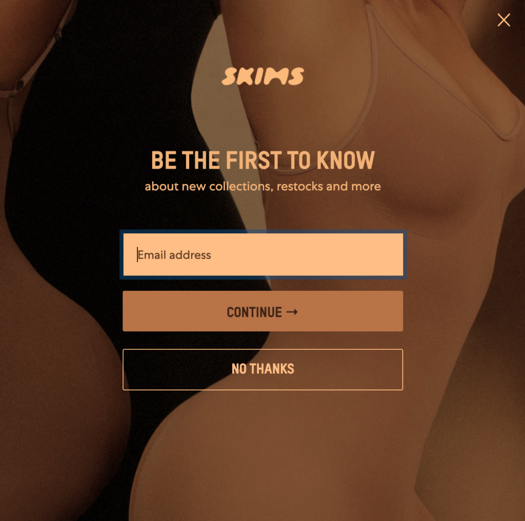
In this lead capture form, the company has an on-brand, elegant image synonymous with the products it makes.
The headline promotes exclusivity to prompt you to sign up and not miss out on timely restocks and sales announcements. Skims is a brand with the name “Kardashian” attached to it which means that items probably sell out regularly. That’s why they use of scarcity makes perfect sense for Skims to capture more email addresses.
6. Casper
Casper is an award-winning mattress maker that helps millions of people sleep better at night.
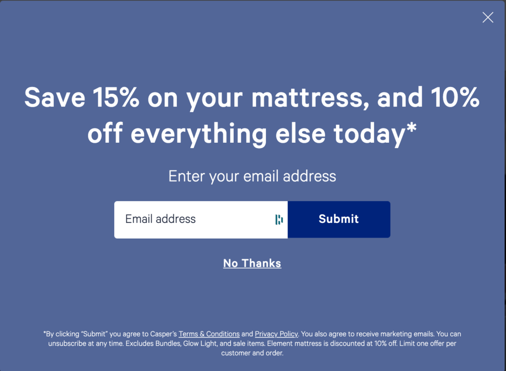
In this simple lead capture popup, Casper uses a headline that carries a sense of urgency. When you read the popup copy, you immediately want to take action.
What’s better, Casper stacks two offers in this headline. Even if you’re not interested in the company’s premium mattresses, you can still shop the sale, provided you join Casper’s email list. And once again, signing up is a breeze with only one input field.
7. BarkBox
BarkBox is a monthly subscription of dog treats, toys, and more. And it’s one of our favorite companies here at Drip, due to its humorous tone of voice and creative copywriting.
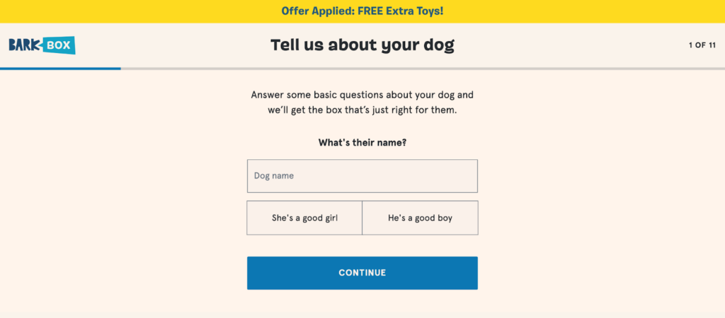
In this form example, BarkBox uses its signature bright design, highlighting the offer boldly. The top bar that reads “Offer Applied” helps you understand that you’re currently redeeming a code that gets you a free extra gift.
To personalize your box (and your future emails,) BarkBox smartly gets more details about your dog in this lead capture form. This way, the company can target you with highly personalized emails and offers.
My favorite part about this lead capture form is the progress bar at the top. Using a similar progress indicator in longer lead capture forms helps visitors understand how many more questions they need to answer, which can help you reduce bounce rates.
8. Firebox
Firebox specializes in personalized unusual gifts, gadgets, books, and more. It’s a fun, lighthearted brand that doesn’t take itself too seriously.
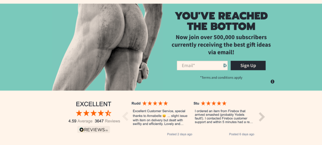
You can clearly see Firebox’s personality in its lead capture form too.
The attention-grabbing image and the funny headline are hard to miss. But Firebox doesn’t only rely on humor to collect email addresses.
In its body copy, the company uses social proof by mentioning its number of subscribers who are getting the best gift ideas via email. When you read Firebox’s copy, the fear of missing out kicks in. And if you don’t want to miss out on something this good, you join 500,000 others and quickly sign up for the company’s email list.

Conclusion
Lead capture forms are essential for every e-commerce business to grow. When you’re able to constantly generate quality, eager-to-buy leads, you can take your business to new heights.
In this article, I covered what a lead capture form is, with eight high-converting examples from top brands.
If you’re looking for more inspiration to create lead capture forms that won’t annoy your visitors, take a look at Drip's onsite campaign templates and duplicate any one of them for your store.


