Running an ecommerce business is far from easy.
The razor-thin net margins as low as 0.64% in the ecommerce game force you to have a large customer base — which means you need lots of traffic — to at least get to the break-even stage.
However, many ecommerce companies fizzle out long before they reach their full potential — even with the best product ideas.
But many ecommerce merchants end up shooting themselves in the foot because of easy-to-avoid ecommerce mistakes.
Because no matter how good your products are, if a customer can’t complete a checkout or doesn’t want to deal with creating an account, you’re not getting that sale.
Let's take a good look at the common ecommerce mistakes you must avoid in 2023 to build a cash flow-positive ecommerce brand with a loyal fan base.
Mistakes To Avoid When Building A New Ecommerce Site
Ready to dive in?
1. Pricing Without Solid Research
Product pricing is directly related to its market relevance, customers’ buying behavior and their immediate need(s).
Here’s the kicker: pricing directly impacts the customer’s view of your brand as a quality provider.
So, if you price higher than required, you would turn off (would-be) great customers. And if you price lower than what you should sell for, it’d make the ideal customers question product quality.
And the last thing you want to do is devalue your product.
Therefore, it needs to be just right to strike that fine balance. And the extent of your market research determines if you’re able to hit the pricing bullseye.
How to Fix this Ecommerce Mistake:
It’s far from a race to the bottom — that’s not a race you can win.
Research your product and your customers extensively. Think about what you want your prices to say about your brand, and what your customers will realistically pay.
For example, MVMT’s Legacy Slim collection watches are simplistic, functional, and thoughtfully priced — all in one place.
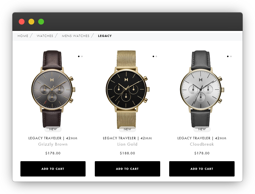
MVMT understands its target audience well — those seeking minimalistic design and a sophisticated look with a durable make at an affordable price. The hardened mineral crystal reflects sophistication, striking all-black colorway suggests a minimalist approach ideal for corporate as well as casual ensembles.
Therefore, the brand not only addresses cosmetic desires but also the demand for a functional watch. This helps MVMT become the go-to brand for most watch buyers.
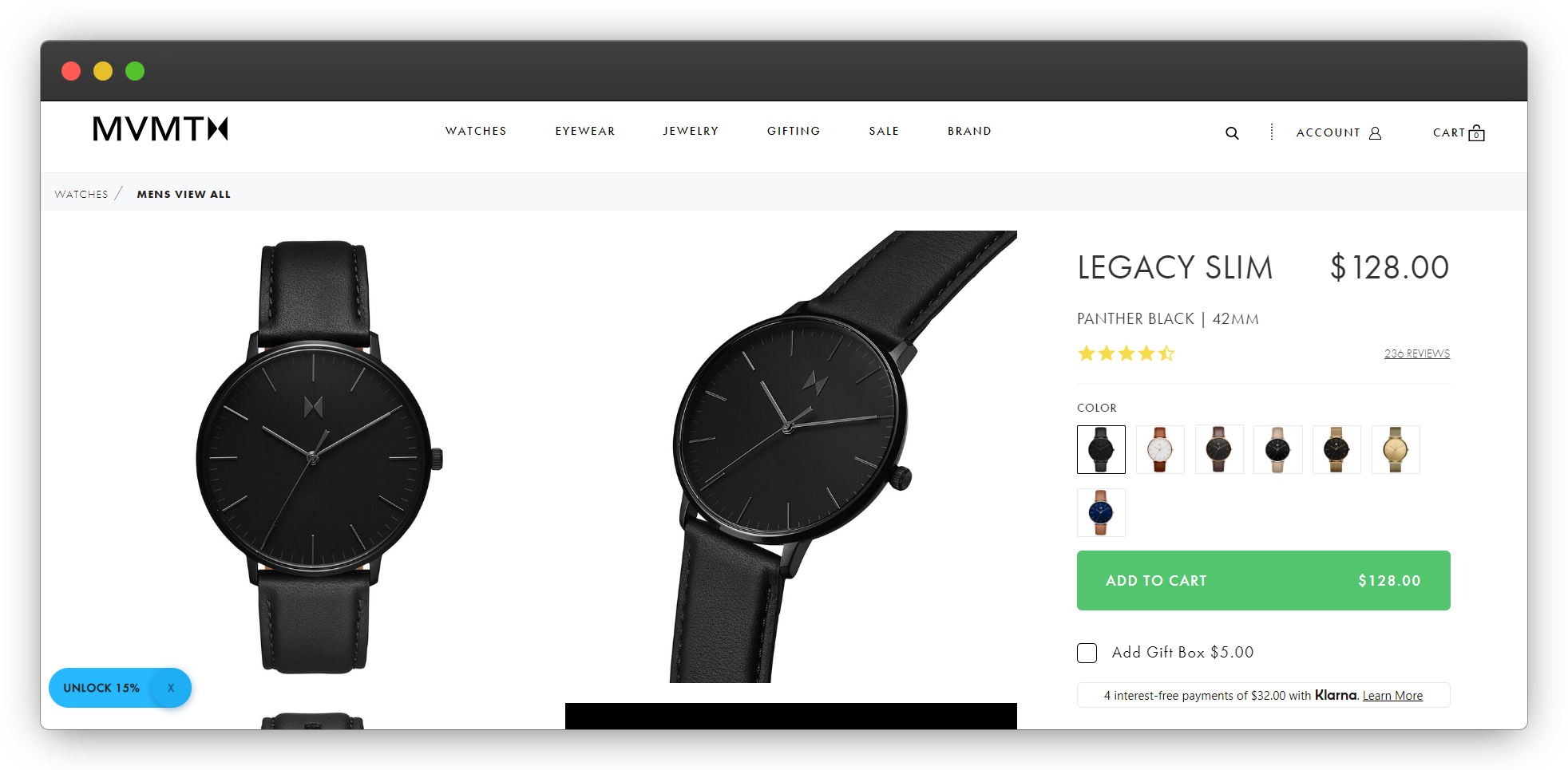
Priced at $128, MVMT offers mass-premium pricing that not only gives its website visitors a compelling reason to buy the product right away but also provides them with an opportunity to capture social currency.
2. Creating Friction-Filled Checkout Process
A high-quality product always makes customers happy.
But a complex, unreliable, or friction-filled checkout process can end the customer journey before it even starts.
Your customers not only expect a reliable payment platform (like GooglePay, PayPal, Stripe, etc. that ensure data security and privacy) but also prefer a one-step checkout process or something remotely close to that.
Suppose you stumble upon a jewelry website where you fall in love with a bracelet. You add it to the cart but don’t end up buying because you were asked to fill up a long mandatory form before making the payment or you were ‘forced’ to make an account before proceeding further.
Although you desperately wanted to buy the product, you didn’t — all because of a complicated, drawn-out checkout process.
How to Fix this Ecommerce Mistake:
The shorter the checkout process, the easier it is to get a customer over the finish line.
From a business standpoint, you might think that imposing your customers to create an account would help in acquiring more customers by growing your email list (which you can later target via email campaigns).
The problem is that this rather ends up agitating the website visitors who otherwise would have become your loyal customers.
Implement a one-step checkout process. If you absolutely must require an account, offer the option of creating one with a social media account or Google. Think about your mobile customers, who have to painstakingly enter everything equipped with only their fat thumbs.
A good example of a smooth checkout process can be seen on the website of Flambette, a brand that sells exquisite fragrances as candles, soaps, etc.
They offer a straightforward and (almost) one-step checkout process as you can opt for the ‘Express Checkout’ option.
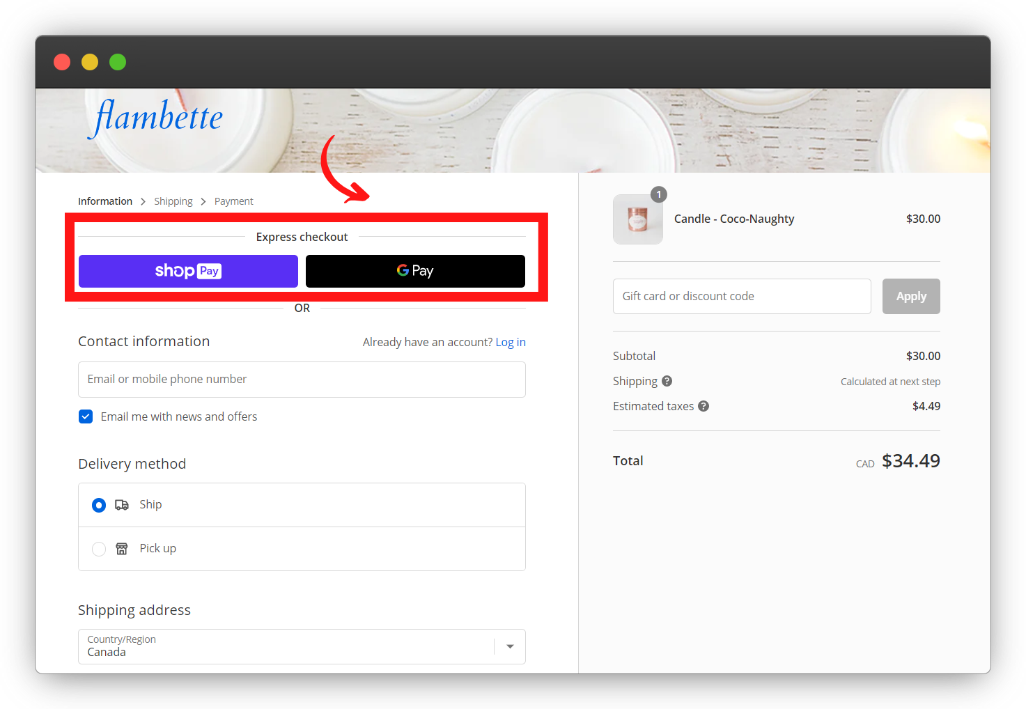
That helps you completely omit filling up the shipping form and making a user account, and leverage Google’s auto-save account details feature (in case you choose GooglePay) to complete your purchase as a guest.
3. Zeroing In On A Wrong Ecommerce Platform
Using the wrong platform for your ecommerce website can slow your ecommerce business’ growth.
When picking the right ecommerce platform, you have to identify all the ‘Whats’ and ‘Hows’:
- What do you need the platform to do?
- How many resources do you have for maintenance?
- What is your desired growth rate?
- How many products are you looking to sell?
You have to have some sense of what your needs are.
For example, an ecommerce platform that is made for larger companies but doesn’t offer much support for smaller businesses isn’t well-adapted to someone just starting out. An ecommerce platform that’s built to be ready out of the box isn’t going to be well-adapted to someone who needs a lot of customization.
The majority of ‘ecommerce newbies’ are not well-versed in the basics of starting up — website making, market validation, running successful email campaigns, influencer marketing, etc.
This only increases the confusion for someone who is doing it for the very first time.
How to Fix this Ecommerce Mistake:
Do your homework and choose an ecommerce platform that makes sense for what you realistically need.
For example, Wix offers an all-in-one ecommerce platform to help you build and run a successful one-product store.
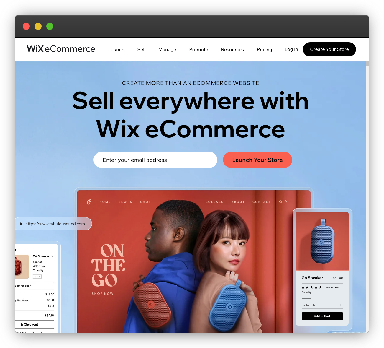 Its ready-made templates take care of website design anxiety for first-timers, and built-in SEO and analytics tools help you rank better (without an SEO expert’s help). Plus you can use its mobile app to sell on and manage multiple platforms (Amazon, Facebook Marketplace, eBay, etc.)
It does its best to help you sell while demolishing the wall of technical and marketing complications that you can (and probably will) face when starting and scaling your ecommerce store.
4. Keyword Stuffing Product Descriptions
Your business grows when the number of website visitors that convert into customers increases.
(But you need to fight off the average 2.17% conversion rate.)
Simple, right?
But what makes people visit your website in the first place? The keywords!
Keywords are the specific phrases and words the customers input into the search engines when they look for a particular product.
Oh really? So, why not just add a high number of keywords to your website copy and rank at the top of Google search results?
Hold on, just a minute…
Your product descriptions consist of a title, meta title, descriptions, and meta descriptions.
If you use the target (and relevant) keywords excessively in these product page sections (use the same keyword repeatedly throughout), it is called keyword stuffing, also known as spamdexing.
And many business owners are unaware that it is penalized by Google as it is considered an unethical ranking practice and a confirmed negative factor.
How to Fix this Ecommerce Mistake:
A good product description strategy is:
- Deploying actionable content that motivates the buyers to explore the product
- Compelling for the site visitors to hit that CTA and purchase the product
- Speaking to the buyers and establishing a connection
- Including keywords that are content-relevant, add value, and have a high potential for increasing the conversion rate
Isoko does product descriptions right.
It loads its Synchrony collection page with a description that:
 Details the inspiration of the product — ‘inspired by the blending of artistic performance and fashion’, and the product goal — ‘freedom to express’ reflects that the brand has a mission greater than just selling apparel.
Instead of keyword stuffing their product description, they leverage this space to inform the customer about the fit, feel, and usability of the Vinci Shirt.
 Interestingly, this also demonstrates that they have the buyer persona figured out.
5. Not Using Easily Readable (Seo-Friendly) URLs
Maybe, as a seller, you don’t realize how inconvenient long and complex URLs can be.
But your customers carry the polar opposite emotion.
Suppose your bestie asks you to share the link of the perfume that she liked when you guys met up at the last gathering.
You visit the website, copy the URL, and send it across.
What do you think would be her first reaction upon reading this: https://perfume.com/assets/*#%/b@/*&/category_B/subcategory_C/freg/
- She would see a clutter of words, symbols, and special characters (parameters and fragments)
- It is nearly impossible to remember and type the whole address if required
- It is badly formatted
- She might also fail to understand the page intent
Google is very much the same way. It speaks a certain language, and the more you optimize your site by putting your text, like URLs, in Google’s native language, you’re making its job easier.
And Google rewards sites that make its job easier.
How to Fix this Ecommerce Mistake:
A URL defines your website as much as the product details, website appearance, etc. would. And a good one is contextual and clearly defines the product.
For example,GoodMovement sells gym and exercise equipment.
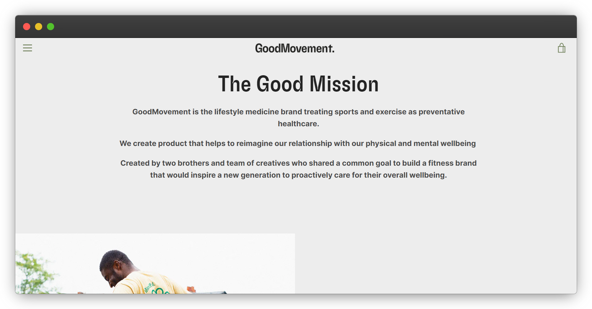 If you click on ‘Good Bands, The Black Band’, you’re directed to the page with the link that looks like this:
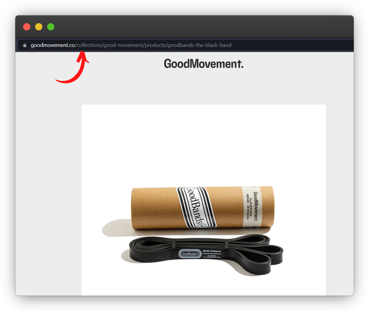 Now this type of URL is well-defined with the domain and subdomains well placed, category pages that do not change frequently (remember the unexpected Error 404 page?), and is easy on the eyes.
It is SEO-friendly (proper and easily readable), and therefore:
- It is primed to rank well on Google (it has complete data, is properly formatted, and is relevant)
- With /good-movement/, it represents proper linking
- /goodbands-the-black-band quickly lays out the product you are going to explore
6. Having A Blog Just Because…
Ask yourself: Do I need a blog to be able to sell products? Is content marketing important for my business?
Having a blog just because every other business has one defeats the very purpose of having a blog in the first place.
You must understand that well-written blog posts help increase website traffic and conversion rate.
Good content helps you:
- Increase brand awareness
- Dominate SERPs (search engine results pages)
- Build domain (and topical) authority
- Heighten customer trust and loyalty
- Offer real value to your customers
For example, a brand selling hair oil to lessen dry scalp issues might leverage Instagram LIVE (instead of a blog) to highlight that hair fall issues can’t be permanently cured but only managed by following a healthy diet, sleeping a good 6-7 hours, exercising regularly, etc.
And then direct that traffic straight to their website with a 20% discount.
This is called selling via conquering the ‘knowledge gap.’
You must expose your buyers to the truth, and educate them about the issues they’re facing, instead of just advertising your product in their faces.
This company can keep selling products using just this process without involving a blogging strategy at all.
How to Fix this Ecommerce Mistake:
You need to really examine your business case and find out the most appropriate marketing and sales channel(s).Think about what really works for your brand and what makes sense for your customers.
If it’s a blog, great! If not, explore other avenues for content creation.
Pulp Pantry sells veggie chips made with simple, sustainable ingredients. It is a fine example of a well-executed content strategy.
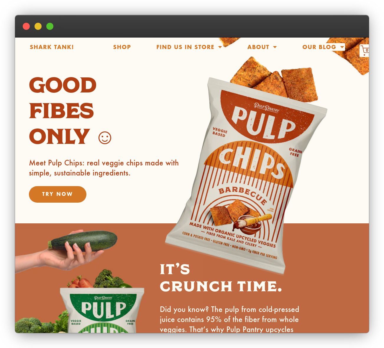 Now, chips are a commodity business. You buy them, eat them, and then forget about them.
How many companies selling chips managed to become a brand in your mind? Think hard.
But just a look at Pulp Pantry’s blog posts, and you know what I’m talking about.
Its blog section is focused on sustainability freaks, and everything they care about.
They use the ‘Inside our Pantry’ section to update the customers with everything happening behind the scenes along with lip-smacking dishes to complement their chips.
 And the ‘Zero Waste Tips and Tricks’ section addresses environmental concerns, and presents tips to achieve zero waste day. Not only does this solidify their sustainability brand angle, but it helps attract potential customers who might be interested in getting to a zero-waste lifestyle.
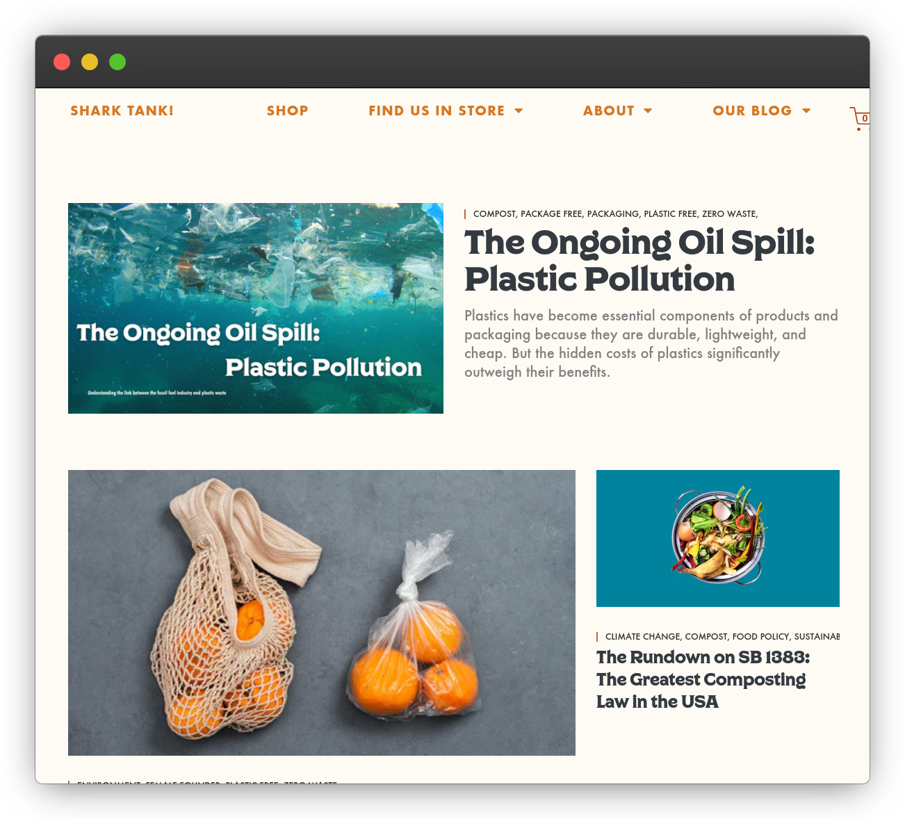 Because even those who look for a sustainable lifestyle like to eat chips. This is the idea behind Pulp Pantry’s content marketing strategy.
7. No Product Reviews (Or Worse — Faking Them)
Customers in 2023 are aware of the authenticity of the featured reviews and testimonials.
They can spot the fake ones quickly, and find it suspicious if you don’t have any.
Even if you have been lucky so far to build a customer base with fake product reviews, you never know which one spoils your ‘fake’ impact and credibility!
A fake testimonial sours customer experience and ruins your market reputation and revenue goals.
But at the same time, established brands like Adidas, Nike, Chanel, etc. don’t need a testimonial to support their genuineness or even their usefulness to the masses. They have come past that stage, and their name speaks quality loudly.
How to Fix this Ecommerce Mistake:
For someone who’s just starting their seller journey, you need real reviews or testimonials to get the customers to hop on that trust engine.
Petaluma is a plant-based sustainable dog food brand.
Every aspect of its website reflects that this company belongs to the people who simply love dogs. They’ve built a dog mom-and-pop community around that love.
The brand features multiple real reviews on its homepage to present the actual user experience.
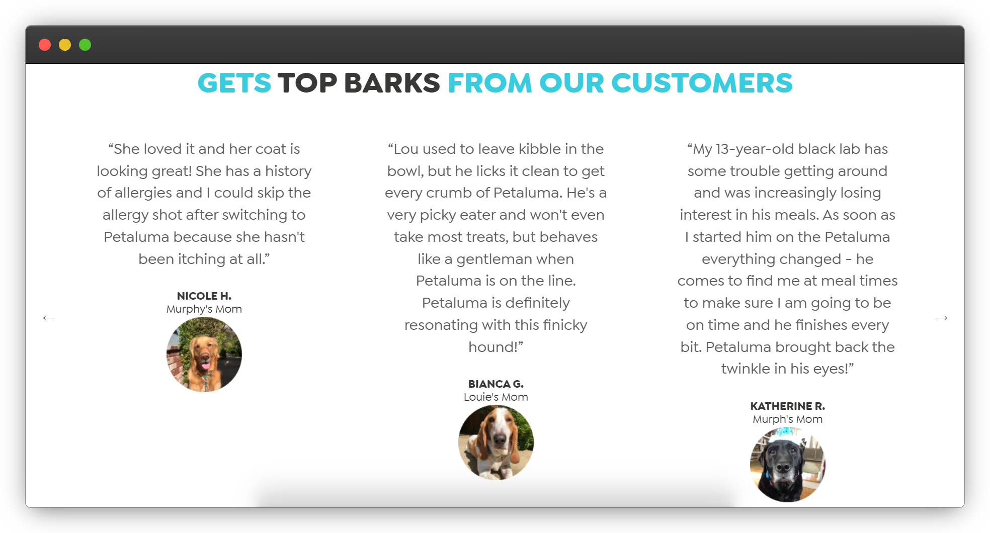 If you click on ‘Read more reviews’ to dig in further, you land on a customer review/discussion forum, where the buyers can directly communicate with the founders regarding their experiences.
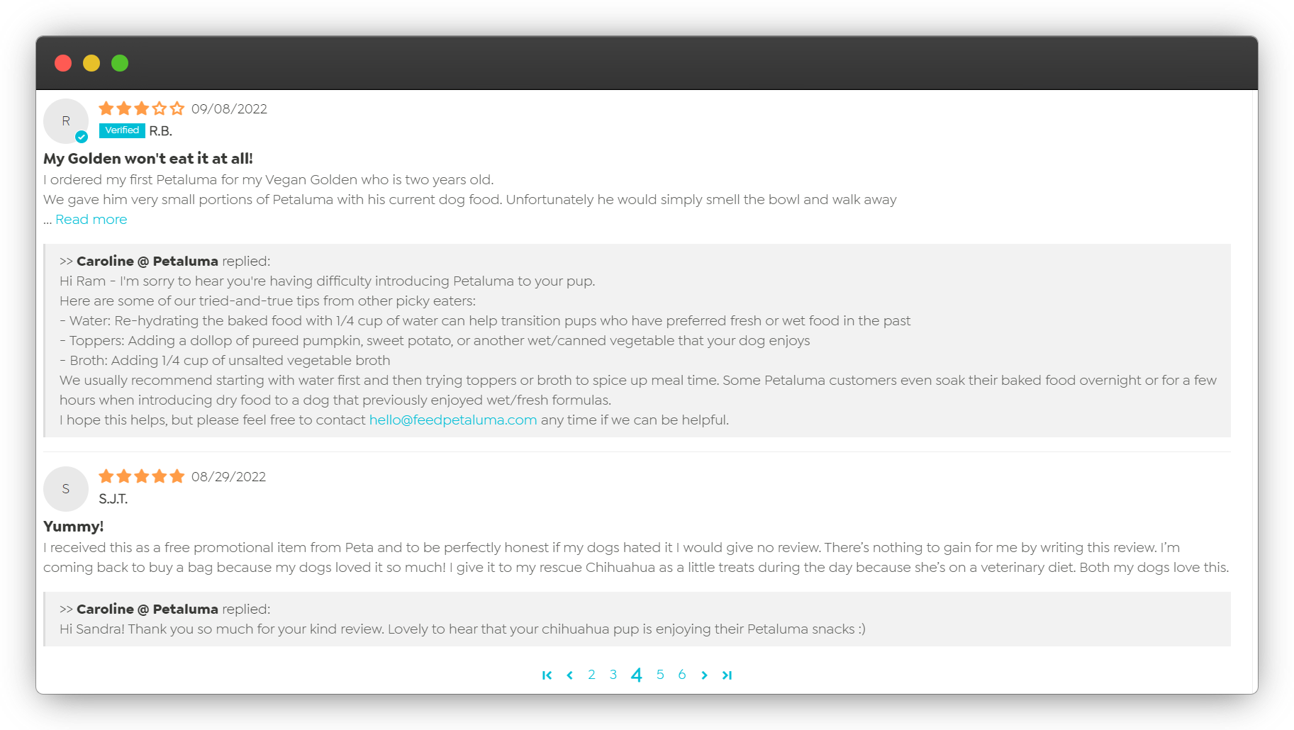 The founders respond to their customers in-depth with facts or advice, which reflects how devoted they are. This creates everlasting credibility and strengthens the trust factor between the brand and their buyers.
But customers aren’t motivated to leave a review — save for very extreme cases either way. So how can you get more reviews and customer testimonials?
Simply ask.
Sometimes, it’s as easy as that. If you find that your customers are particularly unmotivated, you can try incentivizing the feedback. You can add points to their loyalty rewards, offer a discount or free shipping off a next purchase, or a free gift.
Having more social proof from happy customers on your site is definitely worth it.
Avoid Even More Common Ecommerce Mistakes
No one is perfect — even in the ecommerce industry.
Many mistakes boil down to one simple thing: a lack of focus on what really matters. The bottom line is to sell products while generating a profit and building a loyal customer base.
All else is just a distraction. Cancel the noise, and focus on the essentials.
The biggest ecommerce mistake would be sleeping on one of the most profitable channels out there
Among your essentials should be a great marketing automation tool to help you save time and earn more from your customer base. Drip can help you do just that — plus much, much more.
Ready to take the plunge? Try Drip free for 14 days!


