With over 800,000 stores powered by Shopify in 2019, it’s the third biggest ecommerce platform in the world and has a market share of nearly 10 percent.
It’s simple to install, integrates easily with more than 2,500 apps and offers award-winning support 24/7.
Besides that, it allows you to create an amazing ecommerce store that looks professional, loads quickly and is fully mobile responsive.
To get an idea of just what Shopify is capable of and provide you with some inspiration, I’m going to highlight seven of the best Shopify stores.
I’ll include plenty of screenshots and discuss the specific reasons why I love these Shopify stores so you’ll have some tangible takeaways.
That way you can draw from these examples and use the findings to improve your own ecommerce store.
Here we go.
Best Shopify Stores for Inspiration:
1. Death Wish Coffee
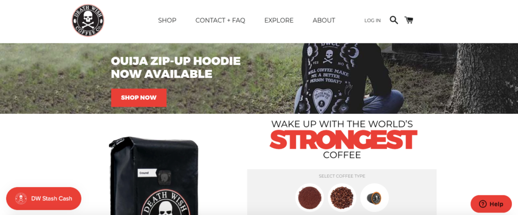
We’ve mentioned Death Wish Coffee before where we talked about their killer unique selling proposition (USP), which is, “Wake up with the world’s strongest coffee.”
I think it’s pretty amazing, and as a serious coffee drinker, it certainly caught my attention.
And it’s probably their brand positioning and great copywriting that I love most about this Shopify store.
Scroll down just a bit on the homepage, and shoppers quickly learn all about the product and what differentiates it from other competitors.
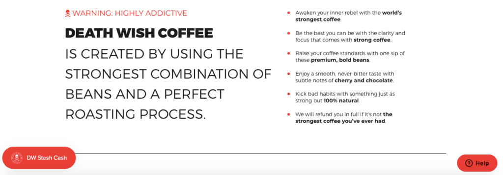
For instance, they only use premium, bold beans and ingredients that are 100 percent natural.
I like their simple, intuitive navigation at the top header, which seamlessly gets you where you need to go.

Browsing through their selection of products is pleasant and painless because of the nice layout and organization.
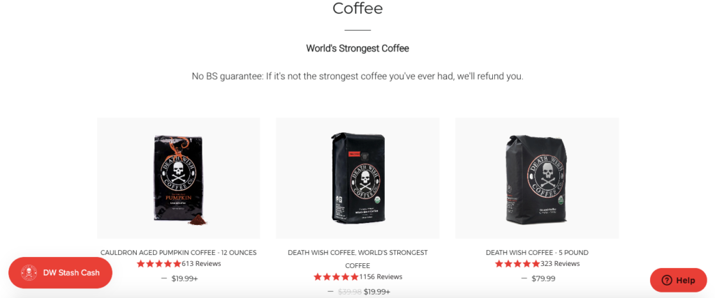
The clean, white background and dark product images and fonts creates a nice contrast that’s pleasing to the eyes.
And including a full product description along with answers to FAQs supplies shoppers with everything they need to make an informed purchase.
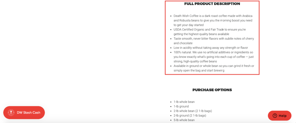
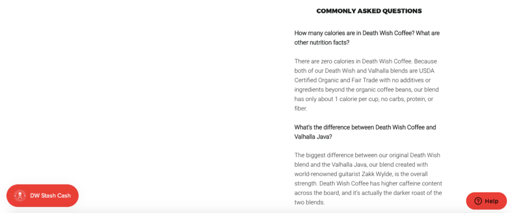
Finally, the distinct brand identity of Death Wish Coffee, which is dark, morbid, yet playful really sets them apart from your average coffee company.
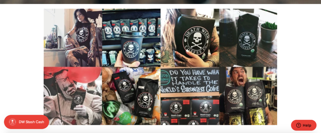
And this is critical considering they’re in such a saturated industry and up against behemoths like Starbucks and Folgers.
2. Manitobah Mukluks
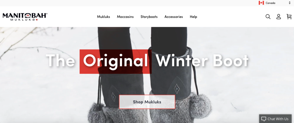
With winter just around the corner, I’m sure Manitobah Mukluks, a company that specializes in high quality, super warm winter boots, will be doing plenty of business.
There’s a lot to love about their Shopify store.
First, it’s visually pleasing with professional images that effectively show their products in action.
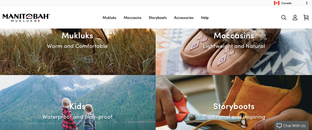
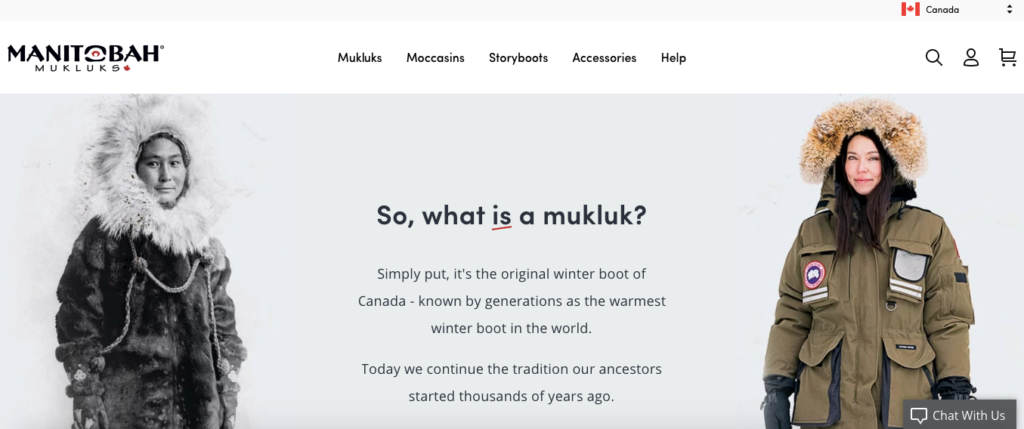
Considering that most people probably aren’t familiar with the term “mukluk,” they do a great job by succinctly explaining it, using clear and concise copy.
They also feature a fantastic video that gives shoppers a quick rundown and shows their products in action.
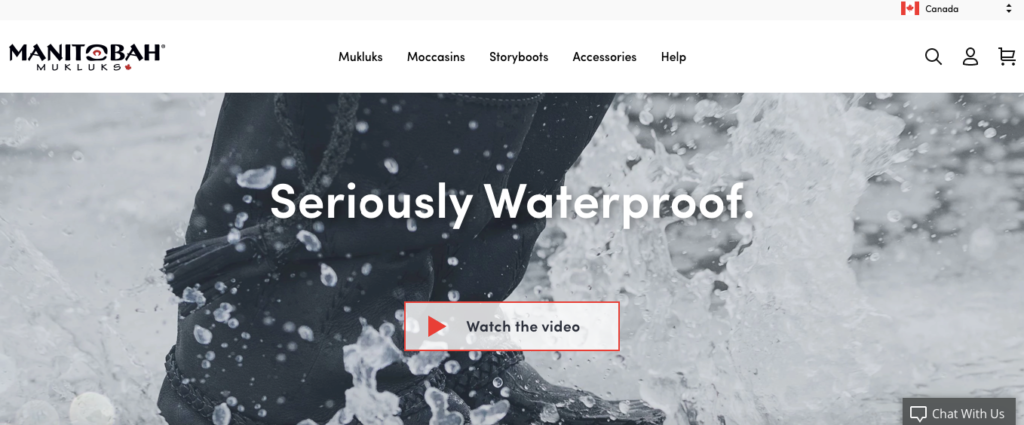
It starts with an unboxing and gives viewers a feel for just how high quality their products are.
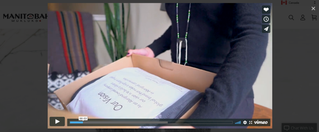
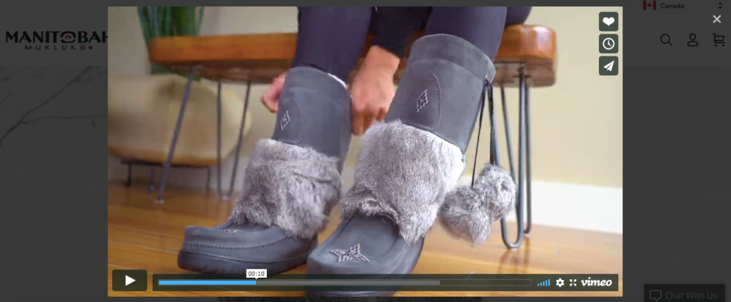
That’s important because the mukluks really come to life, and “73 percent more visitors who watch product videos will buy.”
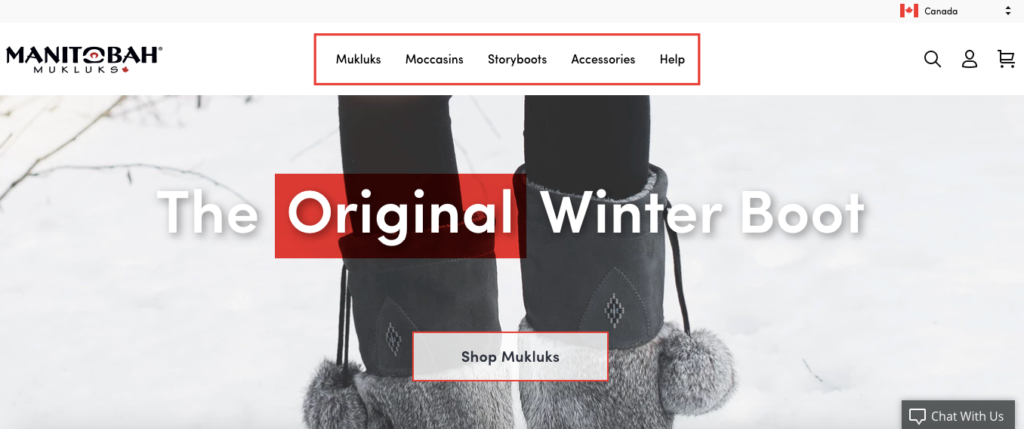
Navigation is super simple, allowing shoppers to conveniently browse through their product selection.
And finally, the product pages are incredibly stunning and include a wealth of helpful information such as the company vision, how they ensure authenticity and how they manufacture their products.
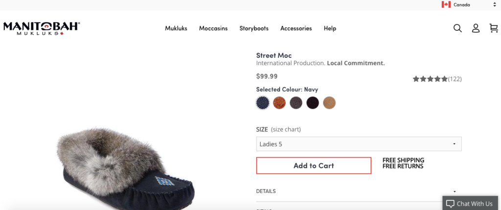
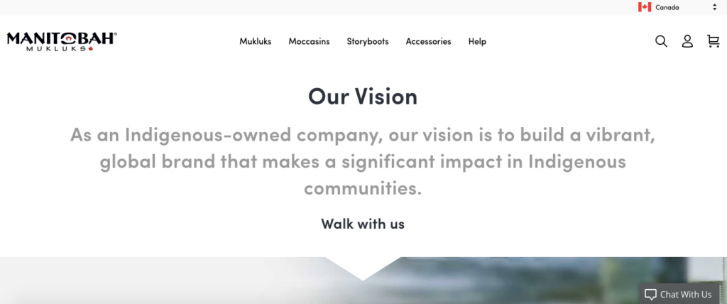
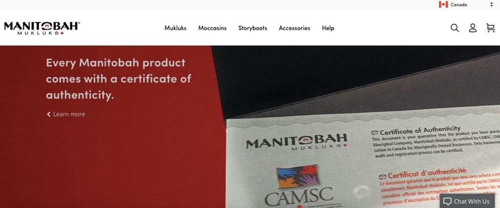
It’s all very transparent, which is important for winning over modern shoppers.
So when you combine all of these different factors, Manitobah Mukluks is hands down one of the best Shopify Stores I’ve seen.
3. Yoga Rebel
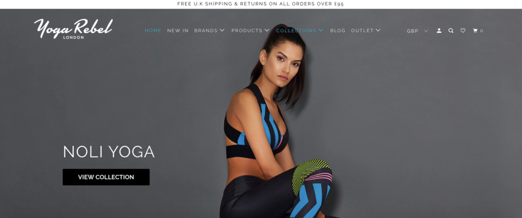
Again, making your ecommerce store aesthetically pleasing is vital for winning over shoppers and making sales.
“Ultimately, the importance of strong visuals in ecommerce is they reinforce branding; decrease purchase anxiety and help users make informed buying decisions,” explains marketing expert Kayla Eric.
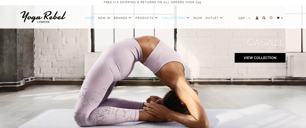
And that’s definitely the strength of Yoga Rebel, a company that stocks all of the top brands yoga clothes, fashion, gym wear and athleisure for women.
Browse through their site, and shoppers quickly see that it’s filled with ultra high quality images that should pique their interest and give them a good sense of how the products look and feel.
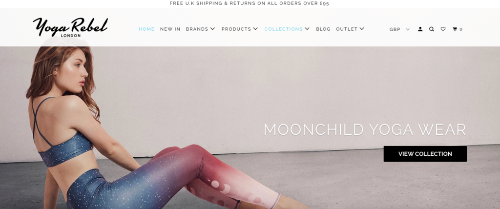
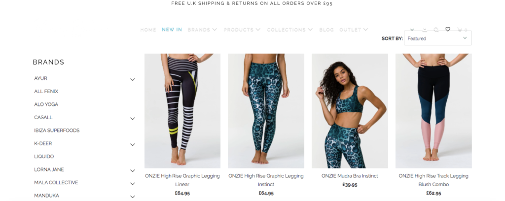
And this carries over to their categories and product pages.
Notice how crisp and clean everything looks, with the white minimalist background and bold images.
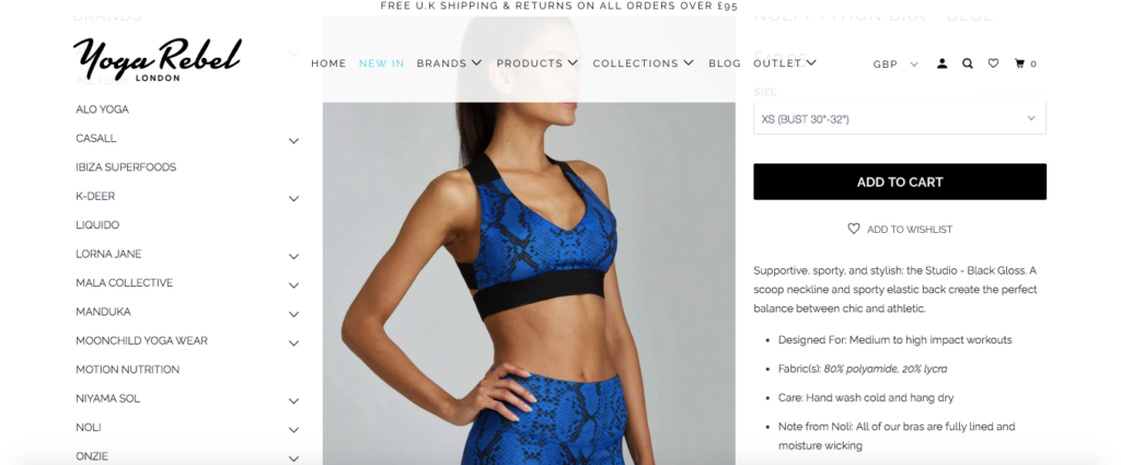
And when someone clicks on a particular product, Yoga Rebel gives them all of the essential information needed to learn about the product details like what type of workouts it’s best suited for, the fabrics it’s made from and tips for proper care.
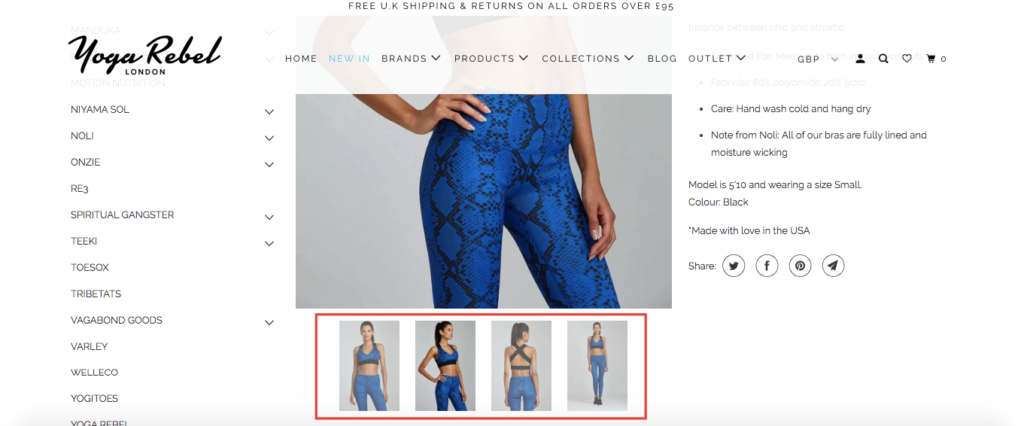
Just below that, there’s the option of seeing the product from different angles, which helps shoppers envision themselves wearing it more easily.
It’s also smart that they include a “You may also like” section at the bottom, which features other relevant products based on the one that’s being viewed.
As you probably already know, personalized product recommendations can have a huge impact on conversions and revenue.
In fact, a study from Salesforce “found shoppers that clicked on recommendations are 4.5x more likely to add items to a cart, and 4.5x more likely to complete their purchase.”
So I’m sure they’re reaping the benefits of this feature.
4. PRESS London
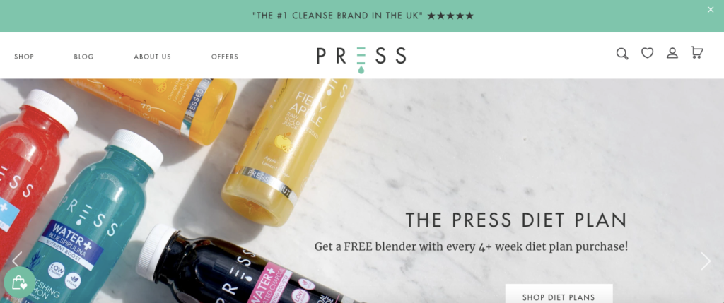
As I mentioned before, having a strong USP is crucial for succeeding with ecommerce.
There needs to be something definitive about your brand that will instantly grab shoppers’ attention and make them interested to explore and engage with your site.
And that’s something I feel PRESS London, a plant-based quality nutrition company, nails with their Shopify store.
Right at the top, one of the first things shoppers notice is that it says, “The #1 Cleanse Brand in the UK,” along with five stars.
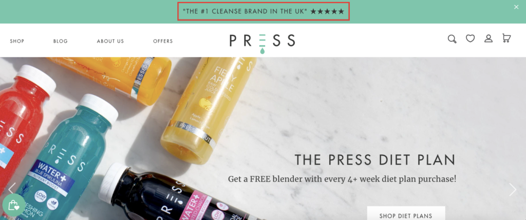
It sets the tone, and that combined with the colorful images and white background create a nice aesthetic that should entice shoppers to browse.
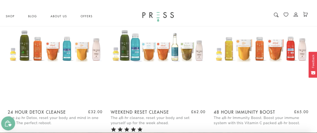
And it’s more of the same when you check out their different line of products.
Here’s what their 1–2 day line of detox products looks like.
Click on an individual detox kit, and shoppers can check it out in-depth to see which specific products they get.
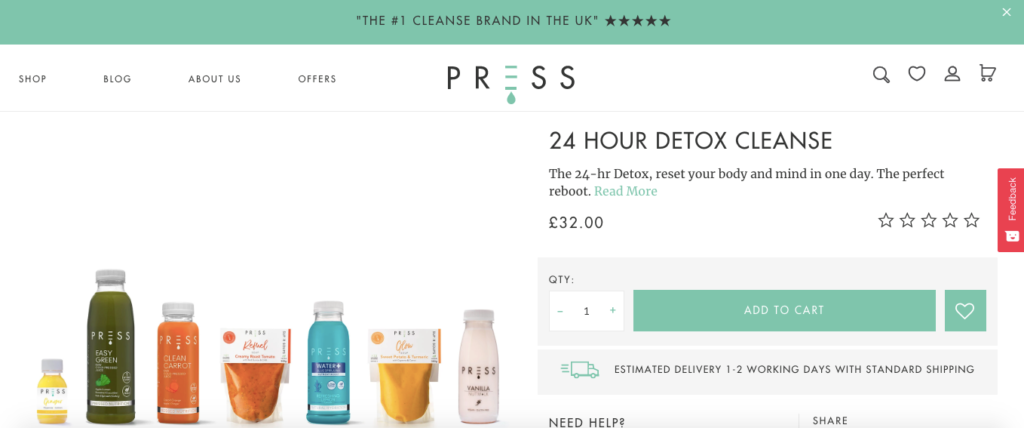
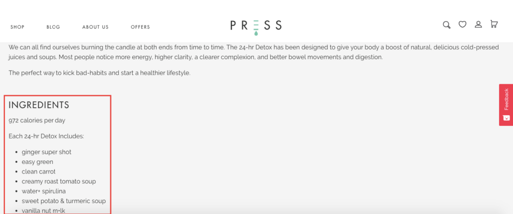
Scroll down a bit more, and they see a nice product description that explains the benefits of these detox products, as well as the exact ingredients and calorie count.
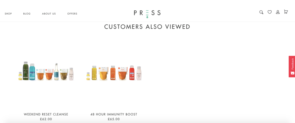
And at the very bottom of the page, there’s a “Customers Also Viewed” section, which features suggested products.
One final thing that I like about this Shopify store is the “Offers” page where shoppers can find limited-time promotions to save.
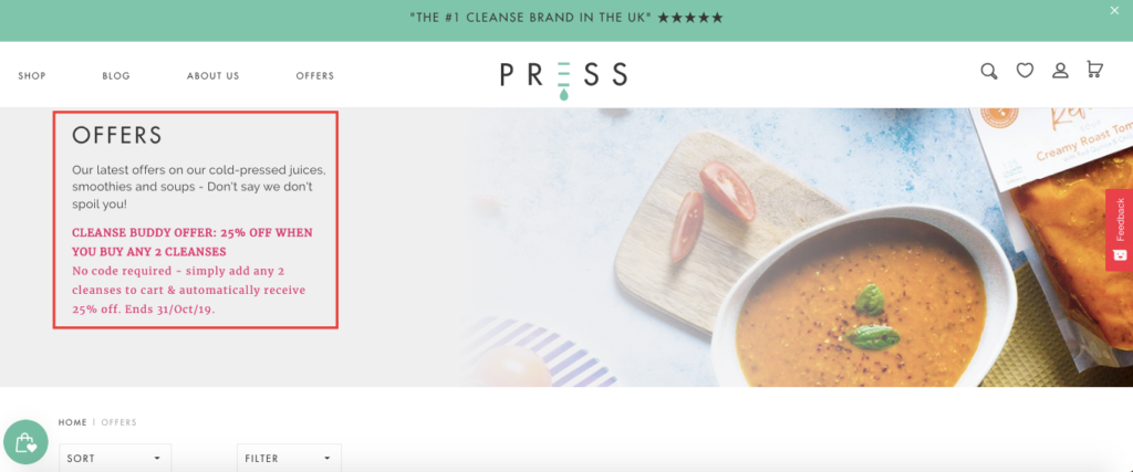
Considering that “81 percent of online consumers want promotions targeted to their product preferences,” I would imagine that this has had a positive impact on their sales.
While I wouldn’t say that PRESS UK does anything overly fancy with their Shopify store, they adhere to the right fundamentals and create an enjoyable online shopping experience through and through.
5. Minaal
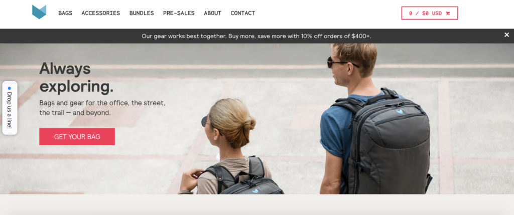
Minaal is an ecommerce brand that specializes in making durable, minimal travel and city bags and accessories.
One of the main things I love about their Shopify store is how simple it is to navigate.
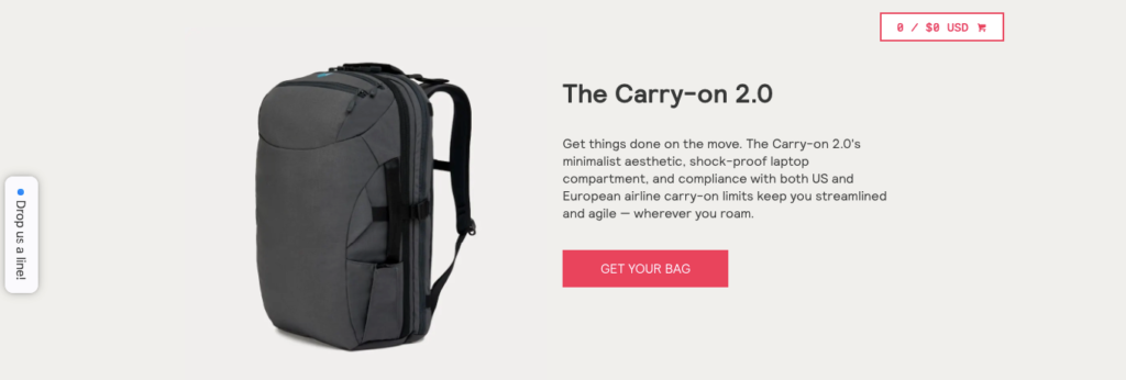
It’s streamlined and intuitive, so shoppers can quickly learn about their offerings, the benefits and why Minaal’s products differ from your average backpack.
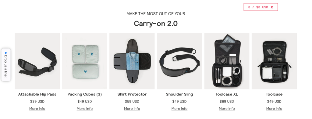
For instance, they get straight to the point in their copy for “The Carry-on 2.0,” and shoppers can instantly see why it’s such an interesting backpack.
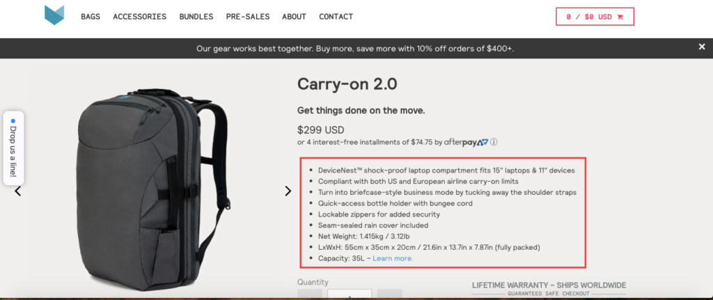
And when they click on the product page, they get the full rundown on features and product details.
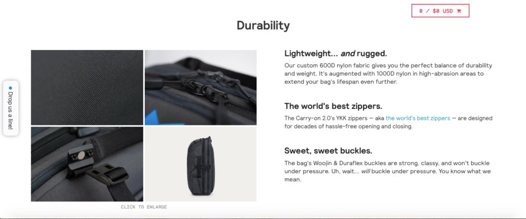
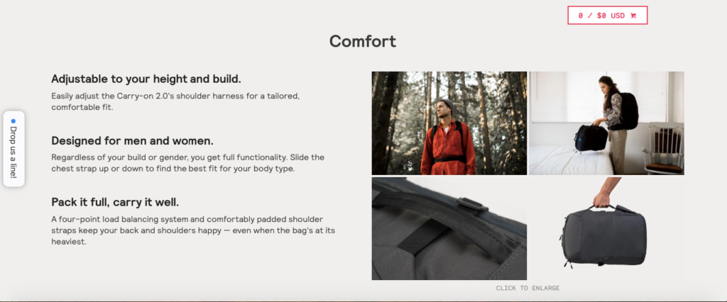
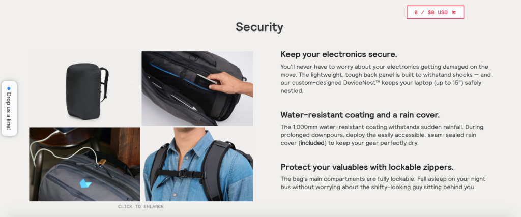
Scroll down further, and there’s a ton of helpful information on the product’s durability, comfort, security and more.
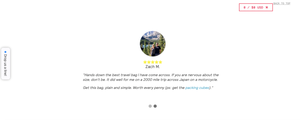
They also throw in some positive reviews so shoppers can get firsthand insight from customers who have actually used the product.
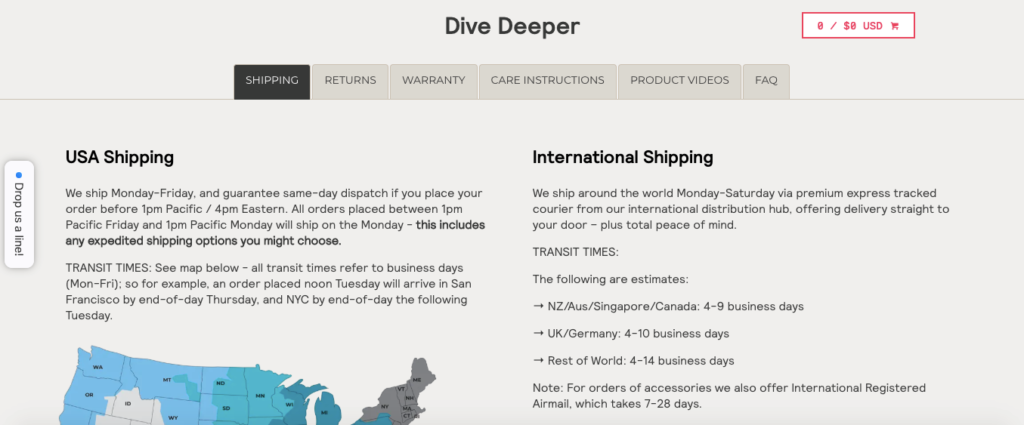
They’re also incredibly transparent about shipping, returns, warranty, and so on, and shoppers can find all of the details toward the bottom of the product page.
I also like the fact that they list the digital outlets and publications they’ve been featured on, which adds credibility to their products.
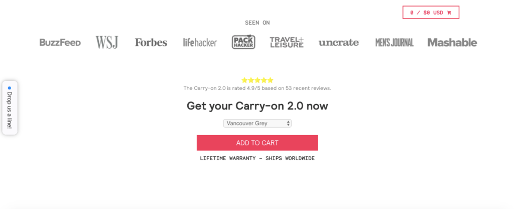
This is a great example of social proof in action.
And finally, they also feature other products that can help customers get even more out of the Carry-on 2.0—a tactic I’m sure has increased their average order value.
6. Bombas
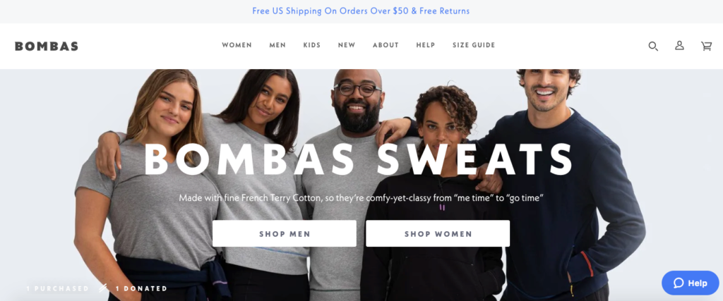
Here’s a sock and apparel brand that focuses on two key things—comfort and helping people in need.
In fact, their dedication to social responsibility is one of the first things they mention on their Shopify store.
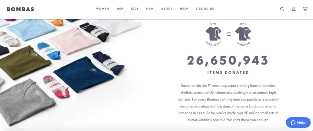
More specifically, they explain that for every item someone purchases, the same kind of item is donated.
And more than 20 million items have been donated to date.
It’s the same concept TOMS was founded on, which played a huge role in their success.
And if you didn’t already know, the vast majority of modern shoppers get behind companies who focus on social good.
In fact, “86 percent of consumers believe that companies should take a stand for social issues, and 64 percent of those that said it was ‘extremely important’ for a company to take a stand on a social issue said they were ‘very likely’ to purchase a product.”
So that’s the main area where Bombas is winning.
Besides that, they have a fantastic website that’s really easy to browse.
Right from the start, shoppers can choose whether they’re looking for men’s or women’s clothing.
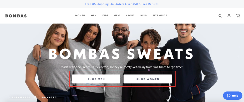
After doing so, they can seamlessly browse through their products, which are well organized and look great aesthetically.
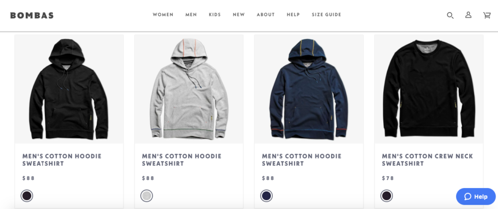
After clicking on a product, they get a nice overview of the features, so they’ll know what makes it unique when compared to similar products.
And Bombas also includes more information on their “one purchased, one donated” concept.
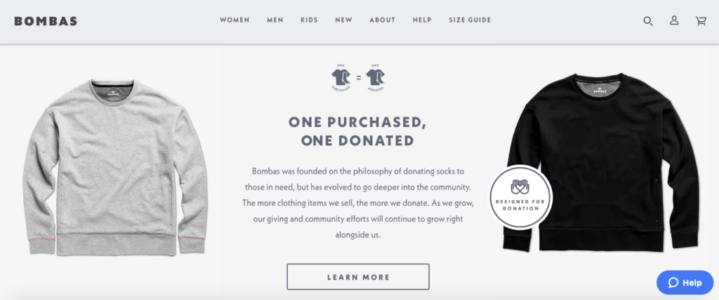
If shoppers want to know more about it, they can click on “Learn More” for all of the details.
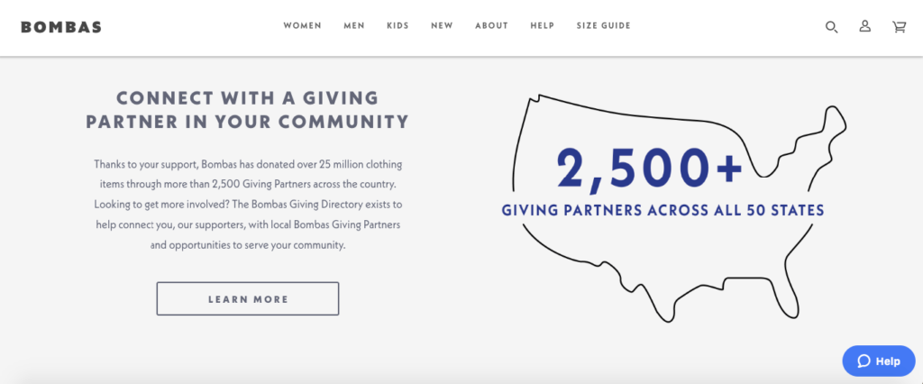
The clear social responsibility of this brand along with their simple design and easy to use interface makes it a clear contender for best Shopify stores.
7. Allbirds
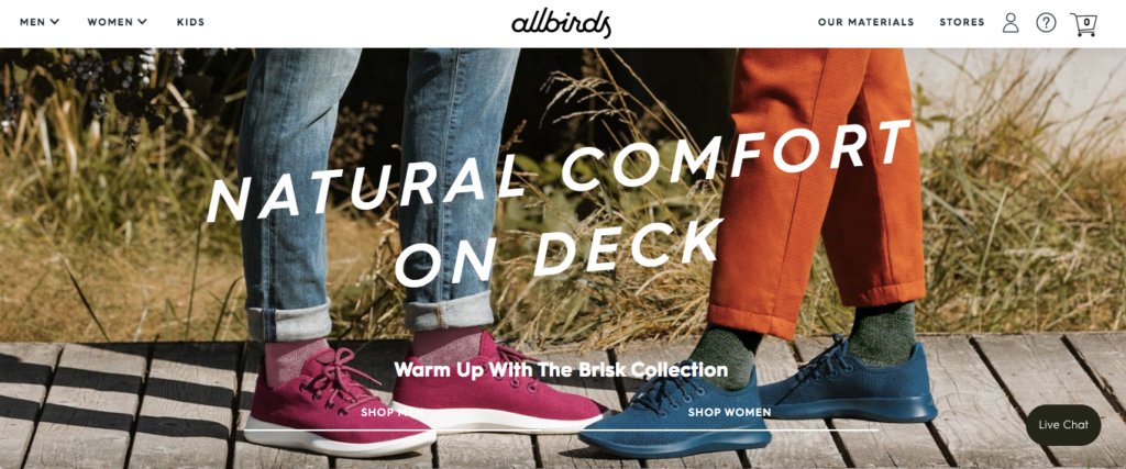
There’s a lot to love about this final example from footwear company Allbirds.
First, I think having “The world’s most comfortable shoe” as their USP is absolutely brilliant.
In just a few words, shoppers know exactly what Allbirds is selling and why they should be interested.
Next, their site has a beautiful, vibrant color scheme.
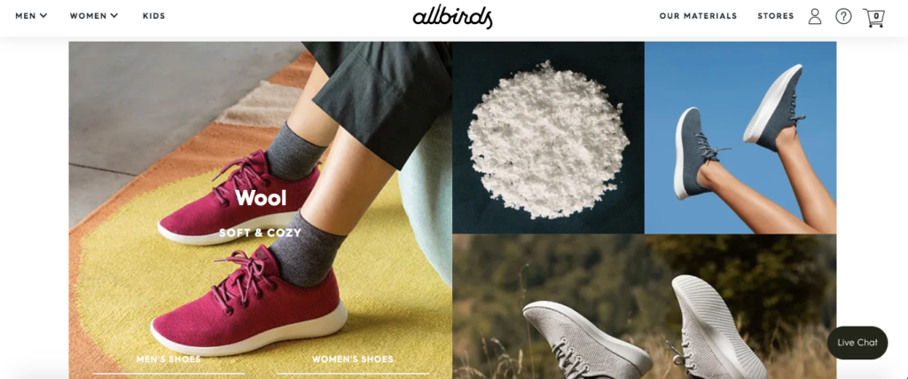
It’s definitely eye-popping and makes shoppers want to explore their site further.
I also like that they include a section on their homepage that explains why their products are such high quality.
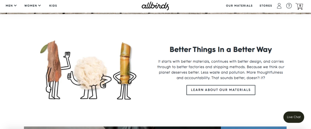
This is important because shoppers don’t have to wonder why Allbirds is the world’s most comfortable shoe.
They can quickly learn why by watching an amazing explainer video and reading well-written copy.
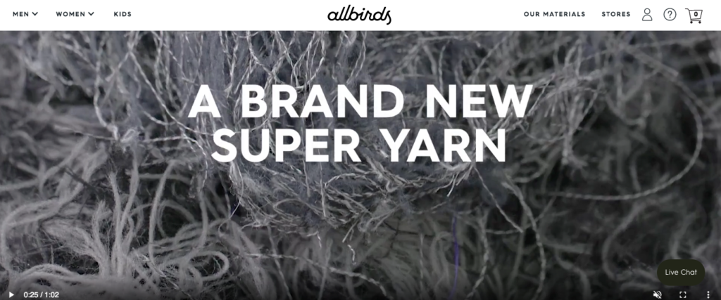
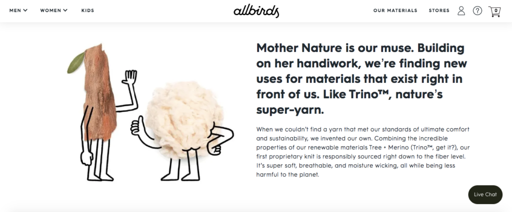
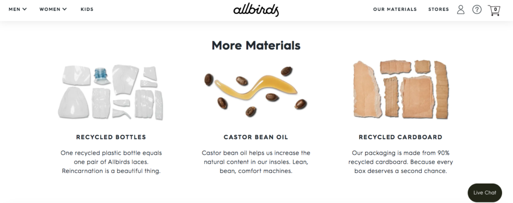
I also love how they explain how sustainability and being environmentally conscious factor into the materials they choose to use for their products.
For instance, they use recycled bottles to create shoelaces, and their packaging is made from 90 percent recycled cardboard.
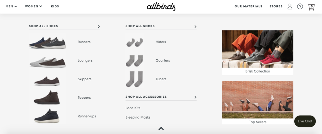
Allbirds also makes navigating their store a breeze.
Shoppers simply click on “Men,” “Women” or “Kids” at the top to quickly narrow down their search.
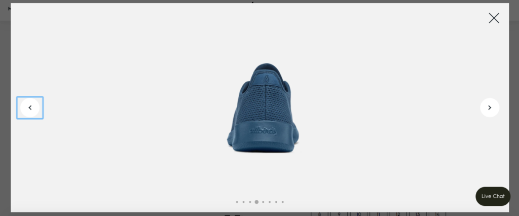
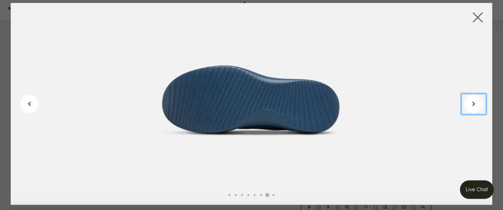
And whenever they check out a particular product, they get an up close look at it and can check it out from a variety of angles.
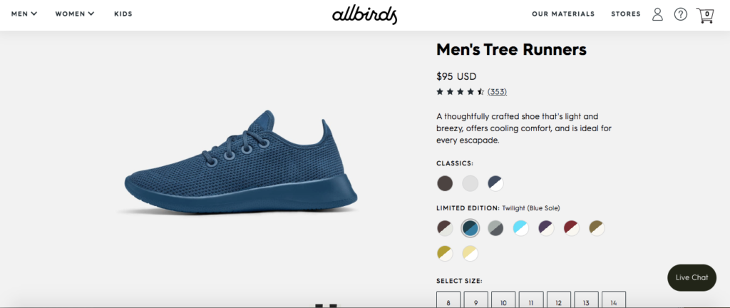
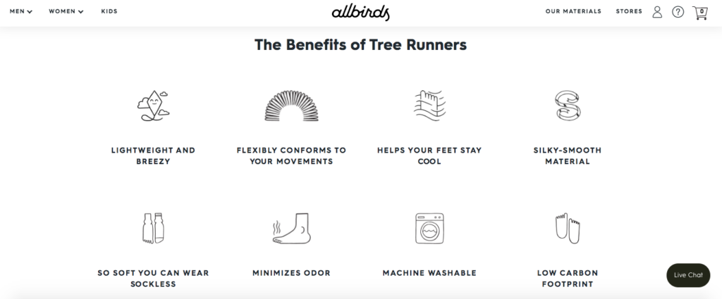
Scroll a little further down the page, and they also get a list of the full benefits this product offers.
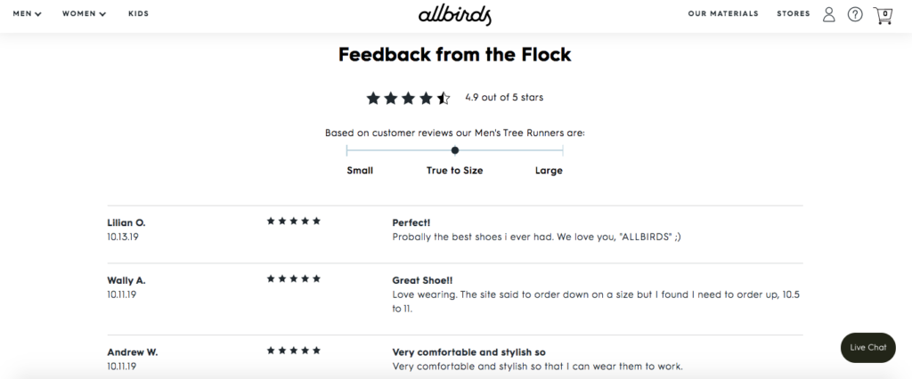
And finally, shoppers can find reviews from actual customers to help guide their purchasing decision.
Allbirds has it all covered.
Their mix of epic branding, strong visuals and transparency makes them an extremely likable brand that many people feel comfortable doing business with.
So I think there’s a lot ecommerce owners can learn from this example.

Conclusion
I’m a huge fan of Shopify because of the simplicity and user-friendliness it offers and because you can build an amazing looking store even with minimal design chops.
While there are a ton of successful brands on this platform, these are seven of the best Shopify stores that really stand out.
Hopefully, you now have a better understanding of the factors that contribute to making an awesome store and have some inspiration that you can use in your own ecommerce endeavors.

