
With shopping moving more online, a well-designed email newsletter has never been more critical.
Email newsletter design is the construction, optimization, and delivery of your email campaign. There is a lot you can do to take advantage of your most profitable marketing channel.
I’m sure you’ve heard this one before, but email isn’t dead.
You are 40x more likely to get a new customer from email marketing than social media. Email marketing newsletters produce a 4200 percent return on investment. For every $1 spent on email marketing, the average return is $42.
That’s why I wanted to cover the nine best email newsletter design practices. Before sending out your next campaign, consider implementing these into your strategy.

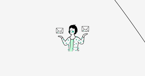
1. Put an Emphasis on Personalization
The first e-commerce email newsletter design best practice is personalization. When an email subscriber feels a personal touch in your outreach, they are more willing to read what you have to say.
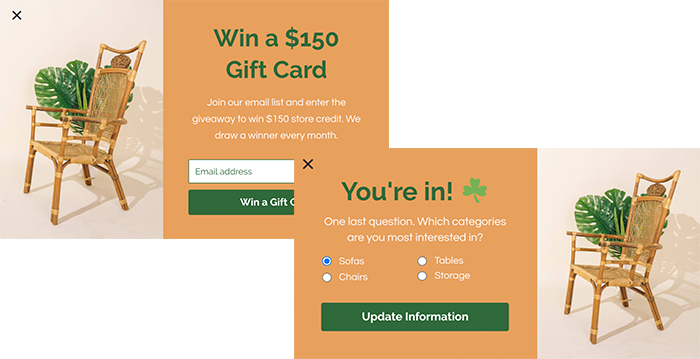
Before you can personalize emails, you need to collect comprehensive data from your subscribers. You can easily achieve this with a multistep popup, where you collect emails in Step 1 and get more information in Step 2:
Now that your data is strong, the three primary ways to best use personalization are (1) dynamic content, (2) location and time-based emails, and (3) subject line personalization.
Start by using dynamic content in your newsletter emails. You can create personalized product recommendations based on your customer’s recent activity, for example, in an abandoned cart email follow-up.
Spotify has found a way to leverage a user’s activity into a perfect personalization email.
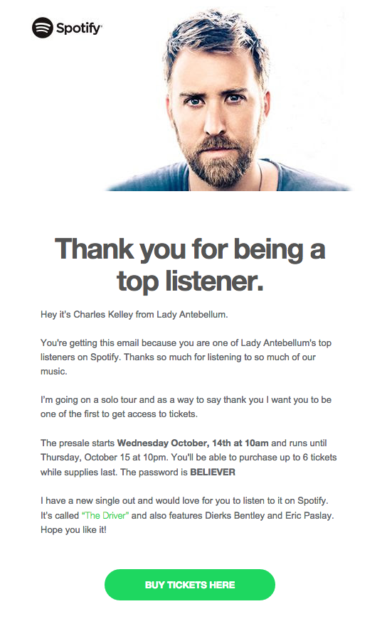
Source: HubSpot
You can then use your subscriber data to build buyer personas to target prospects more specifically with your emails.
You can also experiment with building emails with multiple dynamic content blocks. It will save time for your email creators and requires less copy. Dynamic content blocks will change based on the segmented email list receiving the email.
Remember to time your emails appropriately too. A/B test emails to arrive at optimal times for all recipients despite customer time differences. If 4:00 pm is the best time for open rates, be sure to optimize this across time zones to sync correctly.
Another strategy is to personalize sales offerings based on a customer’s location. For example, a store specializing in sports gear can create specific emails by the city to show products of famous sports teams in the area. After all, would an email announcing a new sale on Yankees jerseys drive a lot of sales in Boston? Probably not.
Don’t forget to personalize your subject lines. They are your first impression of a customer in their inbox. Using the first name of the recipient in the email subject line can increase your open rates by 29 percent.
Use subject lines to highlight important events, but make them personal. Emailing a subscriber with a “Happy Birthday!” in the subject line increases the chances of an open while building customer loyalty.
2. Grab Attention with a Preheader
An email preheader is the summary text that comes directly after the subject line when viewed in the inbox. The best use of this text can significantly increase email open rates and click-through rates.
The preheader is another area where personalization can be used. Mentioning a customer’s interests or name will draw attention and stand out in a crowded inbox.
Use your preheader to ask the customer a question. It builds interest and tells the recipient why they should open your email. Your preheader and subject line should work together.
Preheaders are one of the first ways you interact with a recipient before they open your email. Use emojis for better visibility in the inbox. Not only does it garner more attention, but it humanizes your brand too.
3. Optimize Designs for Mobile
Every savvy marketer knows that all elements need to be optimized for mobile, including email newsletter designs.
46 percent of all email opens occur on mobile devices. So how do you optimize your emails appropriately?
Start by incorporating single-column designs into your email templates to create easier readability for recipients. The single-column design controls where the eyes look. Try to promote one core offering with a visible call to action (CTA).
Remember, not all mobile devices will automatically display images. The lack of configuration between mobile devices and images can be a problem for marketers and email designers who rely on pictures to tell the story of their email. Make sure there is concise text to back up each photo, just in case.
The best way to simplify your email design for mobile is to place more critical elements at the top of the email for instant visibility. Don’t waste any time—quickly present your CTA and let the reader know why they are reading the email.
4. Create a Visual Hierarchy
Visual hierarchy is a design concept that encourages viewers to engage with content in a certain way. There are natural tendencies in how readers consume content, and a visual hierarchy influences their perception of what’s most important
According to the principle of visual hierarchy, readers tend to follow a page in a z-shaped pattern to consume content. The eyes start in the top left corner and scan across to the top right. Then naturally, they move down to the left of the page and back across to the right again. This movement forms an imaginary “Z” shape.
Source: Instapage
There is more than one visual hierarchy. Another option is to design emails in an inverted pyramid structure for better engagement. The inverted pyramid starts by grabbing attention using brand imagery. Then moving down the pyramid, the writing builds anticipation. This all points to a final call to action.
Blush Design uses the inverted pyramid method in their emails:
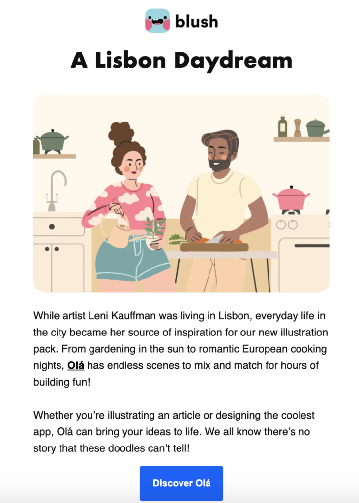
The key to a strong visual hierarchy in your email newsletter designs is an easily scannable hero section. Readers should be able to quickly work through the hero section, consume the following content, and be driven towards your CTA.
5. Compose Strong CTAs
Creating strong CTAs is the foundation for generating sales and conversions from email newsletters. Every element of your email contributes to the success of your CTA.
To start, you need to get more creative than the standard CTAs, such as “Get Started”. Generic text will result in lost conversions. They are overused and don’t entice the reader to want to click.
Your CTA buttons should tell readers what they are clicking on (i.e., “Get your 50% off now”). By writing exactly what the reader gets by clicking with a second person pronoun, you can add an element of personalization in your CTAs.
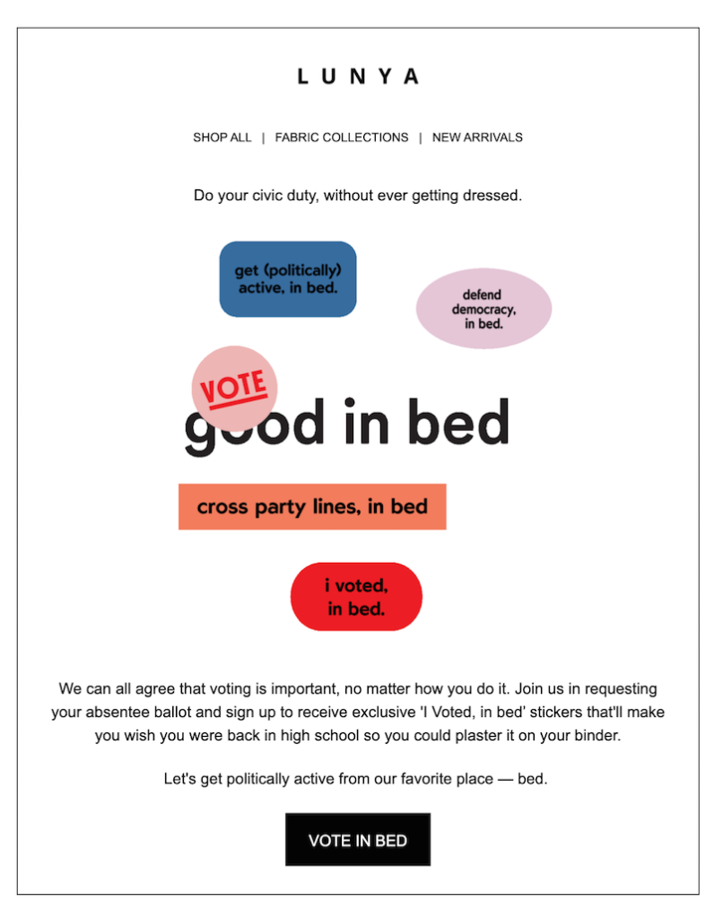
The aesthetic design of your CTA buttons should also stand out on the page. You can use contrasting colors to attract more attention to your buttons.
Lunya does a great job using contrasting colors in their emails. They prefer bright colors to tell the story in the email body and finish it off with a firm black CTA button.
Source: Email Design
The ultimate goal with CTAs is to take away the guesswork and make it obvious for a reader where they should click.
6. Make It Interactive
You likely have a lot to say in your newsletter emails, making them longer than other types of emails. That’s why it is essential to keep your newsletter content engaging and interactive.
Keep in mind that your subscribers aren’t opening your emails in hopes of being sold on something. The purpose of your email must be to inform, engage, and communicate something your reader finds valuable.
But how can you do this?
Start by asking the readers to participate in making sure they are paying attention. Place polls and surveys throughout your email and ask customers to answer questions. Not only does this increase the customer engagement in your emails, but also helps you collect essential customer data.
Use brief videos and GIFs to showcase your products differently. It is essential to keep viewable content short so readers can watch the full length without disturbing the email experience.
Movement attracts attention. The eyes tend to follow the movement.
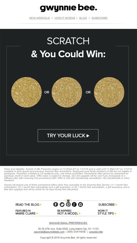
If videos and GIFs aren’t bold enough, try inserting a game directly into your email. See how Gwynnie Bee uses a scratch-and-play game to send high-converting emails:
Source: Constant Contact
7. Include User-Generated Content
There is no better way to promote your brand than through your customers. 9 out of 10 buyers on the Internet read reviews on a brand or product before purchasing.
Increasing your positive reviews is the number one free method to increase sales. Why not showcase those reviews in your emails too?
Be creative in the ways you incorporate 5-star customer reviews into your emails by using GIFs or displaying products with reviews linked below.
My favorite way to use user-generated content (UGC) is reposting social media content.
Find your favorite Instagram posts from customers using your product and repurpose them in your email. Not only does it save you time in creating new content, but it humanizes your business to connect better with customers. (Don’t forget to tag the user in your email, too.)
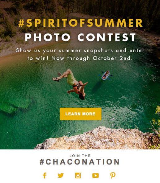
You can even use your newsletter to host a contest to get more user-generated content. Start by creating a set of rules that involves users posting or sharing something on behalf of your brand.
Include social media share buttons in the email, as well. After you have some customers on board, repost their content and increase your traffic. Keep it simple and offer a small prize for the randomly selected winner.
Chaco used a photo contest to generate buzz all summer:
Source: Photoslurp
8. Don’t Fear White Space
White space is more important in your emails than most realize. There are two types of white space that you should use in your emails:
- Passive white space: The white space around the edges of your emails and content. This also includes empty sections placed within your emails.
- Active white space: Intentional white spaces used to emphasize the importance of surrounding elements. Most used to encourage readers to follow a designed flow.
When used correctly, white space gives your email more balance and readability. Instead of extra lines or added elements, white space breaks up the email for better flow.
Mobile email optimization relies heavily on white space. It is a great strategy to avoid the clutter on a screen.
Your emails must be easy to read. Most readers simply scan through rather than read thoroughly. Incorporating white space allows a reader to skim the email and find key points more quickly.
Nothing will scare away a reader faster than opening an email to see their screen crowded with images and text, with no clear direction on where to begin.
9. Emojis Can Help Too
Emojis have become a tool used in everyday conversation worldwide in both personal and professional interactions. They can help a brand clarify the tone of the message.
Get started with emojis by adding them into your subject lines to increase open rates and optimize for mobile. Since preview text, subject lines, and preheaders display fewer characters on mobile devices, emojis can say more with less.
Another excellent way to use emojis in your emails is to collect customer feedback: “Vote 😀 for positive feedback. Vote 😠 for negative feedback.”
Since this is a much easier process for a customer to participate in, expect your survey responses to skyrocket.
It’s time to use all that customer data you have collected by now. What demographic is your audience? If millenials your audience, for instance, expect an even better engagement rate from added emojis into your email design strategy.
Don’t overuse them, though. There is no exact formula for the perfect number of emojis. But be selective with your placement and use them with a purpose in mind.
Conclusion
The e-commerce email newsletter design process requires a lot of testing to see what works best for your business.
Design emails with a focus on the flow of the email, where the subscribers’ eyes should be looking next, and an openness to continue testing new strategies.
If you do so, you will see your open rates increase, and your email marketing will produce a healthy ROI for your e-commerce business soon.

