You’ve got a great product. When people buy it, you deliver it on time. So surely everyone loves you?
Not necessarily. Product and fulfillment are only two parts in the customer satisfaction puzzle. If you provide a poor experience to customers, it really doesn’t matter if you offer the cheapest or highest-quality product on the market—there’s a good chance you’ll never see them again.
The thing is, shoppers, don’t have a “three-strikes” policy. According to business intelligence firm SAS, one in three customers would ditch a brand after a single poor experience, while 90 percent would do so after two to five poor experiences. Instead of buying from you, they’ll look elsewhere.
In other words, if you’re delivering a bad customer experience, you’re effectively doing your competitors’ marketing for them.
But while it’s undeniably important, “customer experience” is quite a nebulous term that can mean different things to different people. When respondents to the same SAS survey were asked to rank their biggest customer experience concerns, the results were wide-ranging and evenly spread:
- Convenience (cited by 38 percent of respondents)
- Responsive customer support (32 percent)
- Responsible behavior (29 percent)
- Flexible returns and refunds (25 percent)
So how can you possibly understand what your customers most want from you?
Ecommerce surveys hold the answer. Here are 15 examples—plus what’s good about each—to help you build your next survey.
Ecommerce Survey Examples from Top Brands:
1. Charlotte Tilbury
Charlotte Tilbury is an upper-tier cosmetics brand with an aspirational product set. This is reflected in its ecommerce surveys, which have a pretty high-end feel to them.
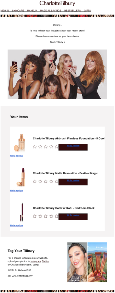
The tone of voice is spot-on, referring to the shopper as “Darling”, and inviting them to “tag your Tilbury” on social media—you wouldn’t do that with a €10 bottle of foundation you picked up at the supermarket.
But this email isn’t all style and no substance. There are some smart design choices here, too.
By laying out multiple purchases in the same email, rather than requesting reviews on multiple items individually, the whole process is streamlined. That’s effective because the last thing you want is to make it hard for customers to review your products.
This choice of layout also subtly reminds you how many items you bought at once, and therefore how much you love Charlotte Tilbury. Maybe it’s time to buy some more?
2. ASOS
Fashion ecommerce giant ASOS saw its revenues increase sixfold between 2012 and 2020 to almost €4 billion, so it’s clearly doing something right. One of those things is definitely its ecommerce surveys.
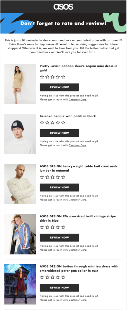
Imagine you’re the customer who just received that email. Your order arrived earlier today and you love everything in it. Maybe you’re even wearing your new oversized vintage shirt right now.
But however much you love a purchase, it’s not always easy to put your thoughts into words. What specifically do you love about it?
This is a problem because a lot of review sites don’t just ask for a star rating—they want to know why you like it, too. That’s understandable because a bunch of blank five-star reviews looks super spammy. But on the other hand, it could be putting people off leaving reviews at all.
ASOS prevents this by giving shoppers a few subtle examples of the sort of feedback they could leave in the first paragraph of the copy.
3. Zippi
Zippi is a small, UK-based company that allows you to print and frame your photos (among other things). As with lots of smaller brands—and a lot of large ones, too—it leans on Feefo to power its ecommerce reviews.
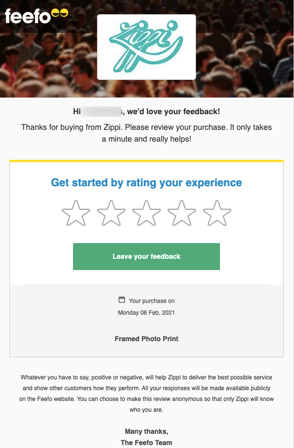
This email is a useful example of a survey that deals with the most important thing first—in this case, seeking your overall feedback on the experience of shopping with Zippi.
Once you’ve got the big-picture stuff out the way, you can drill down into more specific questions that help you add meaning to the overall verdict.
4. Sports Direct
Whereas Zippi has partnered with Feefo to generate customer reviews, Sports Direct has gone with another of the big hitters, Trustpilot.
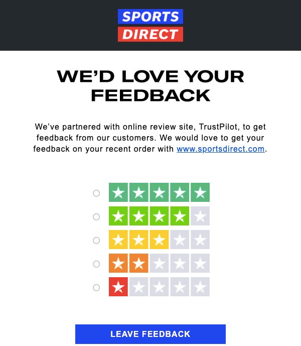
What’s so great about this email? It may not look flashy, but that simple star-rating graphic is highly impactful.
Visuals are important. Indeed, 33% of us are visual learners, making it the most common learning style.
Sports Direct uses this to its advantage, guiding the customer with a visual representation of a “review”. I challenge anyone who receives that email not to click one of the rating boxes.
5. Amazon
Amazon’s entire business is built around delighting customers, so it’s no surprise its ecommerce surveys are so effective.
Source: ReallyGoodEmails
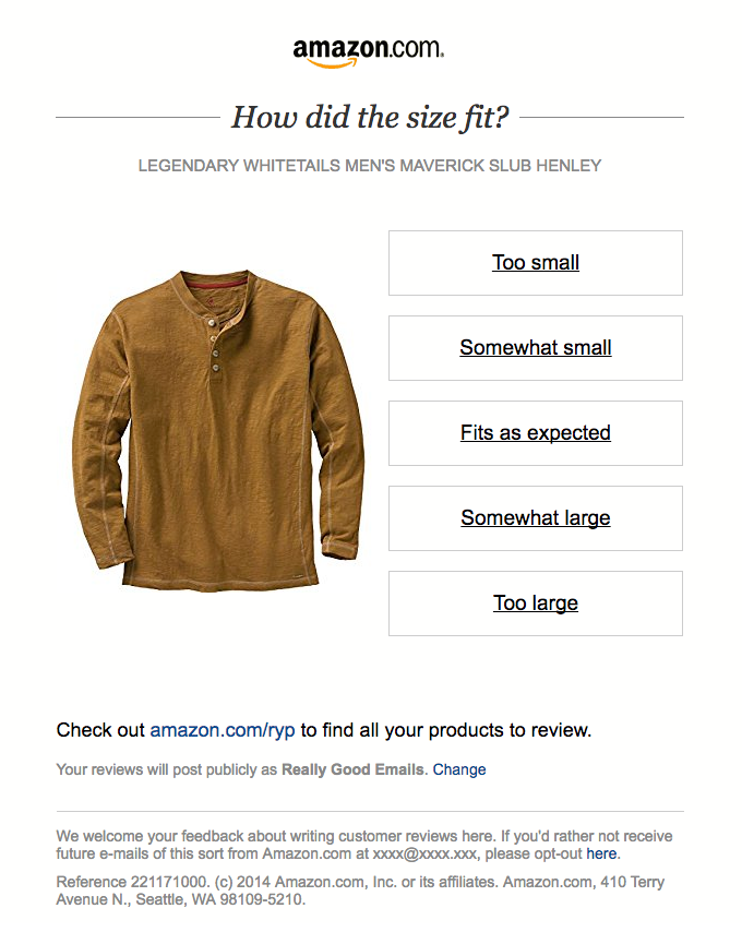
For instance, maybe there’s only one issue on which you really want feedback. Amazon does this by asking for specific insight on how well this product fits because that’s clearly important to shoppers.
If you’ve got a large customer base, you don’t necessarily need to ask every question to every customer. By asking one customer about sizing, one about delivery, and another about comfort, you increase your chances of getting a response (because your survey is so quick and simple), while also generating highly specific feedback.
6. Everlane
This email demonstrates how it’s not always the right idea to ask the broadest possible question first up; it depends entirely on the goal of your survey.
Your customers are busy. What’s more, they receive a lot of emails. By 2022, we’ll receive an average of 333 business and consumer emails a day, or 14 an hour. It’s exhausting just thinking about it.
Source: ReallyGoodEmails
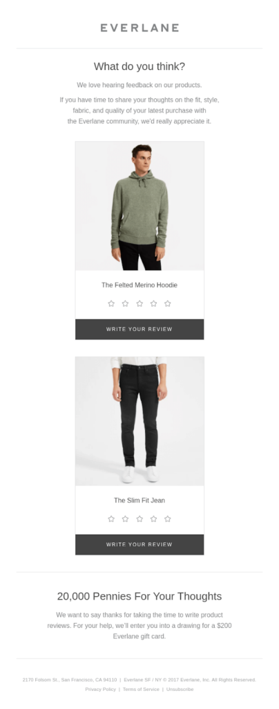
That’s why it’s a good idea to give customers a little incentive to complete your survey. Everlane does this by offering shoppers who fill in its survey a chance to win a $200 gift card.
This is a double win. Not only does it make me more likely to give feedback, but it also demonstrates how much Everlane values my opinion and is committed to improving its customer experience.
7. MeUndies
We love MeUndies so much at Drip, we spent a month analyzing the brand’s whole marketing strategy.
Source: ReallyGoodEmails
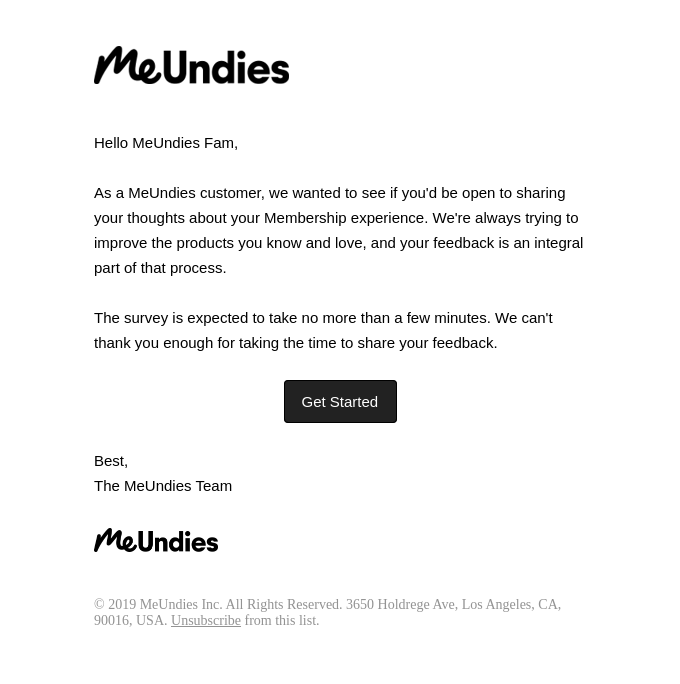
In this example, MeUndies demonstrates that not all ecommerce surveys have to be specifically linked to a recent purchase. Instead, this email asks for feedback on the company’s membership program.
The lesson here? Don’t be afraid to reach out to customers who haven’t bought from you in a while, provided you’ve got something worthwhile to ask.
8. Target
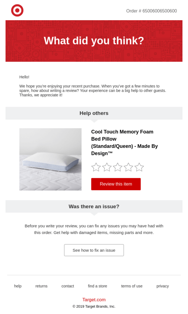
Low review scores are a nightmare for ecommerce brands. According to Inc contributor and entrepreneur Andrew Thomas, it takes roughly 40 positive customer experiences to outweigh the impact of a single negative review.
Source: ReallyGoodEmails
Target recognizes this—so it urges shoppers to fix any issues before they submit their review.
Sure, you might think Target is “cooking the books” on its review scores here. But there’s nothing wrong with asking customers to give you a chance to fix something before they leave a damaging one-star review.
9. Hers
This one isn’t technically a survey at all. Instead, it’s an infographic embedded in an email, detailing the results of an earlier survey.

Source: ReallyGoodEmails
So why have I included it? Because you should definitely learn from (and steal) this tactic.
Not only does it make for an engaging piece of content in its own right, but it also demonstrates how much you care about improving customer experience. Plus it’s an opportunity to sell something—look at all the products referenced in the results.
10. Drop
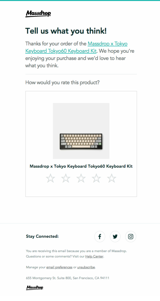
As I’ve already pointed out, we all receive a lot of emails. So it can feel like a real relief opening one that doesn’t bombard you with huge, bright text, emojis, GIFs, and dozens of hyperlinks.
Source: ReallyGoodEmails
Drop takes a clean, uncluttered approach to its ecommerce survey emails. There’s nothing to distract the reader here—just a link to the product, a call to action at the top of the email, an image, and the visual cue of a star rating system.
On another note, linking to the product—as Drop does here—can be super effective, too. It helps your customer find it quickly and remind themselves of things like pricing and specifications that they might want to reference in their review.
11. Bellroy
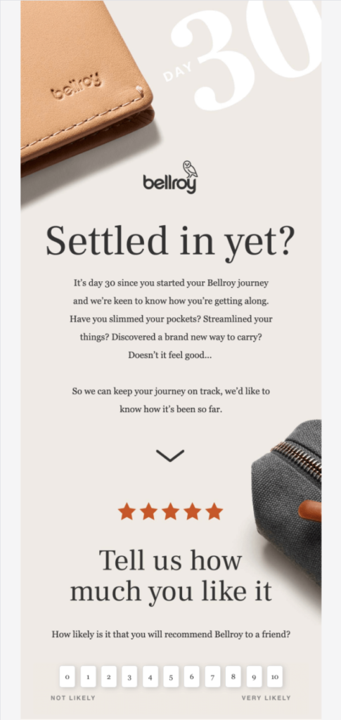
Obviously, the main reason to send an ecommerce survey is to acquire the data you need to improve your customer experience. But that doesn’t mean you can’t also use it to lay the groundwork for retaining customers and encouraging repeat purchases.
Source: ReallyGoodEmails
That’s exactly what Bellroy does here. By positioning a purchase as the start of a journey, rather than a one-off transaction, this survey email paves the way for building a long-term relationship with the customer.
Additionally, the language puts the reader in a positive frame of mind for their review, using phrases like “slimmed your pockets” and “streamlined your things” to reiterate Bellroy’s key features and benefits.
The use of a five-star line-break below the intro text is another nice touch, guiding the customer toward leaving a positive review.
12. Joyus
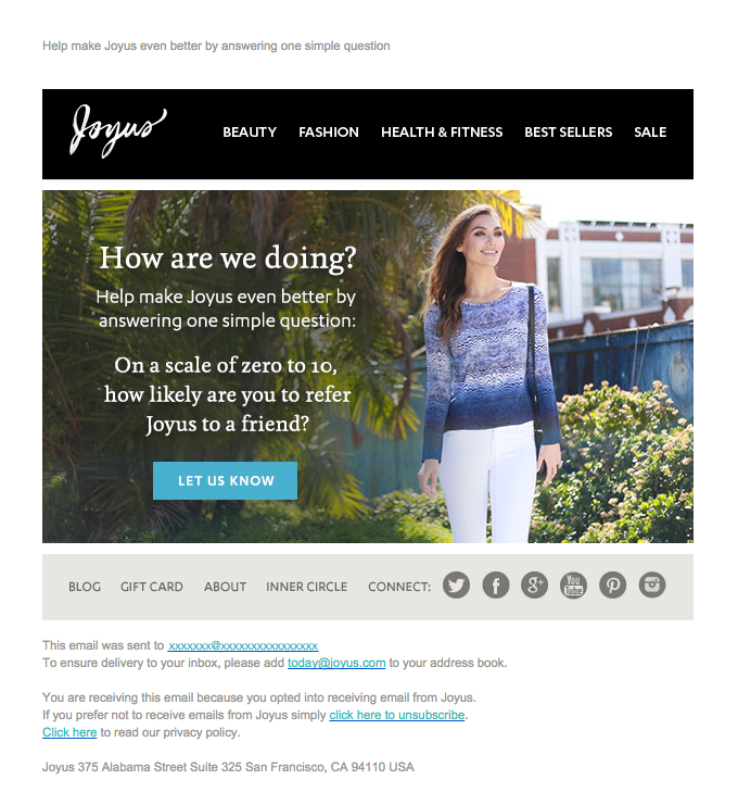
According to HubSpot, 75 percent of consumers don’t accept ads as truth. On the flip side, 90 percent trust brand recommendations from friends.
Source: ReallyGoodEmails
This demonstrates the value of word-of-mouth marketing—something that Joyus clearly recognizes, prompting it to ask the classic NPS question: “How likely are you to refer us to a friend?”
By repeating this survey over time, Joyus can gauge whether its actions are making customers more or less likely to recommend the brand.
What’s more, by asking this specific question, customers are encouraged to think about recommending Joyus. Again, it’s a double win.
13. Nokia
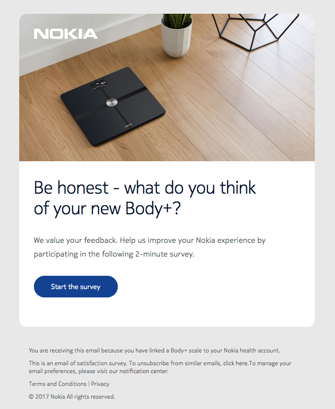
When it comes to encouraging survey completions, it pays to set expectations early, as Nokia does here.
Source: ReallyGoodEmails
Once the customer understands exactly how long it’ll take to fill out your ecommerce survey, they can decide whether they’ve got time for it right now. That makes them more likely to start (and complete) it.
Research suggests the ideal survey length is 10 minutes, so Nokia’s two-minute survey certainly shouldn’t put too many people off.
14. Taylor Stitch
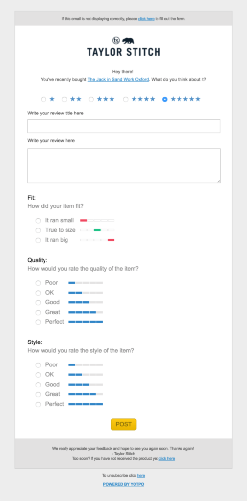
The last thing you want is for someone to click through to your survey, only to bounce back off immediately when they see how many questions you expect them to answer.
Source: ReallyGoodEmails
Taylor Stitch gets around this by incorporating the entire survey within the body of the email. That means it’s super clear what’s expected of the customer, which should lead to low abandonment rates.
15. Warby Parker
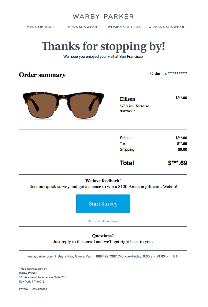
All of the examples I’ve included up to this point work well for pure-play ecommerce stores. But what if you have both an ecommerce operation and physical, brick-and-mortar stores?
Source: ReallyGoodEmails
Warby Parker is an example of a brand with both a high street and online presence.
With this survey example, it manages to take offline interactions online by capturing an email address in-store and sending a feedback survey. That way, it can make customer experience improvements based on feedback from all shoppers, not just those who buy online.
16. Bare Kind
Bare Kind, a sustainable sock company that's all in on protecting the environment and animals, employs some innovative tactics for attracting new customers.
In fact, they've turned to more traditional marketing channels to get new eyes on their ecommerce store: radio.
Radio presents its own challenges – limited ad time, no links to click, and a nightmare when it comes to attribution. But according to Lucy Jeffrey, founder of Bare Kind, post-purchase surveys help her better understand exactly where her customers are coming from.
This is a great way to better attribute your revenue and see how your customers are finding you.

Conclusion
No one expects you to somehow meld all of these examples into a single ecommerce survey email—that would look terrible and be extremely confusing.
Instead, use them as inspiration for testing multiple approaches over time. See which tactics generate the most insightful results (and which just don’t work for you), and do more of the good stuff.
The more data you capture, the smarter your decision-making will be, which will help you build a better customer experience.


