The average email click-through rate hovers somewhere around 2.5 percent. That’s pretty solid.
But some of the top e-commerce brands reach click-through rates well over 5 percent—more than double what average brands get. What’s their secret?
There are many variables, but for most brands, it largely boils down to following best practices, using intelligent email design strategies, and making continual adjustments as more data pours in.
For this post, I’m going to share insights on how to boost your email click-through rate based on my personal experience and provide plenty of examples so you’ll know exactly what I’m talking about.
That way you’ll be able to get the absolute max out of your leads, effectively moving subscribers from their inbox to your email to your offer with minimal friction.
Let’s jump right in.
Table of Contents
1. Start By Setting a Clear Goal With Each Email
Constant Contact makes an excellent point that every email should have a specific goal behind it. Maybe you want to promote a new product you just launched.
Maybe you want to let subscribers know that you’re having a flash sale where they can buy certain products at a discount for a limited period of time. Or maybe you simply want to drive more traffic to your website.
Whatever the case, you should know exactly what that goal is because this makes it easier to “communicate with a purpose so you can get your message across to your audience loud and clear.”
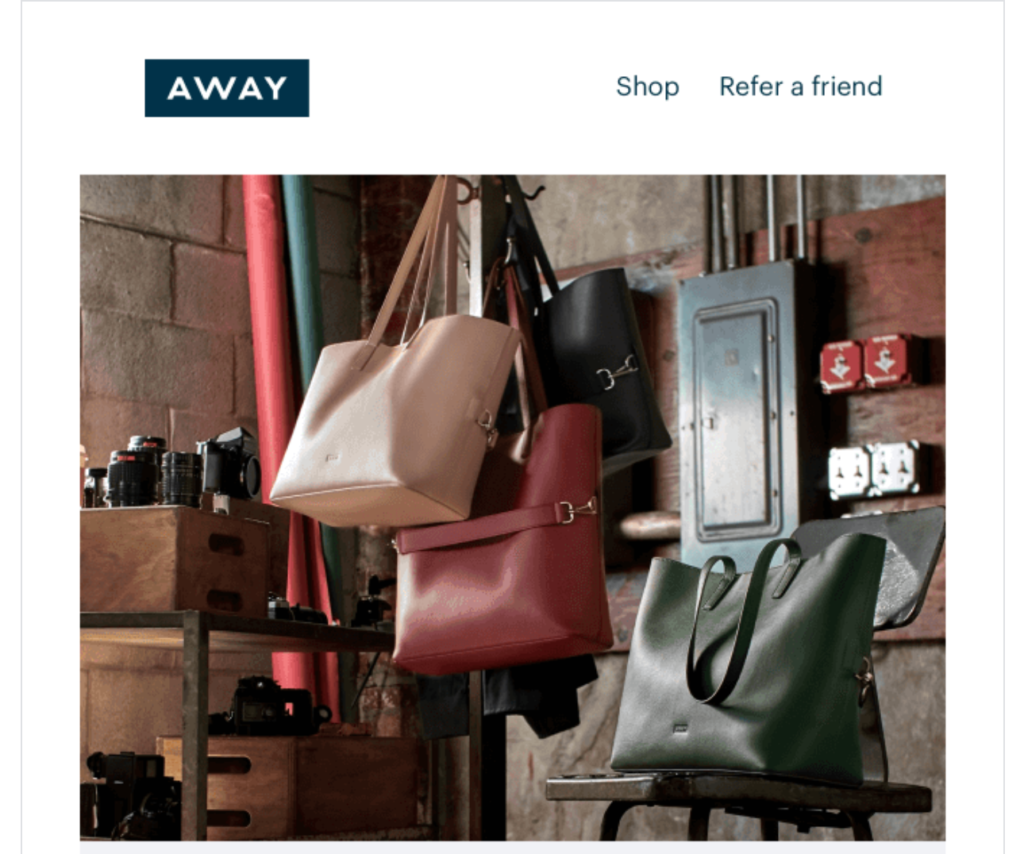
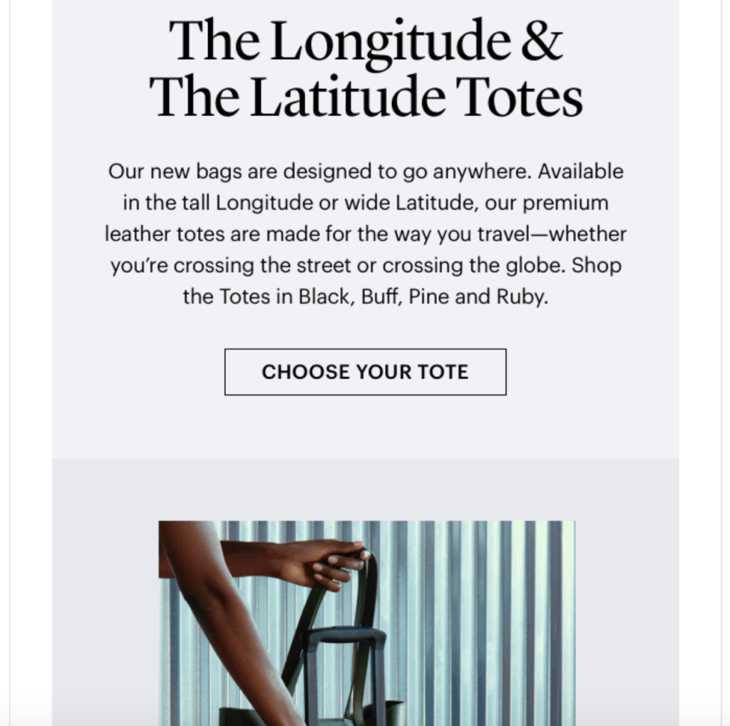
For example, the goal of this email from online luggage brand Away is to promote their new tote bags.
Source: Really Good Emails
Having this objective dictates the images they use, the copy they write, their CTAs, and so on.
It’s all about crystallizing the purpose of each email so you’ll know exactly what to focus on.
By doing so, readers are less prone to go astray, and your message is more likely to resonate with a larger percentage of them to improve your click-through rate.
2. Use Segmentation to Send Hyper-Relevant Content
If you’re still taking a “spray and pray” approach where you send mass emails with zero segmentation, raising your click-through rate is going to be an uphill battle.
So I can’t stress enough the importance of using segmentation to personalize your emails so that they’re customized for each subscriber.
It takes a bit more effort, but it’s well worth it considering half of e-commerce brands feel they increase engagement by increasing personalization. And if that wasn’t enough, “segmented and targeted emails generate 58 percent of all revenue.”
But how exactly do you go about this? One idea is to feature personalized products based on things like shopping behavior, previous purchases, etc.
That’s what activewear brand Fabletics does in this email.
There’s a section that says a subscriber’s personalized picks have arrived, with a crystal clear CTA button (something I’ll discuss in more detail later on).
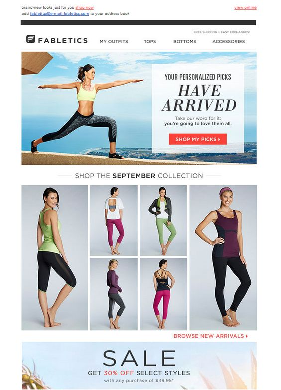
This should instantly raise a subscriber’s interest level and increase their odds of clicking-through.
Another idea is to simply include the subscriber’s name like Sephora does with this email.
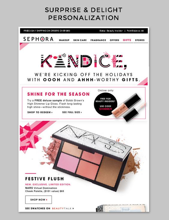
This is a natural attention grabber that makes a person feel more compelled to engage with an email and click-through.
For an in-depth guide on email personalization, I recommend reading this post from Instapage. It’ll walk you through the basic process and show you which mistakes to avoid.
3. Use Strong Visuals
Sometimes I feel like a broken record by talking about the importance of visuals. But the fact of the matter is that they can be a legitimate game-changer for digital marketing.
And this is especially true when it comes to email content.
If you can instantly grab a subscriber’s attention with stunning visuals, they’re far more likely to engage with your content and ultimately click-through to your offer.
That’s why I recommend making eye-popping images your focal point and letting everything else follow from there. Here’s a great example from Mendo, a company that sells “jaw-dropping books.”
This is the first thing subscribers see.
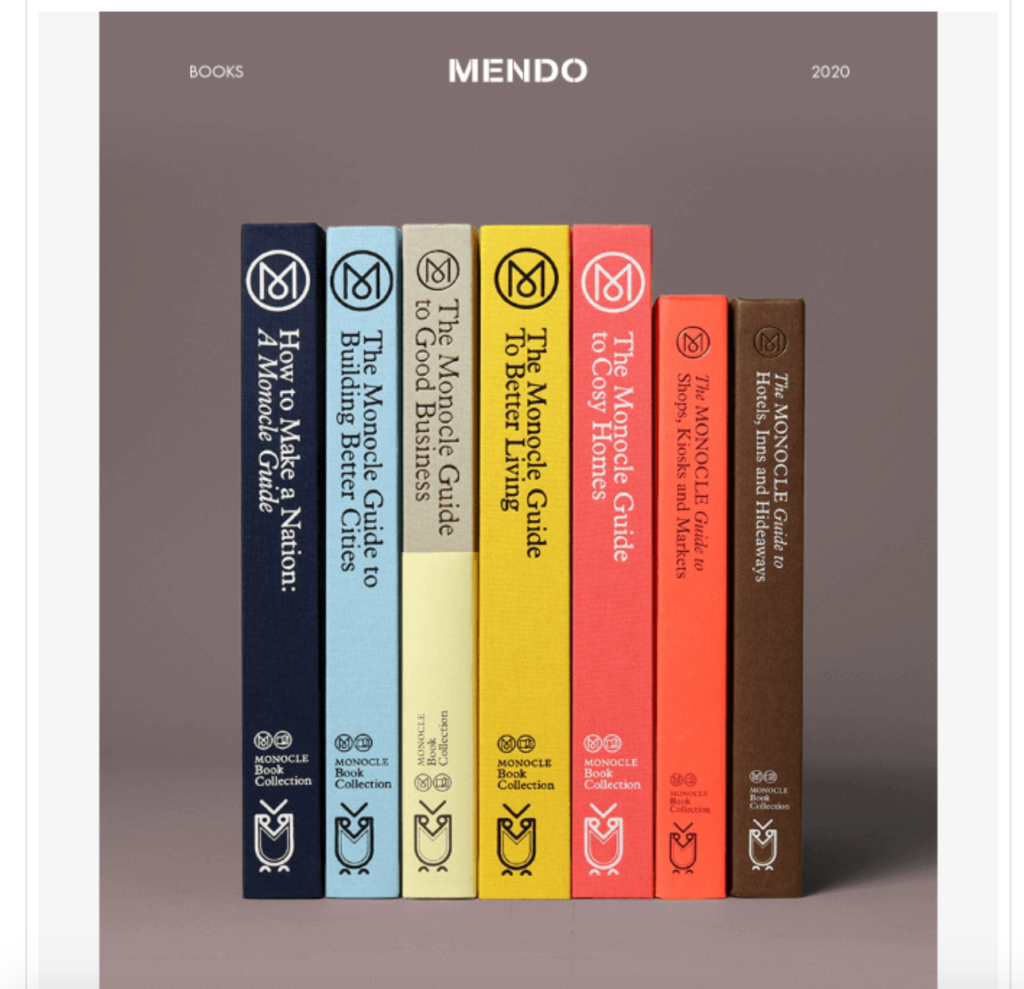
This image looks amazing, has great composition, and instantly lets readers know exactly what Mendo is offering. From there, they launch into their copywriting, elaborating on the offer and providing a CTA.
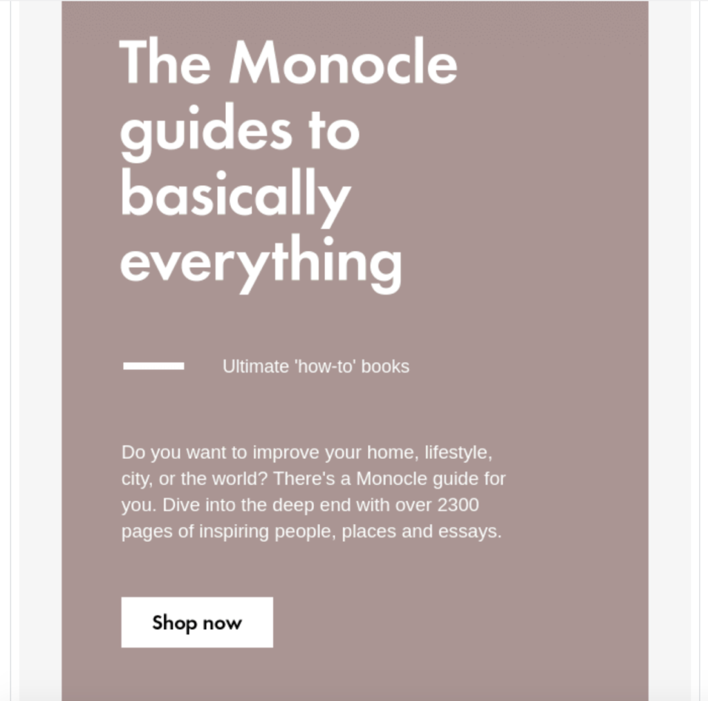
They also provide additional images of the individual books they’re offering after that.
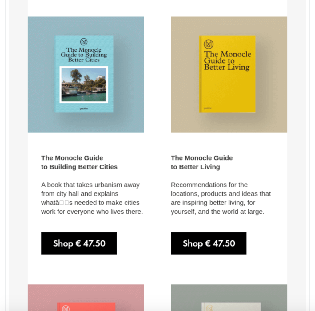
This balances it out and creates a nice aesthetic throughout. But everything begins with an impressive image that captures a subscriber’s attention and piques their interest enough to scroll down.
So always be sure to make visuals an integral part of your email formula, as this opens the door for further engagement.
4. Eliminate Distractions
Less is definitely more when it comes to crafting emails with high click-through rates.
The less clutter there is, the less likely subscribers are to get distracted, and the more likely they are to complete your desired action.
So you should always be cognizant of how much information you include and pare it down to the absolute essentials.
This email from watch, wallet, and bag designer brand Fossil is an excellent example.
Look at how simple it is.
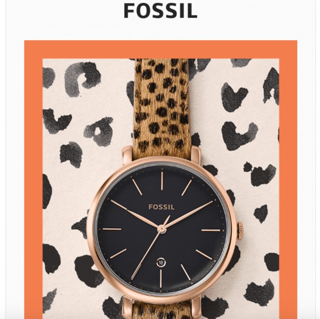
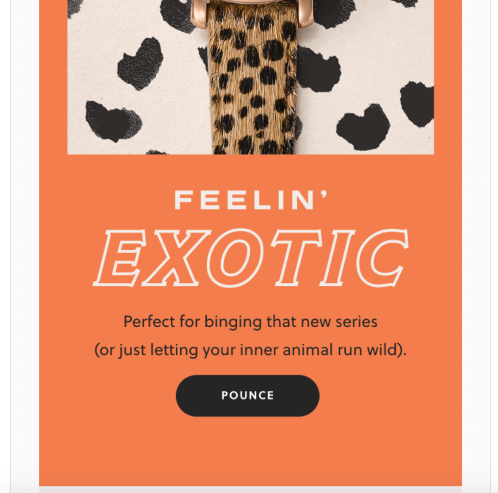
It features this watch that’s based on the smash Netflix series Tiger King. All a reader sees is a vivid picture of the watch and very concise yet clever copy that directs a reader’s eyes directly to the CTA that says “Pounce.”
From there, Fossil shows some other different styles of cat-themed watches that feature nothing but secondary CTAs that simply say “Show Now.”
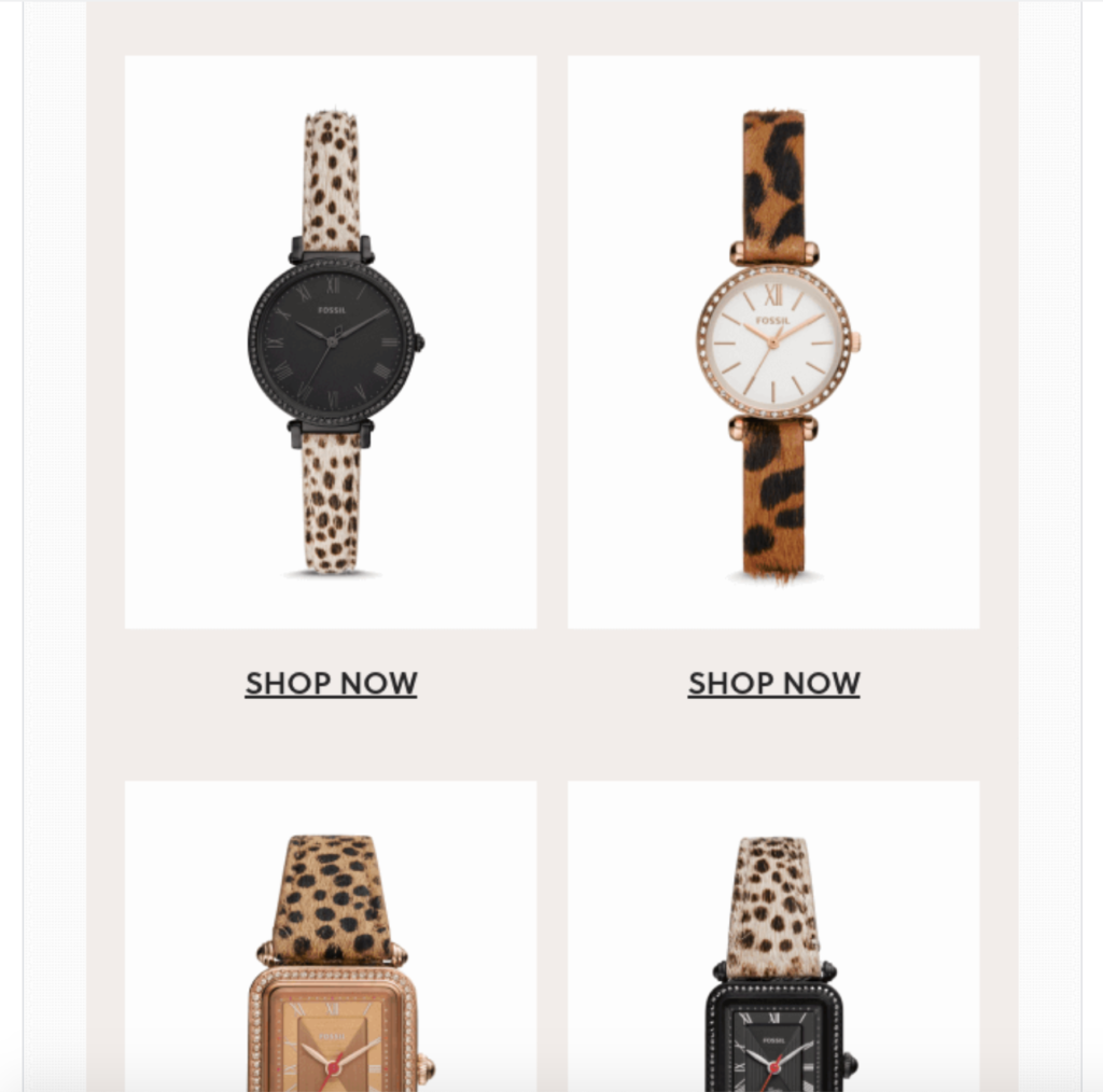
This keeps a reader’s “eyes on the prize” so their attention is never diverted from the watches Fossil is promoting.
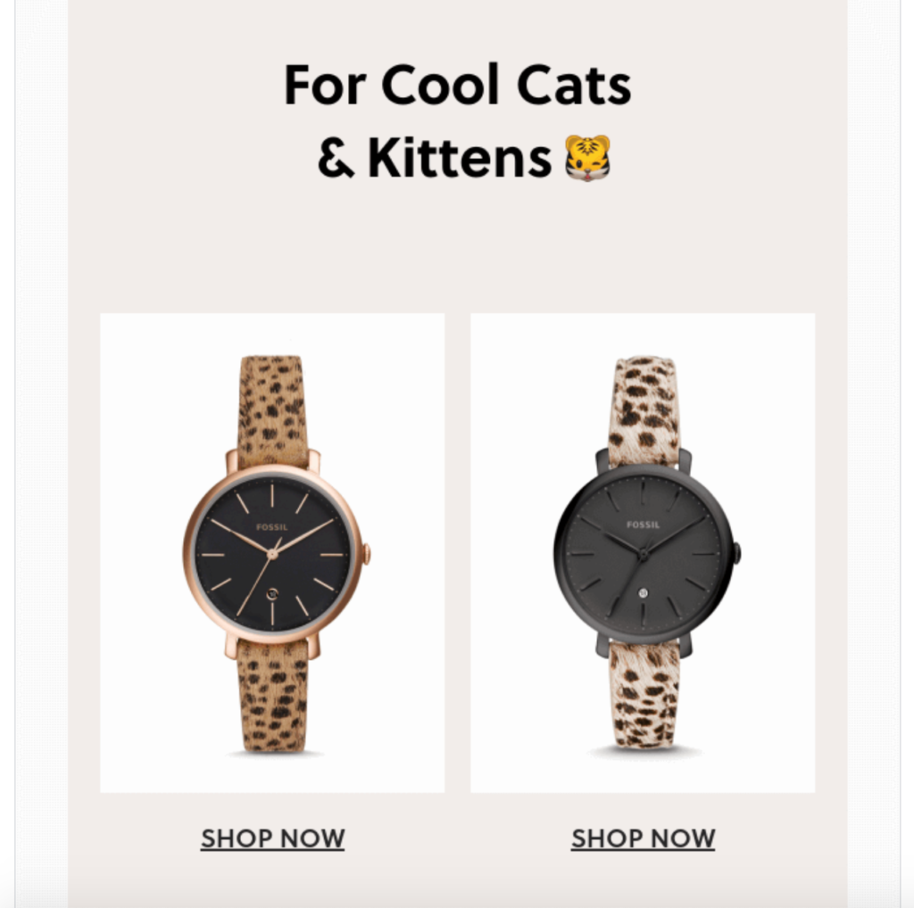
While you don’t necessarily need to go to this extreme, it shows how powerful a bare-bones email can be.
5. Design Your Emails for Scanners
The vast majority of people (79 percent) scan content, compared to only a mere 16 percent that read it word-for-word.
And as Nielsen Norman Group points out, “A newer study found that users read email newsletters even more abruptly than they read websites.”
This is a phenomenon that definitely needs to be taken into account when designing emails. You should anticipate that most people will scan through it, looking for the highlights, rather than reading every single word.
So what exactly does this mean from a design standpoint?
- An email should be broken down into logical chunks
- Each chunk should feature a headline
- You should place a relevant image in each chunk
- You should prioritize your most important messages, placing them toward the top
- You should use adequate spacing between each chunk
- You should also use adequate word spacing (e.g. spacing between headers and body text)
This email from modern furniture brand Article really nails it in terms of scannability.
It starts with a nice image, featuring all three products they’re promoting—a sofa, table, and lounger.
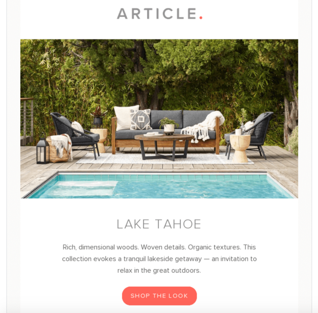
Just below that, there’s a headline, followed by body text and a CTA. Then, they showcase each individual product, including a headline, body text and an image.
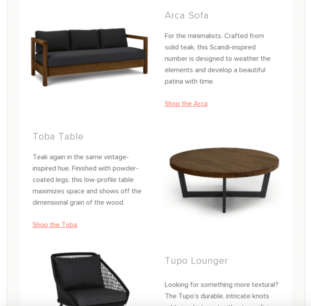
And at the bottom, they also feature some of their tagged images from Instagram.
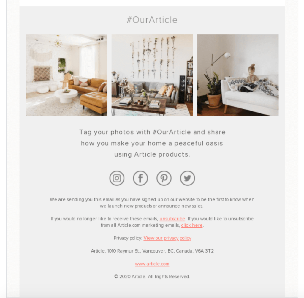
Notice how everything flows smoothly so readers can seamlessly transition from chunk to chunk without any friction and scan without having to read the body text word-for-word.
Also, notice all of the white space they use to prevent the email from appearing cluttered. This is an excellent template to borrow from and should greatly improve engagement to raise your overall click-through rate.
For more info on structuring emails for scanners, I suggest reading this post from Campaign Monitor.
6. Use Buttons for Primary CTAs (And Text Links for Secondary CTAs)
Humans have a natural affinity for clicking on buttons.
“All day every day, throughout the United States, people push buttons — on coffee makers, TV remote controls and even social media posts they ‘like,’” explains Rachel Plotnick, Assistant Professor of Cinema and Media Studies at Indiana University.
There’s an inherent level of satisfaction that comes along with it. So it only makes sense that you’ll want to use buttons for primary CTAs in your emails.
As for secondary CTAs that are of less importance, you’re better off using text links. That way readers are more likely to click on key links, but can still be easily directed to secondary ones.
Let me show you what I’m talking about.
This email from luxury bedding company Brooklinen focuses on celebrating International Women’s Day.
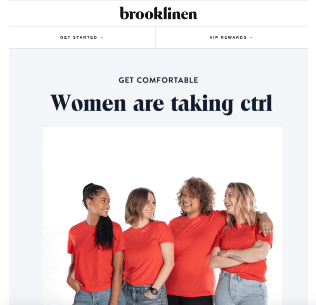
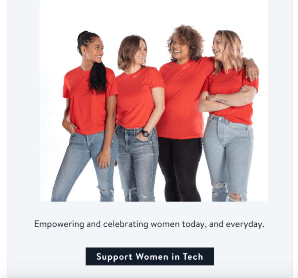
In it, they have a few primary CTAs, which feature buttons. There’s this one that says, “Support Women in Tech.”
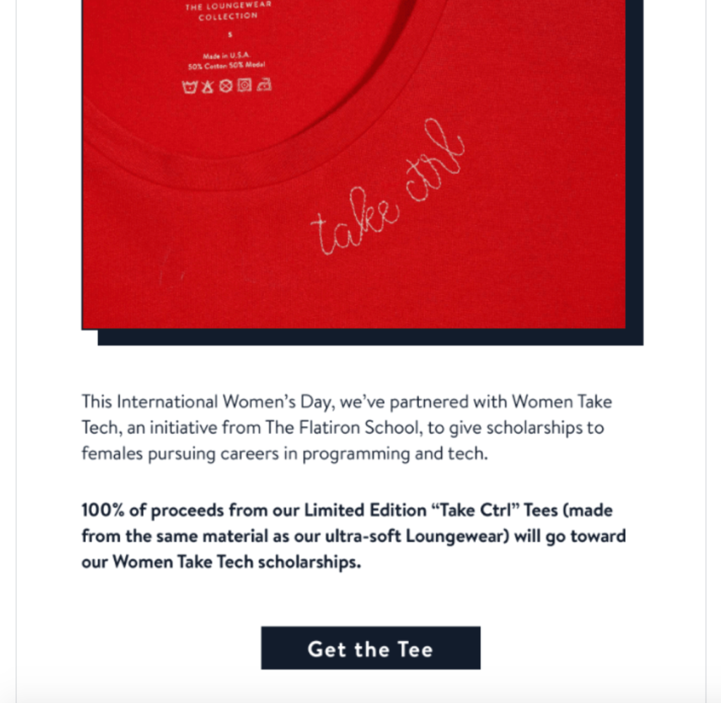
There’s also this one that says, “Get the Tee” for a t-shirt where proceeds go toward Women Take Tech Scholarships.
And at the bottom, Brooklinen includes this CTA that says, “Read more on our blog,” which takes subscribers to the “Brookliving Blog.”
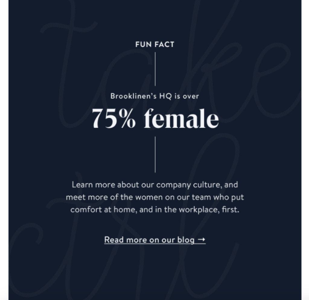
By using black buttons for their primary CTAs that contrast with the white background, Brooklinen is able to effectively draw a reader’s attention to those links and encourage them to click-through.
But notice that they didn’t use this technique for all of their CTAs — just the primary ones. The link pointing to their blog was just a normal text link.
7. Create a Sense of Urgency
Studies have found that creating a sense of urgency affects a subscriber’s perception of emails. Knowing that an item, promotion, sale, etc. will soon be gone is a powerful motivator that often prompts them to take action.
Say, for instance, you’re offering a discount on a particular product. Clearly stating that a subscriber has until the end of the day to get the discount should have a far greater impact than having no deadline.
In turn, you can expect a significantly higher click-through rate.
Take this email from accessories brand Bellroy who sells products like bags, wallets, pouches, and phone cases. Their offer is super straightforward, where they state that shoppers can get up to 55 percent off.
But they also let shoppers know that this is their last chance to buy.
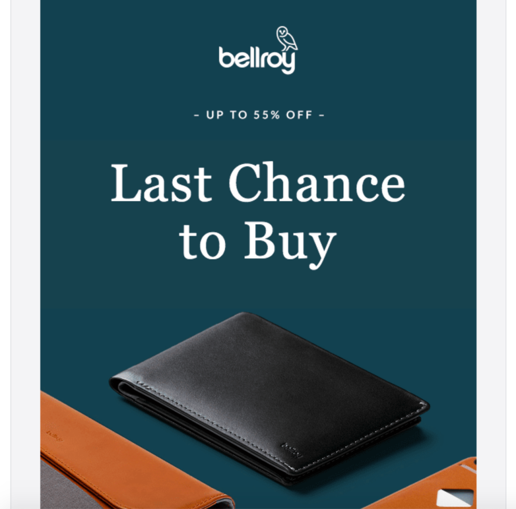
Once the classic items are gone, they’re gone for good.
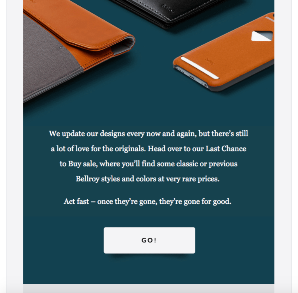
This can serve as some powerful incentive. Rather than waiting until later, many subscribers will go ahead and click-through, with many making a purchase right away.
I know this gets me in the buying zone and can work wonders for many e-commerce brands.
8. Practice Email Scrubbing
There’s a certain amount of churn that naturally occurs with all email lists. Even if you use a double opt-in and send nothing but amazing content, engagement will inevitably wane. In fact, “20 to 30 percent of email addresses decay within one year.”
This can feel a little deflating, but it’s just the way it is. So my final technique to boost your email click-through rate is to get in the habit of email scrubbing, where you remove unengaged users. Doing so offers several benefits, but here are three of the biggest.
First, it increases both your open rate and click-through rate. As a result, this should naturally lead to higher engagement levels, where the people who receive your emails are genuinely interested.
Second, it improves your sender reputation with your email provider, which should increase your email deliverability.
And third, it saves you money because you’re 1) raising your conversion rate and 2) sending fewer emails.
Because most email providers charge by the number of emails you send, this ends up costing you less.
That’s why I recommend scrubbing your email list approximately once every six months to keep it clean and ensure you’re only sending emails to truly engaged subscribers.

Conclusion
Getting readers to open your emails is the most important part of your campaign.
But knowing how to boost your email click-through rate is the second most important. This is what facilitates a smooth subscriber journey and ensures they actually check out your offer.
There are numerous factors that impact your click-through rate, but some of the fundamentals include segmentation, email design, layout, CTAs, and overall flow.
And of course, ensuring you’re only sending your emails to truly engaged subscribers plays a big role in it as well.
The strategies I’ve outlined here should cover all of the bases so that you’re able to effectively grab a reader’s attention, present them with the necessary information and ultimately convince them to click on your CTAs.

