There’s one type of marketing email your subscribers want and expect to see in their inboxes as soon as possible. It’s not an abandoned cart email or a back-in-stock email. It’s an order confirmation email.
Your customers want to be sure that their payment went through and their order is correct.
However, when used right, an order confirmation can become much more than a simple transactional email.
Driving eight times more opens than regular marketing emails, order confirmation emails are the perfect opportunity to:
- Capture buyers’ excitement;
- Cross-sell and upsell without sounding salesy;
- Drive referrals;
- Build customer loyalty;
- And much more.
In this post, I’ll share how to achieve all of the above with minor tweaks to your order confirmation emails—supported by 10 real-life examples from leading e-commerce brands.
What Is an Order Confirmation Email?
An order confirmation email is a transactional email sent by e-commerce brands to inform buyers that their order has been received or processed.
Although an order confirmation email typically contains important transaction details, such as a delivery address, items purchased, and the amount paid, it’s more than a simple receipt.
An order confirmation email is the first step in turning one-time buyers into repeat customers, and repeat customers into brand advocates.
A good order confirmation email captures the buyer’s excitement, eliminates confusion, and, more importantly, builds the foundations of a fruitful relationship with your customers.
In fact, it would be an ecommerce mistake that destroys your customer's trust to neglect this very simple transactional email.
5 Essentials for Every Order Confirmation Email
Before we dive into the examples, here are the five must-have elements that every effective order confirmation email should include:
- Clear Order Number and Purchase Details - Include an easy-to-find order number (preferably in the subject line) and a complete breakdown of purchased items with quantities, sizes, and prices. Customers need this information to track their order or contact support.
- Shipping Address and Delivery Timeline - Display the shipping address prominently so customers can catch errors immediately. Include an estimated delivery date or window—setting clear expectations reduces anxiety and support inquiries.
- Order Summary with Total Cost Breakdown - Show subtotal, discounts applied, shipping costs, taxes, and final total. Transparency builds trust, and seeing the discount amount reminds customers they got a good deal.
- Easy Access to Customer Support - Make it simple for customers to get help with clear contact options—whether that's a support email, phone number, live chat link, or FAQ page. Address common concerns proactively.
- Strategic Next Step or Call-to-Action - Don't waste this high-engagement opportunity. Include one relevant CTA: join your loyalty program, refer a friend, follow on social media, download your app, or shop complementary products. Keep it focused—one clear action performs better than multiple competing CTAs.
10 Best Order Confirmation Email Examples
Let's see 10 of the best order confirmation email examples that maximize engagement and discuss how you can improve your emails.
1. ASOS - The Multi-Touch Confirmation Series
Although hitting the “Complete Order” button creates joy and excitement for many shoppers, it’s not always the case for all your customers.
Regardless of how well-thought-out your checkout is or how many trust badges you display, online shopping always carries uncertainty. Some customers will experience post-purchase excitement, whereas others will feel uneasy.
Luckily, you can put your customers’ minds at ease by giving them detailed information in your confirmation emails, including:
- Where their order will be shipped to;
- When it will arrive; and
- What it contains.
ASOS does this well in its first post-purchase email:
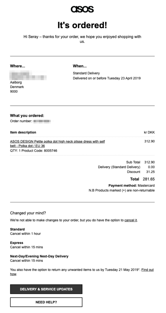
When you place an order on the ASOS website, you receive an email with your order details under three headings: where, when, and what.
Everything you need to know about your order is in this email, from your delivery address to the expected arrival date. You also get a short summary with a product description, size, quantity, and price, as well as your payment method.
Since returns are costly for e-tailers, ASOS gives you the option to cancel your order if you’re hesitant, under a headline that reads “Changed your mind?”
Here, ASOS also reminds you of its flexible return policy to guarantee customer satisfaction from the first email and reduce any unease you might experience.
In the remainder of the email, the company encourages you to join its newsletter, engage with its content, and download its mobile app:
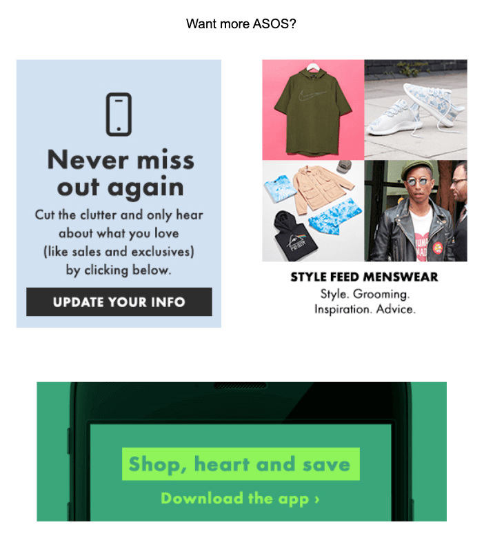
ASOS knows what its customers expect from this email. That’s why any self-promotion only comes after you get the crucial information, in case you “want more ASOS.”
When ASOS ships your order, you get another email, this time inviting you back to its store to check new arrivals:
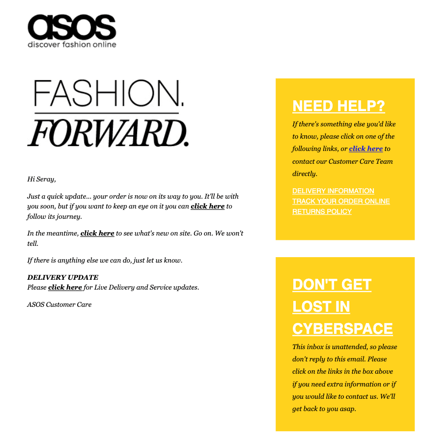
With this email, the company nudges you to place a second order while you’re still highly engaged with the brand.
You hear from ASOS one last time in case your delivery gets delayed, in a simple, plain-text email format:
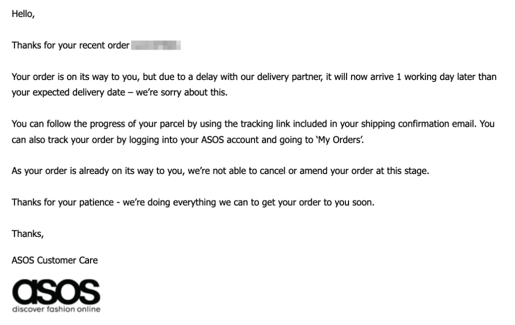
ASOS’s delivery update is a thoughtful addition to its order confirmation series and it’s especially relevant in these times.
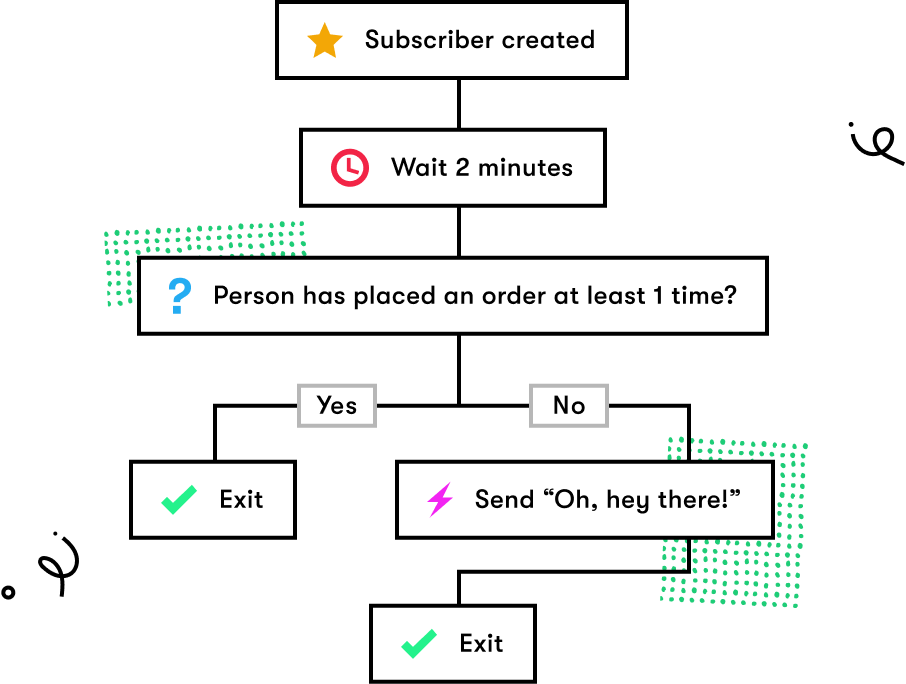
Follow ASOS's example and go beyond a simple confirmation email. Instead, set up a post-purchase workflow to get loyal customers on autopilot.

2. Lush - The Practical Order Summary
While ASOS keeps the content of its order confirmation email to a minimum and focuses only on the three key questions, brands like Lush have other priorities in their emails.
When you place an order on its website, Lush sends you a confirmation email with your order number included in the subject line:

Although it’s far from being creative or exciting, Lush’s practical approach to subject lines can come in handy when shoppers need to locate information about their orders.
(I can’t tell you how many times I looked for an order number in a confirmation email when a support team asked me to. So, thank you, Lush.)
This is what Lush’s order confirmation email looks like:
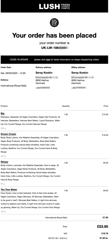
The company starts the email with a Covid19 update, knowing that a lot of online shoppers are unsure about delivery dates, especially when it comes to international parcels.
Next, they recap important information such as order date, delivery method, and delivery and billing addresses.
After that, you see a summary of all the products you ordered with their quantity, price, and weight information—together with some keywords explaining the product and its ingredients.
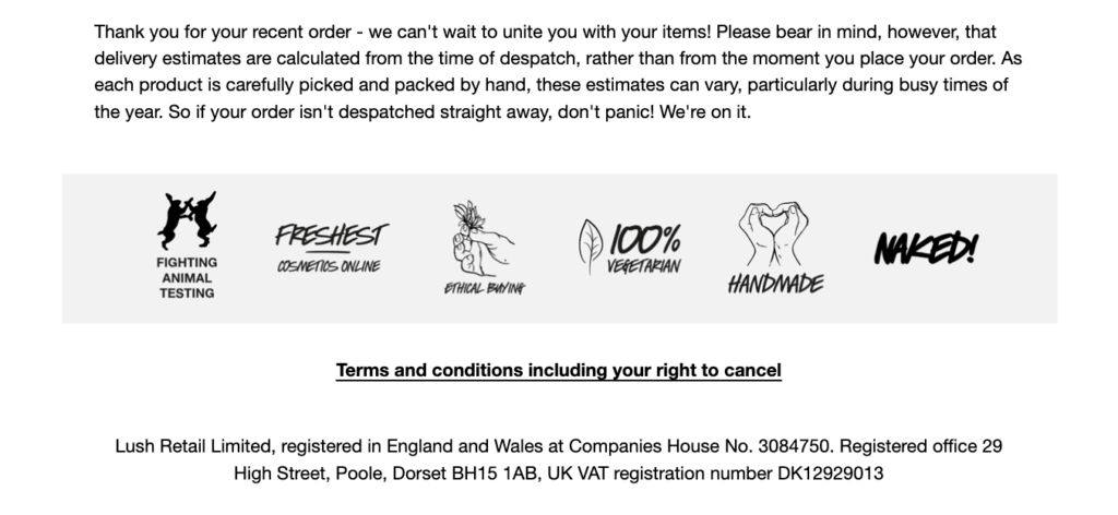
At the bottom of the email, you see six icons, repeating Lush’s key values. If you shop from Lush, you likely share its principles, such as animal welfare and ethical consumption. These badges help remind you that you made the right decision with buying from the company.
It’s also a smart way to add your brand’s personality to an otherwise boring transactional email. Whether visually or verbally, you can brand your confirmation emails by reminding shoppers of your value proposition, as Lush does.
3. Estrid - The Values-Driven Confirmation
It’s one thing to confirm the buyer’s decision with a sentence about your brand values and another to build an entire order confirmation email on them.
Estrid, the Swedish razor subscription company, chooses the latter.
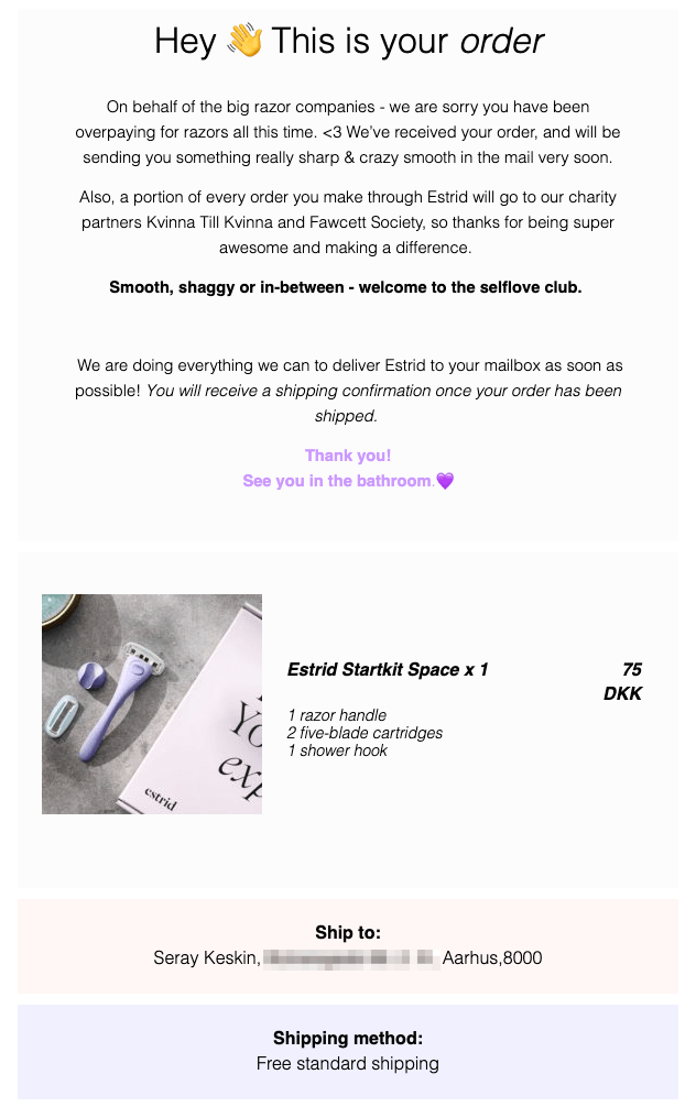
When you place an order on the website, you get this confirmation email with a straightforward headline. In the first two paragraphs of the copy, Estrid aims to make you feel good about your decision.
First, they hint at why you made the right choice by switching to Estrid and how it will save you money. Second, they tell you that a portion of your order will go to charities, so you can feel even better about placing this order.
Estrid is all for body positivity and you can easily tell that from its order confirmation email. When you join its subscription service, they welcome you to the self-love club, making you feel like a part of a community.
Finally, Estrid features the product you just bought with its image, your address, and shipping method so you can double-check for mistakes before it’s too late.
When Estrid packs your order, you get this shipping confirmation email:
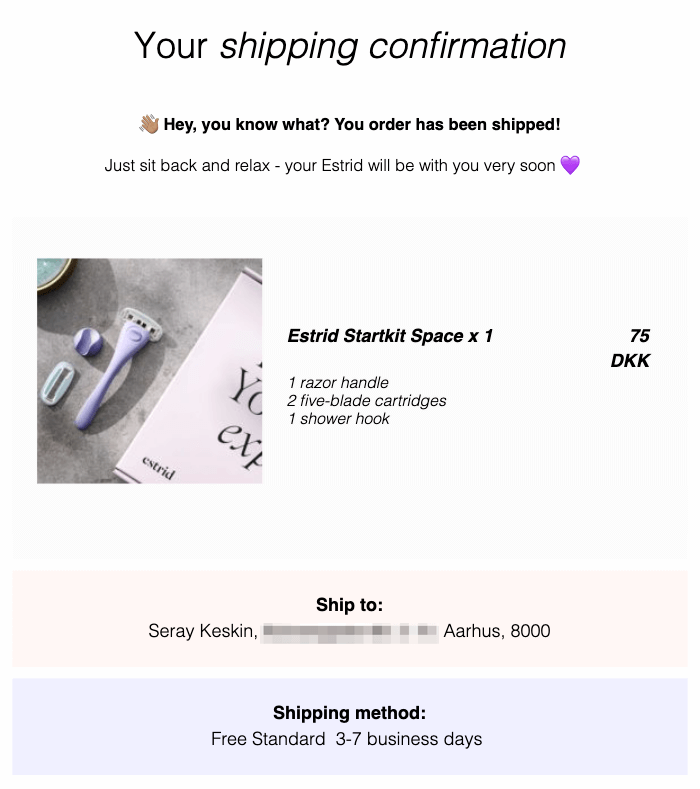
In it, the company simply informs you that your goods are on the way and you can “just sit back and relax.” With this email, Estrid eases your mind (once more) and builds anticipation for the arrival of your order.
If your shipping confirmation emails consist of a tracking number and a link, consider following Estrid’s example instead.
4. Glossier - The Lighthearted Receipt
Many marketers see order confirmation emails as simple receipts. As a result, most of these emails lack creativity.
You don’t need to go above and beyond to turn your order confirmation emails into something they are not. After all, you don’t want to confuse customers with sarcasm or over-the-top humor right after they made a payment.
However, adding a little humor to your confirmation emails can ease the tension and make your customers feel more comfortable about your brand, as Glossier does:
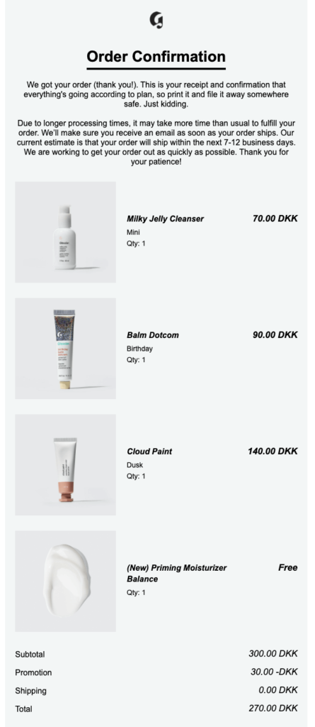
Glossier starts off this email with lighthearted copy that eases your mind by saying “everything is going according to plan.”
Next, the company informs you about its longer processing times and sets clear expectations for your order’s arrival.
In the email, you also see the products you ordered together with large images. This helps you spot any potential mistakes and rekindles your excitement for your new goodies.
Glossier also does something clever at the bottom of this email:
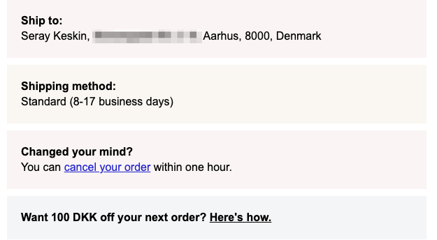
After confirming your shipping address and method, and offering the option to cancel your order, Glossier invites you to its referral program.
Best of all, Glossier does this without mentioning the program itself. Instead, they evoke curiosity by asking if you want to save 100 DKK on your next order. Considering you just bought from the company, you’re likely interested in saving on a future purchase, too.
Glossier’s shipping confirmation also follows a similar tone:
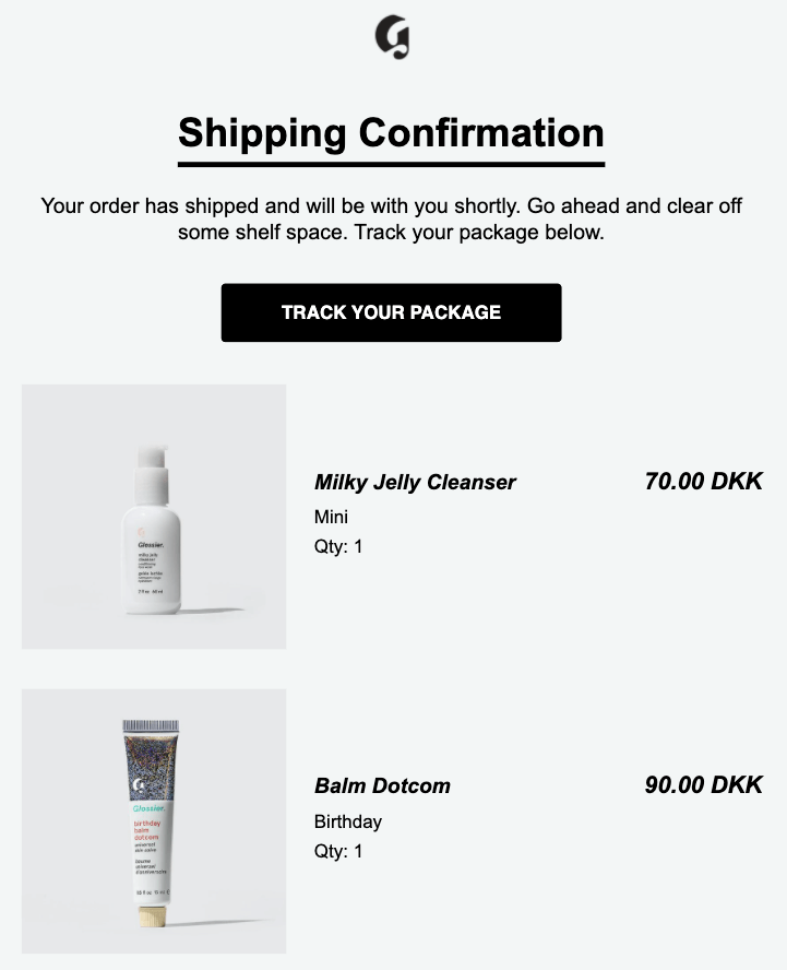
Nothing fancy or extreme here. But notice how Glossier gets you excited about your new products by telling you to “go ahead and clear off some shelf space.” Your products are soon arriving, so you better get ready for them.
5. Monki - The UGC-Powered Follow-Up
As you’ve seen in the examples above, the best order confirmation emails often don’t have a breathtaking design.
Simplicity and clarity work wonders when it comes to this type of email, and Monki is aware of this.
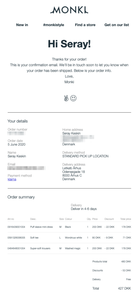
When you place an order on the Monki website, you receive this simple email including your order details and summary, together with the size, quantity, and discount information for each product you bought.
I love how Monki shows the amount of discount you got in your order. It’s a great reminder that you saved money so you feel better about spending money on the Monki store.
Now, take a closer look at the header of Monki’s email:
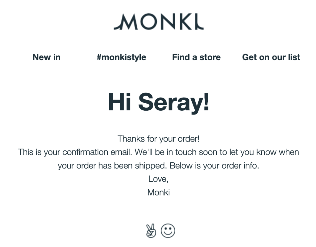
The four headlines take you to the company’s new arrivals, customer photos, store locator, and gives you a chance to join its email list if you haven’t already agreed to that.
This is a smart and subtle way to lure customers back to the website so they can place another order or engage with the brand.
The second headline #monkistyle is worth looking into. When you click the link, Monki takes you to a landing page dedicated to customer photos:
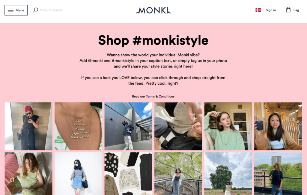
And it gets better.
When clicked, each photo opens in a new modal so you can visit the customer’s Instagram and click through to buy the product in the photo.
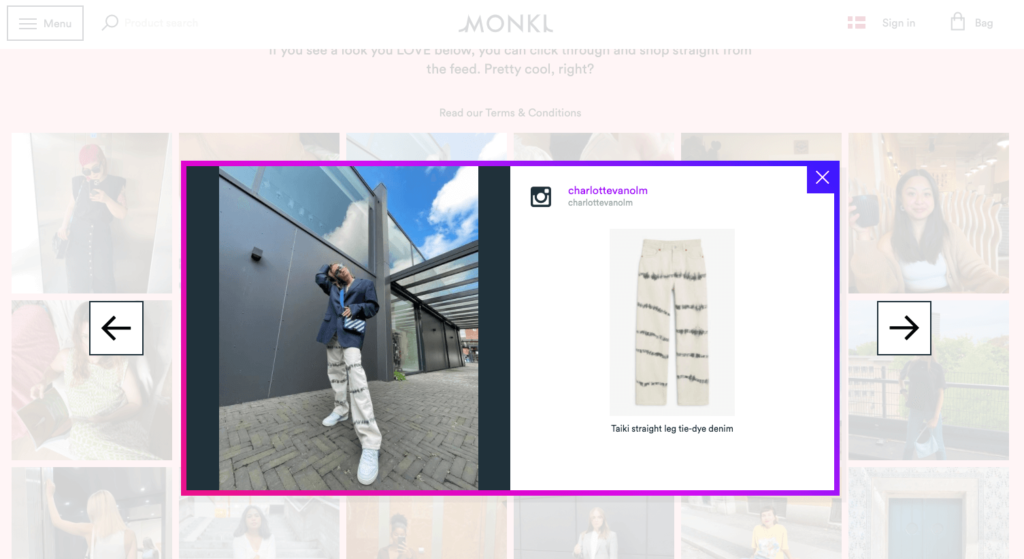
Thanks to user-generated content, Monki shows its products in action without any additional effort and adds social proof to its brand.
6. Bestseller - The Visual Progress Tracker
An effective order confirmation email doesn’t only summarize what just happened. It also sets expectations and builds anticipation by explaining what is about to happen in the upcoming days.
That’s what Bestseller does successfully.
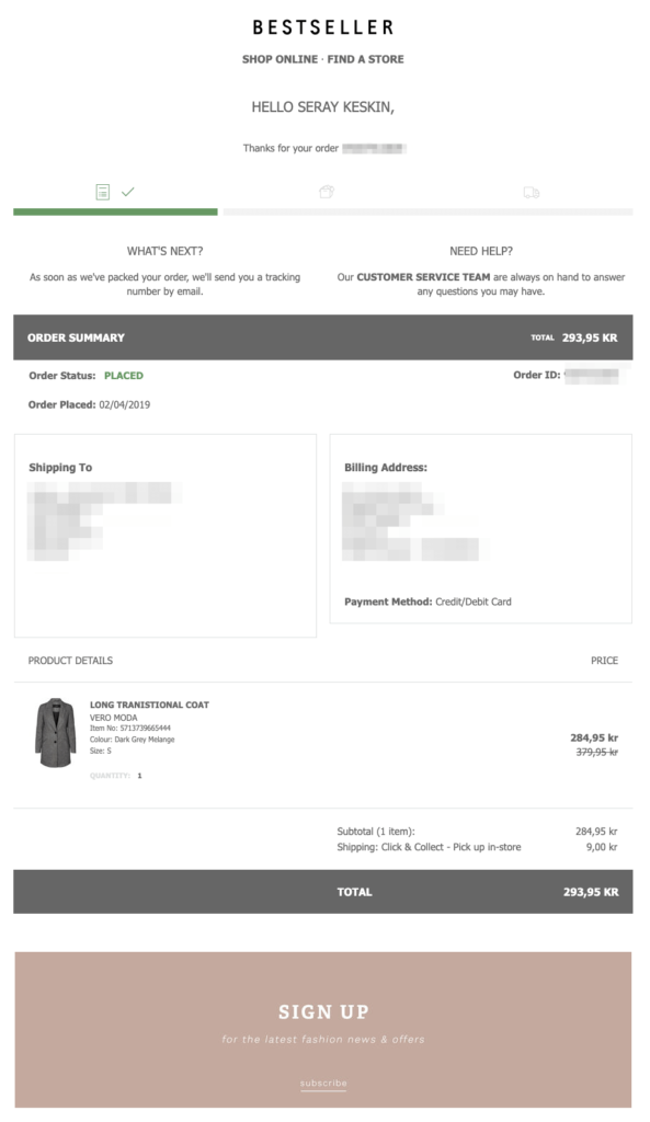
When you place an order and get a confirmation email from Bestseller, you see a progress bar with three icons on top. Thanks to this visual aid and the section called “What’s Next” below, you know what to expect about your order over the next few days.
Bestseller knows that you might have some questions about your order. That’s why the second headline you see in this email is “Need Help?”
After providing you with the transactional details, Bestseller invites you to sign up for its newsletter. Since its customers already committed to something bigger, it’s was a good time for the brand to ask for a smaller favor.
Similar to the examples above, Bestseller sends a delivery confirmation email when it ships your items:
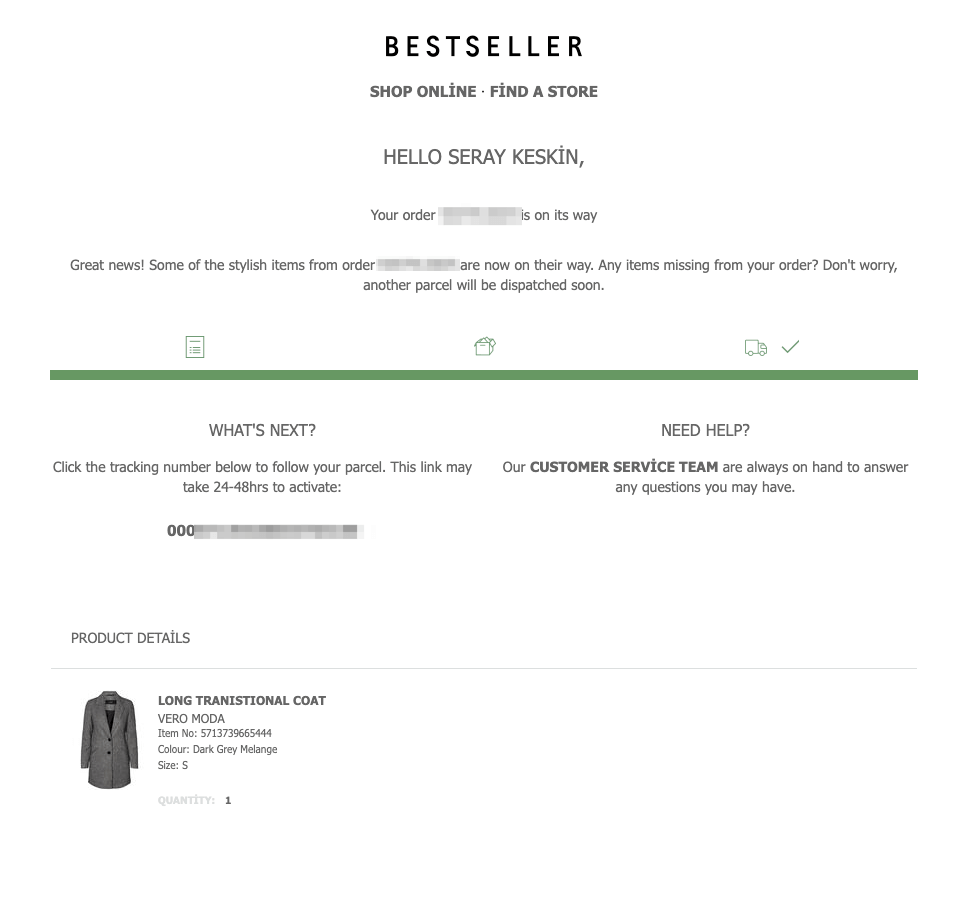
Much like the first email, the company sets expectations with a progress bar that’s now moved one step further.
The “What’s Next” section has now changed to include shipping information so that you can track your order and look forward to receiving it.
Note that the “Need Help?” section is still at the top of the email because the order process isn’t complete yet. This is a great example of a brand making it easy for its customers to reach out at any stage of their order.
7. Cult Beauty - The Segmented Call-to-Action
Order confirmation emails are the perfect place to turn first-time customers into repeat buyers. But for that to work, you need to keep your brand top-of-mind and invite customers back to your site with a compelling reason.
Cult Beauty follows this strategy and guides its customers in the right direction with an engaging order confirmation email example:
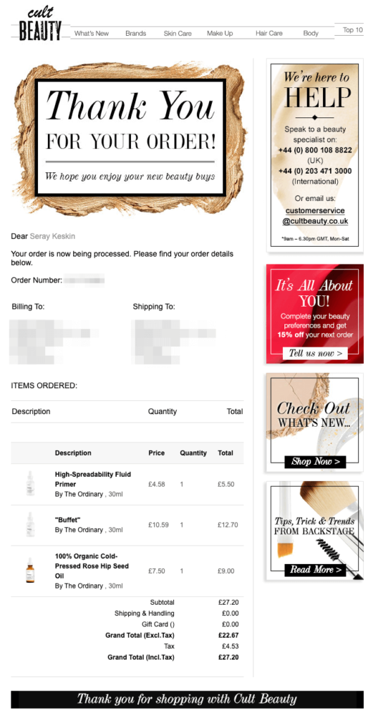
Following best practices, Cult Beauty captures your excitement with its headline. Then, it gives you the details of your transaction.
But something more interesting is happening on the right side of the email.
After offering you a helping hand, Cult Beauty invites you back to its site, but with three different options:
- Update your preferences and get a discount on your next order (read: data enrichment and segmentation);
- Check out what’s new on the website (read: promoting new arrivals); or
- Learn beauty tips and trends (read: content marketing.)
This is a brilliant example of engaging order confirmation emails because Cult Beauty knows that its customers are not the same. That’s why it guides them to places of different engagement levels, with compelling reasons.
Follow Cult Beauty’s example to send new customers back to your website without coming off as too salesy.
8. Firebox - The Referral Request
Encouraging repeat purchases is one way to make more revenue out of your order confirmation emails.
Firebox, on the other hand, follows a different path and focuses on referrals.
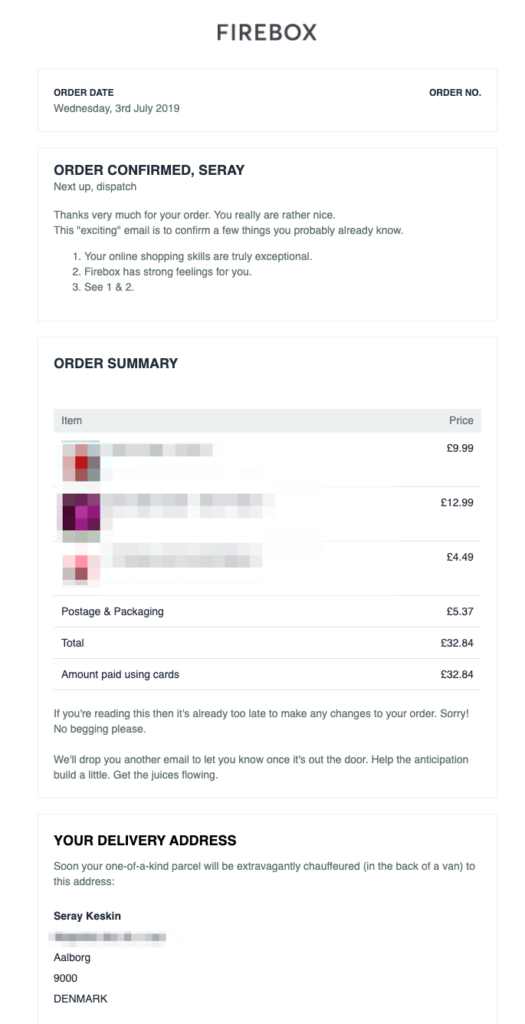
In this email, Firebox simply informs you that next up is dispatch and appreciates you for being a customer in a friendly tone.
After product and delivery details, Firebox has a section dedicated to encouraging referrals:
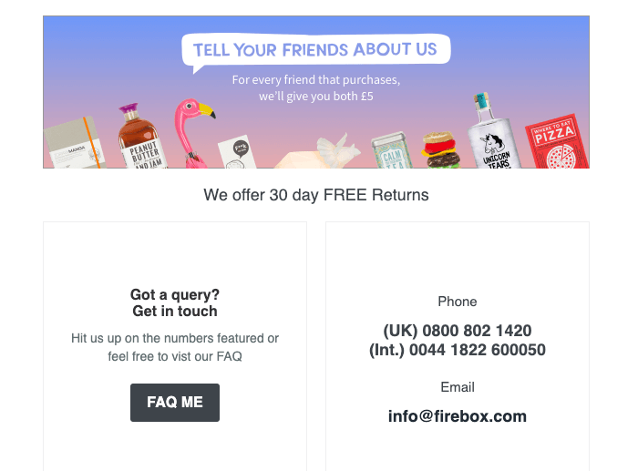
While asking you to tell your friends about them, the company clearly writes the incentive for both parties.
Just when you bought a bunch of new items and heard all the nice words from Firebox, why wouldn’t you tell your friends about them?
9. Beardbrand - The Grooming Guru Welcome
If you’ve been a long-time follower, you know that we’re huge fans of Beardbrand’s marketing. That’s why I had to look into Beardbrand’s order confirmation emails and I’m not disappointed.
When you place an order, Beardbrand, first, sends you this email:
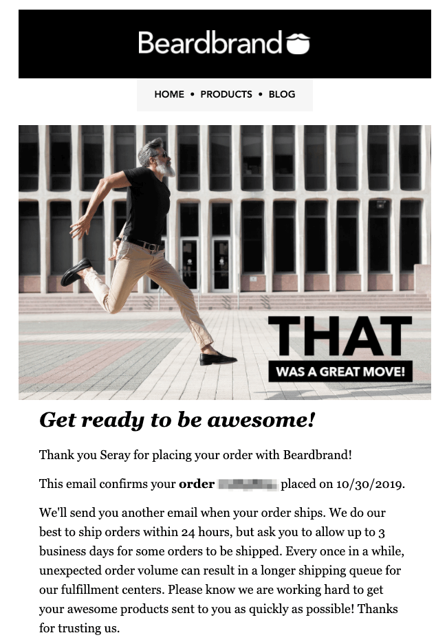
From the visual to the copy, Beardbrand shares your excitement in this email. With the headlines “that was a great move” and “get ready to be awesome,” the company also confirms your buying decision.
A few days after making a purchase, Beardbrand sends you another email with the subject line, “Your friends will thank you.”
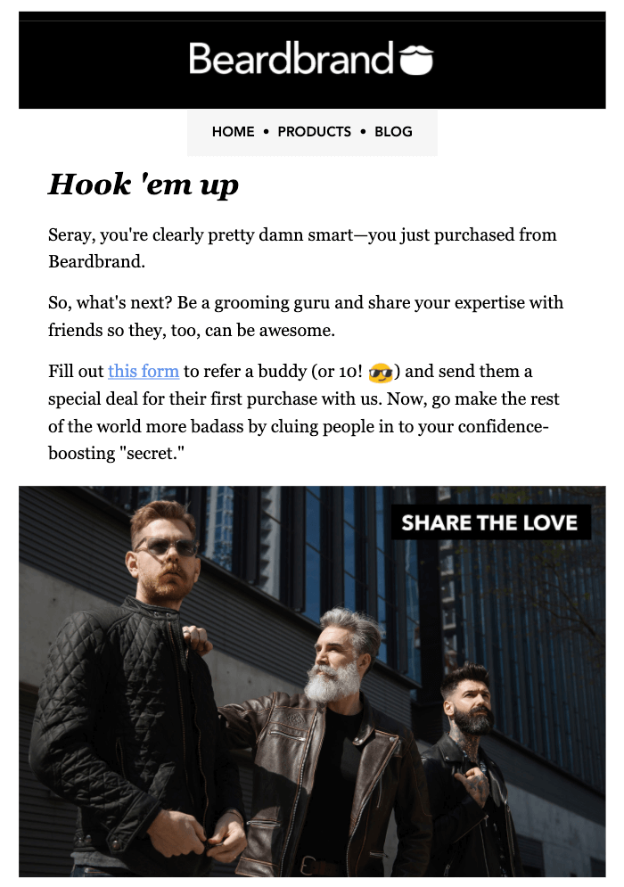
In it, Beardbrand confirms your decision one more time and asks you to refer some friends. If you do so, your friends will get a special deal, and you’ll be a “grooming guru” in their eyes.
After I clicked the email and filled out a form on Beardbrand’s website, my colleague Rikke got this email shortly upon my referral:
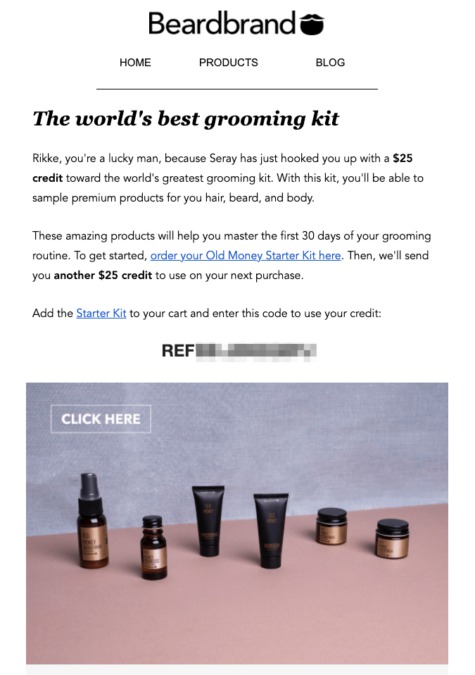
After complimenting Rikke for being a lucky man (!), Beardbrand offers her a $25 credit. But there’s a caveat: it only applies to a specific starter kit.
And if you buy that starter kit, Beardbrand adds another $25 credit to your account. See how they hook you?
Rather than give you a coupon code that applies to any product, Beardbrand directs you to a starting point and makes sure you return for more.
No matter how you manage your referral program, order confirmation emails are a great place to request and follow up on referrals.
10. Zalando - The Smart Cross-Sell
Cross-selling with order confirmation emails is nothing new.
You likely know it well, thanks to Amazon:
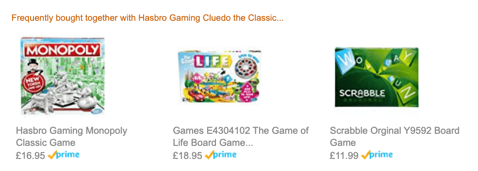
While this approach might work for e-commerce giants like Amazon, you can offer your customers a stronger reason than “frequently bought together.”
The key to effective cross-selling is recommending genuinely complementary products. In some niches, like apparel, it’s easier to make relevant product recommendations.
Check out how Zalando cross-sells in its order confirmation emails:
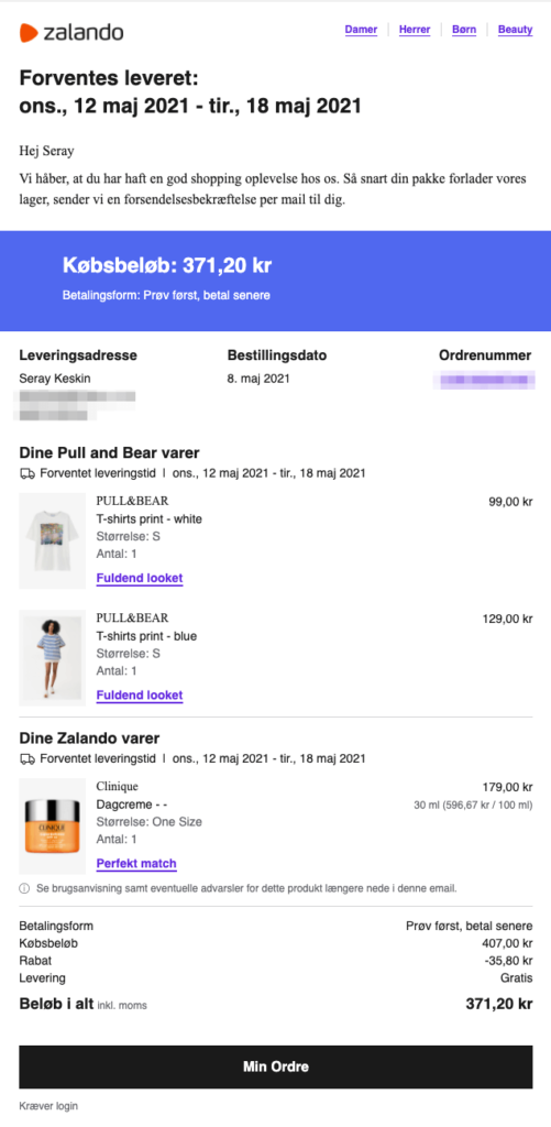
After giving information about the estimated delivery date and the total price, Zalando displays the products you ordered—divided into multiple sellers with different delivery dates.
Under each clothing item you bought, you see a call to action (CTA) button that reads “Complete Your Look.” As opposed to “Frequently Bought Together,” Zalando’s CTA speaks directly to you. Plus, it gives you a clear motive to buy more: completing your look with matching clothes and accessories.
When you click the link, Zalando takes you to a landing page with similar products you might like:
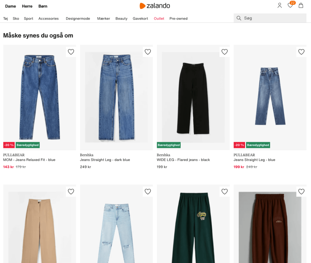
Pants for t-shirts: an easy and reasonable recommendation.
Notice how the CTA changes to “Perfect Match” next to the beauty product in my confirmation email. This time, Zalando recommends other beauty products from the same brand and category:
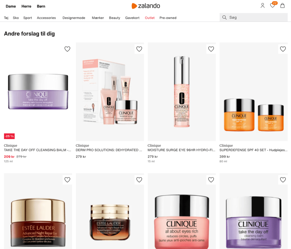
It’s a great tactic that will help increase your revenue with order confirmation emails even if you’re not a fashion e-tailer.
Order Confirmation Email Templates for 2026
Ready to implement what you've learned? Here are three proven order confirmation email templates you can customize for your brand in 2026.
Template 1: The Minimalist Confirmation
Subject Line: Your order #[ORDER_NUMBER] is confirmed!
Email Body:
Hi [FIRST_NAME],
Thanks for your order! We're getting it ready to ship.
ORDER DETAILS
Order #: [ORDER_NUMBER]
Order Date: [ORDER_DATE]
WHAT YOU ORDERED
[PRODUCT_IMAGE] [PRODUCT_NAME] x [QUANTITY] — $[PRICE]
SHIPPING TO
[NAME]
[ADDRESS_LINE_1]
[CITY, STATE ZIP]
Estimated Delivery: [DELIVERY_DATE]
[Track Your Order Button]
Questions? Reply to this email or visit [SUPPORT_LINK]
Thanks for shopping with us!
[YOUR_BRAND]
Template 2: The Excitement Builder
Subject Line: 🎉 Yes! Your order is confirmed, [FIRST_NAME]
Email Body:
Hey [FIRST_NAME]!
That was a great choice. You're about to get [# OF ITEMS] awesome [product(s)] delivered right to your door.
HERE'S WHAT'S COMING YOUR WAY:
[PRODUCT_IMAGE]
[PRODUCT_NAME]
[Quick benefit statement]
Qty: [QUANTITY] | Price: $[PRICE]
YOUR ORDER AT A GLANCE
Order #: [ORDER_NUMBER]
Arriving: [DELIVERY_DATE]
Shipping to: [ADDRESS]
WHILE YOU WAIT...
Want to get even more value from your purchase? Check out our [GUIDE/TUTORIAL/TIPS PAGE]
[Button: Track My Order]
Questions? We're here to help: [EMAIL] | [CHAT_LINK]
Cheers,
The [YOUR_BRAND] Team
P.S. Know someone else who'd love this? Share the love and you both save 15% → [REFERRAL_LINK]
Template 3: The Cross-Sell Specialist
Subject Line: Order #[ORDER_NUMBER] confirmed → Complete your [product category]
Email Body:
[FIRST_NAME], your order is on the way!
ORDER CONFIRMED
Order #: [ORDER_NUMBER]
Arriving: [DELIVERY_DATE]
YOU ORDERED:
[PRODUCT_IMAGE] [PRODUCT_NAME]
Qty: [QUANTITY] | $[PRICE]
COMPLETE YOUR [EXPERIENCE/LOOK/SET]
Customers who bought [PRODUCT_NAME] also love:
[RECOMMENDED_PRODUCT_1 with image]
[Benefit-focused headline]
[Price] [Button: Add to Cart]
[RECOMMENDED_PRODUCT_2 with image]
[Benefit-focused headline]
[Price] [Button: Add to Cart]
YOUR DELIVERY DETAILS:
Shipping to: [ADDRESS]
[Button: Track Order]
Questions? Contact us: [SUPPORT_INFO]
Happy shopping!
[YOUR_BRAND]
Customization Tips for All Templates
Brand Voice Consistency
Adjust the tone to match your brand:
- Luxury brands: More formal, sophisticated language
- Youth brands: Casual, emoji-friendly, conversational
- B2B brands: Professional, efficient, value-focused
Mobile-First Design
- Keep subject lines under 50 characters
- Use single-column layouts
- Make buttons at least 44x44 pixels (easy thumb tap)
- Keep paragraphs short (2-3 lines max)
- Use plenty of white space
Personalization Beyond Name
- Reference specific products purchased
- Mention loyalty status ("As a VIP member...")
- Include location-based shipping estimates
- Segment first-time vs. repeat buyers
Legal Requirements
Always include:
- Physical mailing address
- Unsubscribe link (even for transactional emails in some regions)
- Privacy policy link
- Contact information
Conclusion
Order confirmation emails are a goldmine waiting to be tapped, but only a handful of e-commerce brands are using them to their fullest potential.
With minor improvements, you can optimize your order confirmation emails for higher engagement and increase your revenue on autopilot.
The 10 examples we've covered show different approaches—from ASOS's comprehensive multi-touch series to Beardbrand's personality-driven referral strategy. The key is finding what resonates with your brand values and customer expectations.
Key Takeaways:
- Start with the 5 essentials: order details, shipping info, cost breakdown, support options, and one strategic CTA
- Use templates as a starting point, then customize for your brand voice and customer needs
- Add personality without overwhelming customers with marketing messages
- Test different CTAs to find what drives engagement and sales for your audience
Want to automate your order confirmation workflow? Drip makes it easy to set up a complete post-purchase series in minutes with pre-built templates and seamless e-commerce integrations.
Try Drip Free for 14 Days → No credit card required.

