E-commerce returns are the bane of online businesses. Nearly half (48 percent) of digital shoppers said they made at least one return in 2018, and over $369 billion of sales were lost as a result.
As I’ve mentioned in previous articles, product returns are far more problematic for e-commerce businesses than brick-and-mortar stores.
After all, 30 percent of products ordered online get returned, as compared to just 8.89 percent for brick-and-mortars. So this is an issue that e-commerce brands need to address.
Fortunately, there’s a lot you can do to reduce your number of e-commerce returns—everything from improving your product descriptions to using more protective packaging when shipping orders can help.
In this post, I’ll go over nine specific strategies and include examples from actual companies you can learn from.
Here we go.

Table of Contents
1. Ensure Products Live Up to the Hype
2. Create Detailed Product Descriptions
3. Include Ultra High-Quality Images
1. Make Sure Your Products Live Up to the Hype
First of all, your products must meet basic quality standards and live up to customer expectations. In other words, they shouldn’t be all-sizzle-and-no-steak.
If you make big promises on your product pages but fail to deliver, this is almost guaranteed to send your number of returns soaring. While you want to write compelling copy that makes shoppers want to buy, it must align with reality.
One brand that does a great job at this is Chubbies, a company that specializes in shorts and swim trunks. Each of its products includes concise details so shoppers know what they’ll get.
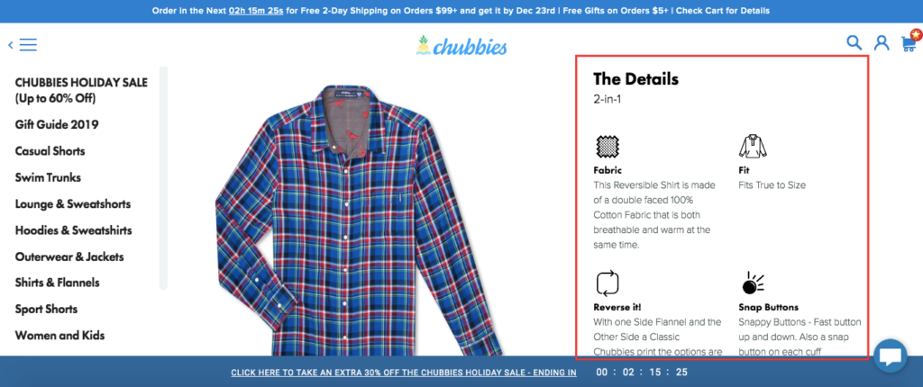
What they don’t do is hype its products up to unattainable standards, saying they’re the greatest thing since sliced bread. They highlight key features and how its products differ from most competitors.
Now doesn’t mean you should sell yourself short. Just be sure not to over promise and under deliver. That right there should help lower your number of e-commerce returns considerably.
2. Create Detailed Product Descriptions (But Don’t Overwhelm Shoppers)
“88 percent of shoppers characterize detailed product content as being extremely important.” So I can’t stress enough how vital it is to nail your product descriptions.
They need to be detailed and succinctly explain everything shoppers want to know. But at the same time, they should overload shoppers with excessive information.
Luxury lifestyle accessories company Hard Graft is an example of an e-commerce brand that does a great job with its product descriptions. Check out what they include for one of their handbags, the Layover Holdall Classic.
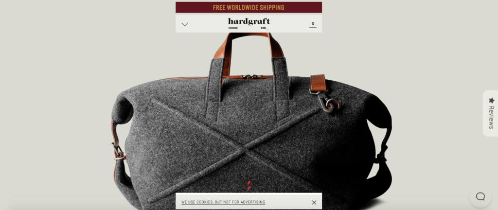
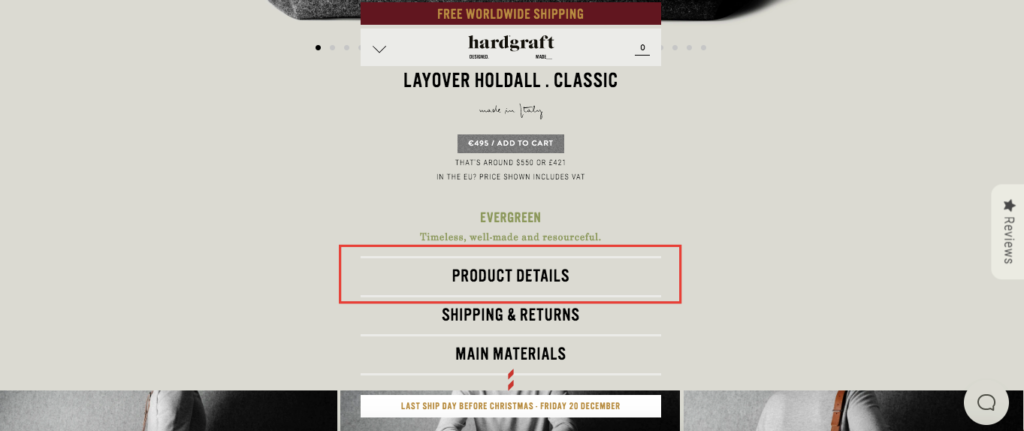
Beneath the main image, they have a “Product Details” section.
Click on it, and Hard Graft gives you a rundown on the handbag, explaining that it has a lot of depth, layers of wool over wool and uses leather detail underneath.
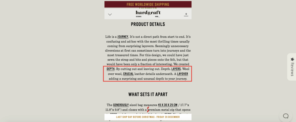
Below that, they explain what sets this product apart, provide measurements, info on the materials that are used, and more.
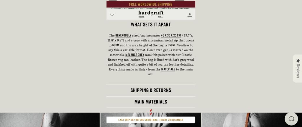
This is excellent copy and fills shoppers in on all of the important details. But at the same time, it doesn’t go overboard with redundant information that isn’t necessary. That’s what makes this example such a great template to follow.
It’s all about including the essentials with your product descriptions but not overwhelming shoppers.
3. Include Ultra High-Quality Images
Using high-quality, professional images serves two key purposes. First, it grabs the attention of shoppers and piques their interest, making them more likely to buy. Second, it gives them a better idea of what it would be like if they owned a particular product.
They can get a feel for what it looks like and feels like and truly envision themselves using it. So if they decide to go ahead with a purchase, there’s a better chance that they’ll be happy with the product and want to keep it.
Twelve South, a brand that sells accessories for Apple products, does an amazing job at using ultra high-quality images. Take, for instance, its product page for the AirSnap Pro, a case for Apple AirPods.
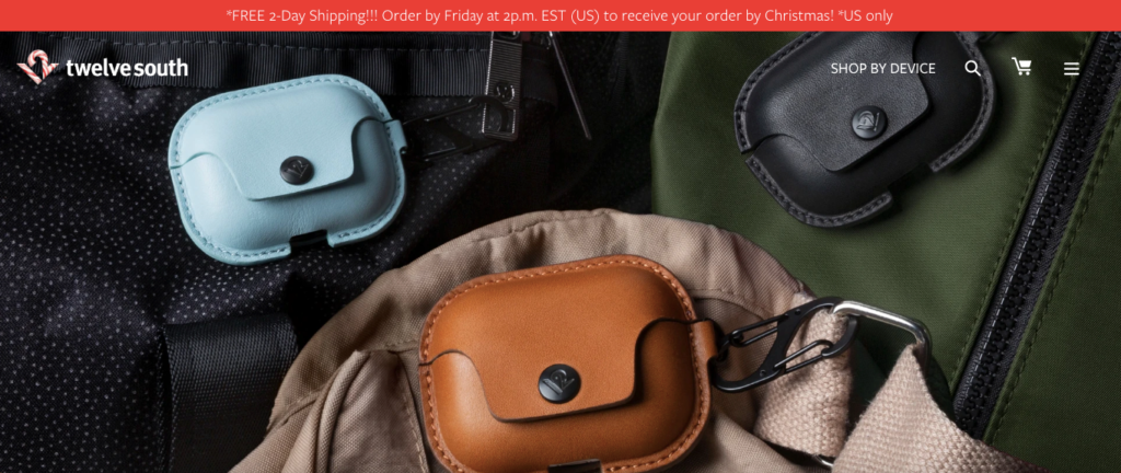
It’s a fairly simple product, but they include numerous images showing the different colors the AirSnap Pro comes in and what it looks like in action.
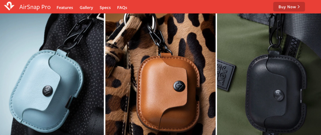
This gives you a feel for what the texture is like. (You can even see the details on the stitching.) I also like that they include this image of the product in someone’s hand, which provides a sense of scale.
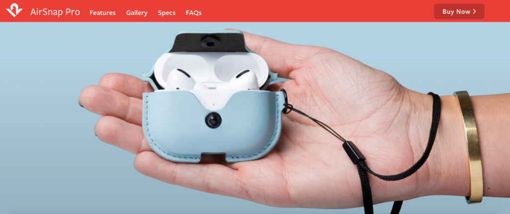
This should eliminate a lot of confusion for shoppers and make them less likely to make a return. My point here is that you should be selective about the images you use and crank up your quality standards.
4. Use Multiple Angles
Remember that online shoppers can’t scope out a product up close and personal like they can at a brick-and-mortar store. All they have to go on is what they see on a screen.
So you can’t just slap up one picture and expect shoppers to understand your product and its subtle nuances completely. Instead, it’s best to use several images from multiple angles.
This is something else that Hard Graft does with its products. Let’s go back to the Layover Holdall Classic handbag. Besides the initial picture you see at the top of the product page, they include 27 other pictures from every angle imaginable, including a few close-up shots.
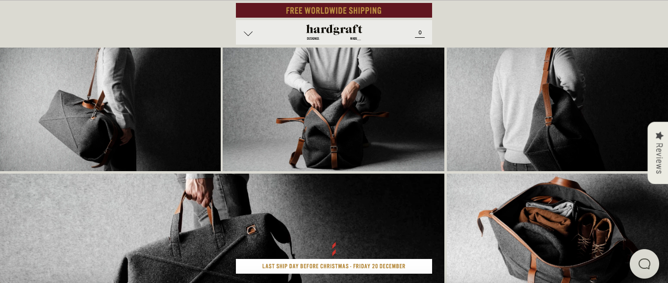
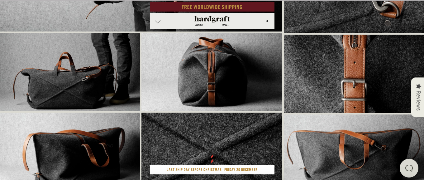
By doing this, Hard Graft leaves no stone unturned and makes shoppers feel more comfortable and confident buying this handbag. While you don’t necessarily need to include 28 shots of a product, this shows the impact that offering multiple angles can have.
So you’ll want to be as thorough as possible.
5. Offer Product Zoom
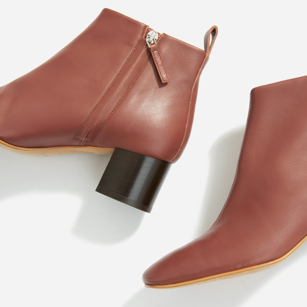
Another great feature for helping shoppers understand your product on a more granular level is product zoom. This is effective for showcasing the materials and craftsmanship, so there are no surprises once a customer receives their order.
Product zoom is something clothing retailer Everlane uses for its products, which helps them come alive. Take, for example, this product, “The Day Boot.” They offer several images, including this one that does a great job of displaying the boot.
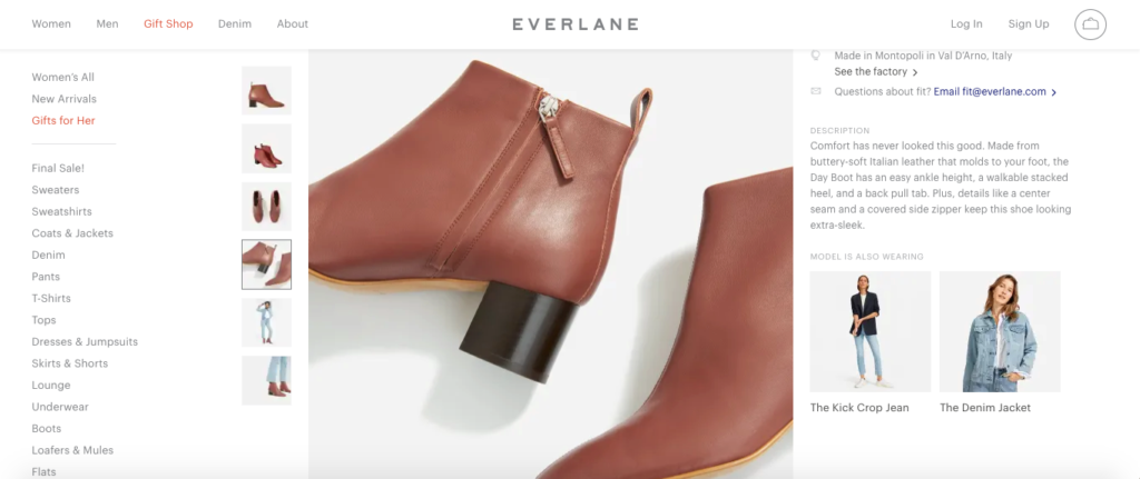
But when you use product zoom, you can see what the texture is like and understand the craftsmanship that goes into this product.
And don’t think that you need any major developing skills to implement product zoom. Many e-commerce platforms have plugins you can use that require zero coding. For instance, there’s All In One Product Zoom for Shopify and Product Image Zoom for WooCommerce.
6. Include Info on Sizing and Fit
This won’t apply to all brands, but it certainly applies to those selling products like apparel or footwear. In fact, apparel is the most commonly returned product category, accounting for 43 percent of returns, and footwear is returned quite frequently as well.
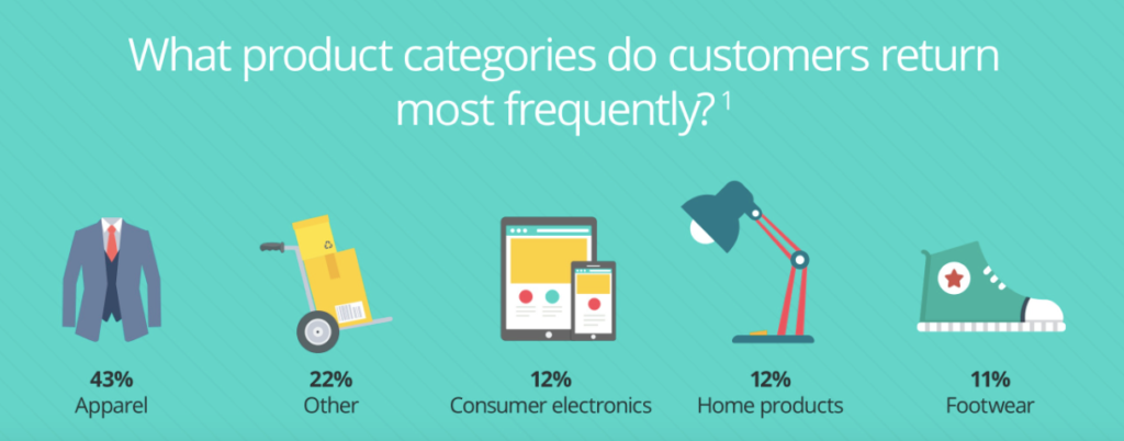
You can do yourself and your customers a huge favor by including details on sizing and fit, so they choose the optimal size.
For example, footwear company Allbirds mentions that its products are only available in whole sizes. So for shoppers who are in between sizes, they recommend sizing up for most products. If someone wore a size 10 ½, for instance, they would want to go with size 11 for the Men’s Tree Toppers shoes.
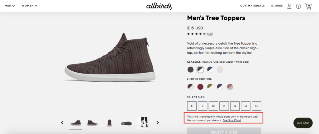
They also offer an Allbirds size chart so shoppers can get more information.
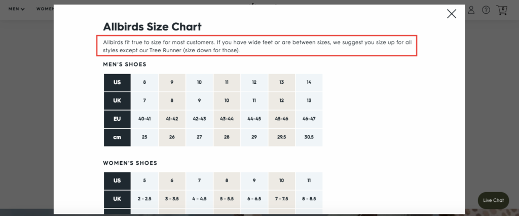
That way, shoppers don’t have to wonder about sizing, and the odds of them choosing the right size increase dramatically, thus reducing the odds of e-commerce returns. And if you feature images of models wearing your products, it’s smart to clarify how tall they are and what specific size they’re wearing.
That’s what premium yoga and fitness wear company Yoga Rebel does.
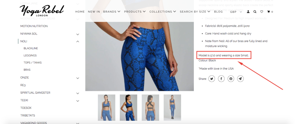
This provides a nice point of reference that can be a huge help when shoppers are deciding what size to get.
7. Incorporate Reviews
I probably don’t need to tell you about the power of customer reviews. “Research shows that 91 percent of people regularly or occasionally read online reviews, and 84 percent trust online reviews as much as a personal recommendation.”
Besides validating your products and backing up any claims you make, reviews serve another purpose. They help give potential customers an objective overview and include helpful details that let them know whether or not a particular product is right for their needs.
This helps flesh out a product page and decreases the chances of customers being dissatisfied and wanting to return an item.
Outdoor Voices, a company that specializes in technical apparel for recreation, does an excellent job of incorporating reviews. For example, the “CloudKnit Hoodie” currently has 35 reviews.
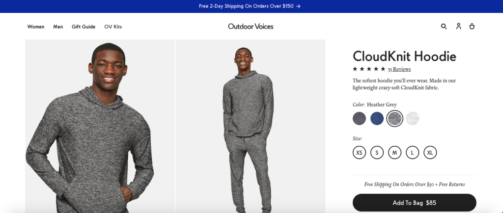
Here are just a couple.
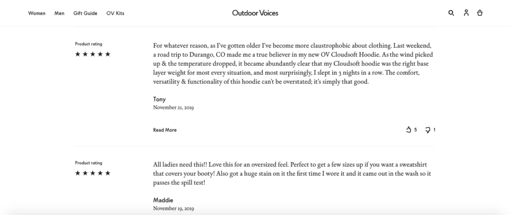
These provide a nice frame of reference and let shoppers know what to expect if the buyer decides to go through with a purchase. That’s why it’s important to encourage your customers to leave reviews and figure out a way to weave them into your product pages.
For instance, Shopify has a plugin called Product Reviews that allows you to do this easily, and this article from Cloudways features ten reviews plugins from WooCommerce.
With reviews, transparency is everything. One e-commerce company takes the approach of disclosing details about its reviews in a long-form content asset. This 3000+ word approach is ideal for their target audience.
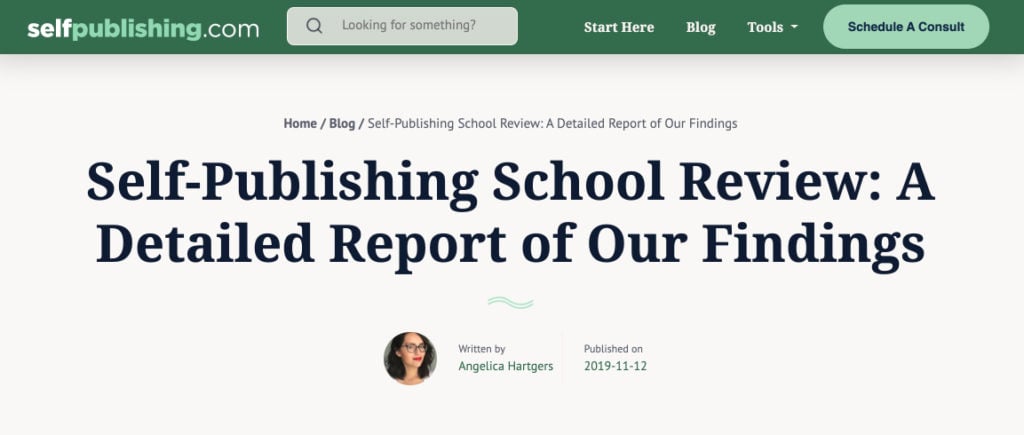
Most common for e-commerce companies is to display product reviews on every product page. Today’s customers can spot a scammy review a mile away. Be transparent, and it will serve to win your customer’s trust and reduce returns.
8. Improve Your Packaging
Another one of the main reasons for returns is because products arrive damaged or broken. In fact, that’s the reason behind 20 percent of all returns.
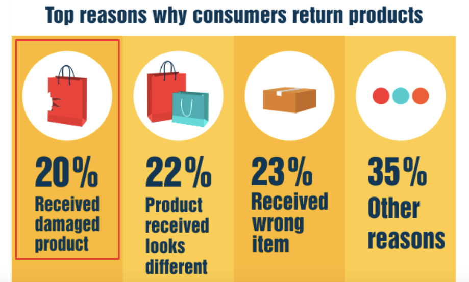
While you never have complete control over the handling of an item during transportation, you can certainly control the quality of your packaging.
If you’re getting frequent returns because of damaged or broken products, it means you need to improve your packaging so that it properly protects products, ensuring they arrive safely to your customers.
This is a whole other topic, but here are some quick tips for doing this:
- Use recyclable loose-fill peanuts. These create a nice barrier of protection and are better for the environment than traditional polystyrene peanuts.
- Use padded mailing bags for smaller products. This tends to be more economical than corrugated boxes and has built-in cushioning.
- Wrap fragile items in bubble tape or surround them with shipping pillows. These are fairly affordable and should absorb most of the impact during transport.
For more information on protective packaging for shipping, I suggest checking out this guide from Grainger Industrial Supply Company. It covers the fundamentals and will get you up to speed.
9. Look for Trends in E-Commerce Returns
Finally, you should be able to reduce your number of returns long-term by looking at your rate of return. “This can be particularly helpful in identifying a quality issue with a product, such as a fit issue with apparel,” explains e-commerce fulfillment provider ShipBob.
“For example, if clothing items are being returned because they are too large, you may be able to identify a potential sizing issue with your manufacturer.” And going about this is simple.
ShipBob suggests giving customers a one-question survey whenever they return an item. As long as it’s quick and easy to fill out, a decent percentage of customers won’t mind letting you know what prompted them to make a return.
The more data you get, the easier it will be to eliminate problems, which can significantly lower your return rate over time.

Conclusion
E-commerce businesses are at a major disadvantage when compared to brick-and-mortars for the simple fact that shoppers can’t physically touch products and check them out in person. And for clothing and apparel, there’s no way for shoppers to try items on before buying.
As a result, the return rate for products bought online is more than triple what it is for products bought from brick-and-mortar stores. This presents a serious challenge for e-commerce brands, and if you’re not careful, returns can take a major chunk out of profits.
Fortunately, it’s a challenge that can be overcome.
By addressing common issues and using the strategies mentioned above, you can help give shoppers a better understanding of your products and ensure that a higher percentage are happy with their purchases.
Beyond that, you can increase the likelihood that items reach their destination safely and intact. That way, you can reduce your number of e-commerce returns, while at the same time making your customers happier.


