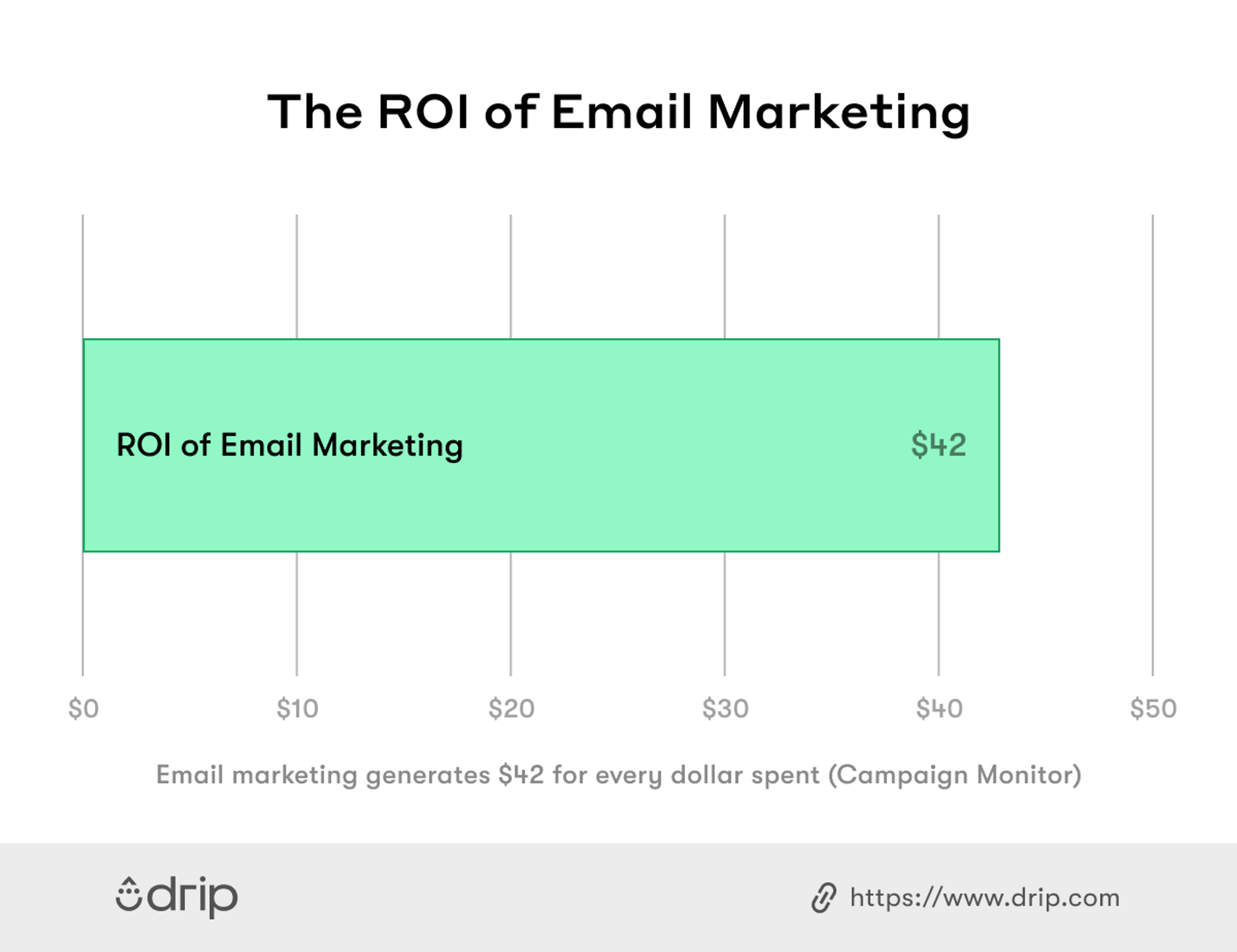
Email marketing is powerful. You can expect an average return of $42 for every dollar you spend on it.
Moreover, 59 percent of people claim that marketing emails influence their purchase decisions. You’re not the only one who knows that, though. The competition is tough, and the only way to stand out is through your email copy.
Coming up with an electrifying email copy is no easy feat. Things can get even trickier when it comes to announcing new arrivals.
Your new arrival emails have to be solid, effective, and enticing to encourage your reader to check out and ultimately buy your product.
To help you with that, I’ve compiled a list of the best new arrival emails that not only drive demand for new products but also promote sales.
Let’s take a look.
Table of Contents
1. Show Your Product (Preferably From Different Angles)
2. Highlight Your Product’s USP
4. Leverage Your History to Establish Trust
What Is a New Arrival Email?
New arrival emails are product promotion emails that highlight a new product and inform the reader about its details. You can use it to announce a new product release, a limited-edition launch, or a new collection release.
The main idea here is to create enough buzz to help increase your sales by showing people how your product can help them. After reading a new arrival email, your subscriber must be sold on your product.
Wondering how to nail your new arrival emails? Here are six of the best examples to help you get started.
1. Show Your Product (Preferably From Different Angles)
You already know and love your product. Now you need to make your customers feel the same way, and the best way to do this is through product photography.
Your new arrival email should introduce your product in a way it instantly catches your reader’s attention and triggers their fear of missing out (FOMO). Simply talking about your product isn’t enough—you must also show your product in all its glory.
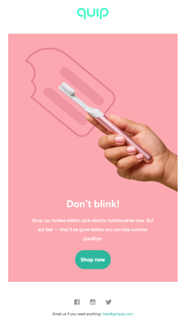
This new arrival email from Quip shows customers how their electric toothbrush will be gone like a melting popsicle before summer ends if they don’t act (read: buy the toothbrush) right away.
The animated GIF adds an element of interest, but the email is still easy on the eyes, thanks to its minimalist design. Besides that, the company uses a contrast aqua-colored logo and a call to action (CTA) button that grabs the reader’s attention prompting them to look exactly where you want them to.
Clever, right?
I also recommend including two to three additional images that show your product from different angles. This will make your product look more genuine, helping you earn brownie points in the eyes of the reader. More points mean more incentive to buy your product.
Key Takeaways:
- Add high-quality images of your product from different angles.
- Use attractive animations and GIFs, but don’t overdo them.
- Come up with a contrasting color scheme that draws attention to your CTA button.

2. Highlight Your Product’s USP
Another important characteristic of a new arrival email is to tell customers what makes your product stand out from other products—in your store as well as among your competitors.
Of course, you shouldn’t go around listing every little detail. Mention three to four key benefits tops to keep the message short, concise, and effective.
Take this new arrival email from Leesa, for example.
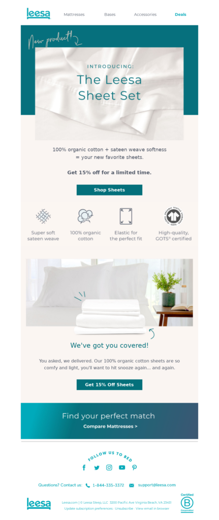
The mattress company launched a new sheet set and focused their entire email around the quality and comfort of their sheets.
Leesa lists the four main benefits of their bed sheet set that are typically what the buyer looks for while buying (i.e., weave, material, fit, and quality).
Plus, they make clever use of font sizes and white space, drawing the reader’s attention to the product’s name and then the “Shop Sheets” CTA button.
Finally, notice the 15 percent discount limited-time offer that gives the reader more incentive to check out the sheets.
Key Takeaways:
- Mention three to four product USPs (unique selling proposition) in your email.
- Use your email’s white space in a way that drives attention to your product’s name.
- Keep the copy short and relevant, highlighting the product quality and other key benefits.
3. Offer an Incentive
Including an attractive offer in your email is a fantastic way to make sure your email stands out from your competition. Think free shipping, free products, or exclusive discounts.
When it comes to incentives, there are no hard and fast rules. Your offer can be anything that you think will be attractive to your customer base.
The trick here is to add the offer in a way that doesn’t take the limelight away from your products. Your new arrival still needs to be the MVP of your email.
So how do you do that?
In my experience, it’s best to place your offer on the lower side of your email, or the footer. This way, the attention stays on your newly launched product, but the reader can still see your offer when scrolling down.
MAC is the undisputed winner when it comes to new arrival emails with incentives, and this particular email from them is no exception:
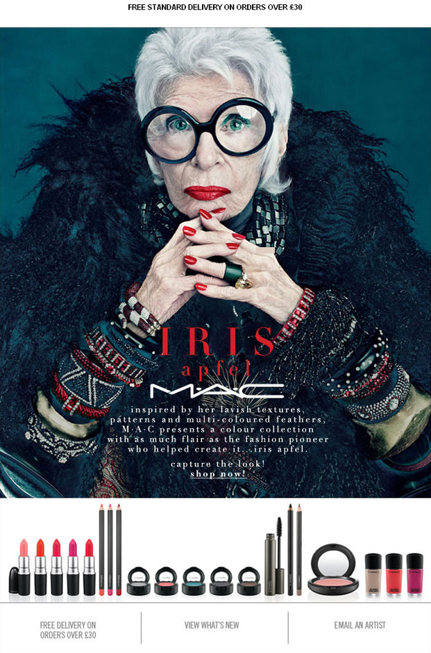
This new arrival email from the cosmetic giant celebrates the accomplishments of Iris Apfel, a renowned fashion icon and interior designer.
They’ve chosen a close-up photo of Apfel, where she looks directly into the reader’s eyes, inviting them to “get her look” with MAC products. As the reader scrolls down the email, they see the free delivery offer on the lower left-hand side.
Do you see how placing the incentive towards the footer area gets the job done without taking away your product focus?
The other reason why I chose this email is that it sells inspiration, as well as the product—killing two birds with one stone.
To apply MAC’s strategy to your new arrival emails, pick a renowned person that matches your brand’s message, form a connection between that person and your product, and then finally, roll out an email copy that encourages immediate action.
That said, the person you choose to endorse your products should have a background that compliments or aligns with your brand’s core values.
If you’re a vegan brand, for instance, you don’t want an ambassador that has their social media filled with images of them devouring meat. Instead, they should practice and preach a vegan lifestyle.
Key Takeaways:
- Connect your product with a famous figure, and come up with a narrative that highlights your product’s features through their accomplishments or experience.
- Include an attractive enticing offer for your customers.
- Place your offer towards the footer area to keep the attention on the product.
4. Leverage Your History to Establish Trust
This strategy may not work well for startups or recently launched companies, but it can be incredibly effective for businesses that enjoy years of goodwill.
When you leverage your company’s history, you also highlight your expertise and experience in the area. This makes your products look more reliable in the eyes of your reader, prompting them to check out the new product immediately.
As a lesser-known email tactic, mentioning your brand history in your new arrival email can lead to an increase in views and sales. You can use a few pointers from this email by Lanna Coffee Co.:
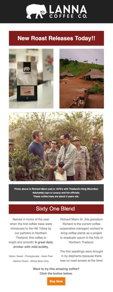
Coffee is a serious business for coffee lovers. It’s why people take into account how long a company has been in the market before making purchase decisions. Lanna Coffee Co. understands this and does a great job at mentioning their legacy in their email, albeit subtly.
They use an image from the 1970s to back up their claim of being in the business for decades. The email also includes a flavor profile to describe the taste of the new coffee blend, which is a brilliant tactic, in my opinion.
You see, doing this gives the reader a better idea about Lanna’s new coffee and what it’ll taste like, eliminating a possible objection they may have when making a purchase.
Key Takeaways:
- Briefly mention your company’s legacy and past goodwill.
- Add (one to three) photos that support your case.
- Find a way to describe aspects of your products that cannot be experienced.
5. Show Your Product Live in Action
We’ve discussed how showing what your product looks like is better than talking about it. Now, we’ll take it a step further and show your product in use.
Hoefler & Co. announced the launch of its stylish new typecase called Peristyle in this email.

First, a small paragraph at the top mentions the important details of Peristyle. The “See more” CTA towards the end does a great job to keep the email concise. Those who want to know more about the typeface can simply click on it to get more information.
As you scroll down the email, you’ll see a variety of fonts and weights displayed in a thumbnail format. This educates users on how they can use Peristyle without leaving them overwhelmed. Plus, users are more likely to buy a product after seeing it live in action.
Hoefler & Co. spice things up by adding a three-minute video that gives the reader a glimpse into the making of Peristyle. Not only does it promote engagement, but it might also boost conversion rates by nearly 80 percent.
Try experimenting with video content in your next new arrival email. Select a high-quality and clear video that talks about your product cohesively and concisely.
Make sure to use the first few seconds of your video wisely. Attention spans are getting shorter, so your video should open with a bang to immediately gather your audience’s interest.
Key Takeaways:
- Come up with different ways to show your product live in action.
- Add a small video to promote engagement.
- Include an explainer paragraph about the product to give readers an idea about what they’re seeing on their screen.
6. Send Out a Teaser Email to Create Excitement
Technically, this one isn’t exactly a new arrival email example. But it’s definitely a great preceding email to your actual new arrival announcement email that creates the right buzz around your product.
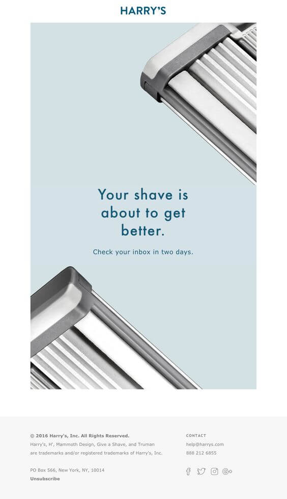
This product hype email from Harry’s ticks off all the right boxes: It’s minimalistic, arouses curiosity, and increases the level of excitement.
The company chooses to be direct with the email copy, asking their subscribers to check their email exactly in two days. Ambiguity doesn’t always work well, but in Harry’s case, the readers already know the new arrival will either be a razor or a shaver.
Furthermore, the email uses high-quality and minimalist imagery of their razor, which enhances the copy and minimal aesthetic. The fact that only a part of the razor is visible works wonders to keep the mystery alive.
This built-up curiosity is exactly the kind of leverage you need to boost sales. Try to include discreet photographs of your new offering in emails to create buzz.
Key Takeaways:
- Consider sending a product hype email before the actual new arrival email.
- Mention the launch date of your product clearly in the email.
- Drop clever hints about the product to keep the excitement high.

Summing Up
New arrivals are incredibly crucial for your company’s growth. However, you can’t expect them to do much if your current and prospective customers remain unaware of it.
It’s your job to inform your email list in a way that gets them excited to check your new arrivals out.
These emails can be a very critical element to your product’s success, especially when it comes to creating awareness, increasing click-through rate, and acquiring more customers.
I hope this list of new arrival emails helps you craft a fantastic one for your latest product or service.


