When it comes to e-commerce marketing, awareness is everything.
Even if you have a game-changing product that will revolutionize your industry, you won’t have much of an impact if nobody knows about it.
So you need to be able to get the word out quickly and reach the maximum percentage of your target audience.
One of the most effective ways to do that is through announcement emails, which are marketing messages that let people know what’s new with your e-commerce store or what’s been changed or updated.
For this post, I’m going to explain the key components and provide you with some of the best announcement emails I’ve seen so you can see what they look like in action.
I’ll also point out some of their specific strengths, so you’ll know what they’re doing right. That way, by the end of the post, you should know the ins and outs of the process and how to apply this strategy to your own email campaign.
Here we go.
Annoucement Email Examples 101
What Are Some Common Types of Email Announcements?
Typically, they break down into five main categories:
- The launch of a new product
- A limited-edition release
- The option to pre-order a product
- A special promotion
- An upcoming event
I should also note that in some cases, there will be an overlap where an email covers two or more categories (e.g., launching a new product and offering a discount).
The 3 Key Components
The specific content e-commerce brands include within an announcement email can vary significantly. But as River Cartie, a content developer at Constant Contact explains, a well-written announcement email will answer three key questions:
- What’s going on?
- Why should the reader care (or what’s in it for them)?
- What do you want them to do about it (call to action)?
Covering all of the bases is important for 1) getting readers to fully engage with your email and 2) encouraging them to click on your CTA. As long as you answer these three questions, you should be in good shape, and a sizable percentage of readers should click-through to your offer.
Now that you have a basic idea of how this technique works, let’s examine some of the best announcement emails to see what it looks like in a real-world context.
1. Bose
Bose is a well-known brand that specializes in audio equipment like headphones, speakers, and wearables.
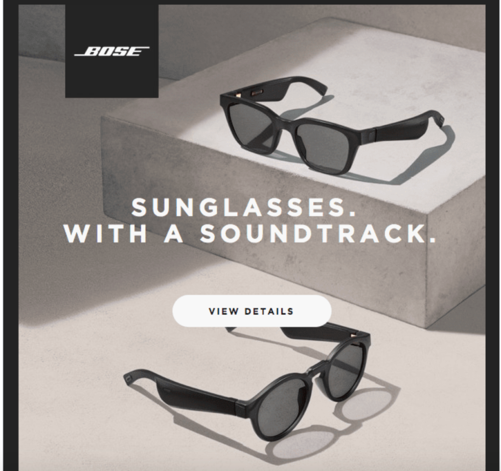
They have a reputation for innovation, which is evident from this email that announces the unveiling of one of their most revolutionary products—the new Bose Frames, which are sunglasses with built-in speakers.
(Source: Really Good Emails.)
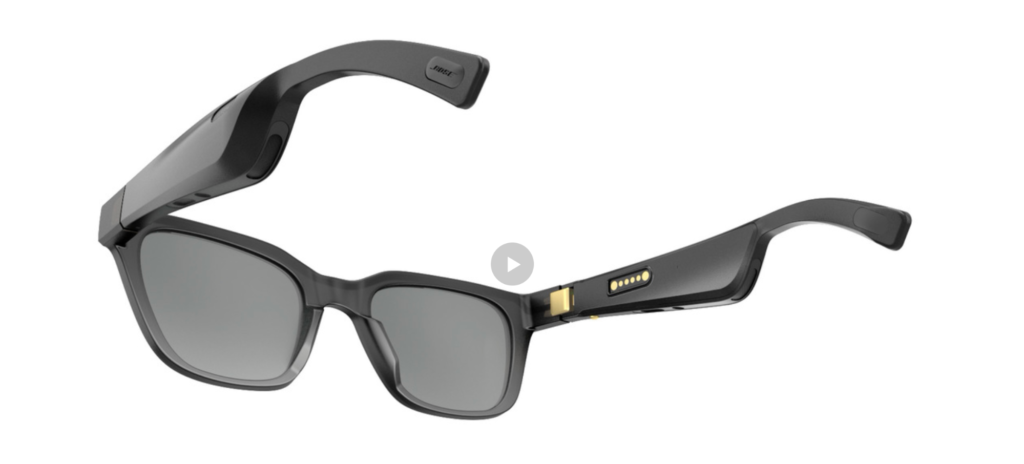
It’s one of the most innovative new gadgets on the market and allows users to listen to audio without having to wear headphones or earphones. Instead, the audio comes directly from the sunglasses.
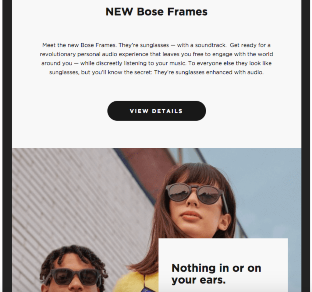
And Bose did a great job of getting the word out with this announcement email.
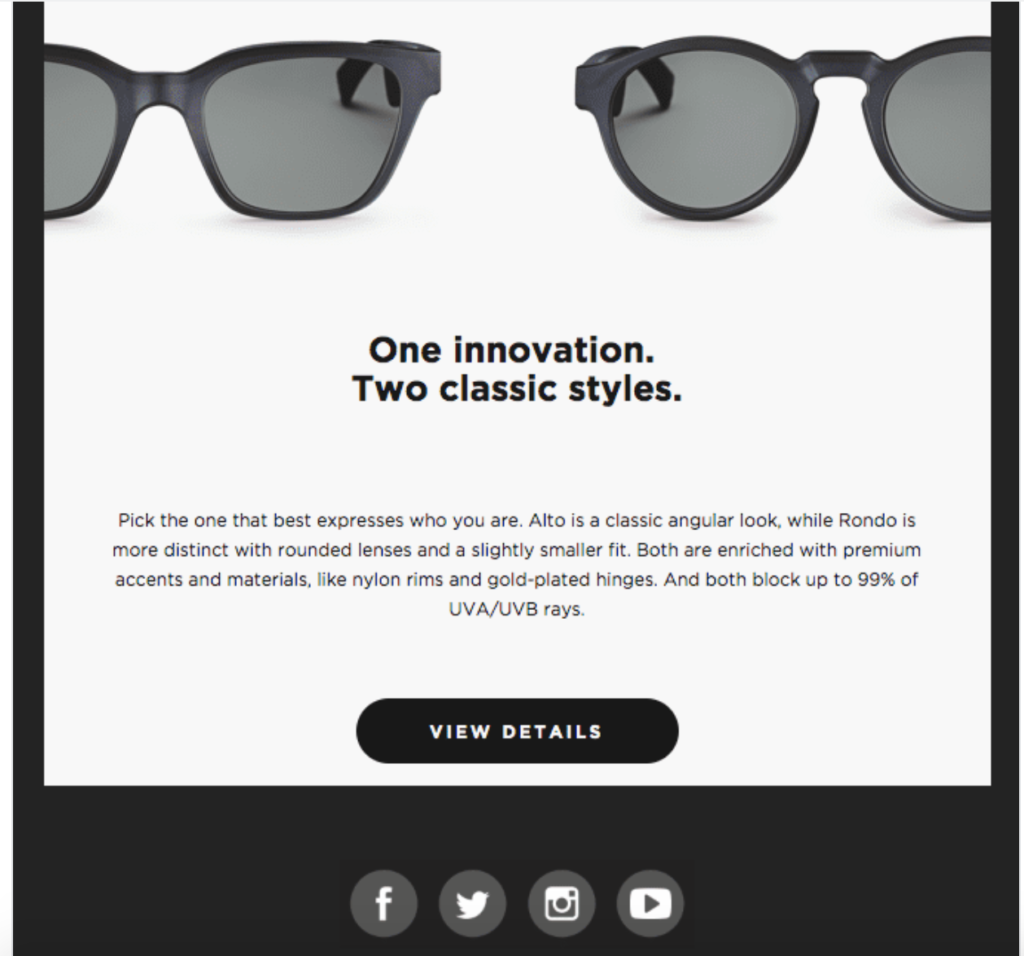
They seamlessly answer the three key questions.
- What’s going on? Bose launched an amazing new product that features groundbreaking technology.
- Why should the reader care? This product allows them to discreetly listen to music and have an immersive audio experience, while still being able to engage with the world around them.
- What do you want them to do about it? Click on one of the “View Details” CTAs to learn more about the product.
Once a reader clicks on it, they land on the Bose Frames product page where they can fully explore and watch videos.
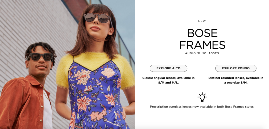
Bose also:
- Includes stunning visuals that instantly grab the readers’ attention;
- Use sharp, snappy copy to outline the basics of how this product; works; and
- Use plenty of contrast with their font and CTAs.
So, if your goal is to announce the launch of a new product, this is definitely an email you can take a page from.

2. UrbanStems
This is a brand that sells high-quality bouquets and wreaths made from sustainably grown plants.
In this email, UrbanStems announces they have a new line of dried bouquets that they’re launching that’s part of a collaboration they’ve done with floral expert, East Olivia.
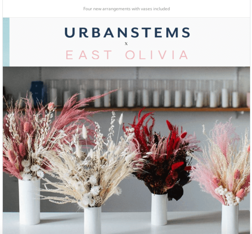
It’s simple and straightforward, where UrbanStems quickly mentions they have a new product line called Dried Bouquets, letting readers know what’s going on.
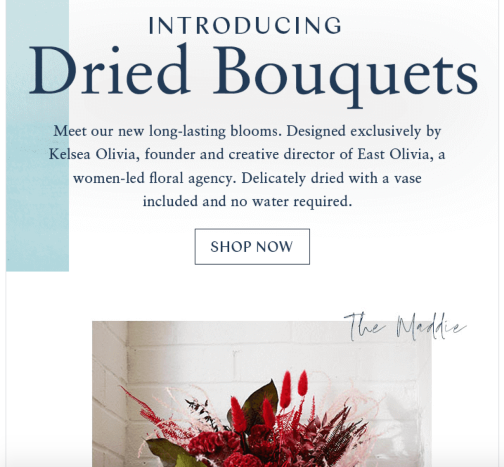
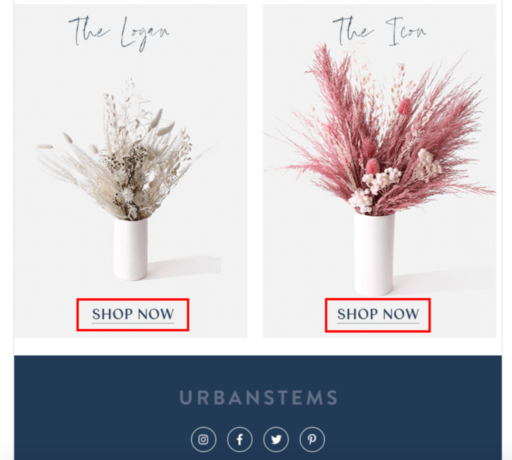
By including epic visuals, readers can instantly see what the new products look like and how beautiful they would be in their home.
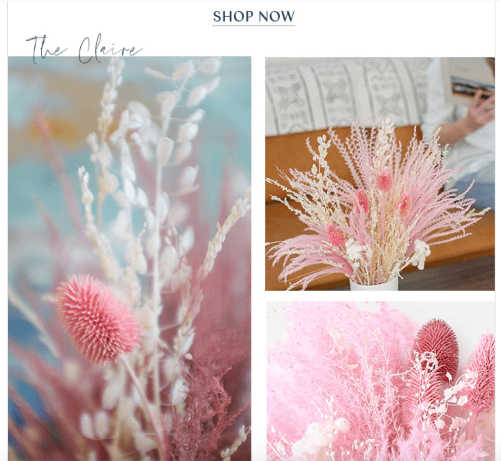
And they include multiple well placed CTAs throughout the email, so readers know what to do next.
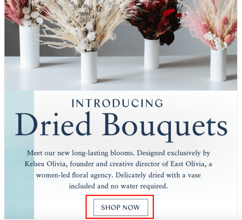
By clicking, they get the full rundown on the product specs.
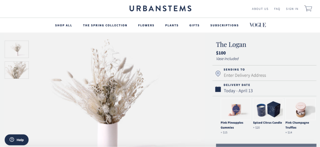
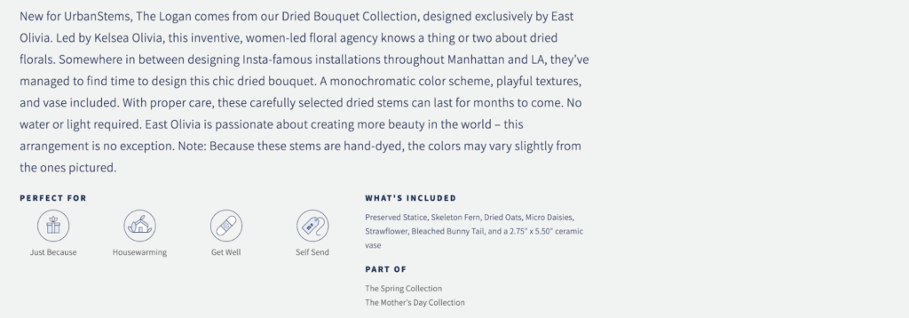
There’s a simple layout, which walks readers through, letting them quickly know what’s happening, why they should care, and what action they should take.
Just like Bose, one of the key strengths of this announcement email from UrbanStems is that it uses ultra high-quality images to pique the attention of readers.
And they also use a contrast between the foreground and background to make the information palatable.

So when you put it all together, this is a well-crafted email that’s highly effective for announcing the new product line from UrbanStems.
3. Hardgraft
Here’s a brand that designs “luxury lifestyle accessories with down to earth aesthetics.” This particular email lets readers know about a new product that will be dropping shortly called The Woolly Cube—a tote bag that vaguely resembles a Rubik’s cube.
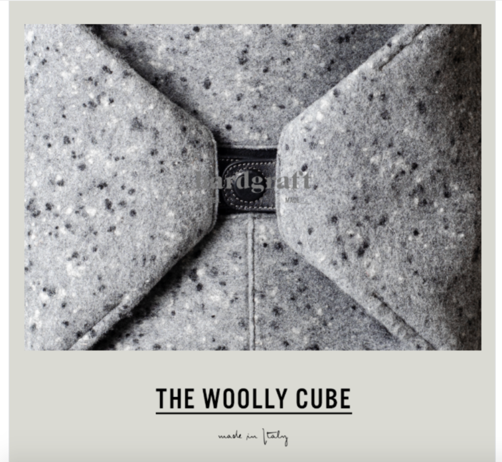
The purpose of this email is to announce that The Woolly Cube will be officially coming out later in the week, and readers can get set up to be notified once it’s out.
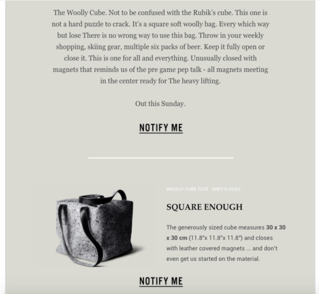
hardgraft does an excellent job of answering the three main concerns, letting readers know about:
- The unveiling of this new product in the near future;
- That it’s an interesting product with a unique look and made with quality materials; and
- That they should click on “Notify Me” to ensure Hardgraft contacts them so they can be the first to order the product.
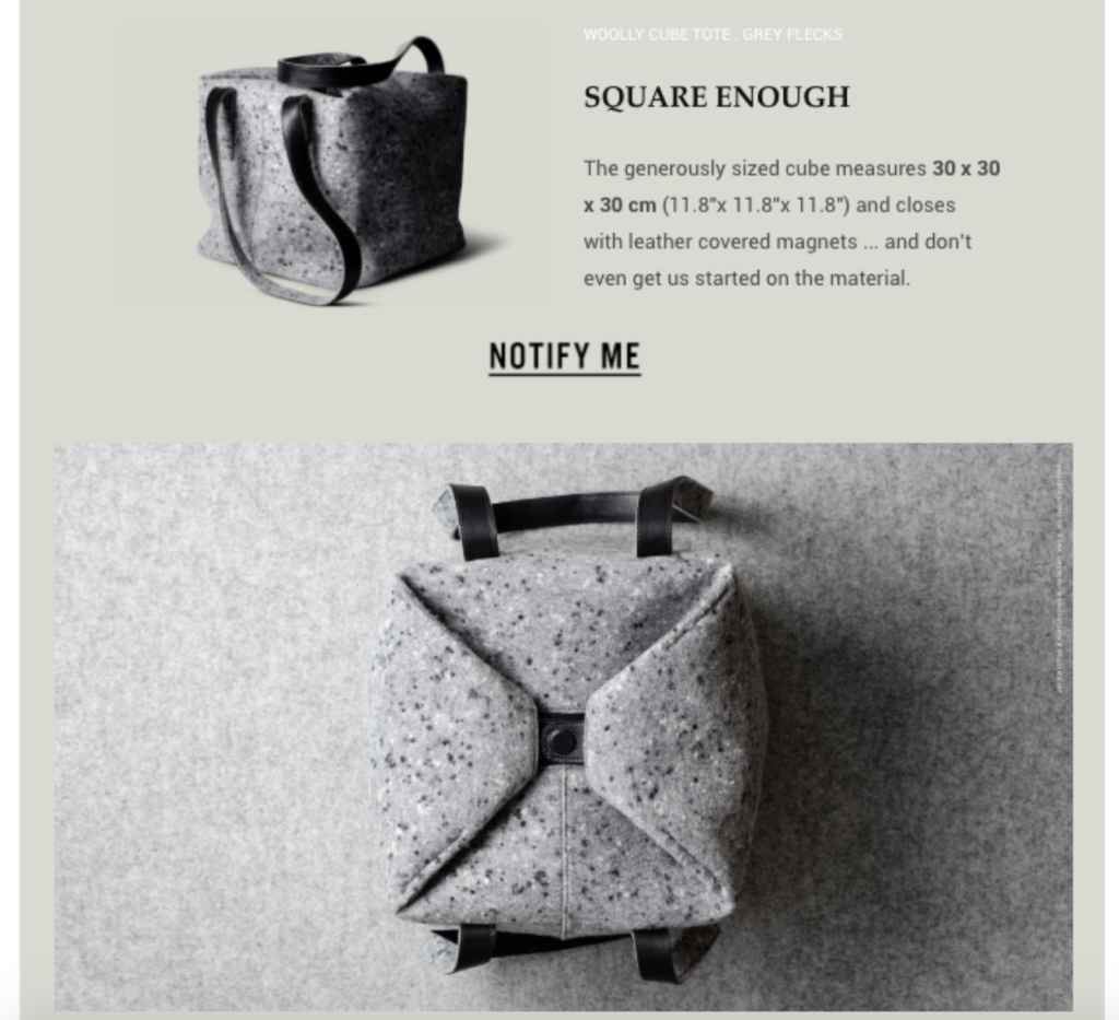
Besides the amazing aesthetics, here’s what I love about this email. It succinctly explains the key features to readers, so they’ll know what to expect, without overwhelming them with information. For example, they mention that it uses magnets that meet in the center so that the bag closes securely and can handle the heavy lifting.
They also include the dimensions, so readers will know how large it is—something that’s not immediately obvious by just looking at the images.
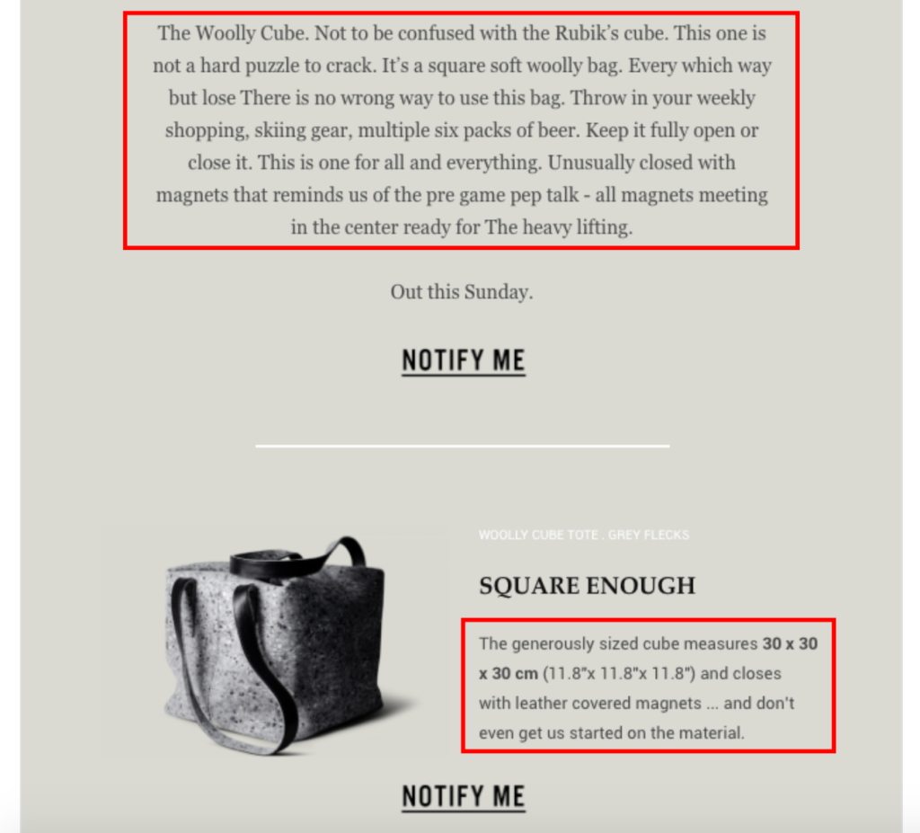
I like the minimalist color scheme with black fonts and gray background, which jives with Hardgraft’s overall brand identity.
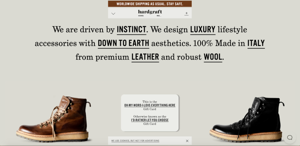
I like that they make this announcement email so easy to navigate, including the same CTA multiple times so readers can easily make sure they stay in the loop by clicking “Notify Me.”
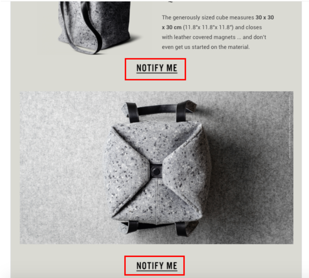
Finally, I like that their copy is clever and playful and makes the connection between The Woolly Cube and the Rubik’s cube, which most people can identify with.
4. Pulp & Press Juice Co.
Pulp & Press Juice Co. is a brand that sells “cold-pressed raw juice made from fresh organic fruits and vegetables.” This email was sent just before Valentine’s Day and announces that readers can get 15 percent off for any two cleanses.
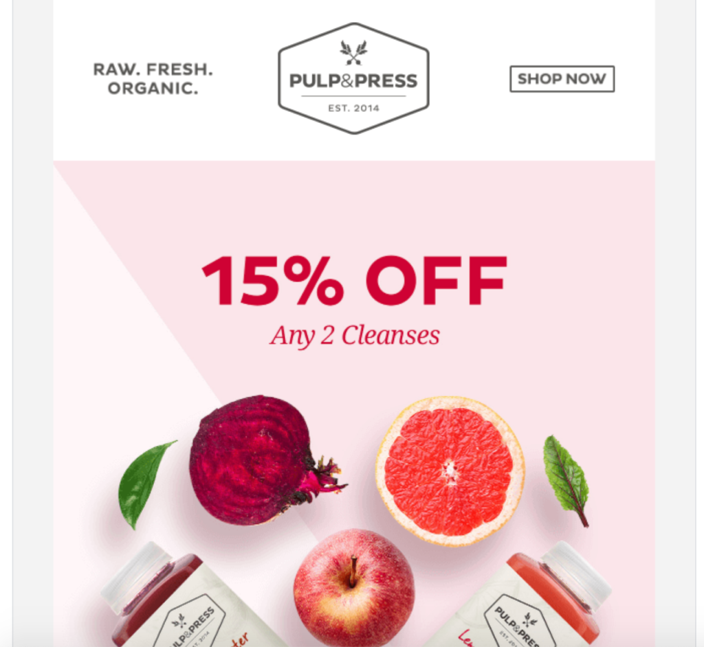
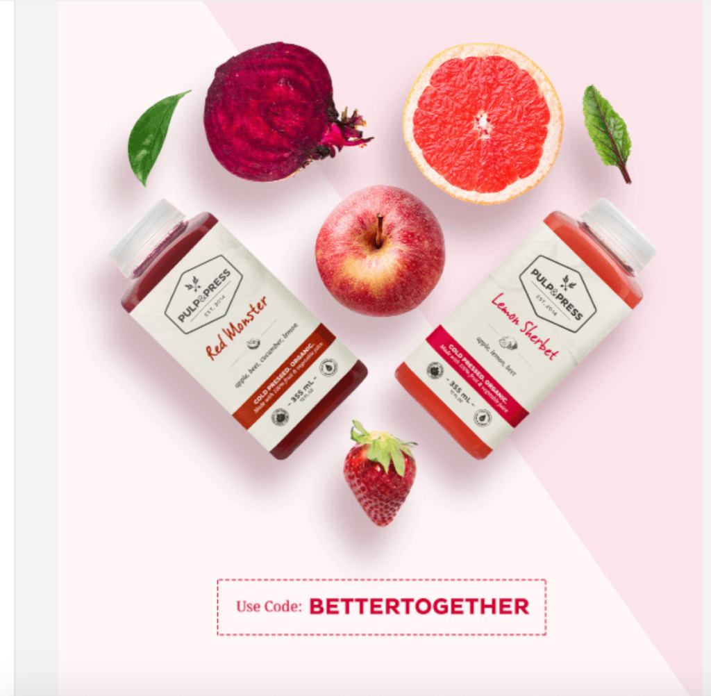
All they have to do is enter the code, BETTERTOGETHER.
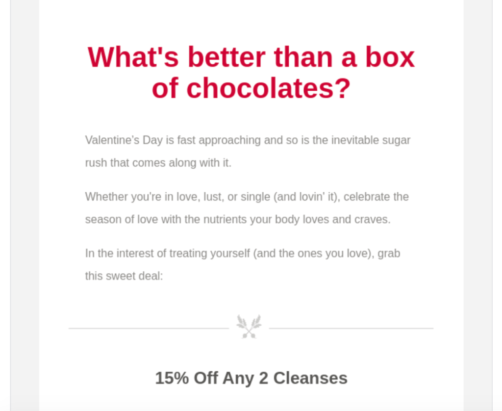
They use some tight copy that asks, “What’s better than a box of chocolates?” and seamlessly work in their products in a fun way.
They also mention that there’s a deadline for using the promo code and that it expires February 16 at midnight.
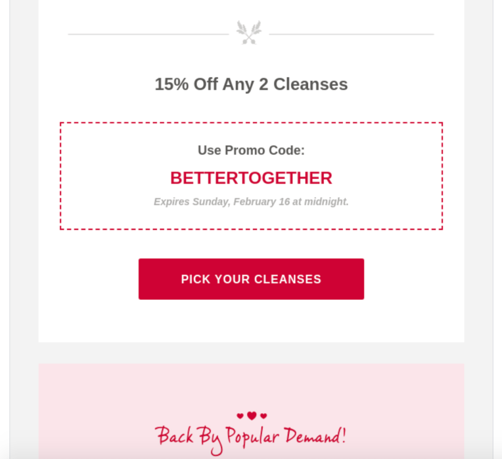
Here’s why this announcement email works. First, it wastes no time letting readers know what’s happening and why they should care. As soon as they open the email, they instantly know they can get 15 percent off any two cleanses.

This should spark an immediate interest for anyone who’s even remotely interested in their products.
Next, Pulp & Press Juice Co. makes it crystal clear what readers should do next—use the code “BETTERTOGETHER” to cash in on the deal. This means there’s zero room for confusion, and readers know what to do without having to think about it.
Third, they use a logical color scheme of pink, white, and red that ties in perfectly with Valentine’s Day.
Even though this romantic holiday and organic juice products don’t exactly go hand in hand, Pulp & Press Juice Co. does a great job at creating a connection and getting people in the right mindset to buy.
Finally, they use a sense of urgency by explaining that the promotion will expire soon.
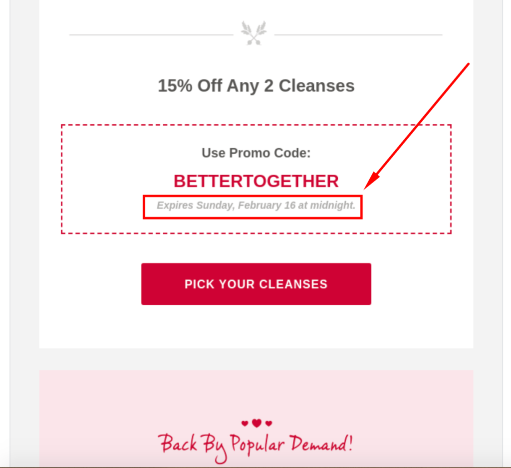
When used correctly, this can be a powerful tactic that provides the push many readers need to take action.
In fact, research from Experian found promotional emails that conveyed a sense of urgency had 59 percent higher transaction-to-click rates and twice as high transaction rates compared to average marketing emails.
So there’s a lot to be learned from this example.
5. Filson
Here’s a company that sells American heritage outerwear, clothing, and bags. Their value is primarily based on the quality and durability of their products.
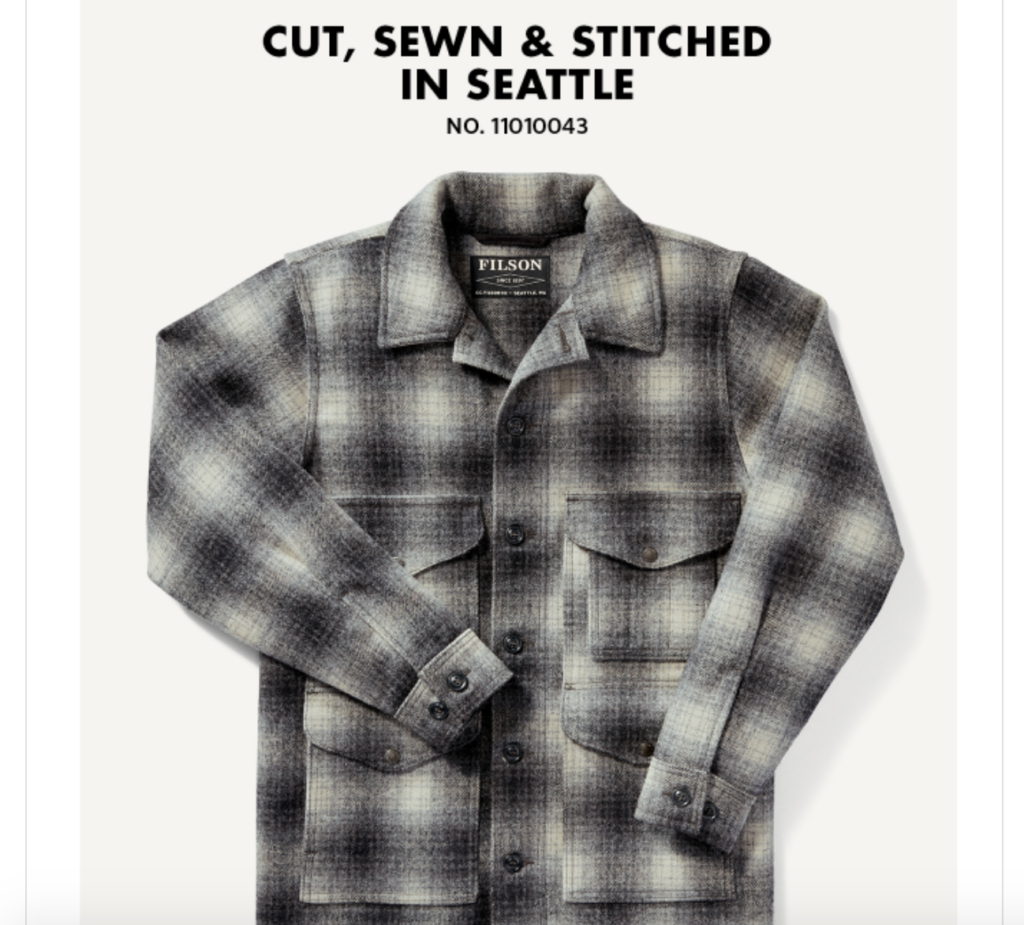
This email focuses on a limited edition release of Filson’s long sleeve, wool shirt called The Mackinaw Cruiser.
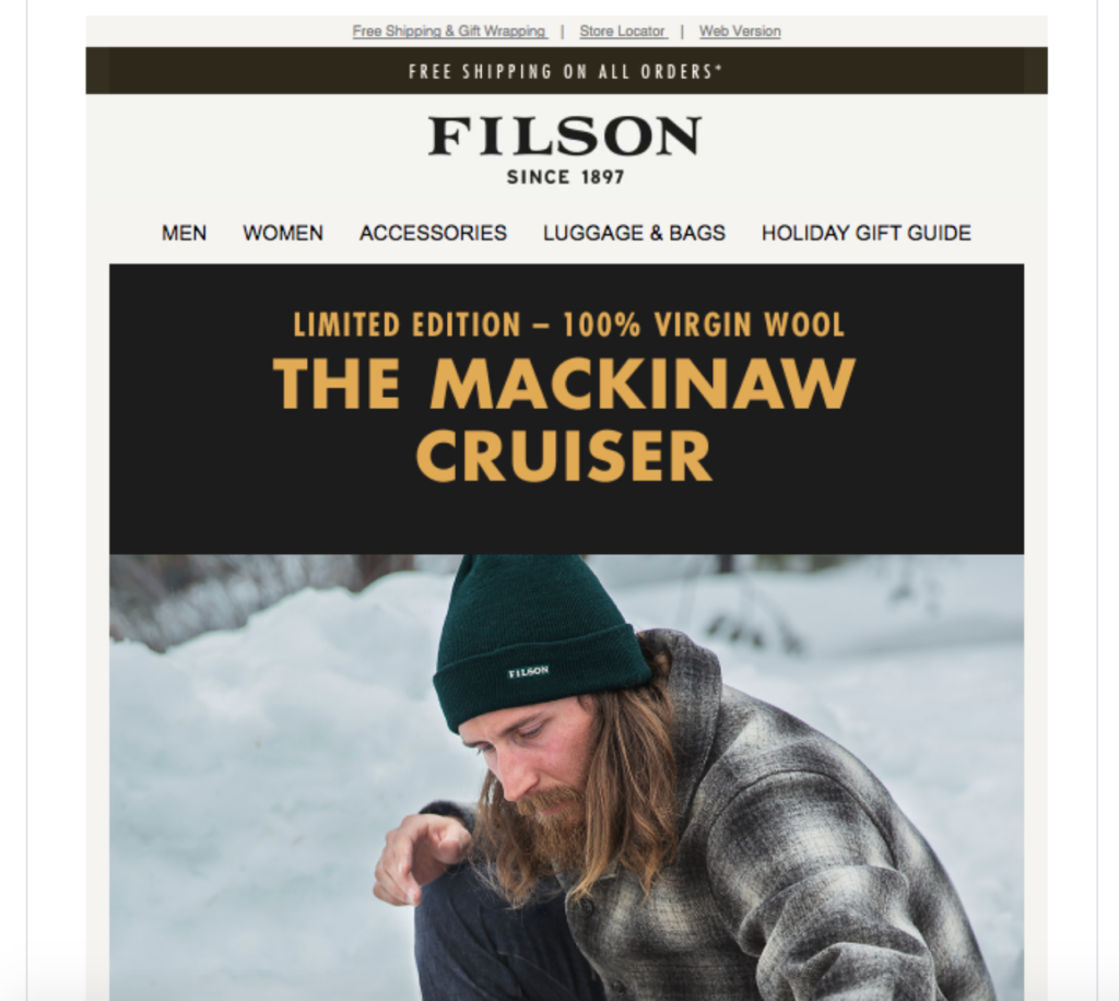
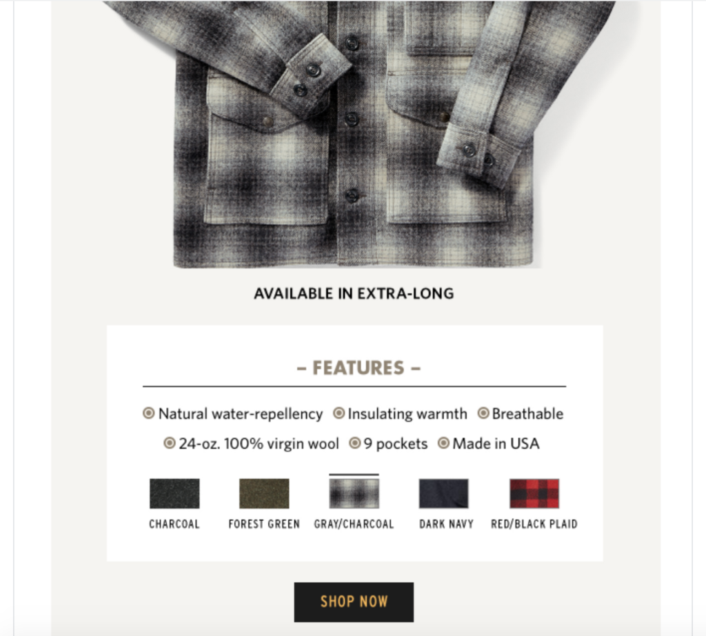
Like the other examples I’ve mentioned, this email features high-quality images, and the information is presented logically and sequentially. In the header, Filson explains what’s going on and that they’re selling a limited edition shirt that’s 100 percent wool.
Just below the main image, they include a “Show Now” CTA, so readers will know what they need to do.
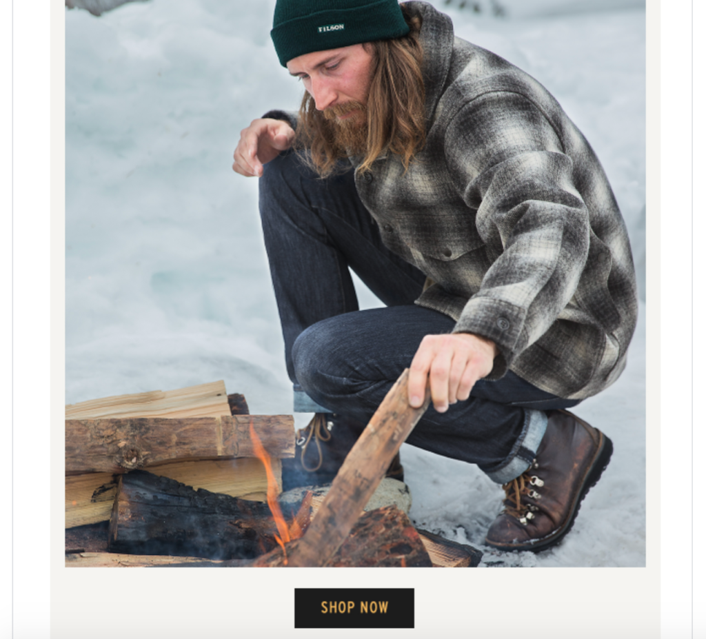
And below that, they provide an up-close view of the product and present some of the key features that potential customers will want to know about it.
Besides that, they let readers know what other colors The Mackinaw Cruiser comes in.
So as you can see, Filson does a great job of answering the three main questions of announcement emails.
In terms of specific strengths, here’s what stands out to me:
- It’s a really simple email that’s uncluttered and easy to digest;
- It does a great job at highlighting the benefits of the product; and
- It perfectly captures Filson’s brand identity of being rugged and outdoorsy
When it comes to the best announcement emails for a limited edition release, this one from Filson can serve as an excellent template.
6. Taylor Stitch
My final example from classic men’s clothing company Taylor Stitch falls into two announcement categories—a limited edition release and a special promotion.
Here’s the first thing readers see when they open it.
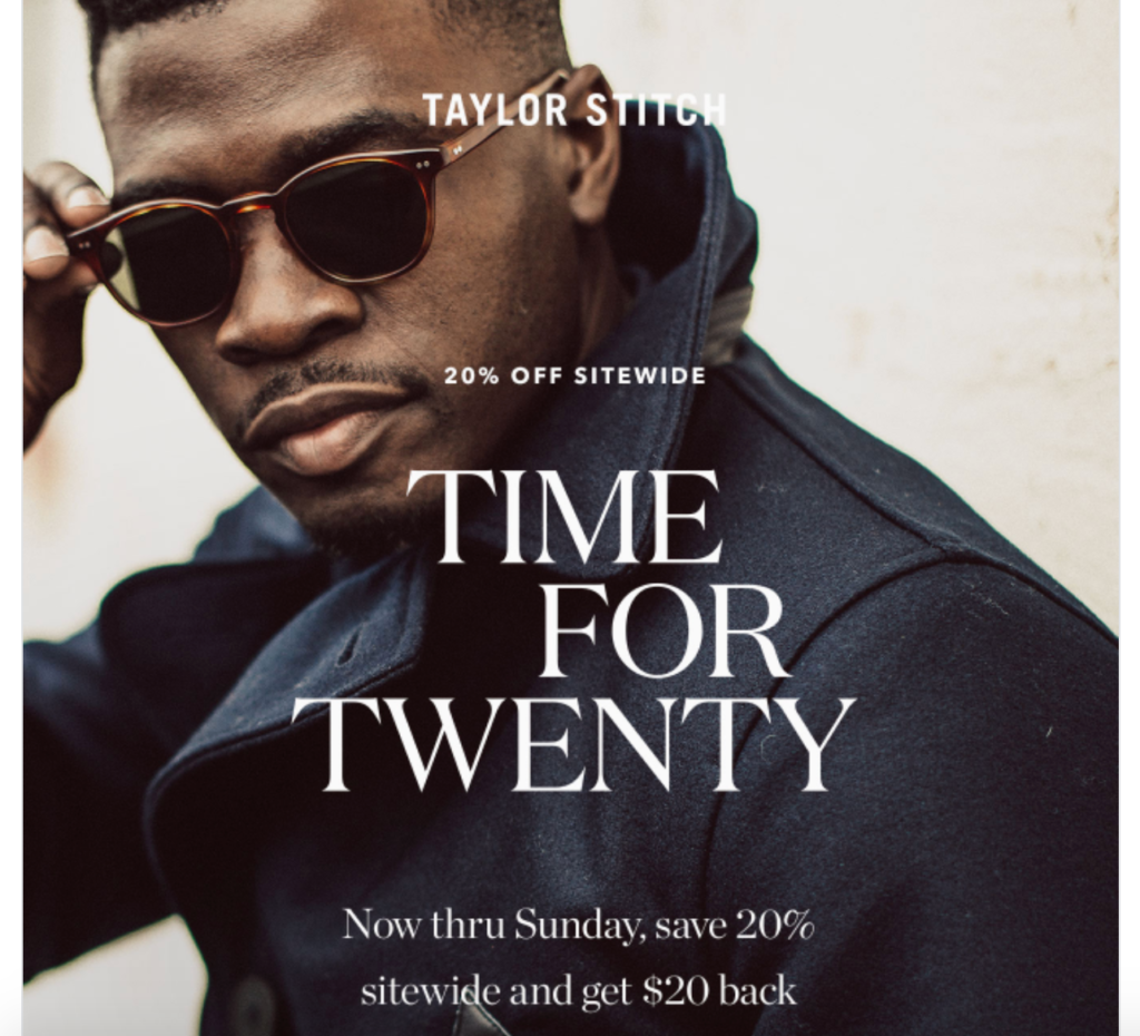
There’s a 20 percent off sitewide sale where they can also get $20 back until the end of the week.
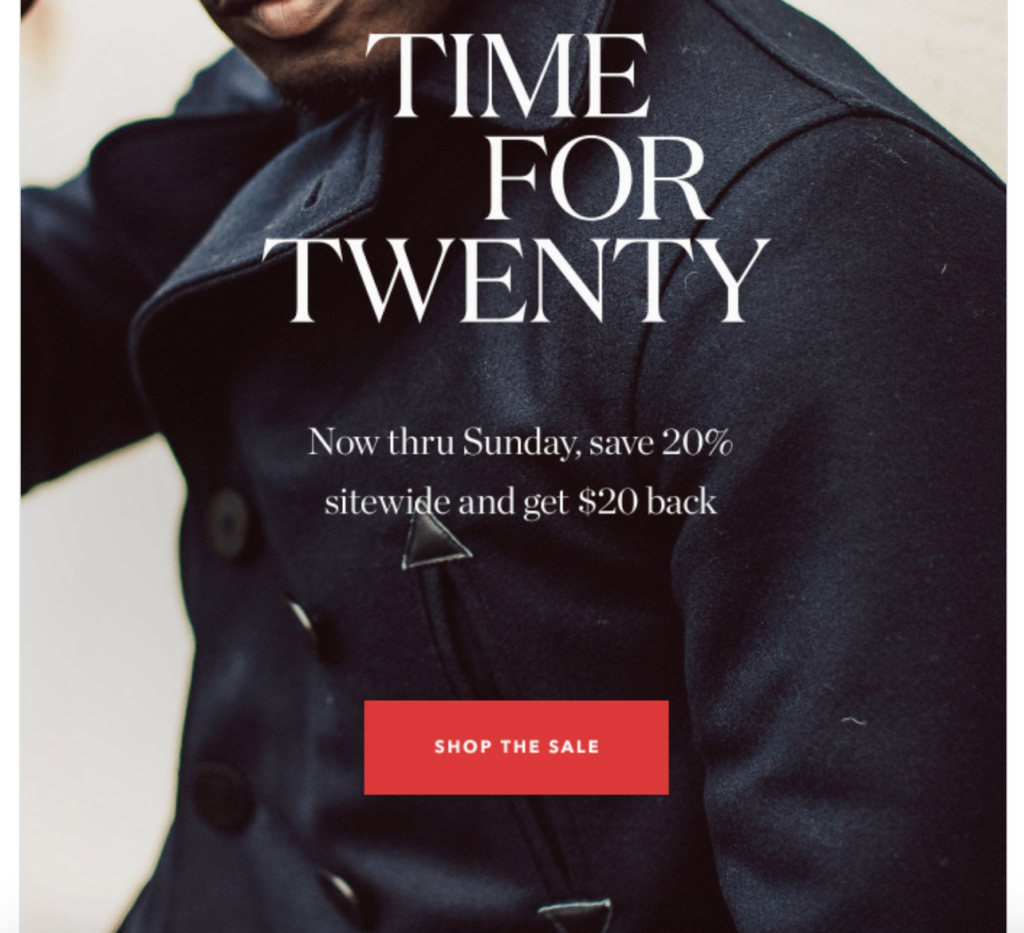
Then, they learn that Taylor Stitch has created “California made jackets” that are limited to a production run of just 100 each.
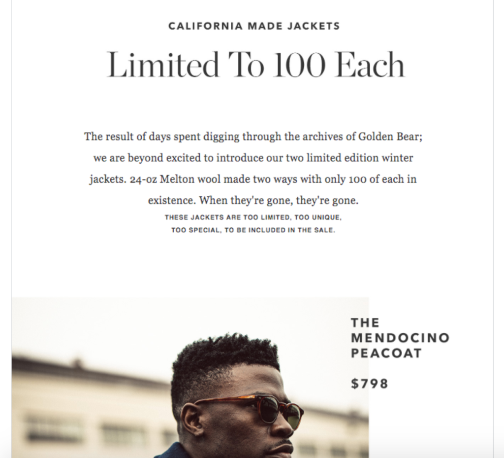
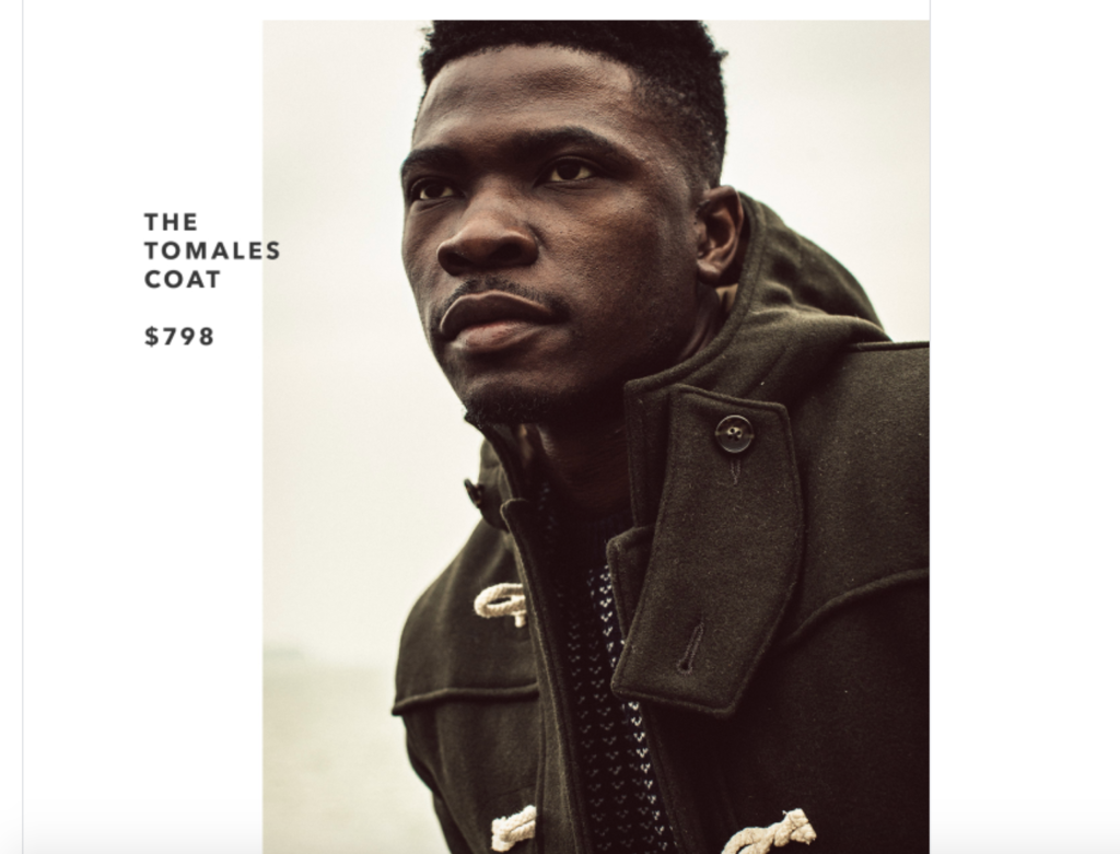
With just a little scrolling, they know what’s happening and why they should care. And by adding a couple of well placed CTAs, they let readers know what they want them to do about it.
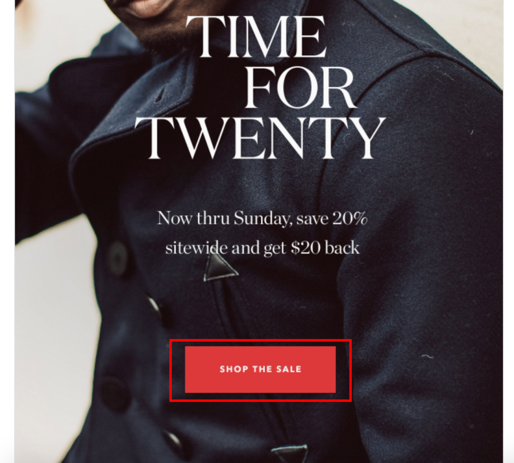
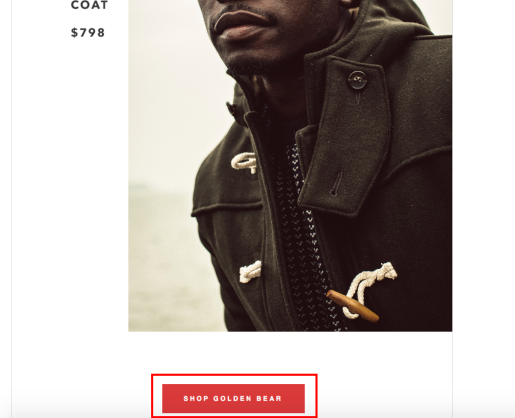
As for the specific strengths of this email, it has:
- Beautiful visuals;
- A smooth flow that seamlessly transitions from the sitewide sale to the limited edition jackets;
- Tight copy that effectively highlights the products without needlessly droning on; and
- Plenty of contrast between fonts, images, CTAs, and the white background.

Conclusion
To recap, the best announcement emails follow a basic formula where they:
- Fill readers in on what’s happening;
- Let them know what’s in it for them; and
- Provide a clear call to action, so they know what to do next
The examples I’ve included above all have slightly different objectives, but they address these three key areas. On top of that, they use great-looking visuals, have contrast between elements in the foreground and background, and have a logical flow that’s easy to follow.
They also do a good job of meshing with the overall brand identity of these companies and use concise copy to relay critical information.
Hopefully, after looking through these examples, you have a better understanding of how to approach announcement emails so that you can get readers excited about your offerings and compel them to go ahead and click through.
And when it’s all said and done, this should boost your sales dramatically.

