With Halloween, Cyber Week, and pre-holiday gift shopping, fall means a high-revenue season (and a hectic few months) for e-commerce marketers.
While marketers have a lot to work with in fall, they often have little time and inspiration.
Because fall is chock full of ecommerce holidays — and shoppers will be shopping.
That’s why I put together the nine best fall email examples I’ve seen and divided them into themes you can use this year and beyond.
Whether you’re looking for fall newsletter design ideas, a fresh, new take on Halloween, or how to prepare for Christmas, this post is for you.
The 9 Best Fall Email Examples
Theme 1: Colors of Fall
Nothing screams fall like yellows, oranges, and browns. Using fall colors in your emails is a no-brainer, but two brands go beyond newsletter design and cleverly make fall colors front and center of its emails.
Let’s see how.
1. J.Crew
If you’re in an industry with seasonal inventory, such as fashion, you likely have products with fall colors and patterns. By curating these products in a simple email, as J.Crew does, you can revive the fall vibe without much effort.
Accompanied by the subject line, “In a fall mood…,” J.Crew’s email begins by listing three things you can easily associate with fall:
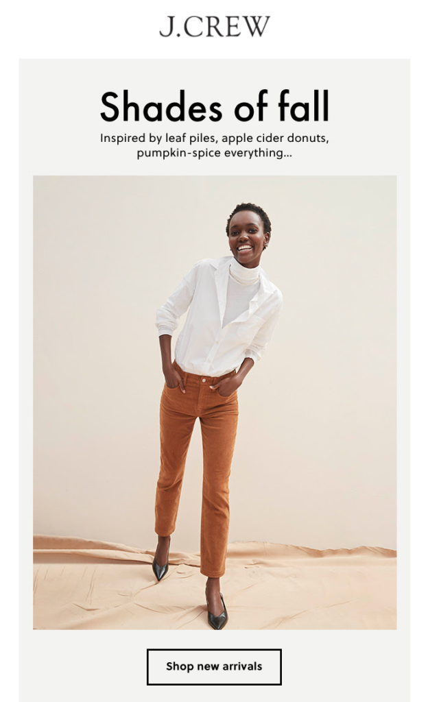
Once you learn where J.Crew gets its inspiration from you see the company’s products from a fall color palette in the remainder of the email:

J.Crew’s promotional email is visually appealing as it’s season-appropriate. In addition to the aesthetically pleasing use of fall colors, J.Crew’s email successfully displays the company’s new arrivals without taking up much space or needing many clicks.
With minimal copy, colorful product photography, and two call-to-action (CTA) buttons, J.Crew invites you to check out its new arrivals with no distractions.
2. Bobbi Brown
If fall were a flavor, it would, doubtlessly, be pumpkin spice.
Using this season’s popular flavor, Bobbi Brown chooses to speak to even more senses in its fall email:
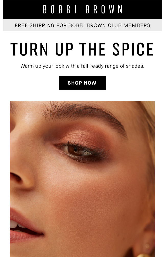
In this email, sent with the subject line “It’s Pumpkin Spice Season,” Bobbi Brown announces the arrival of fall while promoting its warm-toned makeup products.
What’s more, the company recommends a few products in the email that you can use in your fall looks:
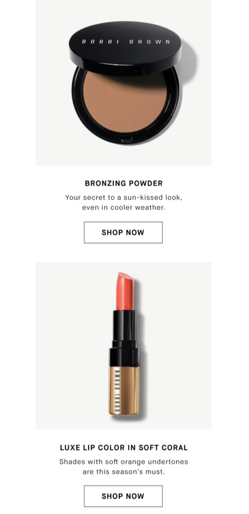
Bobbi Brown also smartly explains in one sentence why these products are this season’s must, so you don’t hesitate to click through them.
Fall emails don’t necessarily mean an all-orange newsletter design. Try using the fall colors in your emails and brainstorm how you can tie common associations to your products, as these two companies successfully do.
Theme 2: Halloween
Fall includes many festivities, which translate into several marketing opportunities for e-commerce businesses. Although it’s a mystery what this year’s Halloween will look like, here are two outstanding examples that’ll inspire your fall emails in any case.
3. IGK Hair
Halloween is a tough tradition to leverage for many brands, especially if your products go nowhere near spooky or entertaining.
Brands like IGK Hair, on the other hand, find creative ways to connect its products to Halloween, even if it’s not the first association that comes to mind.
In this email that carries the subject line “No Tricks, Just Treats.” IGK Hair aims to inspire and educate you with its Halloween content:
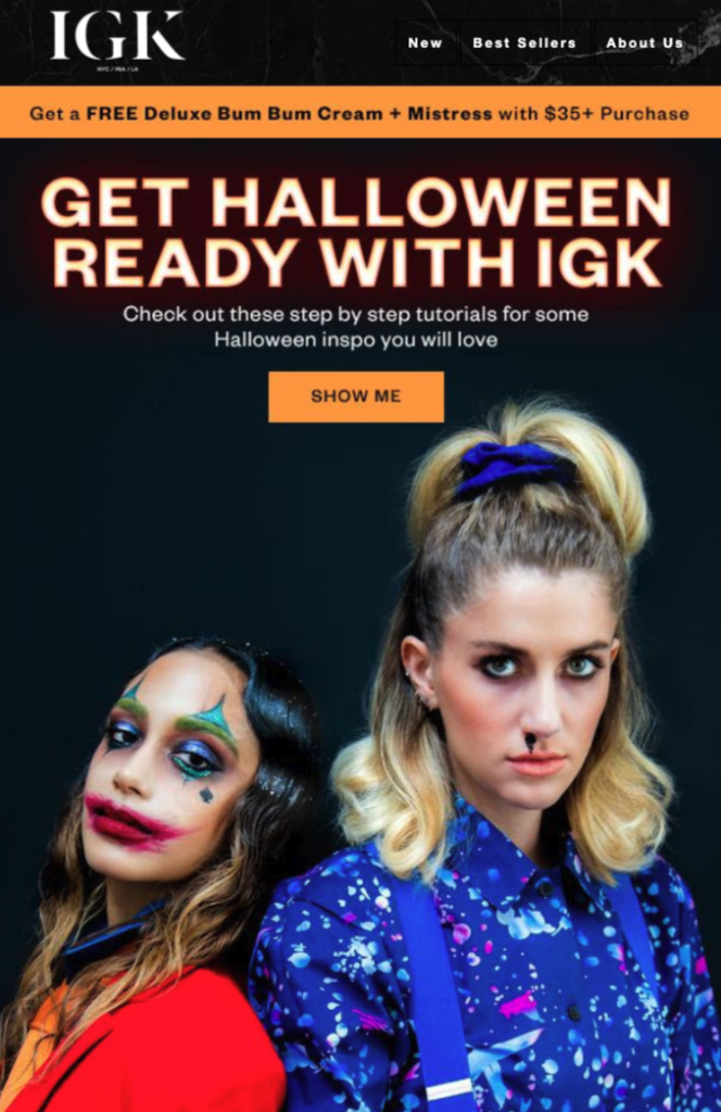
That’s why they feature two of 2019’s most popular costume ideas in the email, including the products you can use to achieve these looks:
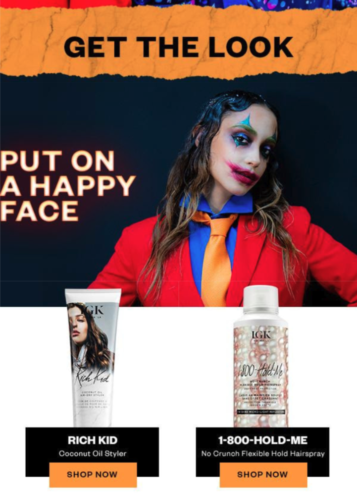
Following the email takes you to a blog post where IGK Hair gives you a step-by-step Halloween tutorial, including links to relevant product pages.
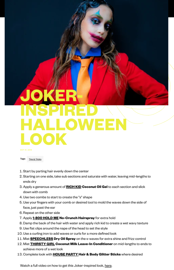
At the bottom of the post, you also find a link to a video tutorial showing you exactly how to get this look:
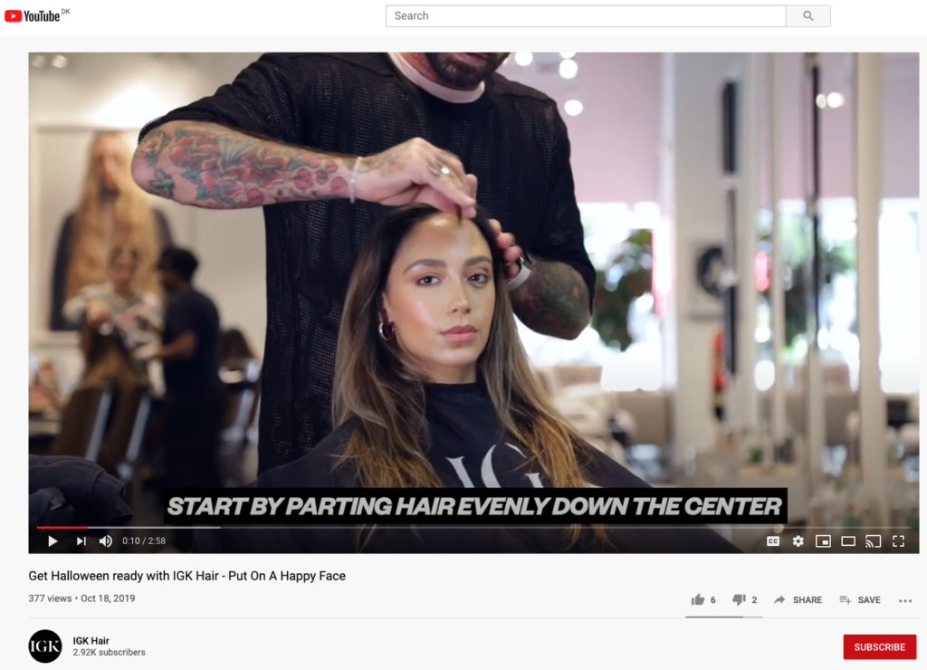
IGK Hair doesn’t necessarily sell costumes, accessories, or spooky things. Yet, they find a way to make themselves relevant for the season by creating useful content around Halloween and implementing product marketing into it.
The bottom line isn’t to shoot a high-production video or start a company blog right away. It’s finding the small details about your brand that can engage your email list before and around holidays in fall.
4. Greetabl
Sending a 10 percent discount code with a pumpkin-themed email is one way to do sales promotion on Halloween. Another (and a more memorable) way is to go the extra mile and add personality to your emails.
Greetabl, a personalized gifting company, chooses the second path. Last year, the company sent a Halloween email with the subject line,
“What do ghosts eat for breakfast? 👻.”
This is how the email preview looks:
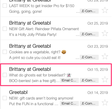
Thanks to the question in the subject field and the dad joke in the preview, Greetabl makes you wonder what’s inside.
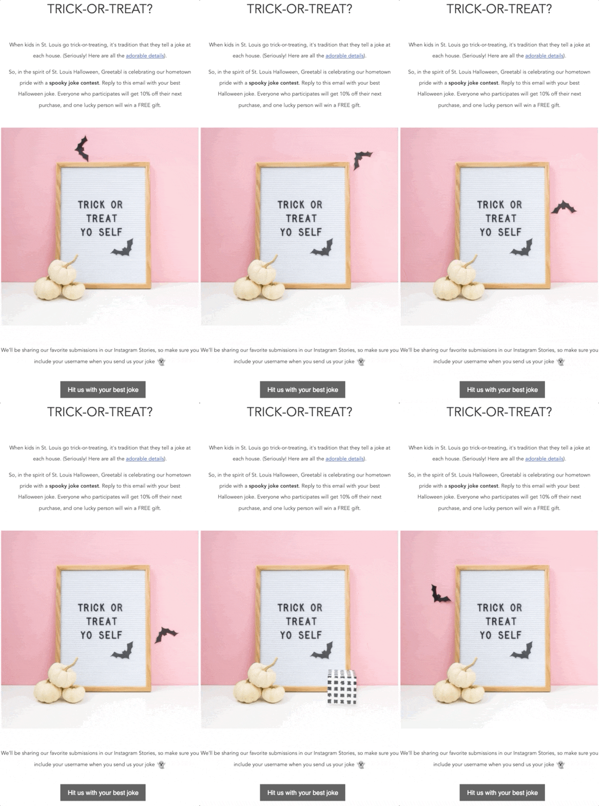
In the email, Greetabl runs a Halloween joke contest for its email list and backs it up with a story about the company’s hometown. The link takes you to the company’s blog, where you can read more about this tradition and get to know the brand better:
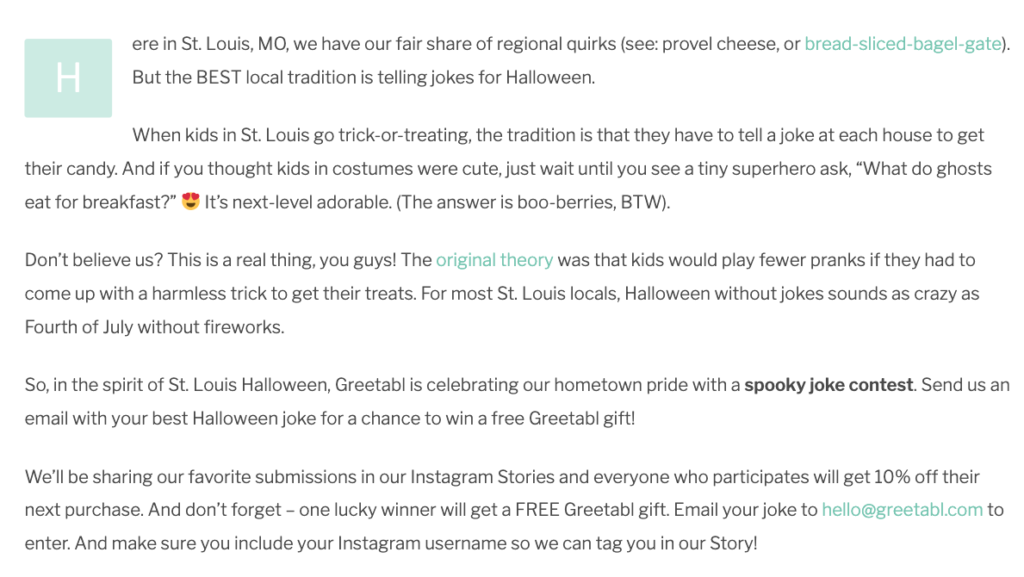
The rules are simple: send your favorite Halloween joke and get the chance to win a free gift. Even if you don’t win, you get a 10 percent discount from the company.
This is a brilliant Halloween email because the Greetabl team shows a lot of personality by telling a story about its Halloween traditions. In addition to humanizing its brand and collecting user-generated content, Greetabl engages its email list before the upcoming holiday season.
Whether you win the jackpot or not, you get 10 percent off your next order—at a time full of holidays and gift shopping.
Theme 3: Coziness
Does the thought of fall make you want to stay indoors, snuggle up with a warm cup of tea and a good book? (In these times, more than ever.)
Coziness is an excellent theme to leverage for e-tailers, especially for furniture and decor companies, outerwear brands, bookshops, and such. Here are two of my favorites, showing how you can emphasize the coziness theme and evoke the fall senses in your emails.
5. Bed Bath & Beyond
The year 2020 will indeed mark a different kind of festive season, and Bed Bath & Beyond is well aware of that.
However, for brands like Bed Bath & Beyond, staying inside can easily turn to an advantage when used right. Check this email the company sent with the subject line “Seasonal decor for every room 🍁 🎃 Plus, score more with a 20% coupon.”
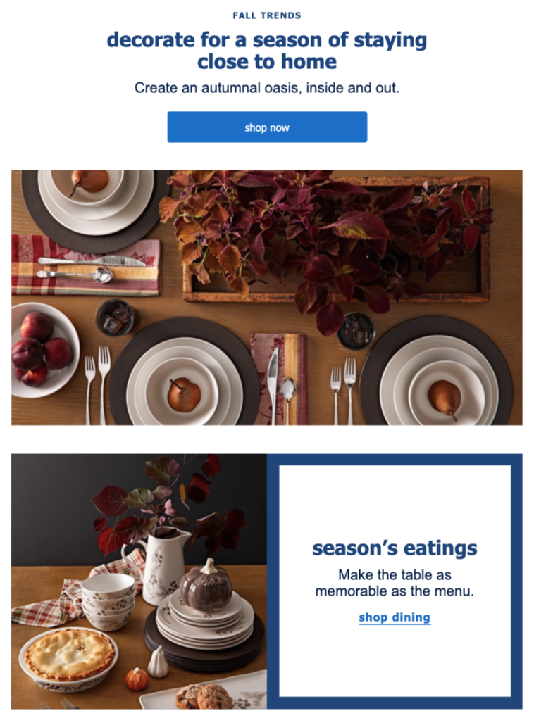
Notice the subtlety in Bed Bath & Beyond’s opening line. Instead of reminding you to stay indoors (which we’re all starting to get sick of,) the company focuses on staying close to home.
Next, they invite you to decorate for such a holiday season and “create an autumnal oasis,” unsurprisingly, by using its products.
In the remainder of the email, Bed Bath & Beyond promotes its seasonally-relevant products by dividing them into categories. Yet, instead of writing “Shop Dining” or “View Decor,” the company highlights the value you’ll get out of each:
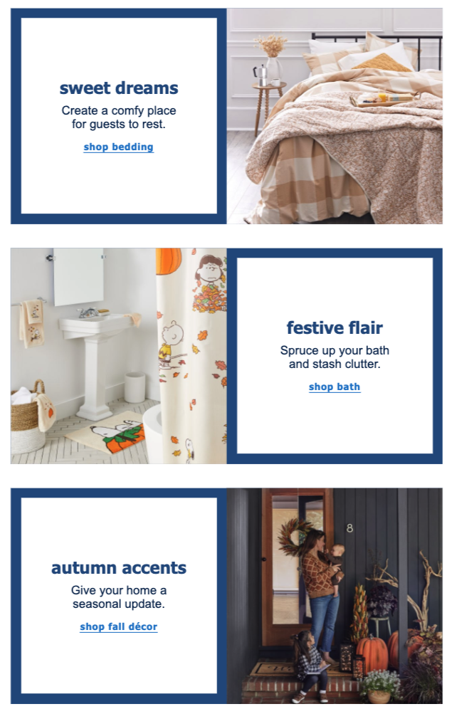
What’s more, clicking any of its CTAs take you to a specially curated fall shop, and not merely to a category page:
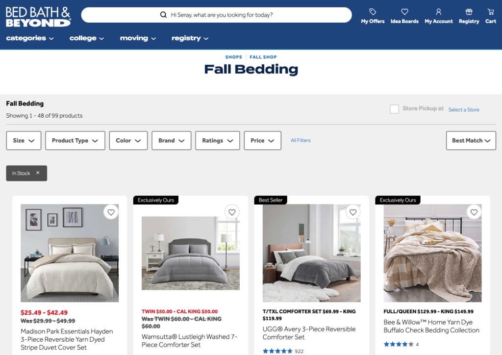
With this fall email, Bed Bath & Beyond successfully uses the coziness theme by focusing on what’s good about staying indoors and smartly recommends relevant products with curated categories.
6. Bombas
While Bed Bath & Beyond focuses on how you can enjoy the indoors with its products, Bombas goes all-in with speaking to your five senses. This email, carrying the subject “New Fall Styles Are Here” is a great example of that:
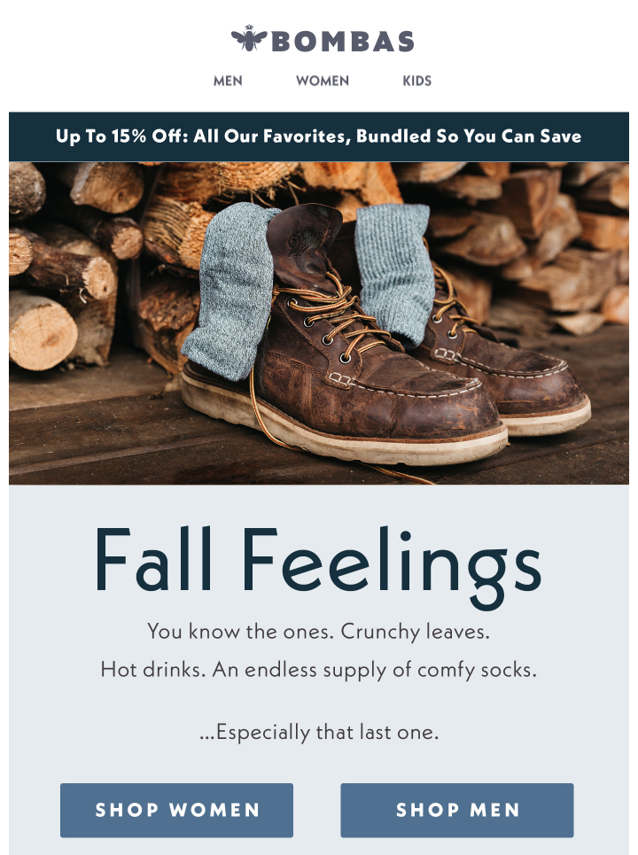
Crunchy leaves. Hot drinks.
You can almost hear and touch Bombas’ email. Cleverly, the sock e-tailer saves the best for last: comfy socks.
After this fall-themed, brilliant introduction, Bombas promotes its sock bundles, divided by categories:
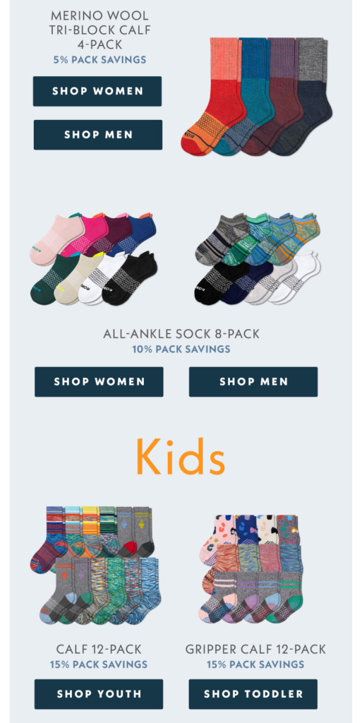
It’s all about recreating that fall feeling and doesn’t take more than Bombas’ email.
Theme 4: Holiday Prep
With the days leading up to Christmas and New Year, fall is the biggest gift shopping season. You can act early and plant the gift ideas in your subscribers’ minds and invite them to prepare for the holidays ahead with your fall emails.
Here are two ways of doing that.
7. Wool and the Gang
Not all buyers are the same. Some prefer planning ahead and act early to shop for gifts, whereas others are chronic last-minute shoppers.
This gives e-tailers an amazing opportunity to leverage the months leading up to winter and convert both types of people into customers.
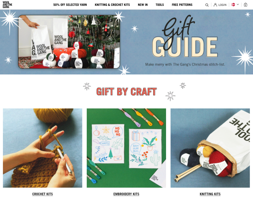
In October and November, for example, you can inspire people with your gift guides and help them find the best presents for its loved ones, just like Wool and the Gang does:
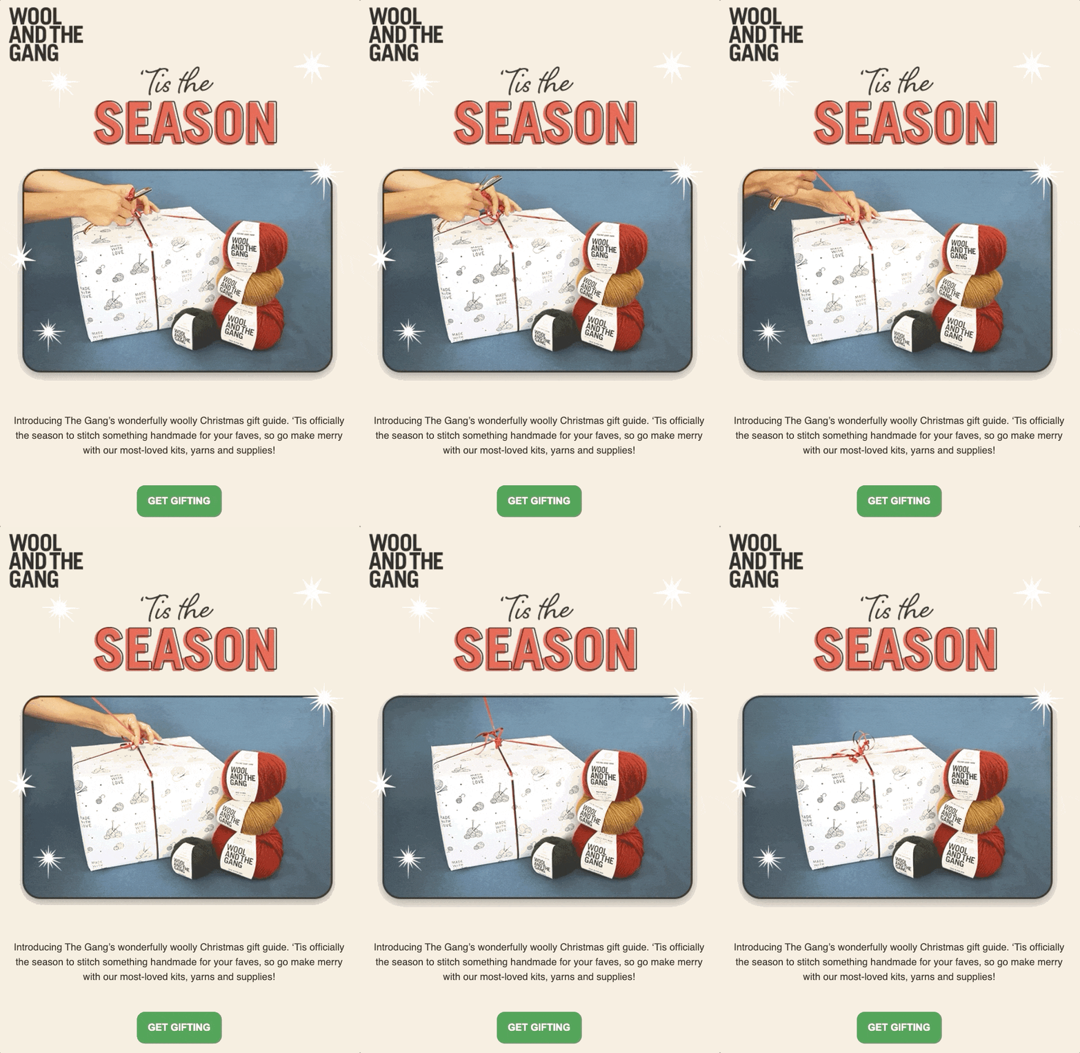
When you click the CTA in Wool and the Gang’s email, you can browse different gift options, categorized by craft, level, and ideas.
Later in December, the company cleverly targets procrastinators with this email by asking “Last Minute Gifter?” in the subject line:
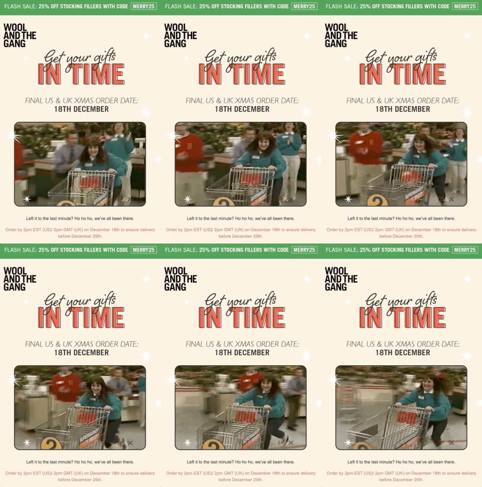
By adding the element of humor, Wool and the Gang gives you a subtle warning: you can still get your gifts in time, but you need to act fast.
To support this sense of urgency when visitors return to your site, you can create a popup with a countdown timer and inform customers when they can shop latest to expect its delivery before Christmas:
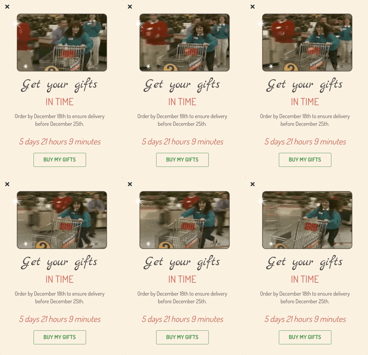
Finally, when it’s too late to promise delivery on time, you can guide visitors to buy a gift card instead, as Wool and the Gang does:
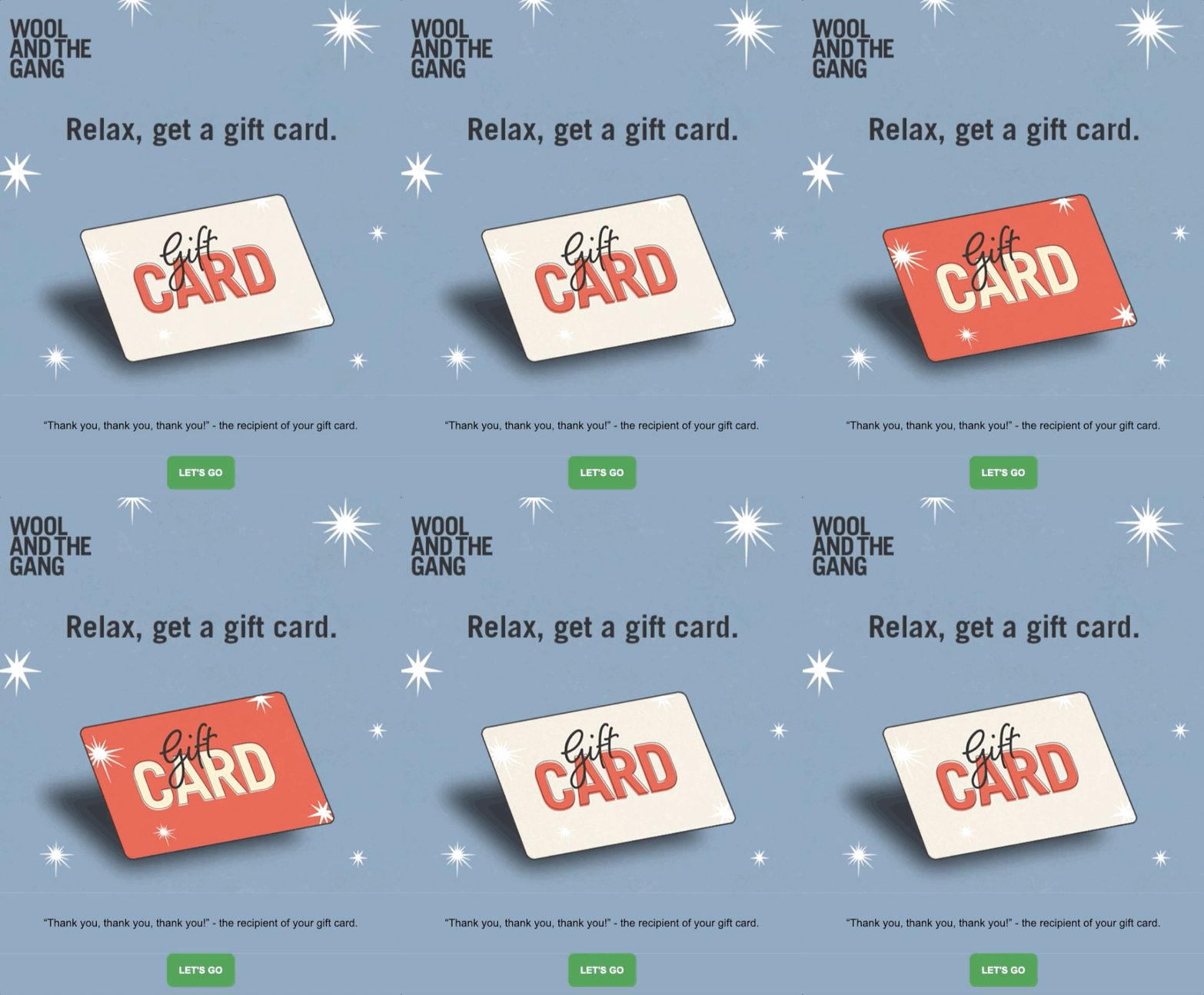
It only takes three emails to capture and convert different types of gift shoppers in fall.
8. The White Company
Even if your products aren’t necessarily giftable or Christmas-y, you can still leverage the holiday theme. After all, holiday prep doesn’t only mean gift shopping.
The White Company, a furniture and decor e-tailer, wants you to be ready for the holidays ahead. That’s why they send you this checklist in October with the subject line “It’s never too early! The Christmas prep to do now”:
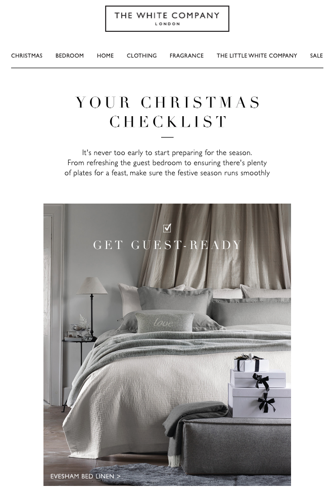
Rather than target last-minute shoppers, The White Company focuses on the exact opposite. It’s never too early to get ready, and according to the company’s checklist, you have a lot to catch up on.

With this email, The White Company creates a holiday shopping list for you, mentioning all the things you need to prepare for your Christmas gatherings. It’s an angle you can easily replicate for your brand this season and beyond.
Theme 5: Black Friday
Speaking of which… you can never be too prepared for Black Friday.
Black Friday is likely the biggest part of your fall email strategy. You’ve probably done your research, read a few articles. So, rather than talk about typical Black Friday emails, today, I’ll only feature an outstanding example—one that ironically suits Black Friday 2020.
9. Shinesty
Sent two Black Fridays ago, Shinesty’s brilliant email quickly captured my attention from the subject line to the end.
Known for its wacky tone of voice and funny emails, the company sends this email with a salient subject line that reads “naked, on the couch, saving up to 50%”:
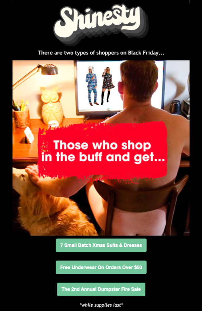
In the email, Shinesty presents you two types of Black Friday shoppers: one who shops online and gets what they want (apparently, while being naked)…
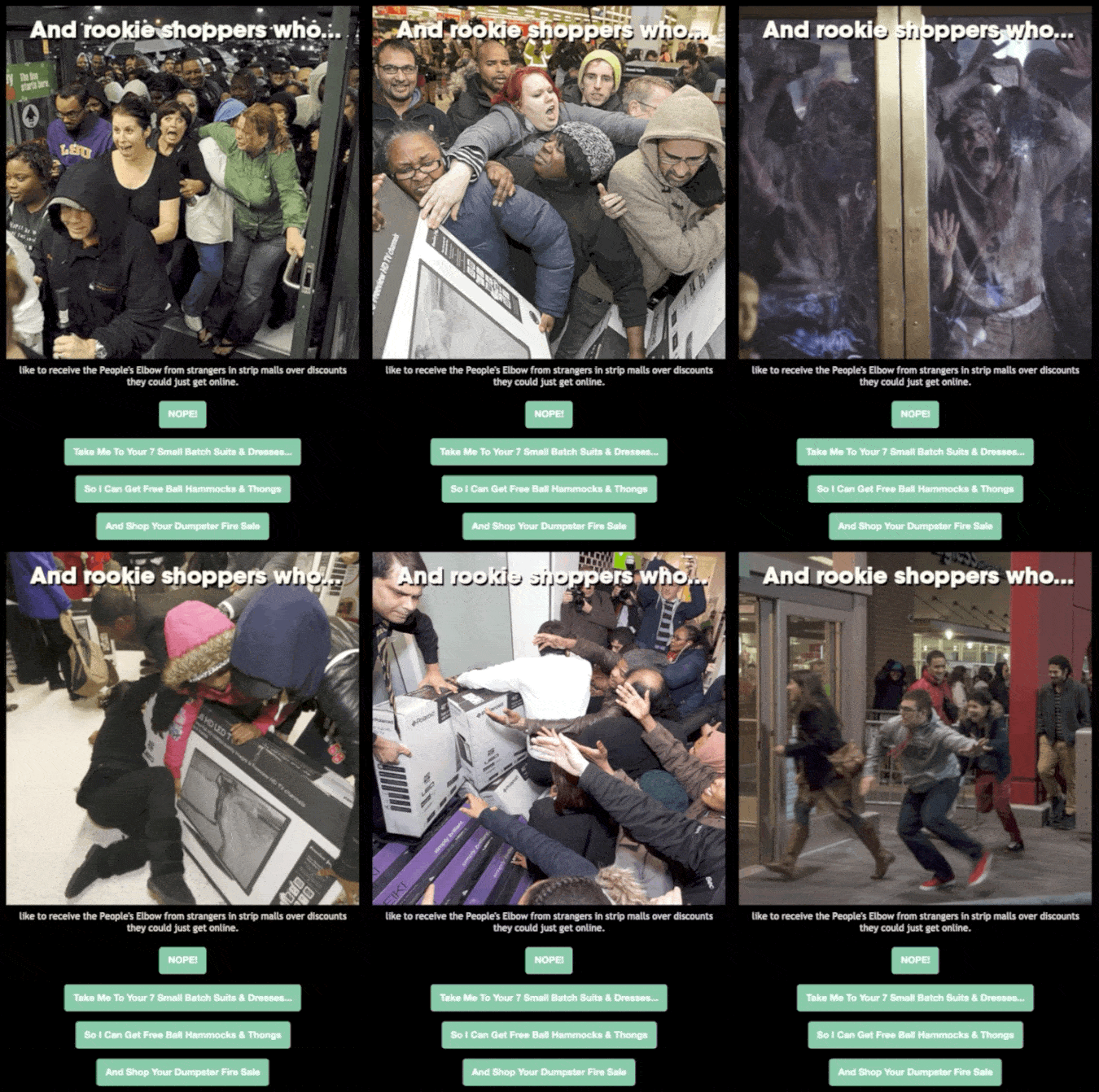
…“and rookie shoppers who like to receive the People’s Elbow from strangers in strip malls over discounts they could just get online.”
All Shinesty does is to state an obvious fact: If you shop online, you can avoid the Black Friday stampede. However, the execution is remarkable.
Compared to hundreds of other Black Friday emails you get every year, Shinesty’s email is one of the most noticeable ones, and it’s hard to forget.
Shinesty’s humor is too bold for most brands, but inviting prospects to your online store for a safer, more convenient Black Friday experience is especially important this year.

Conclusion
With all the holidays and activities ahead, fall is an exciting yet busy time for e-commerce marketers.
No matter if you’re selling used cars, kids’ toys, or men’s clothes, try applying some of these themes to your fall emails. It’s the perfect season to warm up your email list for Black Friday, Christmas, and the winter ahead.
(Is it not fall over there? Check out the nine best spring emails I’ve seen, instead.)

