With over 2.6 billion monthly active users, your potential customers are likely on Facebook (and the Facebook-owned Instagram.) That’s why Facebook is a great channel for e-commerce, whether you want to get more awareness, traffic, or sales.
However, it’s expensive to get new customers to your online store. With customer acquisition costs this high, you need to get your money’s worth on paid advertising, and that’s what I want to help you with today.
This post isn’t about how to set up Facebook ads for e-commerce. (Facebook already has excellent resources on that.) Instead, it’s about how top e-commerce brands use Facebook ads to attract new visitors, stay top-of-mind, reduce cart abandonment, and more.
I’ve done my research on more than 180 e-commerce brands and here are the seven best e-commerce Facebook ads I’ve seen—including why they work and how you can apply their tactics to your business.
Table of Contents
1. Allbirds
There are countless consumer barriers to purchase when it comes to online shopping, ranging from pricing to trust issues.
One of the most common obstacles to online shopping is, however, returns. If you have a solid refund policy or a satisfaction guarantee, you should address these questions on your product pages and during checkout to persuade mid-funnel prospects.
While many e-tailers choose this method, brands like Allbirds take it one step further, and highlight their guarantee in Facebook ads.
Take a look at this example:
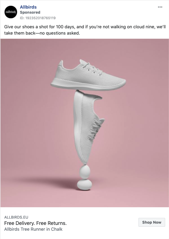
Allbirds’s value proposition is to be “the most comfortable shoes in the world,” and the company wants you to believe that. That’s why, in almost all their ads, you’ll find a note about their no-questions-asked, 100-day satisfaction guarantee.
Whether they’re announcing new arrivals or promoting a product line, Allbirds makes sure to remind you about their free delivery and returns option in every Facebook ad, like this:
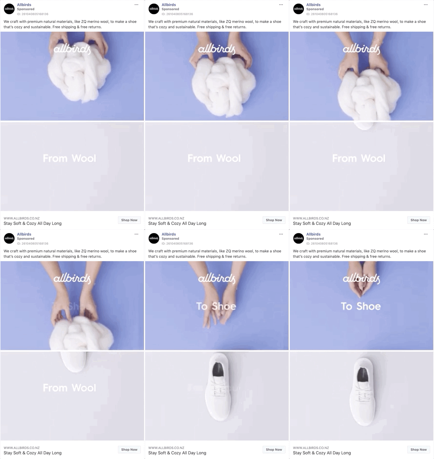
This way, Allbirds removes a significant obstacle to online shopping and increases your likelihood of purchasing.
Takeaway:
If you’re offering free delivery, easy returns, or a satisfaction guarantee, mention them in your ads, and consider running ad campaigns focusing mainly on that.
2. Bellroy
With ad placements dominating our social media timelines, it’s now easier to miss a product that’s a perfect fit for us. To overcome this problem, your ads need to capture the prospects’ attention almost instantly. Luckily, creative ad visuals and brilliant copywriting can help you achieve that.
One tactic you can use in your ad copy is to describe your ideal buyer in a way that the reader can relate to it, as Bellroy repeatedly does:
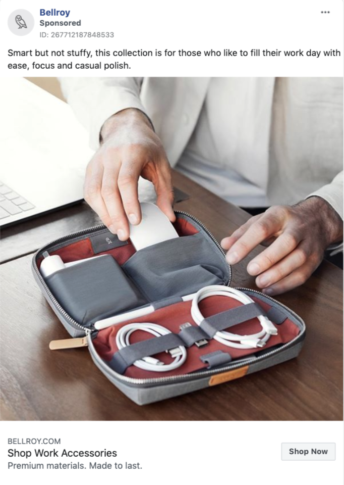
With this ad, Bellroy cuts down on words, and introduces its product collection as “smart but not stuffy.” Next, the company explains who these products are for, and if you can self-identify with this persona, you immediately reach for the “Shop Now” button.
While describing the ideal buyer, Bellroy also covertly communicates the benefits of its products:
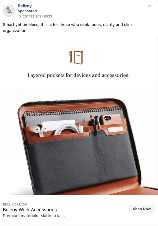
When you see this ad on your Facebook feed, you understand that;
- This product is for people “who seek focus, clarity, and slim organization”; and
- It can help you have more focus and clarity in your life.
Brilliantly enough, Bellroy communicates both, without using many words.
While the above examples are based on concrete benefits, in other product ads, Bellroy not only describes the buyer, but also asks if you’re a good fit:
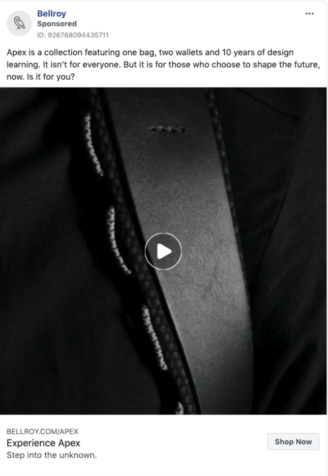 The question “Is it for you?” is a smart conclusion because, this way, Bellroy invites you to the conversation and makes you consider if you can identify yourself with the product. (Plus, when something’s “not for everyone,” it becomes more attractive.)
Takeaway:
Describe your ideal buyer in your product promotion ads by using power words that evoke positive emotions. Consider ending with a question to invite the reader into the conversation.
3. Beardbrand
If you’re a reader of our blog or are interested in impressive success stories, you’re likely familiar with Beardbrand. Starting as a simple blog, the e-tailer is now famous for its valuable content that attracts new customers on autopilot.
While Beardbrand cleverly educates its prospects through its blog, YouTube channel, and email marketing, its Facebook ads are no exception.
Take a look at this carousel video ad, where Beardbrand walks you through the four steps of beard care:
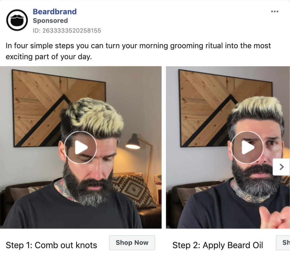
With little copy in this ad, the company educates you with the promise of a more exciting morning routine, rather than trying to hard-sell you.
What’s more, Beardbrand cleverly incorporates product marketing into each video. While you watch the video guides, you can click through and buy Beardbrand’s products, or easily follow their advice by using a competitor. No pressure.
Knowing that you may not always have the time to watch videos, the company also writes out step-by-step beard maintenance guides in other versions of this ad:
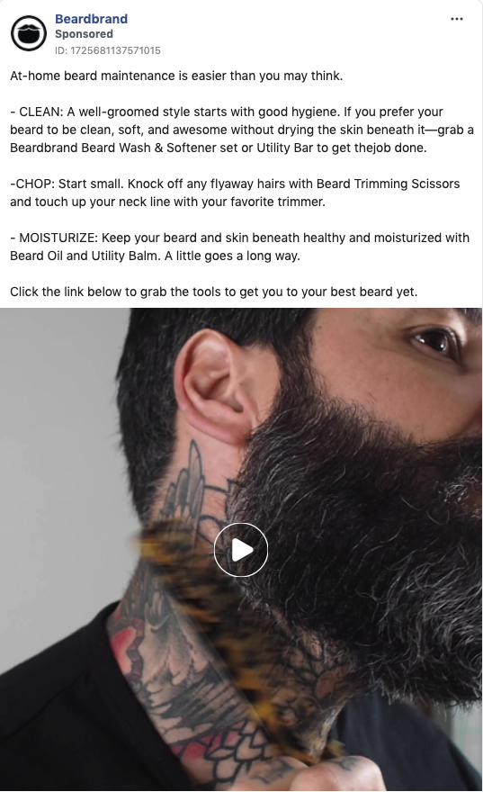
With this ad, Beardbrand, first, handles your objections by saying “at-home beard maintenance is easier than you may think.” After revealing their three-step beard care regimen, they finish the ad with a CTA, inviting you to buy the equipment mentioned in those steps.
Takeaway:
Create small video guides around your niche and use them in carousel ads to attract top-funnel prospects to your store. Alternatively, write them out as step-by-step guides.
4. Old Navy
While driving traffic to your online store is one of the goals you can choose in your Facebook ads, you can also channel offline shoppers into your physical shops or resellers.
Old Navy is a retailer that often uses Facebook ads for this purpose and they always find different ways to do so.
Check this example, where the company promotes its in-store-only weekend sale:
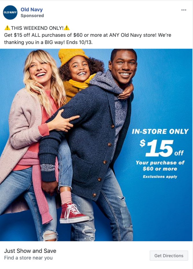
Old Navy successfully drives urgency with this limited-time promotion by clearly stating when the offer ends, and how you can claim it.
Instead of sending users to their website to “learn more,” Old Navy uses the CTA “Get Directions.” When clicked, the button takes you to a map to locate your closest Old Navy store.
You might be thinking that an in-store sale isn’t ideal due to the current Corona restrictions, and you’re right. That being the case, Old Navy still uses Facebook ads to promote its physical stores, but with a different angle:
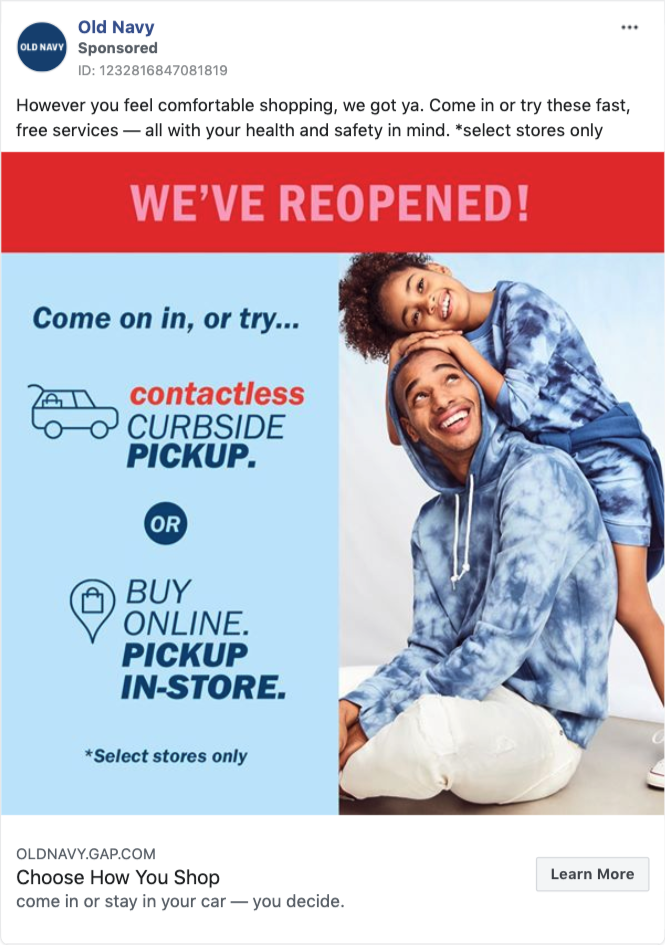
This time, the company informs prospects that its stores are open again, so you can shop with ease, no matter which method you choose.
Takeaway:
If you have physical stores, resellers, or distributors, use them in Facebook ads to guide customers with the store traffic objective.
5. Anastasia Beverly Hills
While it’s becoming common to use social proof in email marketing and website popups, many e-commerce marketers still underutilize social proof in their Facebook ads.
Brands like Anastasia Beverly Hills, on the other hand, know the effectiveness of social proof in persuading prospects, and therefore, use it to its fullest potential.
Check out this ad example by the beauty company:
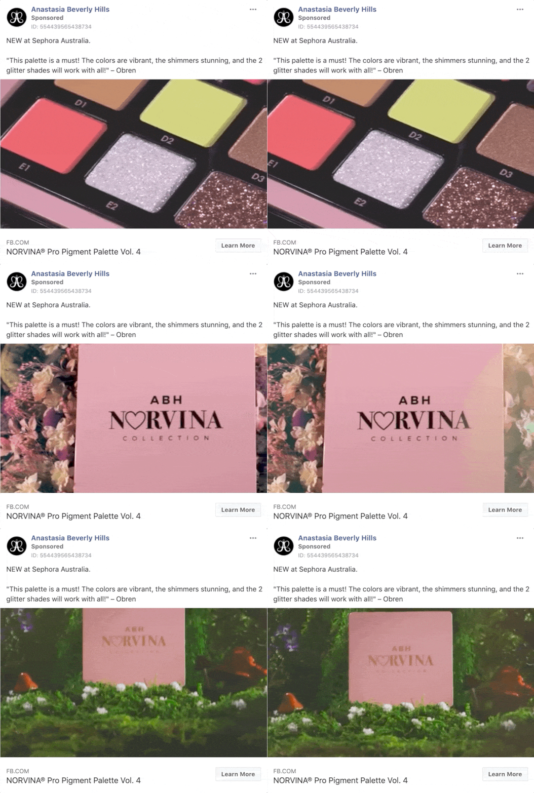
While promoting a new arrival in Australia, Anastasia Beverly Hills simply quotes a short customer testimonial about the product. This way, the company allows its customers to speak on its behalf. No lengthy product descriptions, no fancy words.
In a few other ads, Anastasia Beverly Hills goes beyond testimonials to create social proof and backs up its products’ effectiveness with studies:
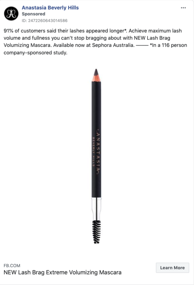
With this type of social proof, the company adds credibility to its claims and immediately makes you think “91 percent can’t be wrong.” (Notice how they transparently write that it’s a company-sponsored study with a sample size of 116.)
What’s more, rather than vaguely calling its products “bestsellers,” Anastasia Beverly Hills gives you the source to support its claims:
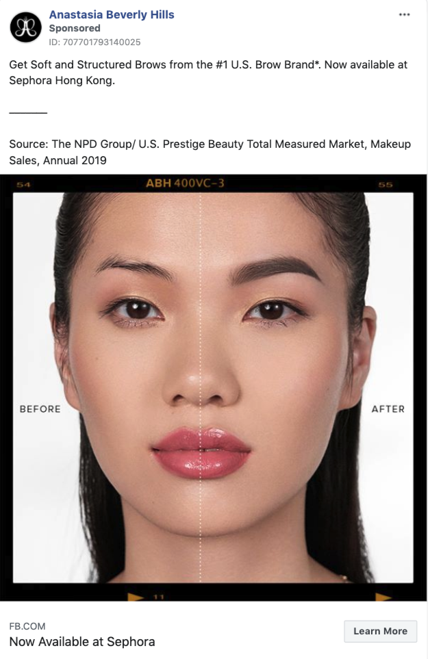
Granted, not all of us have products that are category leaders, but the bottom line is that a valid source that backs up your claims strengthens social proof.
Takeaway:
Handpick your best product reviews and quote them in your Facebook ads.
6. Chubbies
While Anastasia Beverly Hills is a brand of few words, Chubbies has a more fun approach to customer reviews in Facebook ads.
The brand, known for its funny emails, uses humor in its Facebook ads too, and here’s one of many examples:
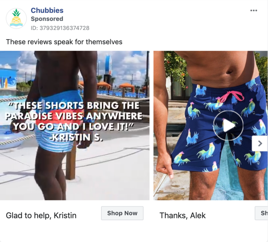
In this carousel ad, Chubbies promotes its shorts by featuring one review per product. While that’s nothing extraordinary at first sight, notice Chubbies’ captions that act as a response to the reviews.
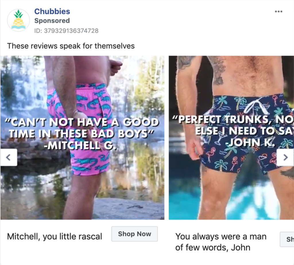
Although these reviews “speak for themselves,” Chubbies makes sure to add a humorous touch to make them stand out among other e-commerce ads in your Facebook timeline.
More interestingly, Chubbies’ signature humor can be seen in almost any type of ad campaign they run:
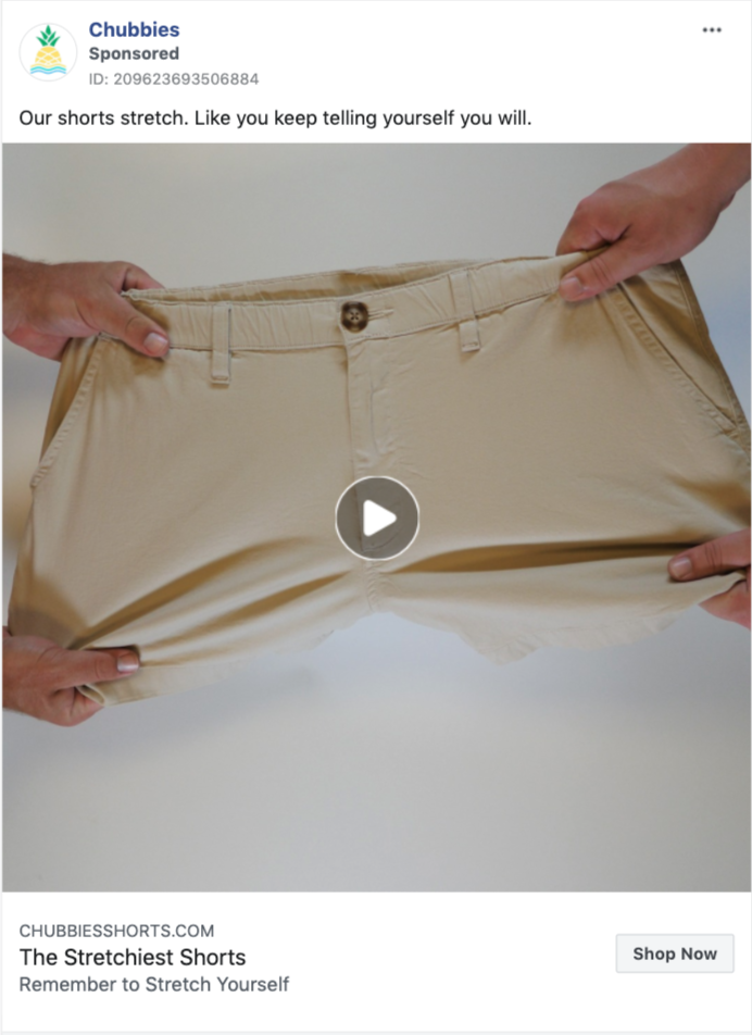
Using humor in Facebook ads can be a challenge for many marketers. But as you can see from the Chubbies example, it doesn’t take much. Sometimes, a simple yet brilliant sentence can say a lot more than long product descriptions.
Takeaway:
Next time you’re running Facebook ad campaigns, think about how you can subtly add humor to your copy.
7. BarkBox
Amazing copywriting and humor are foolproof ways to stand out on prospects’ Facebook timelines. BarkBox knows this well, but they go one step further with their creative use of visuals in Facebook ads.
Take a look at this carousel ad:
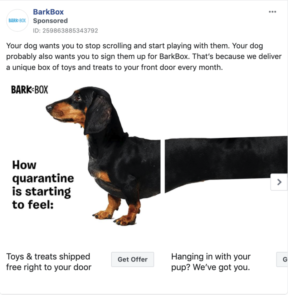
There are a few points worth mentioning about this ad. First, notice the introduction that reads “Your dog wants you to stop scrolling and start playing with them.” This is a brilliant opening line that the reader can easily relate to, while scrolling through Facebook. Next, notice how BarkBox’s copy speaks on behalf of your dog’s needs and wishes, making them hard to resist.
Finally, BarkBox’s ad visual is almost impossible to miss. See what happens when you swipe the carousel ad that begins with the copy “How quarantine is starting to feel”:
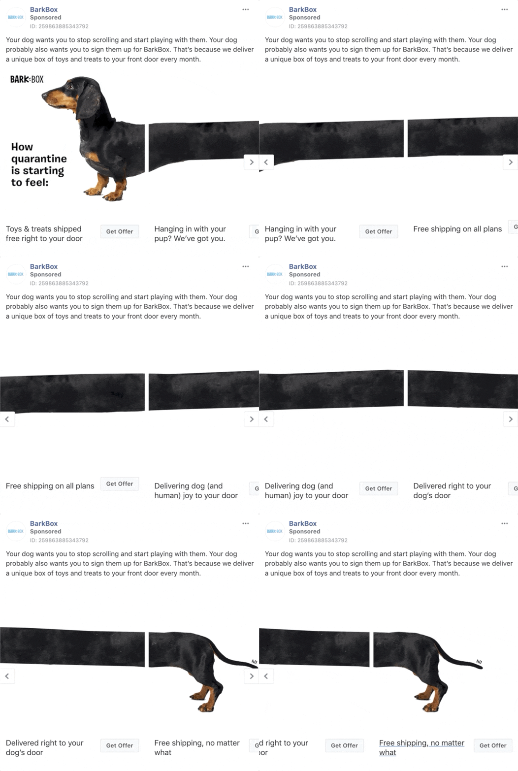
This inventive visual helps BarkBox create salience and stand out in prospects’ timelines. Plus, it carries a timely and humorous message about the current Corona situation.
BarkBox cleverly uses the working-from-home angle in other ads too, but with a twist:
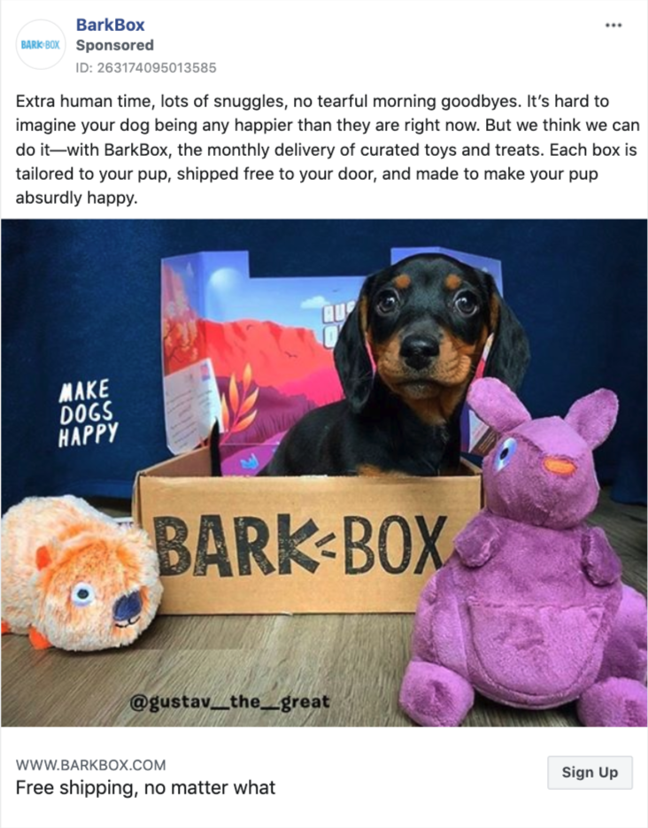
Instead of talking about what staying-at-home means for you, they explain what the situation means for your dog. By doing so, BarkBox helps you look at the bright side, and encourages you to make your dog even happier.
Takeaway:
Think about when and where prospects will see your ads, and adjust your copy accordingly. If possible, experiment with your visuals to create salience.
Bonus: Violet Grey
Although many e-commerce companies use Facebook ads for product and sales promotion campaigns, there’s one ad type underutilized by e-tailers: lead ads.
When used right, Facebook lead ads can help e-commerce businesses collect emails without making users leave the platform. Violet Grey has a simple but effective example of e-commerce lead ads:
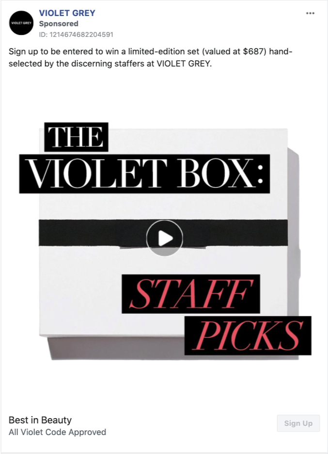
With this ad, the beauty company runs a giveaway and collects entries through a simple lead ad form. This way, Violet Grey grows its email list directly on the platform.
Violet Grey highlights the exclusivity of the prize in its ad copy to make its giveaway more attractive. When you sign up, you can win a hand-selected, limited-edition set, worth $687, and not just a random product or a gift card. It’s a clever twist you can easily apply to your giveaways.
Takeaway:
If you’re running an on-site giveaway, support it with a Facebook lead ad highlighting exclusivity and the value of your prize.

Conclusion
Whether you want to collect emails, promote new arrivals, or keep your brand top-of-mind, Facebook ads can help you achieve your goals.
Take inspiration from these best e-commerce Facebook ads and start applying your favorite takeaways to your own ads.

