Price is of the utmost importance to consumers. In fact, it’s the number one factor determining where Americans shop—87% say that price is very or extremely influential.
Consumers also shop where they want to nowadays, whether it’s through an app, browsing online, via social media, etc.
They can also check prices via Google Shopping and price comparison sites like NexTag.
The point is, shoppers are smart so you have to be, too.
That’s why I’m about to share with you the best of these pricing strategies to help you grow your ecommerce business.

Table of Contents:
- 1. Set an Uber-Specific Price
- 2. Choose Values with Fewer Syllables
- 3. Lure in Customers with a Loss Leader
- 4. Use Visual Cues for Sale Items
- 5. Display a Product’s Registered Retail Price (RRP)
- 6. Place an Expensive Item on the Left
- 7. Show the Equivalent Daily Price
- 8. A/B Test Your Prices
- 9. Offer Similar Products at Slightly Different Prices
1. Set an Uber-Specific Price
If a consumer’s purchasing decision is based on logic, a specific price works better.
By specific I mean, for instance, $319.76, as opposed to $299 or $300.
According to a University of Florida study, consumers think that stores make rounded prices artificially higher. Hence, they are less likely to tap that call-to-action (CTA) button.
You may have just chosen a random price; too high for what the product is actually worth.
Take a look at the exact prices of these HP products:
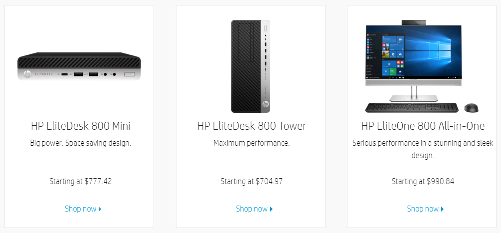
Specific prices work particularly well in categories such as tech. It’s not an emotional decision where the only logic is, “That’s cool. I want that. I’m gonna buy it.” People surmise that the price has been calculated by adding together the sum of the product’s parts.
In the above example, that means all of the individual pieces of hardware inside a desktop computer.
Even if your average consumer doesn’t know exactly what they are…
They know, it’s not just a made-up number.
So, use this logic-based pricing strategy, if your product is practical in nature e.g. electronics, tech, tools and so on.
2. Choose Values with Fewer Syllables
A person perceives a price to be lower if it has fewer syllables.
Research from Clark University found that even if two prices are the same length, e.g. $27.84 and $28.15, the longer the price phonetically, the higher it seems. Which would be $27.84 in this example, despite it being the lower price. It’s strange but true.
Topshop, for example, uses simple, round numbers, which thus have few syllables:
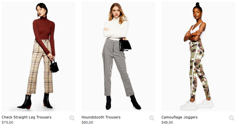
For Topshop, they don’t need to be specific, as customers make emotion-based purchases at their store. Customers can process these numbers quickly and come to a purchasing decision quickly.
For this reason, you may want to experiment with round values for your online store. If you went through all of your prices, counting every single syllable, well, it would drive you mad.
A simple way to reduce the syllable count for emotion-based purchases would be to just round off the values.
3. Lure in Customers with a Loss Leader
Imagine your local supermarket advertises disposable barbecues at a ridiculously low price. It’s so low, the customer feels like they’re robbing the supermarket blind. The supermarket is seemingly losing profits on this product…
But, they are still the puppet master, tugging on the customer’s strings.
Because they know that they will make big profits on all of the tasty steaks, beer, salad and the rest, that the customer buys along with the barbecue.
That’s a loss leader.
This is such a great pricing strategy that Amazon does it in an epic way every year. Global sales reached an estimated $4.19 billion on Prime Day 2018.
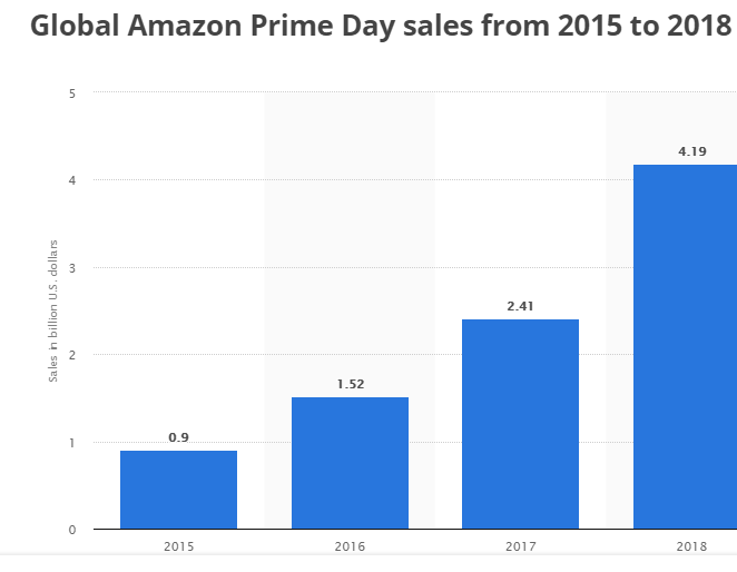
And they can make up for any losses by generating more Prime members in anticipation of the day…
Who then spend more than the average customer in the long-term.
To create a loss leader of your own there are a couple of things you can do:
- Have low-priced items lure customers in, then hit them with upsells and cross-sells.
- Or like Amazon, use a loss leader to generate long-term customer loyalty.
Essentially, this pricing strategy is popular because it’s so effective.
4. Use Visual Cues for Sale Items
You’d think everybody would be doing this by now. Oddly enough, they’re not.
Lots of online stores think projecting a cool vibe with their minimalistic color schemes is more important than basic conversion tactics.
But that’s now always the case.
Eighty-four percent of marketing, creative and tech professionals believe that design-driven companies are outperforming their competitors. The moral of this story is, the way you utilize design is key.
Using a visual contrast between sales prices and original prices, via color or size, for example, magnifies the difference.
Take a look at how Happy Socks does this:
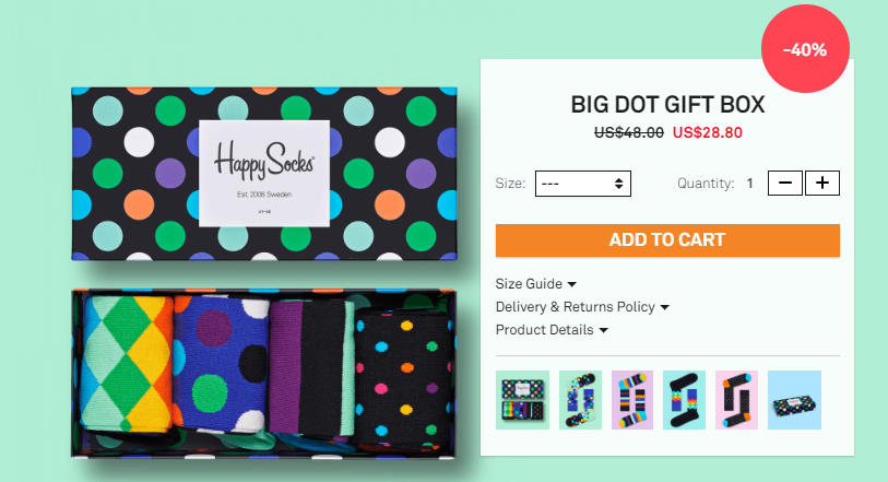
They use red to emphasize the price drop. And even slap the reduction percentage on there in a big red circle. You cannot miss this offer.
There’s no doubting that visuals have an effect on the subconscious mind. So, use them to increase conversions on your product pages.
5. Display a Product’s Registered Retail Price (RRP)
This sends a clear message to the consumer…
Look at what you could have been paying.
You can persuade visitors to make a purchase by emphasizing the stark difference between the regular retail price and your competitors’ offers.
TJ Maxx has made an entire business out of selling designer brand fashion at a fraction of the regular price. And they aren’t afraid to show it:
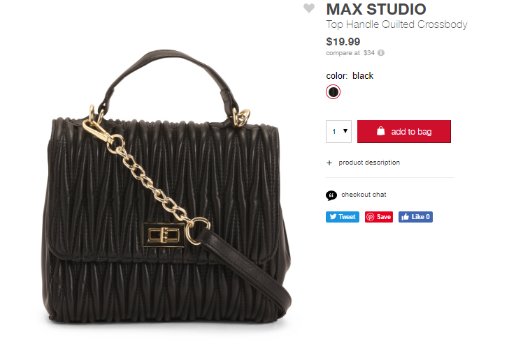
They show the RRP of $34 directly under their price.
If you wish to do something similar, approach this strategy with caution. It doesn’t mean that you should start pricing all of your products way lower than your competitors. When your products are already cheaper than the RRP, then be sure to display it proudly.
This kind of pricing helps your customer understand the value of what they're purchasing, which makes the price feel lower. John Roman of Battlbox understands this, and passes that value down to their customer:
6. Place an Expensive Item on the Left
You need to organize your category pages carefully.
Pawel Ogonowski at Growcode says,
A well-designed category page will build engagement and drive conversions, encouraging visitors to click through to individual product pages and buy.
A great way to put this strategy into action is to place your more expensive items on the left. Because once a consumer sees an expensive item, anything after that seems like a great deal. And they will be more willing to part with their money.
Here’s an example from home furniture company, The Modern Shop:

Boom! You’re hit with a $2,000+ price tag straight away. The bedside tables that follow all cost much less. Therefore, customers are more willing to pay $600-1200 because at least it’s not $2,100.
7. Show the Equivalent Daily Price
When you display the equivalent daily price next to the regular price, the item the consumer was considering doesn’t seem like such an expense. This is comparable to how you might offer monthly financing options for high-ticket items.
Research into this strategy has also shown that reframing a price in terms of a common expense, such as the price of a cup of coffee, has the same effect.
As with any tactic, you can put your own unique spin on it depending on the nature of your brand.
Subscription service, HelloFresh does this brilliantly:
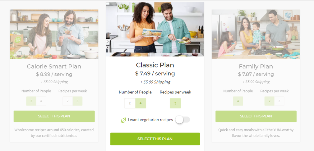
When you get to the checkout stage, you pay a lump sum for a week’s worth of food. Yet, as you can see, HelloFresh reframes the price as the cost per serving. Framing the offer as $7.49 per serving seems reasonable, while the weekly total comes to $95.87. Which is considerably less appealing.
Depending on the price of your product, you can show its inherent value to the customer at just pennies per day.
8. A/B Test Your Prices
A/B testing is a great way to increase conversions.
It’s the second most popular CRO method after customer journey analysis.
Try tweaking your prices to see what would be most profitable for your store overall.
One site selling exercise guides split tested their price with fascinating results. Their course previously sold at $19.95 (the control price). They wanted to see if an increase to $29.95 (variation 1) altered the number of purchases. The difference in the number of buyers was minimal:

Thanks to this A/B test, the site made 61.67% more revenue by increasing their price to $29.95.
You may find that slight increases or decreases to your prices make a huge difference to your bottom line.
9. Offer Similar Products at Slightly Different Prices
Have you ever gone out for ice cream and not known which flavor to pick? There are just so many that it becomes stressful.
Barry Schwartz describes this phenomenon in his book The Paradox of Choice: Why Less is More.
He argues that Americans have so much choice that they get “decision-making paralysis.”
So, if visitors to your site face a bunch of similar products at the same price, what are they going to do?
Bail.
Obviously, you don’t want that.
To avoid that from happening, reduce the impact by assigning slightly different price points to similar products.
CVS does this for their wide catalog of products:
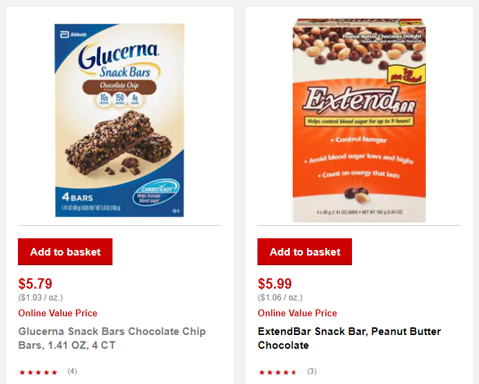
The above are two very similar products. Yet, 20 cents set them apart. This encourages the visitor to make a choice, which may have been difficult if it wasn’t for the price difference.
Price can be the differentiating factor that encourages consumers to make a purchase in cases like this.

Conclusion
Price is essential to a consumer’s purchasing decisions. But modern shoppers are savvy. If your price isn’t good enough for them, they can just look elsewhere.
However, you can’t keep reducing prices if you want a successful ecommerce business. You have to employ intelligent pricing strategies to ensure your sales continue to grow.
Show consumers that your price reflects the value of your product. Turn them into loyal customers with cheap prices. Use psychological tactics to convince consumers that, in fact, your prices aren’t so high. Make sure your offers are imprinted into their subconscious.
Do all of these things and your sales will increase. Start by experimenting with either specific or rounded values depending on whether your products require logic-based or emotion-based decisions.

