Consumers have long insisted that price is less important than quality when making purchase decisions.
I’m no psychologist, but I think there’s reason to be a little skeptical about those findings.
If you asked me whether I buy based on price or quality, I’d probably give the same answer. Because I want to seem like a smart cookie who recognizes a superior product.
But in reality, my thought process often isn’t that deep.
For a lot of products, I’ll look at all the available options, then pick the cheapest.
And if one of those products is on sale at a big discount, all the better.
I might even be swayed into purchasing something solely because of a price drop.
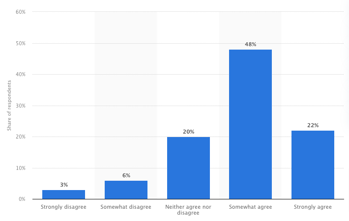
Turns out I’m not the only one, because 70 percent of consumers “somewhat” or “strongly” agree with the statement: “A promotion sometimes encourages me to try something I wouldn't normally buy.”
Fewer than one in 10 people disagree.
 So price promotions can be a powerful tool for driving sales and revenue.
With that in mind, I’ve rounded up nine persuasive price drop email examples from some of my favorite ecommerce brands.
Not only that, but I’ve picked out a key insight for each example to help inform your own email marketing efforts.
Table of Contents
- 1. Vinomofo: Share Daily Price Drops
- 2. ThirdLove: Clearly Display Your Price Drop
- 3. J.Crew: Simplify Cross-Category Price Drops
- 4. Torrid: Display the Highest Discount Number
- 5. Goop: Show Absolute & Relative Discounts
- 6. 4ocean: Use Price Drops to Shift Old Stock
- 7. SSENSE: Drive Urgency Around Price Drops
- 8. KitchenAid: Highlight Key Information
- 9. Greetabl: Make Discounted Products Sound Desirable
1. Vinomofo: Share Daily Price Drops
Typically, the purpose of a price drop is to boost sales of a specific product or collection.
But what if you’re planning to slash prices for a whole range of products across multiple categories?
There are two potential issues with this approach:
- There’s a chance that some of your best promotions will get lost in the noise.
- You risk offering customers too much choice.
Sure, #2 might sound like a classic first-world problem.
“Oh no, there are too many fantastic discounts available, what should I do?”
But research suggests 10 percent of consumers have ditched a planned purchase simply because they were given too many options.
The last thing you want is to actually lose out on sales as a result of your discounting strategy.
Fortunately, there’s a simple solution: offer daily price drops, with a different product (or category) discounted every day.
That’s what Vinomofo does in this price drop email example:
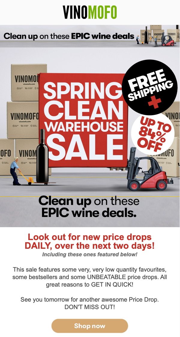 I particularly like this example because it gives recipients a compelling reason to look out for the next email in the sequence (and the one after that).
I bet the open rate for this campaign was through the roof—or at least above average. Because even if you’re not planning an immediate wine purchase, wouldn’t you be interested to find out what’s on offer today?
2. ThirdLove: Clearly Display Your Price Drop
You’d think it’d be pretty simple to communicate a price drop to interested customers.
“Yesterday, this phone case cost $20. Now it costs $10. Want to buy it?”
But for many ecommerce brands, it’s evidently a real head-scratcher.
According to the Baymard Institute, an astonishing one in seven desktop ecommerce sites locate their promotions far away from the price on product pages, which makes it hard for consumers to understand whether a discount is relevant to their planned purchase.
If shoppers can’t figure out the actual price of a product, or whether they’re eligible to access your price promotion, they’re going to feel confused.
And confused customers rarely (if ever) buy.
As is so often the case, the simplest approach is also the best one.
In this price drop email example, ThirdLove clearly displays the discounted product price alongside the original price:
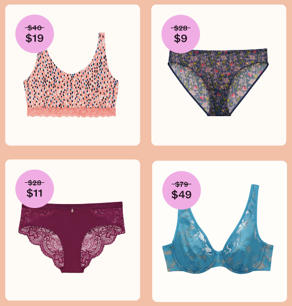 The pre-sale price is marked out with a simple strike-through, which is simple for potential customers to interpret.
So there’s no ambiguity here.
3. J.Crew: Simplify Cross-Category Price Drops
By now, it should be clear that while price drops are theoretically simple, they can get a little messy if you don’t communicate them effectively.
And that can be trickier than you’d imagine.
We’ve already navigated one potential speedbump: displaying price drops alongside the original product price.
But what if your discount applies to a whole category rather than a specific product? And what if all the products within that category are priced differently?
You could communicate each discount individually. But if you’ve got 100 different products in a category, that’s going to make for a pretty lengthy price drop email—and, as we’ve already noted, consumers can feel overwhelmed by too much choice.
A better option is to take a leaf out of J.Crew’s book by displaying the full range of original prices alongside a single, easy-to-understand discount:
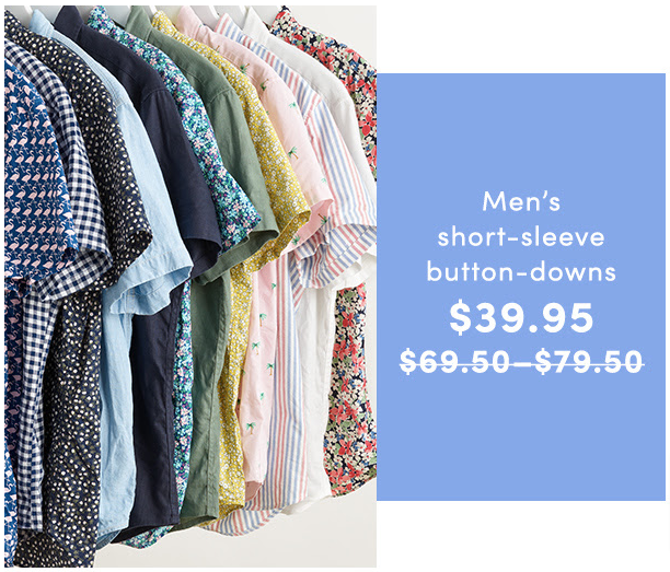 In my experience, there’s almost always a simple solution for communicating price promotions—it just might not be immediately apparent.
4. Torrid: Display the Highest Discount Number
You’re planning a price drop.
One of your most popular products is going to be reduced from $20 to $15.
Naturally, you’re expecting sales to rocket.
However, your performance will likely be affected by the way you explain your discount. Do you position it as a $5 saving? Or a 25 percent discount?
Both amount to the same thing. But they don’t sound the same. So which is best?
Jonah Berger, a marketing professor at the Wharton School of the University of Pennsylvania, has crunched the numbers. He found that customers are more likely to take advantage of a price drop if the highest discount number is displayed.
So in the above example, you’d see more success promoting a 25 percent discount than a $5 saving. But if you were discounting a $500 product to $375, you should push the $125 price saving rather than the 25 percent reduction.
For that reason, Torrid created a price drop email that highlighted multiple “types” of savings:
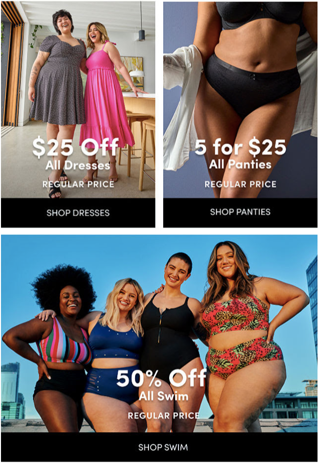 Dresses are described as “$25 off”, whereas swimwear carries a “50 percent off” discount. Because those are the higher, more impressive-sounding figures.
Simple, right?
5. Goop: Show Absolute & Relative Discounts
Another interesting tidbit from the Baymard Institute’s extensive testing into price drops and user experience:
The best way to communicate your price drop is to display the absolute and relative discounts at the same time.
In other words, don’t agonize over whether to position a discount as “$5 off” or “25 percent off”; do both. That’s what Goop does here:
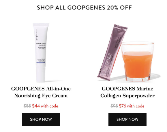 That image carries a lot of information (without being difficult to understand). It tells us:
- The relative discount (20 percent off)
- The original, pre-sale price
- The current, discounted price
6. 4ocean: Use Price Drops to Shift Old Stock
However long you spend on sales forecasting and trends analysis, you’re almost certainly going to be left with some dead stock—stuff that you just can’t sell—at the end of a campaign or season.
While dead stock can include damaged items and incorrect deliveries, the most obvious cause is ordering (or manufacturing) too much of a certain product and failing to sell as much as you hoped.
Figures from the US Census Bureau show that the average inventory-to-sales ratio in June 2022 stood at 1.3, which means the average retailer held $1.30 worth of inventory for every $1 sold.
Clearly, the average excess can pose a big problem to a retailer’s bottom line.
But price drops provide an obvious solution. If you know you’ve ordered too much stock, it’s time to cut your losses and slash the price.
That’s what 4ocean did by launching a 50 percent discount on face mask support frames to coincide with the impending removal of mask mandates:
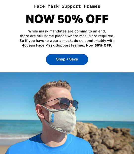 You don’t need to be an economist to realize that the end of mask mandates would hit sales of this particular product pretty hard.
By reducing the price, 4ocean at least gave itself the opportunity to shift a bunch of soon-to-be-dead stock before it starts gathering dust in the forgotten corner of a warehouse.
7. SSENSE: Drive Urgency Around Price Drops
In an ideal world, you’d announce a price drop, and your audience would immediately respond because it’s such a great deal.
But let’s be honest. Taking advantage of your price reduction might not be the top priority for your email subscribers. What’s more, there’s a good chance one of your rivals is running a similar promotion at the same time.
With all those distractions around, how do you compel people to take action?
One approach is to leverage the psychological concept that’s widely known as the fear of missing out, or “FOMO” for short.
According to one study, two-thirds of people experience it.
Many of those FOMO-induced consumers respond by buying something. This is particularly common among younger audiences, with 68 percent of Millennials saying they make a reactive purchase within 24 hours of experiencing FOMO.
This represents a big opportunity for brands. If you can convince your audience that they’re going to miss out on a fantastic opportunity, there’s a good chance they’ll take action.
That’s precisely what SSENSE does in this price drop email, starting with a direct, action-provoking email subject line:
 The message here is simple: if you don’t want to miss that juicy discount, you’d better buy now.
Unsurprisingly, this messaging persists within the email body:
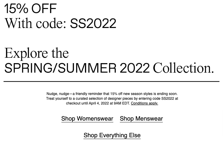 SSENSE clearly spells out the types of products that are included in its price drop and the closing date of the promotion.
That way, no one’s left in any doubt over how long they have to act.
8. KitchenAid: Highlight Key Information
Most price drop emails contain a little more detail than a picture of the product alongside the available discount.
There’s lots more stuff you might want to communicate, like:
- The previous price tag
- The product’s features and benefits
- Terms and conditions of the discount
And while UX experts might tell you to strip out as much information as possible from your emails, we’ve likely all seen examples where smart copywriting has played a key role in driving sales.
So what’s the solution? Send ultra-minimalist emails? Add all the information you can think of? Or something in between?
That’s obviously up to you. But KitchenAid shows us one effective tactic to help consumers easily pick out the most important elements of your price drop email:
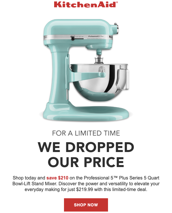 As you can see, the discount amount and CTA button are the only elements to be colored red, which immediately draws the eye. For some people, that’ll be all it takes to click “Shop Now”.
9. Greetabl: Make Discounted Products Sound Desirable
There’s an obvious issue with price drops:
Once you discount a product, customers are going to wonder why. Is it selling badly? Is there something wrong with it? Worst of all, is it uncool?
There’s plenty of evidence that shows consumers will inevitably search for the dark cloud whenever they see the silver lining of a price cut. For instance, Klarna discovered that almost two-fifths of shoppers think constant sales make brands look unfashionable and cheap.
When you think about it, this attitude makes sense. If the only positive thing you have to say about a product is that it’s now cheaper than it was before, that doesn’t make it sound particularly attractive.
So make sure your price drop emails actually promote the product, rather than just flagging up the generous discount you’re offering.
And what better place to add a little positive messaging than your email subject line?
In this example, Greetabl stresses that this price cut doesn’t just apply to any old product; it’s on the brand’s best-selling gift:
 Instantly, that makes the offer look a lot more compelling.
Props to Greetabl for adding an eye-catching emoji and the discounted price, too. All in all, that’s a great subject line.
Drive More Email Sales With Drip
The whole reason you’re sending a price drop email is to boost revenue and sales.
So what if we told you that we can help you drive even more sales and revenue from email marketing?
With Drip, it’s easy to test subject line and copy variants, so you can figure out exactly what works for your audience.
Not only that, but you can test entire email sequences. Do customers spend more when you send two emails in a day? Or convert at a higher rate when you promote different price drops on successive days? We can give you all those answers (and more).
Find out for yourself by signing up for your 14-day free trial.

