The travel industry no doubt took a hit with COVID, and 2020 was a rough year for everyone involved.
But it’s steadily bouncing back.
In fact, the online travel market alone is expected to generate over a trillion dollars in revenue by 2022, and there’s been a CAGR of 11.1% from 2016-2022.
As lockdowns lift and restrictions ease, more and more people will resume traveling once again. I included. One of the best ways for your travel agency to reach targeted leads is through email, wherein in 2020, there was an average ROI of 3,800%.
Here’s a list I’ve compiled of some of the top travel agency email examples so you can see firsthand what’s working and use those ideas to come up with your own winning formula.
Table of Contents
Nassau Paradise Island
It’s late February as I write this. While spring is in sight and there’s a light at the end of winter’s tunnel. It’s still cold and the trees outside my office remain barren. So right about now, a tropical getaway to the Bahamas sounds pretty amazing.
Nassau Paradise Island, a travel agency that offers hotel accommodations, dining, events, and more in the Bahamas. Does an outstanding job capturing the beauty of this area and making readers feel like they’re there.
What’s interesting, however, is that this particular email was sent out right in the heart of the pandemic when much of the world was in lockdown and heavy travel restrictions were in place. So unfortunately, physically traveling to Nassau Island was out of the question for many people at the time.
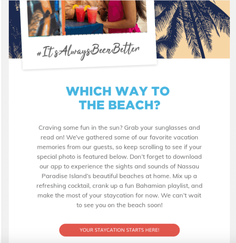
But this travel agency took a creative approach where they gathered some of their favorite vacation memories from guests to help readers make the most of their “staycation.” Nassau Paradise Island also provided media like a music playlist to help readers create their own personal paradise right at home. The email starts off by asking readers, “Which way to the beach?”
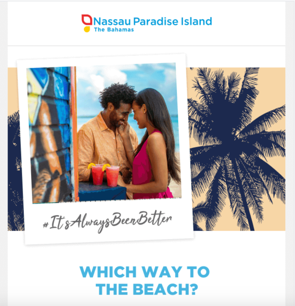
Then, Nassau Paradise Island offers a quick overview of what the email is about, including a well-written CTA that says, “Your Staycation Starts Here!”
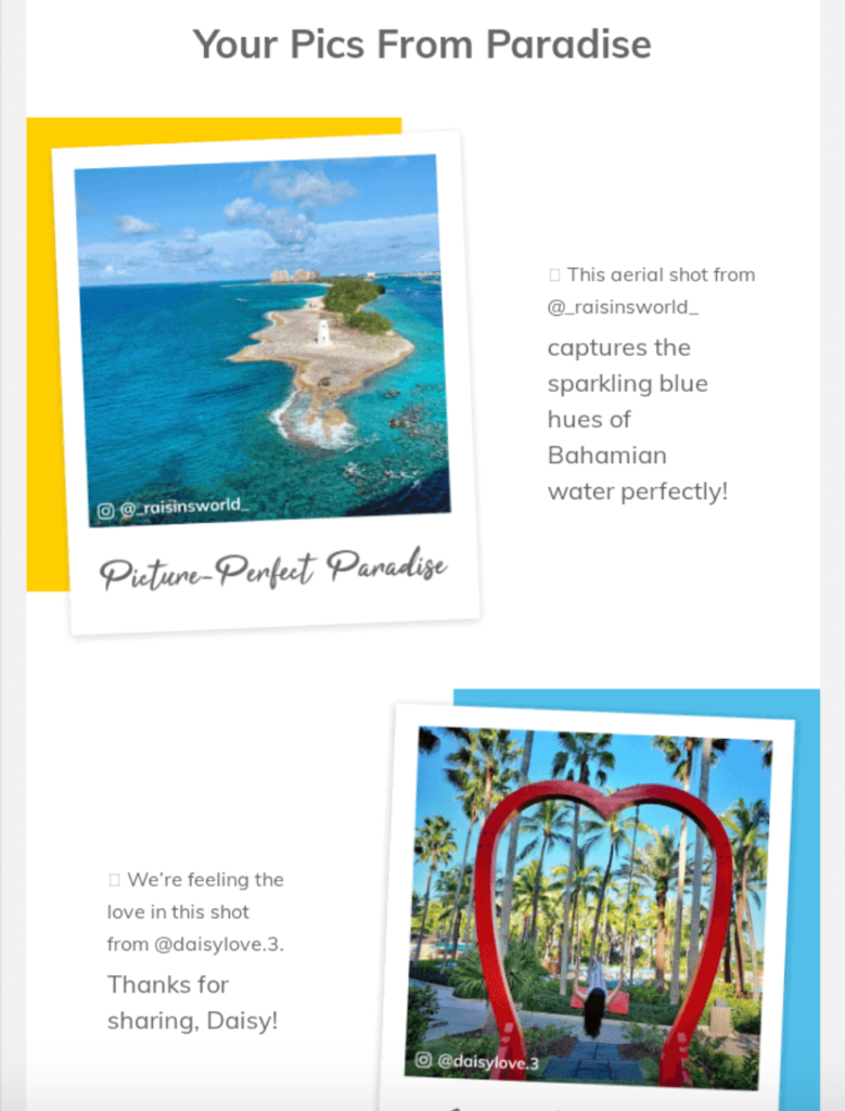
From there, they feature breathtaking pictures from some of their customers’ Instagram accounts.
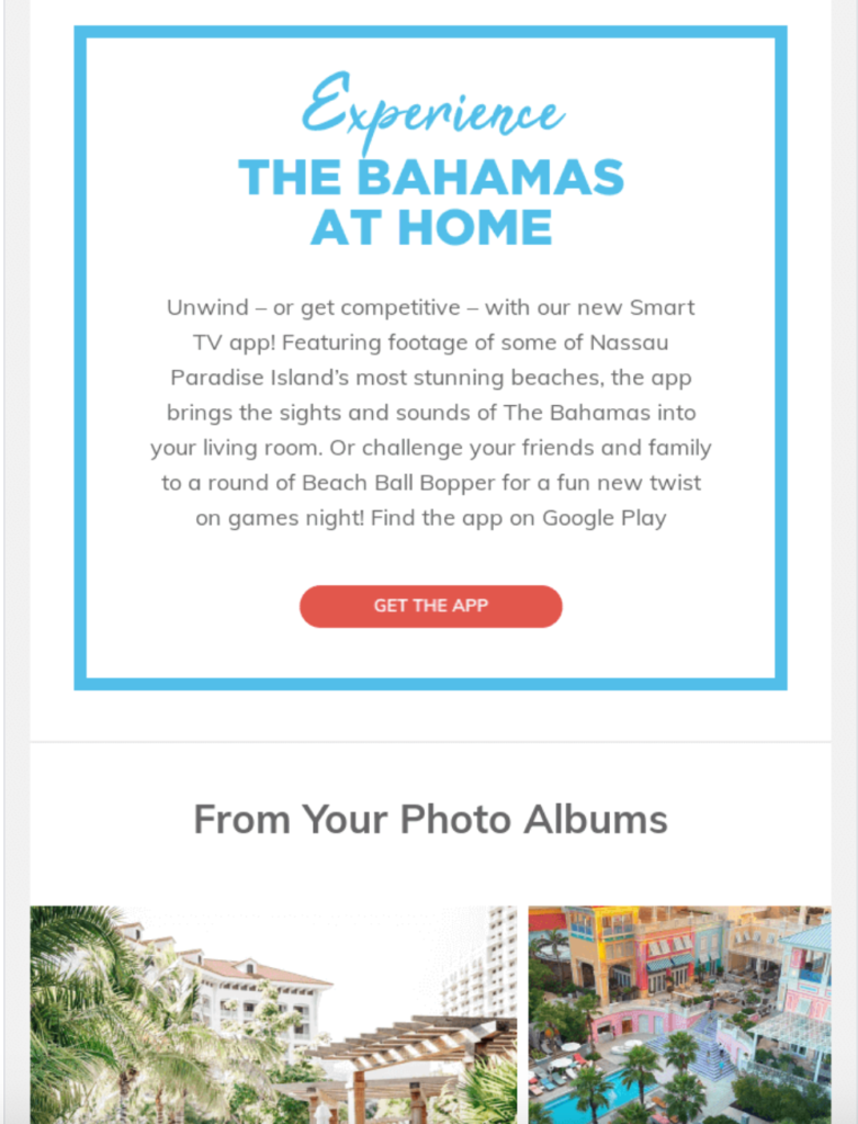
Beneath that, they point readers to the app they can download for sights and sounds of the Bahamas.
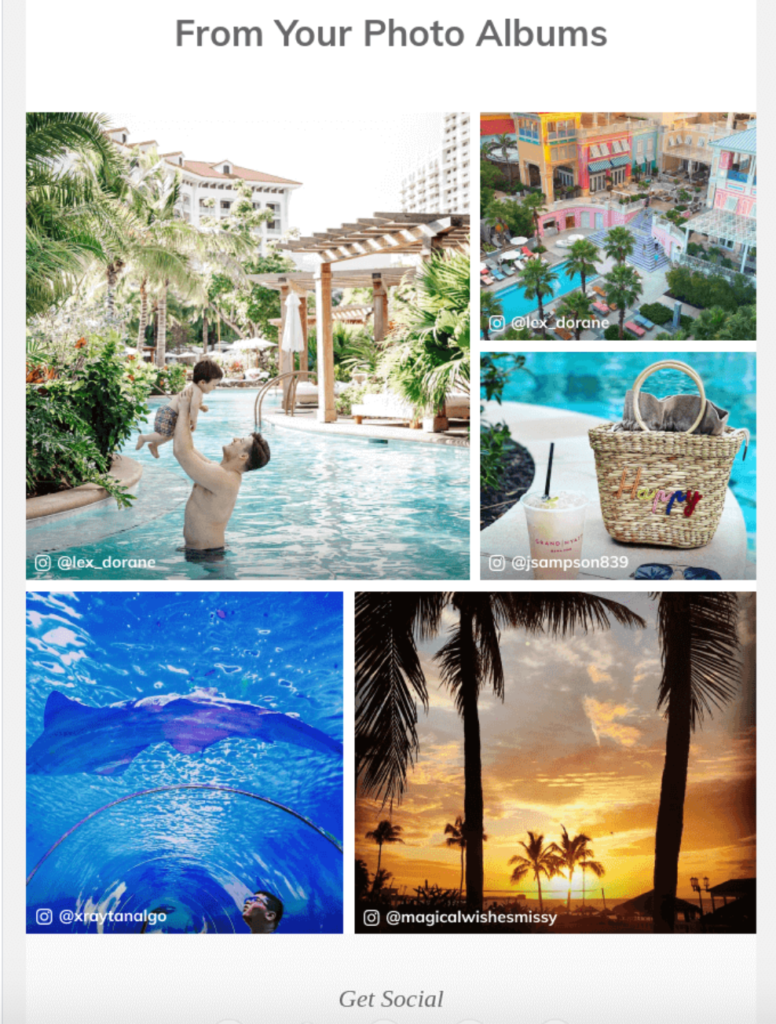
Finally, they wrap it up with a few more Instagram pics that create a stunning kaleidoscope of colors.
Although the Bahamas is now open for travel, it was closed off for most of the world at the time. This travel agency email is the perfect example of how to adapt and create enticing offers regardless of what the current situation is like.
It’s also a visual masterpiece and shows how you can feature user-generated content to tell a story and instantly grab the attention of readers.
U by Uniworld
Speaking of user-generated content, this example from U by Uniworld who offers “modern river cruising for the active traveler” pulls this tactic off flawlessly. At the same time, they offer an ultra attractive discount that many people will find irresistible.
Here’s the first thing readers see above-the-fold.
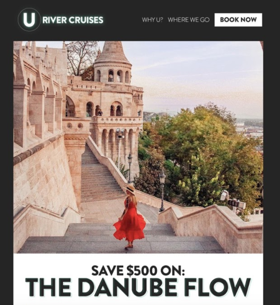
It’s a drool worthy picture from one of the stops on “The Danube Flow” cruise that snakes its way across the Danube River in the heart of Europe, passing through Germany, Austria, Slovakia, and Hungary.
And just below the main image, U by Uniworld explicitly states that readers can save a whopping $500 on The Danube Flow, placing a crystal clear CTA that says, “Learn More.”
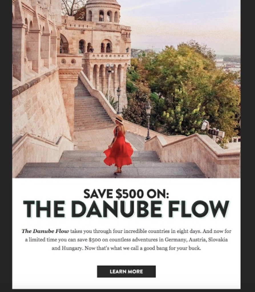
When readers click on that, they can get the full details and learn how they can save a good chunk of change on their next epic adventure through the Danube.
It’s a straightforward delivery that allows the agency to pique the interest of readers and quickly funnels them to the page they want readers to visit. And according to research, offering a discount like this can have a huge impact on conversions—more so than many other promotions.
In fact, “60% of consumers prefer discounts over other types of promotional offers like rebates, free gifts, gift cards, etc.,” writes Max Rice of e-commerce email marketing platform, Jilt.
As for user-generated content, U by Uniworld seamlessly works it in, featuring Instagram pictures and positive feedback from customers in a section called, “How Other Travelers Do U.”
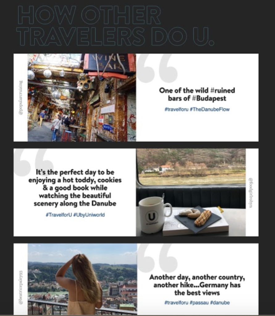
This really makes the experience come to life and gives potential customers a nice glimpse of what the Danube cruise is really like. So, by using eye-popping visuals, discounts, and user-generated content, U by Uniworld is able to get readers dialed in and seriously consider their offer.
I also like how succinct this email is, quickly diving into “the meat of the content,” while eliminating any superfluous information. And the black and white colors stay on brand with U by Uniworld’s website, while creating a nice contrast to pull readers in.
If you’re looking to offer a discount, this is a nice, simple template to borrow from.
KAYAK
Travel agency and search engine, KAYAK, has become insanely popular over the last few years. I know that I’ve personally used them on multiple occasions.
A big part of their success is due to the level of personalization they offer—both on their website and in their emails. And I can’t stress enough just how important personalization is.
Just check out these stats from the real-time email marketing platform, Liveclicker:
- 74 percent of marketers say targeted personalization increases customer engagement rates
- Personalized emails deliver 6x higher transactional rates
- Segmented, targeted, and personalized emails generate 58 percent of all revenue
Here’s what I’m talking about.
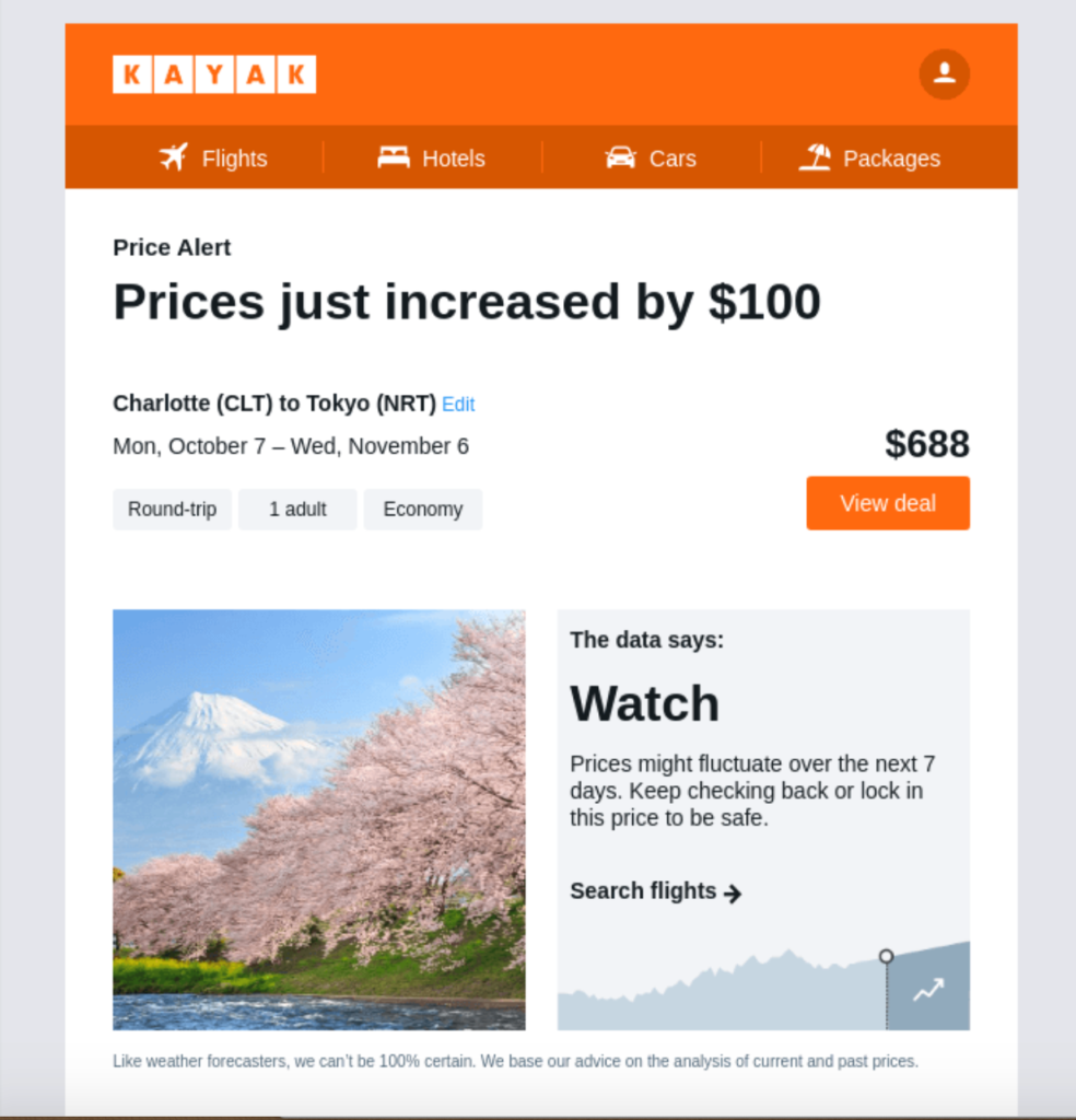
In this example, KAYAK sends an ultra-segmented email to a reader notifying them on an increase in flight prices based on a recent search they performed.
More specifically, they let the reader know that flights from Charlotte, NC to Tokyo just increased by $100. KAYAK also lets the reader know that prices may fluctuate over the next week and advise them to keep checking back or lock in a price to be safe.
Below that, KAYAK highlights some of the day’s top deals, along with convenient links to view all flights, as well as hotels and car rentals.
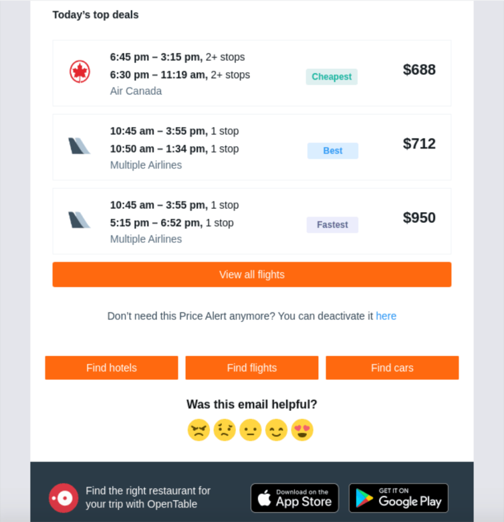
Notice how well done the CTAs where the colors match the signature KAYAK orange and how concise they are where readers know exactly what will happen by clicking.
By gathering user information from previous searches on their site, KAYAK is able to send out a super targeted email featuring information the reader should have a huge interest in.
Not only is it extremely practical, using personalization like this can help create a tighter connection between your travel agency and readers, which can be instrumental for building long-term loyalty.
HotelTonight
“HotelTonight is a travel agency and metasearch engine owned by Airbnb and accessible via the website and mobile app used to book last-minute lodging in the Americas, Europe, and Australia.”
This email specifically targets readers interested in luxe hotel deals and starts off with this jaw-dropping image…
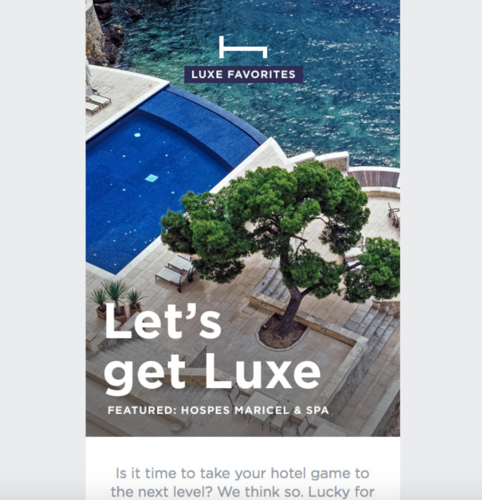
…and this sleek copywriting.
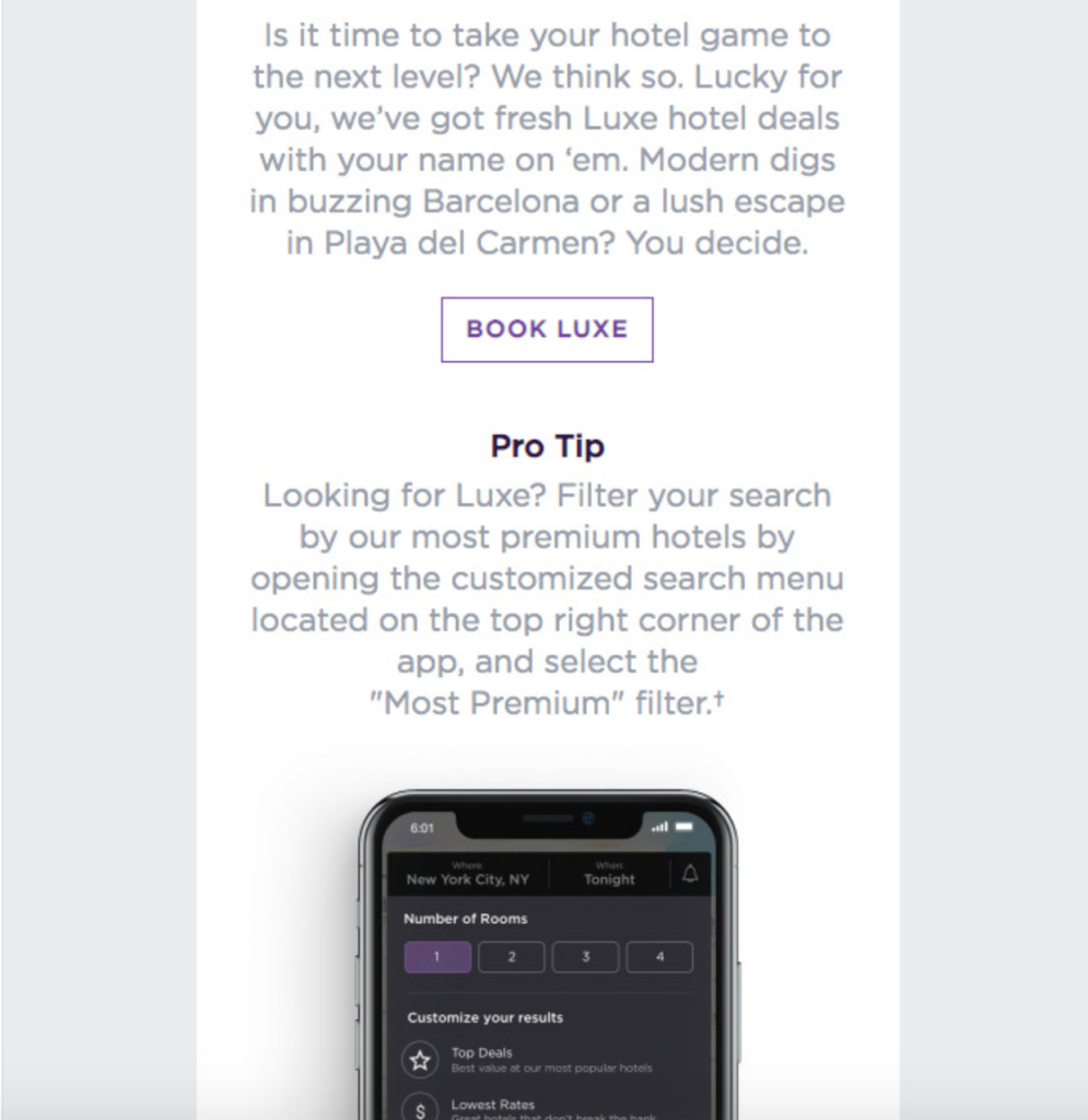
Very quickly HotelTonight gets readers up-to-speed on what the content of the email is about and features a simple CTA that says, “Book Luxe.”
Just below that, there’s a quick pro-tip that provides readers with actionable advice on how to streamline their search for luxe accommodations, including a screenshot from a smartphone.
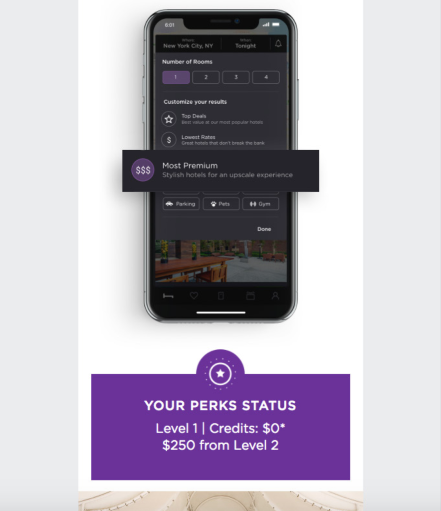
I’m personally a huge fan of hacks like these, so I think it’s a cool way to educate readers, while at the same time promoting a product.
For the rest of the email, Hotel Tonight showcases some of their premier hotels throughout the world and features deals on some of the most noteworthy.
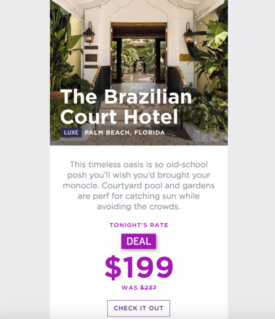
Here’s The Brazilian Court Hotel in Palm Beach, Florida with a current deal for $40 off.
And here’s the iconic Gramercy Park Hotel in New York with a deal for $66 off.
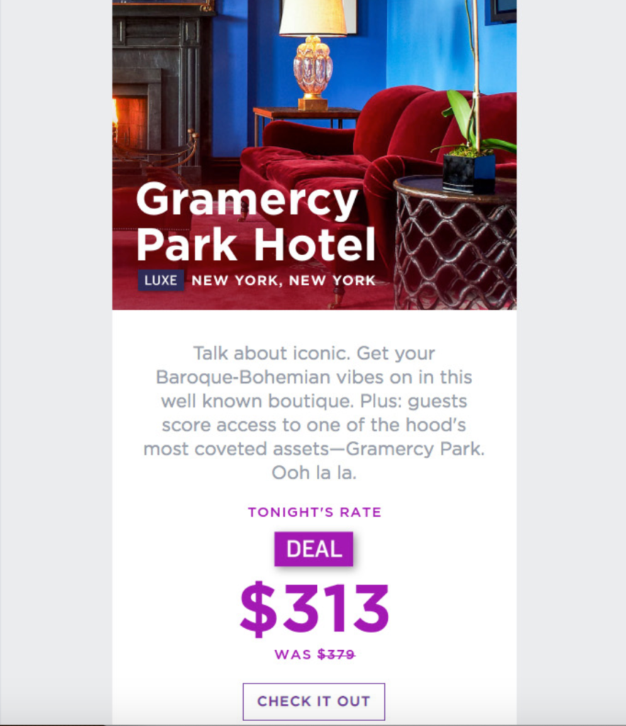
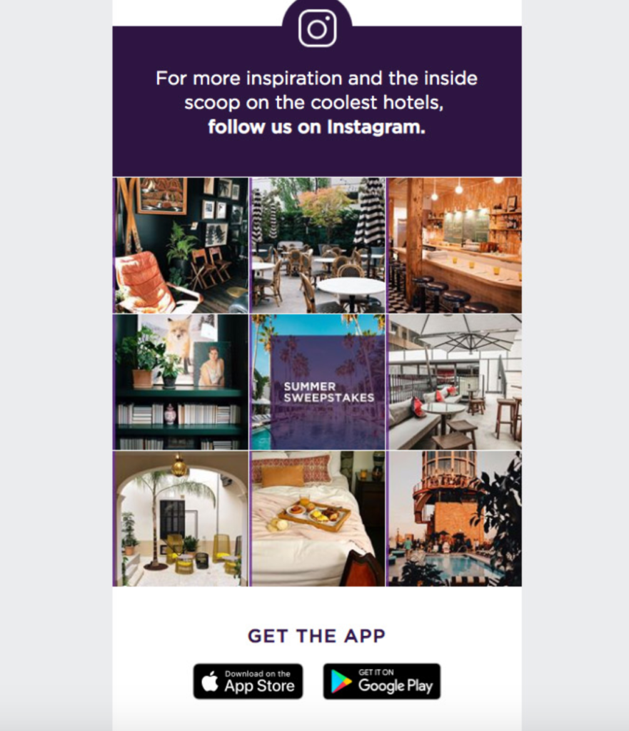
The images look amazing, and offering sweet deals like this with easy to follow links is the perfect way to get readers to take instant action. At the bottom of the email, HotelTonight features a few more pictures from their Instagram feed so readers can get further inspiration to see what other types of accommodations are available.
This travel agency email example shows how you can create content around a particular theme—in this case luxe hotels—and feature relevant deals that readers are interested in. It also illustrates how powerful using the right visuals can be for captivating readers and getting them to fully explore an offer.
Selina
Here’s a unique travel agency that “provides guests with beautiful places to stay, travel, and work abroad indefinitely.” In addition to offering hotel accommodations, they also offer handpicked adventures and co-working spaces. That’s why Selina has been such a hit for digital nomads and long-term travelers.
This is a classic welcome email where Selina reaches out to new subscribers to explain the basics of what they offer and point out potential areas of interest on the website.
It begins with this fantastic image of a tropical beach with “Welcome to Selina” in bold letters for the headline, along with a brief paragraph that summarizes what readers can find.
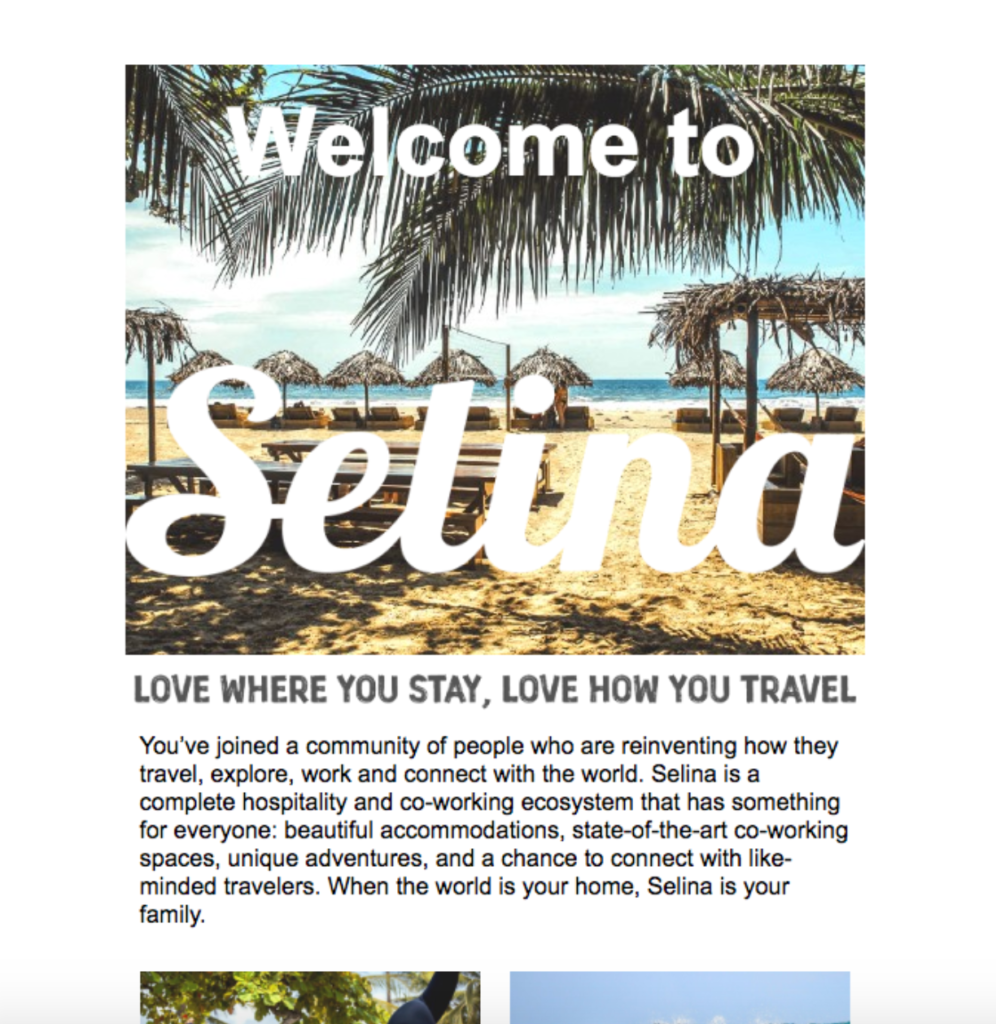
This is the perfect way to appeal to readers who just came on board and are trying to get their bearings. Then, Selina features two key sections of their site. There’s this one for “Explore” where readers can find an awesome adventure in premier destinations throughout the world.
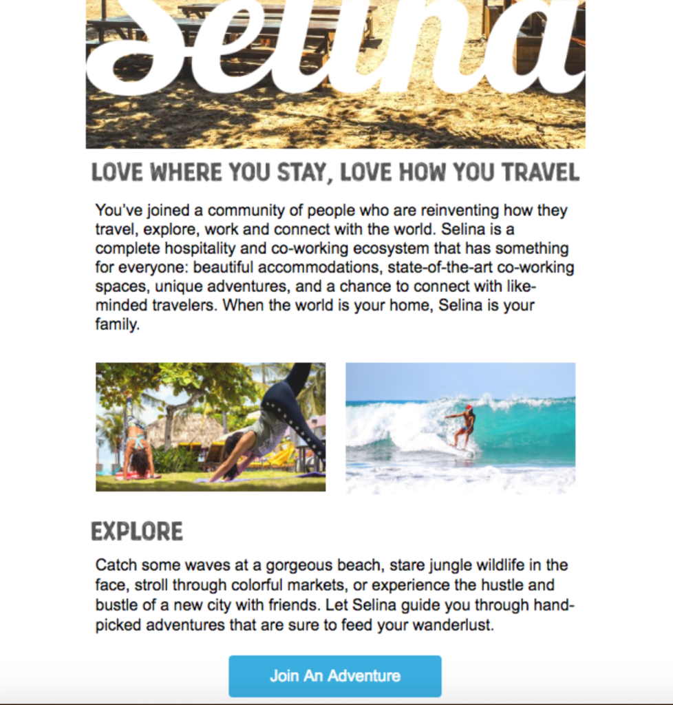
Notice the clearly worded, conspicuous CTA in blue. And there’s this one for “Co-Work” where readers can find co-working spaces during their travels.
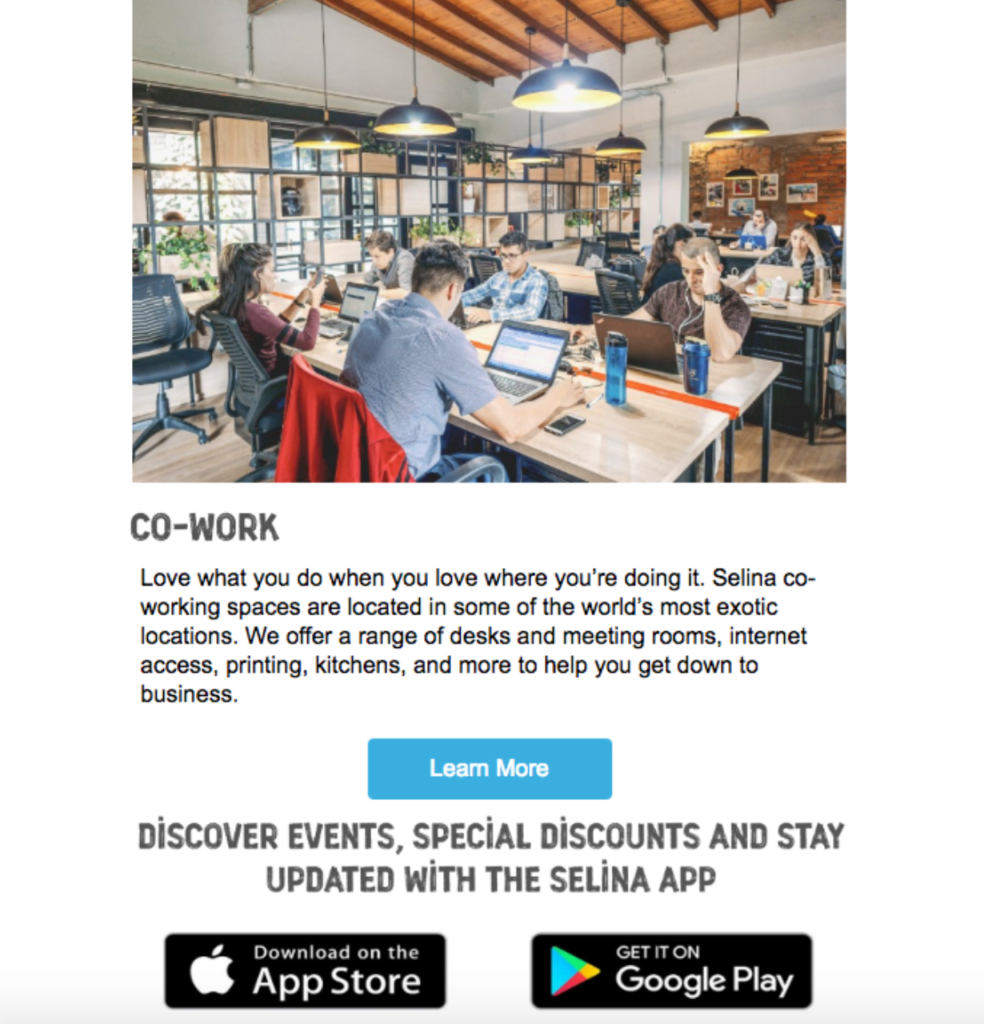
I don’t know about you, but being someone who’s personally prone to wanderlusting, this email makes me want to book my trip ASAP. So, if you’re looking for inspiration when crafting a welcome email, this is a great example to draw it from.
Natural Retreats
The last of the travel agency email examples is from Natural Retreats, a brand that offers “handpicked vacation homes with well-appointed amenities in the United States’ most desirable vacation destinations.” Like the other examples I’ve listed, this one is heavy on the visuals.
But Natural Retreats takes a unique approach by offering infographic style content that naturally encourages readers to scroll down. It specifically promotes accommodations in Taos, NM and does so by educating readers on some of the key attractions in the area.
The header starts off by saying, “Why We Love Taos, NM”…
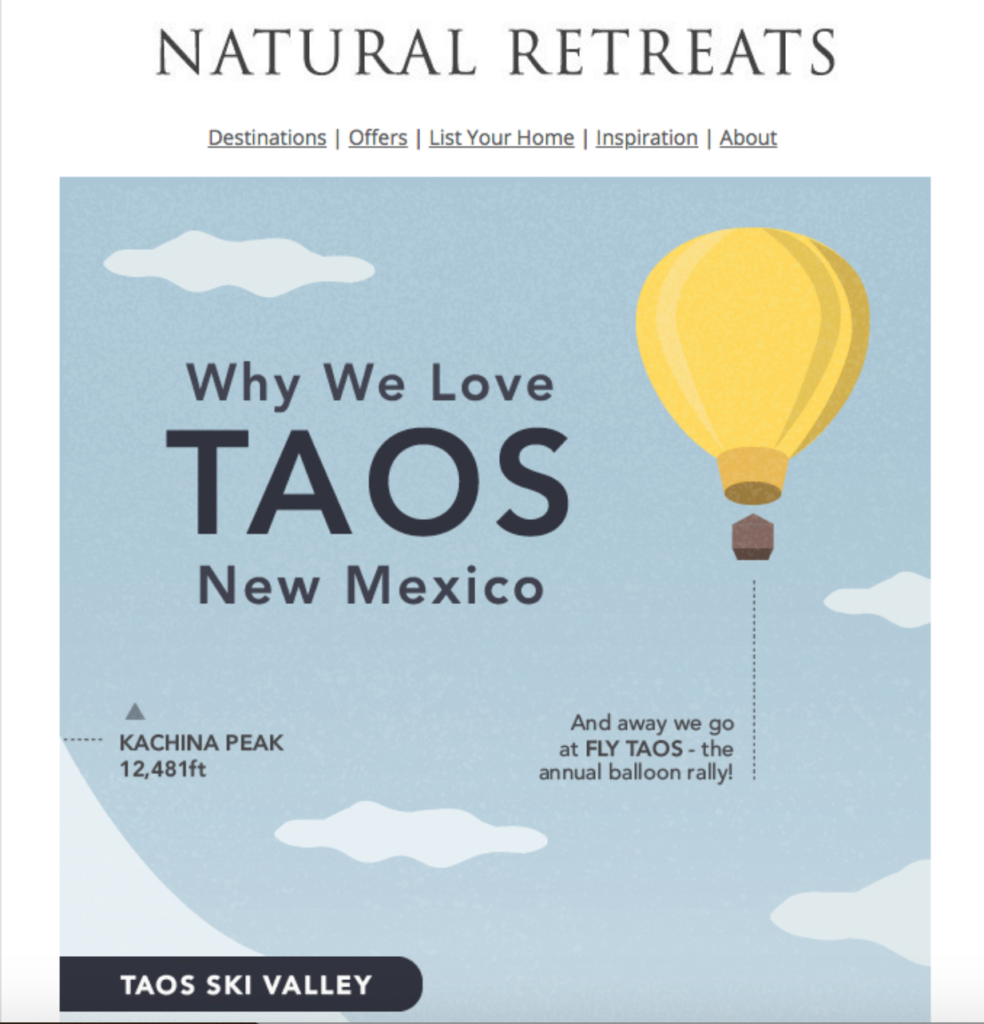
…and then mentions the Taos Ski Valley and Rio Grande Gorge.
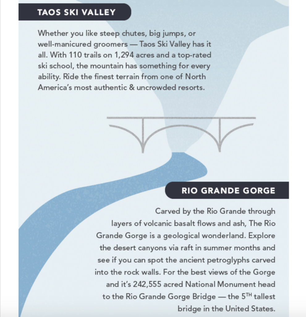
Then it mentions the Taos Wilderness…
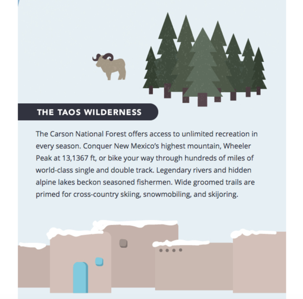
…and the Taos Pueblo.
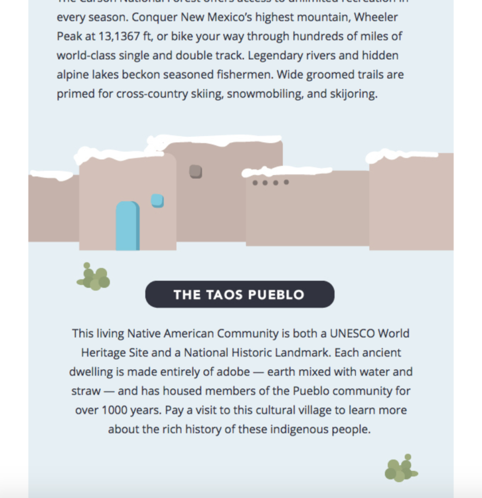
Each section features beautiful cartoon images and offers some interesting backstory so readers know why Taos is so special. From there, Natural Retreats offers the “5 for 4” promo code where customers can land a sweet deal on their next stay.
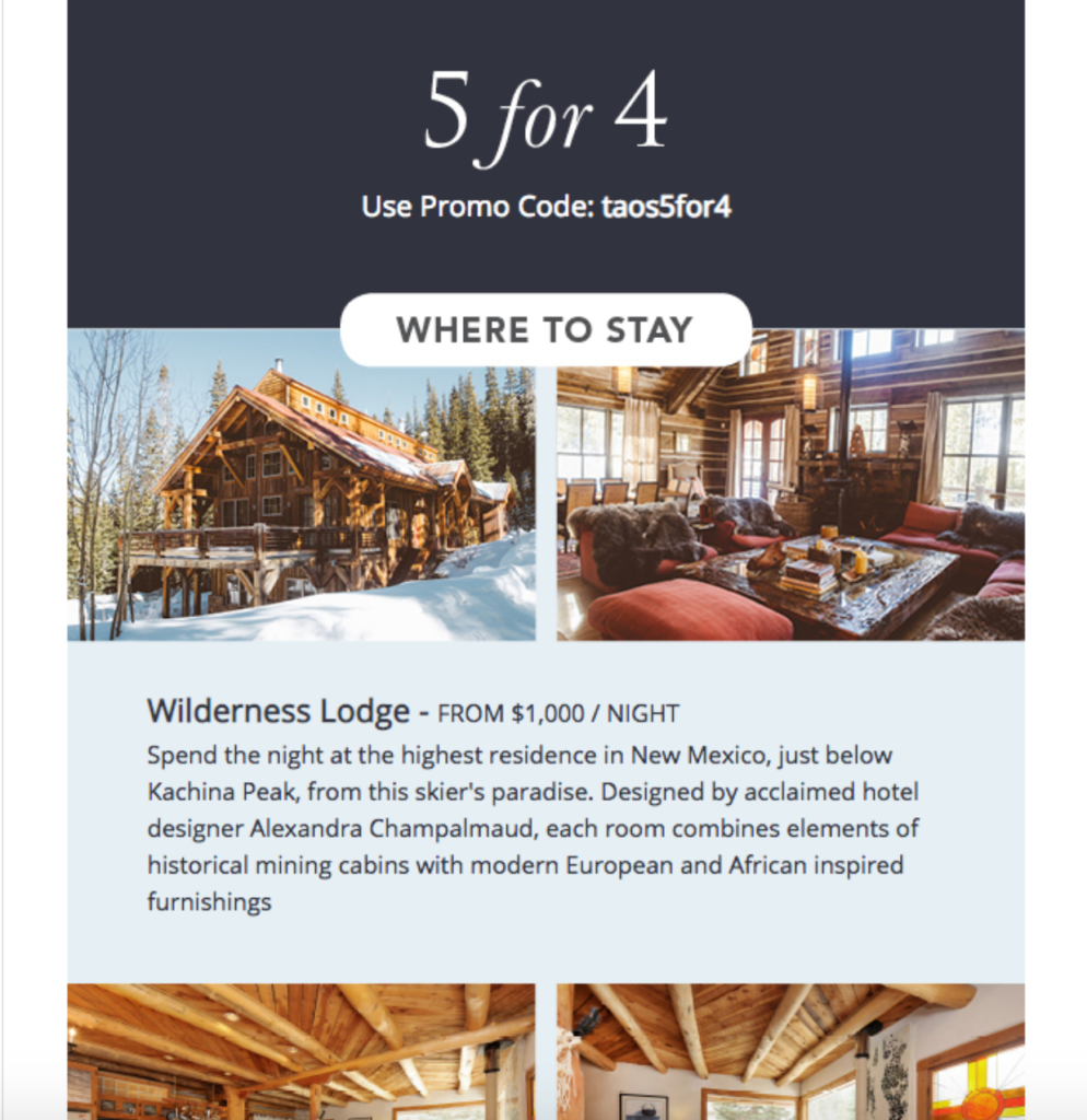
And for the final section, Natural Retreats highlights some specific spots to stay, featuring eye appealing images, along with property information.
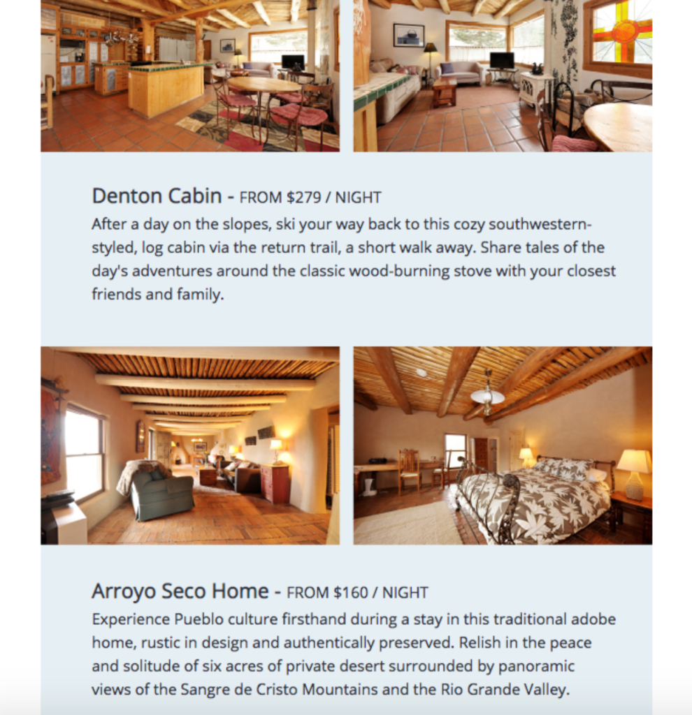
I love this email because it educates readers on the Taos area to help pique their interest and then seamlessly transitions into places to stay. The layout flows well, and using plenty of negative space between images and text keeps the content uncluttered so readers can navigate the information with ease.

Conclusion
Like many people, I’m super excited the travel industry is making a comeback after COVID. When it comes to igniting growth for travel agencies, email remains one of the top channels for outreach.
With a potentially massive ROI of as much as $38 in revenue for every $1 spent, it’s hard to go wrong. You just need to know how to appeal to readers by quickly grabbing their attention and directing them to relevant offers.
These travel agency email examples highlight some of the different approaches you can take and best practices to implement. By learning from them, you can inject some of their swagger into your own email campaign and rev up your ROI big time.

