According to a Forrester report, e-commerce businesses lose a staggering $18 billion annually due to cart abandonment.
The reason is simple: most e-commerce stores don’t have a solid a/b split testing strategy.
If you’re also struggling to come up with a/b split testing ideas you can use on your store, I got you covered.
Start from these proven e-commerce a/b testing ideas to increase your conversions and find out what works best for your website.
Let’s dive right in.
1. Remove Your Auto-Rotating Sliders
Here’s my first hypothesis: A single static image with one value proposition performs better than an auto-rotating slider, also known as a carousel.
Using carousels on your e-commerce site has several disadvantages:
- They distract the human eye from the critical content due to their movements;
- Auto-rotating sliders display too many messages, which can drain your visitor’s cognitive resources, reducing their ability to focus; and
- Carousels look like banners, and shoppers can mistake them for ads. Generally, people consciously or unconsciously ignore banner-like information.
The solution?
Use a simple, static hero image with a solid value like Apple did in the example below.
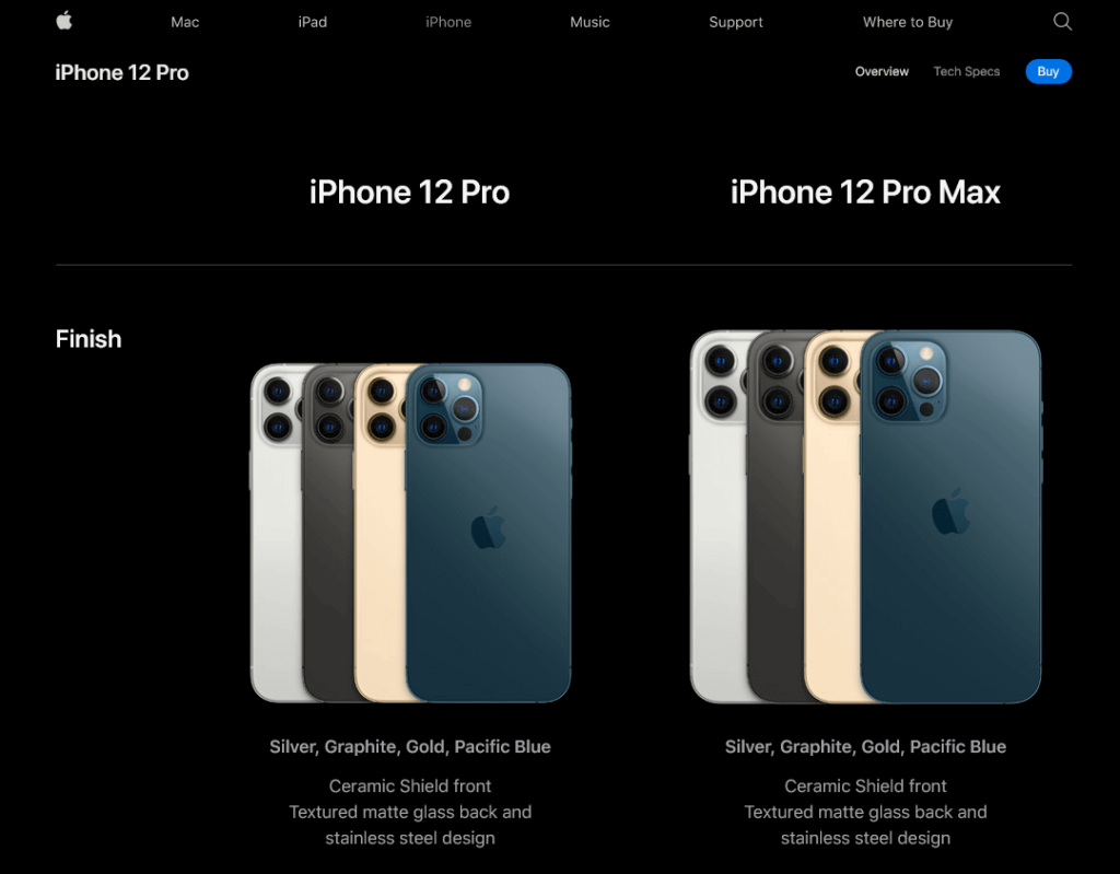
You can, then, a/b test several messages and images to see what works best for your visitors.
2. Show Your Value Proposition on Your Homepage
A value proposition is a promise of what you can deliver to your customers.
Unless you’re a big e-commerce giant like Amazon, you’ll need to explain to your visitors what your value proposition is.
The best way to do this is to make sure that your proposition is the first thing visitors see on your homepage and landing pages. That’s my second hypothesis.
Your value proposition should be relevant, unique, and compelling like this one by Etsy.

Try adding your value proposition above the fold on your main pages and a/b test it against, for example, current sale campaigns or featured products.
3. Add Your Contact Information
While it doesn’t seem like much, adding your contact details on the top of your website can boost conversions.
After all, online shopping is all about trust.
Shoppers want to be sure that they can easily reach you. It’s a simple hypothesis you can test and it has the potential of bringing in immense value.
Zappos is a perfect example of an e-commerce brand that leverages contact information to win prospect’s trust.
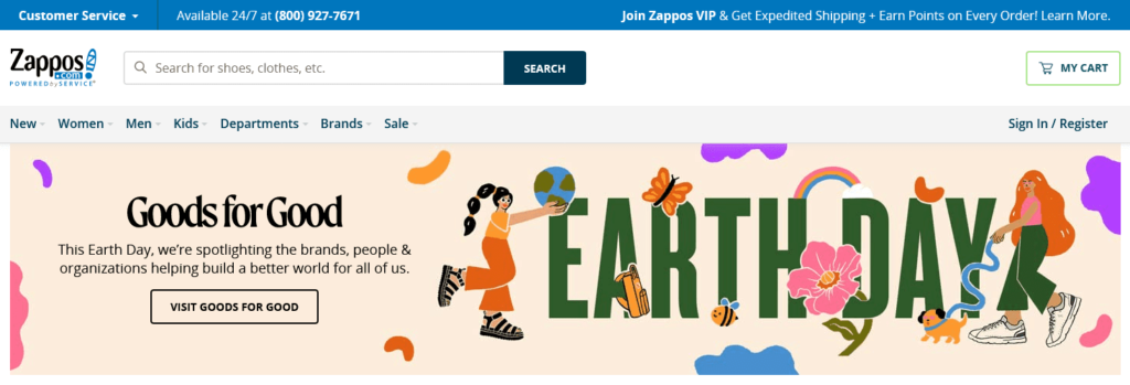
4. Offer Free Shipping
I think you’ll agree with my next assumption: Charging for shipping harms your conversions.
If you’re not offering free shipping, find a way to do so—without hurting your profit margins. You can experiment with a few a/b testing ideas such as:
- Increasing the minimum order value for free shipping;
- Increasing your product prices to cater to free shipping and see how that affects your profits; and
- Offering free shipping on select products where it’s profitable.
Look at how TB12 Sports offers free shipping for orders above $75 in the example below.
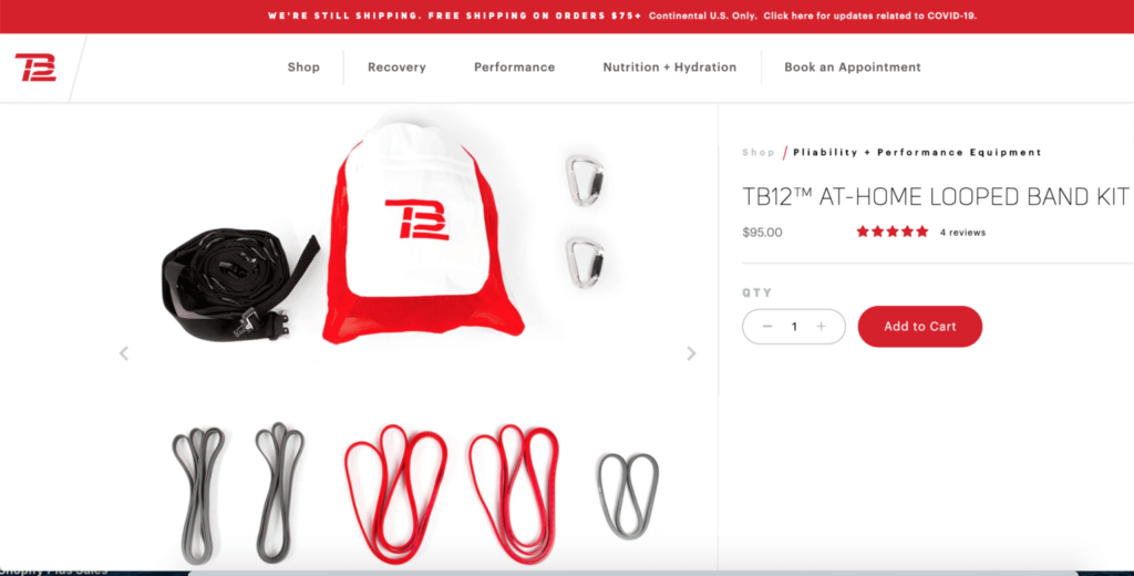
Source: ShipBob
5. Create a Sale Section
According to an Episerver report, 50 percent of online shoppers prefer buying discounted products. The same study shows that 18 percent of your visitors are likely looking for a sales section on your site before anything else.
While you want to maximize profit with your e-commerce business, it would be best to experiment with sale campaigns to attract more conversions.
Check out how Best Buy has perfected the art of creating a sale section on its website.
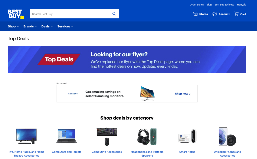
Start with a/b testing whether a sale section will increase your conversions or distract your visitors from higher-priced products.
6. Improve Your Product Descriptions
The main purpose of your product descriptions is to give your visitors enough information so that they can choose the correct item.
(So it’s time to update those technical manufacturer descriptions if you’re a reseller.)
Create clear product descriptions written in a tone that speaks to your target customers. When you’re describing an item, be sure to give customers enough reasons for how your product can help them.
Take a look at this brilliant product description by ban.do to get your creative juices flowing:
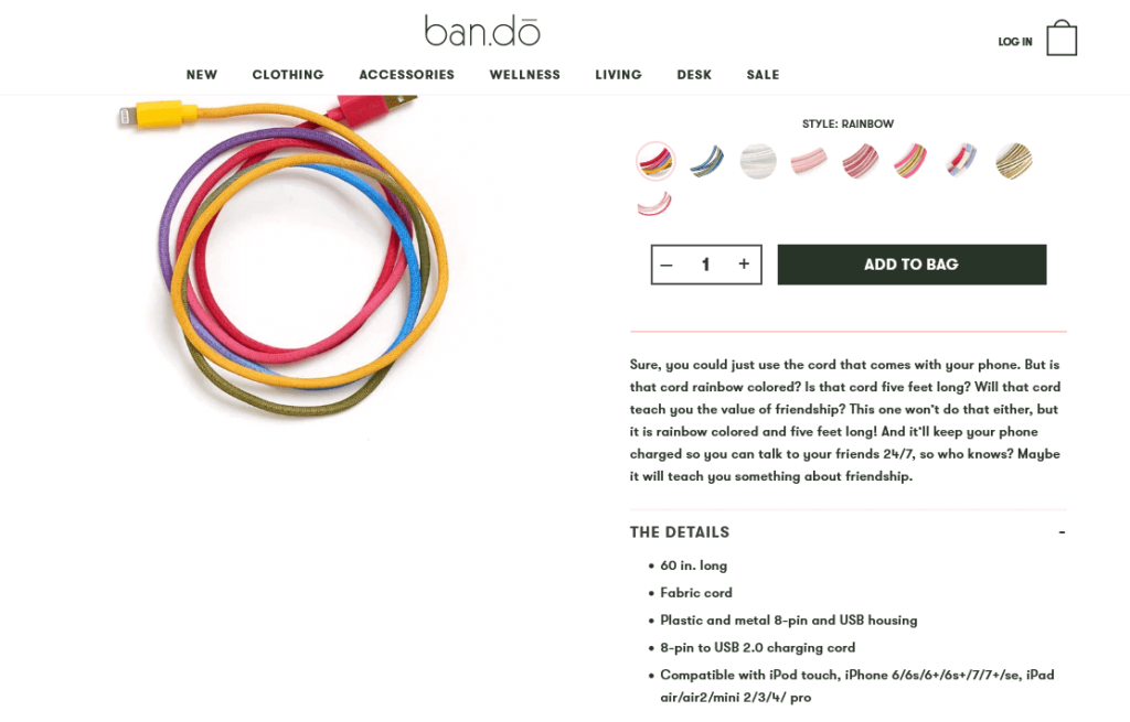
You can a/b test humorous, inventive product descriptions like the above against conventional, benefit-driven ones to see which group resonates better with your audience.
7. Use Product Videos
A picture paints a thousand words, but there’s a limit to how much you can show with an image.
On the flip side, videos reduce the uncertainty shoppers might experience about your products. Plus, videos help potential customers see your product in action before placing an order.
Once again, Zappos is an excellent example of an e-commerce store using product videos.
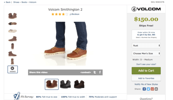
You can incorporate videos into your next a/b split test—be it in the form of product or promo videos, or even video popups.
8. Create (and A/B Test) Email Popups
Although split testing your website design, conversion elements, and email subject lines are great places to start to improve your online store, you shouldn’t stop there.
Your website popups are just as important, if not more, as your other marketing tools, and they should regularly be tested.
We recently spoke with Sadie Leishman from Malouf, who mentioned how critical AB testing was to her overall marketing strategy.
.png?width=1080&height=1080&name=Sadie%20Leishman%2c%20Malouf%20AB%20Testing%20(2).png)
Considering that e-commerce email popups convert at around five percent, there’s a lot of warm leads you can’t afford to miss out on there.
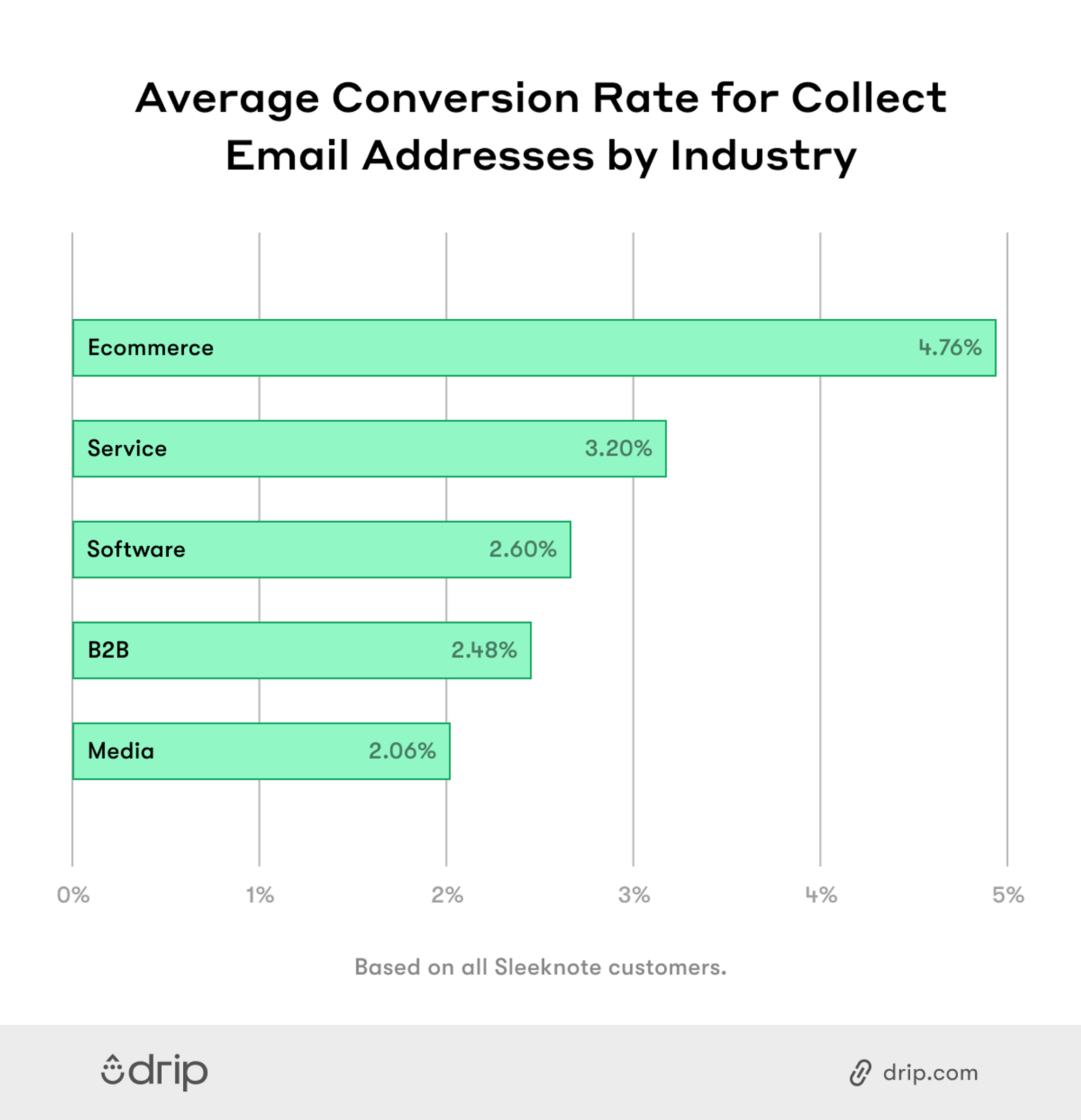
Here are a few elements you can a/b test in your popups:
- Headlines
- Call to action buttons
- Design elements and colors
- Emojis
- Popup position
- Triggers
Run your split tests for a while and use the insights you gathered in your next popup campaigns.
9. Add More Payment Options
Multiple payment options are effective for a couple of reasons.
Due to credit card scandals and identity theft, some shoppers may be reluctant about using their credit cards for online payments. Offering alternative payment solutions can help ease your customers’ minds.
What’s more, 56 percent of online customers expect several payment options at the checkout page.
Try adding other popular payment options like PayPal, coupon code, and Amazon Payments in addition to credit cards in your store. This way, you can win shoppers you’d otherwise lose.
Check out how Moosejaw, an online store that sells clothing and outdoor gear, does it:

10. Make Your Reviews More Visible
Nearly 60 percent of online shoppers read reviews before buying a product or service. A further 40 percent of consumers say they wouldn’t buy without consulting online reviews about a product first.
The point is, you should gather and showcase customer testimonials on your website. Then, a/b test the placement, frequency, or type of testimonials on your website.
Here’s how Casper features its reviews above the fold on its homepage:
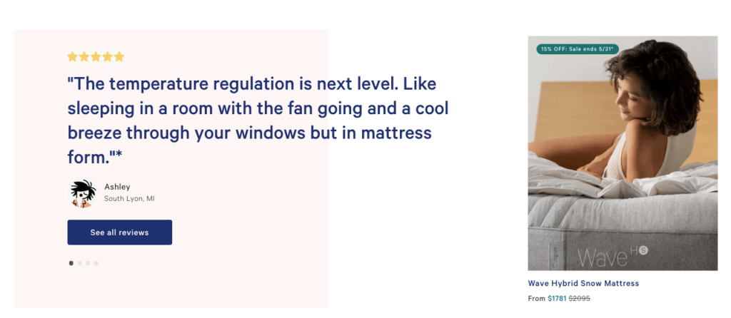
Remember, a handful of negative reviews can help build trust and boost conversions too, so don’t delete them.
Conclusion
The real power of a/b testing happens when you discover what works for your e-commerce store.
Always be on the lookout for actionable split testing insights. With the a/b testing ideas suggested in this post, you can quickly start your first test and create a winning website that brings in more conversions.


