Mobile is not the future. Mobile is now. Accounting for over $1.36 trillion of digital sales last year, mobile e-commerce is too big to ignore.
And it will get bigger.
Mobile users are expected to make up almost 73% of total e-commerce sales in 2021.
There’s a huge potential revenue for e-commerce stores to claim on mobile. Yet, mobile shoppers don’t convert at the same rate as desktop shoppers.
According to a recent study, the average e-commerce conversion rate on desktop is 2.06%, while mobile e-commerce visitors convert at 0.55%.
Luckily, there’s always one thing you can do to improve your mobile conversion rate and increase your sales revenue:
Optimize your online store for a user-friendly mobile experience.
In this article, you’ll learn 7 lesser-known ways of increasing mobile conversion rates with examples from top e-commerce brands.

How to Improve Your Mobile Conversion Rate:
1. Make Your Buy Buttons for Fat Thumbs
Before we begin, let’s take a brief moment to look at your online store through a mobile visitor’s eyes.
A visitor lands on one of your product pages, gets interested in an item, and scrolls down to learn more.
They read through a well-written product description and amazing customer reviews.
They’re almost convinced to buy from you now…
But when they finally make a purchasing decision, they can’t see the buy button. Most likely because it’s all the way up on the page (or somewhere down below.)

Who wants to miss such an opportunity when they’re this close to making a sales?
(Not you, I suppose.)
Mobile shopping is unique because the user journey is based on scrolling with limited screen space.
If your buy button isn’t there when the visitor wants to buy something, you’ll miss out on revenue.
And being pushy with annoying, multiple buttons is not the perfect solution, either. You need to help your visitors in a less intrusive way, instead.
Here’s how Beardbrand solves this problem with sticky add to cart buttons:
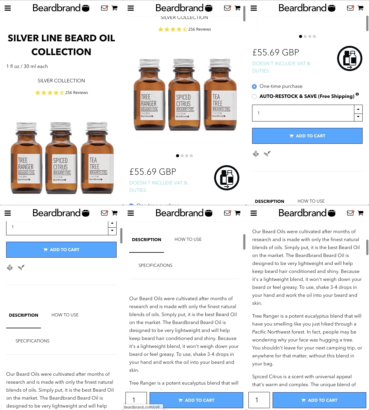
Once you start scrolling down to learn more about the product, the add to cart button shows up on the bottom of the page and stays there.
Here’s how Firebox keeps their buttons visible with an even smoother and non-intrusive animation:
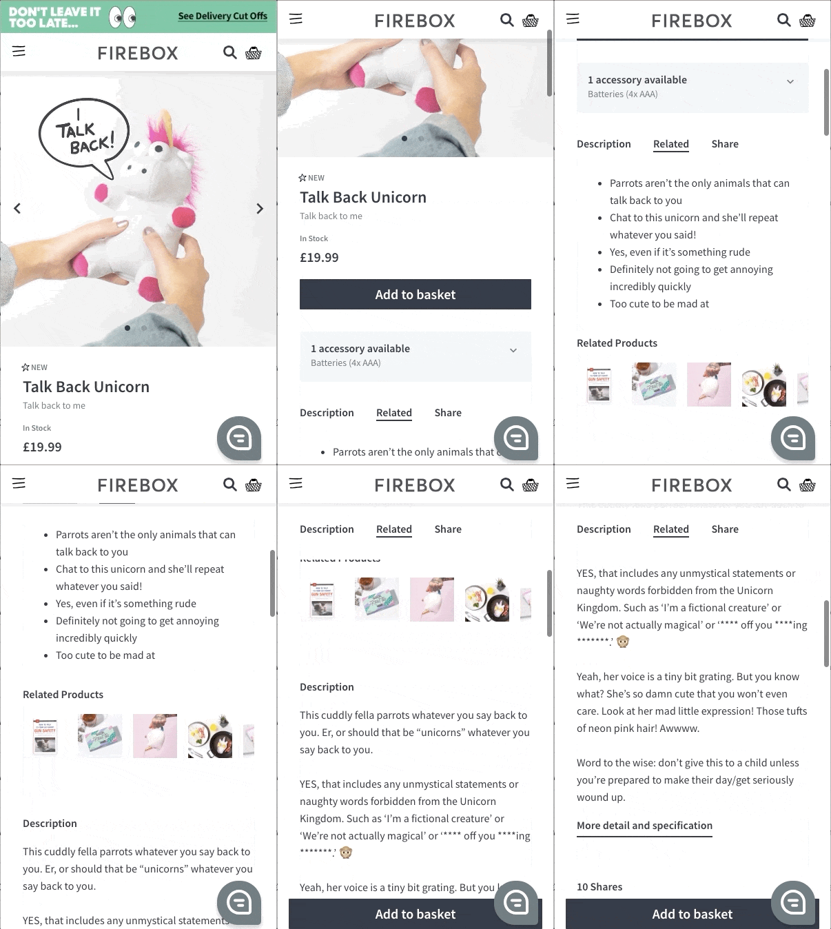
Sticky buttons are easy to implement. Even if you’re not a coding expert, there are great third-party solutions you can try, such as Uplinkly for Shopify or Storefront for WooCommerce.
2. Collect Emails (Without Breaking UX)
Mobile or not, sometimes it takes more than one session to convert visitors into customers.
Instead of patiently waiting for your visitors to return, you can try converting them into email subscribers first. And you can easily do that on mobile, too.
Collecting leads on mobile is a tricky business, though.
There’s already limited space for the visitor to explore on mobile devices and you can’t afford to take up all that free space with your lead forms. Plus, Google started penalizing mobile sites with intrusive interstitials (a.k.a. popups) as of 2017. So, you have to be even more careful and less intrusive when collecting emails on your mobile site.
Glossier does a good job by placing their lead form on top of every page in a visible, yet subtle way:
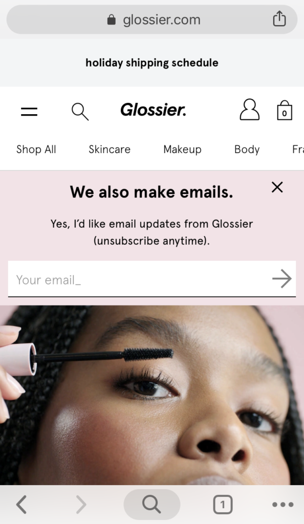
The form works well because it looks like a seamless part of the page and it’s consistent with the site’s overall design. With an interesting headline and compelling copy, it’s easy to opt in.
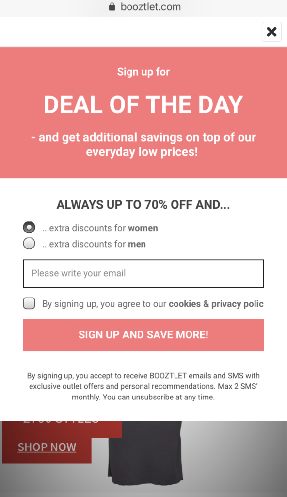
Here’s a great example by one of our customers, Boozt:
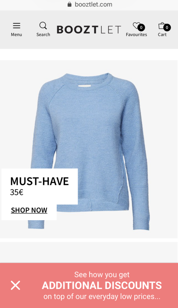
Notice how the copy focuses on (1) the benefit of signing up and (2) evokes curiosity. The campaign is easy to close by tapping the (x) button and the visitor only sees the signup form below, if they’re interested in the deal:
Bonus Tip: Segment subscribers by device. Then, send mobile-relevant campaigns to engage mobile shoppers and help them complete their order.
3. Make On-Page Product Recommendations
Offering product recommendations on your e-commerce site is a great way to help your visitors have a more enjoyable shopping experience…
But it’s also a great way to increase your customers’ average order value.
On desktop, you usually have enough space to promote your products. Or, suggest items based on your visitors’ browsing history through cookies (if you’re collecting them.)
But on mobile, you need to be smart about how you use the space available. (Though this doesn’t mean that you can’t personalize your visitors’ shopping experience.)
One way to make on-page product recommendations on mobile is to display suggested items without making the visitor jump to a new page.
Here’s an example by Zalando:
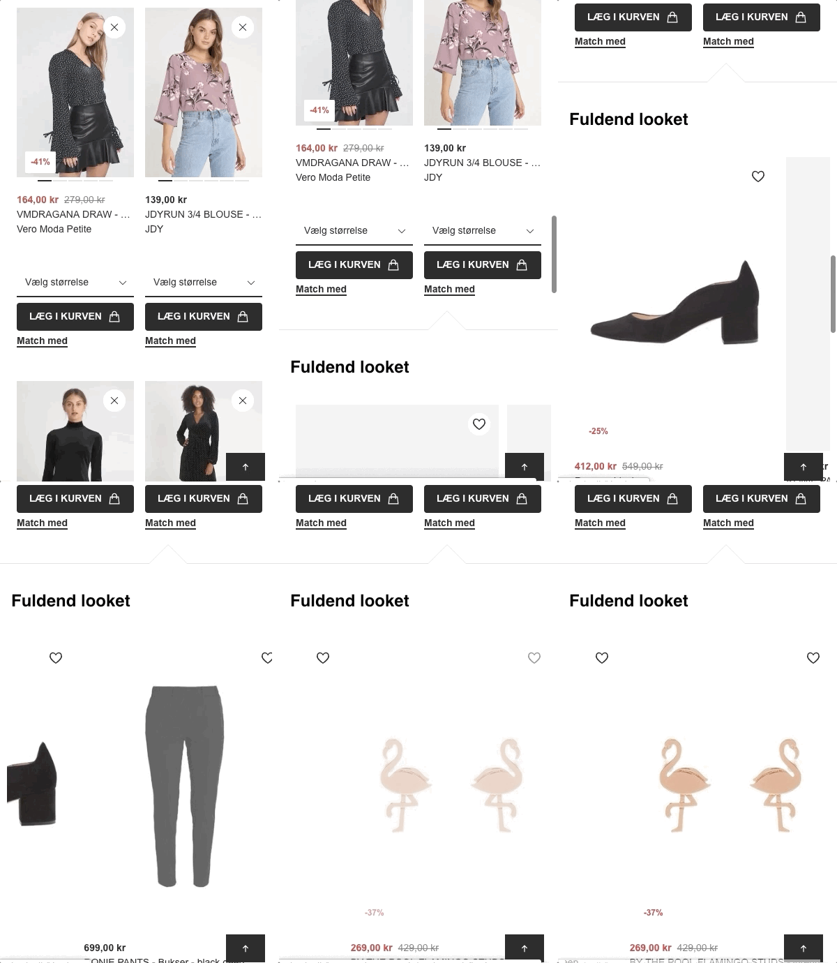
When you visit your Wishlist page on Zalando, there’s a “Match with” button under every item. When clicked, the page slides down and you can view recommended items that complement “the full look.”
This is a brilliant tactic because it allows the visitor to discover more options and potentially spend more—without leaving the product page they’re originally interested in.
It acts both as a gentle cross-selling tool and a personalized style guide that improves the visitors’ shopping experience.
4. Create a UX that Guides Your Visitors on Mobile
It’s easy to assume online stores are less personal than brick-and-mortar shops because it’s impossible to follow your visitors around online and help them find what they’re looking for.
But what if I told you it’s possible? And even easier.
Better online guidance means more sales, fewer returns, and happier customers.
And the best part is, it works perfectly on mobile, too.
Let’s take the example of size guides.
Many online stores offer quick size guides (usually in the form of an image) that force the customer to leave the product page.
But why do you have to steer the visitor away from the product they’re interested in?
Keep them on the page and provide as much information as possible, instead.
Here’s how ASOS chooses an interactive way of guiding their visitors:

ASOS incorporates their existing size guide on mobile so seamlessly that visitors don’t have to leave the page to find their perfect fit.
Simply by following a few steps, you can find your right size before placing an order. And when you visit another product page, it automatically adjusts your information to the new item.
Less likelihood of returning the product. Better chance of completing the purchase. Win. Win.
Another way you can guide your visitors on mobile is by offering them on-site support like Bombas does:
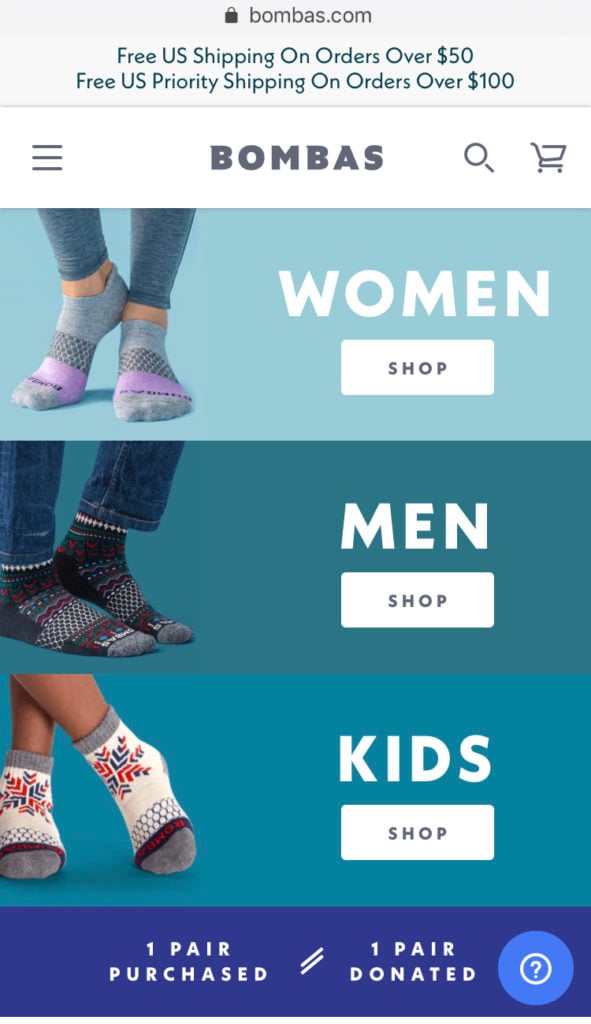
Through the little question button at the bottom of the page, the company lists Frequently Asked Questions and invites you to contact them, if you need further assistance.
Offering on-page support is especially useful if you’re selling complicated or higher end products.
5. Make Sure Your Product Images Are Mobile-Friendly
A good mobile experience is all about images.
Mobile sites, apps, social networks, and games—they all depend heavily on visuals.
And online stores are no exception.
Visuals are much easier to perceive than plain text.
And if you’re selling online, you need to know the importance of optimizing product images for the best shopping experience. In fact, 67% of consumers say product images are very important in buying a product.
How you display your product images can be the key to improving your mobile conversion rate.
Many e-commerce sites prefer using sliders on mobile to make product images easy to browse. But why shouldn’t you use the full potential of swiping on mobile?
Here’s an example by Away to explain what I mean:
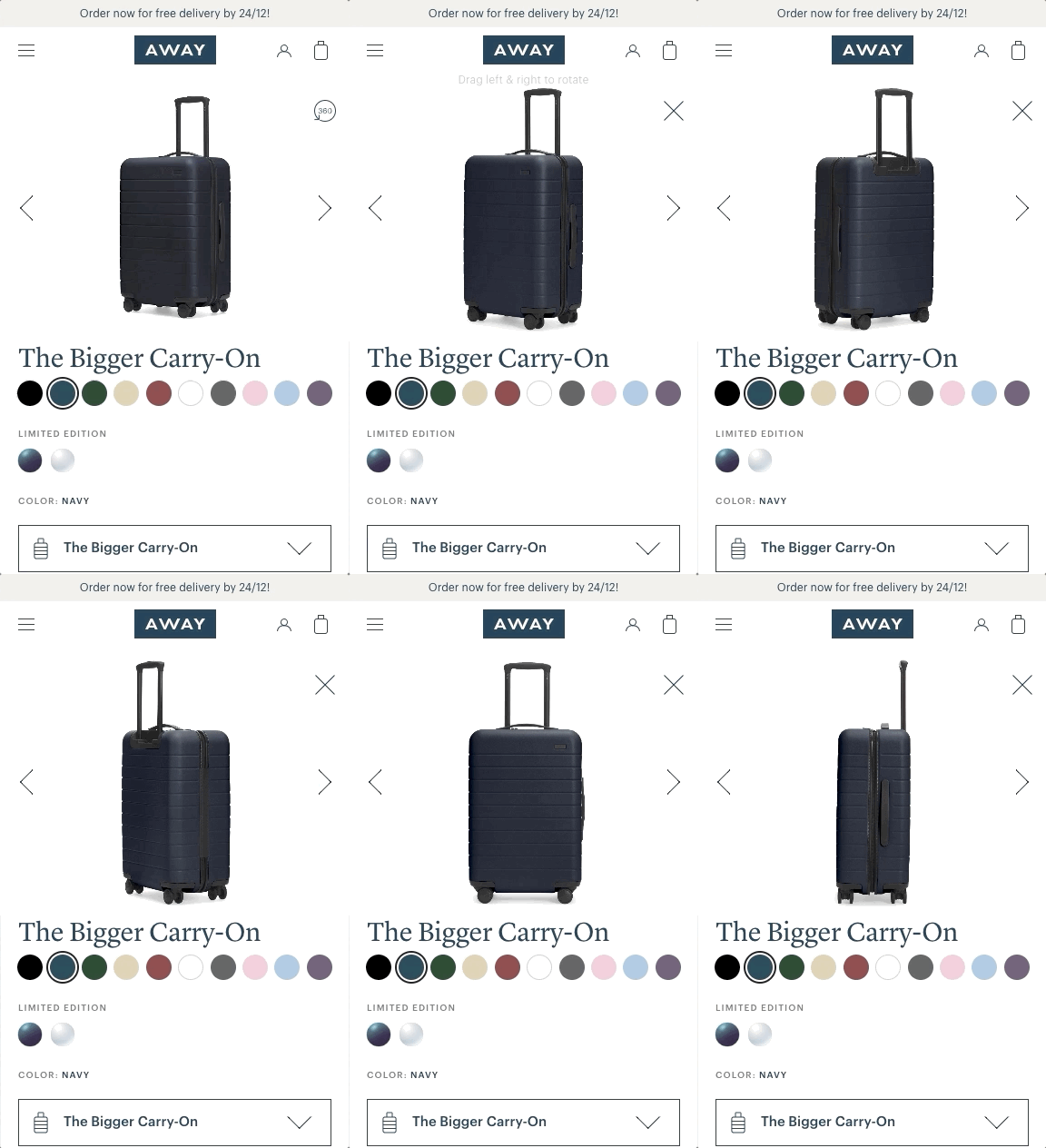
Using 360-degree product images, Away finds a mobile-friendly way of showcasing their products.
This way, visitors get to see the product from different angles. And that means easier purchasing decisions and higher conversion rates.
Third-party solutions such as Magic 360 can help you display your products with a 360-degree view on your online store—without writing code or spending hours.
6. Use Psychological Triggers and FOMO
If you’re a regular reader of our blog, you’ve probably seen us talking about psychological triggers A LOT.
Whether it’s your pricing page or email subject lines, minor improvements that trigger certain feelings can help boost your sales.
Two of my all-time favorite trigger strategies are scarcity and urgency.
All you need to do is to trigger the visitor’s fear of losing their freedom of choice.
In other words, focus on the availability of the item, which is either bound to a number or time.
Even though mobile screens have limited space available to convey your messages, there are smart ways of using psychological triggers on mobile.
By adding simple tags to your products, you can focus on the visitor’s fear of missing out (FOMO) and speed up the purchasing decision.
Here’s an example by Topshop:
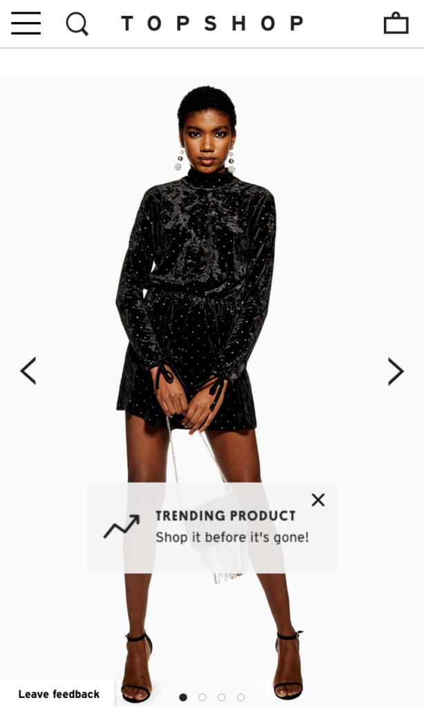
By adding a small “trending” label to the product, the company focuses on the scarcity of the available items left. Using an urgency-based call-to-action, they trigger the fear of missing out on a highly popular item. (Note the subtle layer of social proof added by the word trending.)
A similar example comes from Zalando:
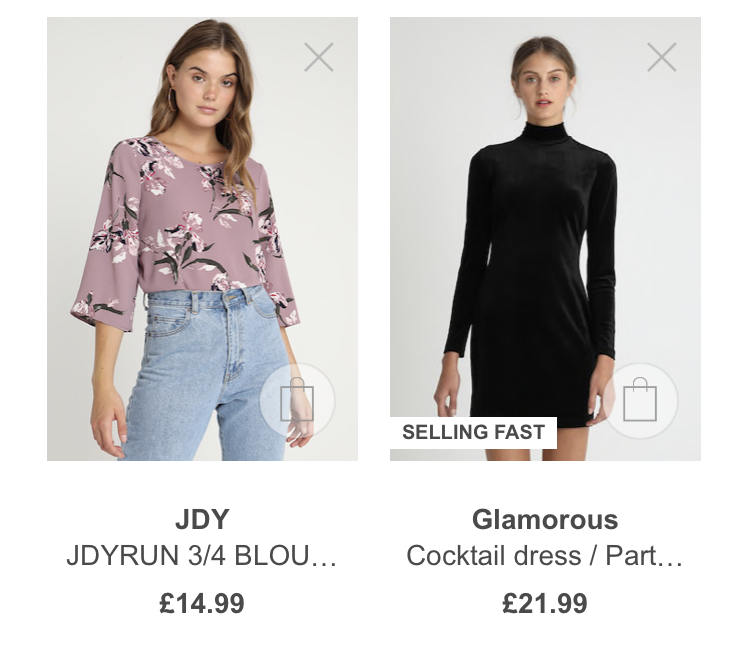
To be honest, when I saw this “Selling Fast” tag on one of my wishlist items, I panicked a little bit…
And I know that’s what they aimed for.
Later, I noticed another label they use:
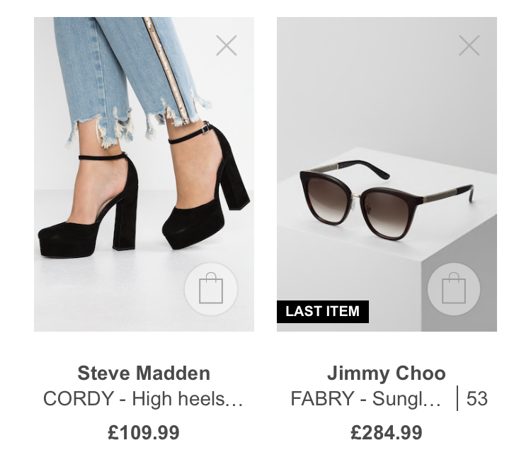
Displaying the count of available items can be a good strategy. But the charm of the “Last Item” is hard to ignore.
7. Create Mobile-Specific Campaigns
As I mentioned earlier, mobile visitors have great potential to convert into customers.
In fact, 61% of retail site visits happened on smartphones in the third quarter of 2018. Yet, mobile visits generated only 45% of the orders in the same period.
Apparently, mobile visitors are still missing something.
How about an incentive helping them complete the purchase? Maybe a discount code?
Here’s an email I recently got from Chubbies:

They created a special discount code that works on their mobile app and they promoted it with email marketing.
Also, check this smart email subject line by Birchbox, announcing their mobile-only sale:

You don’t need to develop a mobile app to implement similar campaigns.
Simply create a campaign that’s only displayed on your mobile site, use a special discount code and enjoy higher mobile conversion rates.

Conclusion
Mobile e-commerce keeps getting bigger. And you can’t afford to stay out of the game. Now is a great time to claim your mobile revenue.
With these small adjustments, you can start converting more mobile visitors into customers and increase your sales.


