Price is the second most important factor influencing online purchase decisions, behind only customer ratings and reviews, according to research from PowerReviews.
So it’s not surprising that discounts have always been one of the most powerful tools brands can employ to drive sales.
There’s lots of evidence to demonstrate how discounts positively impact consumer behavior.
Exhibit A: Dr. Paul J Zak, professor of Neuroeconomics at Claremont Graduate University, discovered that people who received a $10 coupon while shopping online were 11 percent happier than those who didn’t receive a coupon.
What’s more, coupon recipients saw a 32 percent drop in respiration rates, a five percent fall in heart rates, and 20 times lower sweat levels—indicating they felt more relaxed and less stressed.
Exhibit B: Research from RetailMeNot shows that discounts have a profound influence on everything from customer acquisition to brand loyalty. Among lots of other things, the study found that:
- 67 percent of consumers have made a purchase they weren’t planning to make, solely because they found a coupon or discount.
- Four-fifths of consumers feel compelled to buy from a brand that’s new to them after finding a discount.
- 81 percent of Americans say they spend the whole purchase journey thinking about finding an offer or discount.
- 94 percent of consumers seek out deals or offers when shopping online.
- 62 percent of consumers say they can’t complete a purchase without looking for a discount.
From all that research, we can draw one solid conclusion: consumers are obsessed with discounts. That’s why, in this article, I’m taking a look at eight of the best discount email examples from Drip’s own inbox.
The 8 Best Discount Email Examples
1. Everlane
First up is San Francisco-based clothing retailer Everlane. The company was founded with the intention of selling clothing with transparent pricing, and that core mission is apparent from this discount email example.
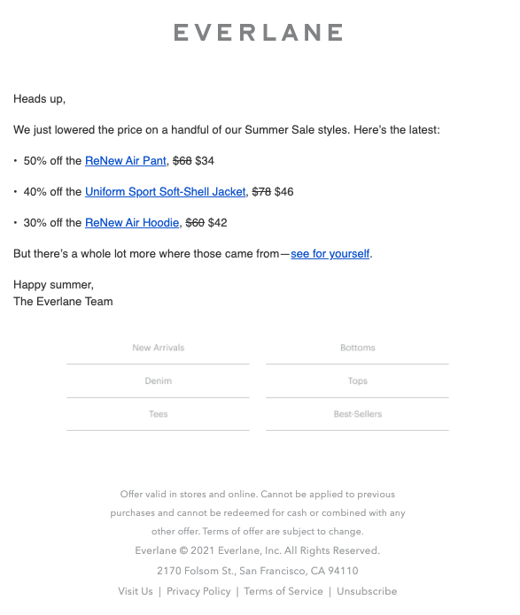
It couldn’t be simpler. No HTML, no bright colors, or flashing GIFs; just a bullet point list of discounted products, including the percentage discount, the original price, and the new price. Then it’s rounded off with a persuasive call to action (CTA).
Sure, it looks a little sparse, which makes a lot of marketers nervous. But there’s plenty of compelling reasons to send plain text emails:
- Some areas have low bandwidth, which makes it hard to open image-laden HTML emails;
- Some users see HTML emails as a security or privacy risk; and
- Some people simply prefer the simplicity of plain text.
What’s more, there’s a growing number of “non-traditional inboxes” out there. For instance, about one-fifth of Americans use a smartwatch or fitness tracker, according to Pew Research Center.
Some smartwatch owners use their devices to access email—and those devices will typically favor plain text over HTML because it’s easier for them to display.
To be clear, I’m not saying you should instantly strip all the imagery from your emails just in case someone happens to open one on an Apple Watch. But it’s definitely worth experimenting to see how plain text goes down with your audience.
2. ban.do
It’s no secret that the psychological concept known as FOMO, or “fear of missing out”, can be a powerful way to influence consumer behavior.
To find out just how powerful it can be, researchers from the Department of Experimental Psychology at University College London and Oslo’s Norwegian Business School presented 200 study participants with a simulated Facebook news feed incorporating five adverts.
One group of participants was shown a selection of ads incorporating FOMO-inducing content, while the other was shown the same ads with the FOMO-y elements removed.
You probably won’t be surprised to learn that memory overall, as well as recall and recognition memory for the advertisements, was better when the FOMO content was present.
Incidentally, not so long ago, I wrote a whole article on FOMO marketing examples—check it out if you want to learn more on the topic.
Anyway, I’m telling you all this because FOMO plays a key role in my next discount email example, from fashion and wellness brand ban.do:
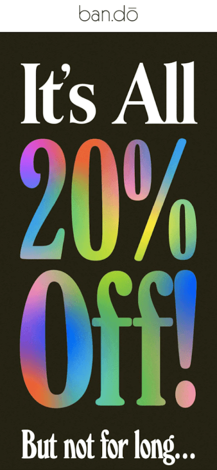
It leads with a simple offer: get 20 percent off everything. The discount (combined with the big, colorful font) lures you in, then the FOMO messaging urges you to act now.
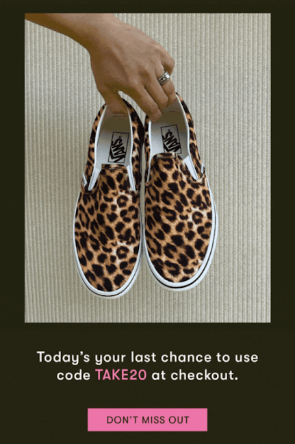
It’s a classic one-two punch that’s consistently proven to drive sales.
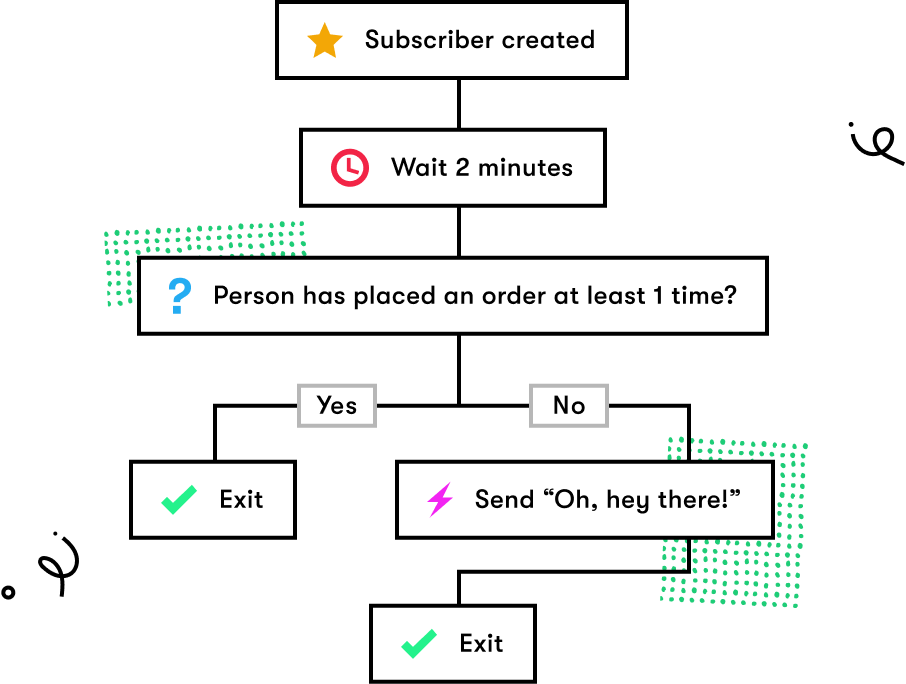
If you haven't found what works best for your audience yet, try using a workflow that split-tests different versions of discount announcements.

3. Sweaty Betty
You’d think deciding on a discount strategy would be easy. Offer consumers a price reduction; they buy from you; profit.
In reality, there are lots of considerations affecting our discounting plans.
From a business perspective, we have set margins to work with; discount too heavily and we’ll lose money. And from a psychological perspective, offering too big a discount can risk devaluing your product and brand (especially if you do it regularly).
At the same time, you want your discount to be impactful. If it’ll only save consumers a dollar or two, it’s unlikely to shift the dial much. So where’s the sweet spot?
Obviously, that depends on your product, audience, and brand. If you literally never run promotions, a one-off 10 percent discount might have a huge effect on sales; if you run them all the time, the same offer might have little or no impact.
However, research from SendOwl gives us some insight into how different discount levels affect order volumes:
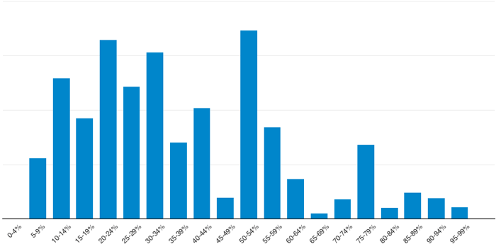
10-34 percent is something of a sweet spot—but the most impactful discount range is 50-54 percent.
If you really want to boost sales, offer half-off, just like women’s activewear brand Sweaty Betty does here:
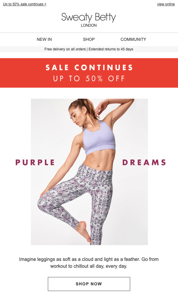
Clearly, Sweaty Betty understands that big discounts can drive big results.
However, a word or two of caution: if you’re planning a similarly massive discount, don’t make a habit of it, and limit it to end-of-run or out-of-season stock.
4. Torrid
Gamification marketing is another highly effective psychological tool for influencing consumer behavior. But don’t just take my word for it; look at the evidence.
For starters, researchers at four Chinese universities collected data from 322 online shopping consumers who used a flash game to test their purchase intention after playing games. They found that three elements of gamification—rewards, absorption, and autonomy—positively enhance consumers’ sense of enjoyment, which in turn affects their online purchase intent.
And in another study, published in the Journal of Business Research, gamification was shown to positively affect brand engagement and further increase brand equity.
To put it more simply, combining gamification and discounts can be extremely effective. That’s what womenswear e-commerce brand Torrid does here:
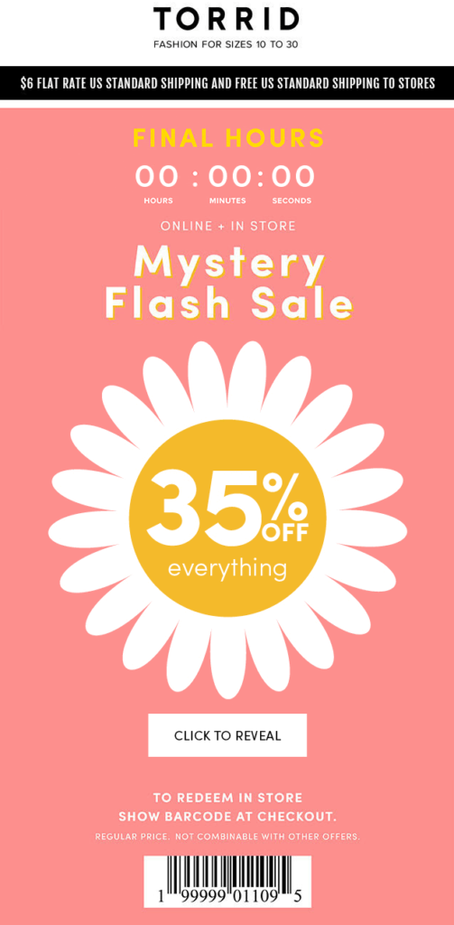
Recipients are prompted to click the CTA button to reveal their “mystery discount”. To add an extra layer of impact, this offer is accompanied by a countdown timer that adds a little FOMO into the mix.
One other thing worth mentioning here: the addition of a barcode means this discount can also be redeemed in a brick-and-mortar store, making this an effective multichannel marketing campaign.
5. Huckberry
It probably won’t shock you to learn that I’m a big fan of quality copywriting.
Copy is a big part of the email marketing equation. Yet it’s easily overlooked in favor of flashy visuals and fancy HTML elements.
So hats off to menswear brand Huckberry for going heavy on the copy to promote a seasonal discount:
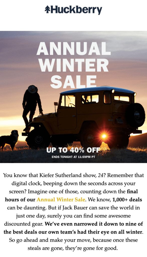
Now, you might well ask: “Why describe a countdown timer when you could just include one in the email?”
But I actually think this works well because it ties in the whole Kiefer Sutherland / Jack Bauer / 24 concept. That messaging is likely to appeal to Huckberry’s audience of outdoorsy, rugged types.
Also, I like how it hypes up the sheer scale of the promotion and uses this to introduce the “best deals” as recommended by the Huckberry team.
Finally, it skillfully introduces an air of FOMO by stressing: “Once these steals are gone, they’re gone for good.”
6. Forever 21
It might sound counterintuitive, but discounting can be one of the most effective ways to increase your average order value (AOV).
By offering customers money off, they’re often tempted to buy more items per transaction and spend more money overall.
That’s especially true if you set a minimum spend to take advantage of a special offer (e.g. spend $30 to get 10 percent off). This is precisely what Forever 21 does here:
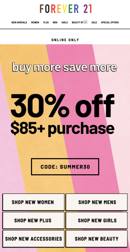
Imagine Forever 21’s AOV is $50; by running this promo it’s encouraging customers to spend significantly more. And if they do, it’ll reward them with a discount.
The downside, of course, is that by attaching such strict terms and conditions to its promotion, Forever 21 is likely to see lower uptake than a simple 10-percent-off sitewide sale.
7. Urban Outfitters
I’ve spoken about how subtle, text-only emails can be highly impactful. However, sometimes there’s just no room for subtlety.
Sometimes, when you’re launching a big discount or offering further savings, you simply want to shout about it as loudly as possible. It’s fair to say that’s what Urban Outfitters is doing here:
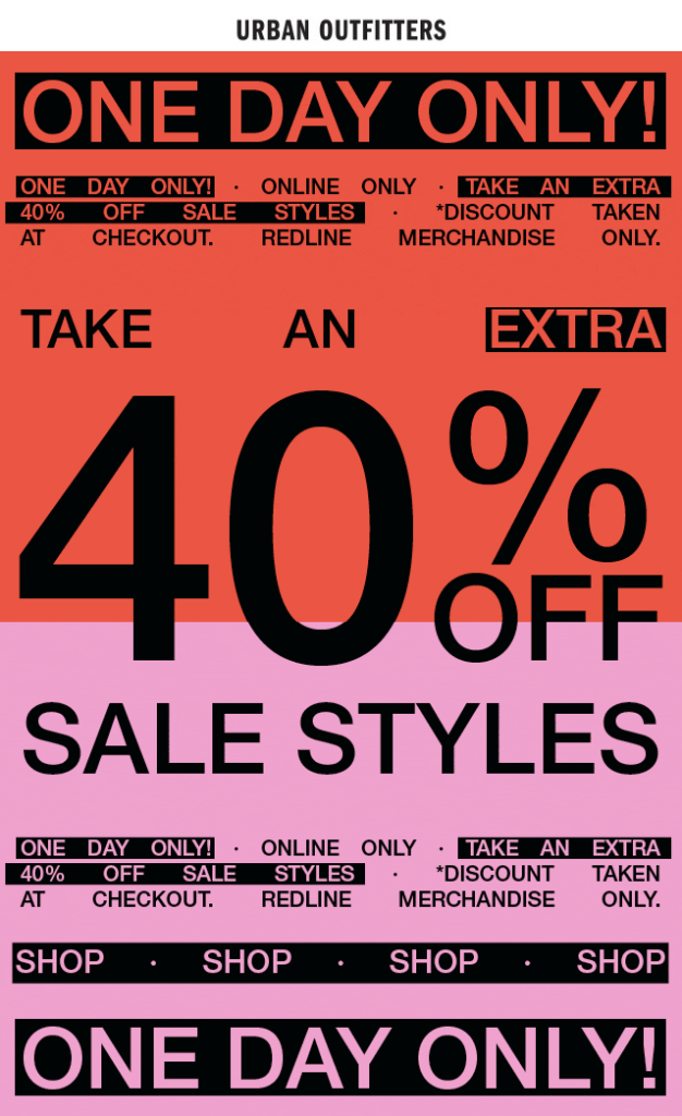
It’s kind of like the graphic designer took the terms and conditions, put them in all-caps, then stuck some gaudy flashing colors behind it and called it a day.
I like it, though. It fits in with Urban Outfitters’ branding, and it’s undeniably effective in communicating that the retailer is running a one-day sale.
Other than making a full-on error that actively harms your brand, pretty much the worst thing you can do from an email marketing perspective is to leave your audience wondering, “What was all that about?”
Urban Outfitters definitely avoids that trap here.
8. Tuft & Needle
It’s always good to have an “excuse” for launching a sale.
That’s part of the reason brands go mad for “traditional” discounting periods like Black Friday and Christmas.
However, it’s not exactly easy to cut through the noise during those traditional discounting periods. With every brand under the sun clamoring to craft the most compelling offer, there’s always a risk you’ll get lost in the crowd.
Which is why it pays to run occasional one-off discounts at different times to your competitors. The downside, though, is that this approach makes it a little harder to come up with a decent “excuse”.
Mattress and bedding company Tuft & Needle gets around this by launching a time-limited sale to coincide with its eighth birthday:
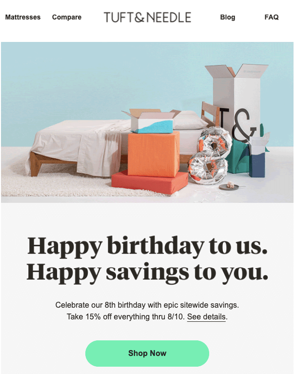
Smartly, the brand hasn’t done anything too complicated here.
When the reason for introducing your sale is a little convoluted, the last thing you need is to confuse customers with lots of byzantine terms and conditions.
A 15 percent sitewide sale is as easy to understand as it gets.

Conclusion
From simple sitewide promos to stricter spend-X-to-save-Y offers, there are many ways to plan and execute a sale.
And, as these discount email examples demonstrate, there are just as many ways to promote a sale.
However, one thing these emails have in common is the simplicity of their messaging.
When you’re promoting a discount, there’s no room for ambivalence: you want your audience to know exactly what you’re offering (and how they can take advantage).
The more complex your proposition, the less engagement you’ll see.


