

The numbers vary from study to study, but recent data from Statista found that over 88 percent of online shopping carts are abandoned.
The numbers vary from study to study, but recent data from Statista found that over 88 percent of online shopping carts are abandoned.
But as a whole, nearly nine out of 10 ecommerce shoppers won’t complete their order after adding items to their cart.
That’s a little depressing, I know.
Even on Shopify, a platform known for its beautiful design, user-friendly interface, and robust features, many digital stores struggle at the point of the checkout.
But there’s no need to fret. There’s a lot you can do to reduce cart abandonment and maximize the number of shoppers that complete their orders on your Shopify store.
For this post, I’m going to highlight some key best practices to optimize ecommerce checkout and showcase some A+ Shopify checkout examples for inspiration.
Let’s hit it.

Ecommerce Checkout Best Practices
The first step to creating a great experience for shoppers and getting them to finalize their orders is understanding what they’re looking for at the point of checkout, as well as what turns them off.
I don’t have time to dive into the full details here, but here are some best practices to keep in mind:
- Use a clean, distraction-free design on your checkout page;
- Only ask for essential information;
- Offer guest or express checkout;
- Offer a range of payment methods;
- Highlight perks like free shipping and returns;
- Make it simple to apply gift cards and discounts;
- Add trust seals;
- Use a progress indicator; and
- Give customers a clear path to support.
For more on ecommerce checkout best practices, I suggest reading this guide from checkout experience platform Bolt. It’s jam-packed with a ton of helpful information and expounds what I just mentioned.
Now, let me share with you some of the most amazing Shopify checkout examples I’ve seen.
1. Package Free Shop
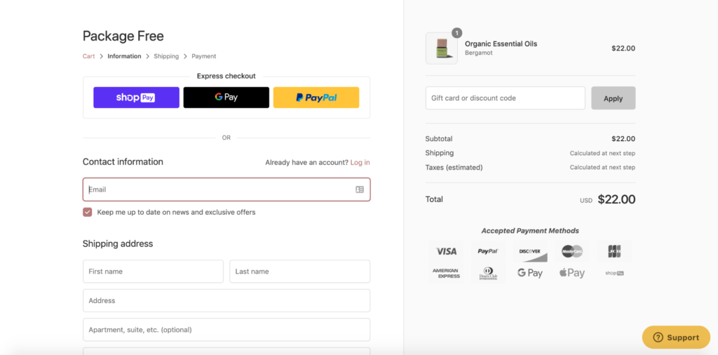
This brand sells “sustainable, green, eco-friendly, plastic-free products to help you live a zero-waste, minimalist, and low impact lifestyle.” Here’s why their Shopify checkout is so flawless.
First, it uses a crisp, clean design that’s completely void of clutter. Check out the nice white background and how there’s plenty of space between elements and fields.
Next, they only ask for essential information.
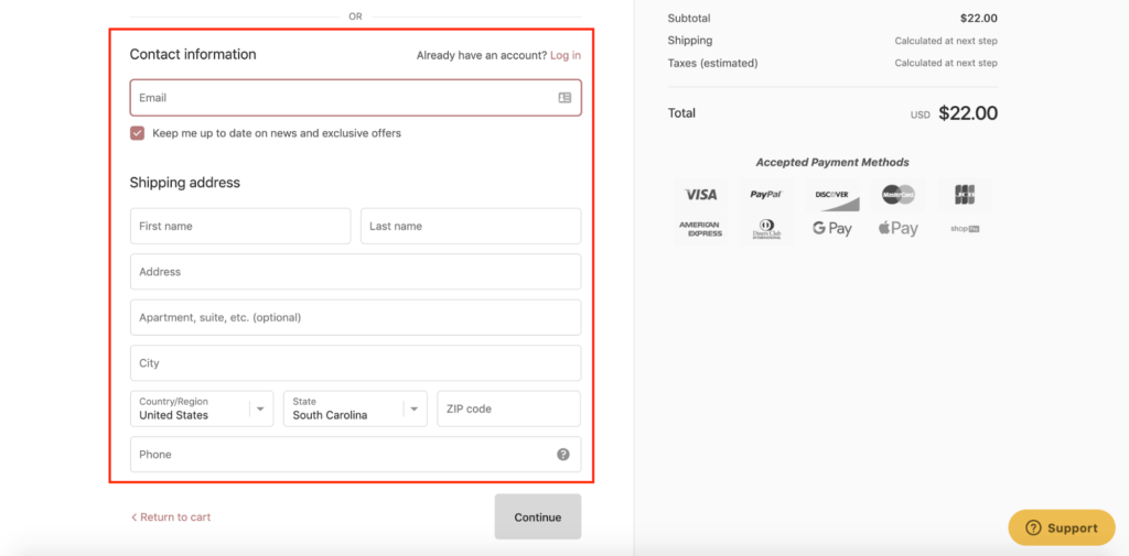
Notice how they only require the basics like a customer’s email and shipping address and stay away from extraneous fields that could potentially slow down the checkout process.
Package Free Shop gives shoppers the option of using express checkout through Shop Pay, Google Pay, and PayPal and has several different types of accepted payment.
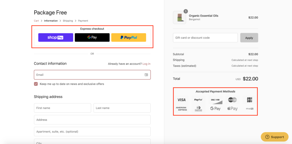
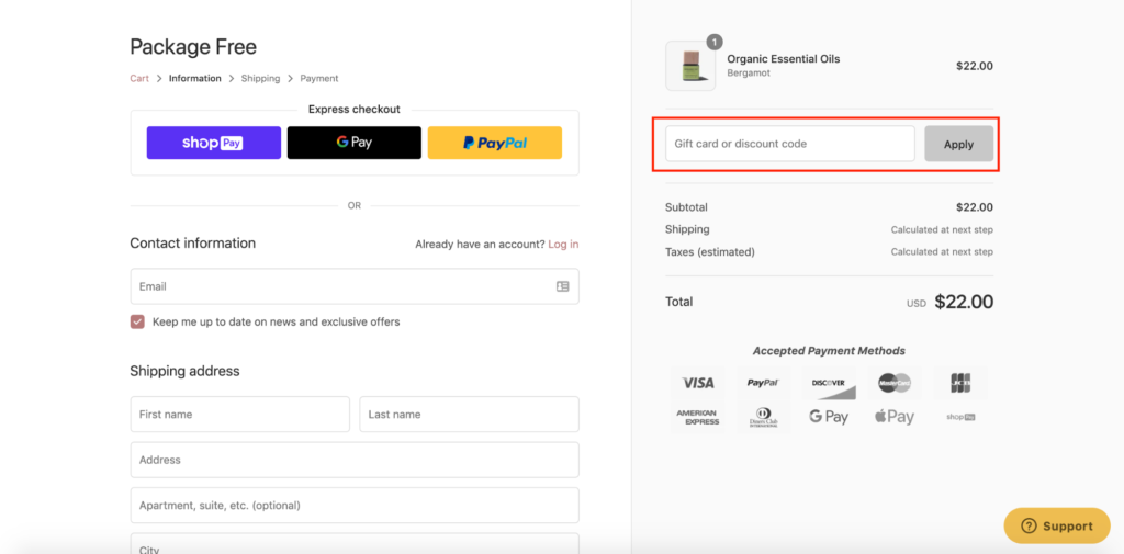
They feature a convenient box for entering gift card or discount code information here.
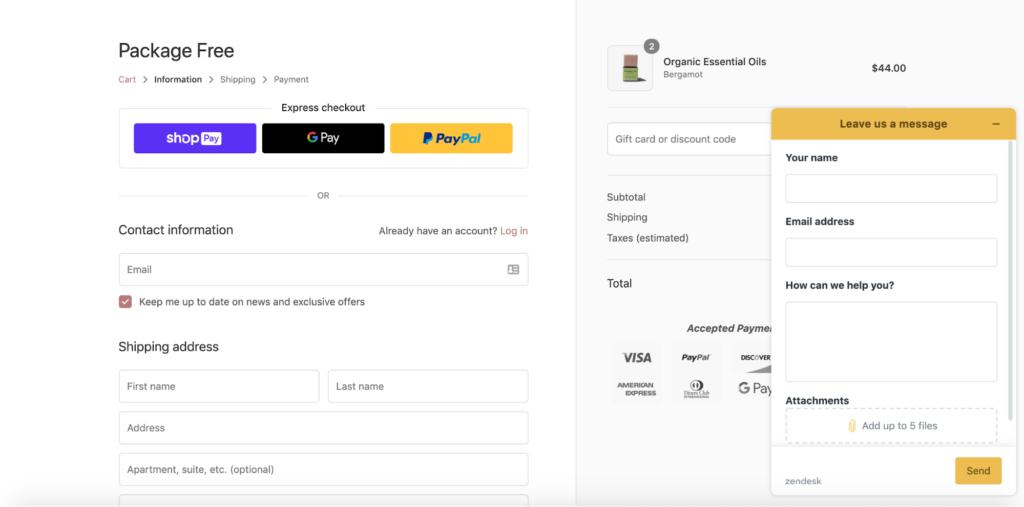
And finally, they have a clear path to support with this button in the bottom right-hand corner.
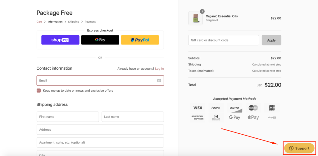
By clicking on that, shoppers can conveniently leave a message, and a company representative will get back to them ASAP.
This Shopify checkout example checks most of the boxes and offers a smooth, streamlined experience to encourage the maximum number of shoppers to complete their order.
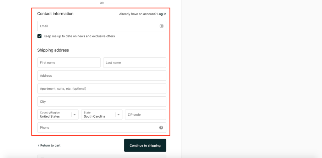
2. Rothy’s
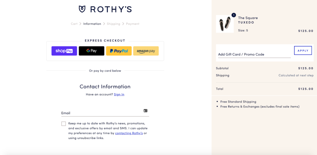
Rothy’s is a fashion company that specializes in ballet flats that are hand-made from recycled materials.
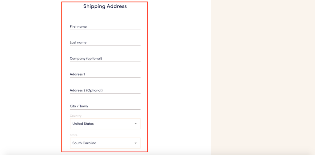
Just like the rest of their Shopify store, Rothy’s uses a minimalist aesthetic on their checkout page. There’s a simple mix of a white and beige colored background with ample negative space between elements and fields.
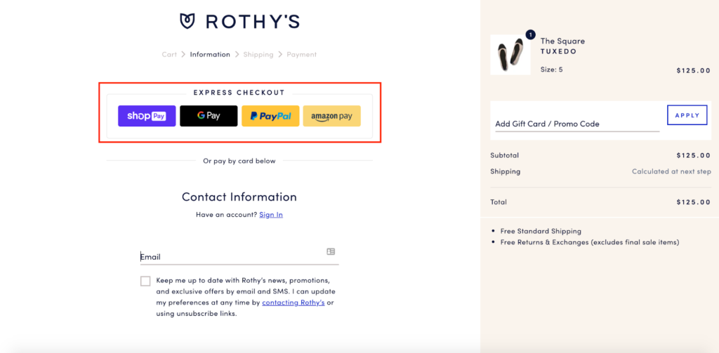
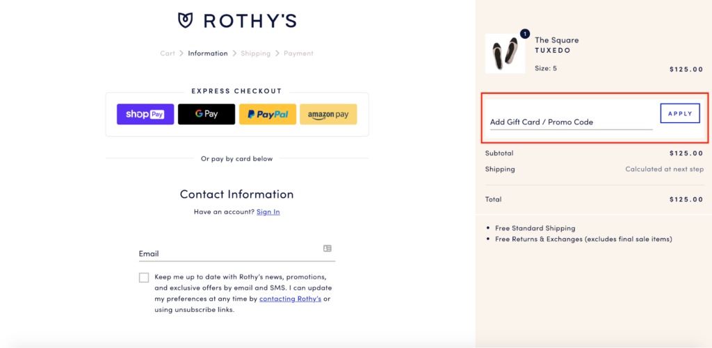
Right off the bat, Rothy’s lets shoppers know they offer express checkout with Shop Pay, Google Pay, PayPal, and Amazon Pay, which is huge for expediting the process.
Or, if shoppers want to add their payment information, Rothy’s keeps it pretty bare bones with what they ask for.
Like Package Free Shop, they make it super easy for shoppers to add a gift card or promo code.
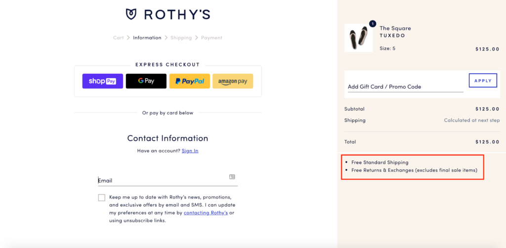
I also like that they clearly highlight the perks of buying from Rothy’s, specifically mentioning they offer free standard shipping, as well as free returns and exchanges.
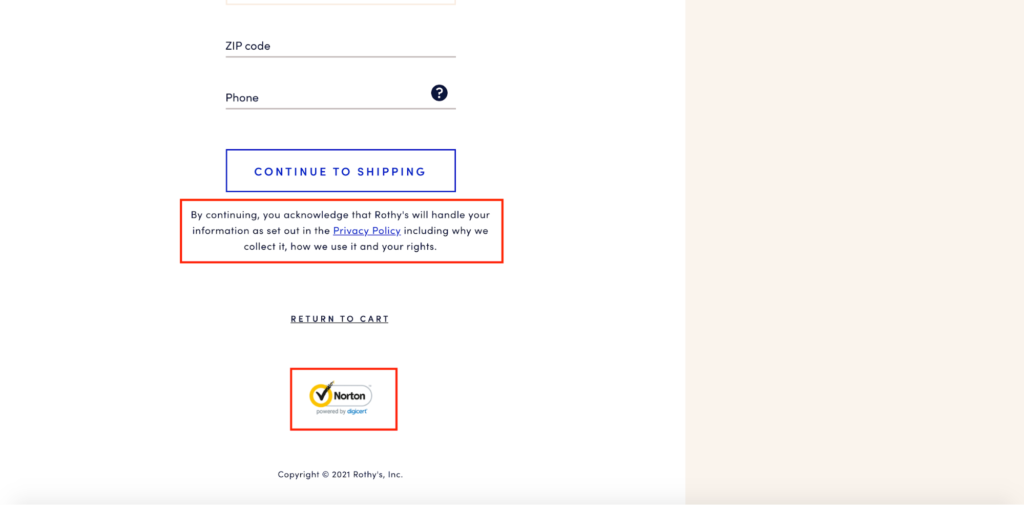
They include privacy information, along with a trust seal at the bottom of the checkout page.
And lastly, they feature a progress indicator so shoppers can instantly tell how far along they are in the checkout process.
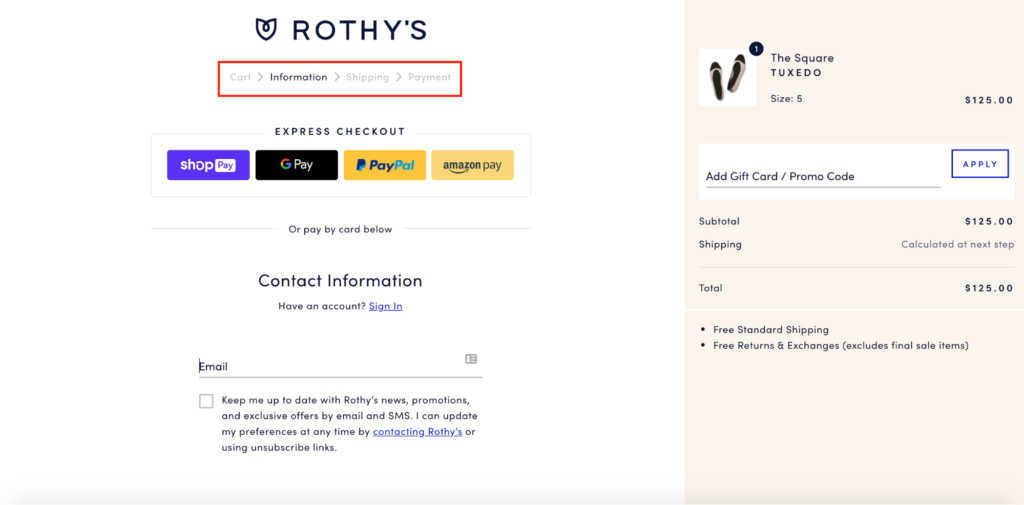
All of this makes for a painless customer experience and one that should create a positive impression.
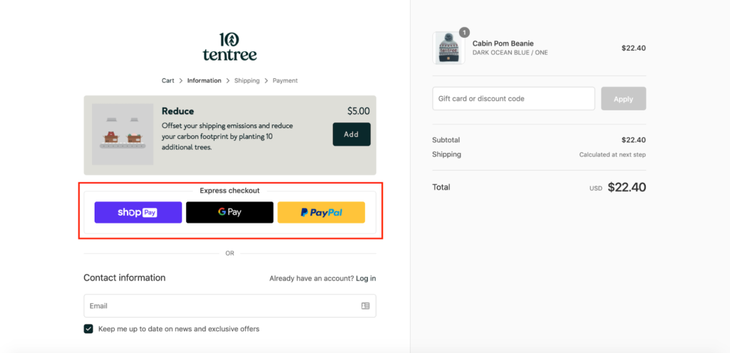
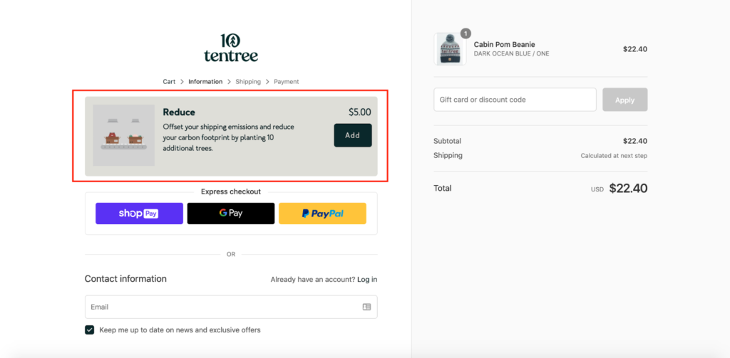
3. tentree

Here’s a clothing brand with a mission to create a more healthy, sustainable world.
Besides selling high-quality apparel made with hemp, cork, and organic cotton, tentree’s main value proposition is that they plant 10 trees for every item sold, with 25+ million trees being planted to date.
One reason their Shopify checkout works is because of the eye-catching design they use. They don’t try to get too fancy or cute with it.
Rather, tentree uses a light-colored, distraction-free background that isn’t “too busy.”
Next, they don’t overwhelm shoppers by asking for too much information. The fields are super straightforward, allowing shoppers to plow right through them with ease.
Or, if shoppers prefer to use guest checkout, they can do so with Shop Pay, Google Pay, or PayPal.
tentree makes it a breeze to enter a gift card or discount code here.
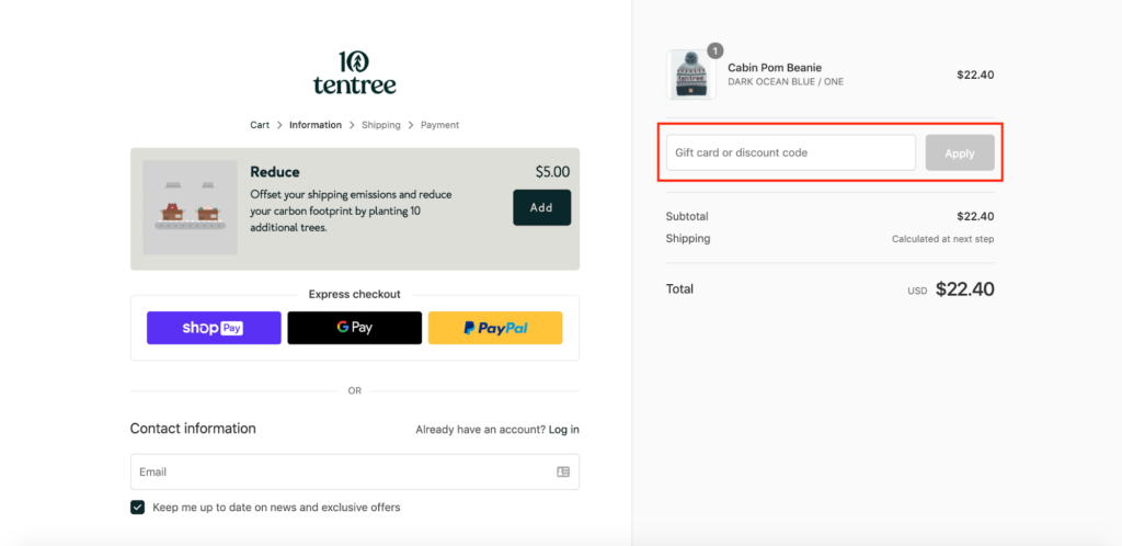
They also throw in this unique add-on where shoppers can have an additional 10 trees planted for $5 more—an offer that should resonate with a sizable chunk of their eco-conscious demographic.
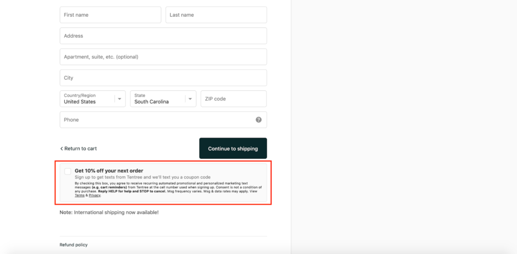
At the bottom, they include this offer where shoppers can get 10 percent off their next order by signing up to receive texts from tentree.
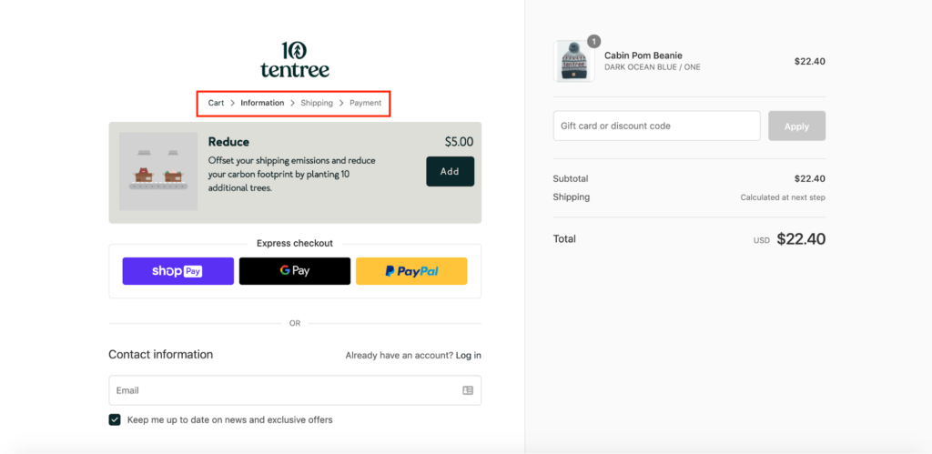
And the last thing I want to point out is that tentree includes this progress indicator, which helps shoppers get their bearings.
Put it all together, and there’s a ton of takeaways you can grab from this brilliant Shopify checkout example.
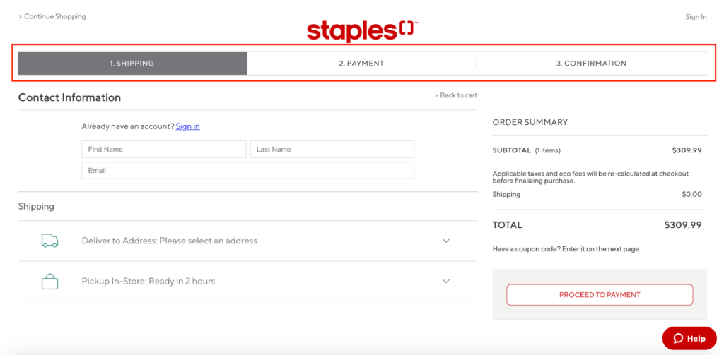
4. Staples
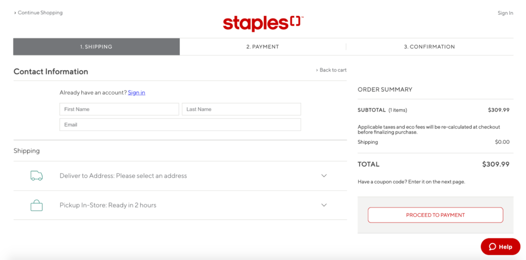
You know an ecommerce platform is legit when a massive brand like Staples trusts it.
Staples was actually one of Shopify’s biggest acquisitions a while back and shows how far they’ve come from their humble beginnings as a snowboard shop back in 2006.
When it comes to Shopify checkout examples, this is one of the most unique and checks off all the right boxes.
Not to sound like a broken record, but again this page has a clean, distraction-free design that’s soothing on the eyes.
Staples places a progress indicator front-and-center, and it’s one of the first things shoppers’ eyeballs gravitate to.
If someone already has a Staples account, they can sign in easily through this link.
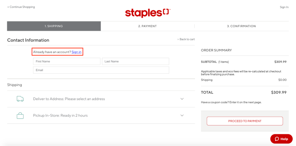
Otherwise, Staples offers a simple, fluid signup, starting with first name, last name, and email.
Then, shoppers can use the drop-downs under “Shipping” to fill out the rest, which helps keep everything very clutter-free.
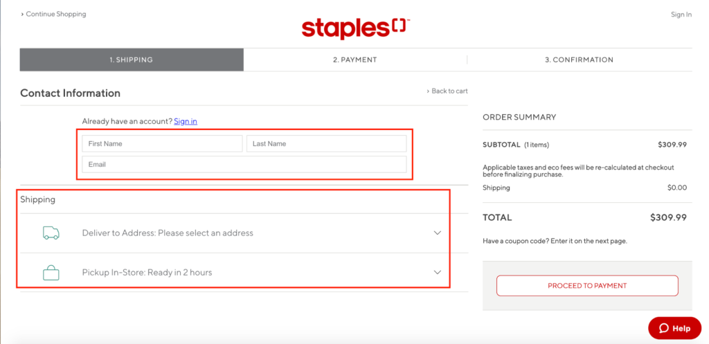
And notice how Staples includes asterisks on mandatory fields so shoppers can skip optional ones.
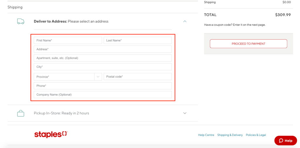
This is a small but nice touch that helps keep things moving smoothly. Also, check out the “Help” button in the bottom right-hand corner.
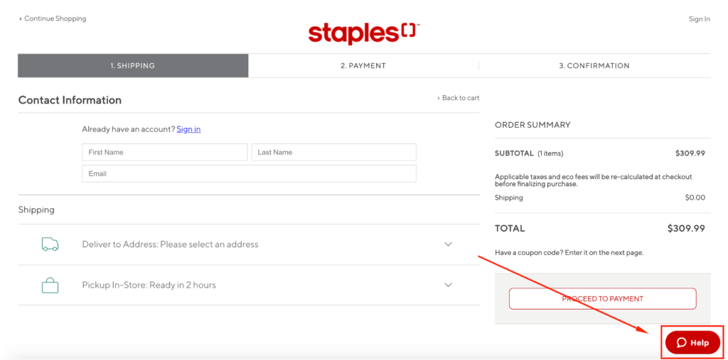
By clicking that, a chatbot opens to help shoppers instantly find answers to their questions.
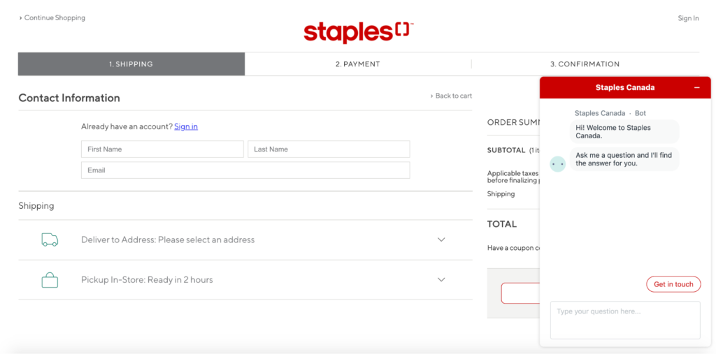
So, if there’s an issue that could potentially get in the way of them making a purchase, Staples can promptly address it and eliminate potential friction.
This is important because any last-minute frustrations can undo all of the progress you’ve made and send shoppers packing without a conversion.
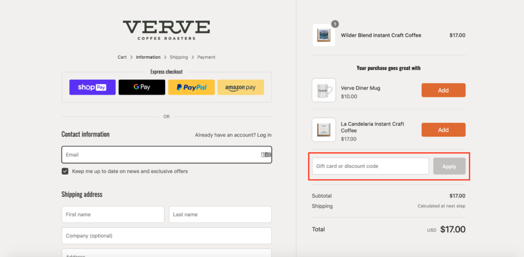
5. Verve Coffee Roasters
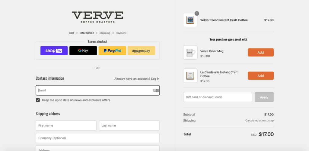
Here’s the Shopify checkout page of California-based Verve Coffee Roasters.
Simple, intuitive layout with non-annoying signup fields—check.
An express checkout option featuring major platforms like Shop Pay, Google Pay, PayPal, and Amazon Pay—check.

A convenient box for entering a gift card or discount code to save—check.
A nice looking progress indicator located conspicuously at the top to keep shoppers oriented—check.
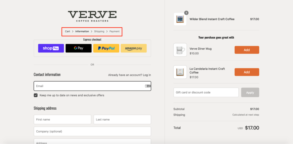
This checkout page has all of the core elements needed to create a positive ecommerce shopping experience.
One other thing I think is a nice touch is this section, featuring two other products that would go great with the purchase.
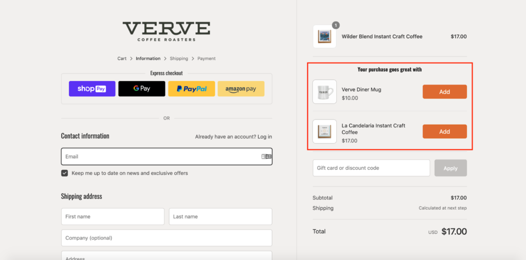
There’s the Verve Diner Mug and La Candelaria Instant Craft Coffee—two items that create value and allow Verve Coffee Roasters to effectively cross-sell without being obnoxious about it.
This is something that can be a nice addition to increase your average order value with zero extra effort. At the same time, it points shoppers to other products they may be interested in but isn’t aware of.
So, it’s definitely worth experimenting with.
6. Taylor Stitch
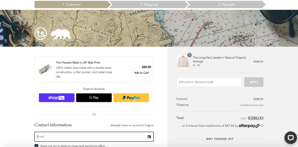
Next up is Taylor Stitch, a classic men’s clothing brand with a great reputation for quality.
Again, their checkout page has the essentials like:
- A simple layout
- Easy to fill fields
- Express checkout options
- A place for gift cards and discount codes
- A progress indicator
- Support for finding answers to questions
But there’s one particular element I’d like to bring to your attention—one that helps Taylor Stitch take its conversion rate to the next level.
It’s the “Why Choose Us?” section on the right-hand side of the page.
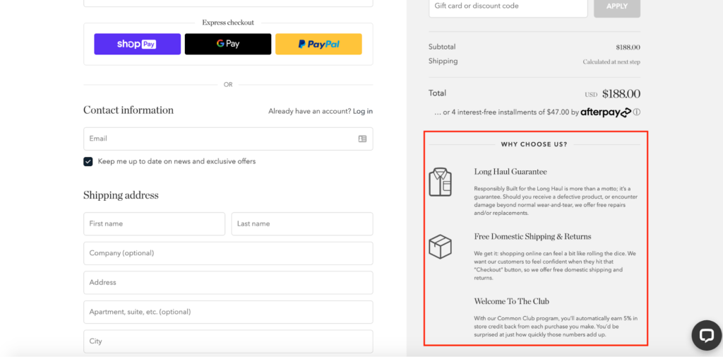
It specifically mentions the brand’s Long Haul Guarantee, which says “should you receive a defective product or encounter damage beyond normal wear-and-tear, we offer free repairs and/or replacements.”
It also points out that Taylor Stitch offers free domestic shipping and returns, as well as references their Common Club where shoppers can earn 5 percent in-store credit back from each purchase they make.
This is a great way to add some last-minute incentive, which is perfect for eliminating any reservations shoppers may have about completing their order.
If your brand has any special propositions like this, be sure to include them in your checkout page because it can serve as an extra bit of firepower.
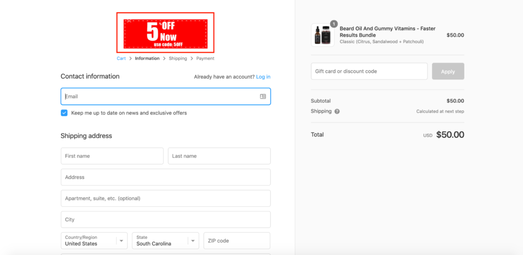
7. Fresh Heritage
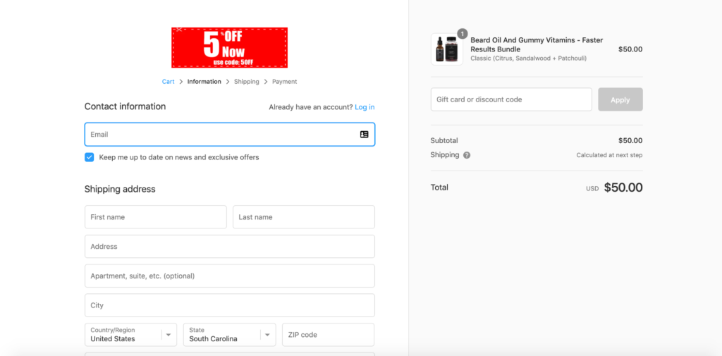
My final Shopify checkout example from beard grooming brand Fresh Heritage contains many of the same elements as the other pages I’ve already covered.
It has, for example, a clean design, only asks for key info, includes a progress indicator, and so on. So, I’m not going to go over everything in detail.
But I wanted to mention one particular element I haven’t seen from many other ecommerce stores: a discount code built directly into the checkout page.
It’s nothing huge—just five percent off.
But it’s a nice touch and something I’m sure many of their shoppers will appreciate. All they have to do is enter the discount code “5Off” into the box here, click “Apply,” and they’re all set.
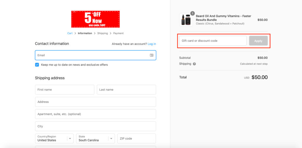
Just like that the order goes from being $50…
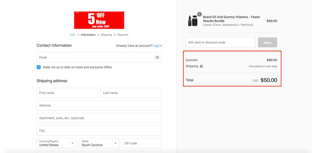
…to $47.50.
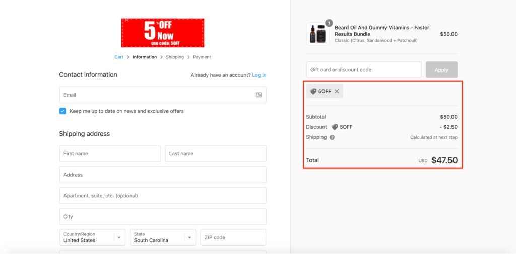
I think it’s inspiring how Fresh Heritage infuses a discount right into their checkout page, and there’s a certain satisfaction shoppers get by entering it in the discount code box at the last minute.
This strategy taps into a powerful psychological concept in sales and marketing—reciprocity, which is Robert Cialdini’s first principle of persuasion.
“The idea of reciprocity says that people, by nature, feel obliged to provide discounts or concessions to others if they’ve received favors from those same people,” explains Marc Schenker of CXL.
This makes it something worth experimenting with, as it has the potential to significantly increase your conversion rate and motivate more shoppers to finalize their transaction.
Conclusion
Shopping cart abandonment is a common concern among Shopify store owners, with recent data putting it at just over 88 percent on average.
But don’t worry. There are plenty of actionable steps you can take to drastically reduce it.
Some of the core best practices include:
- Using simple design with adequate spacing between elements and fields;
- Strictly asking for necessary information;
- Having the option for guest or express checkout;
- Giving shoppers multiple payment options;
- Offering perks like free shipping and returns;
- Allowing shoppers to conveniently apply gift card and discount codes;
- Including trust seals;
- Displaying a progress indicator; and
- Offering easy access to support.
It also never hurts to get creative and personalize your checkout page with relevant cross-sells, special offers, and specific reasons why it makes sense to buy from you.
Even then, sometimes shoppers just get distracted away and need to get pulled back to their forgotten products. This is where Drip comes in.
Drip can help you send a cart abandonment workflow to bring customers back to the products they fell in love with in the first place.
You can even try it free for 14 days, and see how Drip can help you recover abandoned cart sales.

