What would we do without email? Honestly, as a marketer, the thought brings me out in a cold sweat.
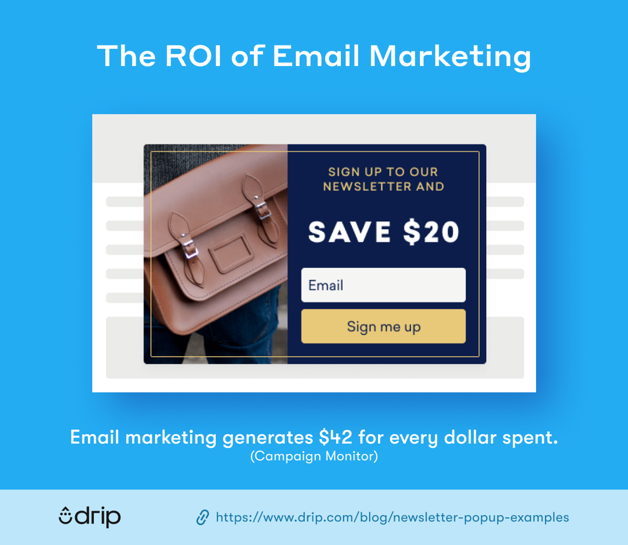
Email is such a fantastic marketing channel. Every $1 spent on it delivers an average return of $42.
If it went away overnight, it’d be impossible to replace.
It’s so versatile, too. Email newsletters can be used to communicate any number of messages to our audience, from promoting products and publicizing events, to building loyalty by sharing useful advice and information.
However (in marketing, there’s always a “however”)…
Your email newsletter is only as effective as your lead generation strategy.
By which I mean, for your newsletter to generate results, you need to get plenty of eyes on it.
One of the best ways to do that is through impactful, eye-catching newsletter popups. Popups that demand attention, clearly set out what a user will get from your newsletter, and compel them to take action.
With that in mind, here are nine killer newsletter popup examples to inspire you.
Table of Contents
1. Kensie
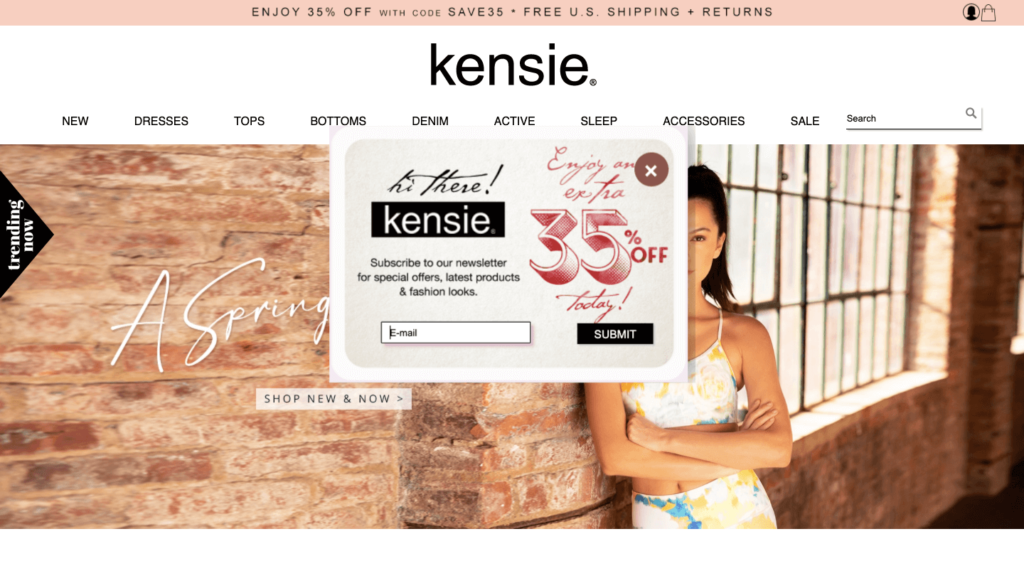
Let’s get things started with a textbook newsletter popup example from Canadian womenswear brand Kensie.
There are three things I love about this popup:
- It spells out exactly what you’re getting. Special offers, new products, and fashion inspiration.
- It gives you an additional reason to sign up. A 35 percent discount if you buy today.
- It doesn’t ask for much in return. Just a single data capture field for your email address.
That final point is especially important because people are busy—and they’re also pretty distrustful. Demand too much information up front and they’re not going to complete your form.
Our research also shows that more input fields often mean fewer conversions.
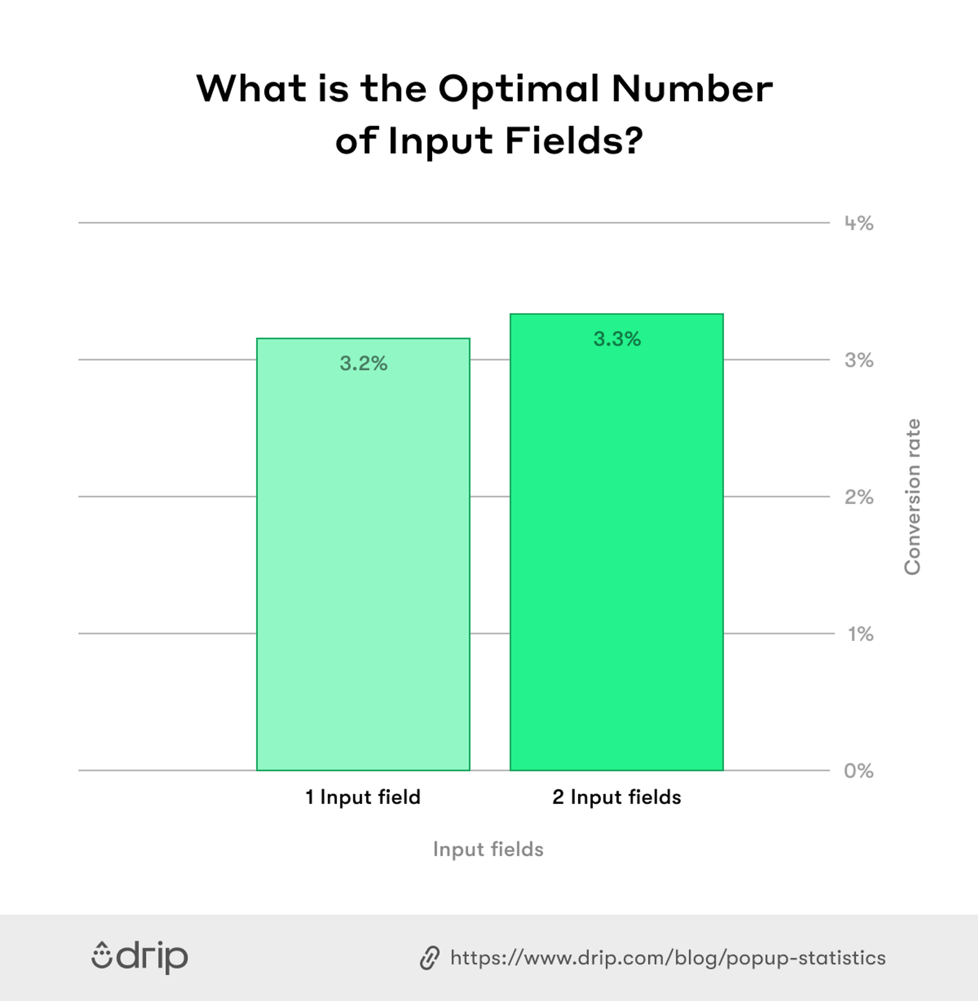 So by asking for just one field of information, Kensie removes a major barrier to conversion. Combined with the promise of special offers and the discount on signup, there’s really no reason not to complete this newsletter popup—especially if you already like Kensie as a brand.
However, not everything about this popup is textbook.
To some people, that mismatch of fonts, graphics, and colors could come across as jarring. However, it works for me because the popup design itself is so simple, so all those different elements combine to make the whole thing more impactful.
2. Gaiam
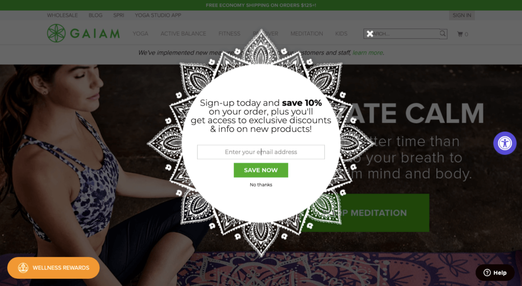
Next up is this elegant popup example from yoga brand Gaiam.
This popup design is so eye-catching it’s impossible to tear yourself away from it, and the visuals tie in perfectly with the brand.
Plus, even though the visual elements are so stylish, they don’t distract from the popup copy, which means they don’t dilute or distract from the overall message.
There’s another point worth mentioning here, too. One that you don’t notice from looking at the screenshot. This is an exit-intent popup, which means it only shows up when you scroll toward the browser bar.
Exit-intent popups like the above can be highly effective when implemented well, giving you a final chance to engage website visitors moments before they leave.
3. Rainbow Jeans
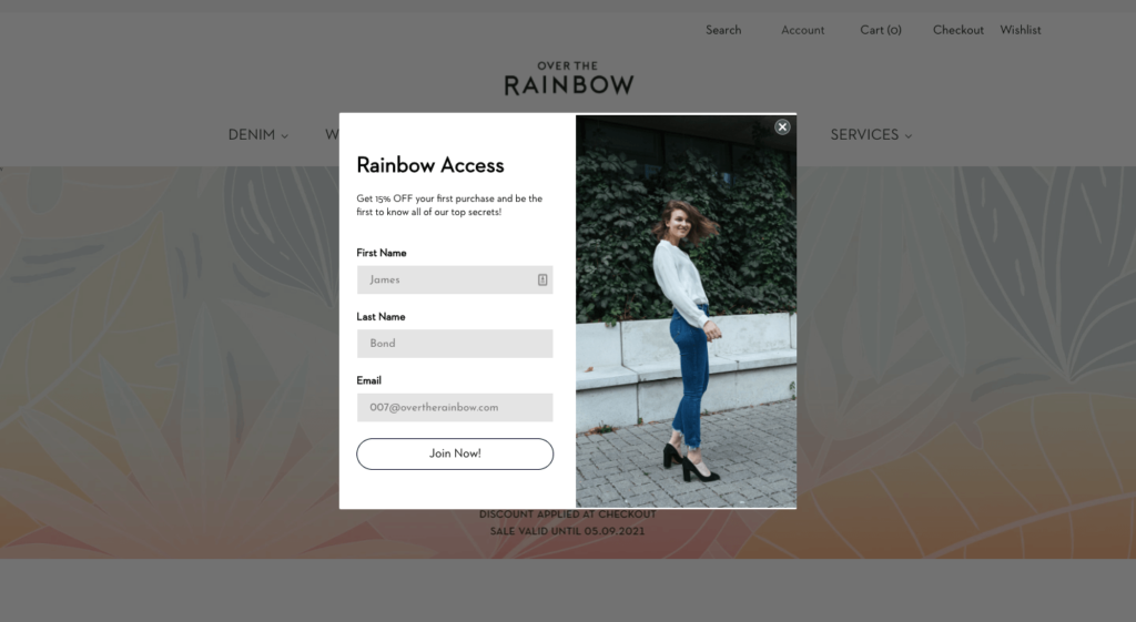
In this example, denim brand Rainbow Jeans proves that a little humor can go a long way.
This popup works well because it sticks with a theme: the idea that by signing up to the newsletter, you’re gaining access to all the brand’s “top secrets”.
After setting the tone with its intro copy, the three data capture fields are underlaid with James Bond’s name and email address (disclaimer: it’s probably not his real email address).
Alright, I’m not saying this newsletter popup is going to win any comedy awards. You’re probably not going to laugh out loud when you read it. But it’s still a nice way to disarm the user and make the whole process of signing up for a newsletter feel a little less transactional.
4. Ulta Beauty
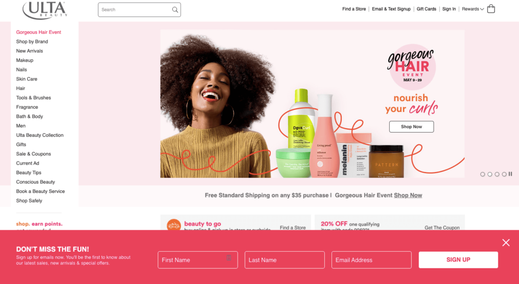
US beauty chain Ulta shows us that the best, highest-performing popups aren’t always the most in-your-face.
In fact, evidence proves that overly attention-grabbing popups can be a big turnoff to consumers. In one study from Nielsen Norman Group, respondents named modal popups—the ones that appear when you first land on a page and force you to close them before you can engage with the page’s content—as their most hated form of online advertising.
In a world of loud, autoplaying videos and gaudy banner ads, that’s really saying something.
So the point here is clear—sometimes it pays to be a little more subtle.
Ulta Beauty gets it right with this bottom-of-the-screen bar that allows you to keep browsing the site, while also presenting you with a compelling offer.
What’s more, because this popup doesn’t interrupt the user’s onsite experience, it doesn’t need to go in with a money-off deal—this isn’t a hard sell.
5. Timberland
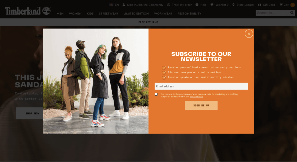
As a fashion brand, it’s no surprise that Timberland understands the value of high-quality visuals.
Imagery plays such an important part in boosting popup conversion rates. Indeed, when we analyzed more than one billion popups for a recent article, we found that popups with images convert 83 percent better than those without.
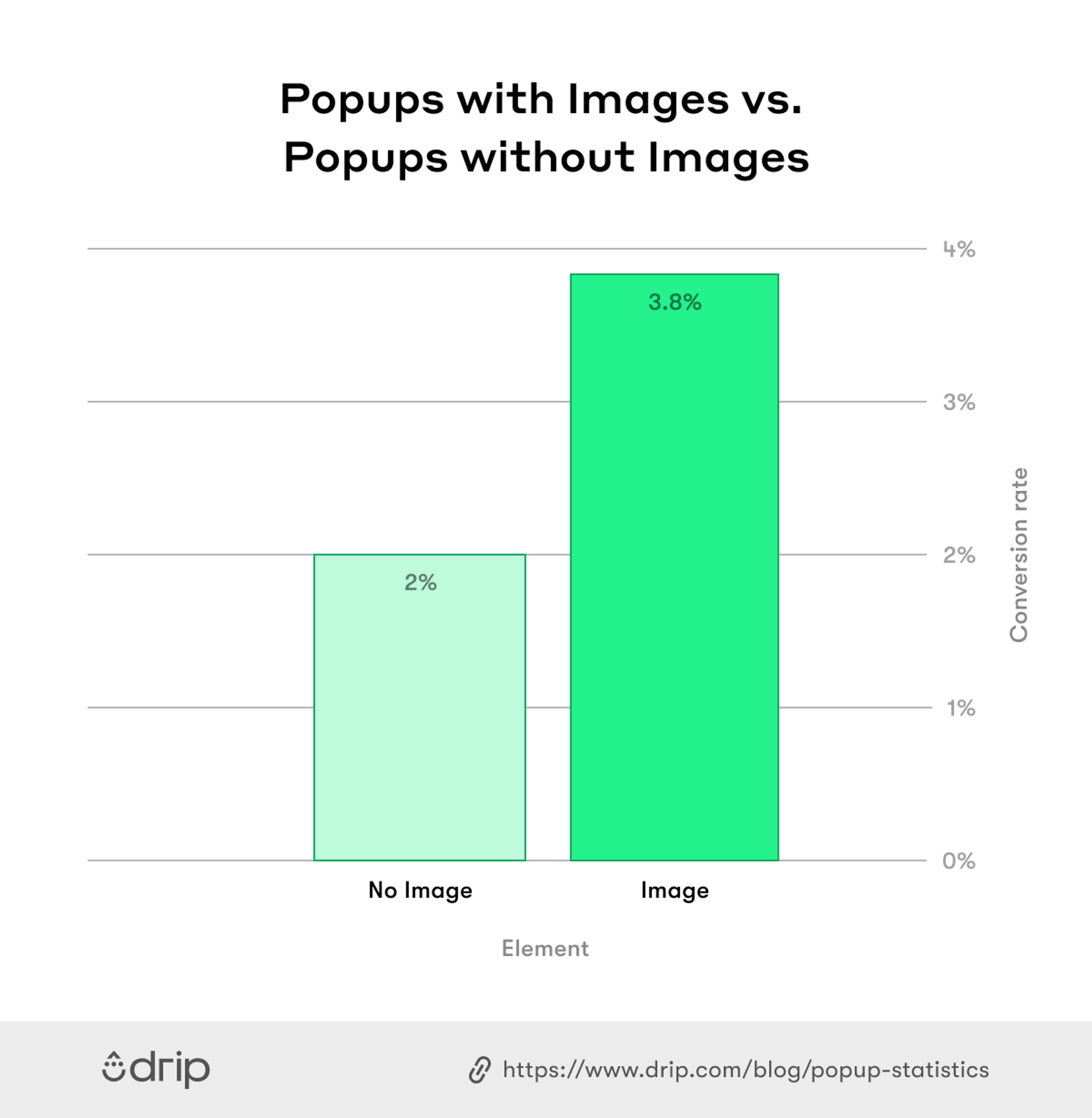 That’s a huge difference. And the best thing is, it’s so simple to just start including images in your popups.
However, the imagery isn’t the only great thing about this popup.
It also lays out the “value proposition” of signing up for the Timberland newsletter in three clear bullet points.
That makes it seem like you’re getting a lot of stuff in exchange for your email address. So much so that Timberland doesn’t even feel the need to offer a money-off discount to drive signups.
6. Gangsta Group
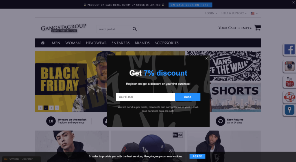
I’ve said it before and I’ll say it again: the simplest popups are often the most effective.
Urban fashion retailer Gangsta Group doesn’t do anything complex here. It’s just a simple prompt offering a seven percent discount in exchange for an email address.
No more, no less.
In fact, the entire popup—from the offer to the call to action—runs to just 31 words, and that’s only if you include the prompt copy in the email field.
Ultimately, this works because it communicates the minimum amount of information someone would need to sign up for the newsletter. It tells you:
- What you get for signing up; and
- What they want from you in return.
If you can’t be equally concise when explaining why people should sign up for your newsletter, your offer may be too complex.
7. Elvie & Leo
It’s pretty annoying being slapped in the face with a popup the moment you land on a website, right?
You’ve not even had a chance to look around and confirm you’re in the right place, so why would you hand over your name and email address?
It’s too much, too soon.
In many ways, it’s like walking into a shop for the first time and immediately being asked if you want to sign up for a store card. Retailers wouldn’t do that in “real life,” and they shouldn’t do it on the Internet either.
But at the same time, you’re understandably hungry to build up your email list. Leave it too long and you might miss out on a bunch of leads who later turn into valuable customers, so there’s clearly a careful balance to be struck.
One way to get your popup in front of enough people without making them feel like they’re being bombarded the second they arrive is to use a time delay trigger.
As the name suggests, this allows you to display your popups once a user has been on a page for a preset amount of time. (We recently found that eight seconds is the magic number.)
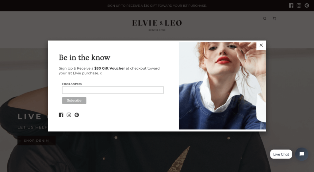
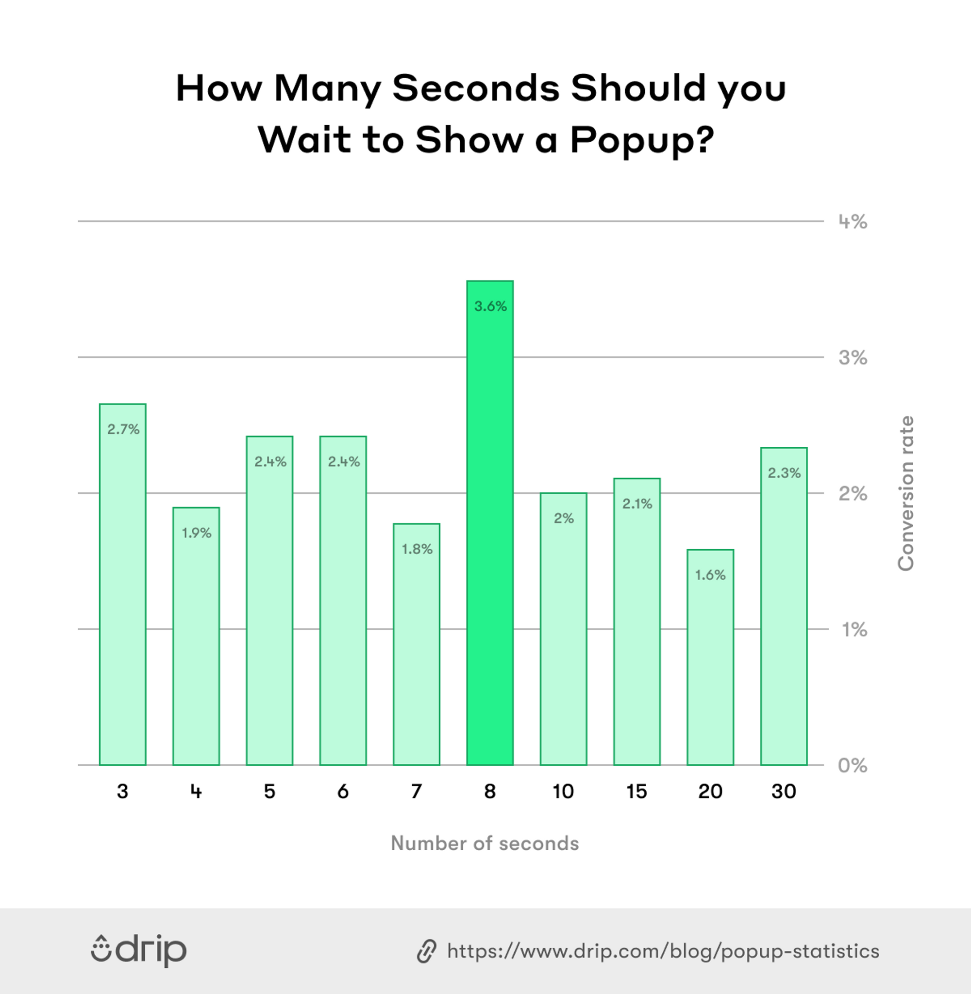 That way, you’re giving them a little breathing room to get their bearings before hitting them with your newsletter offer. And that’s exactly what Elvie & Leo does here. By my (rough) calculation, this popup loads five seconds after you first land on the page.
This definitely doesn’t feel too jarring, and it’s 100 percent better than not having a timed trigger at all. Plus the offer of a $30 gift voucher just for signing up more than makes up for it.
8. Pura Vida
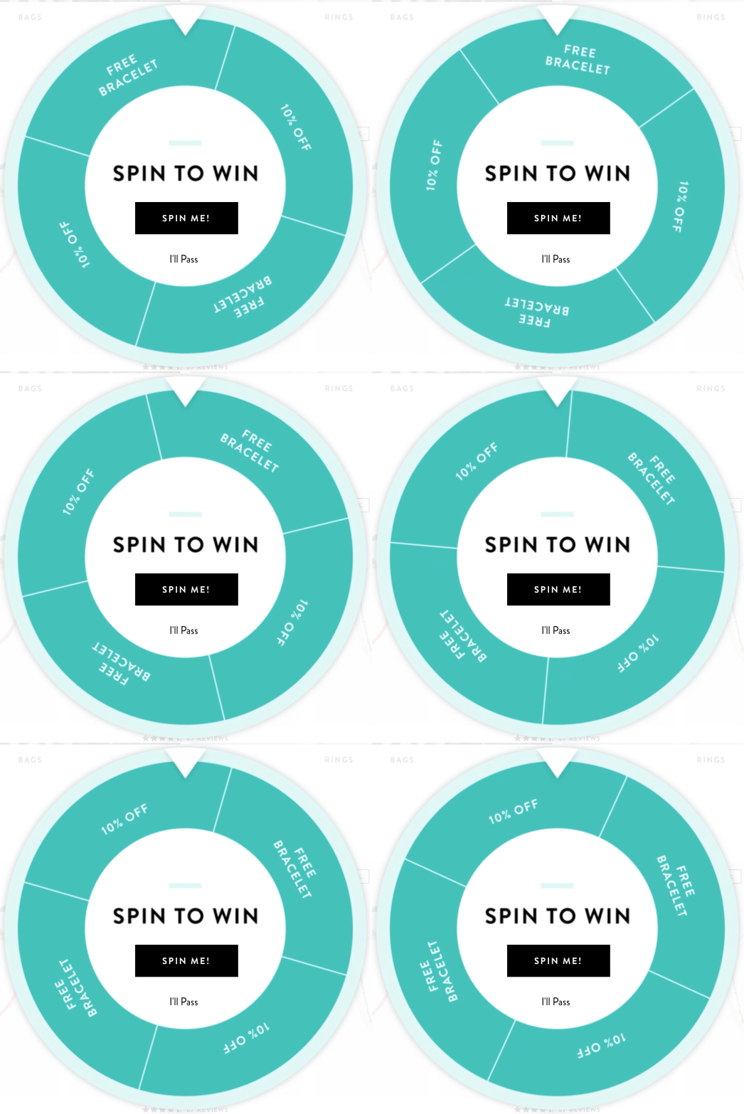
Not seeing a ton of conversions from your newsletter popup? Why not gamify it, like jewelry brand Pura Vida does here?
That “spin me” CTA is pretty tempting, and the two potential “prizes” are attractive enough to persuade you to click (even though everyone knows they’re not winning the free bracelet).
The fact that Pura Vida then asks for both an email address and a phone number will almost certainly have an impact on how many people actually convert using this spin-the-wheel form, but the format itself can be super effective.
What’s more, because you’ve already taken the time to click the “spin me” button by that point, you’re already bought in, which makes it slightly more likely you’ll follow through and hand over your phone number.
Make sure to use gamification in moderation, though. If you overdo it, you might start attracting freebie-seekers rather than quality subscribers who are interested in your brand.
9. The Pool Factory
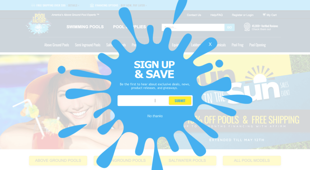
It’s fair to say this newsletter popup from The Pool Factory is hard to miss.
As I’ve already discussed, the most eye-catching and diverting popups can often also be the most annoying. But this one gets away with it by being fun to look at.
Plus, again, it’s a pretty low-commitment offer. It’s not like they’re asking for your passport number and a picture of your bank card.
They just want your email address.
That’s important because you know now that forms with a single field convert three times better than those with three fields. A better alternative would be to use a multistep popup that asks for a visitor’s information in multiple steps.
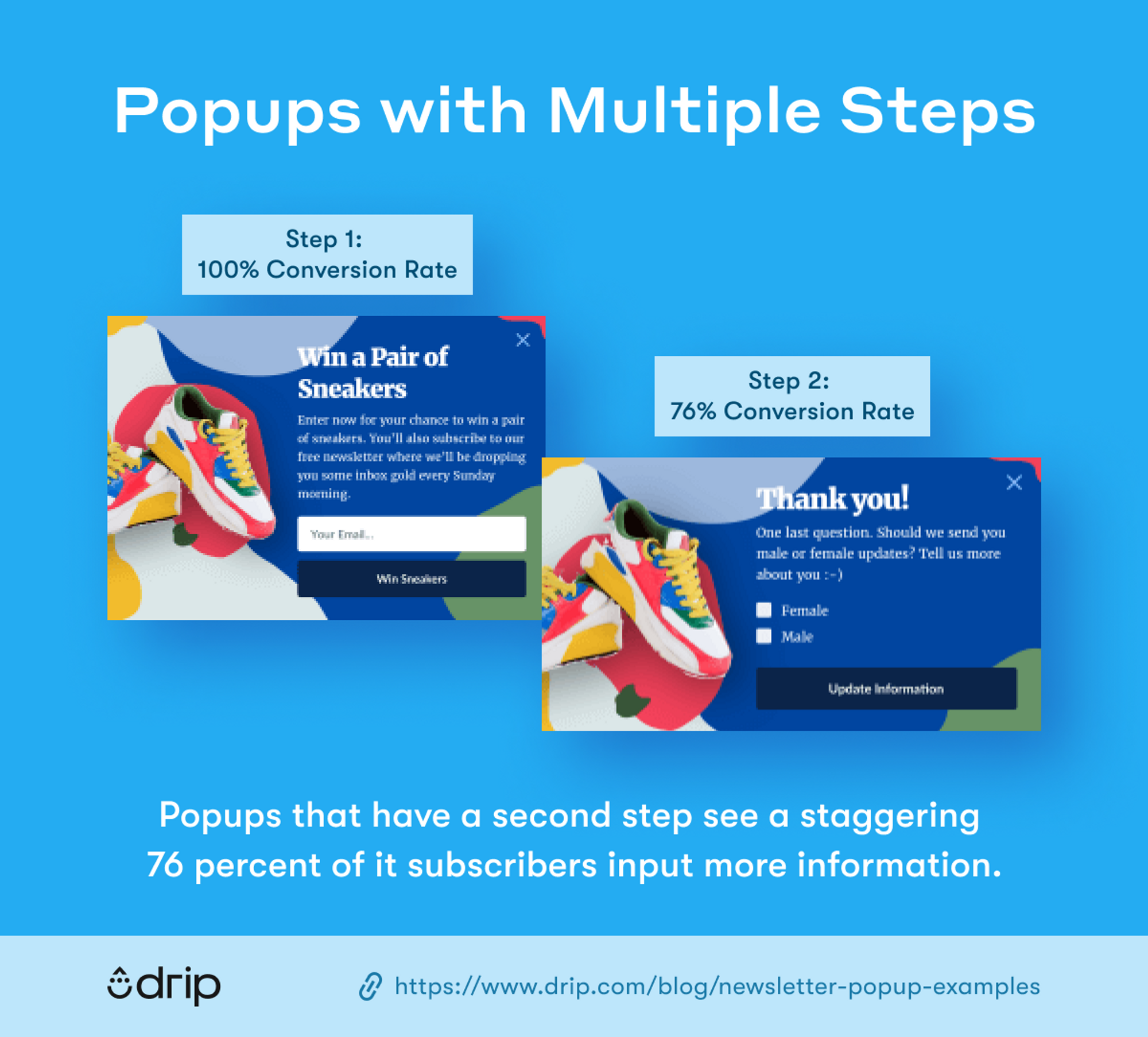
With a multistep newsletter popup, you can ask for a visitor’s email address first, and follow it by segmentation questions such as location, age, gender, or interests.
More conversions and a more segmented email list. Win-win.
Conclusion
Hopefully, you can see from this article that there’s no single “right way” to do newsletter popups.
From timed triggers and exit-intent popups to stylish imagery and subtle design, there are lots of tactics you can employ. More importantly, what works best for one brand may not work so well for you, so you should definitely be open to playing around with a few different formats and offers.
However, there are definitely a few things you should avoid when it comes to creating newsletter popups that convert:
- Don’t interrupt users the second they land on your site.
- Don’t demand too much personal information from them.
- And don’t make your offer too complex. This is a popup, not War and Peace.
If you give users something they actually want and don’t ask for too much in return, you’ll get results.

