Fifty milliseconds. That’s 0.05 seconds, and roughly how long it takes the average ecommerce shopper to form an opinion about your mobile site.
If they like it, they’ll stick around, engage with your store, and hopefully make a purchase. If not, they’ll leave, with a large percentage never to return.
It’s critical that you nail your mobile landing page and hit all of the right notes.
To give you a clear idea of how to accomplish this, here are some of the best mobile landing page examples we’ve come across in 2026 and the specific things they’re doing right.
Table of Contents
1. Mahabis Slippers
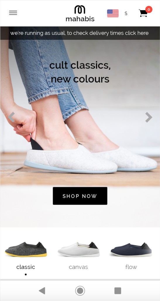
Let’s start with the obvious.
This mobile landing page from mahabis slippers is visually very striking. There’s no doubt that it passes the test of grabbing the attention of most ecommerce shoppers within 50 milliseconds and should compel a good number of them to browse through the site.
Next, mahabis does a great job of showcasing their products, letting shoppers know what they’re selling. mahabis uses barely any copywriting, and instead, lets images of their products do the talking and highlight some of their most popular slippers.
Also, note that this brand uses a slider for their homepage, which shuffles through a couple of other images, including this one.
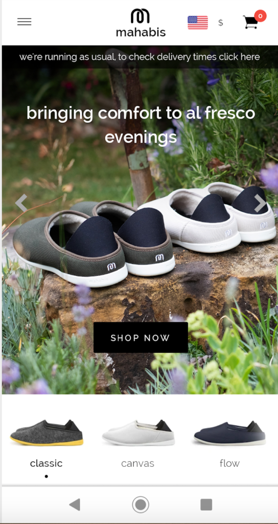
While a slider isn’t always a good idea, and many UX experts straight up advise against them, I think it works in this case and provides shoppers with a quick overview of what they can expect from mahabis.
I love the uncluttered look of this landing page and that mahabis uses plenty of negative space to break up the different elements.
This is important in general, but it’s super important for mobile users dealing with limited real estate (the average size of a smartphone is only 5.5 inches).
Although many mobile users do scroll, you must present the essentials at the top of your mobile page without making them do too much work.
Finally, mahabis has a unique and innovative way of demonstrating how their slippers are constructed and the quality materials they’re made with.
First, shoppers see what the mahabis classic slipper looks like.
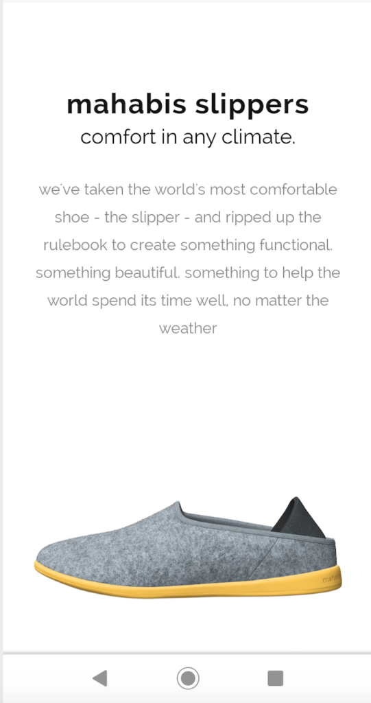
But when they scroll down just a bit, they see the product deconstructed, with a quick rundown on the high-quality materials.
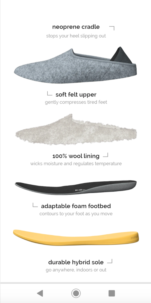
I think this is smart, and there’s a sense of satisfaction that goes into the UX.
2. Bugaboo
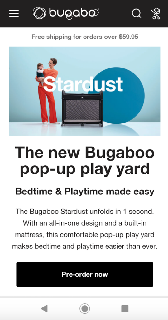
No, this isn’t a 1999 song from Destiny’s Child. Bugaboo is an ecommerce brand that specializes in pop-up play yards, strollers, and accessories for kids.
Here’s why this is one of the best mobile landing page examples of this year.
First, it offers a nice looking image, which instantly lets shoppers know what Bugaboo is selling and gives them a good feel for what the featured product, the Stardust pop-up play yard, looks like. This sets the stage to give shoppers a positive opinion of this brand’s mobile site within 50 milliseconds. Check.
Next, they use clear, concise copy that’s quick and easy to read. The header and subheader do a great job of getting shoppers up to speed, letting them know what Bugaboo is selling and why they should care.
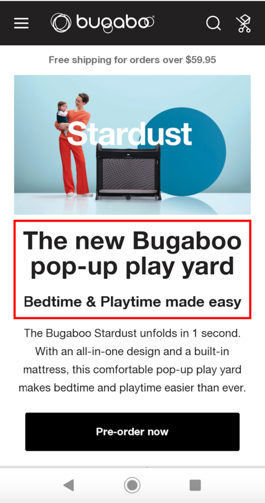
It’s a pop-up play yard, and it makes bedtime and playtime easy. And just below that, it starts with copywriting that’s a real attention grabber.
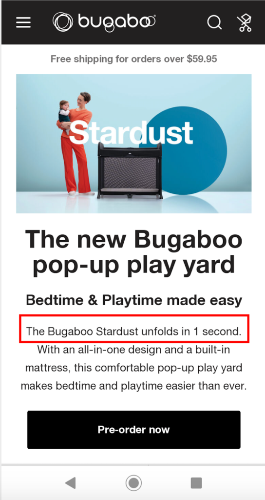
Their product unfolds in one second. Talk about a unique value proposition (UVP). That’s about as fast and easy as possible, and a massive selling point that should pique the interest of almost all shoppers.
Third, this mobile landing page features a prominent CTA that gets shoppers where they need to go with zero confusion.
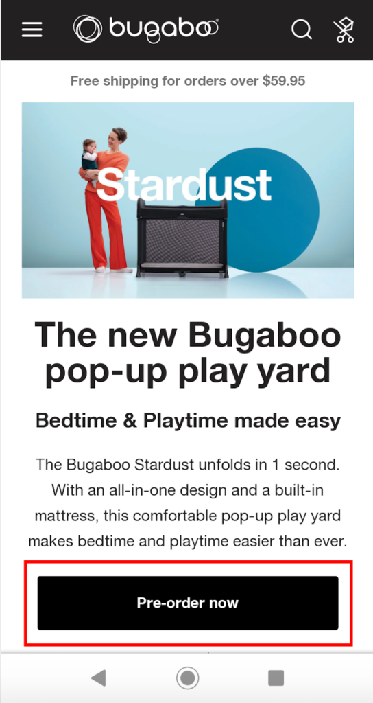
That’s extremely important because you never want any guesswork in terms of what action you want shoppers to complete or to have any friction getting them to the checkout page.
Lastly, Bugaboo makes it a breeze for visitors to browse through the rest of their landing page and conveniently find other products they’re offering besides the pop-up play yard.
For instance, here’s info on their ultra-light, full-size stroller, the Bugaboo Lynx.
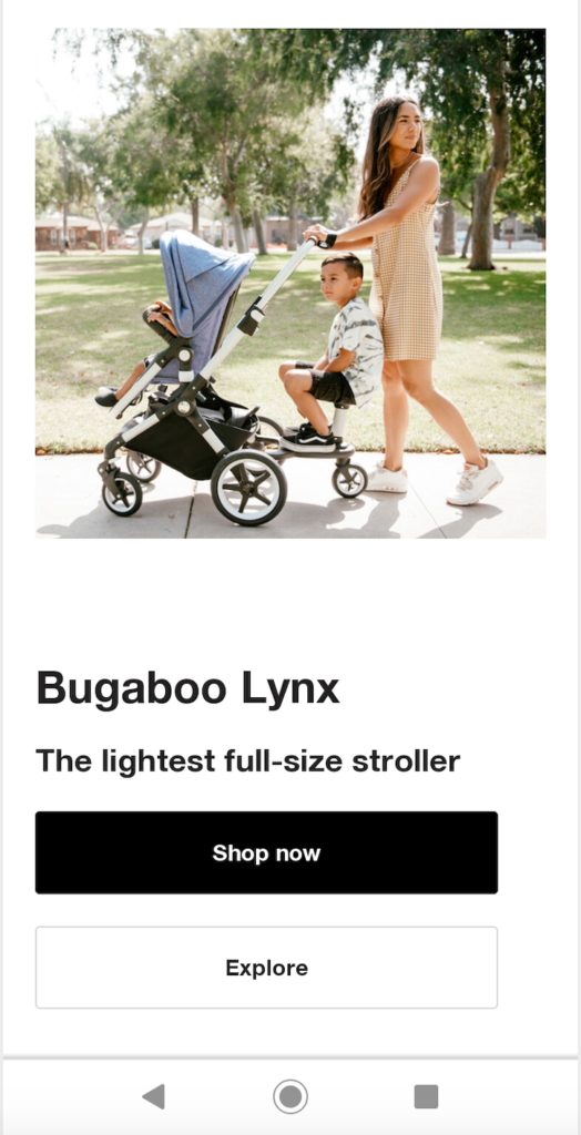
The whole experience is very smooth and seamless and requires very little effort on the shopper’s end. And notice just like with mahabis slippers, Bugaboo does a great job at using plenty of negative space with large fonts to achieve an uncluttered look that looks amazing on mobile.
3. FRONKS
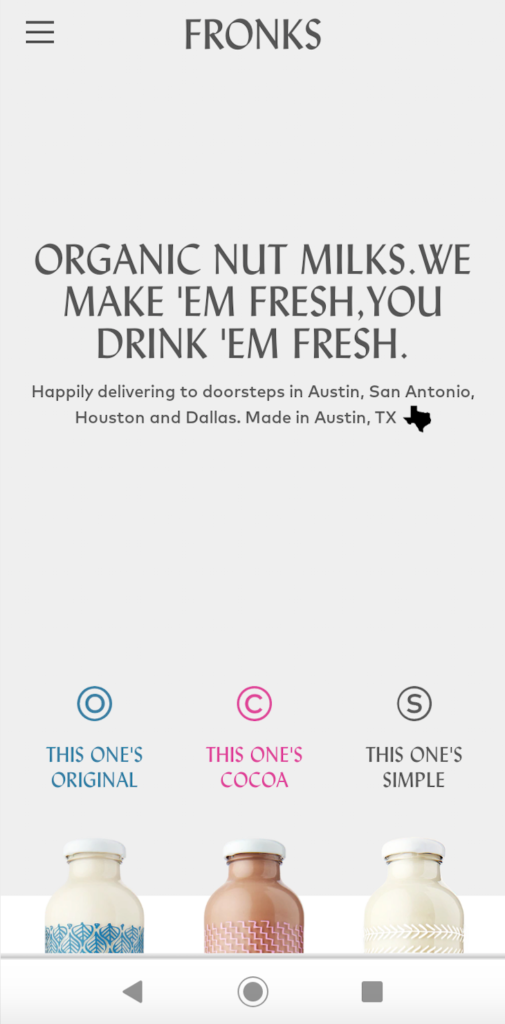
Here’s a brand that sells “original fresh, organic nut milks delivered weekly to your door.” It’s one of the most simplistic mobile landing page examples I’ve come across and has a minimalist feel that many people will appreciate.
The second someone lands here, the bold, clearly written header lets them know what FRONKS is offering.
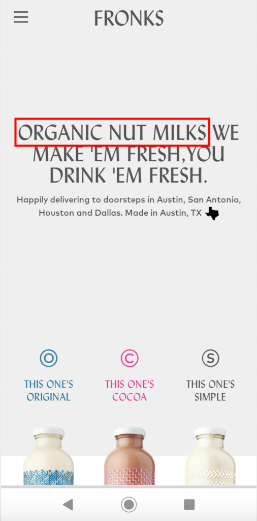
And since this is a regional brand that currently only sells to larger markets throughout Texas, they make this clear in the copy just below that.
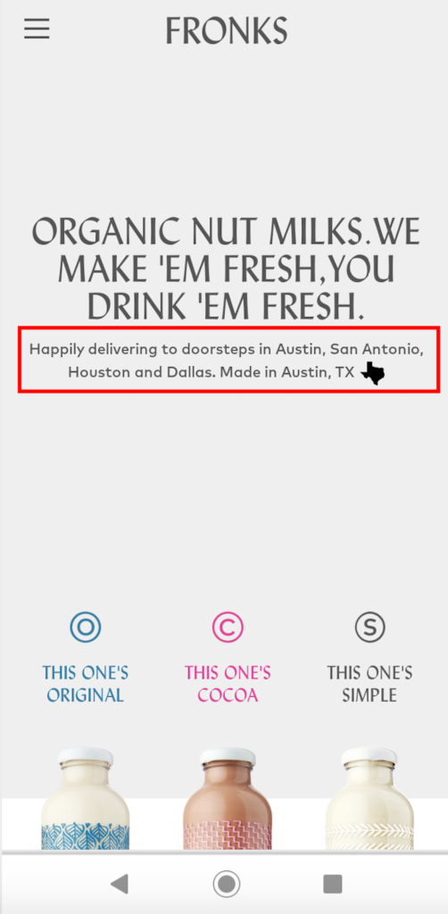
Everything flows well and is enough to reel in a large percentage of visitors, turning them into qualified leads.
But where FRONKS succeeds is below the copy, where they have beautiful images of the three products they’re selling—Original, Cocoa, and Simple organic nut milks.
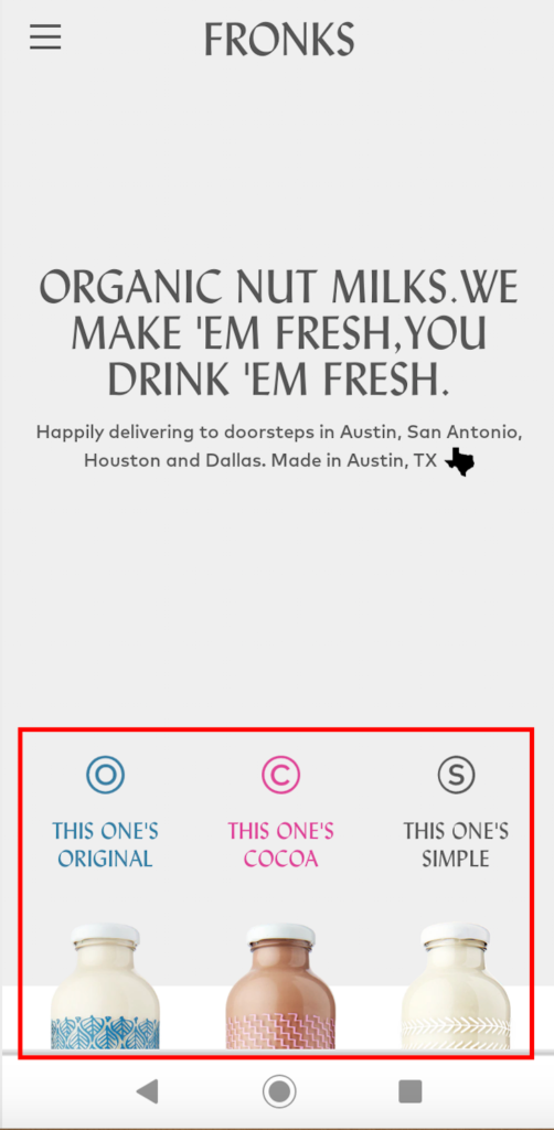
The images look fantastic, and with a quick tap, a shopper can visit each page to learn more about the product and buy.
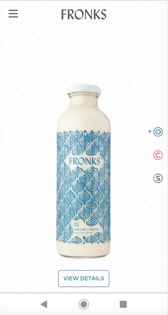
It’s extremely simple and straightforward and gives shoppers all the information they need with minimal cognitive expenditure. And one last thing I should point out is that this entire landing page is above the fold.

There’s no scrolling involved, which helps add to the simplicity and user-friendliness. This isn’t to say that you need to go this extreme when building your own landing page, but it shows the value of making your shoppers’ lives easier.
4. Dress Up
Dress Up is an online dress boutique that makes it a cinch for women to find the trendiest new fashion products.
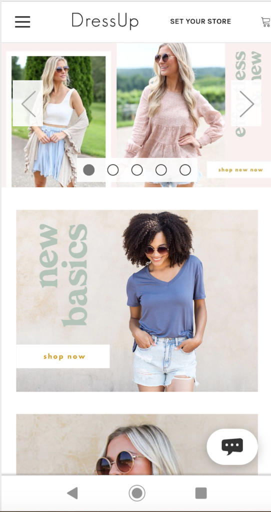
And there’s a lot you can learn from their mobile landing page, starting with the aesthetics. It features stunning images with models in the foreground, and light, pastel-ish backgrounds, for a great contrast that brilliantly shows off their products.
That alone should grab the attention of many visitors and motivate a high percentage to explore their mobile site. Now let’s get into some more details.
At the very top, there’s a slider that allows shoppers to quickly see Dress Up’s current offerings.
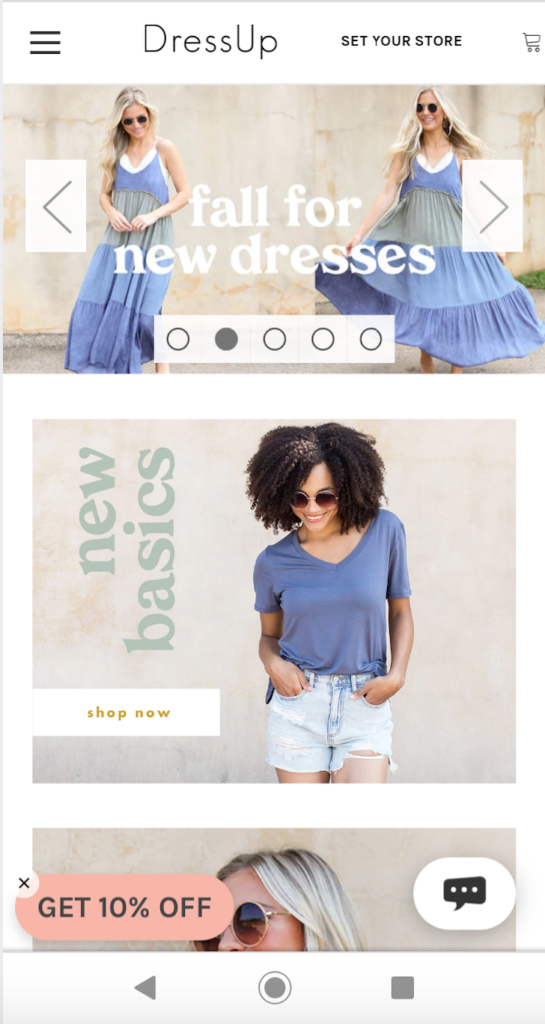
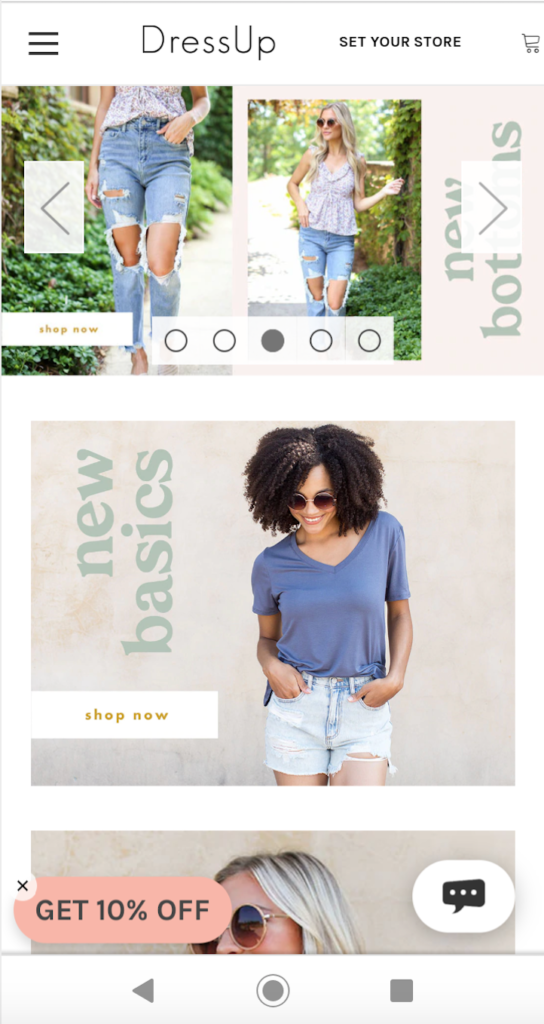
Again, not everyone is crazy about slider navigation, but this example shows that when done right, it can certainly turn out well. Plus, it helps pack more information into a small area above-the-fold.
In terms of copywriting, it’s incredibly straightforward, with everything above-the-fold consisting only of headers. And when a shopper scrolls down to view different product sections, the copy is very concise and isn’t any longer than it needs to be.
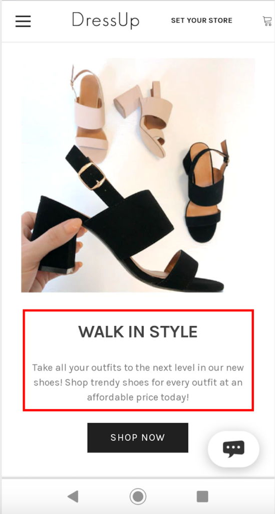
As for CTAs, Dress Up keeps them dead simple, letting shoppers know what actions to take.
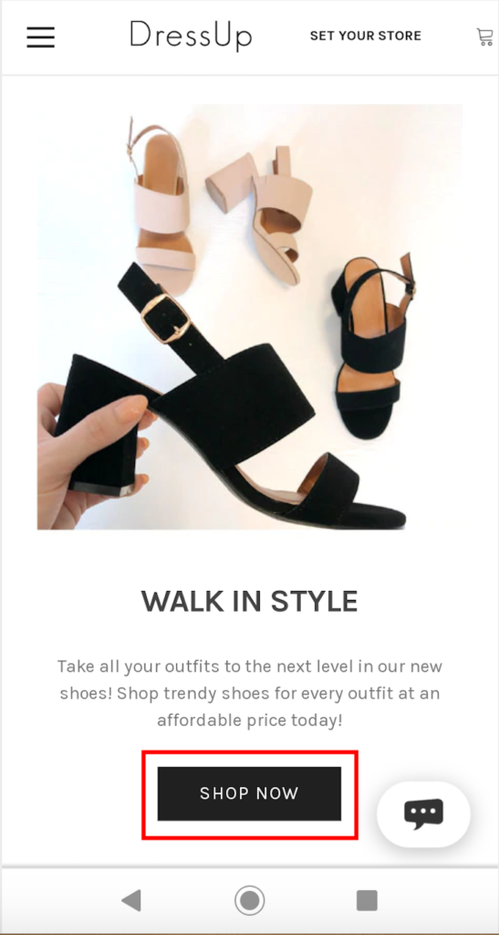
Note that the CTAs use well designed, black colored buttons that contrast perfectly with the white background. This example from Dress Up shows that you don’t need to reinvent the wheel to have a great mobile landing page.
You just need to present your products in a logical, easy to follow manner and use captivating images that showcase what you’re offering.
5. BOXHILL
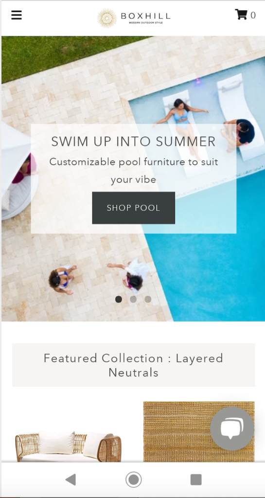
Another common thread that you find among the best mobile landing page examples is the use of a single-column layout. Using this as opposed to a multi-column layout is vital for
- Making information easy to digest;
- Making the landing page look good visually; and
- Preventing mobile shoppers from becoming overwhelmed.
Modern outdoor style company BOXHILL does an impeccable job of using a single-column layout. At the very top, this page starts with a crisp image of a swimming pool, highlighting their customizable pool furniture section that they’re promoting at the moment.
And as a shopper scrolls down, the single-column layout lets them smoothly transition into other different collections, like layered neutrals.
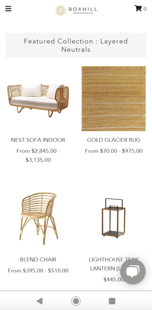
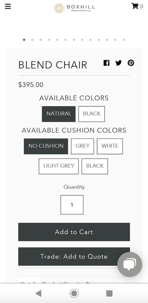
In this section, BOXHILL includes links to four of their bestselling items and does an amazing job creating a contrast between the products in the foreground against the white background.
This looks great, but it’s also easy for mobile shoppers to view pertinent product details, including the name and price range. As they scroll down further, shoppers can find other key offers, while having the products presented in an extremely user-friendly way.
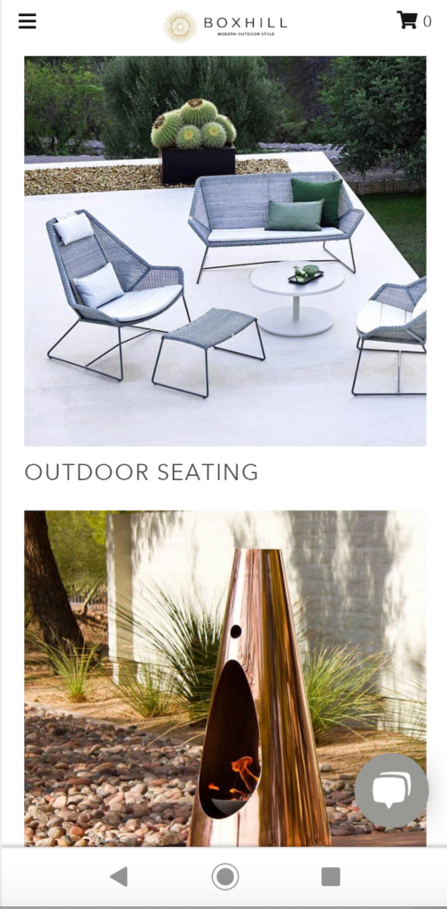
BOXHILL’s primary strengths are using a beautiful layout that serves as eye candy to reel mobile shoppers in and allowing them to seamlessly browse through a sizable selection without feeling the least bit overwhelmed.
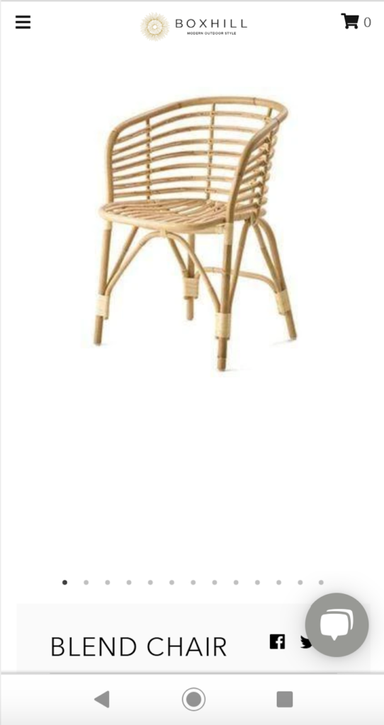
Rather, it feels comfortable, intuitive, and quite satisfying. Whenever a shopper sees something they’re interested in, a quick tap takes them to the individual category or product page, where they can get the details and make a purchase.
6. Bon Bon Bon
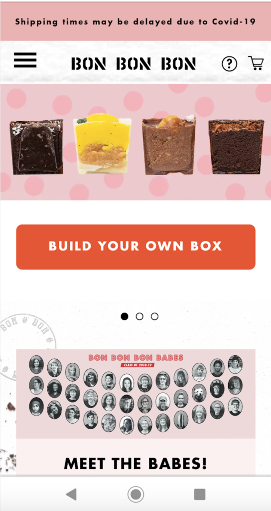
Bon Bon Bon is a Detroit-based brand that sells insanely high-quality chocolates, where customers can create their own custom boxes. Here’s why this mobile landing page example works.
One, it packs a punch visually. The first thing shoppers see when arriving on it is robust images of some of their top chocolates. It’s a natural attention grabber and lets them know that Bon Bon Bon isn’t your average, run-of-the-mill chocolate brand—they’re something special.
Two, they don’t waste any time dropping a CTA. Visitors first see some of the chocolates, and directly under that is a CTA to build their own box, which is about as simple as it gets. And of course, the CTA follows best practices by being a bold button that stands out from the background.
Three, they make the overall mobile browsing experience fluid and enjoyable. Bon Bon Bon allows shoppers to quickly scroll down to find other interesting offers, like their chocolate collections and merch.
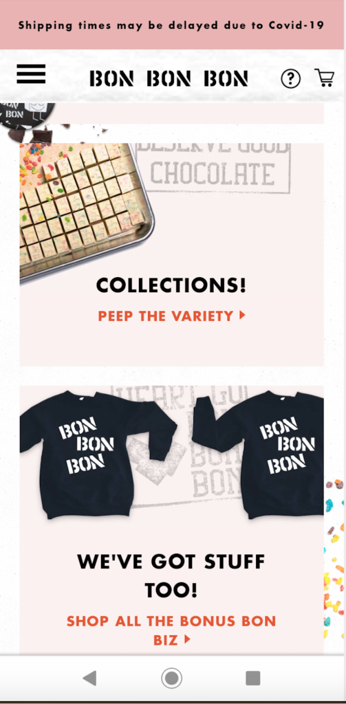
This means shoppers don’t have to expend needless mental energy to figure out what Bon Bon Bon is, why they’re a noteworthy brand, and how to order. It’s all ultra streamlined, and shoppers can get what they want with no hassle.
7. Leather Head Sports
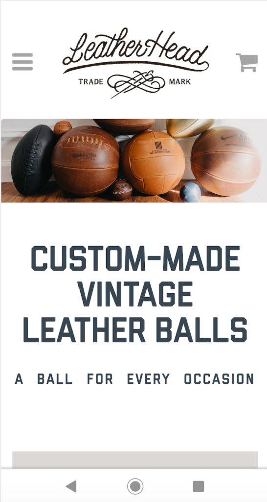
My final example comes from Leather Head Sports, an ecommerce brand that sells the finest handmade leather balls, including footballs, basketballs, baseballs, medicine balls, and more.
Everything is high-end and high performance, with a vintage look that many people are crazy about. There are a few things that stand out on this mobile landing page.
Let’s start by talking about the great-looking image and crystal clear UVP above-the-fold.
The UVP succinctly lets shoppers know what Leather Head Sports is selling—custom made vintage leather balls—and the picture lets them see firsthand what the products look like. This is a good starting point and lets shoppers quickly get oriented.
Next, this brand lets mobile shoppers browse through the different categories on their sites with zero guesswork. For instance, here’s what the football and basketball sections look like.
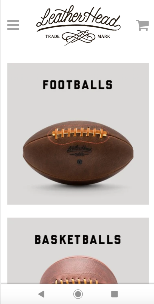
If shoppers scroll down a bit further, they can find more information on each product category that goes into more depth on what distinguishes Leather Head Sports from the competition.
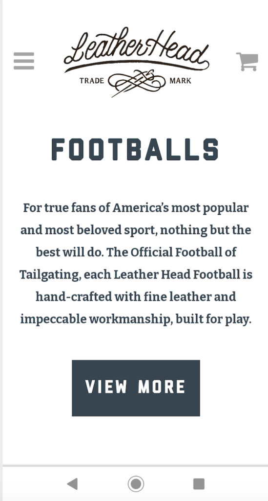
Notice how they emphasize that their products are hand-crafted and have impeccable workmanship. Whatever makes your ecommerce brand epic, let it be known.
And finally, this brand throws in some rock-solid social proof, mentioning that they’ve been featured in high-profile publications, like The Wall Street Journal, GQ, and Esquire.
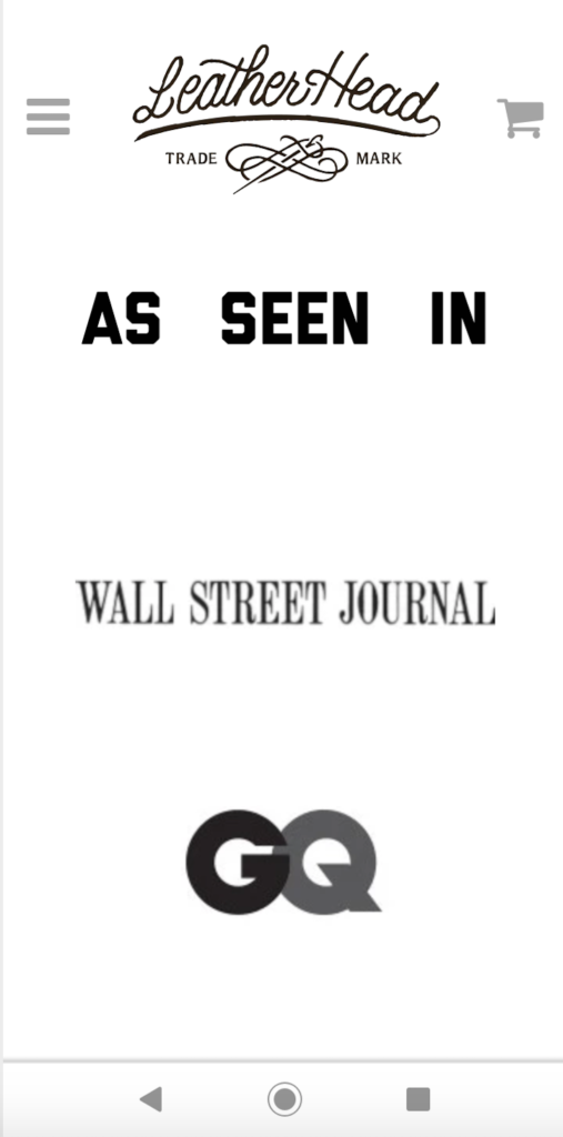
This helps them establish instant credibility and gets shoppers to take them seriously. Combine all that with the clean design of a white background with black text that shows up great on mobile, and you’ve got a winning combination.

Conclusion
I find that often the best way to create a mind-bendingly awesome mobile ecommerce experience is to look at examples of brands that have knocked it out of the ballpark. And that’s what all of these companies have done.
These are some of the best mobile landing page examples that illustrate the core practices you should be following and how to execute them.

