I think we can all agree that email marketing is effective. It allows you to target a massive demographic and yields a median ROI of 122 percent—four times higher than any other digital marketing channel.
But I think we can also agree that it can get a little stale sometimes.
With so many brands using email marketing, a lot of it becomes white noise, and it’s hard for e-commerce brands to differentiate themselves from one another in crowded inboxes.
To stand out from competitors, get opens, click-throughs, and most importantly, sales, it’s vital that you stay creative and try new things with your email marketing campaigns.
One trend that’s catching on like wildfire as of late is sending interactive newsletters.
If you’re unfamiliar with this concept, it involves “anything that requires a viewer to engage actively and participate with the content to access the full experience, usually by tapping, swiping, or interacting with the piece of content.”
In this post, I’ll explain why this technique has so much potential and why it’s something you should seriously consider implementing.
And of course, I’ll include plenty of real-life interactive newsletter examples from brands that are already using it and experiencing massive success.
Let’s go.
Table of Contents
Why You Should Use Interactive Newsletters
First of all, this strategy has proven to pique subscribers’ interests. Because interactive newsletters incorporate interesting strategies not everyone is using, they’re natural attention grabbers.
In fact, “interactive email content increases the click-to-open by 73 percent.” Considering that an average click-to-open rate hovers around 20-30 percent, this can result in a dramatic spike in engagement.
Just imagine if you increased your number of click-throughs by 73 percent. You would be able to do way more with your subscriber list and send a much larger volume of leads to your product pages.
Next, they’re an excellent way to help brands stand out. According to one survey, “88 percent of marketers said that interactive content is effective in differentiating their brand from competitors.”
And this is incredibly important given that so many niches are hyper-competitive.
We’re living in a time where market saturation is an issue that plagues many e-commerce brands, but using innovative techniques like this can be huge for gaining a competitive edge.
Besides that, “93 percent of marketers agreed that interactive content is effective in educating its buyers.”
Because of the hands-on nature of these emails, they’re perfect for filling subscribers in on the details of your products, how they work, their features, benefits, and so on.
This can be really helpful for increasing their interest level and making them feel more comfortable with making a purchase.
Finally, interactive newsletters have a certain “cool factor” that traditional, run-of-the-mill emails don’t, which can help in building relationships with subscribers and improve your overall brand reputation.
So as you can see, there are some serious benefits here.
Now that I’ve provided a bit of perspective, here are some of my favorite interactive newsletter examples that you can get inspiration from.

1. Burberry
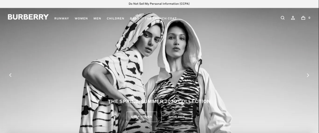
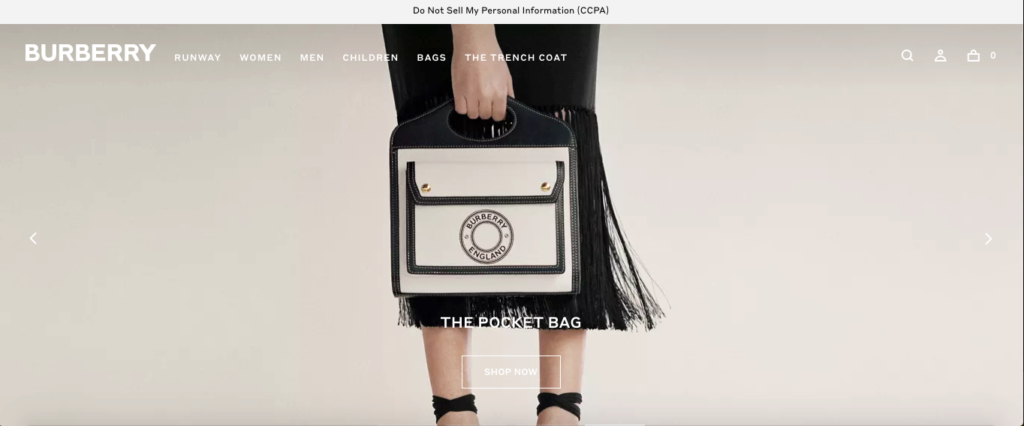
Burberry is a British luxury clothing and accessories brand that specializes in high-end items.
Their website is very dynamic and incorporates elements like an image slider, video clips, and more.
And their strong aesthetic sense definitely spills over into their email campaign.
Take this particular email, for example, promoting their “Nylon and Suede Arthur Sneakers” with a GIF.
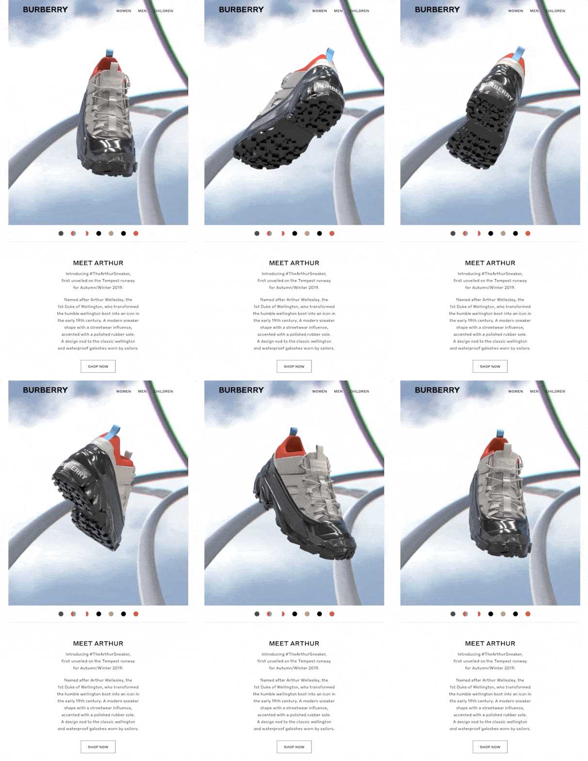
A GIF is one of the most basic forms of interactive content, but as you can see, it can be highly effective for grabbing a subscriber’s attention.
This example is pretty straightforward, with the sneaker spinning around in orbit. But I think it adds a whole new dimension by allowing subscribers to get a 360-degree view of the sneaker, so they can see it from all angles.
I know I personally find it much more compelling than simply looking at a static image. I also like the retro, late 80s/early 90s vibe, which works well for the style of the shoe.
Anyone who’s interested can simply click the “Show Now” button to get the full details on this product.
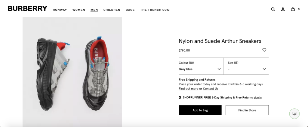
And Burberry does a great job at following up, by offering several crisp images to “sell” it even more.
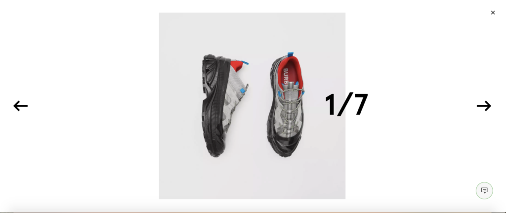
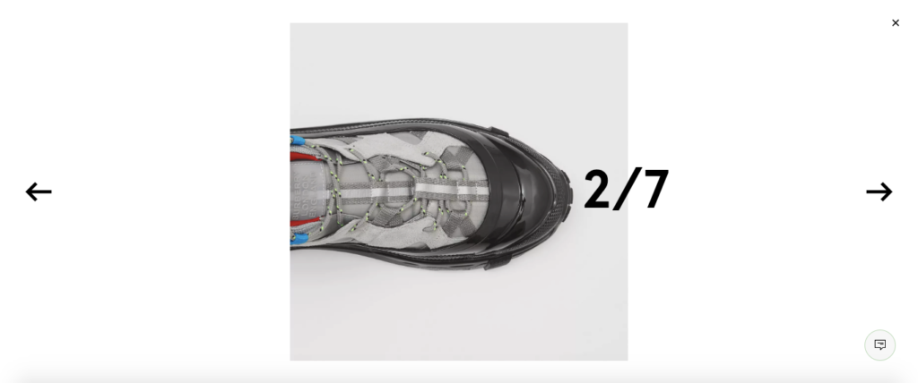
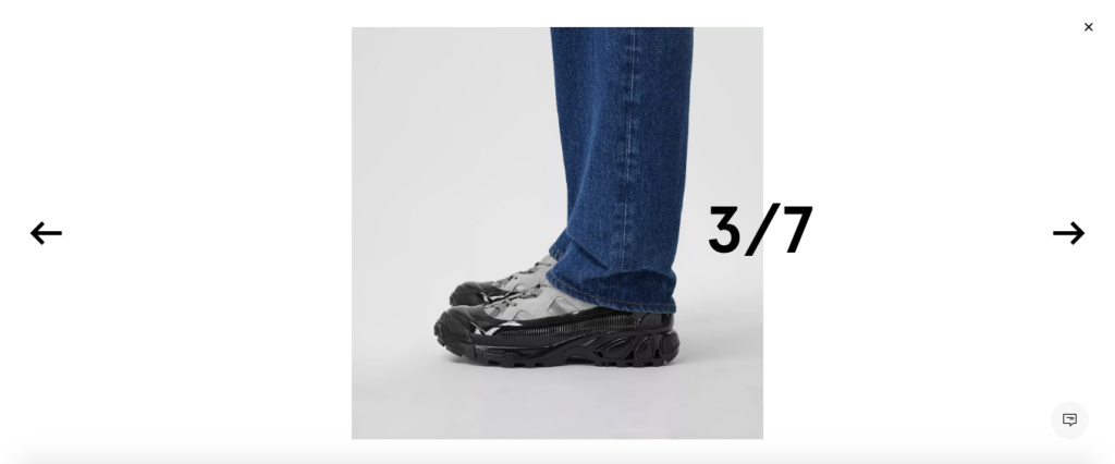
This is one of the more basic examples and goes to show that interactive content doesn’t have to be immaculate to work.
It just needs to capture a subscriber’s attention and make them want to engage.
2. Harry’s
This is a brand that specializes in quality men’s grooming and shaving supplies. They have a really professional site that clearly focuses on aesthetics and delivers a truly eye-popping experience.
Here’s what their homepage looks like.
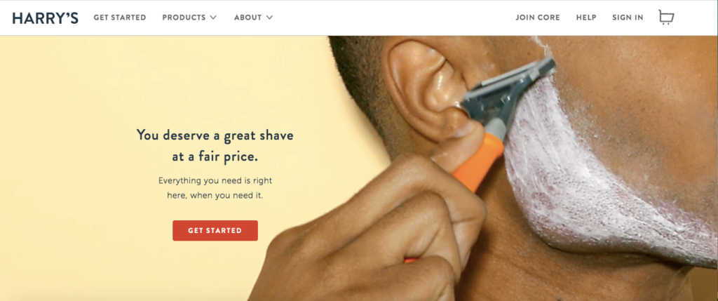
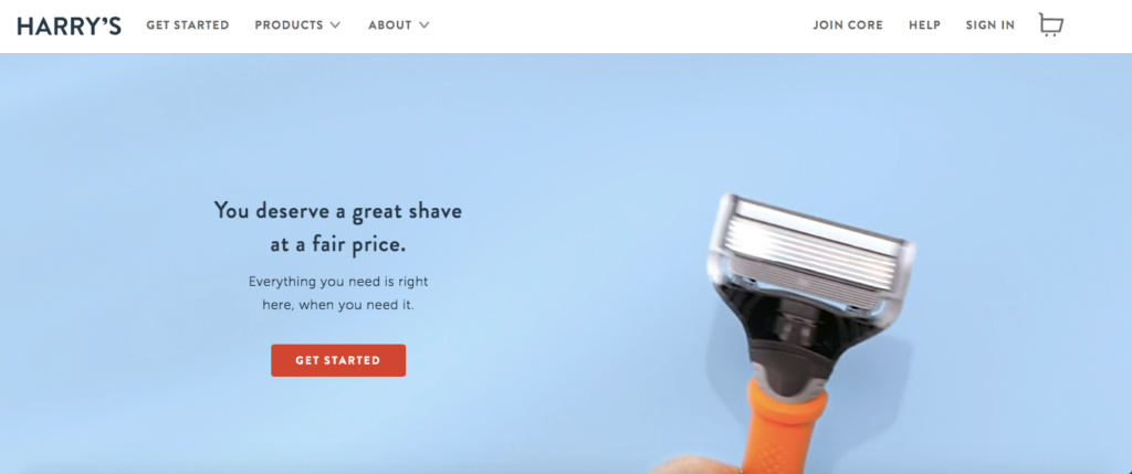
So it should come as no surprise that Harry’s has created some epic interactive newsletters as well.
One that I really love is called “Zen and the Art of Scent-Matching.”

It’s really clever and features a “highly scientific test” to help subscribers decide which body wash scent is right for them — Stone, Fig, or Shiso.
They start by asking this question about which type of mixed drink a person prefers.
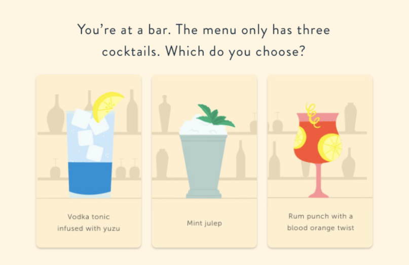
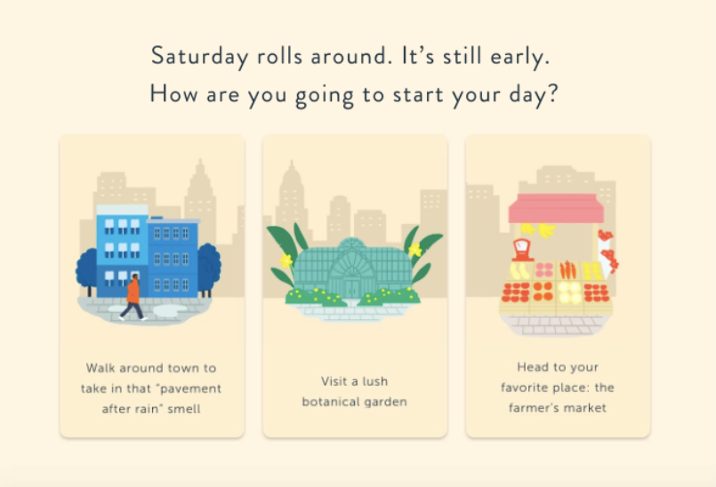
Next, there’s this question about which activity a person would like to start their Saturday with.
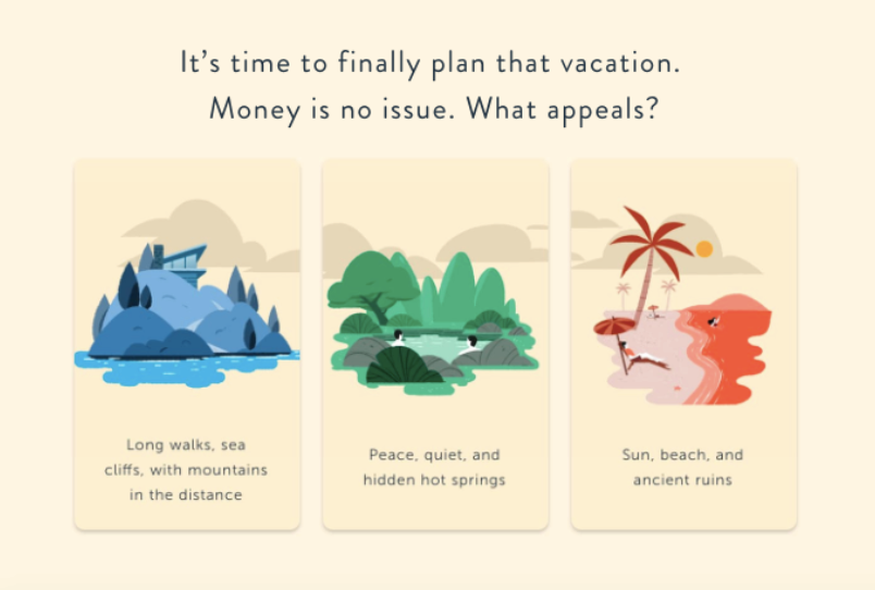
And finally, there’s this question about what their ideal vacation would be.
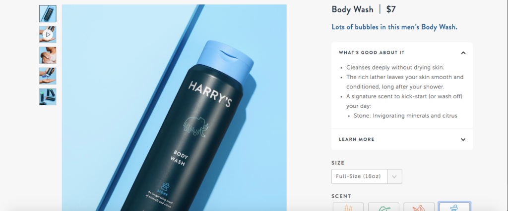
Harry’s then “calculates” a subscriber’s response and lets them know which body wash scent is best suited for them.
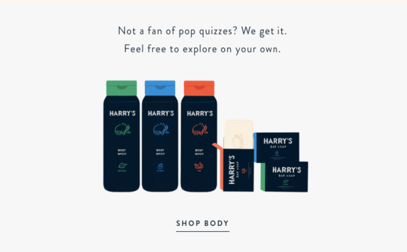
And toward the bottom, there’s another option for people who aren’t fans of pop quizzes where they can explore Harry’s products on their own.
This is a fun and playful interactive newsletter that uses humor, wit, and great visuals to captivate subscribers.
And there’s a lot you can learn from it when developing your own interactive content.
3. Cover Me Ponchos
Here’s an e-commerce company that sells comfortable ponchos for women who are nursing.
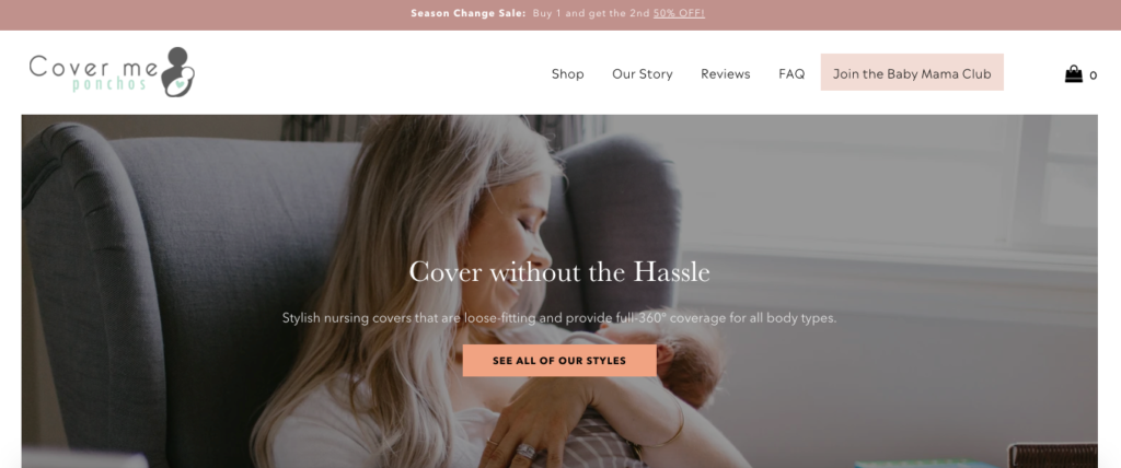
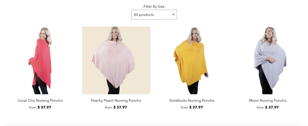
They’ve carved out a nice niche for themselves and have a full line of products that come in a variety of styles and colors like these.
And they have one of the more interesting interactive newsletter examples, which features a “digital scratch card.”
Check it out.
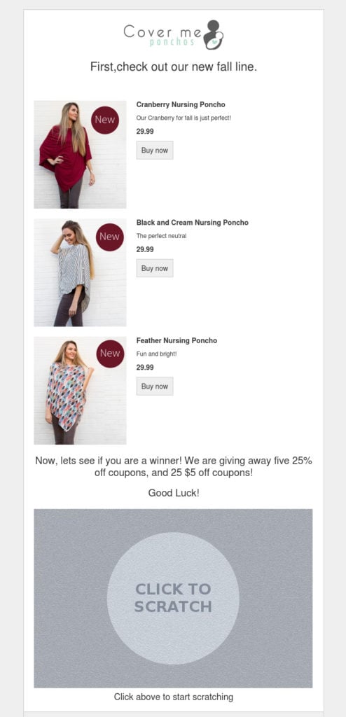
It features three of their top products, and subscribers can “scratch” off the card by clicking on it to see if they win either one of five 25 percent off coupons or one of 25 $5 off coupons.
This is something many email subscribers are interested in and brings back fond nostalgic memories for many who used physical scratch-off cards when growing up.
And it was really successful with a 9.6 percent click-through rate (the average is only 2.5 percent) and four times the conversion rate than other emails Cover Me Ponchos sends.
This makes it yet another interesting interactive newsletter idea to experiment with.
4. BHLDN
BHLDN is a company that sells wedding dresses, bridal gowns, formal dresses, and related accessories.
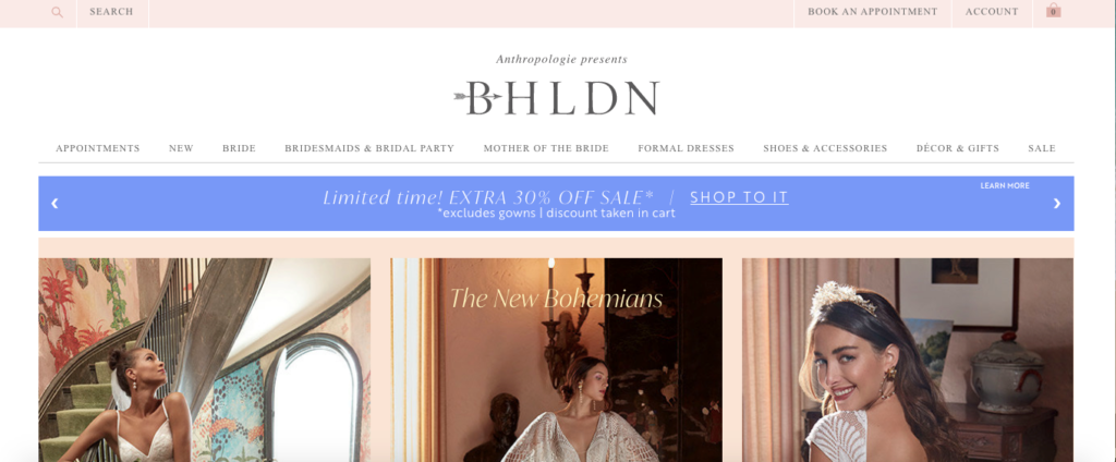
Like the other brands I’ve mentioned so far, they’ve got a great looking website and focus heavily on visuals.
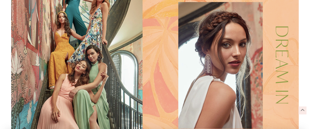
Their purpose is to help brides-to-be and bridesmaids have a fun, unforgettable experience at their wedding. So there’s definitely an element of playfulness to their brand identity.
And that’s something they work into this interactive newsletter as well.
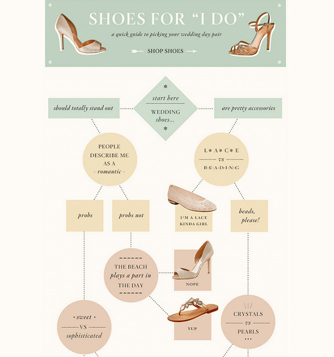
Shoes for “I Do” is an interactive game, which helps email subscribers find the perfect shoes for their wedding day.
They start at the top and decide whether they would prefer wedding shoes that stand out or that are simply pretty accessories.
From there, they work their way down until they find the shoes that are right for them.
Whenever a subscriber clicks on shoes, they’re taken to the product page on BHLDN’s website where they can get more details and make a purchase.
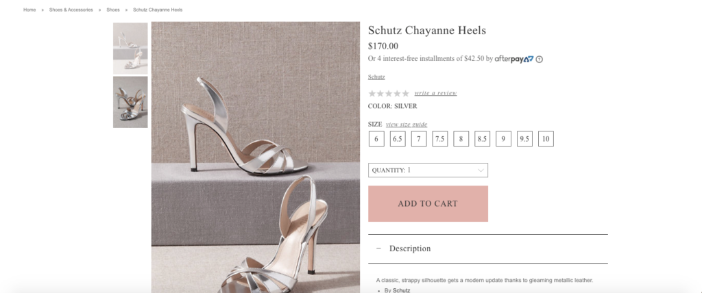
It’s a fun way for subscribers to become more familiar with BHLDN as a brand and is actually quite practical if you think about it, especially for brides-to-be.
They’re likely overwhelmed with a ton of other aspects of wedding planning and could probably use some advice on what kind of shoes to get to complete their attire.
BHLDN helps streamline the process in an interesting way. And this interactive game concept is something that can be applied to a lot of different niches.
It just boils down to being creative and finding unique ways of getting subscribers involved. If you can do that, your engagement and sales should skyrocket.
5. TOMS
I’m a huge fan of TOMS, a shoes and apparel brand that was based on the one-for-one policy, where they gave away a pair of shoes for each one they sold.
They started out small but have grown into an extremely successful company over the years.
TOMS has always had a creative, out-of-the-box approach, which is apparent in the products they create and the marketing techniques they use to reach consumers.
They also have one of the coolest interactive newsletter examples I’ve seen, with this one featuring their “Glow-in-the-Dark Classic” shoes.
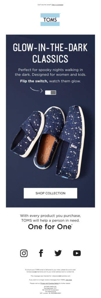
The email starts by displaying the shoes in a typical picture.
But check out what happens when you “flip the switch.”
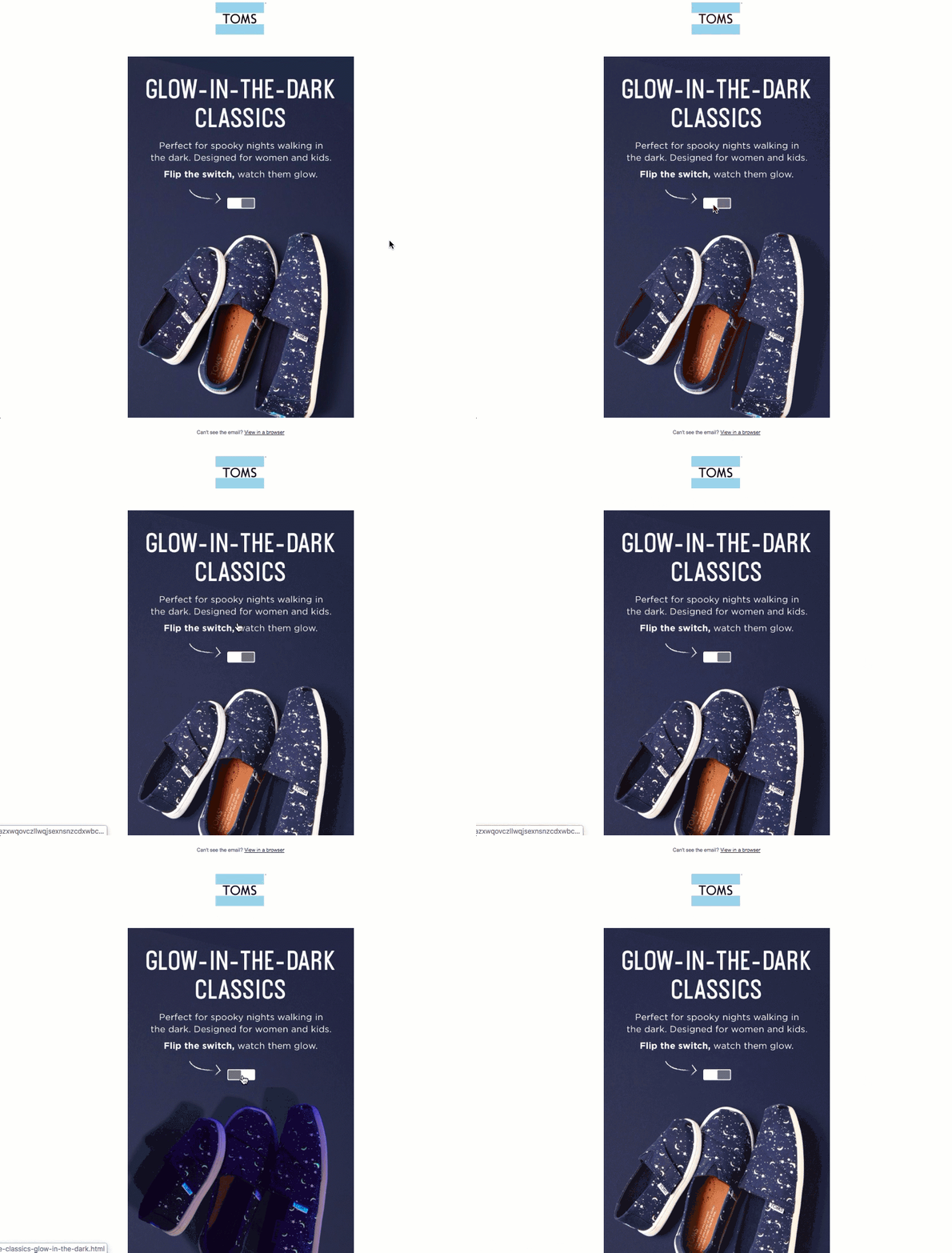
You can instantly see what they look like when they’re glowing in the dark.
Rather than simply showing two different pictures of the shoes before and after, this is a much cooler approach that many subscribers find compelling.
It certainly catches you by surprise and creates a whole new dimension, which I’m sure many people will appreciate.
6. Pretty Little Thing
Finally, there’s Pretty Little Thing, a popular women’s fashion clothing and apparel company that has a staggering 12.4 million Instagram followers as of early 2020.
Again, this is a brand with a heavy visual focus, which is likely a big part of their success.
Their website pops with vibrant colors and does a great job of generating interest in their products.
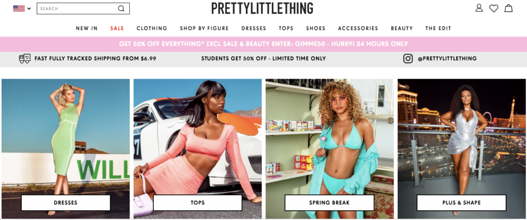
And their email campaign is equally impressive and makes great use of interactive newsletters.
One particular email that stands out is this one, which lets subscribers click a unicorn to reveal a discount.
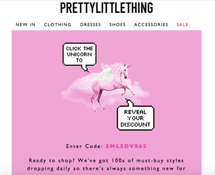
The concept of offering a discount isn’t anything new or groundbreaking. In fact, it’s one of the most common techniques e-commerce brands use to encourage engagement and increase sales.
But the way Pretty Little Thing goes about it is pretty innovative.
I mean, who wouldn’t be interested in clicking on a unicorn to get a discount?
I know I would.
And the theme of this message ties in perfectly with their overall brand identity of being a little bit loud and flashy—so it works well.
The lesson here is that you can take a basic strategy that everyone is using, like offering a discount and repackage it in a way that’s totally unique and sure to get a good percentage of your subscribers excited.
Conclusion
Email marketing has come a long way over the years. It started out with basic text and a link or two with the hopes of directing subscribers to a website or product page and urging them to buy.
But now it’s morphed into something far more interesting, and these interactive newsletter examples provide a glimpse of just how many possibilities there are now.
They also show what e-commerce brands are capable of when they tap into their creativity and push the envelope. And it doesn’t have to be complicated.
Many of these examples rely on straightforward concepts. At the end of the day, it’s just a matter of getting your subscribers in on the action and giving them a fun way to engage with your brand.
As you can see, there are multiple ways to incorporate interaction into your emails.
Whether it’s using GIFS, brief questionnaires, games, or simply letting them click on something like a unicorn to get a discount, this all helps boost engagement.
That way, subscribers will actually be excited when they see an email from you in their inbox, feel compelled to check it out and hopefully click on your offer.
And looking at the bigger picture, this can increase sales, while at the same time building up your brand reputation.

