Bust out the cake, confetti, and streamers. It’s birthday time.
This is one of the most special days of the year when everyone deserves to be acknowledged and celebrated. It’s also the perfect time for e-commerce brands to send a happy birthday email to their subscribers.
And research has found that this is something most people are insanely receptive to, with birthday emails having “179 percent higher unique click rates than promotional emails.”
Just think about it. Would you be more likely to open an email wishing you a happy birthday with some type of exclusive deal or discount? Or one with a shameless promotion that you have no interest in?
It’s obviously the former. Not only that, but birthday emails also have a 481 percent higher transaction rate and earn 342 percent more revenue than promotional emails. So this is definitely something you need to incorporate into your email marketing arsenal.
To understand how to do this effectively, I’m going to share with you some of the best happy birthday email examples I’ve come across from brands who have knocked it out of the park.
I’ll also point out specific elements of each email that make them winners, so you can apply those strategies to your own campaign. Now make a wish and blow out the candles—let’s go.
8 Happy Birthday Email Examples to Inspire Your Own
1. Puma
For a long time, Puma has been a leading athletic and casual fashion brand. Over the years, they’ve done a consistently great job of reaching their target audience through a variety of different mediums, and email is no exception.
I like this happy birthday email example because it gets straight to the point.
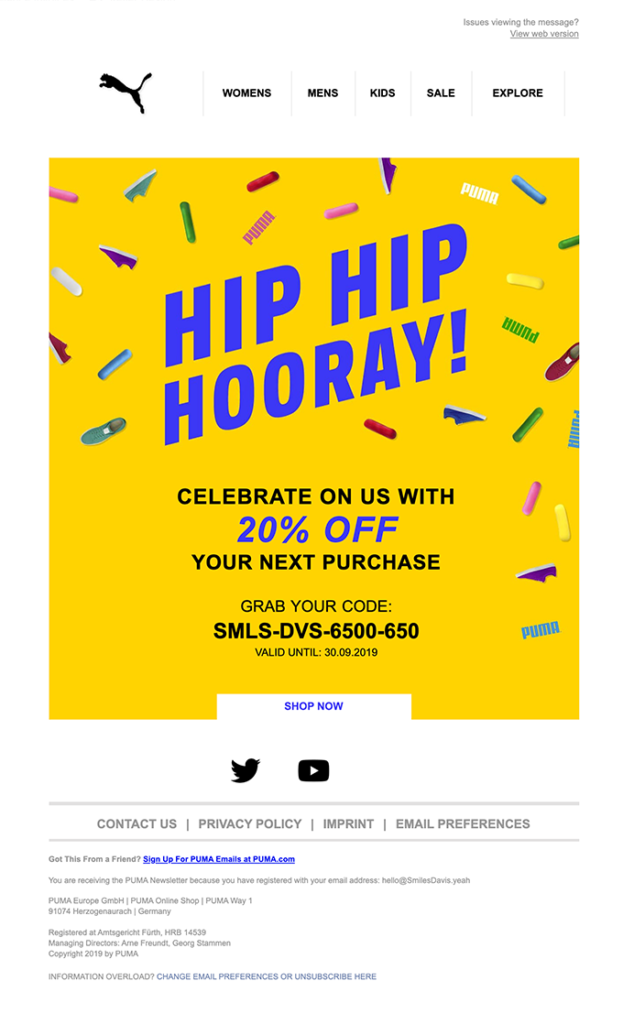
They use bold aesthetics with “Hip Hip Hooray” in large text at the top, along with a mix of birthday sprinkles and Puma shoes, which I think is pretty clever. This is a nice touch and gets readers in a celebratory mindset.
Just below that, they place a crystal clear offer of 20 percent off the reader’s next purchase, which should provide some strong incentive to buy. All they have to do is grab their code and redeem it when making a purchase. It’s super simple, and Puma leaves no room for confusion.
This example shows that less is often best, and you don’t need to do anything fancy for a happy birthday email to have a big impact.

2. Birchbox
We’ve just established that offering discounts can provide a strong incentive for readers to buy. Puma did that by offering 20 percent off.
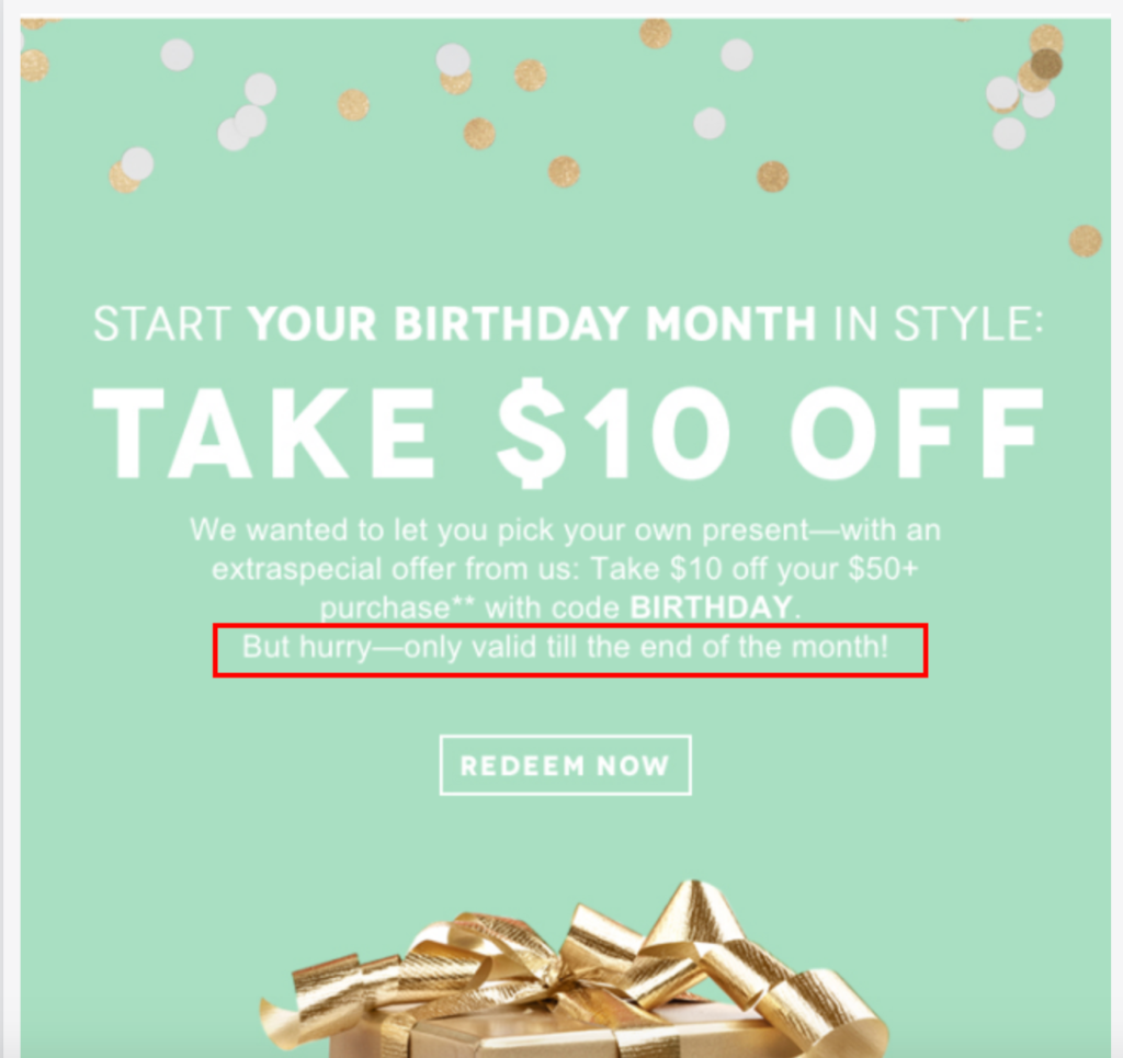
But beauty and grooming subscription box company Birchbox takes another approach by giving a subscriber $10 off their next purchase of $50 or more.
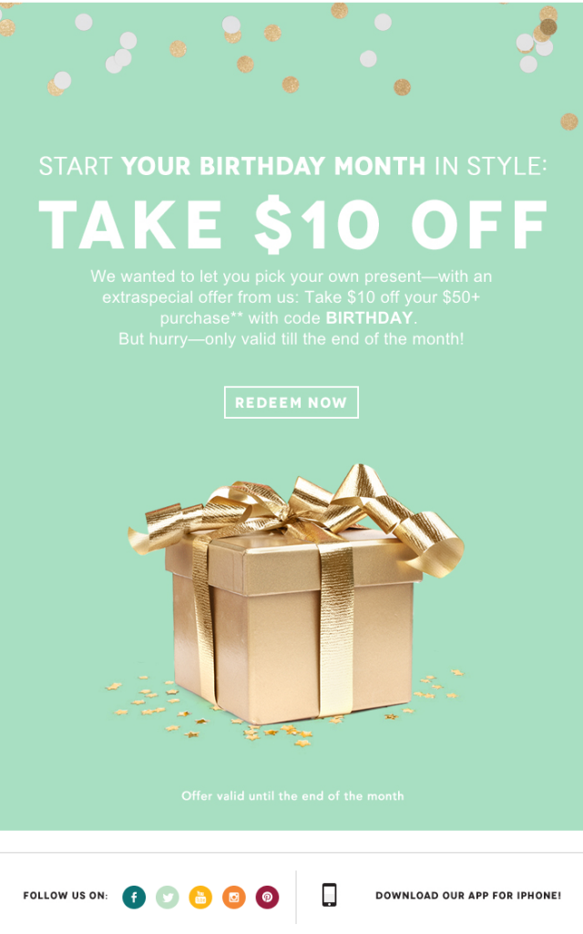
All subscribers have to do is use the redemption code “BIRTHDAY” to cash in on the offer. This is a great way to pique the interest of readers and provides them with a convenient path for saving. And there are a couple of other things I love about this email.
It uses stunning visuals, with a light green background and gold present in the foreground, which immediately grab a reader’s attention. Also, Birchbox creates a sense of urgency by saying the offer is only valid until the end of the month.
They do it here…
And here.
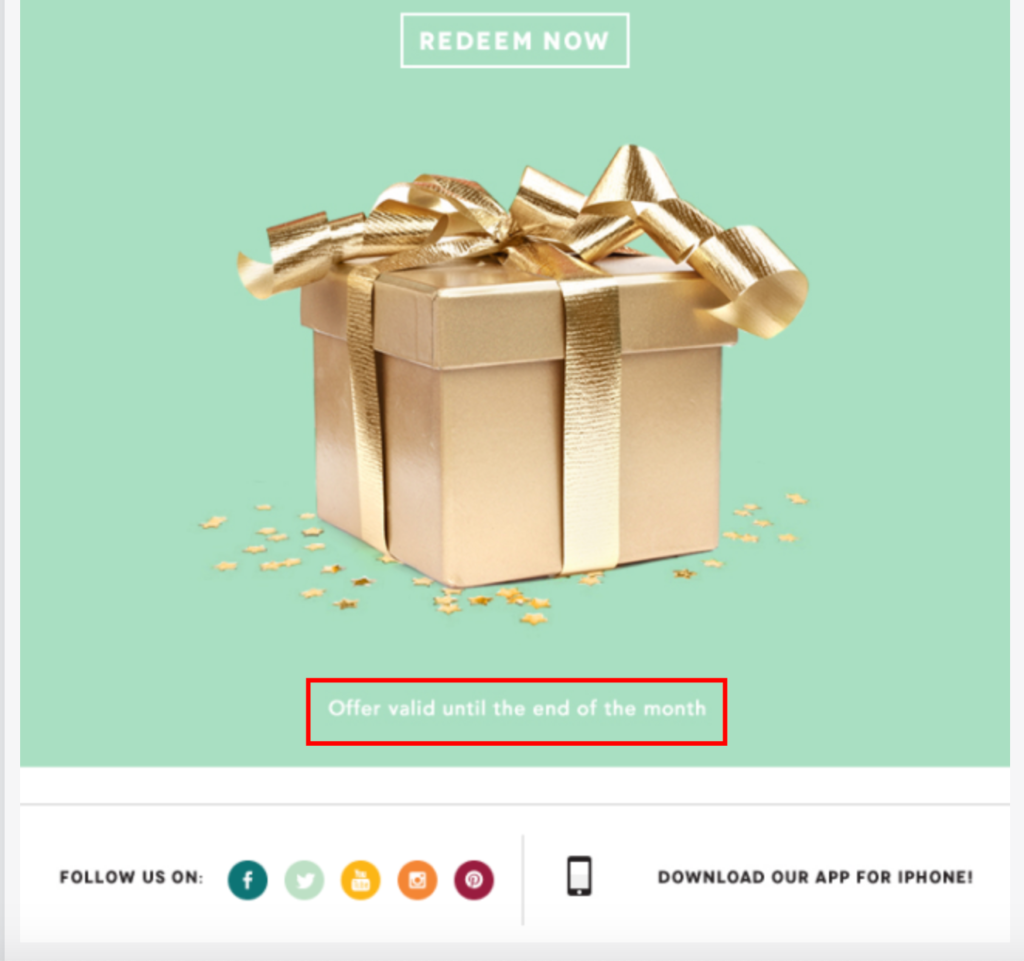
It may not seem like that big of a deal, but research has found, “emails conveying a sense of urgency have twice as high transaction rates compared with average marketing emails.” So keep this in mind when deciding how long you want your offers to last, and let a subscriber know how long they have to redeem it.
3. Nasty Gal
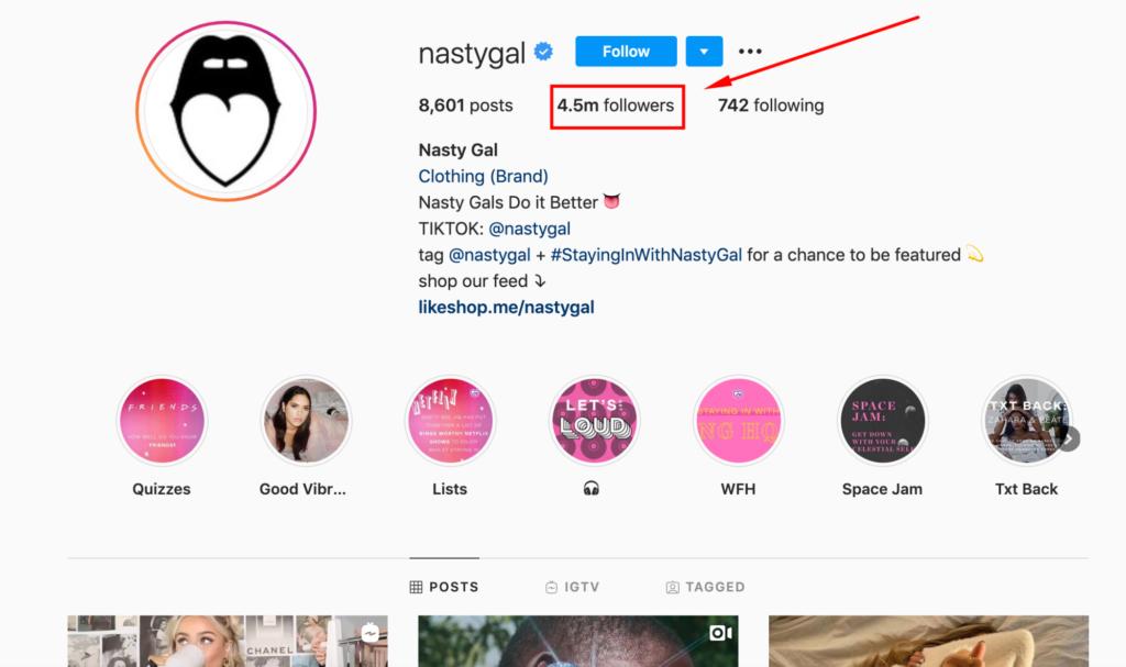
Nasty Gal is an online women’s clothing and fashion accessories company that’s generated a massive following.
Just look at how many Instagram followers they currently have—4.5 million.
Killer branding is their specialty, and they’re always using strong visuals to create a unique vibe and win shoppers over. Take this image on their website, for example, which features a model lounging on a lawn chair in the desert surrounded by plastic pink flamingos.
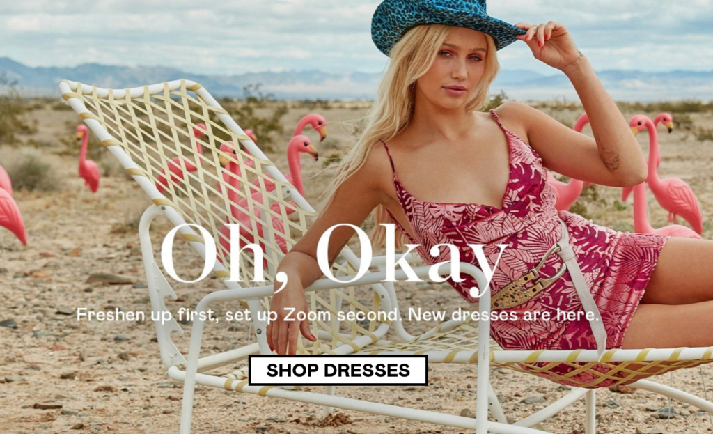
It definitely creates a distinct aesthetic that their shoppers love. And Nasty Gal’s stunning visuals spill over into their emails as well.
In fact, this is one of the most visual-centric happy birthday email examples on this list. It features a model sporting one of Nasty Gal’s outfits and plenty of birthday balloons to create a nice ambiance.
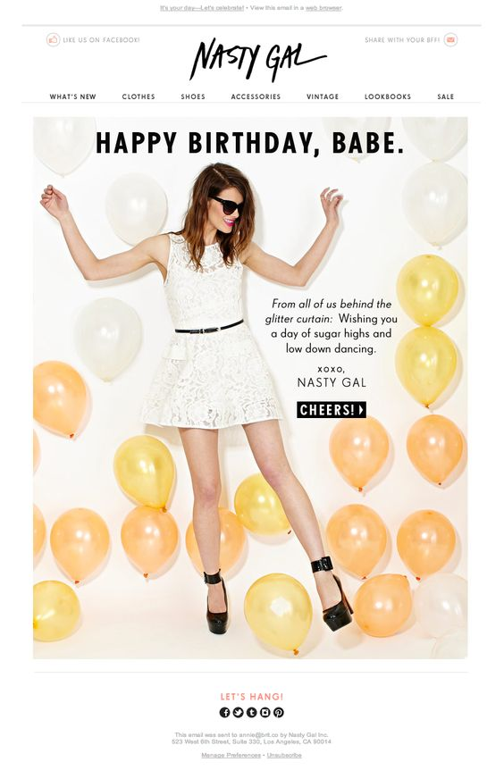
This reaffirms the importance of making your emails look great and that it’s vital for grabbing a reader’s attention.
I also like that Nasty Gal uses superb copywriting that perfectly caters to their demographic of young women.
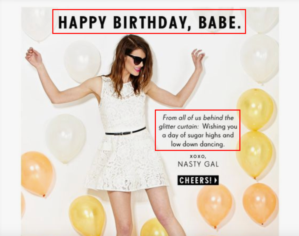
It’s fun and playful and ties in perfectly with the overall vibe of the email. This example also shows that you don’t always have to provide a discount to build rapport with readers.
Simply acknowledging their special day and showing that your e-commerce brand remembered is often all it takes to win them over. And as long as you’re clear about what action you want them to take (e.g., creating a straightforward CTA like this one), you should see a solid click-through rate.
4. Stitch Fix
Stitch Fix is an online styling service that’s gained quite a bit of attention as of late. They offer clothing that’s hand-selected by fashion experts based on a customer’s unique size and style.
It’s a cool concept where shoppers first take a style quiz, and then Stitch Fix sends them quality clothing they can try on at home before buying.
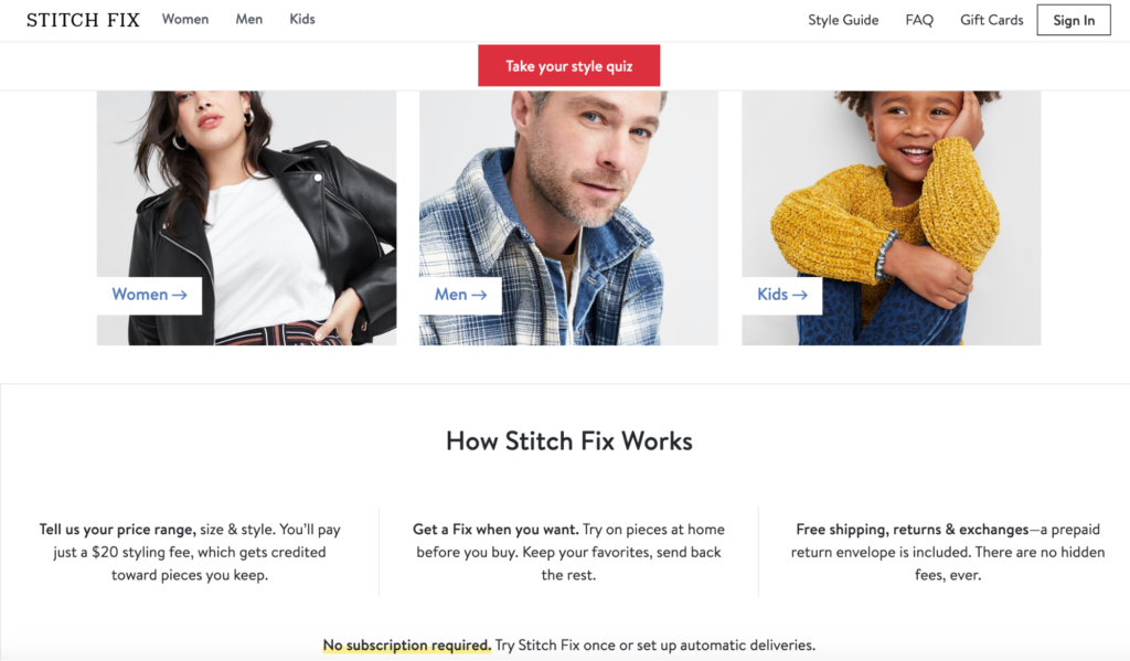
It’s another brand that goes heavy on visuals, with everything having a crisp, clean look. And their email campaign is no different.
This particular happy birthday email features a beautiful arrangement of some of Stitch Fix’s products and invites a subscriber to celebrate their special day by treating themselves to a “Fix” where they try on clothing at home and keep their favorites.
It looks amazing and is an instant attention grabber.
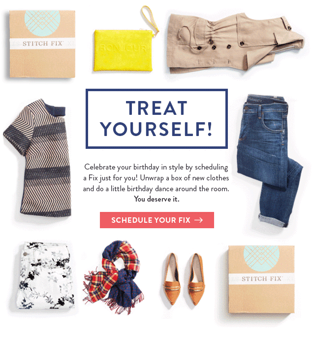
It incorporates succinct yet playful copywriting, saying a reader can “unwrap a box of new clothes and do a little birthday dance around the room.” It also has an excellent CTA that simply says, “Schedule Your Fix.”
The red color contrasts perfectly with the white background, which naturally attracts eyeballs and encourages a reader to visit the Stitch Fix website. So when you put it all together, it’s an incredibly well designed happy birthday email and one I’m sure many of their readers were receptive to.
5. Sephora
Sephora is one of the world’s leading personal care and beauty stores. They’ve got massive brand equity and a loyal legion of dedicated customers. Just check out their insane Instagram following of nearly 20 million.
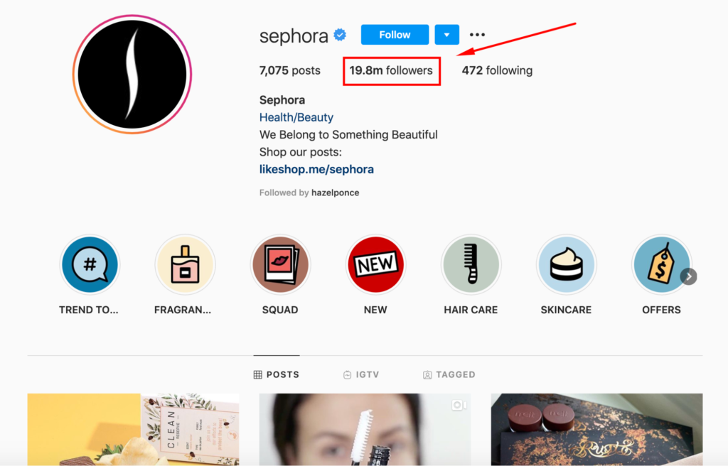
They’re also experts at email marketing, and this is another happy birthday email example e-commerce brands can learn a lot from.
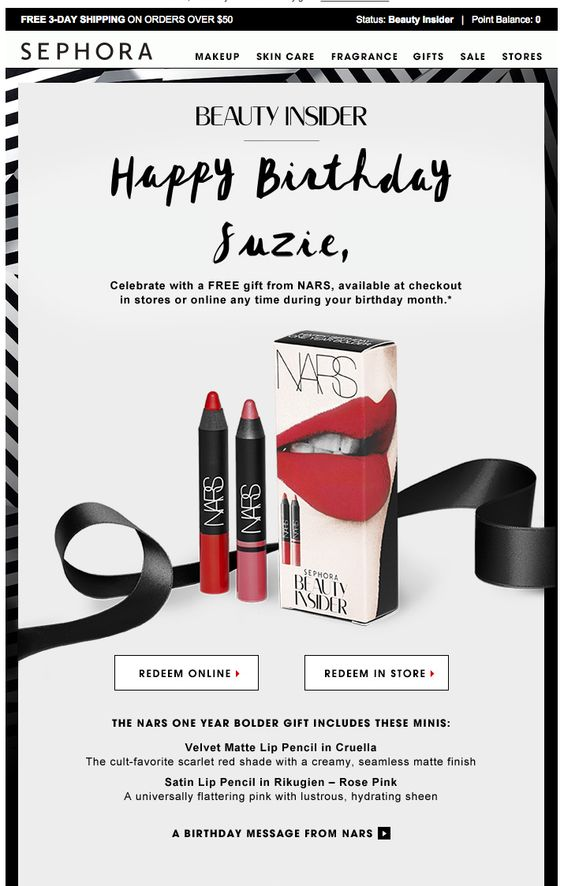
For starters, it’s ultra-personalized and addresses the reader by name with “Happy Birthday Suzie.” This is important because “personalized emails deliver six times higher transaction rates” than non-personalized emails.
The more segmenting you do, the better your outcome should be. And using a subscriber’s first name is one of the best ways to go about that.
Sephora also features an enticing offer, where a subscriber can receive a free gift during their birthday month. A lot of brands offer a discount, but not many straight-up offer a gift for free. So that’s something that should capture the attention of many subscribers.
To ensure that a reader knows exactly what comes in this free gift, Sephora breaks it down so there’s no confusion.
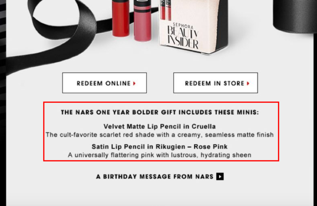
While this isn’t a move that’s viable for every brand, and you need to think about the impact it will have on overall revenue, it’s certainly something to consider.
If a small gift like this is the catalyst for repeat sales, it can be well worth it in the long run. And needless to say, the visuals are top-notch in this email and do a great job of providing the eye candy needed to get a subscriber interested.
6. Outdoor Voices
The first thing a reader notices in this happy birthday email from activewear company Outdoor Voices is the animated images.
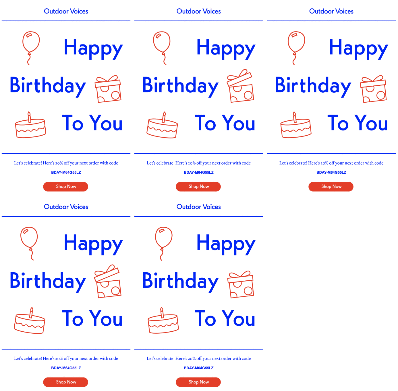
It’s nothing over the top, but adding just a touch of animation like this helps this email stand out and warrants more attention than if it only used static images. So I definitely recommend playing around with your design and including animation whenever it makes sense.
The second thing that stands out is the sheer simplicity. By no means did Outdoor Voices reinvent the wheel with this birthday email. In fact, this is the most straightforward example on this list.
But they did a great job at creating what feels like a heartfelt message wishing subscribers the best on their special day. This goes to show that you don’t always need to go all out with your copywriting. As long as you come across as being genuine, readers should appreciate it and be responsive to your email.
Lastly, Outdoor Voices made it super simple for a subscriber to redeem their 20 percent off discount. All they have to do is grab their code, and they’re all set. Remember, the less friction there is, the more likely a reader is to make a purchase.
So always be aware of how much cognitive expenditure it takes to figure out what’s being offered and how much effort it takes to complete the desired action.
7. BarkBox
This next example doesn’t celebrate the birthday of a human. Instead, it celebrates their dog’s special day. BarkBox is an e-commerce brand that offers a monthly subscription service providing dog products that are delivered right to a customer’s door.
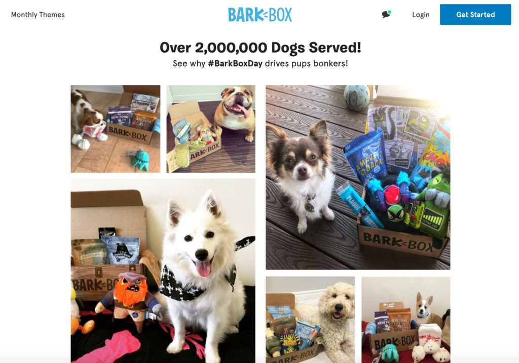
Here are some of their satisfied customers.
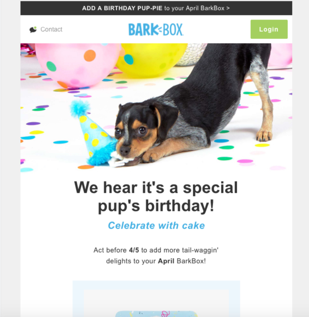
I like this email for three main reasons. First, it’s fun and playful and does a great job of capturing the BarkBox brand image. Just check out this cute pup who’s chomping away at a birthday hat.
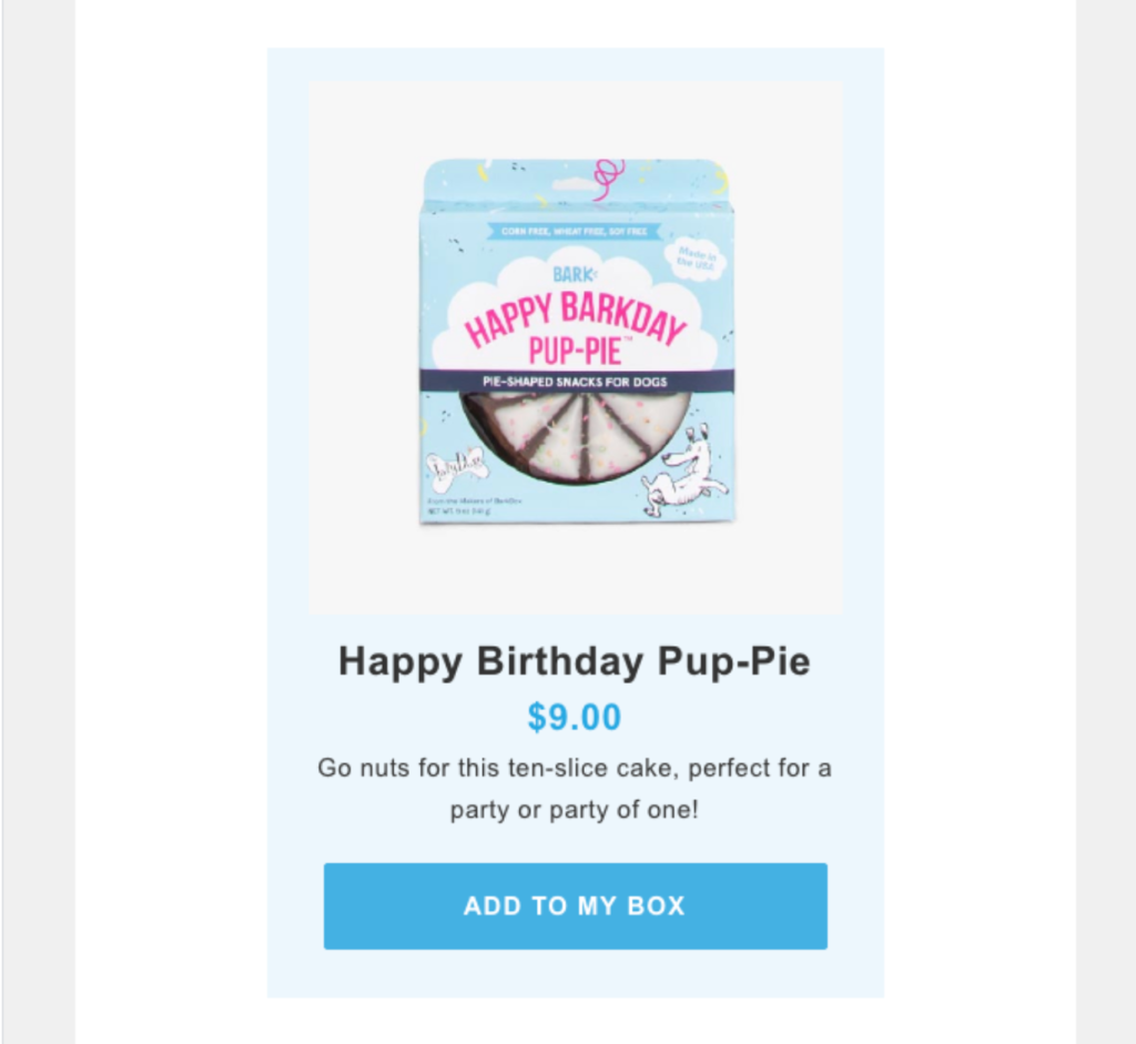
Second, it features two relevant products that readers may be interested in. There’s the “Happy Barkday Pup-Pie.”
And there’s a “Benebone,” which is a delicious chew toy that dogs just can’t resist.
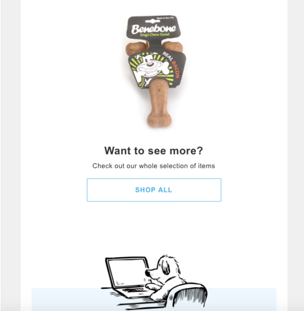
This allows readers to conveniently make a purchase directly through the email, or they can shop all products. Third, they create a sense of urgency by putting a specific deadline when the offer expires.
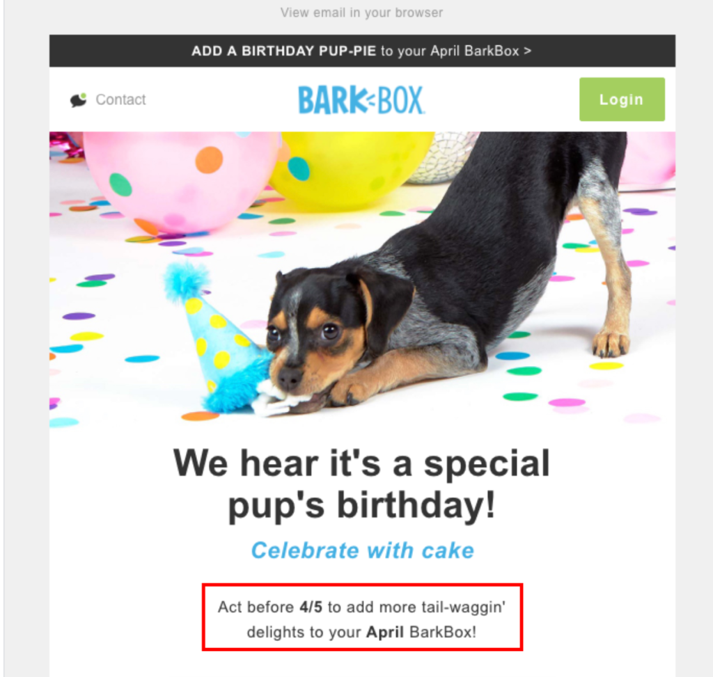
As I mentioned before, creating urgency can have a huge impact on your transaction rate and is definitely something to consider adding. Add all of that up, and this is a really solid happy birthday email that I’m sure many pet owners will appreciate.
8. Need Supply
This final example from vintage clothing company Need Supply isn’t a conventional happy birthday email example. Rather, it’s an email that apologizes for missing a subscriber’s birthday, which I think is really clever.
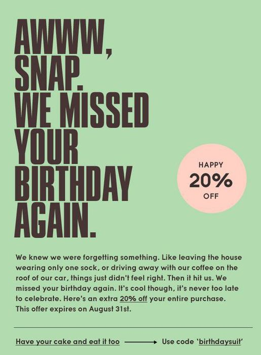
It takes a very personalized and warm approach, using charming copywriting, and lets a subscriber know they can get 20 percent off their next purchase. And this probably isn’t the type of email people expect to receive from an e-commerce brand.
It’s lighthearted where Need Supply treats them like they’re a good friend and feels bad about missing their birthday.
So this is a great example of what you can do if you happen to miss a reader’s birthday but still want to deepen your relationship and present them with an offer.

Conclusion
Nearly everyone wants to be remembered on their birthday. Whether it’s a friend, family member, or colleague taking the time to appreciate them, or one of their favorite e-commerce brands, most people will appreciate it.
These happy birthday email examples show there are a variety of ways to go about this and feature multiple strategies you can use to connect with readers on their special day.
Hopefully, you’ve walked away with some good ideas so you can maximize your click-through rate, boost sales, and, most importantly, create deeper, long-lasting relationships that lead to repeat business.


