Want to generate more clicks and sales from your email marketing?
It’s time you started using countdown timers.
Countdown timers can be employed in emails any time you want to drive urgency and instill feelings of FOMO in your audience.
Clearly, you don’t want every email to be emblazoned with ticking clocks, but evidence shows that, when used sparingly and at the right times, countdown timers can be highly effective.
For instance, we analyzed more than one billion popups and discovered that those with a countdown timer (8.07 percent) convert better than those without a countdown timer (3.79 percent) by 112.93 percent.
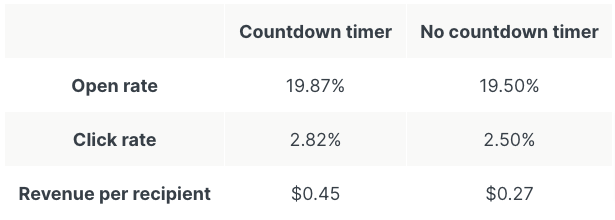
And looking specifically at the world of email marketing, research from one study found that emails containing countdown timers generate 1.7X more revenue per recipient than timer-less emails.
Best of all, email countdown timers don’t require months of planning to implement. You can start adding them to your email campaigns straight away.
Let’s take a look at nine real-world email countdown timer examples you can borrow ahead of your next sale or promotion, grouped into three different use cases.
The 9 Best Email Countdown Timer Examples
Part 1. Delivery-Based Countdown Timers
We, humans, are a naturally impatient bunch. When we buy something, we don’t want to wait a month, a week, or even a couple of days for it—we want it right now. That’s why only two-fifths of consumers consider shipping within 3-4 days to be “fast”.
However, we know that if we buy something at midnight, it’s unlikely to arrive the following day. That’s why it makes sense to tell shoppers how long they have to take advantage of next-day delivery.
What better way to do that than by using a countdown timer?
It’s a particularly helpful tactic during peak shopping periods when orders absolutely must arrive by a specific date (the best example being December 25th).
The great thing about delivery-based countdowns is that the fear of missing out on a purchase is all the motivation you need to seal the deal. That means there’s no need to eat into your margins by offering a discount.
Of course, on the flip side, if you’re guaranteeing delivery by a certain date, it’s essential you don’t let the customer down. One in eight consumers say they’d never order from a retailer again if a delivery arrived late, according to Oracle Retail.
1. Greetabl
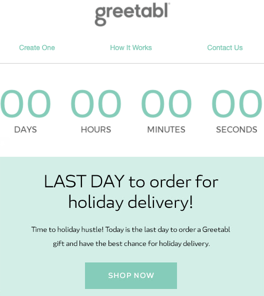
First up is Greetabl, with this simple countdown timer email urging customers to buy now for the best chance of receiving their order in time for Christmas:
As we’ll see throughout this article, location is important where countdown timers are concerned.
If you’re going to include a timer in your email marketing, it makes sense to incorporate it above the fold, and ideally at the very top of the email. That way, you make it the focus of the whole message.
I also like how the urgency of the timer is reinforced by the copy, with “last day” written in all caps. It leaves you in no doubt that if you don’t act now, you’re going to miss out.
2. Chubbies
Chubbies has built this entire email around its overnight shipping proposition, complete with a snazzy graphic of a Chubbies parcel:
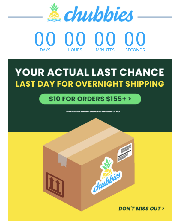
As with Greetabl, the countdown timer is backed up by the copy, which makes it clear this is not a drill: if you don’t buy now, your order won’t arrive in time.
A shout-out for the call to action button, too. It spells out the terms of the overnight shopping deal in two words and two numbers, leaving customers in no doubt about how it all works. That means there’s less chance of confusion or disappointment.
3. The Body Shop
In the process of trawling through hundreds of emails to unearth unique, interesting, and effective countdown timer examples, it became apparent that the vast majority of timers are placed at the very top of the email.
However, The Body Shop bucks that trend, instead of locating its timer beneath a bold, all-caps heading and two paragraphs of copy:
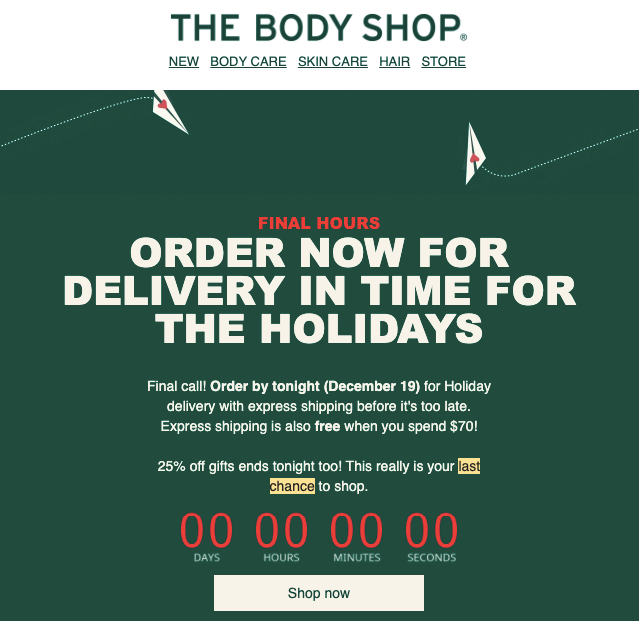
In some ways that’s a risky approach, potentially reducing the impact. If people don’t notice your countdown timer, why bother including it at all?
However, The Body Shop gets away with it through its smart use of color theory. The orange digits really pop against the racing green background, drawing your eyes to the timer despite its less prominent location.
Part 2. Sale Countdown Timers
In the course of my research, easily the most popular use case for countdown timers was to prompt action around a time-limited offer.
These sale-based timers typically come in two varieties:
- End-of-sale timers: The most obvious example is a countdown warning customers that they’ll miss out on huge savings if they don’t buy now.
- Start-of-sale timers: Some brands use countdowns to drum up interest ahead of major sales events like Black Friday and Cyber Monday, compelling shoppers to register for early access or to secure exclusive discounts.
4. Sunski
In this example, sunglasses and apparel brand Sunski uses a countdown timer beneath its logo, a prominent header, and a yellow box that explains the discounts on offer in its latest sale:
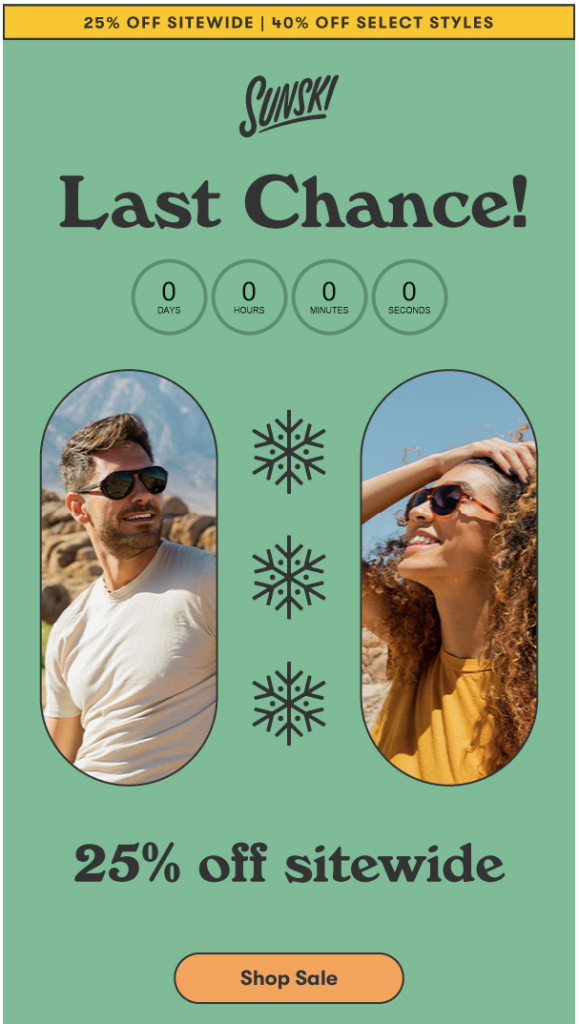
Unusually, Sunski hasn’t made any real effort to help the timer stand out. It’s not the first thing you notice on opening the email—that prize goes to the text on the yellow background. And it doesn’t use radically different font colors or design elements to draw the eye.
But if you want to include a countdown timer in your email marketing without distracting from your wider messaging or interfering with your brand guidelines, this is a good example of how to do it.
5. Flat Tummy Co
There’s a lot of information to communicate when you announce a sale. You want to detail the offer, tell people how long you’re running the promotion for, and explain which products it applies to.
Of course, you’ll want to include an eye-catching CTA and a countdown timer, too.
With all those different elements vying for space, it can be hard for email marketers to decide which detail is most important.
In this example, Flat Tummy Co opts to draw attention to the discount on offer and the call to action by highlighting both with a green background:
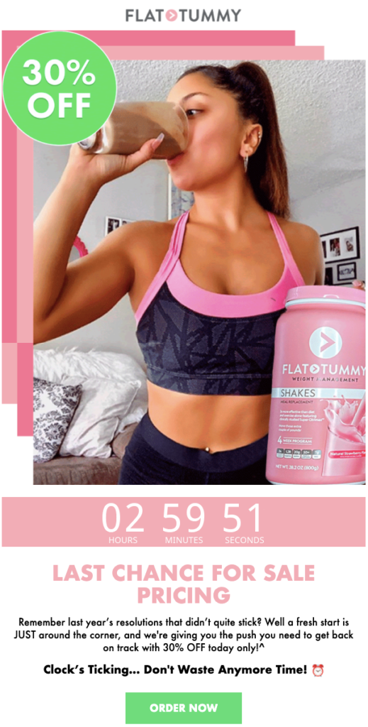
The risk here is that the countdown timer—a key way to drive action—could get lost amid all the “noise”.
But the use of a slightly larger font and white text against a slightly off-pink color ensures that it still manages to cut through.
6. The Diamond Store
More emails are sent on Black Friday than on any other single day.
Clearly, that means you’ll have to work hard if you’re going to stand out.
The Diamond Store wanted to ensure its Black Friday campaign cut through all the noise. And what better way than adding a 24-hour countdown clock to the launch email for its Black Friday promotion?
It supplemented the initial message with a follow-up email sent four hours before the end of the sale to create further urgency:
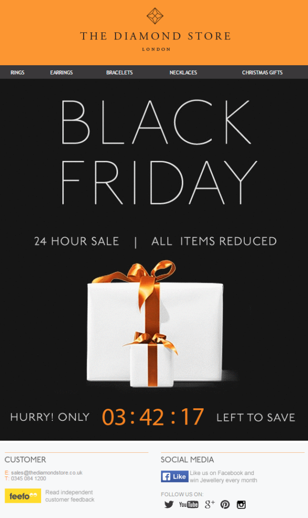
The results spoke for themselves.
Not only did The Diamond Store’s Black Friday emails see a click-to-open rate of 24 percent, but the brand also achieved a 400 percent increase in conversion rates.
7. One Kings Lane
One Kings Lane gives us a textbook example of how to use a countdown timer to generate urgency around the impending end of a sale.
With only hours to go until the time-limited discount drew to a close, the home decor brand sent this email to its subscribers:
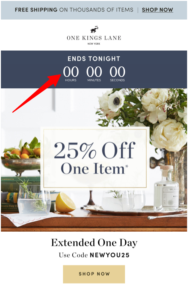
The timer is at the very top, meaning your eyes are naturally drawn toward it on opening the email.
It works well with the “Extended One Day” messaging further down the email, making you think: “I’ve already missed the end of this sale once; I’d better not miss the extended deadline too.”
8. ColourPop
ColourPop takes a similar approach to One Kings Lane, but the big difference here is the striking use of color.
Whereas One Kings Lane goes for a muted white-text-on-dark-background design, ColourPop makes its countdown timer… well… pop with its bold use of pink-on-gray text:
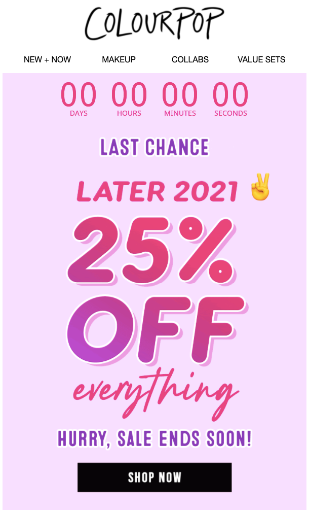
The choice of color is all the more impactful given that the brand opted to use a monochrome palette at the very top of the email. It means the first bright, striking element you see is the countdown timer.
Part 3. End-of-Line Stock Countdown Timers
End-of-line stock is often seen as a hindrance, eating up (physical) space in your warehouse and (virtual) space on your website. But it’s also an opportunity.
Essentially, you’ve got nothing to lose with end-of-line products: you can apply aggressive discounts and market them however you want because your only goal is to shift them as fast as possible.
In other words, urgency is the name of the game—and inevitably, that means countdown timers have a part to play.
9. Function of Beauty
Maybe you don’t want to offer 90 percent off to sell your end-of-line stock. You might be a company that simply doesn’t do discounts; you might think they harm your brand and make the rest of your products look less appealing.
Don’t worry—there’s another way.
Here, Function of Beauty makes smart use of a countdown timer to drum up excitement for two end-of-line products:
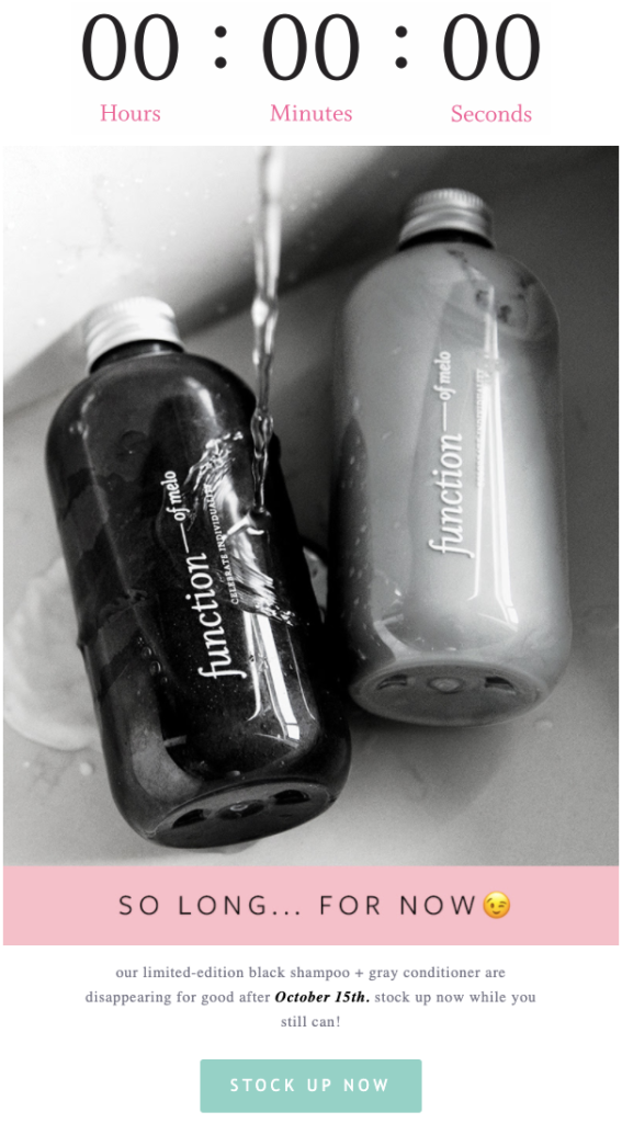
The addition of the timer makes this feel like an exclusive opportunity to get hold of something that’s highly desirable and in scarce supply, rather than a last chance to buy a product at the end of its life.
Conclusion
Earlier on in this article, I alluded to the versatility of countdown timers.
It’s one of my favorite things about them.
They can be quickly and easily integrated into your existing campaigns, without affecting your wider messaging.
So if you’ve never used a countdown timer before, there’s really no reason not to start.
Try it out, and if it works, do it some more. It’s that simple.

